
Digital Media Specialist | Social Media Marketer, Growth Marketing, Digital Content Creator.
Don't wanna be here? Send us removal request.
Statistics
We looked inside some of the posts by ramimaki and here's what we found interesting.
Average Info
Notes Per Post
2
Likes Per Post
2
Reblog Per Post
0
Reply Per Post
0
Time Between Posts
9 hours
Number of Posts By Type
Text
17
Last Seen Tumblr Blogs


Fun Fact
The “We are the 99%” Tumblr blog became the slogan for the Occupy Wall Street movement.
Text
0 notes
Text


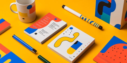


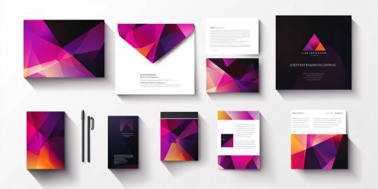
Dynamic Branding and Stationery Design: A Colorful Identity
This project showcases a vibrant and cohesive branding identity designed to leave a lasting impression. With bold, playful geometric patterns and striking primary colors, the design reflects energy, creativity, and modernity, making it ideal for contemporary businesses.
The branding package includes a full range of stationery items, from business cards and letterheads to mugs and packaging. Each item is thoughtfully designed to maintain a unified look while ensuring functionality. The use of bold typography and abstract shapes adds a layer of sophistication, making the designs visually appealing and memorable.
A key feature of this project is the incorporation of laminated finishes, giving the materials a polished, professional feel. The addition of color-coded elements allows for easy brand recognition while offering flexibility across various media platforms.
This branding identity not only enhances the professional appeal of a business but also communicates its values and vision in a dynamic way. The result is a visually compelling and versatile design that can seamlessly transition across both physical and digital platforms, ensuring a consistent and impactful brand presence.
Whether used in daily business operations or special events, this vibrant identity speaks volumes about creativity, attention to detail, and a forward-thinking approach.
#DynamicBranding#CreativeIdentity#ModernDesign#BoldTypography#StationeryDesign#VisualImpact#BrandingExcellence#AbstractAesthetics#ProfessionalBranding#ColorfulIdentity
1 note
·
View note
Text
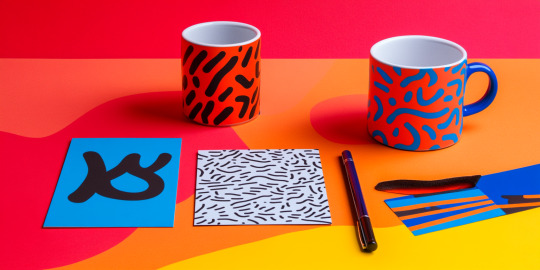
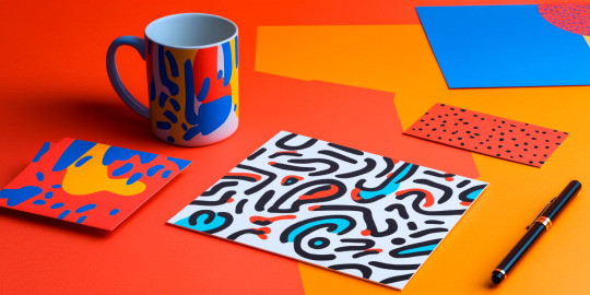

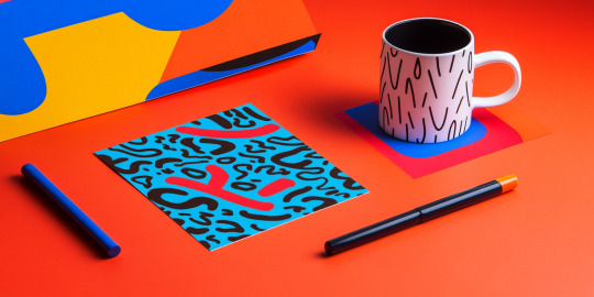
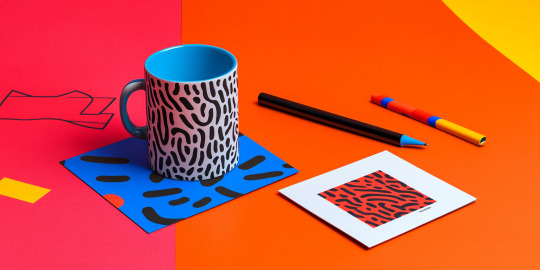
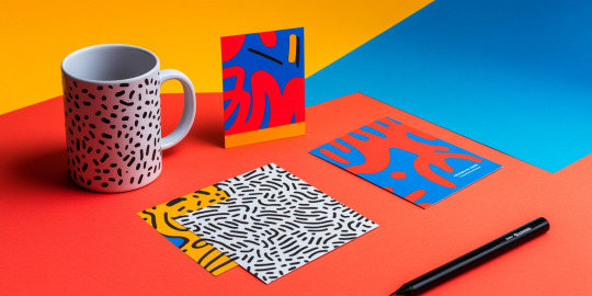
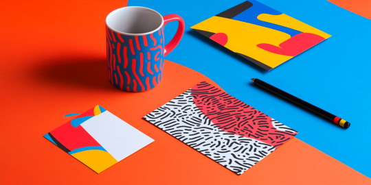
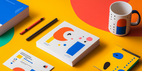
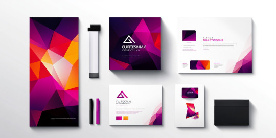
Vivid Patterns: A Creative Take on Everyday Design
This collection of product images showcases the transformative power of bold and imaginative graphic design. Featuring a range of everyday items such as mugs, art prints, and stationery, the project brings vibrant patterns and striking colors to life. With a palette dominated by red, blue, yellow, and black, the designs create a visual symphony that is both playful and sophisticated.
Each piece features abstract and organic patterns that seamlessly blend modernity with artistic flair. The designs elevate ordinary objects into conversation starters, proving that even functional items can be expressions of creativity. The harmonious juxtaposition of bold lines and intricate shapes gives the products a distinctive personality, making them ideal for both retail and personal use.
The use of vibrant colors and dynamic compositions reflects the project’s commitment to infusing art into daily life. The versatility of the designs makes them suitable for a variety of settings, whether as eye-catching promotional materials or as thoughtful gifts. This project not only redefines how we perceive everyday objects but also inspires creativity in how we interact with them.
Ultimately, this project celebrates the intersection of art and practicality, encouraging viewers to embrace design as a tool for making the ordinary extraordinary.
#VividPatterns#CreativeDesign#BoldAesthetics#EverydayArt#ModernGraphics#ColorfulLifestyle#AbstractPatterns#FunctionalArt#DesignMeetsFunction#ExpressiveStyle
0 notes
Text


Flourishing Workspace: Nature-Inspired Desk Accessories
The Flourishing Workspace collection brings the beauty of nature into your daily work routine. Designed with a blend of elegance and functionality, this collection offers a range of desk essentials adorned with botanical patterns, creating a serene and inspiring environment.
The accessories include mugs, organizers, pen holders, and storage containers, all featuring delicate leaf and floral motifs in soft earthy tones. These designs not only enhance the aesthetics of your workspace but also evoke a sense of calm and connection to the outdoors.
Each item in the collection is crafted with premium materials, ensuring durability and sustainability. The subtle gold accents add a touch of sophistication, making these accessories perfect for professionals who value both practicality and style. Whether you’re sipping coffee from a beautifully designed mug or organizing your tools in a sleek holder, every piece contributes to a harmonious workspace.
The Flourishing Workspace collection is ideal for those who appreciate mindful design and wish to transform their desk into a productive yet tranquil oasis. Elevate your workspace today and let nature inspire your creativity and focus!
#FlourishingWorkspace#NatureInspired#ElegantDeskDecor#BotanicalDesign#WorkplaceAesthetics#MinimalistOffice#SustainableStyle#CalmAndProductive#OfficeElegance#MindfulDesign
0 notes
Text


Sungeng Park Branding: Celebrating Natural Elegance
The Sungeng Park Branding Project beautifully encapsulates the serene essence of nature with its minimalist yet sophisticated design. This branding collection reflects a harmonious blend of earthy tones and soft illustrations, perfectly mirroring the tranquility and natural beauty of a serene park landscape.
From stationery to packaging, every piece in this collection maintains a cohesive visual identity. With warm orange and beige hues complemented by flowing lines and delicate illustrations of grass and hills, the design embodies simplicity and elegance. Each item, whether a business card, tote bag, or promotional flyer, tells a consistent story of relaxation and connection to nature.
The typography is clean and modern, adding a contemporary edge to the natural theme. It balances the artistic illustrations, ensuring the overall design feels both professional and approachable. The use of sustainable materials and eco-friendly packaging further emphasizes the brand’s commitment to environmental consciousness, making it not just aesthetically pleasing but also ethically aligned with modern values.
Whether for promotional purposes or operational use, the Sungeng Park branding achieves a unique blend of functionality and artistic expression, making it a standout example of thoughtful and impactful design. This project is a true celebration of the beauty found in simplicity.
#NaturalElegance#MinimalistBranding#EcoFriendlyDesign#SungengPark#SereneAesthetics#SustainableBranding#ModernNature#TimelessDesign#VisualIdentity#BrandStorytelling
0 notes
Text


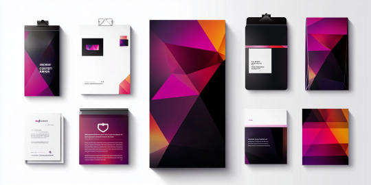
Red and Black Branding: Aesthetic Power in Visual Identity
This striking branding collection emphasizes the impactful combination of red and black, creating a visual identity that is both bold and sophisticated. The integration of smoky textures, minimalist layouts, and emotive portraiture enhances the overall elegance, making this branding package ideal for companies seeking to convey passion, depth, and professionalism.
The red tones evoke energy, power, and warmth, while the black elements add a touch of formality and timelessness. Together, these colors create a dynamic contrast that captures attention immediately. The branding materials include sleek business cards, presentation folders, letterheads, and brochures, each maintaining a coherent theme across various formats.
This collection is designed to resonate with audiences who appreciate minimalist aesthetics combined with emotional storytelling. The inclusion of expressive photographs adds a human element to the branding, fostering connection and authenticity.
Whether used in corporate meetings, creative presentations, or promotional events, this branding package reflects a meticulous approach to design. The thoughtful use of space, balanced color schemes, and personalized elements ensure that every interaction leaves a memorable impression. This visual identity not only speaks of style but also embodies the essence of bold communication, making it ideal for businesses aiming to stand out in a competitive market.
#RedAndBlack#BoldBranding#VisualIdentity#MinimalistDesign#PowerfulAesthetics#ModernBranding#SophisticatedStyle#CreativeMarketing#BrandRecognition#DesignInnovation
0 notes
Text
0 notes
Text


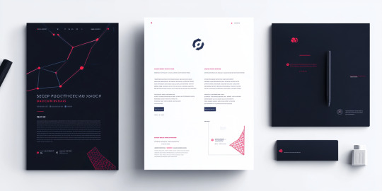


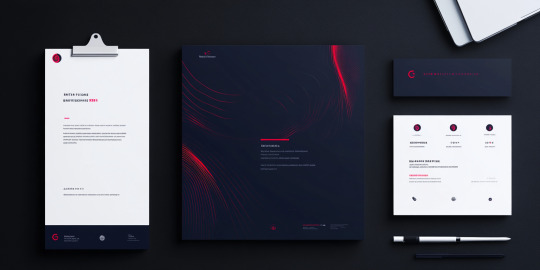

Minimalist Branding with Modern Elegance
This branding suite exudes modern sophistication through its minimalist approach, using a sleek black background accented with dynamic red lines and patterns. The elegant combination of deep tones with fine red detailing creates a visual narrative that conveys precision, professionalism, and forward-thinking innovation.
The use of fine lines and geometric motifs throughout the collection suggests a connection to technology and data, making it ideal for industries focused on digital solutions, analytics, or engineering. Every piece, from business cards to brochures, is meticulously aligned to maintain a cohesive look, emphasizing attention to detail and brand consistency.
The layout achieves a perfect balance between visual complexity and simplicity, ensuring that the information remains accessible while still visually appealing. Red accents provide energy and focus, drawing attention to key elements without overwhelming the design.
This branding collection is not only aesthetically pleasing but also highly functional, with elements that adapt seamlessly across digital and print mediums. It reflects a company that values clarity and innovation, positioning itself as both reliable and cutting-edge. Perfect for businesses aiming to stand out, this design communicates a message of elegance, precision, and future-oriented thinking through every branded touchpoint.
#MinimalistBranding#ModernElegance#SleekDesign#RedAndBlack#ProfessionalIdentity#TechInspired#GeometricAesthetic#PrecisionBranding#VisualImpact#CuttingEdgeStyle
0 notes
Text
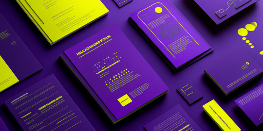
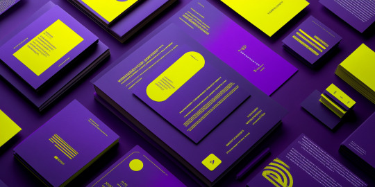


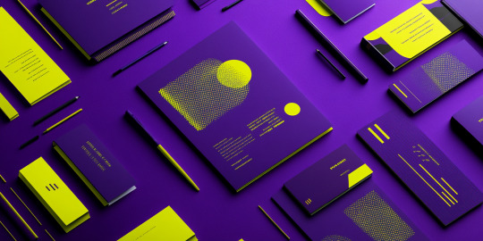

Purple and Neon Yellow Branding
This set of visuals portrays a bold branding identity using a vibrant combination of deep purple and neon yellow. The contrasting colors create an eye-catching and modern aesthetic, evoking creativity, energy, and sophistication. The minimalist design approach ensures clarity and impact, making it ideal for companies looking to convey both professionalism and innovation.
The use of geometric lines, dots, and patterns within the design elements adds texture while maintaining a sleek and organized layout. This cohesive system is applied consistently across various materials, including business cards, notebooks, brochures, and stationery, ensuring a unified brand presence in both digital and print media.
The playful neon yellow accents against the rich purple background symbolize balance—vibrancy with control, making this concept well-suited for industries focused on technology, finance, or creative services. The structured yet dynamic visual language helps brands express authority while still appealing to modern aesthetics.
This identity approach ensures that each piece communicates not just a message but also a mood, leaving a memorable impression. The high-contrast palette guarantees visibility and readability, setting the brand apart in a competitive market and signaling an organization that values both style and substance.
#BoldBranding#NeonYellow#PurpleAesthetic#ModernDesign#CreativeIdentity#HighContrast#VisualImpact#SleekBranding#MinimalistAesthetic#InnovativeLook
1 note
·
View note
Text
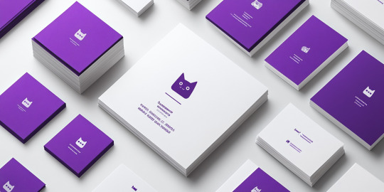
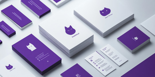
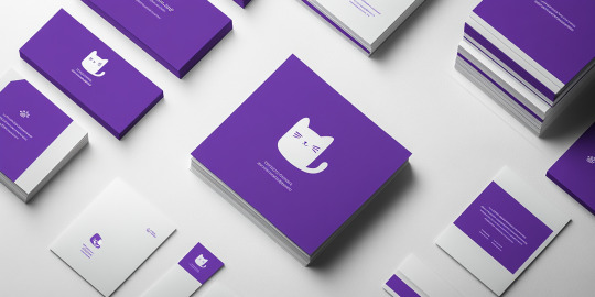
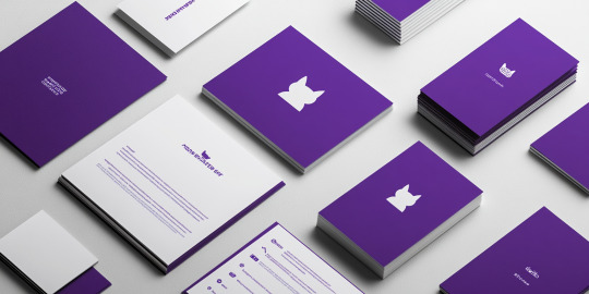

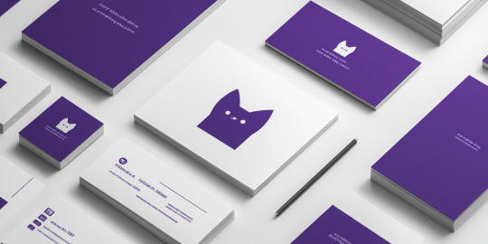

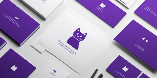
Feline-Inspired Minimalism in Branding
The images showcase a distinctive brand identity using purple and white tones, centered around a simple, recognizable cat icon. This branding approach emphasizes elegance, minimalism, and clarity, demonstrating the power of cohesive design. The use of white space and monochromatic elements enhances readability, ensuring that the visual message is direct and uncluttered.
The consistent application across various materials—business cards, notebooks, brochures, and letterheads—reinforces the brand’s identity. The purple hue symbolizes creativity and ambition, making it ideal for businesses seeking to leave a lasting impression. The cat logo, playful yet refined, adds a personable touch, hinting at the brand’s approachable nature.
This design reflects the importance of uniformity in branding. By maintaining visual harmony across all touchpoints, the brand ensures memorability and fosters trust. The cat icon serves as a focal point, making it instantly recognizable across platforms, whether on print media or digital spaces.
In today’s competitive market, such a consistent and clean brand identity can set a business apart. It communicates professionalism with a hint of playfulness, appealing to audiences seeking both style and substance.
#MinimalistBranding#FelineElegance#ModernIdentity#CleanDesign#PurpleAesthetic#BrandConsistency#ElegantSimplicity#CreativeBranding#IconicLogo#VisualHarmony
0 notes
Text


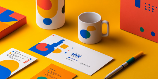
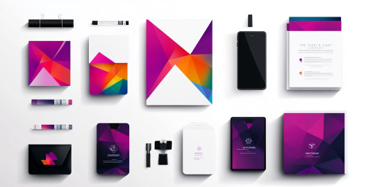
Vibrant Branding: A New Wave in Visual Identity
This series of images redefines branding with an explosion of colors and fluid designs. Showcasing a cohesive stationery set, the visuals incorporate a stunning palette of orange, pink, blue, and purple, accented by dynamic wave-like patterns. These designs are not just eye-catching; they represent the modern brand’s desire to stand out in a competitive market.
The fluid shapes in the branding materials evoke energy, movement, and creativity, making them perfect for businesses aiming to project innovation and flexibility. The designs flow seamlessly across various elements—business cards, envelopes, letterheads, and packaging—creating a unified brand identity. This consistency reflects attention to detail, which is key in building trust and recognition.
The backgrounds, blending pastel tones with vibrant accents, provide a contemporary aesthetic that feels both professional and approachable. The overall visual language communicates modernity and adaptability, making these designs ideal for tech startups, creative agencies, or lifestyle brands.
By blending form and function, these branding materials inspire businesses to embrace boldness in their visual communication. This collection highlights how thoughtful design can elevate a brand, turning everyday stationery into an artistic statement that resonates with clients and customers alike.
#VibrantBranding#ModernIdentity#CreativeDesign#FluidAesthetics#BoldVisuals#InnovativeBranding#EyeCatchingDesign#BrandConsistency#WaveInspired#DesignExcellence
0 notes
Text


A Brand Identity Masterpiece
The collection of images showcases a bold and contemporary branding project where geometric patterns and vibrant color palettes dominate. The design uses a mix of deep purples, vivid pinks, and bright oranges, combined with sharp angles and clean lines to establish a dynamic and professional feel.
The visual elements in this branding set emphasize modernity and creativity, ideal for businesses seeking to make a memorable impression. With items ranging from stationery, brochures, and business cards to packaging and tech accessories, the design ensures consistency across all touchpoints. The balance of bright hues and dark contrasts creates an energetic yet polished look, appealing to innovative and forward-thinking brands.
Each item, from pens to folders, integrates seamlessly with the brand’s theme, maintaining coherence and impact. The layout reflects a meticulous approach to detail, ensuring that every piece contributes to a unified identity. The design’s flexibility also allows for personalization, making it suitable for diverse industries, including fashion, tech, and consulting.
This branding project exemplifies how thoughtful design can elevate a brand’s identity, creating not just recognition but also emotional engagement. The interplay of colors and shapes reflects a perfect harmony of form and function, promising an unforgettable brand experience for clients and partners alike.
#BrandingMasterpiece#BoldDesign#ModernIdentity#GeometricBranding#VibrantAesthetics#CreativeConsistency#InnovativeBranding#VisualImpact#DesignExcellence#BrandRecognition
0 notes
Text
0 notes
Text


Fresh Branding with a Burst of Orange Energy
This vibrant branding collection encapsulates freshness and energy, with a central focus on bright orange hues that immediately evoke citrusy zest and vitality. Ideal for brands associated with health, beverages, or wellness, the collection radiates positivity and freshness through its cohesive and dynamic design.
The playful use of oranges, juice imagery, and leaf accents throughout the materials reinforces the brand’s association with natural and healthy products. From business cards and brochures to packaging and promotional items, every element aligns with the theme of rejuvenation, making the brand instantly recognizable.
The collection’s design blends functionality with aesthetics, ensuring that each piece—from takeaway cups to notebooks—carries a consistent brand identity. The clever incorporation of white elements offers balance, preventing the vibrant orange from overwhelming the design while maintaining a clean and modern look.
Perfect for companies in the beverage or food industry, this branding suite communicates freshness, fun, and quality. Whether used in stores, events, or customer deliveries, the bright and engaging elements ensure a lasting impression. This branding strategy reflects not just a visual identity but also a commitment to bringing joy and energy to customers, making it an excellent fit for modern consumer brands.
#FreshBranding#OrangeEnergy#CitrusVibes#VibrantDesign#HealthAndWellness#ModernBrandIdentity#RejuvenatingColors#NaturalGoodness#CleanAndBold#EngagingAesthetics
0 notes
Text


Fresh and Natural Branding in Green and Citrus Hues
This vibrant branding collection draws inspiration from nature’s palette, combining shades of green and citrus tones to create a fresh and uplifting visual identity. Ideal for health-focused, beverage, or wellness brands, the design conveys a message of vitality, purity, and natural goodness.
The blend of lime green and sunny yellow throughout the packaging evokes feelings of freshness, while images of fruits such as oranges, limes, and lemons reinforce the brand’s connection to natural ingredients. The minimalistic yet elegant presentation highlights simplicity, ensuring the focus remains on the product and its benefits.
The design elements—ranging from juice bottles to eco-friendly packaging—promote a sense of sustainability and well-being. The strategic use of green tones symbolizes health and nature, while the citrus elements add energy, suggesting rejuvenation and positivity. This cohesive visual identity creates a seamless customer experience, whether used for product labels, flyers, or promotional items.
Perfect for businesses aiming to align with health-conscious audiences, this branding suite communicates trust and quality through its clean, modern approach. The thoughtful combination of colors and design reflects a commitment to providing refreshing and healthy products, leaving a lasting impression on customers and enhancing brand loyalty.
#NaturalBranding#FreshDesign#CitrusInspired#GreenAesthetic#WellnessBranding#EcoFriendlyPackaging#HealthFocus#MinimalistElegance#SustainabilityInDesign#VitalityAndPurity
0 notes
Text


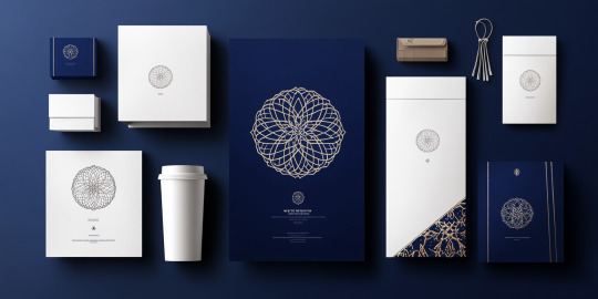


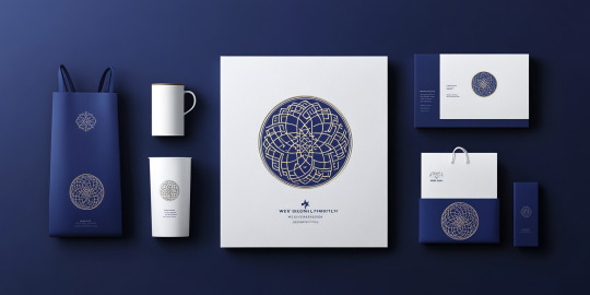


Sophisticated Minimalist Branding
The showcased images present an elegant branding project that embraces the principles of minimalism and sophistication. With a focus on a navy blue and white palette, the design radiates luxury, professionalism, and simplicity. The recurring use of intricate, circular patterns across the materials provides a sense of tradition while aligning seamlessly with modern aesthetics.
Every element, from packaging to stationery, reflects consistency and precision. The high-quality paper bags, mugs, business cards, and product boxes all share the same visual identity, ensuring the brand message remains cohesive across different touchpoints. The typography is subtle yet impactful, complementing the geometric patterns and enhancing the overall refined feel.
This branding concept is particularly well-suited for upscale businesses or luxury products that emphasize elegance and quality. The design’s restrained use of color and artful patterns creates an air of exclusivity while still being approachable. This balance between heritage and modern design gives the brand a timeless appeal, making it both memorable and reliable.
Through this thoughtful branding approach, the design suggests craftsmanship, precision, and authenticity. It communicates that the brand values attention to detail and strives to create meaningful connections with its audience, making it ideal for a company aiming to leave a lasting impression in competitive markets.
#SophisticatedBranding#MinimalistDesign#LuxuryAesthetics#TimelessElegance#ProfessionalBranding#GeometricPatterns#ModernTradition#RefinedVisuals#ConsistentIdentity#AttentionToDetail
0 notes
Text


Fresh Identity Through Minimal Design
The featured images display a sleek branding identity with an emphasis on a minimalist and refreshing aesthetic. The color palette is dominated by soft mint green, blending effortlessly with clean white backgrounds, giving the branding a sense of calm and professionalism.
This design setup includes business cards, notebooks, brochures, stationery, and branded merchandise, suggesting a cohesive approach to corporate identity. Every element is meticulously crafted to maintain brand consistency, reflecting an understanding of modern visual communication. The chosen palette symbolizes freshness and reliability, making it ideal for businesses aiming to project trust, such as those in healthcare, finance, or technology sectors.
The alignment and spacing of the design elements are well thought-out, ensuring clarity and readability, while small details like custom pens, coffee cups, and plants complement the overall visual appeal. The seamless integration of digital presence through mobile mockups indicates the importance of maintaining branding across both physical and online platforms.
In essence, this design exemplifies the power of simplicity in branding. It highlights how a thoughtful color scheme combined with neat layouts and uniform typography can establish a professional image, ensuring that the brand remains memorable and accessible to its target audience.
#MinimalistBranding#ModernAesthetics#CorporateIdentity#FreshDesign#BrandConsistency#VisualCommunication#ProfessionalBranding#DigitalIntegration#SimpleDesign#MemorableIdentity
0 notes