
Don't wanna be here? Send us removal request.
Statistics
We looked inside some of the posts by ramonaillustrationtwo and here's what we found interesting.
Average Info
Notes Per Post
13
Likes Per Post
10
Reblog Per Post
3
Reply Per Post
0
Time Between Posts
5 days
Number of Posts By Type
Photo
11
Text
5
Video
1
Last Seen Tumblr Blogs


Fun Fact
Tumblr was the first site to host the blog for President Barack Obama in 2011.


Photo

Exercise: Presenting yourself
People are switching more and more to digital portfolios. It’s easier for people to see your work prior to making contact, to build working relationships internationally and show a wider range of your work that you would be troublesome to physically carrying around. This is even more relevant during the current global pandemic as more an more companies and people are trying to minimise the need for face to face meetings.
I chose to present my work on the website Portfolio Box after researching different hosting options. I chose Portfolio Box as I felt it looked professional and was well suited to hosting visual content.
I selected examples of my work that I felt best represented myself as an illustrator (lover of clean lines) and that could be appreciated without knowing the full context of the piece. I person could browse through and understand what they were looking at without requiring an explanation.
I created a simple colourful Memphis inspired background as the homepage of my website which I carried over to the ‘about’ page by using it within my photo. Although I understand the need to appear professional with the rise of social media I feel creators are more able to share their personal side also!


Within the gallery, when the cursor hovers over the image it display the title and when viewing in ‘Lightbox’ mode, more details about the image can be read. I kept descriptions short, giving a little context and describing the medium used eg ’Part of a project exploring a sense of place, Digital’.
I went against the exercise specificiations of using only work from the unit and included additional illustrations, prints and educational resources from previous courses and my work in education. I enjoyed the process of creating the website so much I decided to publish it and wanted to include a larger body of my work to be available. I paid $5 to have my website hosted for one year.
https://ramonamason.pb.studio/home
0 notes
Text
Research point: Client-Led Work
Children's Graphic Novel Illustrator
Oak Tree Comics | Anywhere
Apply on Behance
Oak Tree Comics is a new indie publisher of graphic novels for kids. Our focus is on telling imaginative stories that inspire positive social change.
We're starting with two projects. One is a picture book and the other is an epic fantasy graphic novel series. We're looking for an illustrator for each project. In an illustrator, we're looking for someone who values social and environmental justice, loves children's literature, and is a thoughtful collaborator. A sense of humor is a plus.
The fantasy series is inspired by the work of Neil Gaiman and Noelle Stevenson while the picture book takes on a more whimsical and imaginative depiction of the natural world.
We're believers in the fluidity of the creative process. Depending on the artist and their preferred workflow, the job would entail inking, coloring, and lettering the project as a whole or collaborating with other artists who specialize in those areas. Right now the work would be part-time with the potential for growth into a full-time position as a staff artist at Oak Tree Comics.
I decided to use look at job vacancies posted on Behance and selected the above post to consider how I would approach the work and if I would be suitable for the roll.
Strengths - I have a good eye for visual narrative and enjoy illustration for children in both a book and graphic novel setting. Working in education and young people potentially gives me an edge over other applicants as I have a good understanding of the target audience. I am interested in the topic and the brand seems to be inline with my personal ethics.
W- Realistically I would be unable to take on this work but if I were a freelance illustrator (and not in full time employment) I would have to be able to meet deadlines. I would need to ensure that the timeframe was achievable. As I would be working for a client I would need to be flexible in my approach. This is a collaborative project, I need to work on finding a balance between maintaining my artistic view and meeting the view of the client.
Opportunities - I would be able to further build on my graphic novel work which would develop my portfolio and allow me to challenge and build on my skills. My work would be available to purchase and I would be working in a field I enjoy.
Threats - The publishing group is a new venture so it is entirely possible it will not be successful, realistically most new ventures aren't. The work that is already public on their social media is not to my taste and looks quite amateur (in my opinion). It would be worth considering if the writing was not something I felt was good, would I want my work tied to it? I would also be concerned about what they are expecting to pay and that it might not be worth the time.
It would be important to discuss the copyright intentions especially as the company is based in America which has different copyright laws to the UK. It would also be essential to come up with a pricing strategy prior to talking to the client in order to seem professional! I think it would be wise to do further research so I can ask the relevant questions and ensure I don’t miss anything important.
0 notes
Text
Research point: Working Professionally
It’s important when working out what to charge for clients to take not just the work into consideration but other factors. If you are just starting out and trying to build your portfolio you may choose to charge less than a more experienced illustrator. If you have a good reputation and strong work history you may be able to charge more than the standard rate as the client might want you specifically.
Reading through the AOI articles regarding pricing they listed specific things to consider when deciding on pricing.
Usage - You also need to consider the client, if they are a large brand or small independent business and how visible your work will be.
Where is will be used - UK only, Europe, America or worldwide, the bigger the audience the higher the fee.
How long it will be used for - Is it for a one off event or the branding of a product.
The rights to an image needs to be agreed between both the illustrator and client. On the AOI website they recommend going by:
Territory – Duration – Usage
E.g: UK Licence, 1 Year, illustration for Printed Postcard ONLY
Worldwide Licence, 5 years, full coverage illustration for whiskey label ONLY
I found this guide regarding copyright laws and illustration really helpful and have saved it here for future reference. The key point for me is that your illustration is always copyrighted by you whether you mark it as so or not. The only time you loose the copyright is if you sell it.
https://theillustratorsguide.com/copyright-for-illustrators/
‘Understanding copyright for illustrators doesn’t need to be complicated. Every illustration you create is your property – you own it, you are the copyright holder. You can give permission for other people to use the illustration for free or for money, or you can sell the entire copyright. It is yours to do with what you want.
The illustration business operates on the basis that you grant clients a licence to use your intellectual property for different purposes, in different places and for different lengths of time. The artist is still the owner of the illustration and has the right to copy it (copyright). Clients pay to be able to use your work in predetermined ways for a certain amount of time in the form of a licence.
Increasingly, clients are asking for the transfer of copyright in their contracts, which means they will own your illustration outright. It is in your best interests to keep hold of your copyright.’ (Copyright for illustrators, 2018)
Admittedly when I have completed paid work I haven’t usually considered all the points listed above. My paid work so far has always been for one off illustrations for friends, wedding invites etc. I genrally charge using the number of hours it takes to complete the work x £10ph rate. Which is probably under charging. I have also done work in place of buying a wedding gift! Moving forward I want to consider all the factors above when working with a client. Even if I am doing the work as a gift I think it would be valuable to estimate how much I should charge.
References
Lee, G., 2019. How To Price Your Illustrations. [online] Digital Arts. Available at: <https://www.digitalartsonline.co.uk/features/creative-business/how-to-price-illustrations/> [Accessed 21 August 2020].
The AOI. n.d. Negotiating Pricing. [online] Available at: <https://theaoi.com/resources/pricing/negotiating-pricing/> [Accessed 21 August 2020].
The AOI. n.d. Price It Right – Pricing Basics. [online] Available at: <https://theaoi.com/resources/pricing/price-it-right-pricing-basics/> [Accessed 21 August 2020].
The Illustrators Guide. 2018. Copyright For Illustrators. [online] Available at: <https://theillustratorsguide.com/copyright-for-illustrators/> [Accessed 14 September 2020].
0 notes
Text
Exercise: What’s your working process?
Flowchart: My working process
Reflecting on my previous exercises and assignments I have broken my working process down into a flowchart. This would be the basic working progress and could be altered for different outcomes. For example, if I was creating a book illustration, the first steps would be to read the book.

I try to approach my work in a more methodical way, following certain steps. This allows me to break down a project into smaller tasks which helps me to manage my work load and stay goal orientated. In the past I have struggled with exploring my ideas (this was also pointed out in my tutor reports), occasionally I get fixated on an idea and don’t allow myself to consider other possible interpretations of the brief.
I have also noticed I tend to think about my ideas a lot. Rather than writing all my thoughts down and constantly drawing I will turn an idea over in my head for days and weeks. Although this has lead to some interesting outcomes one downside to this method of working is that it is constant, I can be thinking in the shower, during meals, when I’m meant to be asleep... I am trying to reduce this as it’s not a particularly healthy work habit. By trying to spend longer on the mind-mapping stage in order to attempt to work more within set hours rather than constantly.
I use a lot of internet research and photos. If the project requires a depiction of a location/building etc that I am able to visit, I will prefer to take my own photos on site. This means I can get the different angles and perspectives I want, but I also find the process can be inspiring and give greater insight to how it feels in the location. I really enjoy looking at online archives of museums and galleries especially when I want historical reference. I am incredibly fortunate to have a vast book collection not only of my own (I love collecting visual reference books on all subjects from charity shops) but of my parents (my Mum studied art history and my Dad worked in SFX for film and tv) so there are reference books on lots of topics in my house. Another useful research tool for me as a dyslexic person are videos. I feel that research is both a strength and weakness for me as I believe that I conduct quality research however I can become a little lost and spend too much time on that stage of the process.
The hardest thing for me with any sort of creative work is critiquing and finishing. Anything I create, starts with me being very excited about the potential outcome, then about halfway through hating it. Irrationally so. I find it difficult to be subjective and genuinely critique my work and tend to only come up with blanket statements such as ‘I hate it, it’s ugly’. To combat this I have been trying to step back and consider specific questions such as; Does the illustration fit the brief? Have I met all the required criteria? Have I met the goals I set for myself, eg using a specific medium or limited colour palette? This helps me to continue moving forward with my work and not getting stuck. As I am studying I also like to use a strategy that I use with my students and consider:
What went well?
What could be better?
What would you do differently next time?
What did you learn?
I do think I need to improve on my overall drawing skills and try to develop my own personal style further rather than compare my work to reality (which is strange as I don't like realism within illustration). I feel that improved drawing skills and more confidence within my work would enable me to work faster and smarter.
0 notes
Photo


Research point: Self Directed Projects
Quarantine Days at Home Rizki Nirmalasari
Nirmalasari has created a self-directed project that documents her time in quarantine. During the pandemic many creatives have been unable to work, by continuing to produce illustrations (even if it isn’t paid work) enables the illustrator to keep their portfolio and social media presence current. I believe that Nirmalasari’s brief was probably very open such as ‘document the day to day during quarantine’.
Nirmalasari, R., 2020. Quarantine Days At Home. [online] Behance.net. Available at: <https://www.behance.net/gallery/98420021/Quarantin-Days-at-Home?tracking_source=search_projects_recommended%7Cself%20directed%20project> [Accessed 22 August 2020].
0 notes
Photo

Research point: Self Directed Projects
Educating Lettera Shraddha Mandale
Mandale created an illustrated alphabet with each letter representing a different aspect of education. This self-directed project started with a conceptual brief to spread awareness about quality education using typography. Although Mandale has posted her brief on Behance, I would anticipate that she may have written a more detailed brief for personal use. It is also possible that she had the idea prior to writing the brief and used the process of writing the brief to help solidify and explain her concept. Either way it is a really unusual project.


Mandale, S., 2017. Education Letters. [online] Behance.net. Available at: <https://www.behance.net/gallery/54567257/EDUCATING-LETTERS> [Accessed 22 August 2020].
0 notes
Photo

Research point: Self Directed Projects
The Last Unicorn Chervelle Fryer
Fryer created a piece of fan art of the film ‘Save the last Unicorn’. She set herself the loose brief of capturing the ‘feeling’ of the film’. The illustration feels very much a passion piece for Fryer who creates character and narrative based art.
For many illustrators this type of project can work well to engage with people through social media and be a good way to earn money by selling prints and products with the art on. Fan art of film/tv and literature especially if it is nostalgic can help capture the attention of people who also also enjoy the topic, working as a gateway to your portfolio. I have personally found many illustrators work through seeing work featuring Buffy the Vampire Slayer or Studio Gibili characters.
It is also helpful to keep your portfolio (especially online) current with new work. If you are in between jobs self-directed projects can be a good way to keep your work fresh.


youtube
Chervelle.co.uk. 2019. Chervelle Fryer. [online] Available at: <https://chervelle.co.uk> [Accessed 22 August 2020].
0 notes
Photo

Research point: Self Directed Projects
Self Branding Mariana Lopes
A common self-directed project that came up in my research was personal branding. When freelancing and self promoting any interaction can be an opportunity to strengthen your brand. By creating a strong brand identity it can help people remember you and help present a professional image. Digital design student Mariana Lopes set herself the brief of creating a visual concept the represents her personality and aesthetic taste. She selected the colour palette, typography, logo and design elements that could be placed in different configurations. Finally to end the project she mocked up uses for her branding.

Lopes, M., 2017. Self Branding Project. [online] Behance.net. Available at: <https://www.behance.net/gallery/57788871/Self-Branding-Project?tracking_source=search_projects_recommended%7Cself%20directed%20project> [Accessed 22 August 2020].
0 notes
Text
Exercise: Writing a rationale
I chose the Sainsbury’s brief to consider how I would go about answering it.
Client: Sainsbury’s
Brief: Create a piece of design or illustration for a limited edition range of Sainsbury’s shopping
bags.
Requirement: This brief is to create artwork to appear on a new range of bags, based on one of three key themes that are central to Sainsbury’s business:
Be the best for food and health.
Show respect for our environment.
Source with integrity.
Mandatories: The bag dimensions are 390mm high and 450mm wide. So your artwork should fit within such a canvas. There are no colour limitations at all. Sainsbury’s branding will be applied to the side gussets, so your design will dominate both main faces of the bag.
How I would answer the brief:
I would start by mind mapping possible responses to each key theme. eg; Food and health, vegetables, exercise. Respect for the environment, trees, seas, animals, whales, polar bears
Reviewing my mind maps I would select a concept or two which I felt most excited by and thumbnail ideas and composition for that subject. Whether it be a seascape, vegetable garden or animal.
I would conduct visual research if it was required such as photos of the subjects I wish to depict.
From my thumbnails I would select and build on the initial ideas to create more realised concepts, utilising my visual research, around A5-A4 in size.
Working digitally I would set the canvas size to dimensions of the bag and complete the final illustration either by hand or digitally. I would place the final image within the digital canvas.
Clean up image if it is required. Experiment with colour combinations if I can’t decide on one.
Final image made, I would generate some mock-ups to contextualise the image.
The above is generally how I work with some slight variation on the early steps. I find this method suits me well and allows me time to explore and consider the options and directions I could take.
Rationale example:
Responding to the key themes of showing respect for the environment and sourcing with integrity, I would create a bold and bright design depicting a seascape. This would be in reference to sustainable fishing practices and the increased awareness of the worlds oceans. By choosing an issue that is current I would hope to highlight the positive practices of Sainsbury’s to capture the attention of the more conscientious shopper. Animal themes are also popular with children, this could encourage parents to be more likely to select a bag that appeals to their children’s interests.
0 notes
Text
Research Point: Sample Briefs
Sample brief Client: BBC2
Brief: Create an opening credit sequence for The Culture Show that will surprise, inspire and challenge viewers.
Introduction: Launched in November 2004, The Culture Show is BBC2’s leading arts programme. It’s forward-looking focus, stylish presentation and confident, witty tone has attracted a younger audience. We are looking to build the show’s reputation as cutting-edge arts programming, signalling, from the opening second, that The Culture Show is an innovative show that respects its viewers’ intelligence and rewards them with well-crafted, expert, thought-provoking content.
Creative requirements: You should create one or more innovative 20 second credit sequences to open the show, to surprise, inspire and challenge viewers when they tune into The Culture Show. You should reference in some way the show’s coverage of disciplines such as fashion, art, architecture, music, film and TV. It’s down to you how you creatively go about this.
Editorial issues: Please bear in mind that BBC Producers’ guidelines will need to be adhered to in terms of subject matter – no nudity, sex, smoking or drug references.
Who are we talking to: Young, discerning metropolitan minded 25–44 year olds who have a genuine love of culture.
Thoughts on the brief:
This brief is fairly open, the restrictions that have been set are:
Time limit of 20 seconds for the created opening sequence.
BBC producer guidelines
Outside of the these parameters the brief could be interpreted in many ways, especially considering the topic guidance of ‘fashion, art, architecture, music, film and TV’. They use words such as ‘surprise’ ‘challenge’ ‘inspire’ which aren’t very telling in expected visual outcome, this would be down to the illustrator to reflect on how they would address that aspect.
The questions I would ask prior to submission would be:
Outside of the title of the programme is there written information that would be included in the opening sequence such as presenting cast, producers and/or BBC branding?
When is the deadline?
Sample brief Client: Orange
Brief: Create your vision of future communications.
Background: When Orange launced in 1994 we set out to simplify things in a world of confusing new technology. Now, in 2007, we can talk to each other by landline, mobile and internet telephones. We have text messaging, email, IM chat and, more recently, the huge rise in popularity of social networking. So, what’s next in the world of communications?
Target audience: All existing and potential customers of Orange.
Creative requirements: Using illustration, create for us your vision of communications in three to five years time. You could create something tangible, relating to products and physical technology. Something that talks about technology. Something emotional that shows how you think people will feel about communications, and the way that they can communicate with those around them.
Thoughts on the brief:
This brief is incredibly open in that the outcome isn’t specified, it could be responded to with a physical object, animation, illustration, a poster... Personally I would find this very daunting as I would have no idea where to start! As there is so little guidance there is not many questions I would want to ask as I think the concept behind the brief is to find something new and different (the client might not know what exactly they want till they see it!). The only information that is missing is deadline and timeframe.
Client: Sainsbury’s
Brief: Create a piece of design or illustration for a limited edition range of Sainsbury’s shopping
bags.
Requirement: This brief is to create artwork to appear on a new range of bags, based on one of three key themes that are central to Sainsbury’s business:
Be the best for food and health. Show respect for our environment. Source with integrity.
Mandatories: The bag dimensions are 390mm high and 450mm wide. So your artwork should fit within such a canvas. There are no colour limitations at all. Sainsbury’s branding will be applied to the side gussets, so your design will dominate both main faces of the bag.
Thoughts on the brief:
This is my preferred brief as it is the most closed of the three and gives very clear direction. The bags are already in production so you would also be able to research current and past designs to help you get an idea of what the client would like.
390 x 450mm in size
Select one of the key themes from:
Be the best for food and health.
Show respect for our environment.
Source with integrity.
I would have no questions for the client regarding this brief other than timeframes, milestones and deadlines.
0 notes
Video
vimeo


vimeo

Example gif from Studio90

vimeo


vimeo


youtube


vimeo
Story Sphere
https://storyspheres.com/scene/G2QoXZi2
Momento 360
https://momento360.com/e/u/cc5177720eb14297b70920e7a26b3578


0 notes
Photo


Exercise: Contemporary ceramics
I was unsure where to start for this exercise so I made a mind-map looking and various areas of ceramics to see if I could generate any ideas.

I thought about working with the idea of commemorative ceramics (especially in the style of British Royal Commemorative ceramics) and creating my own mugs etc to commemorate family members and events.

(Legacy Antiques, 2020) (Legacy Antiques, 2020)
I discovered the work of Roberto Lugo and how he subverts the traditions of those chosen to be depicted on ceramics by commemorating civil rights activists, hip-hop artists and victims of police brutality.

(Wexler Gallery, 2020)
Although I felt there was scope to create some interesting designs however I wasn’t sure about using portraiture at such a small scale.

Another idea I explored was the history of apothecary/pharmacy/drug jars. Prior to modern pharmaceutical dispensary, medications, medicinal herbs etc were stored in ceramic/stoneware jars. These jars were used across the world and there are many examples, although the styles vary there are some consistent features, the shape and size (although some have handles) is designed to allow the jars to be lined up next to each and easy to grab. A common feature is a space to mark what the contents of the jar is for easy identification. Often there is an image on the jar linking it to the pharmacy, pharmacist or the craftsman of the jar.

Drug jar, made in Puebla de los Angeles, Mexico, about 1700-50. (Drug jar | V&A Search the Collections, 2020)
Drug jar, decorated on one side with the Royal Arms of Portugal, made in Lisbon, about 1650-70(Drug jar | V&A Search the Collections, 2020)

Drug jar late 16th century or early 17th century, France (Jar | V&A Search the Collections, 2020)
Drug jar, tin-glazed earthenware, made in Faenza, Italy, 1490-1500
'Ssuc nenuferi' Water-lily juice
(Drug jar | V&A Search the Collections, 2020)

Apothecary Jar with Running Hares and a Dog 12th century, Iran (Apothecary Jar, 2020)
Drug Jar late16th century-early 17th century (Jar | V&A Search the Collections, 2020)

Pharmacy jar ca. 1579, Italy (Pharmacy jar, Met Museum, 2020)
Reflecting on my research I began to consider how I could relate the conventions of the historical drug jars to a modern setting. I thought about my relationship with drugs. I have my prescribed medication that comes in boxes stored on shelves or a rack. Keeping tablets or inhalers in a jar isn’t particularly hygienic or practical. I also consume a legal drug every day multiple times a day, coffee. Without caffeine I struggle to function, I get withdrawal, headaches, grumpy. Coffee is often stored in jars within the home so I felt this could be a good relationship to explore.
I purchased a plain black jar/canister from IKEA, this gave me dimensions which helped when mapping out the design. I decided to go with organic features as all the decorative jars I looked at used plant and floral motifs. As I planed for coffee to be stored, I used coffee plants as a starting point.

Like the pharmacy branding on many of the jars, I thought about what my branding would be. I doodled things that I like, skulls, stars but nothing really leapt out. I like Columbian coffee, well, all coffee but at the moment Columbian coffee. As many of the drug jars feature animals I researched butterflies that are native to Columbia and other animals.

The above design felt too organic, whereas historically they are more stationary motifs. I revisited the layout to make it symmetrical and static. I changed the label from ‘Coffee’ to ‘Caffeine’ as it sounded more medicinal.


Working to a rough scale I developed this pattern piece to be repeated four times around the base of the jar. I researched fonts and picked Gotisch Weiss UNZ1A as it suited the style of many of the other jars I looked at.

I used white pencil to roughly mark the design onto the jar and used Posca and Liquitex markers to draw the patterns. I sealed the jar with a varnish to attempt to imitate the glaze in the jars I had researched. I am pleased with the overall concept of the piece and feel that it appropriately fits the brief, however, I’m unsure about the final execution and wonder if acrylic and fine paint brushes would have been a better choice of medium over the marker pens. I feel that had I done that perhaps the visual impression would be closer to the aesthetic of the painted ceramics I researched and appear more polished.

References
2020. Jar| V&A Search The Collections. [online] Available at: <https://collections.vam.ac.uk/item/O307583/jar/> [Accessed 14 July 2020].
BBC News. 2020. Discovering Colombia's Rare Flora And Fauna. [online] Available at: <https://www.bbc.co.uk/news/world-latin-america-52948635> [Accessed 15 July 2020].
Collections.vam.ac.uk. 2020. Drug Jar | V&A Search The Collections. [online] Available at: <http://collections.vam.ac.uk/item/O162401/drug-jar-unknown/> [Accessed 14 July 2020].
Collections.vam.ac.uk. 2020. Drug Jar | V&A Search The Collections. [online] Available at: <http://collections.vam.ac.uk/item/O159833/drug-jar-unknown/> [Accessed 14 July 2020].
Collections.vam.ac.uk. 2020. Drug Jar | V&A Search The Collections. [online] Available at: <http://collections.vam.ac.uk/item/O160906/drug-jar-unknown/> [Accessed 14 July 2020].
Collections.vam.ac.uk. 2020. Jar | V&A Search The Collections. [online] Available at: <http://collections.vam.ac.uk/item/O337308/jar-unknown/> [Accessed 14 July 2020].
Dafont.com. 2020. Gotisch Weiss UNZ1A Font | Dafont.Com. [online] Available at: <https://www.dafont.com/gotisch-weiss-unz1a.font?fpp=200&text=Caffeine> [Accessed 15 July 2020].
Legacy Antiques, 2020. Coronet China Investiture Of The Prince Of Wales Bone China Souvenir Mug C.1969. [image] Available at: <https://legacyantiques.co.uk/coronet-china-investiture-of-the-prince-of-wales-bone-china-souvenir-mug-c-1969.html> [Accessed 28 July 2020].
Legacy Antiques, 2020. Sadler Queen Elizabeth II Silver Jubilee (1977) Commemorative Mug. [image] Available at: <https://legacyantiques.co.uk/sadler-queen-elizabeth-ii-silver-jubilee-1977-commemorative-mug.html> [Accessed 28 July 2020].
Metmuseum.org. 2020. Apothecary Jar. [online] Available at: <https://www.metmuseum.org/art/collection/search/458261?searchField=All&sortBy=Relevance&ft=pharmacy&offset=80&rpp=80&pos=106> [Accessed 14 July 2020].
Metmuseum.org. 2020. Pharmacy Jar, Met Museum. [online] Available at: <https://www.metmuseum.org/art/collection/search/201663?searchField=All&sortBy=Relevance&ft=pharmacy&offset=0&rpp=80&pos=54> [Accessed 14 July 2020].
Wexler Gallery, 2020. Roberto Lugo Ceramics. [image] Available at: <https://www.wexlergallery.com/roberto-lugo/> [Accessed 28 July 2020].
0 notes
Photo


Research point: Ceramics
Makoto Kagoshima
Kagoshima is a Japanese based illustrator who works with clay and ceramics. His designs include focus on flora and fauna and utilises a muted colour palate to create whimsical scenes with engaging characters.
I really enjoy his use of pastel tones against black and would like to use a similar colour palate within my own work.
References
Instagram.com. 2020. Makoto Kagoshima Instagram. [online] Available at: <https://www.instagram.com/makoto_kagoshima/> [Accessed 28 July 2020].
Makotokagoshima.net. 2020. [online] Available at: <https://www.makotokagoshima.net/> [Accessed 28 July 2020].
9 notes
·
View notes
Photo


Research point: Ceramics
Little Star Ceramics, Erica Bailey
I am fortunate enough to have a family member who is a ceramist under the name Little Star Ceramics. I decided to take the opportunity to interview her about how she got into ceramics and what inspires her work.
Why ceramics?
I have loved art my whole life and always did art, loved drawing, painting, print making, collage, you name it. I love craft too, and have done all sorts, from stained glass to jewellery making, decoupage, I love making things. I discovered clay because I got a job in a ceramics studio while I was in uni in NY, needing to earn money. I loved it. I was a studio assistant and learned everything from clay prep to firing and glazing. When I finished my degree (English Literature), I just went full time at the studio. I had lots of creative and design input at the studio but didn't actually start making my own work for about ten years. I took lessons and ended up with a second studio job, as studio tech and then manager at the teaching studio where I took classes.
I think why I love clay is partly it just speaks to me, it's my language. I love having a wordless form of expression. I love its connection to the past, it is an ancient ancient form of creativity, there is something primal about holding or using a handmade cup or bowl, when you can see and feel the impressions of the maker's fingers in it. It is of the earth, and before firing a piece can be demolished and recycled back into raw clay. Amazing! I feel part of ancient traditions when I work with clay. Also, and this was profound for me in the teaching studio, it is a totally egalitarian medium. Anybody, no matter what they think, can make something in clay. It was amazing to see the spectrum of people that came in and out of that studio and the unexpected, wild variety of artwork they produced. Things like oil paints, portraiture, pencil drawing, I mean, yes, some people could sit down with no experience and create something impressive, but most of us would be intimidated, feel there is so much to learn, the right and wrong of a technique, etc. Not that ceramics doesn't have an element of that, but literally anyone can sit down and make something on their first try with clay, it is so fulfilling and exciting to see. There is of course a never-ending journey of skill and education to embark on if you want to as well, but clay is inviting and door opening when it comes to artistic expression. And lastly, I don't think any other medium is quite so diverse, it can take so many forms, so many directions, the possibilities are absolutely limitless. I have found I started with one way of working and it led me of its own accord to another, it constantly evolves. It is both humble and astonishing.
Is there a reason you choose to depict nature within your work?
Yes, I have always been deeply connected to the natural world, and have always drawn inspiration from it. When I moved to the country and was surrounded by it all the time, got to see so many more birds and animals, watch the seasons so much more closely, follow the cycles of the moon so easily, really see the stars at night...all of that really started to come into my work much more. It also feels traditional to me in the sense that nature themes are timeless and universal, something that comes up in all art through all time, people connect to nature on an emotional and spiritual level. I do, anyway
References
Facebook.com. 2020. Little Star Ceramics. [online] Available at: <https://www.facebook.com/littlestarceramics/> [Accessed 28 July 2020].
4 notes
·
View notes
Photo
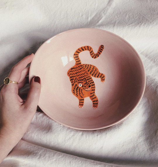
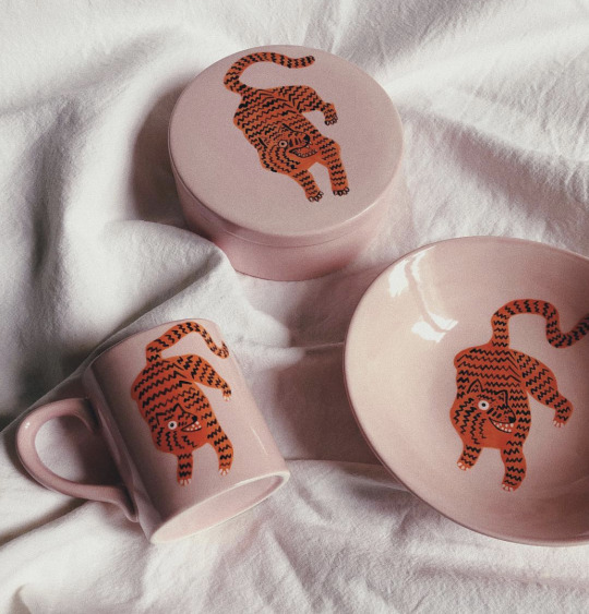
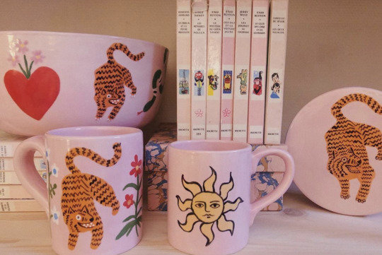

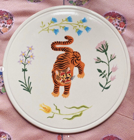
Research point: Ceramics
Camille Gressier
Gressier is French illustrator who works with a variety of mediums including ceramics. Across her body of work she regularly features tigers as the main focus accompanied by florals and and other nature based imagery.
One aspect in particular that I really like within her is the contrast between the pale pastel tones she uses and the bright orange of the tigers. Her work is functional, designed to be decorative and used on a regular basis.
References
Camille-gressier.com. n.d. Http://Camille-Gressier.Com/. [online] Available at: <https://camille-gressier.com/> [Accessed 30 June 2020].
camille-gressier. n.d. Camille-Gressier Shop. [online] Available at: <https://camillegressier.bigcartel.com/> [Accessed 30 June 2020].
Instagram.com. n.d. Camille Gressier Instagram. [online] Available at: <https://www.instagram.com/camille_gressier/> [Accessed 30 June 2020].
0 notes
Photo


Exercise: Paper circus
I started this exercise by listing what acts/people would feature in a circus, excluding animals, and making loose sketches. I also looked through the book ‘The Golden Age of the Circus’ for reference of both circus posters and acts.


Using a piece of rough paper that is the same size as my canvas I mapped out where the characters would go. This allowed me see if the composition would work. I typed and printed the text I intended to use as a guide.

I bought various papers however created the skin tones by painting A5 pieces of paper inspired by the work of Tracey English. I used pens to create pattern on some of the paper. I didn’t view this as breaking the paper only aspect of the exercise as I didn’t do any figurative drawing just flat pattern.

I built up the characters using the large template as a guide for the size.

An aspect I really enjoyed when working with the paper figures was the ability to shuffle them around. The limitations of my own cutting ability (and the tools I had at my disposal) meant that the characters could not be as detailed as if I had drawn them, however I enjoy the effect this had and think it worked well with my overall drawing style.

I included an area at the bottom of the poster for text to be added digitally.
Original photo

Edited photo
Final image adjusted on photoshop to improve quality of colour and tone.
The biggest issue I had was at the end of the exercise when trying to photograph the finished piece. I only had my phone which isn’t very good. Post lockdown I would like to try to photograph it again borrowing a better camera, tripod etc.
References
Loxton, H., 1997. The Golden Age Of The Circus. London: Grange.
0 notes