Last Seen Blogs
civix
syn/aes/the/sia
civix
syn/aes/the/sia
sexybabystevie
"why is this wizard obsessed with clocks?–
kosher-martian
Kosher Martian
selfaware-bungou-stray-dogs
Self-Aware BSD
Text
Getting out there
After attending the Illustrators Fair in July I wanted to apply for the next event. Having worked extensively on my website I felt more confident in my professionalism and decided to apply for their winter event.
The Fair is over subscribed by approximately 300% but there is no harm in applying! In total I applied to be part of three events:
Illustrator's Fair 9/12/23
DIY Art Market 9/12/23
Folk and Bespoke 2/12/23
I have already been contacted by Folk and Bespoke and hopefully will be taking part in their winter event!
0 notes
Text

Humboldt Penguin
Within 3.2 I need to continue with my practical work to ensure I reach my overall target of producing an ABC book of birds. I am aiming to complete five letters over the course of this unit.
I began my visual research some months ago during a visit to the London Zoo. The Humboldt penguins are incredibly charming and I was particularly taken with how they look as they swim underwater.
It's important to me that as the reader turns the pages of the book that each page is varied enough to ensure the reader stays engaged. One of the ways I try to do this is by make sure that the colours shift (despite maintaining the core colour palette).
The penguins will be page 'H' following the Great Horned Owl which features a dark starry night. In contrast to this the bright light blue waves of the water are strikingly different.
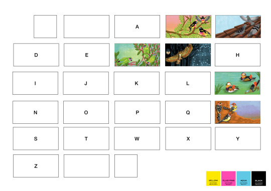
I wanted to push myself to try to convey the way in which water acts as a colour filter causing everything to appear slightly blue. I tried to emulate this by using two layers of aqua, one as the background where the characters of the fish and the penguins were removed and the second as a halftone overlay.
The overlay layer I selected halftone dots and reduced the opacity where it crossed with the black layer. Unfortunately the digital version of this can only give an impression of what the risograph print would look.

vimeo
0 notes
Text
Implementing Website Changes
Using the information and ideas gained from my research I set about developing my website with the aims to:
Reduce the number of pages.
Curate the imagery.
Present myself as a confident professional.
The first thing I did was to reimagine my portfolio. Previously I had four separate portfolios for each medium I had worked with. I removed all of these pages so that I had one single portfolio. I took my time selecting pieces that I am most proud of but also work together. I also made the choice to add a background so that it wasn't just a white grid. Although majority of the illustrators I researched chose a white grid for their portfolios, I thought that in this instance going against the convention may help not only to stand out but also to solidify my branding.

Old portfolio page and new.
I went on to remove the homepage (which I did love aesthetically) but acted as a barrier to seeing my work. When my website is visited now, the first page that a visitor sees is my portfolio.
The next area I wanted to focus on was my 'About' page. When I first created my bio I felt as though I had to clarify that I was a student, rather than risk people thinking that I might be a professional artist. I then realised that I don't need to justify or qualify my art - the portfolio allows visitors to judge my art based purely off its merits rather than my (self-perceived) status as an artist. I want to be taken seriously as an artist and although I am studying art, that doesn't mean that my art is 'student level'.
I added more information about my art, mediums I use and influences to express more of what motivates me as an artist. I chose to keep the silly part at the end about my interests as I enjoy a personable approach.

Old bio and new
One of the areas I was unsure about adding was achievements and where my work can be seen as I have very few experiences to draw from. I added information regarding the Festival of Intimacy and at the bottom of the page links to where my work could be seen. Although basic, I can always add more and remove others in the future.

The final thing that I added was a site icon. The small image that appears on the tab of the website. Using similar overlaid coloured geometric shapes that are used across my website and my handmade font that is intended to look like it's been linoprinted. Although a tiny detail, I feel that it really adds to the professionalism of the website.

Following making the changes to my website, I hope to join a student session to receive peer feedback on the improvements and if they are successful.
0 notes
Text
Reflections on my current website
Using the information from my research I revisited my own website to consider areas for improvement.
0 notes
Text
vimeo
Self Presentations: Websites
A short video of my thoughts on the websites of various illustrators, reflecting on what works well and considering hat changes may benefit my own website.
0 notes
Text
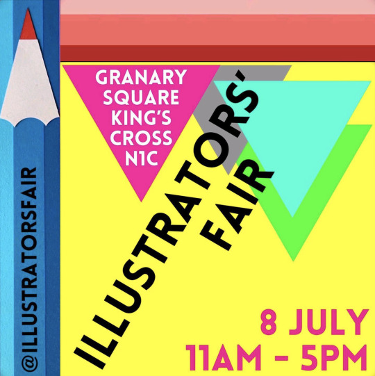
Illustration Fair July 2023
08/07/23
I heard about the The Illustration Fair through instagram, as I follow a lot of illustrators and artists the flyer appeared in my suggested posts. I was surprised that I hadn’t heard of the event before and was keen to check it out.
The Illustration Fair is a bi-annual event held in Granary Square in Kings Cross. Illustrators apply to be at the event, either as an individual or two individuals on the same application to split a exhibition space. The fee for a table is £95.
The event is primarily to enable illustrators to sell their products be they prints, books or other items, however it also acts as opportunity for illustrators to network with potential clients, publishers and other illustrators.
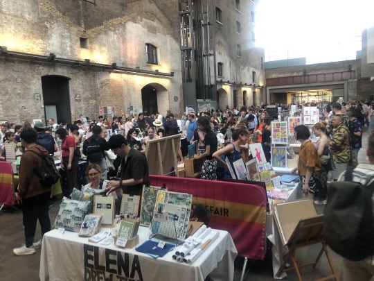

The fair was physically smaller that I had expected, although there were 109 stalls it felt more intimate than that in a covered courtyard type space with a high ceiling. At first I felt nervous about speaking to the vendors but the majority were very friendly and happy to discuss their work.
Attending with 3.2 in mind there were some specific people/businesses that I spoke to that I would like to make contact with and research further. I will expand on them further in different posts.
Design for Today, a small publishers focused on producing design/illustration lead books. Creating beautiful objects of interest. I bought two art books and spoke to the owner and founder. I hope to contact him again and see is he is willing to discuss the process of selecting new books to publish.
Bethan Woollvin, children's book author and illustrator. I’ve looked at her work previously when exploring the use of colour in children’s literature as she uses usual stylised palettes such as Rapunzel which is greyscale with pops of yellow. Woollvin was very kind and when I asked if she would be open to answering some questions she gave me her email address and said she would be happy to set-up and online call at some point.
Owl and Dog books creates unusual board books for children. Although my project does not fit in that genre, I think it’s interesting to see less traditional styles that challange the idea of what a book is. I purchased a couple of books. I am unsure if they will engage or not as the man working at their stall was a little gruff.
The Illustration Fair is an event I think would be valuable to take part. Although it is oversubscribed I would like to apply for their next event.
To apply I would need to do the following:
• A short description of what you do.
• Up to 4 images of your work.
• A link to your IG feed and/or website.
At this point I would not be ready to apply but this gives me an idea of what I need to do and where I need to start making improvements.
0 notes
Text
Reflection on Progress - Assignment Ten
For my final submission I wanted to focus on preparing for assessment. Knowing that assessors only spend a limited time looking at your work I wanted to consider the best way to communicate my aims and work as a whole throughout the unit.
In response to this I developed a short (under 10 minute) video that covers my work in the course from initial ideas to final prints and next steps. My objective was that an individual who had not seen any of my work would get a sense of my practice and progression. Creating the video itself was in itself a valuable process for me as it forced me to go back to the very start of my learning journey and review all the progress that I had made.
I will also need to consider how I submit the illustrations themselves for assessment. Although the images are not chronological I would like to experiment with linking the together for the assessor to review rather than just sending the scanned files. I am unsure if we are able to send physical work for assessment anymore but even if it has to be photographed there are other ways I could arrange the images.
One display method I would like to experiment with is a concertina effect with areas of the background removed to highlight specific subjects. I’ve seen this concept before in a range of cards by printmakers Mark Hearld and Angela Harding. I feel this could be a really engaging way to display my work especially as a physical object that can be held and manipulated.
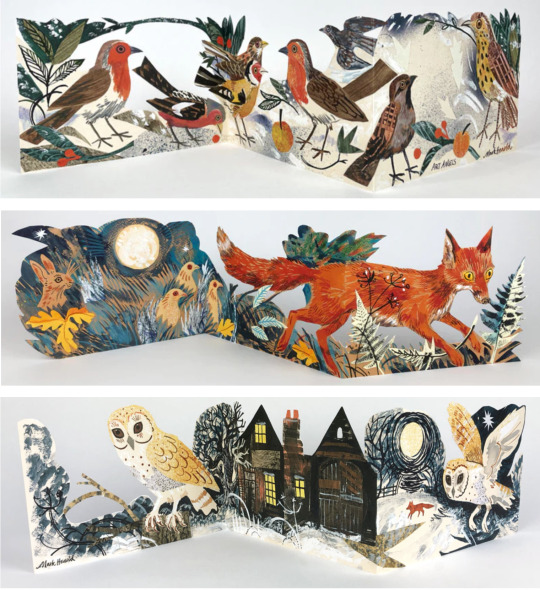
(Hearld, Menagerie cards)
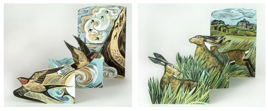
(Harding, Cornish Swallows, Hares and Open Fields)
I am admittedly nervous about the assessment process as unlike levels one and two where you were responding directly to an assignment, the freedom to pursue my own project has it’s drawbacks. I am continually asking myself, have I done enough?
0 notes
Text
Reflections on Group Feedback
During the group feedback session I asked for my peers to look at my illustrations with addition of text. I am by no means a writer and thought this would be an opportune time to get some support.
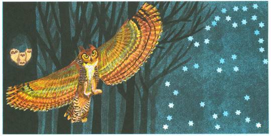
The illustration that received the most feedback was ‘The Great Horned Owl’. Although mostly positive, there was a general agreement that ‘for her chicks’ changed the flow of the verse and a continuation of the ‘g’ sound would be better.

I really struggled to think of words that would fit and still communicate clearly what I was referencing. I tried ‘Gang of goofs���
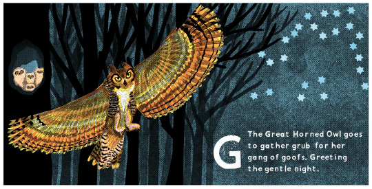
I liked the phrase ‘goof’ as for me it does suit the fluffy owlets...however, would it make sense to a child? It’s a fairly dated phase and more American than British. Would this ruin the flow for a parent and child reading session?
I also explored changing the latter part of the sentence changing ‘glowing’ to ‘gentle’. This adjective I believe compliments the illustration well adding to the atmosphere.

‘Gang’ is a more recognisable term that commonly used. It doesn’t evoke baby birds though. They a fluffy and daft whereas ‘gang’ has connotations of being organised.

I experimented with adding an additional adjective before the noun, so even though it wasn’t a ‘g’ sound it added an additional one to the sentence.
I’m still not sure but I think this is better than the original ‘chicks’ and it also uses the correct term making it more educational.
The group session really challenged me to reflect and reconsider my text. I’ve been looking at the illustrations for so long I had mentally decided they were finished but there is definitely room for further improvement!
1 note
·
View note
Text
Reflection on Progress - Assignment Nine
My main goal for this assignment was to get the mini mock up illustrations risograph printed as this ultimately is the only way to know if the illustration works. The digital compositions are able to give an idea of how the finished result may look but are unable to capture the true colour, texture and alignment of the risograph that makes it so unique and the reason I chose it as a medium.
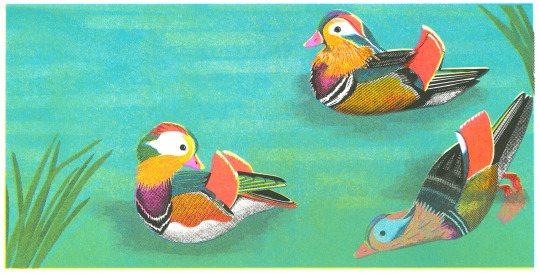
The risograph prints came out beautifully. In particular the fluro-pink that is so hard to capture on screen adds a pop of colour that helps to tie all the illustrations together thematically. It was exciting for me to see the culmination of my progress throughout the unit, in particular with the original duck print. The first composition and print included a lot of negative space in order to add texture to the colour rather than a solid block. The result of this however was that the water had no sense of depth. Likewise with the grass area on the first print, it is pale and lacklustre especially considering it’s nearly half of the overall image! The second test print uses gradients of yellow and blue with negative texture on either layer. The result of this is a much richer saturation of colour which when printed creates a bold playful illustration.
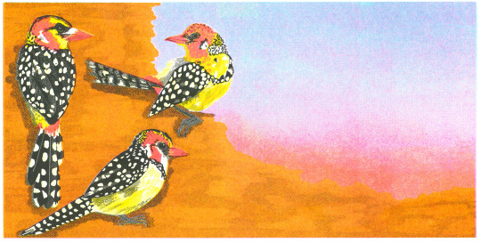
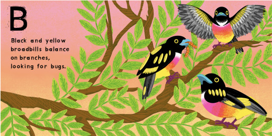
To help cover the costs of the print run and future printing costs that will inevitably arise through 3.2 and 3.3 I have been selling both individual prints and the A3 prints (featuring three birds). This has been fairly successful (especially considering only posted on instagram and facebook) and covered all the costs of this run of prints. I am interested in how I could push this further to help fund more printing, during my next holiday for work I would like to explore the possibility of selling at a local art fair or similar. This has also enabled me to compare the images directly in popularity. Thus far the ducks and owls have sold 5 each, broadbills and barbets 4 each and the pigeons and fig parrots 2 each. Although obviously the data pool is too small to draw any conclusions from it does give me an idea of which illustrations are generally well liked but also that there is interest in all of them. As someone who struggles with self belief the sales have also acted as a confidence boost.
As I approach the end of 3.1 I want to reflect on the process as a whole. To do this I am developing a short video that allows the viewer to get a solid overview of the entire course. At this point however I feel as though I have made good progress and have a clear idea of what my next steps will be.
0 notes
Photo

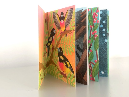
Mini Mock-up
I wanted to get a sense of how the illustrations compliment each other in the context of a book. Using the 50% scale prints I folded them together to make a simple page spread. The illustrations work well together and it I enjoyed turning the ‘pages’ from one to the next.
The prints has also helped me to see where some tweaks can be made to work better as a book. There are couple of pages where the featured bird/s is very close to the edge.
1 note
·
View note


Text
Reflection on Progress - Assignment Eight
The primary focus of this assignment has been the introduction of text to the illustrations.
I began very simply by listing any and every relevant word I could think of starting with the letter required. I then began to piece the words together into sentences for each letter subject. I have made good progress and although there is still room for improvement it’s a decent start.
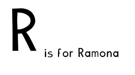
I have created a new font improving on the previous one ensuring the letter strokes are clearer but adding the chatter and energy of a hand-cut lino texture. I really like the result of this, I’m hoping other people like it also.

I’ve created a single page layout mock-up which allows me to see all the pages in relation to each other. Which pages with be back to back, the cover and the endpapers. Moving onto the the next sections of this final unit I feel this is a valuable working document to oversee the body of work.
Regarding next steps for the writing and how to improve I am hoping to make changes based on my tutors feedback and circulating it amongst friends and colleagues with children at the right age and gaining their insight on the text and book style and structure in general. I am a little nervous about this however incase the feedback is especially critical!
Moving forwards in the unit, before my next assignment I want to:
Have printed the miniature mock-ups of the illustrations
Implemented any further feedback on my essay
Sought out feedback on the overall illustration/text combination implemented any changes I feel are necessary.
0 notes
Text
Developing text
I was hesitant to start writing the text to accompany the illustrations for my ABC of birds book as writing is not my strong suit. There are two styles of text generally in the ABC books I have read, ‘is for’ and sentences.
The ‘is for’ style is the most common and recognised structure for an ABC book with minimal written language. A is for Apple, B is for Ball etc.
The sentences can range from creative narrative sentences such as those in ABC Scarry, 2011 ‘As mother cat was driving father cat to the airport she had an accident’ (interestingly all every time the featured letter is used even mid word it is identified by changing the colour).
Others contain facts about the subject featured such as ABC insects, 2014 ‘A, Aphids can lay eggs or give birth to live young’
I wanted to attempt to combine a combination of the two styles. The sentences would be realistic in content, accurate to the subject although not facts per-say and also to repeat the focus letter in the majority of the words. Although this can result in less common words being used this can act as language development and exposure for children.


There were some few initial issues with some of the additions of text. Mainly with the ‘G’ composition. The stars along the bottom of the of the composition made it busy and difficult to read.

I redid two layers of the illustration reducing the stars so that there was more contrast for the white text to stand against.
Experimentation with other colours
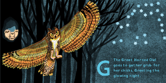
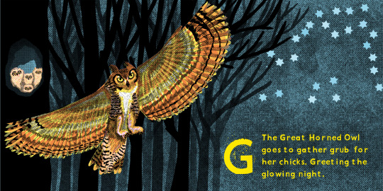

Out of the 4 versions I think the white might be the clearest, however when I receive the physical prints I want to explore this again.
On every other page the text is black, I did explore white but I’m not sure.

0 notes
Text
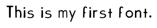
Linocut style font
I wanted to try and recreate the chatter and artefacts that are characteristic of linocut.
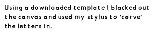


The font does feel very reminiscent of linocut while remaining readable and not too distracting. Capital letters contain more have a little more chatter while I’ve been mindful to ensure the lowercase isn’t overwhelmed by it.
vimeo
0 notes
Text
Reflection on Progress - Assignment Seven
For this assignment as I outlined in my last reflective commentary I really wanted to develop my critical review which I have been struggling with. I am happy that I’ve made significant process in this area as I get more of a feel for the subject and structure of the essay. A turning point for me has been how I view the essay structure. Previously I was focused on artistic techniques and what they can achieve however I realised that it made for very clunky reading. I have now switched it to the outcome and how the illustrator achieved it. Although there is still plenty of room for improvement I am proud that what I am submitting somewhat resembles an essay. With three more assignments after this I feel confident that I can make the necessary changes prior to submitting for assessment. I have been looking at developing fonts that I draw by hand and the convert into the a tff file to allow me to type in the letters I’ve drawn. Accessibility and reading comfort is very important to me as a dyslexic individual. When presented with a font that I find uncomfortable, not only does it make it harder for me to read it, I also loose motivation to read it. I knew from the start I wanted a sans-serif font with clear forms making the letters distinguishable form one another. I was however open to the idea of varied weight. There are many fonts that are preferable for dyslexic readers but there have also been fonts developed specifically for them such as:

Unfortunately, these fonts are pretty ugly. This is not an area I am familiar with but I wanted to set myself a challange to explore something I had never done. My first attempt was a good trial run and is fairly easy to read. However the crossbars are too small making letter distinction difficult. For my second attempt I wanted to try and emulate the chatter of printed linocut lettering.
Moving forwards in the unit, before my next assignment I want to:
• Have printed the miniature mock-ups of the illustrations
• Experimented with different typeface choices and prepared mock-ups
• Implemented any further feedback on my essay
0 notes
Text
Experimenting with fonts


There is a lack of definition especially on letters with a cross bar. I will try to bear this in mind when attempting the second version. It was an enjoyable activity though!
0 notes