
Don't wanna be here? Send us removal request.
Statistics
We looked inside some of the posts by rashaituckerunit6 and here's what we found interesting.
Average Info
Notes Per Post
6
Likes Per Post
6
Reblog Per Post
0
Reply Per Post
0
Time Between Posts
11 days
Number of Posts By Type
Text
12
Photo
3
Last Seen Tumblr Blogs


Fun Fact
Premium Tumblr themes are available from anywhere between $9 to $49.
Text
Zine Evaluation
Before I started my zines I was required to look up what a ZINE is, collect a variety of visual zine examples and annotated why did I like it, what methods have been used in the design what it’s about, research into other graphic and illustrative styles, find at least 20 examples and annotate 3 in detail, why did I like it, what methods have been used in the design, what is it about, which style theme was I thinking of using , find visual references and influences online that helped me develop a style and consistent aesthetic and annotate.
In all honesty, I first thought I was going to just stick to the theme “CUT-COPY-PASTE” but the more I started to create my zines the more I wanted to be creative and make my zines truly outstanding. In total, I covered three themes for my zines. I covered “CUT-COPY-PASTE”, Layered chaos and Sparton zen. With my first zine that I created, I did not use the theme cut-copy-past. I ended up doing my own illustration and doing a sparton zen themed zine. I wanted the zine to be aggressive but peaceful at the same time, or dark / gritty and show enlightening hope. Because my zines involved around the artist Travis Scott, I thought it would be a good idea to portray his dark and gritty albums ( RODEO / DAYS BEFORE RODEO ) to his new bright up beat albums ( Birds In The Trap / ASTROWORLD ). With this idea in my head I thought it would be cool to illustrate a drawing of him with half of his face being blacked out with white sharp teeth. That would portray his old albums that were dark and gritty. On the other side of the face, It would still show sharp teeth with him smiling but with his face not being blacked out. This would portray his current album ASTROWORLD. He would still have the sharp teeth because In ASTROWORLD it still has slight dark themed meanings in some of the songs. I thought having a pink background would look cool as well and make the face pop out. In the beginning the split Travis Scott face had more detail in the creases of the mouth and chin but I wanted to make it more mundane. I ended up using the level tool and darkened one side while keeping the teeth bright and sharp. I wanted to use this as a front and back cover for the zines. The front would be the dark themed (Travis Scott) and the back would be the light themed (Travis Scott). I am happy about how my front and back cover looks but I think I feel like I could have added something more like a simple text.
The second page that I had created ended up being a mix of layered chaos and CUT-COPY-PAST themed zine. I looked for images where Travis Is performing and going all out in performing. I got about three where he is live and looking intense. I wanted to use three to show his energy and craziness but also show that he is not just some crazy person. I got a pictured of him smiling to the fans as well. I used the magnetic lasso tool, magic wand tool, quick selection tool and move tool. This allowed me to take the images and cut out anything that I didn't want. I overlapped the images of Travis over each other and had the ASTROWORLD concert in the background. Because this page specifically has to do with ASTROWORLD, I tried to make it not look super dark or gritty. Hence why the biggest picture out of all the Travis's is him smiling looking over all the other Travis's. The last thing that I added was a grainy effect. I wanted it to look a little like an advertisement for a magazine ( just a little ). I thought it looked amazing and was not to complicated to create. It took time and patience to make sure I cut out each of the Travis Scott pictures. I have no regrets as to how this page came out for the zine. It was fairly easy compared to the other pages that I had to create.
Moving on to the third page for the zine, It was now time to create A RODEO themed page. In the album rodeo, there is a very significant and recognisable figure in the album. The doll of Travis Scott is heavily shown for the cover of the album. I thought it would be a good idea to now base this page as a sparton zen themed page. I would then draw the doll with the names of the songs in the album around it. I wouldn't draw to much detail nor add colour. Why not add colour? I thought it looked better and would stand out more if it didn't have any colour. I kept that sketchy draft look of the doll by not erasing to much of the outline of the doll. Mainly used the brush tool and changed the hardness and texture of the brush to a more flow look. I added a grainy texture to it all to make it look even more cooler. If I had not added the grain, I feel like it would been to plain. I added the parent advisory explicit content box to make it look like an actual vinyl cover, or cd cover. I love this page because of its simplicity. I am indeed happy with this page. Because it is rodeo and sparton zen themed, I wanted to have the doll staring at you to indeed portray it as creepy but at the same time peaceful. Once again, I was trying to have all my ASTROWORLD themed pages not as dark and grimy as the RODEO themed pages.
The fourth page that I had was pretty fun to make. I was on face time with my friend in my country, who listens to Travis Scott as well. We were talking about cool ideas and interesting things that a photographer could see at a Travis Scott concert. He started to talk about mosh pits and I instantly thought about what others don't see unless they down and dirty in the mosh pits. I decided once again to do a sparton zen theme page which would show aggressiveness but peaceful vibes. A person can indeed get a bloody nose and bruises on their eye in the mosh pit but they could also be enjoying themselves and have the adrenalin so they could possibly not even feel the bruises that they have. All true Travis Scott ragers know that If you go to a Travis Scott conert, there are no bystander's. You best be jumping and moving like there aint no tomorrow. I decided to illustrate a person who is at an ASTROWORLD concert a little bloody and bruised from being in a mosh pit but having a great time. This was very fun for me because I was able to draw a character from my imagination. Because I love drawing characters and in a manga style, I decided why not add a little manga inspired illustration to the page. I ended up with a character who had brown hair and wearing one of his merch t shirts. I got the ear piercing an nose piercing inspiration from myself. When I had initially finished it, I didn't like how the character looked unnatural and unrealistic. I added a grainy effect to it and also made his hair transparent a little bit and flow with the background lights and strobes. It shocked me as to how it looked way better than just him having brown hair looking at the photographer. Because it is sparton zen, I did show that it could be dark and gritty with the blood and bruises but I also wanted to show he is not angry and is actually enjoying himself. He is smiling. The main tools I used to illustrate this page was the brush tool, magic wand tool and quick selection tool. I also played around with the curves to change the darkness of his hair and transparency. I am extremely happy with what It looks like. I didn't expect it too turn out as good as it looks. I originally didn't like that he stood out that much because he is a manga inspired illustration but I think that when people draw non realistic drawings into realistic photos it looks eye catching. I had to fiddle around with the transparency and blending mode to get the proper colours set for his hair skin and t shirt. With the drawing tablet I have at home, it allowed m to draw it better than a mouse. But because it is a very tiny and cheap one, its not easy drawing like how I do on paper. I am currently saving money for one that the college provides or better.
For this page, it has to be by far my favourite out of all of the pages for the zine. I personally like Travis Scotts old albums where his music was dark, grimy and gritty. Because this next page had to be RODEO themed I decided again to pick sparton zen. I also did a little bit of layered chaos for this page. This pages illustration was way harder to draw than the previous page. The previous pages illustration had slight bruises and blood but because this person went to a Travis Scott concert where mainly rodeo and days before rodeo songs where playing, the moshpit was a lot more aggressive with day one OG Travis Scott fans. I had to step out of my cum fort zone and draw a different perspective of a person lying on the floor chin up and thumbs up looking ok. I am terrible at for shortening so it was difficult drawing and SHADING the hand. I find shading hard but I tried best. Another thing is that I am very unused to drawing on a drawing pad compared to a good old pen and paper. The main reason why I ended up drawing on my pad Is because I didn't have enough time to copy and render anything where I could colour it in the computer. I did enjoy drawing the character though. In the page it shows the illustrated character ( wearing Travis Scott RODEO merch t shirt ) lying down on the floor with a bloody nose, swollen eye, bloody lip and dazed but HAPPY. You have other people around him enjoying the the party. This specific page took me a good set of hours to create. In total it took me about 8 hours straight no break to finish. The main tools that I used as the brush tool to draw the character, quick selection and magic wand tool to cut out the images that I would layer on top of each other. I also thought it would look sick as either an album cover, vinyl cover or CD, so once again I added the Parental Advisory image. I used once again a grainy layer over everything to make it even more grimy and dark. I honestly love this page a lot because I am proud as to how I am being aware of the importance of layers. Separating and creating new layers for each and every important thing. This shows that I can step out of my comfort zone and illustrate things I wouldn't usually. So yes I am extremely hay with what I created for this page. Love it!
With the 5th page coming along , I wanted to create something pretty eye catching and tripy to look at. Because this page had to be ASTROWORLD themed, I thought it would be cool to implament a songs meaning. One of the songs of the album is STARGAZING. I thought it would be cool to have a galaxy looking page with the golden Travis Scott head fading towards the person. At the very end I made the Travis Scott Head pretty visible but bright. I also made sure there was a alaxy with sparkling stars and distant plants. I ended up putting the same text tat you get on the back of a t shirt if you get on of his merch T shirts. I decided to put it directly in the middle because It grabs the viewers attention. The eyes might wonder all around the page to see and view everything but in the end the main thing that will immediately grab their attention is the test “ WISH YOU WERE HERE”. I kept the text bright and white. In order to create such A cool page for my zine I had to duplicate the head, make them transparent at a certain limit and make them smaller as they move towards the back ( top of the page ). I left one of the heads not as transparent as the others and changed the blending mode. I also used the quick selection tool, magic wand tool and the magnetic lasso tool. This allowed me to cut out the golden Travis Scott head. The zine theme that I had chosen was layered chaos. Each head was being layered on repeat. I thought that this zine page was unique and outstanding like the others as well. It was simple but eye catching. I honestly do not really have any regrets or thoughts of changes to it. I didn't want to add a whole lot to it and wanted to keep it like it is.
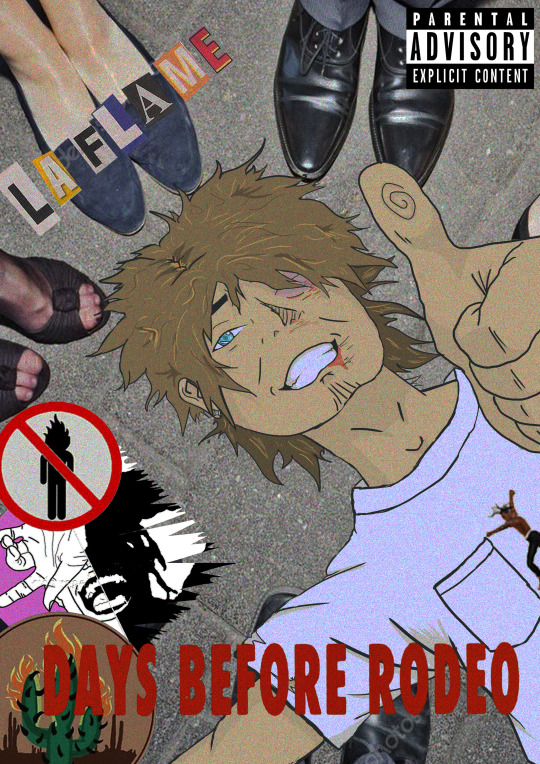
Coming to the last page of the zine, It had to be Rodeo themed. If you look closely you can notice a pattern. Rodeo themes page, astro themed page, rodeo … astro... etc. I decided to make the last page not only rodeo themed but also layerd chaos. I feel like the picture of Travis Screaming or galoping, what ever you want to call it , its a good representation of layers chaos. Truthfully when I finished this page, I thought it was a good way to end it. It shows a bunch of crazy, chaotic Travis Scott raging off into the Texas night. I put the text La Flame there in bright red letters because it is another name fans call him. Its red to implement ( flame/fire ) as well. I didn't want to add to much texts or random objects in it. I decided to put the main Travis Scott horse slightly away from the others to represent leadership. It looks like its Travis leading his loyal fans into the night to rage and party to the end. There is no size or gender that Travis will deny to follow him into the night. Creating, I used the magic wand tool, quick selection tool and move tool. This allowed me to cut out Travis and duplicate him. With the colours that you see that fade into the night, I made sure it all faded smoothly and pretty by messing around with the blending mode. I kept the parental advisory explicit content icon because once again it look kind of like a vinyl or cd cover. Because Travis Scott is from HOUSTEN TEXAS and names his album RODEO I thought it would be pretty smart to implement that into a zine page. In Texas the first thing that comes to my mind is cowboy hats, horses, bulls, cactus etc.
Overall, I think that my zine looks eye catching. It inst a bunch of flashy pictures on the front cover. Its got a simple face in the front which would possibly encourage others to open it and see what its about. I am profoundly happy as to how it came out. I was nervous because I originally created my zines as an A4 document but I was later able to change it. With my zines, it leaves the person not knowing if every single page will look the exact same. For example, If I had a zine about fruits. You could possibly assume that each page would have an image of a fruit. For me its different. The person would flip the page and see Travis Scott but automatically assume that it will be photos of just him page after page. As they flip though the pages they would see that it is Travis Scott inspiration illustrations and graphic designs. So YES, I do think that I have visual consistency. When the person flips to the next page its not something that they should possibly expect. With my zine, It actually ended up better than what I wanted to achieve portray. I am very proud of what I have created.
0 notes
Text
ZINE - La Flame
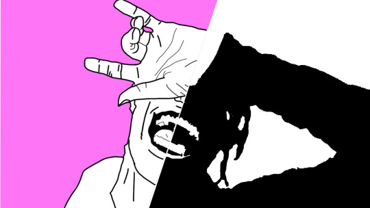
In all honesty, I first thought I was going to just stick to the theme “CUT-COPY-PASTE” but the more I started to create my zines the more I wanted to be creative and make my zines truly outstanding. In total, I covered three themes for my zines. I covered “CUT-COPY-PASTE”, Layered chaos and Sparton zen. With my first zine that I created, I did not use the theme cut-copy-past. I ended up doing my own illustration and doing a sparton zen themed zine. I wanted the zine to be aggressive but peaceful at the same time, or dark / gritty and show enlightening hope. Because my zines involved around the artist Travis Scott, I thought it would be a good idea to portray his dark and gritty albums ( RODEO / DAYS BEFORE RODEO ) to his new bright up beat albums ( Birds In The Trap / ASTROWORLD ). With this idea in my head I thought it would be cool to illustrate a drawing of him with half of his face being blacked out with white sharp teeth. That would portray his old albums that were dark and gritty. On the other side of the face, It would still show sharp teeth with him smiling but with his face not being blacked out. This would portray his current album ASTROWORLD. He would still have the sharp teeth because In ASTROWORLD it still has slight dark themed meanings in some of the songs. I thought having a pink background would look cool as well and make the face pop out. In the beginning the split Travis Scott face had more detail in the creases of the mouth and chin but I wanted to make it more mundane. I ended up using the level tool and darkened one side while keeping the teeth bright and sharp. I wanted to use this as a front and back cover for the zines. The front would be the dark themed (Travis Scott) and the back would be the light themed (Travis Scott). I am happy about how my front and back cover looks but I think I feel like I could have added something more like a simple text.
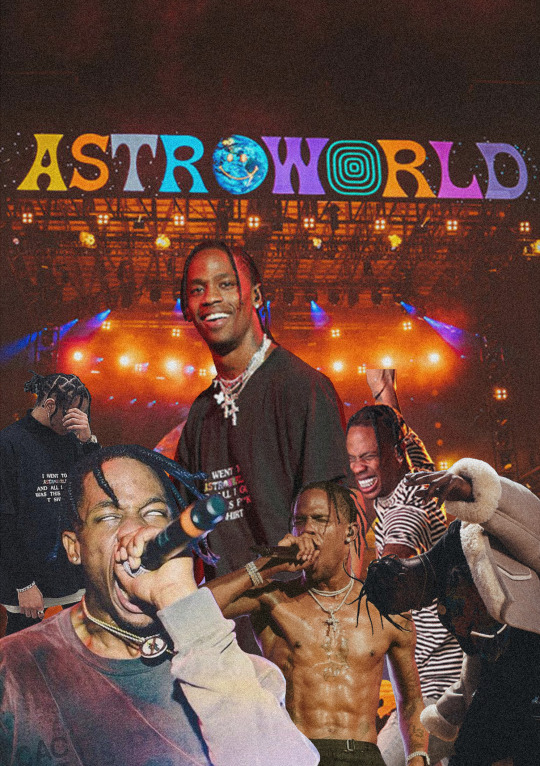
The second page that I had created ended up being a mix of layered chaos and CUT-COPY-PAST themed zine. I looked for images where Travis Is performing and going all out in performing. I got about three where he is live and looking intense. I wanted to use three to show his energy and craziness but also show that he is not just some crazy person. I got a pictured of him smiling to the fans as well. I used the magnetic lasso tool, magic wand tool, quick selection tool and move tool. This allowed me to take the images and cut out anything that I didn't want. I overlapped the images of Travis over each other and had the ASTROWORLD concert in the background. Because this page specifically has to do with ASTROWORLD, I tried to make it not look super dark or gritty. Hence why the biggest picture out of all the Travis's is him smiling looking over all the other Travis's. The last thing that I added was a grainy effect. I wanted it to look a little like an advertisement for a magazine ( just a little ). I thought it looked amazing and was not to complicated to create. It took time and patience to make sure I cut out each of the Travis Scott pictures. I have no regrets as to how this page came out for the zine. It was fairly easy compared to the other pages that I had to create.
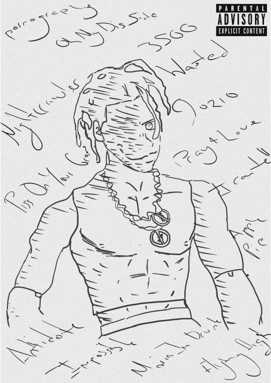
Moving on to the third page for the zine, It was now time to create A RODEO themed page. In the album rodeo, there is a very significant and recognizable figure in the album. The doll of Travis Scott is heavily shown for the cover of the album. I thought it would be a good idea to now base this page as a sparton zen themed page. I would then draw the doll with the names of the songs in the album around it. I wouldn't draw to much detail nor add colour. Why not add colour? I thought it looked better and would stand out more if it didn't have any colour. I kept that sketchy draft look of the doll by not erasing to much of the outline of the doll. Mainly used the brush tool and changed the hardness and texture of the brush to a more flow look. I added a grainy texture to it all to make it look even more cooler. If I had not added the grain, I feel like it would been to plain. I added the parent advisory explicit content box to make it look like an actual vinyl cover, or cd cover. I love this page because of its simplicity. I am indeed happy with this page. Because it is rodeo and sparton zen themed, I wanted to have the doll staring at you to indeed portray it as creepy but at the same time peaceful. Once again, I was trying to have all my ASTROWORLD themed pages not as dark and grimy as the RODEO themed pages.
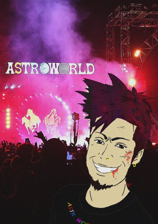
The fourth page that I had was pretty fun to make. I was on face time with my friend in my country, who listens to Travis Scott as well. We were talking about cool ideas and interesting things that a photographer could see at a Travis Scott concert. He started to talk about mosh pits and I instantly thought about what others don't see unless they down and dirty in the mosh pits. I decided once again to do a sparton zen theme page which would show aggressiveness but peaceful vibes. A person can indeed get a bloody nose and bruises on their eye in the mosh pit but they could also be enjoying themselves and have the adrenalin so they could possibly not even feel the bruises that they have. All true Travis Scott ragers know that If you go to a Travis Scott conert, there are no bystander's. You best be jumping and moving like there aint no tomorrow. I decided to illustrate a person who is at an ASTROWORLD concert a little bloody and bruised from being in a mosh pit but having a great time. This was very fun for me because I was able to draw a character from my imagination. Because I love drawing characters and in a manga style, I decided why not add a little manga inspired illustration to the page. I ended up with a character who had brown hair and wearing one of his merch t shirts. I got the ear piercing an nose piercing inspiration from myself. When I had initially finished it, I didn't like how the character looked unnatural and unrealistic. I added a grainy effect to it and also made his hair transparent a little bit and flow with the background lights and strobes. It shocked me as to how it looked way better than just him having brown hair looking at the photographer. Because it is sparton zen, I did show that it could be dark and gritty with the blood and bruises but I also wanted to show he is not angry and is actually enjoying himself. He is smiling. The main tools I used to illustrate this page was the brush tool, magic wand tool and quick selection tool. I also played around with the curves to change the darkness of his hair and transparency. I am extremely happy with what It looks like. I didn't expect it too turn out as good as it looks. I originally didn't like that he stood out that much because he is a manga inspired illustration but I think that when people draw non realistic drawings into realistic photos it looks eye catching. I had to fiddle around with the transparency and blending mode to get the proper colours set for his hair skin and t shirt. With the drawing tablet I have at home, it allowed m to draw it better than a mouse. But because it is a very tiny and cheap one, its not easy drawing like how I do on paper. I am currently saving money for one that the college provides or better.
For this page, it has to be by far my favourite out of all of the pages for the zine. I personally like Travis Scotts old albums where his music was dark, grimy and gritty. Because this next page had to be RODEO themed I decided again to pick sparton zen. I also did a little bit of layered chaos for this page. This pages illustration was way harder to draw than the previous page. The previous pages illustration had slight bruises and blood but because this person went to a Travis Scott concert where mainly rodeo and days before rodeo songs where playing, the moshpit was a lot more aggressive with day one OG Travis Scott fans. I had to step out of my cum fort zone and draw a different perspective of a person lying on the floor chin up and thumbs up looking ok. I am terrible at for shortening so it was difficult drawing and SHADING the hand. I find shading hard but I tried best. Another thing is that I am very unused to drawing on a drawing pad compared to a good old pen and paper. The main reason why I ended up drawing on my pad Is because I didn't have enough time to copy and render anything where I could colour it in the computer. I did enjoy drawing the character though. In the page it shows the illustrated character ( wearing Travis Scott RODEO merch t shirt ) lying down on the floor with a bloody nose, swollen eye, bloody lip and dazed but HAPPY. You have other people around him enjoying the the party. This specific page took me a good set of hours to create. In total it took me about 8 hours straight no break to finish. The main tools that I used as the brush tool to draw the character, quick selection and magic wand tool to cut out the images that I would layer on top of each other. I also thought it would look sick as either an album cover, vinyl cover or CD, so once again I added the Parental Advisory image. I used once again a grainy layer over everything to make it even more grimy and dark. I honestly love this page a lot because I am proud as to how I am being aware of the importance of layers. Separating and creating new layers for each and every important thing. This shows that I can step out of my comfort zone and illustrate things I wouldn't usually. So yes I am extremely hay with what I created for this page. Love it!
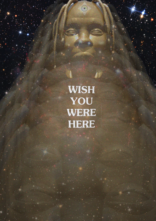
With the 5th page coming along , I wanted to create something pretty eye catching and tripy to look at. Because this page had to be ASTROWORLD themed, I thought it would be cool to implament a songs meaning. One of the songs of the album is STARGAZING. I thought it would be cool to have a galaxy looking page with the golden Travis Scott head fading towards the person. At the very end I made the Travis Scott Head pretty visible but bright. I also made sure there was a alaxy with sparkling stars and distant plants. I ended up putting the same text tat you get on the back of a t shirt if you get on of his merch T shirts. I decided to put it directly in the middle because It grabs the viewers attention. The eyes might wonder all around the page to see and view everything but in the end the main thing that will immediately grab their attention is the test “ WISH YOU WERE HERE”. I kept the text bright and white. In order to create such A cool page for my zine I had to duplicate the head, make them transparent at a certain limit and make them smaller as they move towards the back ( top of the page ). I left one of the heads not as transparent as the others and changed the blending mode. I also used the quick selection tool, magic wand tool and the magnetic lasso tool. This allowed me to cut out the golden Travis Scott head. The zine theme that I had chosen was layered chaos. Each head was being layered on repeat. I thought that this zine page was unique and outstanding like the others as well. It was simple but eye catching. I honestly do not really have any regrets o
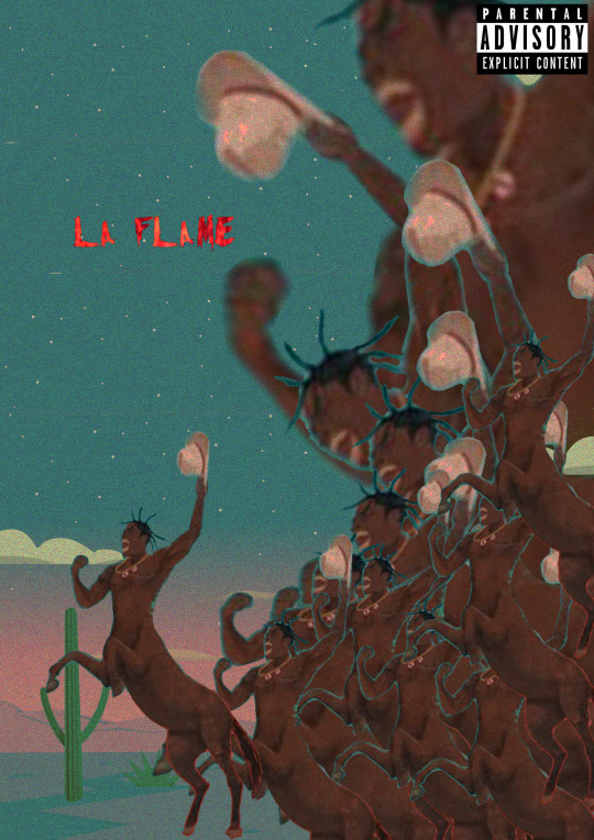
Coming to the last page of the zine, It had to be Rodeo themed. If you look closely you can notice a pattern. Rodeo themes page, astro themed page, rodeo … astro... etc. I decided to make the last page not only rodeo themed but also layerd chaos. I feel like the picture of Travis Screaming or galoping, what ever you want to call it , its a good representation of layers chaos. Truthfully when I finished this page, I thought it was a good way to end it. It shows a bunch of crazy, chaotic Travis Scott raging off into the Texas night. I put the text La Flame there in bright red letters because it is another name fans call him. Its red to implement ( flame/fire ) as well. I didn't want to add to much texts or random objects in it. I decided to put the main Travis Scott horse slightly away from the others to represent leadership. It looks like its Travis leading his loyal fans into the night to rage and party to the end. There is no size or gender that Travis will deny to follow him into the night. Creating, I used the magic wand tool, quick selection tool and move tool. This allowed me to cut out Travis and duplicate him. With the colours that you see that fade into the night, I made sure it all faded smoothly and pretty by messing around with the blending mode. I kept the parental advisory explicit content icon because once again it look kind of like a vinyl or cd cover. Because Travis Scott is from HOUSTEN TEXAS and names his album RODEO I thought it would be pretty smart to implement that into a zine page. In Texas the first thing that comes to my mind is cowboy hats, horses, bulls, cactus etc.
0 notes
Text
link 20 illustrator types
https://graphicmama.com/blog/types-of-illustration/
0 notes
Text
Zine
What is a zine - A zine is a small-circulation self-published work of original or appropriated texts and images. Zines are either the product of a single person, or of a very small group and are popularly photocopied into physical prints for circulation.


These four zines caught my eye because of the black and white sketch style. There is a page on one of the zines that has a red background which is really making the image pop out. The red in my opinion is such a vibrant colour. The zines (except one page) are in black ink with a white background. In the zines above, I think that while they were creating it, they had minimalism in their head. Looking closely to the zines that I have picked, some look to be zines that have different graphic artwork in them. There are also some zines that looks like it talks about abortion. I think once again the design looks really cool. It’s not overly complicated with a bunch of graphic artworks. It looks simple and easy to replicate. For me personally, I like minimalistic sketches that are in simple black and white artwork, so they definitely caught my eye.
What is an illustrator ?
An illustrator is an artist who specializes in enhancing writing or elucidating concepts by providing a visual representation that corresponds to the content of the associated text or idea. The illustration may be intended to clarify complicated concepts or objects that are difficult to describe textually. The easier definition of what an illustrator is would be a person who draws or creates pictures for magazines, books, advertising, etc.
18 Different illustration styles
1. Wood cutting
2. Metal etching
3. Pencil illustration
4. Charcoal Illustration
5. Lithograph Illustration
6. Water colour illustrations
7. Gouache Illustrations
8. Acrylics Illustrations
9. Collage illustrations
10. Pen-And-Ink Illustrations
11. Free hand and digital illustrations
12. Vector graphics
13. Concept art
14. Childrens book illustartion
15. Comics / Graphics Novels
16. Advertising
17. Packaging
18. Branding logo
3 Illustrations Types That I like
Pencil Illustration

Pencil sketches have such a raw beauty in line, form and value that really captures the essence of an object whether it is a simple outline or a hyper-real drawing. Who hasn’t started drawing with pencil sketching? From doodles, scribbles to stick men, pencil sketching is the basis from which we all learn the freedom of line and freedom of expression in drawing. I’ve always loved the simplicity in picking up a pencil and drawing something.
Watercolor illustrations

In watercolor illustrations, the main thing is to use color pigments and to create nuances and different transparencies by adding water to the color. The overall feeling of watercolor illustrations is soft, airy, with lots of depth. Illustrators prefer it for illustrating of cookbooks, feminine and fashion types of illustration, children book illustrations, as it is very light. It is one of the easiest ways of creating splashes of color, merging one into another – common threats for the mentioned illustration styles. From dancing, vibrating light-filled passages to richly colored transparent dark, from cascading wet washes to staccato dry brush effects, watercolors can produce painting effects that can easily catch anyone eye. That’s why I like it.
Collage illustration

Collage comes from the French coller, which means ‘to glue’. I would say that this is a CUT COPY PASTE theme when it comes to ZINES. It is a technique, where the artwork is made from an assemblage of different forms, often from different materials, to form a new whole. This type of illustration is hugely popular in the recent years, and even is considered as an inspiration for the big trend – material design. Often, illustrators use the shading from the different layers of their collage to achieve a beautiful 3D effect and to achieve depth.
0 notes
Photo


The pictures above will be merged.


With the pictures above, they all influenced me to create an Astroworld, Days Before Rodeo, Rodeo, Birds In The Trap Sing Mc Night, ragers themed zine. The themes I chose are, CUT COPY PASTE and Sparton Zine. I want to show how live his events are, how he loves to rage with his fans and how sick his energy is through pictures and collages.
Because I also picked Sparton Zen I want to portray my zen with a dark and grimy vibe, while still keeping some light aspects to my zine. With the images that I choose above, they are examples as to how I might overlap my cut and paste images in. The colors are vibrant and I might implement them into my Zine. I also want to put in half a photo and half a drawing.
I drew in a line from top to bottom to split the image. I will merge the drawing of me with the picture of me. On one side of my face It will have the drawing of me an on the other side it would have the picture of me.
0 notes


Text
Surreal Landscape

Today ( 13 /12/ 2018 ) we did some more photo shop work. We ended up doing some surreal landscape work. It wasn’t one hundred percent easy though. There were a few parts that I was slacking on. I was able to finish and create the first surreal landscape with some help.
All the pictures were already cut out for us to begin with. If I did not want a specific layer I would click the “ indicate layer visibility “. That would either allow me to see or not see the different objects. For my first surreal landscape I used a market square, lighthouse, moon and a background. The tools that I used today that allowed me to create what you see were the, elliptical tool, Polygonal tool, move tool. ( Create a new fill or adjustment layer ) which allowed me to change the hue/saturation, curves and levels. I also changed the background to a gradient.

When we were finished creating the first surreal landscape we had to then move on to creating our own. I ended up creating what you see above. When I had finished creating it ( because of the vibrant colors and outer space vibes ), it reminded me of an album cover.

0 notes
Text
Disintegrating

Original Photo

To try and have his face looking like it is disintegrating I first had to use the poly lasso tool and cut out random shapes around his head. I had cut around at least 5 to six random shapes. Once I had finished, I then clicked edit, define brush preset and then named it “Dispersion”. Once that was finished I used the clone stamp and started to clone areas around his head and face. This allows me to make it look like some of his skin was disintegration off.

In order for it not to look like a pattern, I had to changing the brush settings. I ended up adjusting and playing with the, Size jitter, Angle jitter, Roundness jitter, and maximum roundness. With me doing this It allowed me to add more areas that didnt look like it was in a pattern. It looked like his face was naturally being chipped away.

Once I was finished editing with the clone stamp, I moved on with trying to make his face look like hes cracking and fading away. I got an image off of google of cracks. I was then able to import it into Photoshop. I masked a layer, and warped the crack so it fits the face snug. It wouldn't look right if the cracks were flat and did not round off around his face. I also changed the opacity so it doesn't look as harsh on his face including change the blend mode to multiply.

I added another layer by copying and pasting the previous layer with the crack. The last and final thing I did was change the blend mode to divide which enlightened the crack.

So today 06 / 12 / 2018, We were able to disperse/disintegrate, an individuals face. I learnt how to use the warp tool and I further enhanced my skills on the clone stamp. Because of this, I feel a little more confident on it.
0 notes
Text
Clone stamp & Spot Healing

Before

After
I was able to use the spot healing brush to take away the kids chicken pox.

After the 15 minute break we had, we continued using the clone tool. We were also introduced to using the spot healing brush ( SHIFT - J ). I was already introduced to it from last year so It wasn't challenging to use.
0 notes
Text
Clone tool

The original photo with tree.

Here I was able to clone the trees up too three times.

I took it up a notch and took the trees out completely. This was all done by using the clone tool. ( SHIFT - S )

Before Picture ( Original Photo )

Here I was able to take the cables that were in the sky out, including what i believe was hay or a fence ( at the bottom left part of the photo ).
Today 25 / 11/ 2018 In lesson we used the clone tool. It allowed us to copy / duplicate an object or even take out an object. The tool that I used to do all of this was the clone stamp tool. In order for me to clone something I had to tap ALT, then click the spot I would be cloning. Once I taped it, I can then begin to hold down the left side of the mouse and start to scribble / draw / move the mouse.
In my opinion this is really cool because If your really good at using this tool, you can take things out of photos you don’t want to be in there. People who do photography for magazines, I am sure use this and other tools / techniques to take away blemishes, marks, or any other things that they don’t want. If I had to clone an area that had a lot of detail around the area, it was pretty challenging to clone.
In order for me to overcome that obstacle I had to, zoom in really close and make the brush size smaller than what I usually have it on.
0 notes
Photo


Today ( 22 / 11 / 2018 ) we did Victoria Siemer inspired work. It was pretty challenging to create but it was fun. In my opinion this looks like a cool desktop wallpaper. In order for me to not forget how to create a Victoria Siemer inspired work I wrote down some notes. Step by step. In the notes it shows what Tools and what I have to click and do next.


With the techniques that I have used today, I can create some very interesting and complex graphic designs.
1 note
·
View note
Text


Today ( 22 / 11 / 2018 ) I ended up liquefying images. This really allowed me to edit the facial features of people. In order for me to change the facial features of the people I had to use the Forward warp tool, Pucker tool and Bloat tool. I could increase and decrease the brush size with the open bracket and close bracket keys.
My first attempt with angelina jolie was a little over the top. I ended up making it look like she had horns coming out of her chin.
The second attempt with tobey maguire wasn't as bad. I was able to stil have it looki like him in the end. Its just that his eyes and ears were abnormally big.
The third and final picture I did was with Sam Worthington. This was done by just adjusting the dials. I did not have to constantly click and drag anything. I just had to adjust a dial left and right.
1 note
·
View note

Photo


Today ( 15/ 11/ 2018 ) in lesson we went over face swapping. Liam showed us step by step in the front of the class on the screen. We followed along while writing down notes so we wouldn't forget in the future. I had a general idea how to face swap so I was not feel un easy about doing it. It ended up being really fun to see how simple it to face swap and how it looks like in the end.
The first faces I started to merge was with two females. The two females are Chantel Jefffris and Madison Beer. I got a portrait of them from google images. I got pictures of them that where in high definition. In order for me to do that, I had to go to tools and select large. Once that was done I selected an image of the two females, copied the images, went into Photoshop, clicked CTLR + N and then copied and pasted them in. This allowed what was copied onto the clip board go on Photoshop with a perfect size. Continuing this I used the pen tool, cut around Madison beers face, right clicked, selected selection and then clicked and held onto the move tool. In doing this I took the face of Madison beer and dragged it on top of Chantel Jeffris. I adjusted Madison beers face by holdign shift so it doesnt squash and pinch the face. I had to rotate it a little because Maison beers face was tilted sideways. To help myself out, I had Madisons face with an opacity of 50 percent. This allowed me to see Chantels face from behind.
Once I thought Madison face was in a good spot I clicked the eraser tool and changed the hardness, opacity and size of it. This allowed me to smooth off the edges of Madison Beers face. I also did this on the face so the skin complexion would mix. I had finally finished it and moved on to the next face. I ended up doing Hugh Jackman and Ryan Reynolds. I did the exact same process with the both of them.
Do I think I did a good job? I think I did an excellent job for the two females. It looks really good. It doesn't look as fake as i thought. Or in other words, it doesn't look as noticeable as i thought it would be. Looking at this, it looks like a normal person.
Can I think of any other uses for this technique ?
I cant think of alot of ways in which I would need to do this to be honest. A few things that do come to my mind is if i needed to change text and I can not so such. I could take a picture of it and edit it justlike how I did the face swap. I could also use this when it comes to poster designs and t shirts.
2 notes
·
View notes
Text
Photo shop rendering


Today ( 08 / 11 / 2018 ) is the first class coming from the break with liam. In todays lesson, we went over and talked about rendering. We were asked if we had every used photo shop before. I myself used photo shop last year in Owains class so I had some general knowledge of some of the tools in photo shop and shortcuts I can use on the key board.
The technique that we learnt today allows us to get to know an objects ‘form’. Meaning its shape and the way that light hits it. Recreating this I was able to give a flat 2D drawing the feel of being 3-dimensional. I completely agree that this technique is very useful because it allows drawings that are completely flat to pop. This technique will come in very handy when it comes to my animations and character design. I think that I did an ( OK ) job. While I was shading parts of the couch, I was definitely thinking about form while adding all in the shadows. I was trying to make sure that the shadows were in places that make seance.To be completely I am not really good at shading but I am sure the more I use this technique the better I will most definitely get. I also honestly cant really think of other ways of other ways or better ways of doing the same job.
The more I look at my couch and the way I shaded it, the more it looks like its burnt. It either looks like, it got scorched, someone didn't get a bath form months or its old and moldy. It really makes me laugh.
1 note
·
View note