
Don't wanna be here? Send us removal request.
Statistics
We looked inside some of the posts by rawan20191466 and here's what we found interesting.
Average Info
Notes Per Post
96
Likes Per Post
60
Reblog Per Post
14
Reply Per Post
22
Time Between Posts
1 month
Number of Posts By Type
Photo
3
Text
14
Last Seen Tumblr Blogs


Fun Fact
Tumblr.com rank in the US is 25.
Photo


Logo Modernism
Jens Muller and Julius Wiedemann
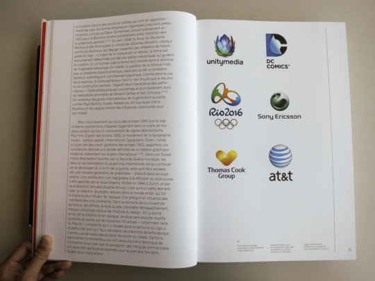
The book documents more than 6000 logos representing modern graphic design ideas between the years 1940 and 1980. These years marked a massive shift in the graphic design industry: It is an excellent book for use as a reference. The book's content is split into three parts: effect, geometric, and typographic. Each section is organized through form-based themes and style, which include dots, squares, and alphabets. The book features eight case studies of different major projects in the Mexico Olympic games of 1968. The book attempts to assess the modernist attitudes and imperatives that gave birth to the current corporate identity in the modern world.
The book starts by introducing an overview of the history of logo design. This welcomes the reader and prepares their mind for what they should expect in the book. The book also features Roger Remington’s essay on modernism and graphic design as part of its introduction. Famous logo designers such as Stefan Kanchev, Anton Stankowski, Ibou Paul, Yusaku Kamekura, and Paul Rand have also been featured in the book, including their profiles and famous work (Müller & Remington, 2015). The achievements of these spotlight logo designers and their profiles have also been highlighted in the book.
The content of the book provides a vast number of designs that led to modern-day graphic designs. It is useful for advertisers, and branding specialists are it provides a history of famous artists and how their work came to be known. It gives a good overview of corporate and cultural history through the good persuasive power of form and image. Famous media outfits and retail giants who formed part of the original graphic designs in the corporate world have been featured in this book. These examples include major airlines and art galleries.
The book aims to positively impact the lives of new artists joining the art industry. It provides the history of graphic design and explains how famous designers made it in their careers. The book motivates new entrants into the industry and gives them a path to follow for their designs to stand out in the industry. New designers can reference their work using this book as it provides informative resources needed to become great designers.
بإشراف: د. سماء الهاشمي
@uob-funoon
1 note
·
View note
Photo


أنا أستطيع
قصة تتمحور حول سؤال الأستاذة مريم للطالبة ريم عن ماذا تريد أن تكون؟ ففكرت ريم بجميع أنواع الإعمال والمجالات التي قد تريد أن تلتحق بها لاحقا ولكنها احتارت. شعرت معلمتها الأستاذة مريم بحيرتها وبعدم ثقتها إمكانياتها وقررت أن تساعدها على اختيار الوظيفة المستقبلية المناسبة لها. فيا ترى ما هي هذه الوظيفة؟
بإشراف: د. سماء الهاشمي
@uob-funoon
9 notes
·
View notes
Text
Project #1 for 222

Artists Interview #2
Link: https://www.youtube.com/watch?v=C0jHfVrgC7M
Katy Jade Dobson
I realised i wanted to be an artist about three years ago when i took on oil painting properly so before i sued mixed media.
i have been thinking about my theme for this collections for a long time with there being a few different sections through the collection that was selfish for my benefit i wanted to work on everything at once.
it started to take shape early on cause i had a-lot of things to do a different pallet shapes and compositions that i wanted to do.
i recently launched the collection 21 grams in Edinburgh.
the exhibition was really exciting for me i was really nervous about it i was working on these paintings for a while i hadn't really shown people the and its really interesting to talk to people about my art they show a new perspective they might appreciate a texture or color that happened by accident.
To see the work hanged up in a gallery is always quite surreal because theyre in my living space for months then all of a sudden they're quite formal framed in a gallery setting with people looking at them.
1 note
·
View note
Text
Project #1 for 222
Artists Interview #1
Link: https://www.youtube.com/watch?v=unqdRH8trBg
Conceptual artist John Baldessari (b.1931-d.2020), who many describe as a cultural symbol and the grandmaster of the Los Angeles art scene. “My perception of the city is very ugly. But that’s attractive too. It’s very seductive.”
What was it that fascinated you?
I was in grade school and i was always selected by the art teacher to do some project i gues that recognition gave me the courage to carry on
Looking back on the history of art did you have any idols?
Ofcourse, Giotto. If you go into my studio you'll see lot of elements of Giottos paintings from the iranian chapel in padua he was always a big influence on me
So why did you decide to give up painting then?
Because of the sony portapak and then all kinds of other things became possible you began to hear this term conceptual art which i was part of which you made art invother mediums of painting if one looks at this level and you're trying to produce an image its a-lot faster
What is it that fascinated you about images?
I Think two of mine has always been language and images in combination i always put words or a phrase with imagery I mean these works by Giotto that i was referring to earlier each one they're all printed purple and each one the text underneath is a different word for purple
What is it that fascinated you about movies?
i think years ago i was in a bookstore in hollywood and they sold 8*10 Glossies for movies and i was spending you know till i get exhausted just picking any image and thinking maybe i can use this then i begin to lay them out on a table and then i begin to group them and then i use that as source material for my work
How did the city of los angeles influence you?
Actually i got more recognition from new york i dont like being called a los angeles artist my perception of the city is very ugly. But that’s attractive too. It’s very seductive.
Why is art still even getting more important in the society?
Well 2 good things is that it seems to be a nutritional need for the public we build museums and put what somebody besides us art we put in there and people go in there on with their kids and they look at it so thats good the bad thing is the connection with money they're going to museums they look at the Rembrandt and thinking how much it costs.
2 notes
·
View notes
Text
Project #1 for 222

Art Exhibition #2
Date: 26/5/2021.
YouTube link: www.youtube.com/watch?v=1JMAd0SifuY
Venue: California.
Through the inception of shrewd arts to decry how threatened the life of the tiger was and how the rare breed was on the verge of extinction. The painting was chosen as the best amongst diverse paintings that expressed various threats to the natural setting of the earth. The picture depicted the tiger with a cold background that portended the lack of freedom it was facing. In light of heightened threats to the wild animals, the exhibition was worthy and hence chosen as the best piece of art in the exhibition.
According to the moderators of the exhibition, the piece of art was spectacular and stood the test of time in describing how the rare breed of tigers was facing extinction. The piece of art was considered too rare and helped in redefining the definition of art in the contemporary realm. In the spirit of constant redefinition of art, the tiger painting reasserted the definition of art by the intellectual contemporary reservation.
Besides the picture represents the iconographic acknowledgement in the definition of the art which literary traditional medieval visually. However, it also recognizes the innovation modes in terms of the expression and the contribution of the new discoveries in classical animal study. Besides the art brings about the intended fascination in the unknown creatures of in the world and the several creatures which are as a result of the breakthroughs in the society more in the naturalistic discoveries. The art comes up with the iconographic aspects more so in the symbolic illumination of the animal world. The painting illustrates the more ideologies on the jungle life more in wild framing of the animal in question.
The illumination of the animal brings about the animal imagery in the renaissance art which has the architectural sculpture of the animal in a more three dimensional paper work. This animal art de sign sticks in the mind due to the nature of the picture in terms of the iconographic artefact. In fact, the animal is more iconic in terms of the meaning and the feeling it brings about to the observer. The impression on the observers mind it is created by the imagery implied in the phot which creates an in-built relationship between the observer and the imagery is essential in the since it conveys the emotions which are necessary in the construction of the relationship between the observer and the image.
In this image we observe the animal symbolism in terms of the creation of the meaning of the animal from the project art. This animal in the picture can be used to represent a given context in terms of the branding or any given commercial event; in addition to this the meaning of the animal plays a key role in stirring up the feelings and generally the emotional affections and the affiliations in connection to the art. The animal symbolizes a sign of the fast and speedy acceleration of the event in question. The animal represents amazing members other wild family due to the nature of the speed and protection ability.
Besides, the animal represents fast thinking and flexibility in terms of the performance hence it can affect the mindset of the observer since it may exhibit motion and the protection frameworks. Animals can be used in the religious iconography more so in renaissance in a broader way than in the medieval arts; like in the case of this animal art it is crystal clear that the animal can be of importance in creating and developing the morality in the society if it is used symbolically. This animal can be used in different perspectives more so in the humanistic approaches in the society such as in free standing sculptures.
4 notes
·
View notes
Text
Project #1 for 222

Art/design exhibitions. #1
Venue: London design museum.
Youtube link: www.youtube.com/watch?v=0MHx-Xj-G5I
In the 2021 London exhibitions a spectacular approach was given by various artists in expressing their taste of art. Aljazeera broadcasting cooperation showcases the commodities of art that were displayed in the London exhibition. According to various YouTube viewers, the proponents of the exhibition show brought on board quite expensive pieces of art ranging from high end expensive shoes to expensive clothes whose value contributed immensely to the 80 billion dollars industry. According to reservations from Demir (2012), art revolution has led to a different definition of art in the contemporary society. In the spirit of Demirs reservation, the London exhibition show, utilized the presence of contemporary pieces of art to make their day a success. The main sponsors of the London exhibition show ranged from high end shoe companies such as Nike, Adidas, Gucci, Balenciaga and Christian Dior. The famous shoe and apparel companies redefined art in the London shoe by putting up pieces of art that were too expensive to be purchased by an ordinary lover of apparels. The London exhibition was also in tandem with Hollis (2012) reservation on the use of art in the contemporary world. The exhibition successfully utilized the presence of expensive shoes and clothes to redefine art by the convectional perspective of art. The marketers also used art in accentuating the worth of the London 2021 exhibition.
4 notes
·
View notes
Text
Project #1 for 222

Advertisement Critique #2
The sound revolution part advertisement poster welcomes youth to an end-year function that is set to be performed in the new square club. The advertisement incepts the use of contemporary art to appeal to youths who love music and partying. The shiny shouting poster appeals to revelers who will create a virtual picture of how colorful the party will be. The advertisement uses an exceptional approach to art to pass a message to its audience.
The advert incepts the image of two speakers and a disk jockey deck to illustrate whatever will happen at the party. The party familiarizes with an explicit clique based on the images presented in the advert. The performing arts are also listed shrewdly in a bright attractive color that is easily seen from afar. The advert is shrewdly crafted to understand just by a glance. According to Iskin (2014), a good advertisement should be understood without much fuss. The advert should be crafted in bright colors that are easily seen from afar. The message that is passed to the audience should be understood just by a glance without interpretations. In the spirit of advertisements, the presentation of the message is based on the audience that it is involved. In familiarizing with the revelers as in the context with the partying advertisement, the performing artists should be famous figures that invoke happiness and a high turn up to parties. Based on Iskin's reservation, an advertisement should abide by the graphical tricks of designing, the advert should be conspicuous and avoid jargon in their illustrations. Dull colors must be avoided in putting up posters since they don’t attract viewers. In the event of a musical concert, public figures who are perceived negatively in the intellectual realm should be avoided and should not be mentioned in the advert.
4 notes
·
View notes
Text
Project #1 for 222

Advertisement Critique #1
The advertisement wants to show that the “hub” or coffee shop are throwing a game night. They’re trying to show that games are for everyone and that no one is “too old” for gaming they’re welcoming customers of all ages. They’re saying it because they’re attempting to make viewers feel welcomed to join the game night without embarrassment or second thought the more people feel welcomed the more they’ll feel inclined to come and bring their friends and family to the hub with them.
By using a slogan that says no one is too old for games and a picture of a grown man as a background playing card games to show
people of all ages are welcomed to come and play. They’re using pathos -to appeal to an audience's emotions by making the viewer of all ages feel seen. It makes me feel like I’m missing out on something and that it will obviously be so much fun and that I need to be there. It triggers “FOMO” Fear Of Missing Out therefore if I saw this ad on instagram and its in a place near by I would actually send the post to my friends so we can make a plan of going there. They’re using all of those tactics so they can lure the viewer to the hub during game night and the hub would benefit a lot from that because more viewers more paying customers. Everyone who enjoys gaming but in particular adults who enjoy game night. It is presented in a way that shows the color pallet of the hub. It also shows a sense of community with the way they’re telling others to join them and the picture of the customer in the background. Also the dice and chess signs are there to show that its going to be a game night.
4 notes
·
View notes
Text
Project #1 for 222
Logo analysis #2
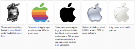
The apple logo design is exceptional based on the revolution of art it has gone through. The apple logo design can be classified without much fuss into the contemporary traditionalist perception of art. The original Apple logo featured Isaac newton under the famous fabled apple tree. The apple logo has since changed with time to befit the technical advancements that come with the different versions of the Apple iPhone operating system modifications The apple logo then changed from the monochrome rainbow apple logo to the stylized logo that is used up now.
According to Demir (2012), a logo is designed to befit the visual engagement of the client that it is addressed. Based on the reservation of Demir, the apple logo was incepted based on the value that is accorded to the apple, the original apple design consisted of a picture of Isaac Newton sitting below the fable apple tree. The company chose the apple logo to express its need of producing commodities that stand the test of time. The revolution of the apple logo over time satisfies the traditional and contemporary stand of intellectual artists. The paradigm shift determined the appearance of the apple logo. The most current apple logo consists of a shiny revitalized apple logo that portends the value of the devices they produce. Demir reservation was vital in the graphical design of the apple logo. The constant change of the apple logo to befit the quality and advancement of the apple devices justifies the definition of art in the 21st century.
According to Demir (2012), a logo is designed to befit the visual engagement of the client that it is addressed. Based on the reservation of Demir, the apple logo was incepted based on the value that is accorded to the apple, the original apple design consisted of a picture of Isaac Newton sitting below the fable apple tree. The company chose the apple logo to express its need of producing commodities that stand the test of time. The revolution of the apple logo over time satisfies the traditional and contemporary stand of intellectual artists. The paradigm shift determined the appearance of the apple logo. The most current apple logo consists of a shiny revitalized apple logo that portends the value of the devices they produce. Demir reservation was vital in the graphical design of the apple logo. The constant change of the apple logo to befit the quality and advancement of the apple devices justifies the definition of art in the 21st century.
Based on empirical research Frascara (1988), justifies the need as to why Apple had to constantly change its logo from the original monochrome to the redefined shinny-bitten apple. Frasca addresses the importance of changing the logo to befit the quality of their devices and products. In addressing the need of finding a central definition of art, the author describes art into two cliques, fine art or social science. Justification of the logo as a fine art addresses the question of how important art is an indifferent faction of the contemporary world. The empirical research justifies art as a utility realm that can be used in diverse factions to achieve an explicit agenda, In the event of the apple logo, the proponents of the company incepted art to exhibit how quality their products are. The designer of the logo manipulated the apple based on its value amongst fruits. The graphical illustration of the logo is vital in creating a relation with a first-time customer who has no information on the quality of services and goods being offered.
4 notes
·
View notes
Text
Project #1 for 222
Logo analysis #1
Title: Logo Design
Author: logo designers NRG.
Radio Aviva is a web radio and podcast that is accessible to the majority of USA university students on various social media platforms. The logo of the radio stations was designed to befit the contemporary aesthetic value held esteem by university students. The logo incepted the use of colors of the national flag to familiarize with the youths who are interested in music and podcasts. The artist shrewdly incepts a mic logo to address the concern of upcoming musicians who will benefit from the Radio station. The logo is a state-of-the-art artistic work that delivers numerous messages at a glance. The presence of the color of the U.S.A flags represents the unity that the station will promote and help a great deal in revitalizing art within the US.

According to an article, Meggs history of graphic design (2016), graphic design is held in high esteem amongst individuals who depend entirely on graphic designing marketing of their goods and services. Based on the author's reservation, the best-selling graphic reference collection consists of a diverse collection of pictures that are in high definition and also consist of diverse logos that are ranked amongst the highest viewed graphical design in history. Based on the perception of Megg, logos are created to define what a company offers in a nutshell. a logo that is crafted carelessly also represents the willingness of the company to deliver substandard services and goods.
Invoking the context of radio Aviva, the logo that was incepted to announce its existence was listed amongst the top 5 graphical logo designs. The logo was in tandem with the characteristics of a good logo and was central to popularizing the radio station. In addressing the paradigm shift in art, the logo incepted a spectacular color of the USA flag and a microphone to represent the youth who were interested in music recording. The 3d design of the logo made it stand out as in diverse marketing platforms and social media realms, making it visible at a glance. The presence of the microphone within the logo was a direct attraction to any client who was willing to invest in music. The microphone is placed shrewdly within the logo and occupies 30 percent of the advert. The presence of the microphone within the radio station logo is necessary for passing information on what the radio station will specify. The microphone determines the need of whoever is willing to visit the radio station both online and within offline Radio Frequencies.
According to Hollis (2012), logos are designed explicitly to portend exactly what the company offers. In the light of the radio station logo, the services offered by the radio company can be
4 notes
·
View notes
Text
Project #1 for 222
Lecture #2
YouTube presentation of art criticism.
Topic: Art criticism and aesthetics.
YouTube link: www.youtube.com/watch?v=O3eCP5B-VYg&t=16s.
The editors of the Asian magazines and journals exploit how their mastery and acumen in art has thrived through indulgence into diverse platforms during the line of duty. The editors have gained great acumen and dexterity in the art after several years in writing and art criticism.
The editors in a spectacular manner reveal how they have delved and promoted art through sponsoring art exhibitions. the editors appreciate how art has degenerated positively in the contemporary realm. Advancements brought by the internet revolution have led to different definitions of art and the editors in that empirical video tend to find a solution to the definition of art.
In the spirit of aesthetics, paradigm shifts have led to a great redefinition of art. the beauty of art has since been retained and also redefined to allow art to be used for diverse purposes such as marketing and sensitizations. According to the editors, art has been exploited by activists to be used in activism campaigns. The editors of the Asian newspaper are concerned with the revolution of art based on the originality of art that has since lost meaning because of various technological advancements in the artistic realm. Based on the need to improve art, the four magazine and journal editors appreciate how art has been central in realization of their dreams. The editors accept that graphical designing has also been central in their day-to-day endeavors. The dexterity and acumen the editors have gained in art over the long time they have pursued journalism.
The editors redefined art based on contemporary agendas that they experience in their lines of duty. In disparaging the conventional definition of art. The editors showcase how art has been central to their success.

4 notes
·
View notes
Text
project #1 for 222
Lecture #1
Art lecture by Theodore E. Stebbins J
Venue: Menschel Hall, Harvard Art Museums
YouTube link: https://www.youtube.com/watch?v=Q2KVmwBezU4
Theodore E. Stebbins Jr., curator of American art, emeritus, at the Harvard Art Museums, offers
His reservations on the sudden changes he has wi8tnessd in the realm of art since 1961. In his description of the positive developments witnessed in the realm of art, he attributes the quality of contemporary exhibitions to a decrease in connoisseurship withstanding.
The lecture describes the answer to art criticism, he refutes serious art criticism by comparing art to music that entails just picking up a violin and starting to play it without classes. He decries the internet revolution as great attributes to the decline of poetry aesthetics. The designers of poetry have shifted to marketing and selling rather than thinking, designing, and creating. The internet revolution has redefined art by the introduction of the software’s that ‘think’ and design for current artists. The internet forces the artist to be creator and seller at the same time hence shifting the concentration of the artists leading to the production of substandard artwork.
The art maestro describes art as a fascinating tool that has no designated name to describe it. The American art curator appreciates the constant change in art and gives it credit to the contentious definition of art. The author describes his comfortability with the ever-changing definition of art since it reflects the advancements happening in the realm of art.
3 notes
·
View notes
Text


Principles of Graphic Design 222 - Mnwar Mukhtar
Assignment 6
@uob-funoon
In this assignment we were supposed to chose one principle and make a design report and a presentation about it. With repetition (the element I chose) in mind I chose to make a business card which has the repetition of the elements (shapes, fonts, and color) I am confident my business card looks like a professional design.
7 notes
·
View notes
Text

Assignment 3 for FA222 Principles of Graphic Design
We had to create a design with a barcode.
I drew an accordion and made the bellows of it a barcode.
21 notes
·
View notes
Text


Principles of Graphic Design 222 - Mnwar Mukhtar
Assignment 5
@uob-funoon
In this assignment I tried my best to analyze every aspect of the existing logo, I noticed it was lacking meaning (meaningless umbrella) the font was too thin typeface not suitable nor welcoming nothing shows the meaning of “taawon” (help). That’s why I decided to add the hands to show community a coffee stain to make clear that this place is a coffee shop and used a suitable clearer typeface. I used Adobe illustrator for the illustrations and logo.
9 notes
·
View notes
Text

FA224 / an exercise
Drawing in adobe illustrator
11 notes
·
View notes
Photo

Visual Communication 225 - Salman
@uob-funoon
4 notes
·
View notes