
Don't wanna be here? Send us removal request.
Statistics
We looked inside some of the posts by ray79513 and here's what we found interesting.
Average Info
Notes Per Post
1
Likes Per Post
1
Reblog Per Post
0
Reply Per Post
0
Time Between Posts
11 days
Number of Posts By Type
Text
12
Video
1
Last Seen Tumblr Blogs


Fun Fact
Tumblr has 4 main sources of revenue.
Text
The Extension of Geometric Architecture: Sydney Opera House


The Sydney Opera House


Informative Models of The Sydney Opera House


Informative Drawings of The Sydney Opera House
youtube
Transformation of the roof design
youtube
Projection of the Spherical Solution
youtube
The rings of the Spherical Solution
The Sydney Opera House is uniquely designed and significant. It blends with the surrounding environment and looks like sails in the bay, waves in the sea, and shells in the sea. The Opera House is located at Bennelong Point. Its special location inspired Danish architect Joern Utzon to design this building, whether from land, sea, or the view of the sky looks beautiful.
Although it was said that "free-form" was difficult to be defined by general geometry at that time, it was continuously tested, and it was later found that the roof of one-layer thin shell could not bear, however, the roof of double-layer thin shell solved by mathematics at that time, which the engineer was not satisfied and the design case could not be guaranteed. After six years of hard work, he tried to make various models with reasonable shapes and tried to find other ways to support the thin shell.
The concept of the new design comes from mastering and understanding the shell roof, which is a curved surface constructed by a three-dimensional space, not an elegant second-dimensional space object on the facade. As far as the structure is concerned, those curved roof ribs are pre-made, and they have a geometric relationship with each other. They are also obtained by dividing the outer edge of the spherical surface. From another perspective, because of the regular outer shell top geometry, the smooth surface inside the shell top allows the glass compartments and other interior decoration materials to be attached in a natural and logical manner.
Reference List:
Image:
Kim Ho, 2020, Sydney Opera House to undergo historic upgrade, image, Infrastructuremagazine, viewed 20 June 2020, <https://infrastructuremagazine.com.au/2020/02/04/sydney-opera-house-to-undergo-historic-upgrade/>.
Alyssa Newcomb, 2016, Google Launches Virtual Tour Inside Sydney Opera House, image, ABC News, viewed 20 June 2020, <https://abcnews.go.com/OnCampus/google-launches-virtual-tour-inside-sydney-opera-house/story?id=38703007>.
Steen Winther, 2015, Sydney Opera House Sail Geometry, image, GrabCAD, viewed 21 June 2020, <https://grabcad.com/library/sydney-opera-house-sail-geometry-1?locale=it>.
Sarah Hadianti, 2013, Sydney Opera House Analysis, image, Behance, viewed 21 June 2020, <https://www.behance.net/gallery/13129081/Sydney-Opera-House-Analysis>.
0 notes
Text
Bank of China Tower

Bank of China Tower

The model concept

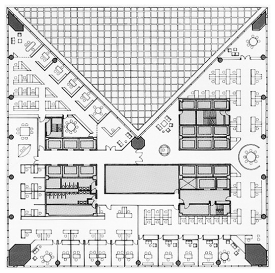

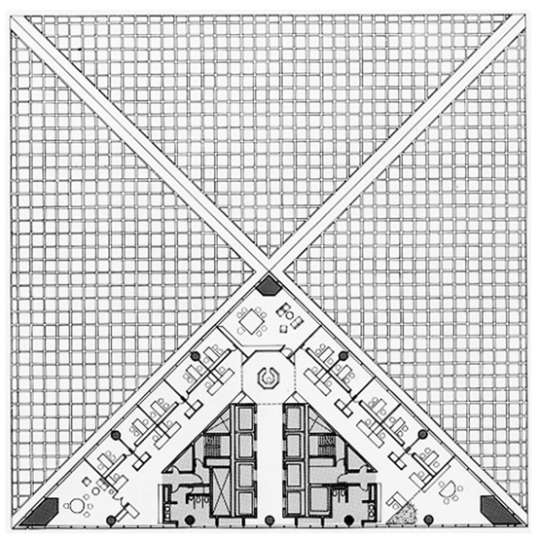
The architectural plans

The perspective drawing

The front elevation drawing
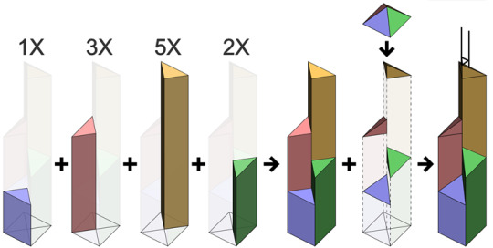
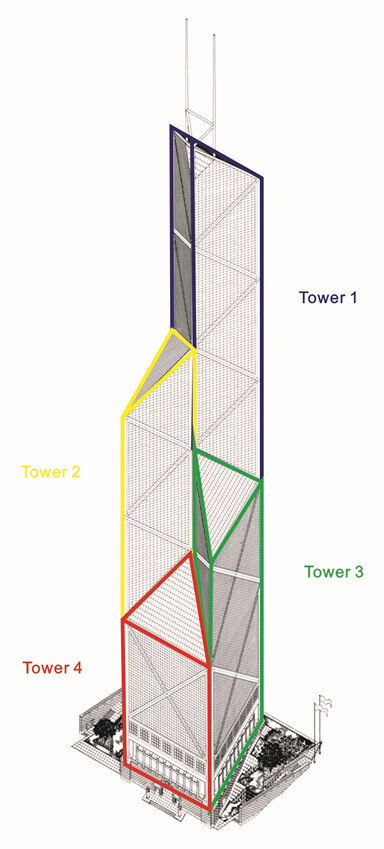
Massing model showing the shape of the Bank of China Tower. The labels correspond to the number of 'X' shapes on each outward facing side. (Cmglee, 2011)
My diagram analysis of the tower volume
I.M. Pei.
Bank of China Tower is located in Hong Kong, China, and it’s designed by Chinese-American architect I.M. Pei who was usually called ‘’the last master of high modernist architecture’’. (Aimir, 2019) His buildings have been adhering to the tradition of modern architecture for more than 40 years. He firmly believes that architecture is not a popular style, and it is impossible to always change the way to attract favors. Architecture is a great cause and must be responsible for social history. He continued to study and discuss form, space, building materials and technology to make his works more diverse and better. He never argued for his own design, never wrote and interpreted the concept of the work himself. He believed that the building itself was the best manifesto. The combination of light and space makes the space change a lot. "Let the light do the design" is the famous saying of I.M. Pei.
Design principles of I.M. Pei.
1. The concept of space in which architecture is integrated into nature: "Let the light do the design" is Pei's famous motto, focusing on the projection and change of light in the design works
2.Make good use of geometric shapes for design: Pei is known for its volume and prefers the appearance of the facade. He is good at using geometry to create variable shapes
3. Pay attention to regional context: When creating works, paying attention to the correlation between the overall buildings.
4. Structural and sculptural: the structure and structural texture clearly visible in Pei’s works, and in the use of concrete in Pei’s works, his works are presented like sculptures
5. Delicate detail design: In the architectural works of Pei, many of them can be found exquisite detail design in subtle methods.
The design of Bank of China Tower
Lines
The architect utilizes straight lines as the main geometric structure in triangles and diamonds pattern to clad the entire building, so we can obviously see the clear lines to form the volume of design, integrating geometric structure and volume together at the same time.
Colors
The principal colors are white, grey and blue used in the design. White color is mainly utilized for manifesting the entire structure which can be seen from its exterior appearance. Grey is specifically used within the foundation of building. And blue is the chief color that covering glasses reflect among the façade.
Shapes
The shapes of this design can be seen as variable plans in different groups of floors among the entire skyscraper. Each group of floors is distinguished by dividing one-quarter of the square, and we can see the gradual variation of its shapes through pictures of architectural plans above.
Forms
The form of this skyscraper is mainly defined by its shapes design, and we can also consider it as different triangular prisms blending together which is showed in the diagram above as well. Different height of triangle prisms establishing the main style of its geometric form, also showing the particular effect of variable volumes throughout the entire building.
Space
Since the entire building is alike the sort of sculptural design, we can perceive the main geometric body of it occupies the specific space in the city center of Hong Kong. And the geometric variation also makes viewers sense the positive and negative space changes within the entire form over the sky.
Denotation
With a limited budget and a difficult inland site, the owner requested a distinctive regional headquarters with an imposing banking hall and 130,000 m2 of office space. These criteria called for a tall and dynamic structure that would take advantage of the surrounding views while being robust enough to withstand a typhoon. Comprised of four vertical shafts, the tower emerges incrementally from a 52-meter cube and diminishes in mass, quadrant by quadrant, until a single triangular prism remains. The diagonal cuts that generate the prism create a sequence of atrium spaces that flood the tower with natural light. (I.M. Pei, 1989)
Connotation
The tower represents the successful integration of structure and form to meet the needs of both client and city. Clad in reflective glass that mirrors the changing sky, the tower anchors the expanding business district and provides a distinctive vertical axis on Hong Kong's crowded skyline. At ground level, it is pulled back from the street to create a welcoming pedestrian environment that is fully accessible yet removed from urban congestion. Its innovative composite structural system of steel and concrete resists high-velocity winds and involved significant savings in construction time and materials. (I.M. Pei, 1989)


Bank of China Tower


The view of atrium
Other links and connections
The Bank of China Tower was completed in 1989, a year the "New York Times" called "the year of I.M. Pei ... the high priest of modernism." For it was in this same year that Pei also completed the glass pyramid of the Louvre Museum in Paris, the Meyerson Symphony Center in Dallas, the Creative Artist Agency Headquarters in Los Angeles, the Choate Science Center in Connecticut, and the Mt. Sinai Medical Center in New York. "To many people I.M. Pei has become the pre-eminent designer of modernist monuments of our time," the newspaper wrote.
After the Bank of China officially moved into the tower in 1991, noted architect and critic Peter Blake visited the building and declared it to be "probably the most innovative skyscraper structure built anywhere to date."
"It is, in the view of many who have seen it, the finest Modern skyscraper since Mies van der Rohe's Seagram Building was completed over 30 years ago," he wrote in the "Architectural Record."
Nearly 30 years after the building's construction, the Bank of China Tower continues to offer valuable lessons of architectural and structural ingenuity under tremendous constraints. Most importantly, the tower has become one of the most important cultural icons for the city of Hong Kong. (Juan Du, 2018)
Reference List:
Image:
I.M. Pei, 1989, Bank of China Tower, image, Pei Cobb Freed & Partners, viewed 14 June 2020, <https://www.pcf-p.com/projects/bank-of-china-tower/>.
Cmglee, 2011, Bank of China Tower massing model, image, Wikipedia, viewed 20 June 2020, <https://en.wikipedia.org/wiki/Bank_of_China_Tower_(Hong_Kong)#/media/File:Bank_of_China_Tower_massing_model.svg>.
Website:
Aimir C.G. (2019) The Fall of An Architectural Era- I.M. Pei, online at https://www.aimircg.com/the-fall-of-an-architectural-era-i-m-pei/, accessed 14/06/2020.
I.M. Pei (1989) Bank of China Tower, online at https://www.pcf-p.com/projects/bank-of-china-tower/, accessed 14/06/2020.
Juan Du (2018) How I.M. Pei's Bank of China Tower changed Hong Kong's skyline, online at https://edition.cnn.com/style/article/100-years-of-i-m-pei-bank-of-china/index.html, accessed 20/06/2020.
0 notes
Text
Writing Inspired by The White Pube Writing


Central Park R9 Station
Central Park R9 Station @ Kaohsiung, Taiwan
01/06/2020
Emoji summary: 😎🚝🌌
Due to the coronavirus pandemic in the UK and all over the world, I have turned back to my country for about two months. In this period of time, I have a chance to visit and have some observation for my hometown Kaohsiung city in Taiwan again. Since the epidemic situation is controlled well and gradually declines in Taiwan, more and more people start going out to have their own activities again. Some places in the city center of Kaohsiung also begin to have more visitors and citizens like the time before COVID-19. Such as Central Park which has the R9 underground station in Kaohsiung is one of the popular places to be visited in our city.
Central Park R9 Station is designed by the architect Richard Rogers, locating in the field of public square of Central Park. The main form of the station is sort of the SEMI-OPEN SPACE which allows underground passengers to experience different spacial variations when they enter or exit the underground station. I remember that I was really ASTONISHED by this method of design when I visited this station in the first time and got MOVED as well while getting through the sequential space within this station. If you have an opportunity to get off the R9 station, firstly the large white and metal canopy supported by four groups of yellow metal tubes with the spacious semi-underground square and the long stairs, escalators and artificial waterfall will come into your view. I reckon this is kind of GENIUS DESIGN that can impress every visitor who have such an astonishing experience when they instantly see this special scene.
Many passengers and visitors would stay in this semi-underground square for a while to take some pictures or try to perceive this specific space. Afterwards, people will gradually go up to the ground floor by the long stairs or escalators, and I consider this is another splendid part of design that can give visitors the special chance to have MOVING EXPERIENCE for passing through the station slope, immersing yourself in this miraculous process of climbing the slope slowly with the spacious space under the white canopy.
After you arrive at the ground floor, you will see a round square with fountains located in front of the R9 Station with park areas, then you also will start to have the chance to look around what actually the entire station looks like. In my opinion, this station gives me kind of feeling like the AIRSHIP OR SPACESHIP is ready to take off from the ground, standing by with passengers who would like to get to another planet. The slightly tilted white canopy defines the particular space under itself, covering the semi-underground space with stepped slope. With the support of four groups of concise yellow metal tubes, the white canopy and the entire station seem to get ready for loading citizens HOPE AND VISION toward the future at all times in Central Park of Kaohsiung City.
Reference List:
Image:
Richard Rogers, 2007, R9 Station, image, Rogers Stirk Harbour + Partners, viewed 01 June 2020, <https://www.rsh-p.com/projects/r9-station/>.
0 notes
Video
tumblr
The experimental video according to my sketches of line analyses

Foundation Louis Vuitton


Sketches of line analyses
Interpretive Analysis of Lines in An Image
I choose the image of Foundation Louis Vuitton which is designed by architect Frank Gehry and located in Paris, France for doing the line analysis and movement of it. Initially I mainly did the analysed sketch for the outline of this building design, which manifests several curved and structured panels of glass covering the main body of building. The first outline sketch leaves out the main body of design, showing the result of concise covering glassed panels for the main visual effect and structure. Afterwards I started to utilize the method of one-way and consecutive line to try linking those different blocks of sketch, then it presented like in the second sketch. I attempt to link those blocks in the feeling of movement related to the topic of this experiment, the I also took the video for recording the trace of this one-way movement from the second sketch in the balcony of my house. With the white ground with black marks as the main background, the video took the record of moving walk which was translated from the second sketch over the balcony ground of my house.
Reference List:
Image:
Carla Guédy, 2014, Fondation Louis Vuitton : Bernard Arnault verse 100 millions d’euros, image, LUXE.NET, viewed 03 June 2020, <https://luxe.net/fondation-louis-vuitton-bernard-arnault-verse-100-millions-deuros/>.
0 notes
Text
The Analysis of Film


The screenshots of movie Interstellar
Film Title: Interstellar
Genre: Science Fiction Movie
Genre elements:
Setting – mise en scene/location
Characters – representations,stereotypes, behavior, body language, specific actors/stars
Narrative events – how is the narrative ordered and structured? Is it elliptical/enigmatic?(elements left out to intrigue/entice the audience)
Iconography – Well known or recognizable people/objects/buildings mise en scene/ props, costume, setting, symbolic codes
STYLE: Technical and audio codes – camera use, editing, diegetic/non diegetic sound, sfx. Mise en scene/lighting, color
Conventions:
Setting:
The rural farm and house
The research laboratory and factory
The spacecraft and outer space
The black hole and different dimension space
Characters:
Joseph Cooper, a widowed NASA pilot as the agency was closed by the government of the US, has retired to become a farmer.
Amelia Brand, a NASA astronaut and scientist.
Murphy Cooper, Joseph's younger daughter, who eventually becomes a Plan A scientist at NASA.
Professor Brand, a high-ranking NASA scientist, conceiver of Plan A, former mentor of Cooper and father of Amelia.
Narrative events:
The film describes the lack of crops and dust in the earth, which is no longer suitable for human habitation. The protagonist and daughter broke into NASA ’s secret base one day. Scientists inside the base informed them that NASA hoped that while building a large space station and solving the gravity equation, the protagonist, a former top pilot, could drive the spacecraft through the wormhole for searching new planets so that humans can continue. Therefore, NASA formed a team to travel to three planets that may be suitable for human habitation. Encountered major crises such as a planetary tsunami on the way and the discovery of forged data by the advance team members. Fortunately, the protagonist finally traveled through time and space, providing information to the grown-up daughter, and completing the equation of gravity to enable humans to leave the earth and live on a space station orbiting Saturn.
Iconography:
Matthew McConaughey as Joseph Cooper
Anne Hathaway as Amelia Brand
Jessica Chastain as Murphy Cooper
Michael Caine as Professor Brand
The earth part:
The rural farm and house, the mysterious Murphy Cooper’s watch, bookshelf and room, NASA laboratory and factory, the professor Brand’s research blackboard, the ward and hospital, the earth with exceptional climate and phenomenon…and so forth.
The outer space part:
The NASA spacecraft, the airship Ranger, the astronauts, the robot Tars, the wormhole, the black hole, the weird planets, the particular dimension space, the gravity effect, the space station with new dimension, the outer space with new discoveries in the new era.
STYLE - Technical and audio codes:
The wormholes and black holes in the film are calculated by physicists to allow light to pass through the wormhole or surround the black hole. The visual effects director and computer special effects personnel work together to write new computer special effects software to construct an accurate gravity model. Therefore, the audience sees a picture based on Einstein's theory of relativity.
In addition to these amazing special effects scenes, because the entire film was shot with IMAX cameras for 70 minutes, the colors of these clips are very full and bright. Under such high-resolution shooting, cosmic phenomena such as rocket lift-off, light and shadow changes in the galaxy, Saturn rings and so on stay perfectly on the screen, and the audience can entirely feel immersive in it.
Summarize how the above helps to define genre in the text:
From the sections of setting, characters, narrative events, iconography and style, the film can be defined as the sort of science fiction movie by those significant elements and content within these five main topics
Target audience: (who do you think is the target audience and how do you know?)
The main target audience is the vast public and for the groups of explorer, aspire, succeeder or reformer to experience the mysterious journal and story within the earth and outer space, additionally, the classes of upper middle and middle class are more suitable for watching this science fiction movie.
Reference List:
Image:
BLUSCREENS, 2014, Interstellar, image, viewed 9 May 2020 <https://www.bluscreens.net/interstellar.html >.
0 notes
Text
Q&A of Image


Twisting Virginia school The Heights


The diagrams of design concepts
1.Who made it?
Bjarke Ingels Group (BIG)
2.What is the concept of the work?
BIG has arranged the classrooms of this white-brick and glass school in Arlington, Virginia in the United States with a fan-shape to allow for a "cascading terraces". "The density of the urban Arlington neighbourhood became the inspiration for the school – we fanned the classrooms to allow each and every floor to be connected to the roof garden on top of the classrooms below," said BIG founder Bjarke Ingels. (Dezeen, 2019)
3.Why the architectural volumes look like that?
Five classroom volumes are stacked and pivoted on top of a larger base level, and detailed to look as if they overlap one another. A swooping staircase alternates between inside and outside to provide access to each of the floors and the rooftop gardens above. Each terrace is landscaped to lend itself not just to the social life of the students but also as informal outdoor spaces for learning. And Large expanses of glazing are placed on the inner side of the fan to offer views to the surroundings. (Dezeen, 2019)
4.Which kind of effect and atmosphere it would like to deliver?
Utilizing a method in which each level is rotated along a single hinge point, which results in the cascading effect leading classrooms to the playing field. Meanwhile, the ground plan is manipulated in order to establish sunken courtyards and a bring daylight into the lower floors of the school. The effective fanning choreography of the structure will bring landscape into the school. Each of the terraces will produce a meaningful dialogue between the teaching spaces and the surrounding nature– corresponding to the adjacent floor and facilitate with learning. (Designboom, 2016)
5.How to support student’s learning by this design?
BIG’s design concept performs more like a university campus than a typical secondary school, full of environments that support opportunistic, independent, and project-based learning. The large, open lobby, for example, offers tiered seating for students to gather between and after classes, engage in self-guided learning and investigate their interests alone or in groups. Outdoor learning environments are located on roof terraces adjacent to each floor. (LEO A DALY, 2019)
Reference List:
Image:
Bridget Cogley,2019 , BIG designs twisting Virginia school The Heights, image, Dezeen, viewed 10 May 2020, <https://www.dezeen.com/2019/10/30/the-heights-school-arlington-virginia-big/ >.
Website:
Dezeen (2019) BIG designs twisting Virginia school The Heights, online at https://www.dezeen.com/2019/10/30/the-heights-school-arlington-virginia-big/, accessed 10/05/2020.
Designboom (2016) BIG rotates each level of virginia school to form cascading rooftop terraces, online at https://www.designboom.com/architecture/big-bjarke-ingels-group-wilson-school-arlington-virginia-usa-01-08-2016/, accessed 10/05/2020.
LEO A DALY (2019) Reimagining the vertical school, online at https://leoadaly.com/perspectives/reimagining-the-vertical-school/, accessed 10/05/2020.
0 notes
Text
Tim Walker: Wonderful Things (Analyzing its Work in The Exhibition)
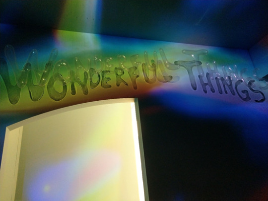


The photos of exhibition

Cate Blanchett, 'Mozart' on the moon
Fashion
Dior
Paris, 2015
In this work, the artist utilizes the comparatively darker colors within the part of model’s body, showing the visual stability among the entire scene. Apart from the part of body, other parts seem to be much lighter than it, so the viewers will be more focus on the model herself. From my opinion, the artist would like to create the sort of futuristic ambience through setting transparent and spherical covers on the model’s head and candle on her hand. Not only transparent spheres give the sense of future but the facial makeup, hair style and handy candle express the sort of surreal atmosphere. Additionally, the golden colors of rings, candle base, accessories and hair also strengthen the mysterious and futuristic style in this work.
0 notes
Text
Analyzing My Own Collage

The Head of Mobile Phone
I try to make the kind of illusion of blending the technology and human being together in this work which is cut from the newspaper. The three mobile phones overlap one by one with one another, which creates the effect of gradation with three layers within the man’s head, so it has three main directional axes crisscrossing at the same time to have the sense of extension. The principal color in the part of man’s body is deep and light blue, expressing a sort of melancholy sense within the bottom of the entire collage. The color of the one of the mobile phones is also blue, connecting the relationship between the head and body. There have some titles in front of the man’s body and arm, the words give the focal point and visual stability among the scene of the work. In this work, I would like to deliver not only the illusional message but also the ironic contrast between the technology and human beings simultaneously, making the sort of humorous and surreal effect in it.

The Blend of Female and Male
I would like to create the sort of surreal imagination by mixing the female and male, asleep and awake, technological and native, head and body and so forth in this collage which is also cut from the newspaper. I put an asleep female head with the fluorescent earphone covering a male head supporting by his one of hand. By the mix of these two concise pictures, I have the intent for making a kind of vivid image having the unreal condition. And by blending these two contrasting photos, it also shows the conflicting message toward the viewers, making them feel confused about what actually happen when they suddenly see the work. I choose two similar colors’ pictures putting together to have the emphasis on the entire image itself and conflicting feeling among it. In this work, the female head will be as the main visual point at first, then the male body as the second attention by viewers for having the interestingly visual sequence up and down.
0 notes
Text
Interpreting the Visual World: Formal Element Analysis(The Image)


Otro designed by Koo Jeong-A (2012)
STEP 1: Basic 2-step analysis
Artwork (Name of work, Artist, date):
Otro
Koo Jeong-A
2012
Describe it as simply as you can (denotation):
It’s kind of an organic skating space with the fluorescent effect at night, it has some negative semispheres inset into the ground and skater can skate free around the entire negative space integrated with the landscape.
Comment on any possible connotations that you think of:
The skating place is alike the human organ as heart, and skaters who play in it like blood, freely flowing around the organic space which has the vivid condition.
STEP 2: Formal elements analysis
Identify & describe how the element is used in this work:
Element
Line:
It mainly used in organic curving lines to form the entire space.
Color:
It has the light green colour in the daytime, and fluorescent green at night.
Shape, Form, Space:
The shape of the plan of it consists of some circles and semicircles to make several hemispheres forms which creates the negative insetting space into the ground.
Texture, Pattern:
It uses the green phosphorescent concrete for smooth surface as the main texture, and utilizes circles and semicircles as the motif of pattern in the plan of venue.
Explain any possible connotations (messages, meanings or ideas communicated):
Element
Line:
Curving lines around the space connotes the flowing and energetic condition.
Color:
The light green color appropriately fits in the surrounding grassland, and fluorescent green creates the mysterious atmosphere at night.
Shape, Form, Space:
The shape and form of it connote the flowing image for skating style, and the entire negative space integrated with ground shows the immersion with natural environment.
Texture, Pattern:
The smooth surface makes it more fluid and flexible for skaters, and the circular patterns creates the organic image as well as free spirit among the space.
STEP 3:Find out more SECONDARY RESEARCH – Find out more
Read more on the Tate website or Google the artwork. Write 2 or 3 interesting facts you find out about the work. Things you might find out: Information about why or how the artist created the work Information about particular techniques or technology used Information about meanings in the work Information about what was happening in the world at the time
The concept of Otro has oval shape, and the use of phosphorescent green paint, its slow discovery, and its integration with the island prairie make this sculpture an unlimited experimental area. Koo Jeong A invited beginners and confirmed that they can experience the physical senses of his work through skating scenery.
This “skateable sculpture” is made from green phosphorescent concrete so it gives off a radioactive glare, which enables skaters to pull some rad tricks without bumping into one another.
Wesbite link – copy the link here:
https://www.vice.com/en_us/article/8qm34z/korean-artist-koo-jeong-a-creates-glow-in-the-dark-skate-park-in-france--2
STEP 4: Respond to and evaluate the work OVERALL RESPONSE – What is your overall response to the work?
Personal opinion – Do you like or dislike the work? Can you use examples from your formal elements analysis to explain why? What do you think about any messages, meanings or ideas communicated by the work? When you found out more about the artist and work did it change your opinions about it?
I appreciate the organic and flowing condition of this skating work which has curving shape of plan as well as the form of spheres and hemispheres among it, enabling players to freely skate around the negative space of work. I reckon the work tries to expresses the mysterious ambiance and free spirit toward participants playing around the space. After I searched for some information on this work, I still don’t change my opinion about the idea of its work delivers.
Visual response - What was your first reaction to the work? What was the first word that came into your head when you saw it? What did you notice first? Do some parts draw your attention more than others?
I felt I saw a kind of alien creature living on the earth, which is my first reaction to this work. And the first word came into my head is “organism”. I notice of the light green material applied to the work and the fluorescent effect which draw my attention much more than other parts at night.
Memory/ experience - Does the work remind you of anything? Why? Have you seen or experienced anything like this before? Can you describe where or when? (another piece of artists work or item).
The work reminds me of visiting the national aquarium for seeing many marine creatures such as the octopus, squid and starfish and so forth. Since the shape and form of this work are similar as the marine creatures staying in the sea. I didn’t have the skating experience which is alike this work previously, so I can just imagine that this work is related to alien or marine creatures due to the organic circumstance among it.
0 notes
Text
Interpreting the Visual World: Formal Element Analysis(The Pathway)


Church of the Light designed by Tadao Ando (1989)
STEP 1: Basic 2-step analysis
Artwork (Name of work, Artist, date):
Church of the Light
Tadao Ando
1989
Describe it as simply as you can (denotation):
It’s a rectangular volume with openings of entrance and cross on the front wall, and have the extended wall from exterior to interior as the guide to entrance.
Comment on any possible connotations that you think of:
The entire building utilizes grey and polished concrete which connotes the kind of solemn and spiritual atmosphere among the space. And the light penetrates simple opening cross on the wall, connoting the meaning of redemption relates to Christianity.
STEP 2: Formal elements analysis
Identify & describe how the element is used in this work:
Element
Line:
It mainly uses straight lines to make the three-dimensional space
Color:
Grey as the principal color in the case
Shape, Form, Space:
It has the geometric shape of plan to create a rectangular volume with negative space inside it and the positive space as walls
Texture, Pattern:
The walls are in smooth and polished texture with lines and dots of construction. The main pattern here is the cross as motif on the wall
Explain any possible connotations (messages, meanings or ideas communicated):
Element
Line:
Straight lines connote the feeling of solid and clear among the church
Color:
The grey color connotes the sort of spiritual ambiance which calms people inside the space
Shape, Form, Space:
The architect utilizes the simple geometric form and negative space to make it more stable and sublime, enabling people to meditate or think deeply in it
Texture, Pattern:
The smooth walls connote the sense of modern and urban style, and the pattern of cross with light represents the salvation of Christ
STEP 3:Find out more SECONDARY RESEARCH – Find out more
Read more on the Tate website or Google the artwork. Write 2 or 3 interesting facts you find out about the work. Things you might find out:· Information about why or how the artist created the work Information about particular techniques or technology used Information about meanings in the work Information about what was happening in the world at the time
Absolute enclosing of solid and thick concrete creates a dark space, so that people who enter it instantly feel isolated from the outside world, and the sunlight leaks from the horizontal and vertical staggered openings of the wall, which is the famous "Cross of Light" - sacred, clear, pure, shocking.
There is only a downward slope in the church, there are no stairs; the most important thing is that the seat of the believer is higher than the altar, which is different from most churches (the altar will be on a high platform, solemnly overlooking the believer), This breaks the traditional Catholic church building and reflects the idea that everyone in the world should be equal.
Wesbite link – copy the link here:
https://www.archute.com/church-of-the-light/
STEP 4: Respond to and evaluate the work OVERALL RESPONSE – What is your overall response to the work?
Personal opinion – Do you like or dislike the work? Can you use examples from your formal elements analysis to explain why? What do you think about any messages, meanings or ideas communicated by the work? When you found out more about the artist and work did it change your opinions about it?
I appreciate this work very much. From the use of colour, pattern, form and space, I am draw by the spiritual as well as solemn atmosphere among the church which strongly conveys some related concepts from Christianity and the sublime world. I don’t change my opinion because the architect Tadao Ando designed this kind of iconic church with light which represents the sacred space and world.
Visual response - What was your first reaction to the work? What was the first word that came into your head when you saw it? What did you notice first? Do some parts draw your attention more than others?
When I first saw this work on the internet, I feel the space with light through the cross on the wall that not only delivers the message of salvation but also has the impressive ambience. The first word came into my mind I think is “spiritual’’, and firstly I noticed here is the hollow cross on the front wall which plays the mainly iconic image draw my attention.
Memory/ experience - Does the work remind you of anything? Why? Have you seen or experienced anything like this before? Can you describe where or when? (another piece of artists work or item).
This architectural work reminds me of singing hymns in another church, because the spiritual space here triggers the memory of it naturally. I have experienced this kind of feeling when I visited Luce Memorial Chapel in Taichung, Taiwan about 5 years ago, the church also uses similar method of opening to let the light come through interior space.
0 notes
Text
The Artwork Analysis of Tate Modern
Ile de France
1.Take a photo of the artwork in 5 different ways (i.e. close up, far away, look at details such as texture, form, colour) and add the best images to your research journal


Ile de France painted by Jean Hélion (1935)
2.Include information about who the artist/designer is, when it was made, where it was made, what was it made out of
Who the artist is?
Jean Hélion
When it was made?
1935
Where it was made?
Paris
What was it made out of?
Oil paint on canvas
3.Write about the formal elements in the artwork. This should include information about a variety of formal elements including texture, color, composition, lines, light .... How are the lines in the work? (straight, curved, flowing, horizontal, vertical, diagonal, thin, thick, broken, light, heavy?) What shapes are in the work (large, small, flat, rounded)? Light (is the light noticeable in the work? What is it doing in the work? Are there shadows?) Space (how much space is there in the work between shapes and objects) Time and Motion (if it’s a moving image work, how is the pace of the work?) Is there contrast between the colors in the work? Is there contrast between shapes in the work?
The artist utilized some types of invisible lines such as straight and curved to define outlines of various planes and volumes. The painting contains some large and flat shapes in the background and has mix types of shapes like flat, curved and rounded in the foreground. In the foreground, there are some solid and three-dimensional volumes having light changes as well as shadows accompanied with various flattened planes. The artwork seems to have the main object composed of different planes and volumes in the center position, and it leaves more space behind the main object in the background. The color contrast mainly appears between the background and foreground object, the background is close to light colors however the foreground object has some elements of deep colors. The painting is mostly made up of flattened shapes but the forms in the foreground appear solid and three-dimensional.
4.Record the image in another way - such as through drawing.

The colorful sketch according to Ile de France
5.What do you think the concept of the work is?
I consider that the concept of this painting might be to express the metaphor of the region in Ile de France, showing the innermost world of the artist toward the specific circumstance in his era.
6.How do you think the forms within the work help convey the concept?
I think the forms within this work try to utilize the abstract expression to deliver the sort of message of human living condition which interestingly reflects the diversity and multivariate from the artist’s observation.
0 notes
Text
Denotation and Connotation


Daxing International Airport

The main architectural plan
Beijing Daxing International Airport
Who made it?
Zaha Hadid Architects and ADP Ingeniérie
When was it made?
It was completed in 25/09/2019
Where was it made?
Daxing, Beijing, China
Denotation and Connotation
Daxing International Airport is located at the junction of Beijing and Hebei Province, about 25.6 kilometers from the Capital Airport and 46 kilometers from Tiananmen Square. From the exterior of the building, it has a core with six claws extending out of it, five of which are boarding corridors, denoting like giant starfish, and also like the base of a space battleship, showing a sense of science and technology of the age.
Daxing Airport has 4 airport runways, one more than Beijing Capital Airport. In particular, the sign of giant starfish has only a single terminal building, radiating 5 boarding corridors from the terminal building. It is the largest single terminal building in the world, with an area equivalent to 97 football fields. The five main boarding corridors as the signified that these can provide 79 empty boarding bridges, and each corridor is no more than 600 meters from the core, allowing passengers to walk from the security checkpoint to any gate within 8 minutes. (Airport Technology, 2019)
The airport was designed by Zaha Hadid, a British architect of Iraqi descent. Hadid 's team said that the long walking distance of passengers is a pain point for many giant airports. Many airports use shuttle buses, but Daxing Airport uses a single central terminal which connotes for shortening the distance from passengers to the boarding gate.
Reference List:
Image:
Tom Ravenscroft, Zaha Hadid Architects' giant starfish-shaped airport opens in Beijing, image, Dezeen, viewed 08 Feb 2018, <https://www.dezeen.com/2019/09/26/zaha-hadid-architects-starfish-beijing-daxing-international-airport/>.
Website:
Airport Technology(2019), Beijing Daxing International Airport, online at https://www.airport-technology.com/projects/beijing-daxing-international-airport-china/, accessed 08/08/20.
0 notes
Text
Reseaching the Visual World

Sky lantern in Taiwan
What is it?
Sky lantern
Who made it?
Zhuge Liang (courtesy name Kong Ming) was a Chinese famous Shu Han Prime Minister, outstanding politician, military strategist, essayist, and calligrapher during the Three Kingdoms.
What is it for/ why was it made?
Sky lanterns originated in the Three Kingdoms era. According to legend, they were originally created by Zhuge Liang (Kong Ming), so they are also called Kong Ming lanterns. At first, in order to convey the military situation in the city, the lamp was made to float in the air by using the principle of rising hot air, which caused the wrong "astrology" information to deceive the army of Sima Yi. It is also the pioneer of the hot air balloon in the world today. (Vision Times, 2017)
Describe what it looks like, including what it is made of (imagine you are describing it to someone who cannot see).
The sky lantern is made of iron wire or bamboo with a bottom frame, and xuan paper is glued around the surface. The bottom is small and the top is large to avoid the loss of hot air. A simple oil paper is placed in the middle of the chassis. After it is ignited, it will rise because the hot air inside is lighter than the cold air outside.
Why did you choose this image?
The photograph artistically demonstrates the night scene of the sky lantern’s event in Taiwan, accompanying with the Chinese blessing characters on the left one, so I reckon this image can be the significant representative here.
Explain why you think it links to your culture.
The lantern-reporting safety function reflects the history of the southern Fujian people from the mainland to Taiwan in the Qing dynasty to cross the sea to cultivate in Pingxi. It gradually became the Lantern Festival, which was a trend of local cultural characteristics in the late 20th century of Taiwan.
Reference List:
Image:
Robert, International reputation! It has long been a "must-go" festival for everyone-Pingxi's sky lanterns are moving, have you ever experienced it?, image, Accupass, viewed 27 Jan 2020, <https://blog.accupass.com/2017_sky_lantern.html>
Website:
Vision Times (2017) Zhuge Liang, One of the Famous People from Ancient China, online at http://www.visiontimes.com/2017/06/16/zhuge-liang-one-of-the-famous-people-from-ancient-china.html, accessed 27/01/20.
1 note
·
View note