
Don't wanna be here? Send us removal request.
Statistics
We looked inside some of the posts by razan-n-athamneh and here's what we found interesting.
Average Info
Notes Per Post
1
Likes Per Post
1
Reblog Per Post
0
Reply Per Post
0
Time Between Posts
34 minutes
Number of Posts By Type
Text
8
Last Seen Tumblr Blogs


Fun Fact
12.7% of mobile users access Tumblr.
Text
Machine Learning for Data Analysis — Week 4 Assignment
This covers my work submitted for the fourth week’s assignment of the Machine Learning for Data Analysis course. The goal of this assignment was to practice k-means cluster analysis.
For this analysis I used the Boston House Price dataset freely available from Machine Learning Mastery at this link. This dataset involves predicting the price of a house in thousands of dollars given details of the house and its neighborhood. The variable present in the dataset are:
CRIM: per capita crime rate by town.
ZN: proportion of residential land zoned for lots over 25,000 sq.ft.
INDUS: proportion of nonretail business acres per town.
CHAS: Charles River dummy variable (= 1 if tract bounds river; 0 otherwise).
NOX: nitric oxides concentration (parts per 10 million).
RM: average number of rooms per dwelling.
AGE: proportion of owner-occupied units built prior to 1940.
DIS: weighted distances to five Boston employment centers.
RAD: index of accessibility to radial highways.
TAX: full-value property-tax rate per $10,000.
PTRATIO: pupil-teacher ratio by town.
B: 1000(Bk — 0.63)² where Bk is the proportion of blacks by town.
LSTAT: % lower status of the population.
MEDV: Median value of owner-occupied homes in $1000s.
For my analysis I used SAS, as that is the software I’m most familiar with and make the most use of in my day-to-day role. Following the examples in the course, I began by cleaning the data and removing all observations with missing data. Then, I split the data into test and train sets via simple random sampling, and standardised the output. I then created a kmeans macro utilising the fastclus procedure, which could accept an input of a variety of values of k. I then plotted the elbow curve for the resulting values of r-squared for each of the different values of k, which yielded the following:
The plot showed significant bends at the 2, 5 and 7 clusters. For the rest of this analysis, I focused on the k-means algorithm with five clusters.
Using canonical discriminant analysis, I reduced the dimensions of the dataset so that we could plot the result. Below are the results of the reduction prodecure:
Using this, we can plot the first two canonical variables as a scatterplot:
This shows that observations within clusters one and three are highly correlated with each other, and within-cluster variance is low. Observations in cluster two are further spread out, but the cluster is relatively distinct. Cluster four is very spread out, and cluster five only contains a handful of observations. This suggests that the best clustering solution may contain less than five clusters.
Below are the results of that fastclus procedure for the five cluster solution, which were created by the macro described earlier:
As an example, clusters one and three share similar levels of crime rate, but vary on land zoned for lots of 25,000 sqft, with this being higher for cluster one.
Now let’s see how this impacts house prices using the ANOVA procedure and producing boxplots. Note that I’ve discounted the fifth cluster from this analysis as there were so few observations in that cluster:
We can see that clusters two and four contain the, on average, less costly houses, whereas clusters one and three contain the more expensive ones.
Code used:
data clust; set housingnew;* create a unique identifier to merge cluster assignment variable with the main data set;idnum=_n_; keep idnum CRIM ZN INDUS CHAS NOX RM AGE DIS RAD TAX PTRATIO B LSTAT MEDV; * delete observations with missing data; if cmiss(of _all_) then delete; run;ods graphics on;* Split data randomly into test and training data;proc surveyselect data=clust out=traintest seed = 123 samprate=0.7 method=srs outall; run;data clus_train; set traintest; if selected=1; run;data clus_test; set traintest; if selected=0; run;* standardize the clustering variables to have a mean of 0 and standard deviation of 1;proc standard data=clus_train out=clustvar mean=0 std=1; var CRIM ZN INDUS CHAS NOX RM AGE DIS RAD TAX PTRATIO B LSTAT; run;%macro kmean(K); proc fastclus data=clustvar out=outdata&K. outstat=cluststat&K. maxclusters= &K. maxiter=300; var CRIM ZN INDUS CHAS NOX RM AGE DIS RAD TAX PTRATIO B LSTAT; run; %mend;%kmean(1); %kmean(2); %kmean(3); %kmean(4); %kmean(5); %kmean(6); %kmean(7); %kmean(8); %kmean(9);* extract r-square values from each cluster solution and then merge them to plot elbow curve;data clus1; set cluststat1; nclust=1; if _type_='RSQ'; keep nclust over_all; run;data clus2; set cluststat2; nclust=2; if _type_='RSQ'; keep nclust over_all; run;data clus3; set cluststat3; nclust=3; if _type_='RSQ'; keep nclust over_all; run;data clus4; set cluststat4; nclust=4; if _type_='RSQ'; keep nclust over_all; run;data clus5; set cluststat5; nclust=5; if _type_='RSQ'; keep nclust over_all; run;data clus6; set cluststat6; nclust=6; if _type_='RSQ'; keep nclust over_all; run;data clus7; set cluststat7; nclust=7; if _type_='RSQ'; keep nclust over_all; run;data clus8; set cluststat8; nclust=8; if _type_='RSQ'; keep nclust over_all; run;data clus9; set cluststat9; nclust=9; if _type_='RSQ'; keep nclust over_all; run;data clusrsquare; set clus1 clus2 clus3 clus4 clus5 clus6 clus7 clus8 clus9; run;* plot elbow curve using r-square values; symbol1 color=blue interpol=join; proc gplot data=clusrsquare; plot over_all*nclust; run;******************************************************************** further examine cluster solution for the number of clusters suggested by the elbow curve ******************************************************************** plot clusters for 5 cluster solution; proc candisc data=outdata5 out=clustcan; class cluster; var CRIM ZN INDUS CHAS NOX RM AGE DIS RAD TAX PTRATIO B LSTAT; run;proc sgplot data=clustcan; scatter y=can2 x=can1 / group=cluster; run;data MEDV_data; set clus_train; keep idnum MEDV; run;proc sort data=outdata4; by idnum; run;proc sort data=MEDV_data; by idnum; run;data merged; merge outdata4 MEDV_data; by idnum; run;proc sort data=merged; by cluster; run;proc means data=merged; var MEDV; by cluster; run;proc anova data=merged; class cluster; model MEDV = cluster; means cluster/tukey; run;
0 notes
Text
Regression Models Course Project
Summary
Motor Trend is a automobile industry Magazine. We are interested the relationship betweenvariables that affect miles per gallon MPG.
Are automatic or manual transmission better for MPG?
What are the MPG differences between automatic/manual transmissions?
Using a data set provided by Motor Trend Magazine do linear regression and hypothesistesting, to see if there is a significant MPG differences between automatic and manualtransmission.To quantify the MPG difference between automatic and manual transmission cars, a linearregression model was used to take into account the weight, transmission type and theacceleration. Based on these findings manual transmissions have better fuel economy of2.94 MPG more than automatic transmissions.
Load needed Libraries
library(ggplot2)
## Warning: package 'ggplot2' was built under R version 3.2.5
library(dplyr)
## Warning: package 'dplyr' was built under R version 3.2.5
## ## Attaching package: 'dplyr'
## The following objects are masked from 'package:stats': ## ## filter, lag
## The following objects are masked from 'package:base': ## ## intersect, setdiff, setequal, union
Read the Data
data(mtcars) str(mtcars)
## 'data.frame': 32 obs. of 11 variables: ## $ mpg : num 21 21 22.8 21.4 18.7 18.1 14.3 24.4 22.8 19.2 ... ## $ cyl : num 6 6 4 6 8 6 8 4 4 6 ... ## $ disp: num 160 160 108 258 360 ... ## $ hp : num 110 110 93 110 175 105 245 62 95 123 ... ## $ drat: num 3.9 3.9 3.85 3.08 3.15 2.76 3.21 3.69 3.92 3.92 ... ## $ wt : num 2.62 2.88 2.32 3.21 3.44 ... ## $ qsec: num 16.5 17 18.6 19.4 17 ... ## $ vs : num 0 0 1 1 0 1 0 1 1 1 ... ## $ am : num 1 1 1 0 0 0 0 0 0 0 ... ## $ gear: num 4 4 4 3 3 3 3 4 4 4 ... ## $ carb: num 4 4 1 1 2 1 4 2 2 4 ...
Process the Data
Convert “am” to a factor variable, “AT” = Automatic Transmission and “MT” = ManualTransmission.
mtcars$am<-as.factor(mtcars$am) levels(mtcars$am)<-c("AT", "MT")
Exploratory Data Analysis
Get The Mean of Automatic and Manual Transmissions:
aggregate(mpg~am, data=mtcars, mean)
## am mpg ## 1 AT 17.14737 ## 2 MT 24.39231
The mean MPG for manual transmissions is 7.245 which higher than automatic transmissioncars. Is this significant?
Validate Significance:
aData <- mtcars[mtcars$am == "AT",] mData <- mtcars[mtcars$am == "MT",] t.test(aData$mpg, mData$mpg)
## ## Welch Two Sample t-test ## ## data: aData$mpg and mData$mpg ## t = -3.7671, df = 18.332, p-value = 0.001374 ## alternative hypothesis: true difference in means is not equal to 0 ## 95 percent confidence interval: ## -11.280194 -3.209684 ## sample estimates: ## mean of x mean of y ## 17.14737 24.39231
The p-value of the t-tst is 0.001374, with 95% confidence interval. There is a significantdifference between the mean MPG for automatic verses manual transmissions.
Histogram of the mpg for Automatic and Manual Trasmissions.
ggplot(data = mtcars, aes(mpg)) + geom_histogram() + facet_grid(.~am) + labs(x = "Miles per Gallon", y = "Frequency", title = "MPG Histogram for automatic verses manual transmissions")
## `stat_bin()` using `bins = 30`. Pick better value with `binwidth`.
Boxplot mpg for Automatic and Manual Trasmissions
ggplot(data = mtcars, aes(am,mpg)) + geom_boxplot() + labs(x= "Transmission", y = "MPG", title = "MPG: Automatic and Manual Trasmissions")
Correlations:
corr <- select(mtcars, mpg,cyl,disp,wt,qsec, am) pairs(corr, col = 4)
Linear Model 1
Illastration mpg for automatic transmisions
f1 <-lm(mpg~am, data = mtcars) summary(f1)
## ## Call: ## lm(formula = mpg ~ am, data = mtcars) ## ## Residuals: ## Min 1Q Median 3Q Max ## -9.3923 -3.0923 -0.2974 3.2439 9.5077 ## ## Coefficients: ## Estimate Std. Error t value Pr(>|t|) ## (Intercept) 17.147 1.125 15.247 1.13e-15 *** ## amMT 7.245 1.764 4.106 0.000285 *** ## --- ## Signif. codes: 0 '***' 0.001 '**' 0.01 '*' 0.05 '.' 0.1 ' ' 1 ## ## Residual standard error: 4.902 on 30 degrees of freedom ## Multiple R-squared: 0.3598, Adjusted R-squared: 0.3385 ## F-statistic: 16.86 on 1 and 30 DF, p-value: 0.000285
From this linear regression model of mpg against automatic, manual transmission have7.24 MPG more than automatic transmission. The R^2 value of this model is 0.3598,meaning that it only explains 35.98% of the
Linear Model 2
Using step function.
f2 = step(lm(data = mtcars, mpg ~ .),trace=0,steps=10000) summary(f2)
## ## Call: ## lm(formula = mpg ~ wt + qsec + am, data = mtcars) ## ## Residuals: ## Min 1Q Median 3Q Max ## -3.4811 -1.5555 -0.7257 1.4110 4.6610 ## ## Coefficients: ## Estimate Std. Error t value Pr(>|t|) ## (Intercept) 9.6178 6.9596 1.382 0.177915 ## wt -3.9165 0.7112 -5.507 6.95e-06 *** ## qsec 1.2259 0.2887 4.247 0.000216 *** ## amMT 2.9358 1.4109 2.081 0.046716 * ## --- ## Signif. codes: 0 '***' 0.001 '**' 0.01 '*' 0.05 '.' 0.1 ' ' 1 ## ## Residual standard error: 2.459 on 28 degrees of freedom ## Multiple R-squared: 0.8497, Adjusted R-squared: 0.8336 ## F-statistic: 52.75 on 3 and 28 DF, p-value: 1.21e-11
This model uses an algorithm to pick the variables with the most affect on mpg.From the model, the weight, acceleration as well as the transmission affect thempg of the car the most.Based on a multivariate regression model, a manual transmission cars have better fuelefficiency of 2.94 MPG higher than automatic transmission cars. The adjusted R^2of the model is 0.834, meaning that 83% of the variance in mpg is do to themodel.
ANOVA 2 Models
fstep<-lm(mpg~ am + wt + qsec, data = mtcars) anova(f1, fstep)
## Analysis of Variance Table ## ## Model 1: mpg ~ am ## Model 2: mpg ~ am + wt + qsec ## Res.Df RSS Df Sum of Sq F Pr(>F) ## 1 30 720.90 ## 2 28 169.29 2 551.61 45.618 1.55e-09 *** ## --- ## Signif. codes: 0 '***' 0.001 '**' 0.01 '*' 0.05 '.' 0.1 ' ' 1
The p-value indicates that we should reject the null hypothesis that the means from bothmodels are the same. That is, the weight and acceleration of the car have a significantimpact on it’s MPG.
Conclusion
In conclusion, holding the weight and acceleration of the cars as constant, manualtransmission cars offer 2.94 MPG better fuel efficiency.
Model Residuals
par(mfrow = c(2,2)) plot(f2, col = 4)
By examining the plot of residuals, we can see that there are a few outliers,but nothing significant that would skew the data.
0 notes
Text
Peer-graded Assignment: Running a Random Forest
Objective: A random forest analysis was performed with a binary target variable (american dream). American dream was created based on survey results that was ranked from 0-10. Results >= 5 was categorized to have achieved their american dream (1) & <5 were categorized to not have achieved their american dream (0).
Syntax:
proc import datafile=’/home/pragyaratnarai0/Course 4/ool_pds.csv’ out = imported replace; run; DATA new; set imported; if w2_qe3 GE 5 then AmericanDream=1; else AmericanDream=0; proc hpforest; target americandream/level=nominal; input w1_c1c w2_qe2 w1_p4 w1_p13 w1_p13a ppagect4 ppeducat ppethm ppgender PPINCIMP PPHOUSE /level=nominal; RUN;


The model information is pretty standard with the default values being set. THere were 2294 observations, all of which were used in the analysis. The misclassification rate was 46.8%, i.e. the forest correctly classified 53.2% of the sample.
The first 30 and last 30 observations are also shown in output above. As the number of trees increases it is seen that the fit statistics for OOB data goes down from a misclassification rate of 24% and starts leveling off at around 16.2%. With the tail end of the tree we can see that it levels off at around the same 16.6% rate with the misclassification rate for the training set levelling off at 14.3%.
The loss reduction variable importance table shows that on the most important variable is W2_QE2 (Qn - Are you generally optimistic, pessimistic or neither optimistic nor pessimistic about the future of the United States), followed by PPEDUCAT(Education-categorical) & W1_P13 (Are you a citizen of the US).
From the analysis, it makes sense that the top variable to use would be “Are you optimistic or pessimistic about the future”. I had not thought that education level & being citizen would have had such an impact on my target variable. A more complete analysis could have included all variables in the data set and to get a variable importance table for all these variables. Then a classification tree could have been modelled based on the top variables from this table. In the previous week, I thought there could’ve been more variables that I could have used to make the decision tree, but had no clue on how to pick the variables. This random forest analysis could have helped me in that.
0 notes
Text
Assignment: Running a Classification Tree
Below is a picture of the final tree generated by the program:

Decision tree analysis was performed to test nonlinear relationships among a series of explanatory variables ( for this assignment purpose, i chose variables ‘HISPANIC’,’WHITE’,’BLACK’ only) and a binary, categorical response variable (SMOKING).
The training data set had 60% of the data while test had 40% of the data.
All possible separations (categorical) or cut points (quantitative) are tested. For the present analyses, the entropy “goodness of split” criterion was used to grow the tree and a cost complexity algorithm was used for pruning the full tree into a final subtree.
The smoking score was the first variable to separate the sample into further subgroups based on smoking = Yes or No.
Prediction Score is 82%
Smokers with a score greater than 0.3328 were more likely to be Whites.
CODE:
In [1]:
from pandas import Series, DataFrame import pandas as pd import numpy as np import os import matplotlib.pylab as plt from sklearn.cross_validation import train_test_split from sklearn.tree import DecisionTreeClassifier from sklearn.metrics import classification_report import sklearn.metrics
In [2]:
os.chdir("F:/COURSERA COURSES/Machine Learning for Data Analysis/Week 1")
In [3]:
""" Data Engineering and Analysis """ #Load the dataset AH_data = pd.read_csv("tree_addhealth.csv")
In [4]:
AH_data.head()
Out[4]:BIO_SEXHISPANICWHITEBLACKNAMERICANASIANageTREG1ALCEVR1ALCPROBS1…ESTEEM1VIOL1PASSISTDEVIANT1SCHCONN1GPA1EXPEL1FAMCONCTPARACTVPARPRES
0200100NaN012…47405NaNNaN024.3815
120010019.427397111…35105222.333333023.3915
2101000NaN000…45001302.250000024.3315
310010020.430137100…47414192.000000018.7614
4200100NaN010…39005323.000000020.096
5 rows × 25 columns
In [5]:
data_clean = AH_data.dropna()
In [6]:
data_clean.dtypes
Out[6]:
BIO_SEX float64 HISPANIC float64 WHITE float64 BLACK float64 NAMERICAN float64 ASIAN float64 age float64 TREG1 float64 ALCEVR1 float64 ALCPROBS1 int64 marever1 int64 cocever1 int64 inhever1 int64 cigavail float64 DEP1 float64 ESTEEM1 float64 VIOL1 float64 PASSIST int64 DEVIANT1 float64 SCHCONN1 float64 GPA1 float64 EXPEL1 float64 FAMCONCT float64 PARACTV float64 PARPRES float64 dtype: object
In [7]:
data_clean.describe()
Out[7]:BIO_SEXHISPANICWHITEBLACKNAMERICANASIANageTREG1ALCEVR1ALCPROBS1…ESTEEM1VIOL1PASSISTDEVIANT1SCHCONN1GPA1EXPEL1FAMCONCTPARACTVPARPRES
count4575.0000004575.0000004575.0000004575.0000004575.0000004575.0000004575.0000004575.0000004575.0000004575.000000…4575.0000004575.0000004575.0000004575.0000004575.0000004575.0000004575.0000004575.0000004575.0000004575.000000
mean1.5210930.1110380.6832790.2360660.0362840.04043716.4930520.1763930.5274320.369180…40.9521311.6185790.1025142.64502728.3606562.8156470.04021922.5705576.29071013.398033
std0.4996090.3142140.4652490.4247090.1870170.1970041.5521740.3811960.4993020.894947…5.3814392.5932300.3033563.5205545.1563850.7701670.1964932.6147543.3602192.085837
min1.0000000.0000000.0000000.0000000.0000000.00000012.6767120.0000000.0000000.000000…18.0000000.0000000.0000000.0000006.0000001.0000000.0000006.3000000.0000003.000000
25%1.0000000.0000000.0000000.0000000.0000000.00000015.2547950.0000000.0000000.000000…38.0000000.0000000.0000000.00000025.0000002.2500000.00000021.7000004.00000012.000000
50%2.0000000.0000001.0000000.0000000.0000000.00000016.5095890.0000001.0000000.000000…40.0000000.0000000.0000001.00000029.0000002.7500000.00000023.7000006.00000014.000000
75%2.0000000.0000001.0000000.0000000.0000000.00000017.6794520.0000001.0000000.000000…45.0000002.0000000.0000004.00000032.0000003.5000000.00000024.3000009.00000015.000000
max2.0000001.0000001.0000001.0000001.0000001.00000021.5123291.0000001.0000006.000000…50.00000019.0000001.00000027.00000038.0000004.0000001.00000025.00000018.00000015.000000
8 rows × 25 columns
In [72]:
""" Modeling and Prediction """ #Split into training and testing sets """ ORIGINAL DATA.... predictors = data_clean[['BIO_SEX','HISPANIC','WHITE','BLACK','NAMERICAN','ASIAN', 'age','ALCEVR1','ALCPROBS1','marever1','cocever1','inhever1','cigavail','DEP1', 'ESTEEM1','VIOL1','PASSIST','DEVIANT1','SCHCONN1','GPA1','EXPEL1','FAMCONCT','PARACTV', 'PARPRES']] """ # predictors = data_clean[['BIO_SEX','HISPANIC','WHITE','BLACK','NAMERICAN','ASIAN']] predictors = data_clean[['DEVIANT1','HISPANIC','WHITE','BLACK']]
In [73]:
targets = data_clean.TREG1 pred_train, pred_test, tar_train, tar_test = train_test_split(predictors, targets, test_size=.4)
In [74]:
pred_train.shape
Out[74]:
(2745, 3)
In [75]:
pred_test.shape
Out[75]:
(1830, 3)
In [76]:
tar_train.shape
Out[76]:
(2745L,)
In [77]:
tar_test.shape
Out[77]:
(1830L,)
In [78]:
#Build model on training data classifier=DecisionTreeClassifier()
In [79]:
classifier=classifier.fit(pred_train,tar_train)
In [80]:
predictions=classifier.predict(pred_test)
In [81]:
""" Confusion Matrix """ sklearn.metrics.confusion_matrix(tar_test,predictions)
Out[81]:
array([[1497, 0], [ 333, 0]])
In [82]:
""" Accuracy Score """ sklearn.metrics.accuracy_score(tar_test, predictions)
Out[82]:
0.81803278688524594
In [83]:
#Displaying the decision tree from sklearn import tree
In [84]:
#from StringIO import StringIO # from io import StringIO from io import BytesIO #from StringIO import StringIO from IPython.display import Image # out = StringIO() out = BytesIO()
In [85]:
tree.export_graphviz(classifier, out_file=out) import pydotplus
In [86]:
graph=pydotplus.graph_from_dot_data(out.getvalue()) Image(graph.create_png())
Out[86]:
In [ ]:
0 notes
Text
Logistic Regression Model
Preview
This assignment aims to examine the association of potential drug abuse/dependence prior to the last 12 months with major depression diagnosis in the last 12 months. among US adults aged from 18 to 30 years old (N=9535). All four explanatory variables were 4-level categorical and they were binned into 2 categories (0.=“No abuse/dependence, 1.=“Drug abuse/dependence”) for the purpose of these logistic models. More specifically, cannabis abuse/dependence (CANDEPPR12) is the primary explanatory variable and the potential confounding factors were cocaine (COCDEPPR12), heroine (HERDEPPR12) and alcohol (ALCDEPPR12). The response variable is major depression (MAJORDEP12) diagnosed in the last 12 months, which is categorical binary variable (0.=“No”, 1.=“Yes”). Therefore, we can evaluate if a specific drug abuse/dependence issue during the period prior to the last 12 months, is positively correlated with depression diagnosis in the last 12 months.
Results


The logistic regression model presented above illustrates the association of cannabis and cocaine abuse/dependence issue prior to the last 12 months with major depression, diagnosed in the last 12 months. The number of observations is 9535 (18-30) and the regression is significant at a P value of less than 0.0001 for cannabis and 0.001 for cocaine. The odds of having major depression were 2.5 times higher for participants with cannabis abuse/dependence than for participants without abuse/dependence (OR=2.59, 95% CI = 2.17-3.10, p=.0001). For cocaine the odds of having major depression were more than 1.7 times higher for individuals with cocaine abuse/dependence than for individuals without abuse/dependence (OR=1.73, 95% CI = 1.25-2.40, p=.001).

On the other hand, heroine’s relationship with major depression was not significant, with a p-value at 0.079 which is more than 0.05. Thus, the null hypothesis cannot be rejected.
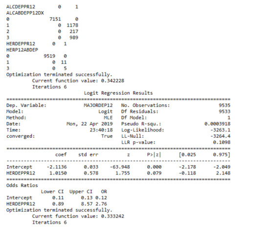
After adjusting for potential confounding factors alcohol and cocaine abuse/dependence, the odds of having depression were slightly more double for participants with cannabis issues than for participants without cannabis issues (OR=2.11, 95% CI = 1.74-2.55, p=.0001). Alcohol appeared to be also positively correlated with major depression, since alcoholic individuals had 1.5 times higher odds of getting diagnosed with this psychiatric disorder (OR=1.5, 95% CI = 1.32-1.79, p=.0001). Cocaine’s abuse/dependence odds seemed to be very close to alcohol (OR=1.54, 95% CI = 1.11-2.14, p=.01).
Summary
The logistic regression model revealed that cannabis, cocaine and alcohol were positively correlated with major depression, while heroine was not. Cannabis dependence was my primary explanatory variable and its significance appeared to remain steady when adding potential predictors (alcohol and cocaine) to the model. Therefore, there was no evidence of confounding for the association between my primary explanatory variable and the response variable. The results support my initial hypothesis.
0 notes
Text
Multiple Regression Model
Analysis


The multiple regression analysis aims to evaluate multiple predictors of the quantitative response variable, number of cannabis dependence symptoms (CanDepSymptoms). The primary explanatory variable is major depression diagnosis, in the last 12 months (MAJORDEP12), while the confounding factors are:
agebeganuse_c: Centered quantitative variable, which represents the age when individuals began using cannabis the most (values 5-64. Age).
numberjosmoked_c: Centered quantitative variable, which represents the number of joints smoked per day when using cannabis the most (values 1-98. Joints).
canuseduration_c: Centered quantitative variable, which represents the duration (in weeks) individuals used cannabis the most (values 1-2818. Weeks).
GENAXDX12: Categorical variable, which represents the diagnosis of general anxiety in the last 12 months (0.=“No”, 1.=“Yes”).
DYSDX12: Categorical variable, which represents the diagnosis of dysthymia in the last 12 months (0.=“No”, 1.=“Yes”).
SOCPDX12: Categorical variable, which represents the diagnosis of social phobia in the last 12 months (0.=“No”, 1.=“Yes”).
After adjusting the potential confounding factors, major depression (Beta=0.25, p=0.0001) was significantly and positively associated with number of cannabis dependence symptoms. The R-squared value was extremely small at 0.047 and F-statistic value is equal to 16.88. For the confounding variables:
Age when began using cannabis the most was not significantly associated with cannabis dependence symptoms and the null hypothesis cannot be rejected (Beta=-0.03, p=0.18).
Number of joints smoked per day was significantly associated with cannabis dependence symptoms, such that the larger quantity reported a greater number of cannabis dependence symptoms (Beta= 0.003, p=0.008).
Duration of cannabis use was not significantly associated with cannabis dependence symptoms and the null hypothesis cannot be rejected (Beta=9.4e-06, p=0.56).
General anxiety diagnosis was not significantly associated with cannabis dependence symptoms and the null hypothesis cannot be rejected (Beta=0.18, p=0.07).
Dysthymia diagnosis was significantly associated with cannabis dependence symptoms (Beta= 0.43, p=0.0001).
Social phobia diagnosis was significantly associated with cannabis dependence symptoms (Beta= 0.31, p=0.0001).
Report
To evaluate if the additional explanatory variables confounded the relationship between major depression diagnosis (primary explanatory variable) and cannabis dependence symptoms (response variable), I added the variables to my model one at a time. As a result, none of this variables confounded the association, since every time I added each predictor the p-value of major depression remained significant, at 0.0001. Therefore, the results of the multiple regression analysis for these adjusted potential confounding variables, supported my initial hypothesis.
Polynomial Regression


The second multiple regression analysis examines the association between the quantitative response variable, number of cannabis dependence symptoms (CanDepSymptoms) and the centered quantitative explanatory variable, number of joints smoked per day when using the most (numberjosmoked_c). A second order polynomial of number of joints variable (’numberjosmoked_c^2) was added to the regression equation in order to improve the fit of the model and capture the curve of linear relationship that was evident in the scatter plot. In addition, the recoded variable (CUFREQ) which represents the frequency of cannabis use (values 1-10, 1.=“Once a year”, 10.=“Every day”), was included to the model as a potential confounding factor. There is also a show that coefficients for the linear, and quadratic variables, remain significant after adjusting for frequency of cannabis use rate.
If we look at the results, it is noticeable that the value for the linear term for number of joints is 0.05, and the p value is less than 0.0001. In addition, the quadratic term is negative (-0.0006) and the p value is also significant (0.0001). The R square increases from 0.003 to 0.18., which means that adding the quadratic term for cannabis joints, increase the amount of variability in cannabis dependence symptoms that can be explained by cannabis use quantity from 0.3% to 18%. For the frequency of cannabis use the coefficient is equal to 0.09 and the p-value is significantly small, at 0.0001.

Diagnostic Plots
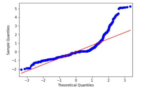
This qq-plot evaluates the assumption that the residuals from our reggression model are normally distributed. A qq-plot, plots the quantiles of the residuals that we would theoretically see if the residuals followed a normal distribution, against the quantiles for the residuals estimated from the reggression model. It is noticeable that the residuals generally deviate from a straight line, especially at higher quantiles. This indicates that our residuals did not follow perfect normal distribution. This could mean that the curvilinear association that we observed in our scatter plot may not be fully estimated by the quadratic cannabis joints variable. Therefore, there might be other explanatory variables that could improve estimation of the observed curvilinearity.
Plot of standardized residuals for all observations

To evaluate the overall fit of the predicted values of the response variable to the observed values and to look for outliers, I created a plot for the standardized residuals of each observation. As we can see, most of the residuals fall between -2 and 2, but many of them fall also above 2. This indicates that we have several outliers, basically above the mean of 0. Furthermore, some of these outliers fall above 4 (extreme outliers) which suggests that the fit of the model is relatively poor and could be improved.
Regression plots for frequency of cannabis use
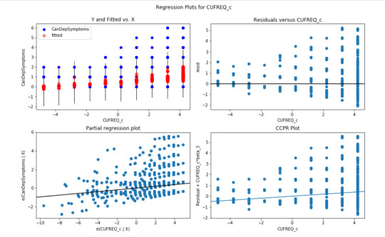
The plot in the upper right hand corner shows the residuals for each observation at different values of cannabis use frequency rate. There is clearly a funnel shaped pattern to the residuals where we can see that the absolute values of the them are small at lower values of frequency use rate, but then they start to get larger at higher levels. This indicates that this model does not predict cannabis dependence symptoms as well for individuals who have either high or low levels of cannabis use frequency rate. But is particularly worse predicting dependence symptoms for individuals with high frequency of cannabis use.
The partial regression residual plot, in the lower left hand corner, attempts to show the effect of adding cannabis use frequency rate as an additional explanatory variable to the model. For the frequency use rate variable, the values in the scatter plot are two sets of residuals. The residuals from a model predicting the cannabis dependence symptoms response from the other explanatory variables, excluding frequency of use, are plotted on the vertical access, and the residuals from the model predicting frequency of use from all the other explanatory variables are plotted on the horizontal access.What this means is that the partial regression plot shows the relationship between the response variable and specific explanatory variable, after controlling for the other explanatory variables. The residuals are spread out in a random pattern around the partial regression line and many of the residuals are pretty far from this line, indicating a great deal of cannabis dependence symptoms prediction error. Although cannabis use frequency rate shows a statistically significant association with cannabis dependence symptoms, this association is pretty weak after controlling for the number of joints smoked.
Leverage plot

The leverage plot attempts to identify observations that have an unusually large influence on the estimation of the predicted value of the response variable, cannabis dependence symptoms, or that are outliers, or both. We can see in the leverage plot is that we have a several outliers, contents that have residuals greater than 2 or less than -2. We’ve already identified some of these outliers in previous plots, but the plot also tells us which outliers have small or close to zero leverage values, meaning that although they are outlying observations, they do not have an undue influence on the estimation of the regression model.
0 notes
Text
Test a Basic Linear Regression Model Preview
The data was provided by the National Epidemiological Survey on Alcohol and Related Conditions (NESARC), which was conducted in a random sample of 43,093 U.S. adults and designed to determine the magnitude of alcohol use and psychiatric disorders. The data analytic subset, examined in this study, includes individuals aged between 18 and 30 years old who reported using cannabis at least once in their life (N=2,412). This assignment aims to evaluate the association between major depression diagnosis in the last 12 months (categorical explanatory variable) and cannabis dependence symptoms (quantitative response variable) during the same period, using a linear regression model.
Variables
Explanatory

Major depression diagnosis (MAJORDEP12) is a 2-level categorical variable (0=“No” , 1=“Yes”). The “No” category was initially coded “0”, thus there was no need for recode.
Frequency table of major depression diagnosis in cannabis users, ages 18-30

Response
Cannabis dependence symptoms (CanDepSymptoms) is a quantitative variable which I created for the purpose of the assignment. This variable was coded to represent the sum of 6 criteria:
Current cannabis abuse/dependence criteria, variables: S3CD5Q14C9 , S3CD5Q14C9
Longer period cannabis abuse/dependence criteria, variable: S3CD5Q14C3
Cannabis abuse/dependence sub-symptom criteria, which are:
Current cannabis use cut down criteria, variables: S3CD5Q14C2 , S3CD5Q14C1
Current reduce of important/pleasurable activities criteria, variables: S3CD5Q14C10 , S3CD5Q14C11
Current cannabis use continuation despite knowledge of physical or psychological problem criteria, variables: S3CD5Q14C13 , S3CD5Q14C12
Feel depressed because of cannabis effects wearing off, variable: S3CD5Q14C6C
Face sleeping difficulties because of cannabis effects wearing off, variable: S3CD5Q14C6R
Eat more because of cannabis effects wearing off, variable: S3CD5Q14C6H
Feel nervous or anxious because of cannabis effects wearing off, variable: S3CD5Q14C6I
Have fast heart beat because of cannabis effects wearing off, variable: S3CD5Q14C6D
Feel weak or tired because of cannabis effects wearing off, variable: S3CD5Q14C6B
Measures
ols function was used in order to estimate the regression equation and examine if major depression is correlated with cannabis dependence symptoms. Therefore, the F-statistic, P-value and parameter estimates (a.k.a. coefficients or beta weights) were calculated. In addition, the mean and the standard deviation were evaluated and the results were visualized with a bivariate bar graph.
Linear Regression Analysis Results
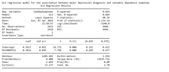
The linear regression model presented above aims to examine the association between major depression diagnosis in the last 12 months (categorical explanatory variable) and cannabis dependence symptoms (quantitative response variable), among U.S. adults aged between 18 and 30 years old. The number of observations that had valid data on both the response and explanatory variables and were therefore included in this analysis, was 2,412. The F-statistic is 60.34 and the P-value is 1.17e-14 (written in scientific notation). The P-value is considerably less than our alpha level of 0.05, which indicates that we can reject the null hypothesis and conclude that major depression diagnosis is significantly associated with cannabis dependence symptoms. In addition, the coefficient for major depression diagnosis is 0.38, and the intercept is 0.39. The P-value for our explanatory variable, in association with the response variable is p<0.0001 and the R-squared value, which is the proportion of the variance in cannabis dependence symptoms that can be explained by the major depression diagnosis, is significantly low at 2.4%.
Model Regression Equation

Bar Chart


The bivariate bar graph presented above illustrates the association between major depression, diagnosed in the last 12 months (explanatory variable) and cannabis dependence symptoms (response variable), in U.S. adults aged from 18 to 30 years old. The “No” category of major depression diagnosis is coded with “0” and the “Yes” is coded with “1”. As we can see, the individuals diagnosed with major depression in the last 12 months appeared to have marginally double cannabis dependence symptoms (mean = 0.77), compared to those who did not meet the criteria for this disorder (mean = 0.39). Therefore, major depression diagnosis is significantly associated with cannabis dependence symptoms.
1 note
·
View note
Text
Regression Modeling in Practice Week 1 Assignment
I am continuing on with the Coursera Data Analysis and Interpretation Specialization courses. The third course is called Regression Modeling in Practice. I will be continuing my analysis into the relation between democracy and economic well-being for this course. This week’s assignment is to submit a blog entry in which I describe 1) the sample, 2) the data collection procedure, and 3) a measures section describing your variables and how I managed them to address my research question. So without further ado…
About my Data
Sample
The sample is from the GapMinder project. The GapMinder project collects country-level time series data on health, wealth and development. The data set for this class only has one year of data for 213 countries.
Data Collection Procedure
Data were collected by a handful of sources, including the Institute for Health Metrics and Evaluation, US Census Bureau’s International Database, United Nations Statistics Division, and the World Bank.
Measures
Income per person (economic well-being) is the 2010 Gross Domestic Product per capita is measured in constant 2000 U.S. dollars. This allows for comparison across countries with different costs of living. This data originally came from the World Bank’s Work Development Indicators.
The level of democracy is measured by the 2009 polity score developed by the Polity IV Project. This value ranges from -10 (autocracy) to 10 (full democracy). For my analysis this measure was binned into 5 categories developed by the Polity IV Project authors. These categories and their polity scores are:
Full Democracy (polity score = 10)
Democracy (6 to 9)
Open Anocracy (1 to 5)
Closed Anocracy (-5 to 0)
Autocracy (-10 to -6)
The urbanization rate is measured by the share of the 2008 population living in an urban setting. This data was originally produced by the World Bank. The urban population is defined by national statistical offices. This variable is a possible confounded and will be binned into three categories:
Not Urban (0% to 32% urbanization rate)
In Transition (33% to 65% urbanization rate)
Urban (< 66% urbanization rate)
0 notes