
Don't wanna be here? Send us removal request.
Statistics
We looked inside some of the posts by rbrown-campbellsvad-gd and here's what we found interesting.
Average Info
Notes Per Post
10
Likes Per Post
10
Reblog Per Post
0
Reply Per Post
0
Time Between Posts
7 days
Number of Posts By Type
Text
12
Last Seen Tumblr Blogs


Fun Fact
Tumblr has a low social media market share in South America.
Text
Final Reflection of ARTS 246
I am a graphic design major and I plan on applying for portfolio review in hopes of getting into the graphic design program here at USC. I have thoroughly enjoyed this class. Project deadlines came up quick, but it has honestly helped with time management and gaining knowledge of what it could be like in the real world in this field outside of school and classes. This course has helped me grow as a designer and has helped me learn new skills while also using the skills that I already know from previous design/art courses. Being able to get so much useful feedback from a great group of peer designers as well as my professor definitely helped me to push my creativity more and has definitely helped to push my designs a bit further. I was very glad to be able to use InDesign in this class and to work with it a lot as I have never used it prior to this class, and I know it will be a very useful tool throughout my career. This class has helped to push my creative side while developing and figuring out my own ‘style.’ The weekly blogs helped me stay on track as well as the mini deadlines within projects. I really enjoyed making the process book to see my process throughout this class and to actually make an entire book to show it off. I took four levels of graphic communication classes in high school and looking back and remembering some of things that I created and designed back in high school compared to the products that I have designed and created in this course, I can definitely tell that I have grown as a designer while in this course.
0 notes
Text
Chapter 12; Image 11
Chapter 12 of the textbook explains the different process that designers go through while created and implementing a typographic design. The authors of the textbook state that “often, designers work in a realm somewhere between these two extremes, somewhere between intuition and logic. The solution to a problem emerges on rare occasion as a brilliant scrawl on a dinner napkin, by most often the problem-solving process is a journey that requires courage, patience, and confidence in finding one’s way through uncertain terrain.” The design process is a combination of different processes and sequence of events that leads the designer to the final result. This chapter describes in detail the components of process such as defining, gathering, ideating, synthesizing, and realizing. Another process that they described that many designers use for coming up with ideas for the design. These processes are sketchbooks and process books. I am glad that this typographic class implements sketches before designer (although, I would sketch anyway before designing anything) and process books/blogs. The process blogs helped me to get me ideas down in words and helps to see how far I have come from my original sketch or on-screen mockup. The process book that we are working on right now will definitely be beneficial as a portfolio and to just show my progress and how much I have learned and grown in my designs. This chapter also has a handful of case studies to describe in detail the different process that certain designers have went through while designing. It was very helpful to read and learn about how different designers works in different ways and how the sequence of events that they go through while designing changes from person to person.
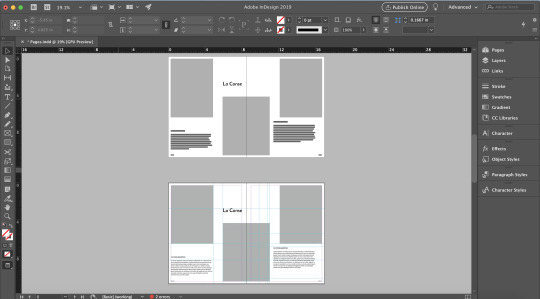
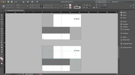
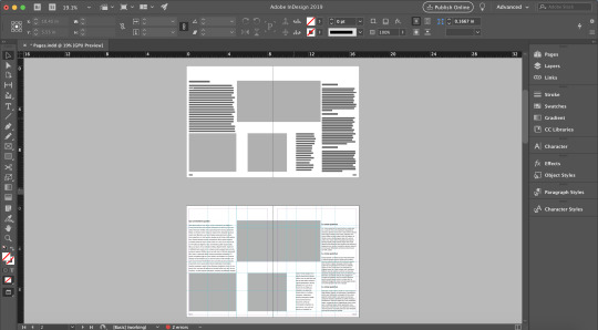
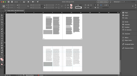
Shown above are images on my beginning stages and process of my process book. Shown above is my grid and different layouts from the grid assignment that contain an image heavy grid option, a text heavy grid option, and two image and text combined grid options. I do enjoy these layouts, but they may change a bit throughout my process. This weekend, I plan on starting to actually design my book and work on the 3 front matter spreads that are due on Tuesday. I do think that I would eventually like to add a navigation system for my book. I am still looking around, getting inspiration, and deciding on a color scheme that I would like to implement throughout my book as well. I think the best way to break up my book is to do it by week with sub sections to break down each week’s chapter/podcast, and process reflection of each week’s blog post. I did attend Meaghan Dee’s lecture, so I plan to incorporate that reflection in my process book as well. I am still deciding if I would like to place this information at the end of the book or within the week that it happened, which would have been a week while we were designing our type pair posters as her critique of my poster helped me with changes that I made to the poster. I am very excited about this project and looked forward to designing a whole book as I have only designed separate random spreads of the same topic in other courses.
0 notes
Text
Chapter 10; Image 10
Chapter 10 of the textbooks explained in detail some projects by designers where they encountered issues and problems while designing to therefore explain the most common typographic design problems that designers face in the professional field. These problems are those such as how to and the best way to integrate type and image on posters, establish a visual system to unify various materials, translating content to experimental form in publication design, ways to think about typography in terms of time and motion, and many more. For each of the case studies that they described, the concept of the design is described and analyzed and the reasoning behind the solution is discussed in detail. The most interesting thing that I read in this chapter was the fact that the United States National Park Service (NPS) developed their own type of grid, the Unigrid system in 1976 and was later used to develop a unified design system for their site brochures, maps, etc. The case study that I really enjoyed was the Buenos Aires Underground (Subte) design. A lot of research went into this project and design to come up with concepts and to actually implement and put the map together. I appreciate and enjoy how the designers created a grid and a proportional system that related to all the other system components and relates to all the other pieces of production for this underground system. I also really enjoy that they used circular columns and signs so it was therefore easier to be viewed at a distance and from any angle so everyone can see the information about links to other subway lines.
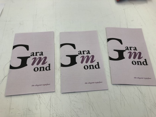
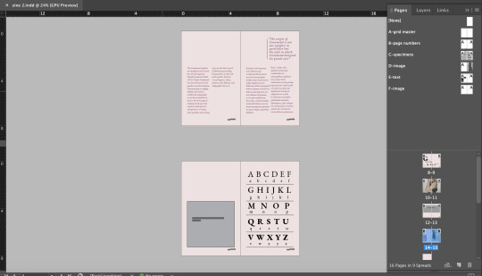
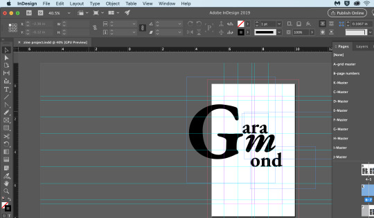
Shown above is the final product and design of my ‘zine for the Garamond typeface, bound and cut. I really enjoyed this project and working with spreads. I was scared that the binding of these zines was going to be hard, but it was actually very simple, especially after the demo. This was my first-time binding something and I am glad that I was able to learn this skill and technique. I am very pleased with my design and I believe that I have accomplished everything that I wanted to with my design. This was my first time really using InDesign in depth and my first-time designing spreads. However, after this project I think I can confidently say that I think I am starting to understand InDesign better and am looking forward to using it in the future. I am looking forward to continuing to build on this zine after the in-class critique to improve my portfolio for when I apply for portfolio review to get into the Graphic Design program.
Reflection:
I really enjoyed this project. I was able to gain a better understanding of InDesign and I feel comfortable using this program now as I have not used InDesign prior to this project. The master pages were super helpful especially when using the grid to make sure that each page of my project had a flow line and to make everything cohesive. It was very helpful to have the group critiques but I also kind of which that we had a class critique like we did with the posters where each person wrote 3 things so I could get more feedback for my project. I also found the need for a fully working dummy super helpful as I was able to practice the saddle sticking and binding it before I did it on my actual project. I definitely feel that I did a better job on my final with the binding and the cutting than I did on my working dummy. Overall, I really enjoyed this project and enjoyed working with spreads, especially ‘mini’ spreads to begin with before going to a full book/magazine. I enjoyed getting to learn and work with InDesign and learn more about this widely used typeface.
1 note
·
View note
Text
Chapter 9; Image 9
Chapter 9 of the textbook discussed typography is motion. Designers have the ability to create type that creates a sense of motion in order to exemplify a “voice” to the message in which the designer is trying to get across to the audience. It is up to the designer to establish a pace and sequence for the message, which therefore, creates time, “the most significant structural element in the design.” This sense of time establishes a mood amongst the viewers. One of the first examples of type in motion can be seen in advertisements from 1899 that were created and designed by Georges Méliès, who was a filmmaker and illusionist. Time in motion can be closely related to film title sequences. Moving type offers two forms of opportunities when it comes to communication: form and behavior. As previously mentioned, type allows for a message to be portrayed. Viewers of design and moving type rely on what the actual type looks like and how it moves in order to interpret the message. It was interesting to learn that type in motion and static type are very similar in some ways but are also different in other ways when legibility is concerned. Type in motion and static type are similar in ways when it comes to legibility such as what typeface is being used, size, case, letterspacing and color. However, the length and grouping of the desired text, speed and duration, are important to consider and have different guidelines than static type. When designing with type, you are conveying thoughts, messages, and emotions with the audience for them to connect with.
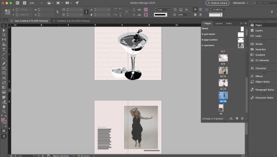
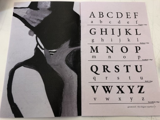
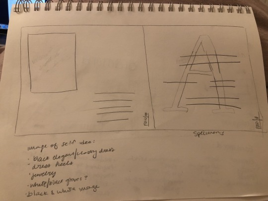
Shown above are process images of my Garamond zine. Over the past week I have done more research on the typeface to include and use as body copy of my zine. I also produced my experimental and metaphorical images of my typeface. I drew an illustration of a woman who was dressed in very elegant clothing that was later water colored. I thought this illustration of mine closely resembled the typeface as the typeface is also elegant and classy. I decided to turn the image black and white as the original illustration had red in it which I thought did not go with the color scheme of my zine and because, personally, I think the black and white effect makes images seem more elegant. As I was working on this project and while and brainstorming ideas for these two images, I kept thinking of more objects, and characteristics that reminded me of this typeface. This is when I came up with the idea of the martini glass. When I think of a martini glass, I think elegance and fancy. I created this martini glass in illustrator and again, decided to stick with black and white as the actual green and clear color of a martini would not go with my zine. I decided to use the Garamond font to create a repeating pattern in the background to create an interesting background rather than it just being a solid color. After critique, I may or may not decide to keep this typographic background. Over the last week, I have also gone through each spread of my zine to make sure that I have a visible flow line. I have also added to my colophon and inserted the correct information and recognition that is needed, as well as the visual of the grid that I used throughout my work.
1 note
·
View note
Text
Chapter 8; Image 8
Chapter 8 of the textbook discusses typography on screen. With new technological advances, digital, on screen design are becoming more and more popular. When type is designed for on screen use, the type needs to be rasterized, or converted into tiny dots called pixels in order to create it more as an ‘image’ than type to ensure that it is legible to the viewer. For on screen use, when type is small it includes fewer pixels which therefore decreases legibility. San serif typefaces are more legible and simpler to use on screen and slab serifs provide more legibility than old style, transitional, or modern typefaces. For websites, it is important to create contrast using variety of sizes (that will still appear legible), weight, and typeface. For selecting typefaces for on screen, more specifically websites, no more than two or three different typefaces should be used in order to still maintain hierarchical clarity. It was very interesting to know how the ‘rules’ for typography and legibility for print is different in some ways for the ‘rules’ of typography and legibility for on screen designs. When it comes to interletter and interword spacing, more spacing is required for on screen than prints in order to be more legible and clearer to the viewer. The most common on-screen design use are websites. Websites can be created using HTML (hypertext markup language), CSS (cascading style sheets), or JavaScript. HTML is a set of markup tags or code that describes the hierarchy, structure, or function of the content that you wish to display throughout the website. CSS are style sheets that allow the designers to have more control of the page composition and the characteristics of type such as sizes, weights, styles, interletter, interline, and interword spacings. JavaScript is used to create dynamic and interactive web pages, image rollovers, and open pop-up window. This chapter was very helpful as I do want to learn how to design website and on-screen materials in the future.
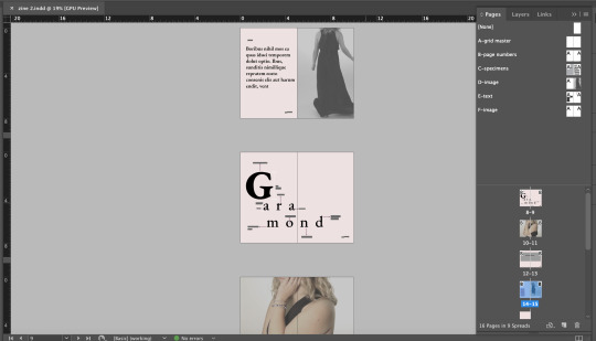
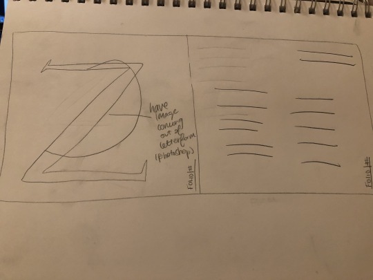
Shown above are a few screenshots of spreads from my zine on the Garamond typeface. I am still working on and finalizing my ideas for the metaphorical and experimental uses of the typefaces as well as the poem. I am still conducting some research to add some more context throughout my zine. I wanted the layout of my zine to be very elegant as the Garamond typeface is a elegant, classy, soft typeface. I decided to edit some of the photos into black and white to express that elegant, classy feeling and other photos I decided to lighten it a bit to give it a softer look. I also find Garamond very feminine like especially since it is so elegant and classy. Therefore, I decided to use these colors, however, I may end up changing them as I continue to work. I am still unsure at the moment. I am also still deciding if I want my type and context to be in the purple color or if I should change it back to black. I am really enjoying this project and am becoming more comfortable with InDesign.
1 note
·
View note
Text
Chapter 6 & 7; Image 7
Chapter 6 describes how typography is “a language of potent visible signs, a language capable of educating, persuading, informing, and entertaining.” The message that typography conveys is verbal, visual, and vocal. The authors of the book describe it as a very “dynamic communication medium” as typography can also be viewed and interpreted visually, and heard and interpreted audibility rather than it strictly being viewed visually. With the creation of works based around the moments of Futurism such as Dadaism, de Stijl, and Constructivism in Russia, the typographic message started to become a “multifaced and expressive form of communication” that needed to be “read, seen, heard, felt, and experienced” by the viewers. The most important role of typography is to ensure that the viewer/reader clearly understand the message that the designer is trying to get across. This designer should try to achieve this by using both logic and intuitive judgement. Typographic signs operate in two dimensions: syntactic and semantic. The author states that “when the mind is concerned with the form of a sign, it is involved with typographic syntax. When it associates a particular meaning with a sign, it is operating in the semantic dimension.” These signs can either be connotative, being drawn from personal experiences, or denotative, the objective meaning or the factual world of collective awareness and experience. I really enjoyed all of the examples of the designs of the typographic signs to actually experience them in order to see just how typography can be viewed visually, verbally, vocally, and can be interpreted audibility. Chapter 7 discuss the evolution of type. Typographic design is closely related to the evolution of type and how it has emerged over the years. When type and typesetting was first invented, it was very difficult to make small subtle changes to the type. There was a whole process to do so and it took time. Type and typesetting have emerged over the years from hand composition, to machine compositions such as the linotype, monotype, and Ludlow, to digital publishing. Once type moved to digital, it became much easier to make these small subtle changes such as type size, leading, kerning, etc. When we visited the Special Collections Library here at USC, I found it very interesting to look and hold and see how type was set back before it was digital.


Above are some images displaying my progress with my Zine project. I decided to the typeface, Garamond. The first few pictures are screenshots of the grid and layout that was due. I wanted to do wider margins since I personally like wide margins in works. Since the Garamond typeface is such an air-y and elegant and soft typeface, I wanted the wide margins in order to create a sense of calmness and tranquility throughout my grid. However, I am thinking about decreasing my margins just a bit but not too much so it will still create this sensation. As you can also see from my grid and layout screenshots, I decided to use a modular grid in order to give myself some more freedom to experiment and play around with where I want things to be placed. I have never really used InDesign before, and this was my first time being introduced and using master pages in order to create a book. It did get some taken used to do but once I started doing all the pages, I think I got a good hang of it. I am still playing around with the layout and it more than likely change in some way. Since the typeface itself is elegant and classy, I want to make sure that the layout and design is also elegant and classy like. I am still working on finishing up some of my research as I want to include some body copy and a brief ‘essay’ that describes the history and characteristics and the designer of Garamond. After reading Chapter 6 of the textbook, depending on exactly what my poem is going to be or maybe even for one of my made images I have to create for this typeface, I am thinking about possibly using a typographic sign like those examples shown in the “Verbal/Visual Equations” section of Chapter 6.
1 note
·
View note
Text
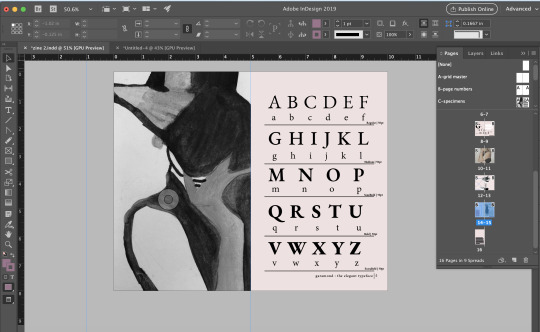
Chapter 5; Image 6
Chapter 5 explains how syntax helps to create a strong design and layout by using the elements of design––letter, word, line, column, and margin in order to create a unified and balanced layout. These five elements of design create unity through the use of typographic space, visual hierarchy, ABA form, and grid systems. The letter itself allows to distinguish one type family from another as they all have various sizes, shapes, and weights. When using letters in your design it is important to consider the composition of your design along with the white space around it so it can properly interact with the surrounding white space in order to create a balanced form-to-void relationship. The chapter explains that words have “the potential to express an idea, object, or event” or to reveal their meaning by creating word signs. You have to look and think about the letterforms in order to create a word sign as words are made up of letterforms. It is important to try and find “connections and rhythms” between the letterform and the word itself. The words then create lines that can either be symmetrical or asymmetrical and should have a balanced relationship between the line of text and the negative space. You can easily increase the emphasis of a line of text by adjusting the point size, weight, or line length while also considering alignments and spacing. Columns and margins are important to the letter, the word, and the line, to create a balanced and legible design. The proportion of the column height to width, texture, and tone relationship is imperative to consider while designing. To ensure legibility of your design, the height and width of columns should be considered in relation to the negative space to make the pages “spatially activated, optically balanced, and hierarchically ordered.” It is also important to think about typographical space, which is “the rhythmic and dimensional field in which typographic communication exists,” visual hierarchy, the “arrangement of elements in a graduated series, from the most prominent to the lease prominent, in an area of typographic space,” which can be achieved by using the ABA form. It is important to take all of these into consideration when designing in order to make the design balanced and to make it more legible to the viewer.
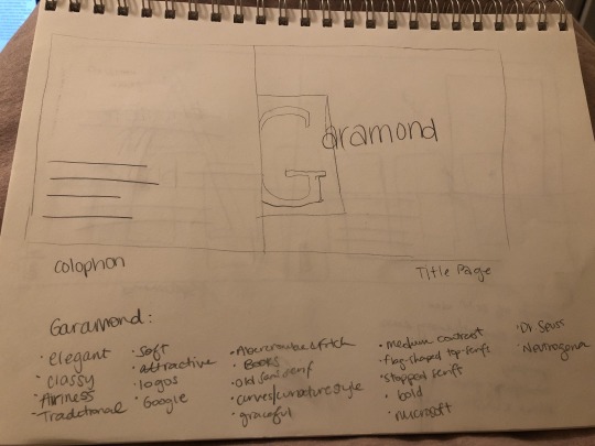
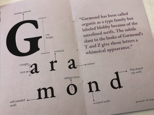
Above are some of the sketches that I did for three spreads of the Zine project. I chose the font Garamond because it really stuck out to me. This typeface has such beautiful letterforms and unique characteristics. This typeface feels very elegant, classy, and traditional, but still feels very soft to me. I plan on using a modular grid to allow for more options and freedom in where I place things throughout my design. As you can see in my sketches, I listed out the characteristics and things that remind me of that typeface as instructed by Meena. This was super helpful in helping me decide what to wear in the photoshoot. Since, to me, Garamond is very classy and elegant, I plan on dressing very ‘classy” with jewelry and plan to do a black and white photograph as it feels more graceful in an image like this to also relate the typeface itself. The images and examples of hierarchy of lines of texts and layout were super helpful to me in giving me a visual of these concepts and helping me to have some additional layout/design ideas that I may end up including in my Zine.
1 note
·
View note
Text
Chapter 4; Image 5
Chapter 4 of the textbook discusses grids and how grids help to create a design in order to intrigue the audience and create a thoughtfully composed design. As the authors put it, “a grid is a skeletal framework used by designers to organize information within a spatial field.” A grid helps to compose the text and other information or visuals in order to carefully place the most important pieces of information and helps to make “information clear and optimally accessible.” A grid, more specifically a typographic grid, is all about proportions. The most common grid is the golden section. The golden section is used throughout centuries of art, design, architectures, and music. Another type of familiar grid is the Fibonacci sequence, which is closely related to the golden section. When working with a single column grid, it is imperative to choose the right typeface for the content, to change the letter spacing, word spacing, and linespacing in order to make the content more legible to the viewer. However, when working with multicolumn grids, it’s important to balance three variables: type size, line length, and interline spacing (leading). Module grids are created by the intersections of horizontal and vertical lines in order to achieve hierarchy throughout the composition. Improvisational grids are more asymmetrical and “evolve in response to the specific elements of information.” Grids are important when working on any print or design as it helps to distribute typographic elements in order for it to be clearly legible.
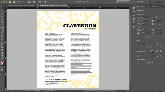
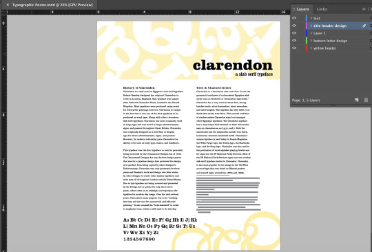
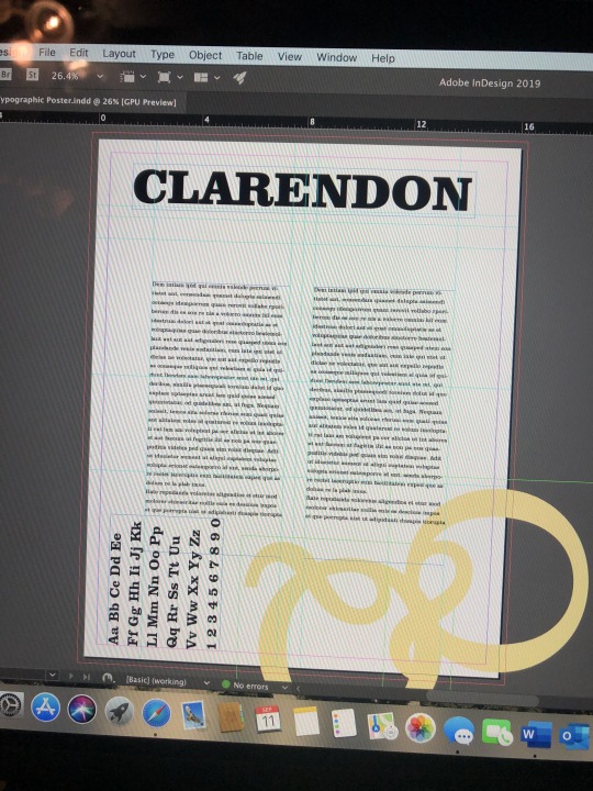
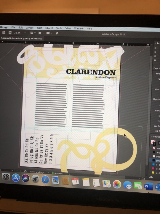
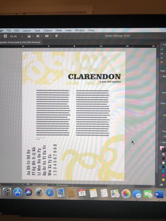
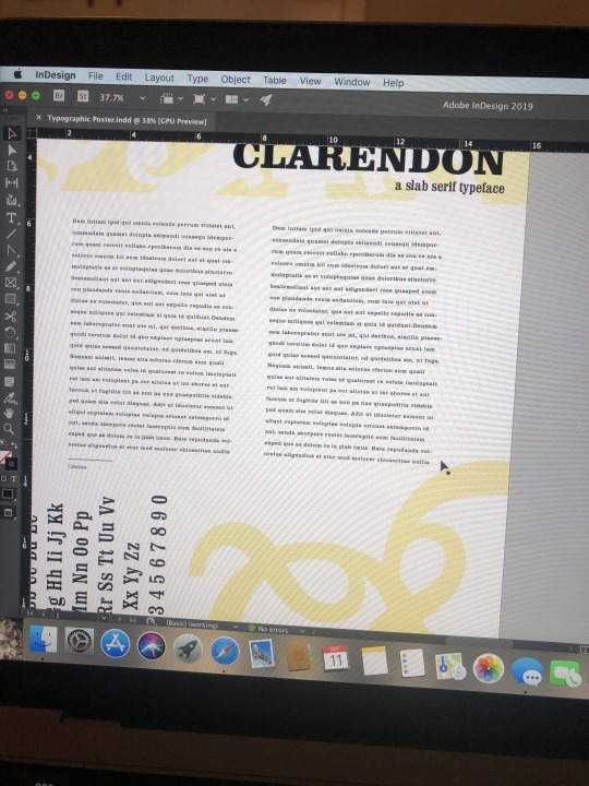
Shown above is my final information poster and conceptual poster for the Type Post Pair project. For the informational poster, I used a grid in order to make everything uniform, especially the body copy. The grid helped me to make sure that each item lined up in order to create a carefully composed design or layout that is legible for the viewers. Since smaller margins creates a sense of anxiety to the reader, I decided to use a grid that would make my margins larger in order to create a sense of calmness to my audience and to make the content more legible and easier on the eyes. I decided to use a multicolumn grid for my informational poster since I had so much content and a longer essay. As described in the Chapter 4 of the textbook, when working in multicolumn grids, it is imperative to balance three variables: type size, line length, and interline spacing (leading) in order to make sure that your body copy is optimally legible to the viewer. When I was working on the body copy of the informational poster, I kept having to go back and forth with these variables in order to make sure it would be legible when it was printed and to make sure that my ragged right was balanced throughout my body copy.
I really enjoyed this project and being able to work and learn more about InDesign. The readings that were assigned over the course of this project really helped me in developing my poster and helping me to make sure that I follow these criteria of legibility and grids. Overall, I am happy the final designs of my posters. I feel as though I respectfully used a grid in order to create me information poster and designed a conceptual poster that best represents the typeface that I chose. When I first started designing the conceptual poster, I had something completely different. However, after doing more research I discovered that Clarendon was the first typeface that was protected under the Ornamental Designs Act, a design patent for typeface design. Clarendon was only protected for three years and after that, Clarendon was copied and stolen by other designers and several other slab serifs are based and copied by characteristics of Clarendon. Since the first thing that drew me into the typeface was the distinct characteristics of Clarendon. Therefore, I decided to change my conceptual side to look as if it was something that the designer, Robert Beasley, would have drawn out as he was designing this typeface, sort of like a ‘blueprint’ while also using it as a sort of diagram to point out the characteristics of this typeface that makes it unique and that immediately caught my eye. The hardest part of this project was making sure that my flush left ragged right looked balance in any body copy. I adjusted the type size, line length, and leading multiple times and I still feel as though there are a bit unbalanced. Other than that, everything else went pretty smoothly for me and I am happy with my finished products.
1 note
·
View note
Text
Chapter 3; Image 4
Chapter three of the textbook discusses the concept of legibility in typography. The author describes that legibility makes it “possible for a reader to comprehend typographic forms with the lease amount of difficulty.” The main function of typography and letterforms is to “convey a reasonable meaning to the mind.” Not only are well chosen typeface pairings imperative for legibility, but there are several other factors that designers need to take into consideration such as, interletter spacing, interword spacing, type size, line length, and interline spacing, weight of the typefaces, paragraphs and indentations, alignment of your body copy, and color of the both the text and the background of the design. I really enjoyed and appreciated all of the examples of right and wrong ways to execute these factors such as those on pages 55-57 and 62-64. All of these factors and aspects that should be taken into consideration by designers not only helps improve legibility but also helps to make sure that your work will be something that the reader wants to engage in and creates a sense of calm while reading and not having the illegibility of your type create anxiety and make the reader disengage from your work.
Shown above are pictures from my process for both my information typography and my conceptual poster. I have been improving and continuing to build on my information poster from my last blog post. I have included my essay, played around with weight in my minuscules, majuscules, and numbers. I also decided to add a shadowed effect to my header design to make it more dimensional and make it a stronger design for my poster. This chapter relates and has helped me with the informational poster of this project. I needed to make sure that my text was going to legible to my readers, especially since I have so much body copy. I had to play around with interline and interword spacing in order to make my body copy legible without making it larger and to make that my body copy was flush left, ragged right correctly and to make it flowed.
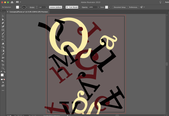
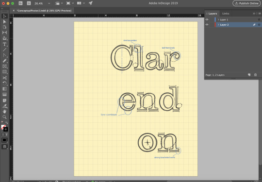
The other poster shown above is my conceptual poster. From the beginning, and one of the reasons why I chose this font Is because, I was automatically drawn to the characteristics of this typeface. From the square, horizontal brackets, vertical stress, to the unique ball terminals, I was very intrigued, and I wanted to show off these unique characteristics in my conceptual poster. The third picture was my original idea for my conceptional poster. However, after getting feedback from Professor Khalili, I decided to go with a diagram concept of the typeface. I decided to create something that could be found back when this typeface was designed by Robert Beasley. I decided to use a grid and create the ‘blueprint’ for this typeface as Beasley, along with other typeface designers do when designing a typeface. I think that this concept better represents the unique characteristics of this typeface that I wanted to portray.
1 note
·
View note
Text
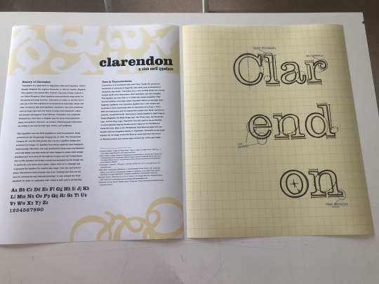
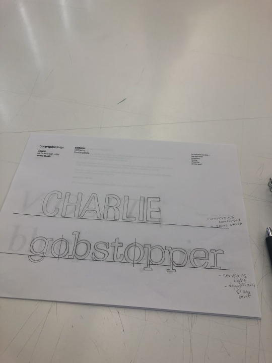
Chapter 2; Image 3
Chapter 2 of our textbook consisted of the anatomy of typography, diagrams of typefaces and definitions of parts of typefaces and letterforms in order to correctly identify the typefaces classification and to notice the distinct characteristics between different classifications of typefaces. There are four main variables behind letterform proportions that is important in typography and important in the designing aspect of a work. The four major variables are stroke-to-height ratio, contrast in stroke weigh, expanded and condensed styles, and the x-height and proportion. All of these characteristics can be easily identifiable throughout a typeface family. I feel that is imperative, yet fascinating to know and understand the different parts of a typeface or letterform in order to correct identify their classification to further allow for your design to include typefaces that work will together and create a legible yet aesthetically pleasing design as well as a structured layout using a grid and the anatomy of typefaces such as the ascenders, descenders, base line and x-height.
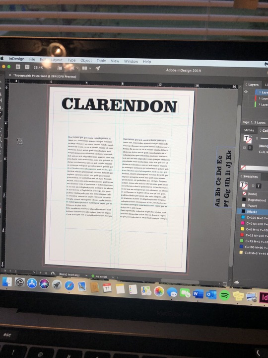
The images shown above are images taken from different stages of my Typographic Poster. Shown above is my information poster about my chosen typeface, Clarendon. Chapter 2 of the textbook directly relates to this project as I used the anatomy of the typeface that I found unique and interesting in order to create my design for this poster. I also used the anatomy and of the typeface and letterforms in order to describe in my body copy what was so unique and different about it and to describe this particular typeface’s characteristics. The concept for my information poster is to describe the history and the distinct characterizes that sets the Clarendon typeface apart from others. With that being said, I decided to use the most unique parts of some of the letterforms of Clarendon in order to create my design for my poster. I really wanted to explore and visually show the beautiful ball terminals that are found on some of Clarendon’s miniscule letterforms like a, c, f, r, and y. I also wanted to visually show the bracketed, squared serifs that appear on the majority of both minuscules and majuscules of the Clarendon typeface. I plan on conceptually portraying these characteristics in my conceptual poster as well.
1 note
·
View note
Text
Chapter 1; Image 2
After reading and examining the timeline of type, typography, and typeface, I am astonished at the transformation of type and written communication throughout the years. The evolution of typography and typefaces and their characterizes have changed drastically over the years from the origins of writing, to the first written records in clay, to the first type of writing system, Cuneiform, to the writing materials that were used, to using the written language on famous structures like the Parthenon, to the creation of the Bible, to hand printing, to the first book being printed in the English language, to new typefaces and characterizes being developed that are still around today, to the way type and typography is used today on mobile devices in order to produce materials digitally. I also really enjoyed seeing the transition of the style of graphics that were used. The designs back in the day for cover pages, advertisements, product labels, posters, etc. are much different those styles of designs produced today. The older designs and layouts were not colored, only in black and white. Designs over the past several years have transitioned to color and a more complex design as we were able to introduce new ways to create designs for these same products.
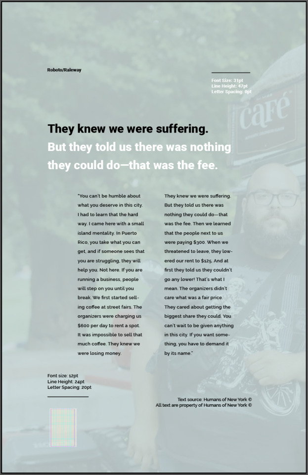
The poster shown above is a poster that I created for our Font Pairing and Grid Structure exercise in InDesign. The poster is about the Humans of New York, which is a series of photos of street portraits and interviews that have been collected off of strangers in the streets of New York City since 2010. This project was very beneficial to me as I have not used InDesign that much. This project helped me learn the basics of InDesign while being able to visually see how a well composed poster should be put together. The font pairings that were given were also super beneficial so I could scroll through each pair and compare the two, so I know in the future which types of typefaces work well together. If I were to go back and change anything, I would maybe increase the leading or font size for the body copy a bit more as I feel that once it was printed and put up, it created a bit of gray area and was a little eligible. As described in Chapter 1 of our textbook, typography has a lot to do with visual communication. I was able to complete this poster, design it, chose fonts and the compositional layout of the poster in order to portray the message of this particular Humans of New York story.
1 note
·
View note
Text
I really enjoyed this 99% Invisible podcast, Mexico 68.Although Lance Wyman was very talented, even at a young age with no much experience, his design for the Mexico 68 Olympics was very well executed. I really enjoy the ‘opt art’ style that he used to create this logo and to create this sense of movement. I think that Wyman’s choice to include or borrow, or as the podcast put it, “riffed off,” the 5 Olympic ring symbol, was an important part of the logo that needed to be added and made the design and logo more cohesive but complex so it is identifiable as the logo for the Olympics being held there. Although I do enjoy his design for this logo, I do find it odd that they chose someone who was not from Mexico and had never visited to create something that they wanted to be identifiable to Mexico. The creation of the typefaces, logos and design for apparel and other parts of the city creates a sense of unity throughout the city during this big event. With others may believe different, I enjoy that for some of the items the design was later used for prior to the event, like the event tickets, the logo was altered slightly and did not have the same movement that the original design did but it still was identifiable to the logo and still created movement thought the ‘opt art’ style. As everyone knows, the Olympics is a huge nation-wide event. I found it very brilliant and creative that Wyman decided to design the icons to be across the entire city to help people navigate around the city and during this event. Since the Olympics is a nation-wide event, there are many visitors, not from the area or even the same the country, that travel to attend this huge event. These simple but very descriptive and contextual icons helped those people get around. I find it interesting that these icons were also used for inspirations to improve the metro lines in Mexico city to again, make the city more easily navigable for visitors or tourists which later spread outside of the country and into places like Washington D.C. to help improve their metro systems as well. Wyman, one that had no history of Mexico and the culture and had never visited, contributed greatly to the country over the years that he was there. His one design for the Olympics was later used and altered to describe and bring awareness to issues that were occurring in the city like “The Games of Peace” and later spread outside of the country, which I think is truly remarkable. The meaning of this one design changed among all of the ways that it was presented and used throughout the city.
1 note
·
View note