
Don't wanna be here? Send us removal request.
Statistics
We looked inside some of the posts by realworld25 and here's what we found interesting.
Average Info
Notes Per Post
0
Likes Per Post
0
Reblog Per Post
0
Reply Per Post
0
Time Between Posts
2 days
Number of Posts By Type
Text
17
Last Seen Tumblr Blogs


Fun Fact
Tumblr has been providing a Korean-language service since 2013.
Text
Infographics work:
After doing some research that's shown here:
I decided to create my own version of those infographics that could be used in a work setting or in their eternal memos.
Starting off I decided to make a 1080 by 1080px document in illustrator and added a grid so i could easily create multiple graphics in one document.


After that I started creating a standard person icon that could be used to describe customers or be used as the default profile picture in an app or an account on their website:


It was simple enough so i decided to create a chef icon for employees or to represent important people in the company, This could be used to better convey statistics relating to the company or to employees specifically. Which I feel is useful in a business setting.


At the same time I decided on creating different colours based on the pound bakery branding, which would be good because it allows interesting design choices and designs depending on if you want the outline version or the colour version.


After that I created arrows to be used in company wide statistics. The goal in this outcome being much more function focused then appearance focused, to make the information presented as clear and concise as possible.


Next I decided to create literal PIE charts, to try and add back in some of the humour that is usually shown in Pound Bakery advertisements, plus I feel like it would be a really interesting way of conveying that Information.
Though it was a challenge to make it look like a pie and not make it look bulky or tacky, which I feel like I succeeded in doing by keeping all the Pie elements in the circle shape without adding anything onto it or taking bits away.


After creating those I decided to create multiple more Arrows in the shape of different utensils, mainly tridents, forks and salad forks which worked really well because it relates it back to the bakery aethetic and vibe.
If I was selling these to a client I would show them the range of colours and outlines they could use.


After that I created very simple arrow and bag icons that could be used in a general sense around the company, these could point out key information or sales statistics.
Though if I had more time I think I would try and create an example info graph using these Icons but for now I feel like having them available to use is better then anything.

Despite not seeing these in a proper way I do already dislike the Icons without an outline because it makes the designs less clear and hard to read, comparing this to other infographics I think this is because of the colours I've been using:

This is an example of icons like mine but used in proper context showing how my graphics would be used.
But I don't have the time at this point to do it properly and make it feel as good as the rest of my work, the quality drop wouldn't be worth getting it done.
To do list:
Create finished infographic
Explore different graphics
Experiment with different styles/colours
Work on time keeping skills
0 notes
Text
3D Printing work:

I don't have a lot of screenshots on this because I forgot to document the process, but we where able to 3D print a switch fidget toy off of Thingiverse a online 3D printing website that gave us pre-done models to print.

Despite not having enough time at the moment to 3D print anything I have had a look through the website to see what I could do with it.


Most of which where just seeing what cool things i could print out for my personal use, usually cool anime trinkets and props, though I did particularly like a small dark souls crystal lizard model I could use for my desk.

Apart from that I was actually able to find some 3D models of things used in a bakery, like cutters, molds, Machinery switches? and measuring cups.
With these sorts of resources being really useful if you have a 3D printer but can't afford measuring cups.


This seems like a good avenue to go down, it provides an easy way to get 3D outcomes or proofs of concept, especially since I am quite good at blender I know I could make a few basic things and trinkets.
though I think I'd like to learn a bit more of the process it takes to make a printable 3D model.
From my research as well it seems theres a lot more to 3D printing then just printing it out, as I've seen on this guys channel since he does 3D printing professionally for props and cosplay:
Which is fair enough since this is a medium I've just started learning.
To do list:
Learn software program
Find more 3D prints
Learn how to model with 3D printing in mind.
0 notes
Text
Michael craig martin Advertisement work:
After doing some practice work I decided on doing some advertising mockups using his style:


So first I decided to look on their website and decide on some products to bring attention to, I wanted something that was either not too popular or something that was easily marketable.


So I decided to do a mix of simple snacks like Coffee, Chocolate Eclairs and more complicated bundles like their meal deal and cupcakes.


Since I used the same technique from last post I thought it would be redundant to show the process every time, but during this process I did make a mistake where I made the coffee water look like it was just a hole in the cup.
If you wanna see the process then it's displayed here:


With the eclairs I tried to make them strange colours like in the original artwork that Michael craig martin does but I felt like It didn't look like an eclair, so I changed it back and it looks a lot better and I like how the yellow text looks on the background.
But finishing this I decided to finish the others before fully deciding on if the text was good or not.


This one didn't really pose any issues as I feel like I've gotten the hang of it, Though I'm not as keen on the colours as the other ones.


The fairy cakes was the Last one I did, I chose this one strictly because valentines day was coming up and I felt like doing some art for it.
I love the colours I chose for it because the pastel blues and pinks being really striking and meld really well together, though the cupcakes are more complicated then last time I think that works to differentiate it from the other piece.


Originally I had the text a lot larger then shown before and it made each piece seem crowded and messy, but after I fixed it I was able to make them feel a lot less crowded and messy and I was able to place more focus on the products rather than the Text.


After exporting them all properly I really like how they all turned out, not too simple not too Messy. Out of all of them I think that the coffee and the fairy cakes are the best looking out of them, and to be honest I think I was lazy on the first cupcake I had made but It panned out alright to make it look distinct from the later designs I later made.
If I had time I think I'd try animating these in Adobe after effects or Photoshop, But for now I think it's okay to leave these ideas where they are.
To do List:
Explore more concepts
Create info graphics
Create more posters
Explore cheese-zilla concept.
0 notes
Text
Michael Craig Martin Outcome:
After Researching Michael Craig martin I wanted to do some work on him to see if he could fit in with the Real world brief I had been working on, Though I didn't want to go straight into trying to make designs for it straight away.


Starting off I gathered some reference pictures as well as my own Personal branding guidelines in order to try and create a similar looking piece, I wanted to create some thing that related back to my own punk style of branding and colour scheme to give myself a good jumping off point to experiment.


I started by outlining the Boot and blocking out specific colours in order to create the shape of the boot, and at this point I was pretty confident in this style as I had used it a little before and realised my colours was really good for stuff like this.


After adding finishing up the Boot I wanted to give it a background colour, so using the reference I had used before I picked a colour Michael Craig Martin had used in order to link it back to the original piece a little stronger.

All together I think it was really Cool looking and effective not only as an art piece but as a study on Michael Craig Martin's work, Though it's a bit safe I would like to do more in this style and try adding more Items or add weirder colours or objects.


Using this same technique I took some of their branding and redesigned it in the artists style.


And after getting the feel right I used a sans serif font, Ariel black bold to recreate the lettering, before changing the colour to include the same classic colours featured in Michael craig martins art.


Unfortunately I don't have the exported file for this piece because I honestly forgot to and can't access the original at this time, so thats some thing to improve on straight away.
But even so I think i've used this style effectively as an advertisement and I believe the concept is really solid. Though because of my little slip up i may have to redo this with a finished piece at the end.
To do list:
Create a finished outcome
experiment more
See if I can incorporate this into my personal art.
0 notes
Text
Bakery Witch idea progression:
Carrying on from the post above I wanted to progress the Bakery witch idea further and as a start I decided to create some sketches for possible designs I could do for her:


I did these designs and annotated parts that I liked and disliked about each one, I liked this idea because it gives the company a mascot that can be used in a variety of ways.
It relates to a younger audience as Anime and Japanese culture have been becoming more and more popular, and as a person in this fandom it really blew up around the release of the first season of attack on titan:

Which makes me think the style will just become more popular with more unique and good shows like Jujutsu Kaisen and Jojo's bizarre adventure, so brands and companies should incorporate some of the elements found in Japanese media.
This has popped up in some places like in the streaming service crunchyroll, the Company AMD Ryzen a major tech company and funnily enough the catholic church most recently.


And while looking at these I found out that theres a name for these types of characters and mascots, Gijinka or Moe anthropomorphism, which is more prominent in Japanese media but can also be seen elsewhere in regular anthropomorphism.
This is shown in brands like Kellog's, Captain morgan and Ronald Mcdonald:


So their is a place for these sorts of advertisements and campaigns, which made me a lot more confident in this idea so I took it a step further.
I was able to work through some ideas and get a version of the mascot I had in mind, Though I do like how it turned out I feel like the shading is off somehow.
I also made two versions in order to properly explore the options, one using a blue colour scheme to try and be a subtle dig at Greggs linking back to their comedic advertisements here:

While I do love it I don't think it get's the point across that the blue is a dig at Greggs and their marketing and just serves as a cool looking background, I looks good visually but I feel like by trying to add multiple concepts into one piece makes the entire thing worse.
So afterwards I decided to do one where the background was more in line with my branding colours.

Though even now I think it misses the mark on what I wanted to do, but at this point I think I want to redesign the character too take more from my original concepts.
The art isn't bad but I don't think it's the most effective way of doing this concept, and would like to take more from my original designs like these:
I think I lost some of the witchy elements and uniqueness of my previous designs in trade for sex appeal, of corse with things like this especially Moe anthropomorphism it is a big part of the appeal so i'd like to find a balance between the two.
Next steps:
Redesign Witch
create poster mockups
0 notes
Text
Conceptual Art Work:
Today we where looking at Conceptual art and how it relates to graphic design, I came to the conclusion that It's a very thin line between conceptual art and Graphic design and the main difference is the idea behind it rather than the Execution.

Some artists that we where shown for this blur the line especially to me, I picked out three that stood out to me a lot since they called out to me through their use of interesting concepts, bold design choices and general sense of playfulness.
One of them being Micheal Craig Martin in particular because of his work with every day objects and very colourful graphical style that I feel like lends itself well to advertisements and Graphics.


Researching This further I really like his style of art as it pops really well and harkens back to old Pop artwork like the ones of Roy Lichtenstein or Andy Warhol, and I feel like I could recreate this type of art for the work I've been doing for Pound Bakery and even do it quite effectively since I do use very bright colours as well.

I could do some thing like this but with A set of food items or kitchen utensils so I can relate it to the work I've been doing.
Another artist I rally like is Yayoi Kusama a Japanese contemporary artist that Specialises in Infinity rooms, Statues and pattern work which look visually striking and really pretty to look at which i really like.


Her unique style of interactive and tactile art is really cool and unique, her shapes and form language are very natural looking and bright giving off an air of boldness, confidence and cheerfulness that I adore it really fits in with the type of art I'm drawn to and the entire style is just interesting to look at.

I would like to do some thing like this but try and adapt it to my style as I don't think I'll have the time or resources in order to create some thing as big as a sculpture or as complicated as an infinity room, maybe I could do some thing with patterns like a really colourful zentangle pattern that I could then add to my graphics.
Lastly the art of Damien Hirst is Interesting as hell! It's very macabre and experimental, his art ranging from fancy performance pieces and surrealist art to stunning intricate abstract art and wall murals.


His art beautifully balances between morbid and fantastical particularly with his performance pieces like 'The impossibility of death seen through the eyes of the living' which shows a dead shark in three equal containers that can be pulled part into segments that can be examined individually.
I feel like this is to show that the shark is dead yet living because of the lifelike way in which it's been posed, creating the disconnect where we perceive it to be alive because of the pose though we only can be sure that it isn't when it gets puled apart into segments.
I'd like to add this sort of conceptual art to my own work, as I think I'm not very good at coming up with concepts and I think It'll be a good skill to develop fully for my future work. And I think the best way to do that is to try and bake it into my creative process.
To do list:
Create outcomes based in my researched artists
Do more research into chosen artists
Look at ways to incorporate research into real world work.
0 notes
Text
Ideas generation:
Most of my ideas I wont walk you through because I feel like that will be too monotonous especially for some of them that I don't really like but i'll show all the ones I've done before explaining some that i like and some I don't like


All of these came from an ideas generation activity where we where encouraged to straw away from doing work on the computers, I feel like this helped me a lot since I have a pension to pigeon hole myself into doing one idea and not explore the options I have.
Ideas Narrowed down:
The Bakery Witch:
Admittedly this is one of the worst drawn ones but i feel like it mixes a lot of the ideas that I personally have as keeping some ideas that the pound bakery advertising already have, I could mix in my love for Anime and goth aesthetics with pound bakery's tongue and cheek humour, and pension for complicated graphics.
Some inspirations I found while searching for the bakery is a game by the same name on steam which I really like the idea of and I've seen gameplay and it's a really wholesome idea, And i'd like to have tat same comfy feeling From this idea:

Morgan La Fae from Fate is another one because she's a witch and i'd like to draw on her for the anime elements I want to add as well as her colour scheme and deep lore with old British history, which I'm immensely interested in anyway but i feel like would be a good match for a very British brand:
And as well I could draw on just general ideas of witches which i've shown through an Ai image i've found because I feel like It would be a good tool in order to create quick and easy idea generation, I would rather quit being an artist however before I submit Ai art as my own work as i don't really like the technique in order to produce finalised work or outcomes:

Pizza-Zila:
For the Pizza-Zilla idea I wanted it to be more like the Terry Gilliam style that I like where I try and draw Godzilla but then layer over it different city scapes and environments to give it that type of collage feel that his art has, Not only that but I feel like it opens up a lot of avenues for me to animate it and do interesting things for it like different monster designs and Puns I could use for Slogans.
Some Examples and inspirations I could Draw from is;
Of corse most if not all of Terry Gilliam's art and his work on monty python, since I'll be using his style of collage as a base. This could also tie deeply into their already distinctly British branding and evoke nostalgia for old TV, that could bring in an older audience with deeper pockets or introduce it to a younger audience that is a lot looser with spending their money.

The original Movie of Godzilla since I like the style of the older movies better especially because they all had a little bit of comedy to them with their messaging and how they use the suits:

Other lesser inspirations I can think of is other Kaiju media like Neon Genesis Evangellian but i don't think i'd like to add too many anime influences into this idea if I'm already using it for other areas of my professional work:
One of the only other ones is old medieval art work and depictions of dragons and Monsters to try and make the Connection to Terry Gilliam and Monty python stronger and hopefully nail the style better, and i'd like to try and get that sort of tapestry stye into my work or even sort of :

Squeeze bottle:
With the squeeze bottle I wanted to do a more clever and restrained version of the work I've done before, shown here:
But I want to e better about it and take inspiration from artists like Foka Wolf, he was introduced to me a year ago and I love his comedic way of doing art and the creative way he does each piece is very interesting. This one being really funny to me because i know a lot of road men and they'd hate it:

After doing this I'll have to do some more work on the three Ideas that I've chosen to take forward as well as doing some extra work on a few of the other ideas I've had just to see If I like them or not, As I don't think I can fully rule any of them out without doing experiments on them first.
To do List:
Create more experiments
Focus on three main experiments
Create more ideas
Work on more experimental forms of design
0 notes
Text
Info graphics challenge:
Today we was set a simple info graphics challenge based on Teachers being left in the dark about retirement:

After given some examples we where also given a site that we could go to for info graphics for us to download and use, which i feel like just defeats the point of doing the work in the first place, so I've chosen to ignore it and do my own icons for myself.

Though it was good to know that we should keep all the icons feeling similar, like having or nor having an outline and colours, which I thought was an obvious thing to do but I guess we had to be told that in the lesson.


Out of the three Examples given I feel like it'd be best to use the smaller example below, because I don't need to convey as much information as any of the ones shown above so they'd inevitably be a lot of wasted space and useless added in information to try and offset that fact:

So naturally I started doing Ideas generation on what type of graphics I could do and how they relate to the information presented above in a clear manner, And from these ideas I want to take maybe 4 or 5 ideas that i like and take them further after experimenting with how they look.


Al of these I can relate in some way to teaching and i can already think of interesting ways of showing the percentages using these ions I've thought of.
But I think I was a bit too harsh on the resources I was given before so I had a quick look at the website 'The noun project' for a little bit more research, and I have the same problem as before where I feel like They're too corporate an lifeless for me personally. But from looking at some of these icons I feel like I'm gravitating towards the solid colours and feel because they don't feel too boxed in and rigid to me and I think it gives the icons space to breathe.
the prime example for me is the one in the middle with the black background, I'd like icons that feel like that so thats what I'll be aiming for because they don't feel too boxed in and rigid due to the lack of outlines and the different colours.

Another good looking set of outlines that I've just found is the work of Luis Prado since It embodies what I was saying above way better because of the solid colours and catchy style.

After looking at this I created a few designs from my ideas generation some I decided not to include since they didn't fit, working in square grids so i can make it feel symmetrical and professional:


First I tried to create a graduation cap to try and evoke the image of education and teachers while also experimenting on how I can show the percentages visually before people read the information provided to them.


Te percentage version I experimented with using my Brand colours or creating my own colour pallet with this piece, and I eventually decided on a grey, red and dark navy colour scheme since I imagine that this would be for a separate company rather than for my own work or branding as my info graphics would be more hand drawn and messy rater then clean and corporate.


Using the same techniques I created a few more graphics to show percentages, visually cementing my choice to make it so i used the red and grey colours rather than my own branding.


These I ended up using in my final piece where I added in the information I needed to present, while these ones below I didn't end up using because it wasn't the feeling that I wanted and I felt as if they did't really fit in with what I was doing.


Picking a font that i thought would be suitable I was able to arrange everything and present all the information I needed to from above in a clear and readable.


after this the only thing I needed to do was fix a couple mistakes and label which information is related to which graphic, just making it easier for people to read, as well as just rewording some of my text:

Looking at it I think I did a really good job at doing this work and I feel like I did it in an effective and quick way taking a lot less time then what I normally would, if I had to nit pick I would say that it's safe and clean and a departure then what I'm used to and i'll have to get a second opinion on how it looks since it's such a large difference to what I'm used to.
But apart from that I'll have to apply this to the info graphics I'm Looking to create for my chosen brand.
To do List:
Apply lesson to Pound bakery work.
Experiment more with info graphics
try and add to Personal Branding
Look at other companies Info Graphics
0 notes
Text
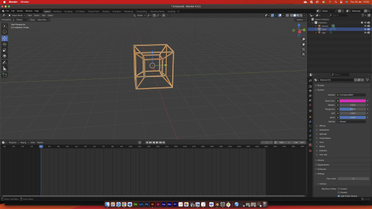
Tesseract Blender animation:
I once again tried to work in blender trying to get the tesseract shape sorted and animated, I had gotten to the point where I had it before where it was a simple mesh shape and much faster this time, but I ran into the same road block again where I couldn't connected the points like I thought I could.
After a few tries of connecting them I still couldn't do it, but thats when I had the genius idea of putting them as the same object with command J.
Doing this i not only got a new UI that I was familiar with but i was then able to connect the different point on the shape with Shift+left click, filling in the faces I needed using the 'F' key.
After that I was able to thicken the outlines to give it that sort of tesseract shape that I wanted while keeping the faces of the shapes transparent.
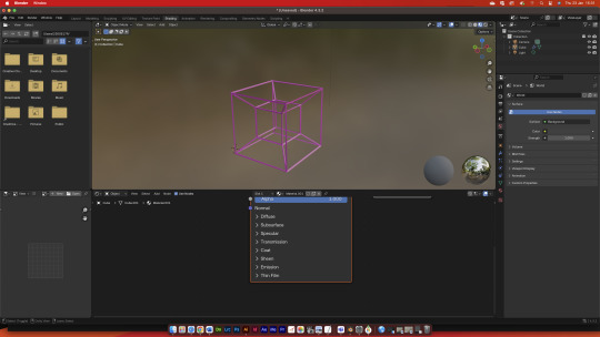
But after that it was a simple thing of using the same key framing knowledge that I had brought over from the after effects work i had previously done here:
Finally rendering it I was able to actually see it as an animation, the rendering process being slow but interesting t watch as the software chugged through each frame.
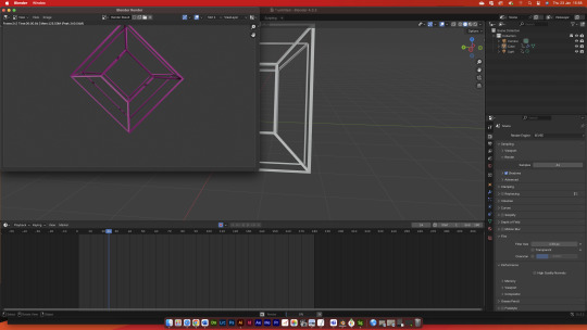
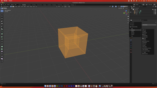
Final animation:
I really like how it came out I love how the shadows mess with the object and scene in general as well as how I used my branding colours (Pink) from my brand guide lines I used previously:
But apart from that I think if i had done this again I'd have to try and keep it in frame as well as adding some more dynamic movements into it to try and make the animation more interesting, that and I think it would be good to try and add more colours and even a background if I am able to.
To do List:
More animation tests
explore more concepts
stay in frame
do similar tests for each concept
0 notes
Text
Pound bakery Poster experiments:
After experimenting with some innuendos in illustrator that I've shown in this post:
I was given this bit of advice basically to try and recreate these outcomes and experiment a bit more with innuendo and skirting the line between what I can and can't show:

So my immediate thought was the more obvious one where I replaced a penis for a sausage roll and my first idea wasn't... good in the slightest. It was funny but i think the way I did it was very good:

Having it cut off makes the proportions weird and I don't think I could find a funny way of doing it and making it suitable for a poster or an advert.


But after experimenting I think I found a way to do it and keep it lewd enough but also safe enough for companies to like, because I don't think that I could explain to them some thing too lewd and still get it across as an actually serious campaign.

Now you can probably see where I'm trying to go with this version of the Pound bakery adverts.


Though I would love to keep the sauce white and try and get it across as mayonnaise but if it looks a lot less phallic I have a higher chance of getting it through and actually approved by a design team or the company I'm working for, but next i needed to recreate the pound bakery logo with my own little spin on it.


Yea I modelled it off of a certain... 'Corn' website that uses similar colours to pound bakery and their branding and works really well with the tongue and cheek vibe i've been trying to go for, adding it to the image I think it works really well as well as funny as hell.

This was my first version of the completed poster and I don't think that it works well just because of the large text, it commands too much of the Piece and makes it too lop sided and heavy.
So to fix this I reduced the side and stuck it in the corner:

This one I feel works way better and looks better as well, I would like to try out different foods and condiments to see if any of those would work better then this one, as well as that I think it would be really funny if I animated it and added in the percussion intro from a certain 'Corn' website as parody .
Apart from that I feel like I could get the colours Better and maybe make it so the orange has the same gradient as previously shown in this post:
To do List:
Animate the poster
Add background music
experiment with different products and style
Experiment with brand guideline and colours
0 notes
Text
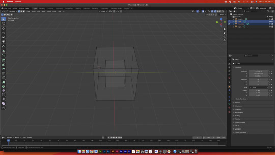
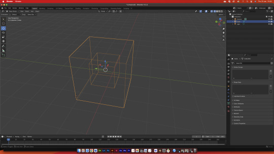
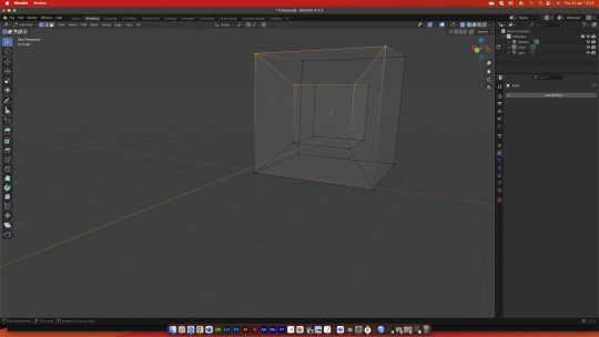
Blender tesseract failure:

After working on the, mind body problem as well as my blender work I had an idea of an interesting way I could create a tesseract without using other ways I would usually do it, I wanted to try and avoid things like illustrator and photoshop since I believe I use these too much in my work.


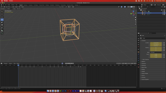
Copying over the cube I thought all I needed to do was just make it smaller and then join the vertices but I think I underestimated how complicated making a 4D object would be, so I thought it would work better if It didn't have any faces and just the edges.


Though even though this looked closer to what I wanted but I still couldn't find a way to connect the corners together to create this kind of shape:

Though I haven't been able to recreate i'll keep trying to get it right so it could have the corner connected as well as animating it to shift and change shapes trying to show how impossible 4D shapes should look, as well as adding a small glow to it.
though I do think it's a good improvement of the concepts I brought up in this post:
I still want to try and make this work but I would like to do that once I've experimented with a few more avenues with the different ideas i've had.
0 notes
Text
Blender Work:

Today I wanted to do some work in Blender because I haven't really done work in it and I feel like it would be a good programme to work in because of it's wide range of features and uses, I do enjoy using it so I have no clue why I haven't included work like this before.


First of all i decided to try and relearn some of the controls especially the ones for selecting the entire object as well as for subdivisions, subdivisions are the orange lines you see and they allow the object to be moulded and interacted with like how points are used in illustrator to define and edit a shape.

After a few experiments where I was highlighting the visible surfaces I could see I finally found the right one and highlighted the entire shape, which i would use later once i had gotten the shapes and proportions of my model made.
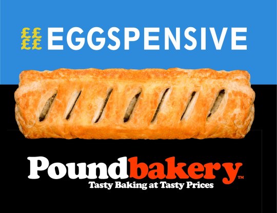
Since I wanted to do work for Pound Bakery I wanted to create 3D assets for some of their products starting with a sausage roll, because it's one of the staples of their brand and one of the most recognisable items on the menu next to the pizza's and their cookies.


Quickly making a cylinder I had contorted and re-meshed from a sphere I took a couple attempts into making it the right kind of shape that wasn't too flat or too round to try and copy the shape of a sausage roll:


After this I added a simple texture to the whole model that was made to try and imitate the texture that Sausages would have when they've been cooked, and I think I did quite well though i could've added more variation in the shape to show the different type of meat or texture thats found in sausages.

I feel like it was successful in making the basic shape of a sausage roll but I wanted to quickly see how the roll would look like once I coloured it in, and I feel like I really need to work more on this part especially as well because some of the sausage pokes through the mesh of the roll creating a blank white spot.


I feel like it was successful in making the basic shape of a sausage roll but I wanted to quickly see how the roll would look like once I coloured it in, and I feel like I really need to work more on this part especially as well because some of the sausage pokes through the mesh of the roll creating a blank white spot.


But for what I was able to get done I think I did really good and this is a medium I would like to explore later on and more in depth.
To do:
Create more models
Learn how to do colours properly
Animate my 3D work
0 notes
Text
Mind body Work:
Today we looked at the mind body problem, which as I understand it is a problem where people try to explain our realities and the relationships between our selves and the world around it.
Some of the more popular ones being:
Dualism: The mind and body are distinct entities that interact to form our realities.
Property Dualism: This view holds that there is only one kind of substance (usually physical), but that this substance has two kinds of properties: physical properties and mental properties.
Epiphenomenalism: Is a theory that the mental state is a bi-product of the physical reality.
After hearing al this these where my first ideas:

My initial ideas for pieces I could do are:
Idea one:

A completely blank piece of paper, showing that there isn't an answer to this question and doesn't need to be. The fact that the question alone exists shows that we're conscious and influence our realities.
I don't really like this one but I feel like It could be interesting if I did it right And some examples of minimalist advertising have pulled this off really interestingly:


Idea two:

The next idea I had was creating a line of Rorschach tests because they're a common way of diagnosing mental health disorders and conditions which I could try and relate back to The mind body theory maybe adding in a separate textile element to show the difference between how your mind and body experience it.
I could also link this in to some of my inspirations like movies and comics because of the watchmen movies and comic books, as well s some horror games i'm into like Resident Evil or Mouth washing:


Idea Three:

This idea is more inspired by the idea of Mind body problem and Dualism, and i'll be honest mental states in general, bringing fourth ideas of M.R.I scans as well as my personal connection between Existential horror and ideas and cosmic horror showing in this pice the ideas of all three thought processes by showing space as this ever present force and our brain as an empty vessel or the reverse which I feel is a lot more terrifying.
Some images I think would work well and relate this is some M.R.I scans that i've found especially of scans on people with mental illnesses, as well as some cool space imagery I've found like the hand/eye of god or the void in space which in my opinion is absolutely terrifying to look at:


Idea four:

Lastly i had the idea of a Tesseract, which is mankind's simplistic way to try and show a fourth dimensional object in a 3 dimensional space or in this case 2 dimensional space, which I feel like is a good representation of the problem because it's a very complicated concept that we're trying to represent in it's most simplistic form in order to communicate it better with other people and to understand our world and realities better.
Some inspirations for this is of corse the Tesseract from The Marvel cinematic universe as well as other weird and cooky shapes like a Mobius strip or a fractal:


To do list:
Create outcomes
generate more ideas
search for relating branding
work on how to incorporate this into main project.
0 notes
Text
Concepting Training:
Today we did concept training in groups to share ideas and show our process for generating ideas, and I feel like it helped me a lot since I usually pigeon hole myself into only doing one idea :

First as a group of three I helped Oliver generate some ideas with his chosen brand, Forbidden planet, generating ideas from Mascots and comic book styled posters to universe style posters and scoping out his competition.
And I believe this helped him try and find new ideas for his work as well as helping him produce more work to be assessed, giving me as well some insight on what I could add to my idea generation and branding work.


Two of the ideas I personally want him to continue with is the idea of making a mascot for the brand and using that to market it bringing ideas and imagery fourth of old marvel and dark horse comic books,these avenues could also mean he could also expand out into animated mediums as well as 3D modelling work.
some examples I could think of is the 3D marvel art of Scott Christian Sava, because of his professional background in books, games and now run a successful youtube channel as well as his flexibility working in multiple areas like gouache and pen art:


I would love to see where he goes with this and what he produces using the feed ack me and others have given him, though he does like to keep to digital art i think it'd be fun to see him experiment with more traditional art forms.

For another persons work I did't have that many ideas because his work was way further out of my comfort zone then I was used to Though I tried to generate ideas for it, it was a brand that didn't have any marketing outside influencers and celebrities (Word of mouth) and makes 3D printed shoes, What we had settled on in a group was showing how the shoes interact with the feet with my contribution being this:

It's an old advert by Mizuna that shows that the shoes are apart of the foot and that treating them as such is just as important, emphasising how important they are to running and sports as well as the impact that having good quality shoes have on your body and comfort. Though I don't really understand it i'm very interested in where he takes this sort of imagery.

For mine I used the mind map I had previously used in order to make the process go by a bit quicker and I would't have to redo it, and because I have been able to expand on a few of these ideas in the drawings below:


The first idea I had was to go straight back into the DADA style of Terry Gilliam which has become a safe space for me at this point where I excel and don't have to challenge myself, the idea I had for it being a satire of the current prime minister making him shyly hid behind a pound bakery sausage roll while west minister burns around him or something ridiculous happens like London being trampled by a monster or set on fire by flying Swedish fish.

After doing that I decided to make som info graphics to try and break myself out of that rut and force myself to do something different which I actually found helped a lot, getting me to think of different ways I could create graphics and the types of styles that I could use in my work thinking of some simple looking road map graphics, more complicated arrow graphics and a 'pie' chart.

Heres the next step of the arrow designs I had made in the previous post, these ones being both based off of different utensils in the kitchen because it's a bakery but also references to different media that I like.
The first one being a basically direct copy of Ichigo's first shikai from bleach, and it still works because ichigo's knife was originally based off of am oversized Khyber knife which wasn't used for cooking but is still cool to think about:


Secondly the knife next to it isn't actually a knife but a wooden spoon which I tried to turn into more of a pointed shape which I feel like failed since it doesn't look like a spoon anymore let alone a wooden one, so I may actually go back and redraw it so it actually looks like a wooden spoon and not a weird pointy arrow thing that looks crap.
the one after that was cool because I actually learned that theres a spoon specifically for salads that has prongs like a fork, a demonic spork variant if you would, that has one sharper and longer prong that I thought looked really good for an arrow concept.

Lastly the only one I think I need to explain is the trident which I had the idea for when I saw the demon spork, I decided to do this to try and add in my inspirations from mythology so I did the one for halloween style branding and info graphics as Poseidons trident, which now that I think about it should really be Hades Bident because of the halloween implication that it has.


After all this I feel like I have a plethora of avenues I can go down thanks to me having to step out of my comfort zone and help other people with their work, I could do so many things, Like I could create adverts based off of Godzilla monsters or even make some music video looking advertisements or maybe even a 3D animation.
To do list:
Create visuals for ideas I have
Find supporting art inspirations I could use
Do research on niche subjects i'm interested in
Do more work in different mediums (3D, painting, Clay, wood, etc.)
0 notes
Text
Feedback:
Got some feed back from one of my friends about my work, She hardly has an art back ground at least education wise so I think this is the best metric I have for how effective my art was.


I showed her both images and she said that firstly she liked the one on the left because of the colour scheme and the text, while she disliked the red colour scheme and font. On top of that she said she disliked the use of floating imagery and suggested that using full images like on the Greggs gift cards would be better, like this:


Which I do agree with a little, I do think that stand alone images are harder to frame and work with than large images like the ones shown in the Greggs advertisements but I feel like for the things i'm using them for it could work well.
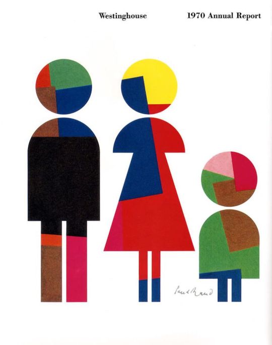
So after that I decided to start working on a new one to try and solve some of those flaws that I saw with it and stick closer to Paul rands style, this time taking directly from this piece:

At first i did try to experiment with unique shapes and forms but I immediately didn't like it especially since I had gotten a square image and had to compensate for that, so i immediately swapped the image out but I still didn't like it!


So after that I simply decided to try and do a one to one recreation of the image but with sausage rolls:

Having it next to my workspace really helped as I had an immediate reference at hand and I was more likely to look at it and take inspiration from it, so I think i'll start putting reference images on the outside of my space in the future for easier access.


As you can see i pretty much just wanted to make it a one to one copy swapping out the colours that I wanted to use and putting them where I thought they looked good, But pretty soon after this I wanted to make sure I was making the best product so I swapped the colours around to see which way looked better.

And i'll be honest I was more partial to the black background as I think it highlighted the brighter colours better and had a much more demanding presence which would be good for an advert.


After that I added text on both background using the same method as I had learnt before in order to make it so the text changed colours with the back ground.
I did intend on doing more with the text but decided on not doing so as to not make it too messy and complicated.
But after this I didn't feel like it was complete so I asked the same friend for more feedback.
A quick side not but I think it's been good for my independent work to study with someone else even if it's just on call, I may get distracted but I feel like the speed and efficiency at which I work is a lot faster and I don't feel as drained as I would if I was working on my own, and I enjoy the small breaks where I help her in her studies as we both are on completely different courses.

But she recommended me add in some pricing and maybe more images as to fill the page more and not make it feel as empty, so I quickly shifted some text around to add a price and add the box I had left out from thats in the reference.


Wanting to copy the style of the original I converted an image of a pound bakery location to grey scale and upped the contrast, after that I went through several experiments as to get a good texture over it in order to make it look like it was cropped out of a news paper or an old magazine.


But after a while I settles on a very paper like texture with a slight bit of saturation as to make it look a little smudged and papery, which I feel like fit the style perfectly.

But adding that in made me feel like i had done a good job and it actually looked good, I'll have to experiment more if I want to truly know how to mimic the style without ripping it straight out the source.
Looking at it now though I'm really happy with how it turned out and the speed at which I worked having got this completed in only a couple hours the actual writing taking longer than the actual process which I really appreciate. I'll love to add more of this style into my work as I move forward in this project.

On an unrelated not I had a few more examples but I couldn't add them because of Tumblr's restriction on the amount of images allowed (Only allowed 30 images), which I feel like denotes either an improvement with how I present and explain my work but could also be a sign that i am becoming too lazy with how I explain my work.
Though I do feel like I've done enough work on Paul rand now and need to branch off into other Artists, and I think I'll work on Terry Gilliam as a little treat to myself after this.
0 notes
Text
Paul Rand outcomes #1:
After looking over some of Paul rands work I decided to experiment with some poster designs inspired by his work, slowly getting more and more experimental and close to his kind of style with each and every iteration.


These where my first two and now I look at it critically it looks incredibly crap, it looks close to the official poster I had taken inspiration from below don't get me wrong:
But I feel like I need to add a few more little details like the different text colours and, bit more text to fill out the extra space and the small gradient in the background. I feel like those small details gives it a noticeable drop in quality and just makes it feel cheap and badly made, especially when put side by side with the original.


I tried to fix this later by splitting the text and changing the colours, I feel like even with this small change it makes the entire piece feel better as your eyes have to explore more of the image to read the text this feeling more natural to western audiences as we're taught to read left to right rather than right to left and i'll have to see if this works the same for eastern audiences.
Though I still think I can improve on the design I wanted to explore more styles in which I could take this idea so I moved on from the more standard Pound Bakery advertisements, below being the full image version of the screenshot above.

After realising their was a gradient in most Pound Bakery advertisements I tried to reproduce it as best as I could, first as a sort of light to dark gradient that i felt was a little off for some reason.


And after some experimentation I realised that it felt off because the gradient they use isn't from light to dark, it was from Orange to a more Vibrant reddish orange:

Recreating it I adjusted the colour until I was happy with it creating a clipping mask so I could easily use it for backgrounds later which saved me a lot of time.
Though its not 100% accurate i'm still happy with it and i know i wouldn't be able to get the exact gradient without knowing the CMYK values they used, which might be something for me to look into later on.


Using this I was able to create more of the branding that I liked, these two i think being a lot closer to the Peter rand style that I wanted to convey thanks to the use of irregular shapes and bold colours.

Not only that but I was able to loop in the more comedic aspects of their branding including innuendo as well as a jab to their competitors, Though i don't know if a few of these might be crossing the line in a professional setting and will have to get them looked at before I would send these off as finished.
Both of these as well looking quite similar to their inspirations:
While doing this i had an interesting problem, I would need to switch the colour of the text between white and orange, so the text would be closer to how Paul rand does his text.
To fix this i created a clipping mask over the black shape before placing the orange text inside it creating the illusion that it was melding into the different colours.


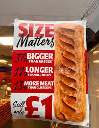
Using this I was able to make this as a final sort of outcome for the day, adding in my own custom graphics and eluding to a dick size innuendo which they've already done in their previous "Size matters" advertising as displayed below:

Though I think this one is the best out of them all i'll need to see how other people react to it in order to see if they get the joke and if they see it as an effective piece of marketing for Pound Bakery, and immediately the one thing i can point out is the lack of logo or discerning imagery that could send someone the businesses way.
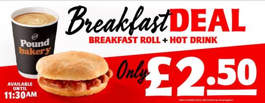
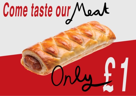
While I was doing that though as well i was working on some red and white branding closer to the ones used inside of Pound bakery:

This one beimg closer to Advertisements like this one:
And to that end i decided on adding in some hand written aspects to it after i had gotten the initial typed font down since it used a different one than before, So after a few experiments i was able to pick out the right font that felt like a match.


Sending it to my tablet I was able to hand write into it creating a piece I believed to be a lot closer to the Original Branding that I was researching, the handwriting helping keep the entire piece away from that mass produced slop that don't really enjoy.
This I really liked as I find the format really effective when adding in the more messy hand drawn elements so it doesn't look too boring to me, Then only complaint I have is that it could do with bolder shapes and that i don't really like my own hand writing.
Moving on from that I produced a couple more that could be easier made and produced on a wide scale and would fit in nicer with their current branding if they didn't like the hand written text, not only so it would be easier but to also show how it interacts with the orange branding as i don't know which I want to use yet:

Putting them side by side I'm not sure which I like better, I think I should ask a friend or someone else I know to look this over and give me their thoughts.
But all in all I think I've done an effective job at exploring my options as well as producing some clear and well informed pieces, and if I could nit pick I think I'd only need to experiment with shapes more and add more recognisable branding in order to keep it closer to the Paul Rand style as well as make sure it's funnelling people to the desired place I want them to go.
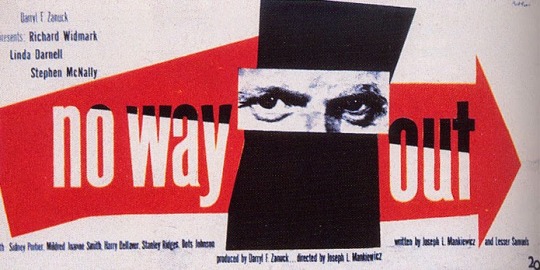
Heres the previous inspiration for them as well as the Artist I had used as reference so far:
0 notes
Text
Pound bakery Guidelines:

Made a quick set of guidelines for myself as a baseline for my work going forward so i have a quick and easy point of reference for things like colours and text.
One roadblock i had when doing this was trying to find a font that matched up with the pound bakery one, having to go through several iterations before landing on the one I had now:


After several of these attempts i settled on the font Adobe caslon bold, it was the closest i could get it without changing it and to get the specific curve of the lettering i had to add an outline of sufficient thickness for the font size, as well as having to mess with specific kerning between the letters.
Pre outline and kerning:

after outline and kerning:

Having done this I'll be able to keep the feel of the brand that i am trying to advertise as well as mess with it enough to feel unique and breathe new life into it, crossing one of my bullet points off of one of my previous lists:
I feel like after this i will need to complete the rest of the points on that list as well as expand outwards to different artists and inspirations, to not only inform my art but push it forward in an interesting and unique direction.
0 notes