
Don't wanna be here? Send us removal request.
Statistics
We looked inside some of the posts by realworldhncproject and here's what we found interesting.
Average Info
Notes Per Post
1
Likes Per Post
1
Reblog Per Post
0
Reply Per Post
0
Time Between Posts
3 hours
Number of Posts By Type
Text
17
Last Seen Tumblr Blogs


Fun Fact
The total number of visits Tumblr.com received during January 2021 is 327 million.
Text
‧͙⁺˚・༓☾ FEEDBACK


I asked for feedback during the last week of the project, when I decided to switch the brand I want to create designs for. I followed this guide, and the checklist on the left to make sure I had everything I needed to. I also referred back to the Formative Assessment sheet. I referred back to the feedback I received in the last project too in order to avoid previous mistakes
‧͙⁺˚・༓☾ CONCLUSIONS ☽༓・˚⁺‧͙ part 1
I tried to challenge myself by choosing a niche company and interest for this project. I believed I can be some sort of change in the world, appealing to things others won't want to. All that changed within me is learning to differentiate between professionalism and hobbies
I ruminated over Toyhouse a lot and wasted about 4 weeks of this project. Although I had several ideas I did not expand enough on it. To make up for it, I tried to expand and experiment with the ideas for Displate as much as I could within a week.
I managed my time poorly, but attempted to be efficient in the last week. I worked the most during the last 4 days of the project, trying to tick the tasks off the checklist one by one, day by day. I thought I wouldn't be able to finish everything but this strategy allowed me to produce everything I needed to, on a minimal scale.
Looking back at my project, I believe I should have added the history of posters and metal posters. I will conduct the research I need, and include it below
‧͙⁺˚・༓☾ METAL PRINTS
Metal art dates back to 7000B.C. but metal prints are a lot more recent. Depending on the type of print, some may say it started around 1180's or 15th century.
Displate specifically, uses a technique called dye sublimination which is a process that started in 1950s. Dye sublimination was used on ceramics at first and, as the name suggest, it uses sublimination to print. Certain dyes transform from a solid form, directly into a gas, which stains whatever it's being printed on. In modern times, this process is also used to print on fabrics, metals and print instant photos, like ID photographs. It's also a more effective way to print because, unlike traditional printing, it penetrates fibres deeper. This makes the pigment almost impossible to wash away.
Displate also playfully showcases how their posters are made:
‧͙⁺˚・༓☾ CONCLUSIONS ☽༓・˚⁺‧͙ part 2
As seen above, I try to correct all mistakes I notice.
Overall, I am satisfied with the amount of work I made in 7 days, and think it is sufficient. I tried showing my progress and processes in detail, but there's always room for improvement when it comes to presentation.
In this project I learned how to make infographics and how to work under pressure. I also earned how to 3D print. We briefly went over it, but couldn't find a use for it in this project. Next brief is for the Final Major Project, which, I assume, is more open ended, therefore giving me an opportunity to 3D print if I wished to do so. During the 3D printing drill I printed "Pochita", a character from Chainsaw Man. I downloaded the model from "Thingiverse". The gif shows Pochita being printed.


In the next project I plan to make my own model to 3D print. I also want to pay closer attention to the brief and put more effort into the sketches I made. Although sketches are not meant to look beautiful, it would be a huge upgrade to have better planning and presentation.
⠁⠂⠄⠄⠂⠁⠁⠂⠄⠄⠂⠁⠁⠂⠄⠄⠂⠁⠁⠂⠄⠄⠂⠁⠁⠂⠄⠄⠂⠁⠁⠂⠄⠄⠄⠂⠁⠁⠂⠄⠄
0 notes
Text
‧͙⁺˚・༓☾ BANNERS ☽༓・˚⁺‧͙
Currently, this is Displate's twitter banner. Although it clearly shows some of the metal posters they sell, I think I can make some adjustments. Similarly to how I enlarged the poster thumbnails for the web design update, I could do the same thing for this banner. I think it would benefit from being enlarged, like so:

The blue background is distracting and unappealing. If I were to remake this banner completely, I would cover the entirety of the banner, leaving no blue background. I think it could benefit from just showing the posters, without gaps between them. I will show exactly what I mean below

I tried to retain the 3d look by adding shadows, and drawing some metallic shine on each poster. Displate's original banner shows the texture and gloss of the posters better. This example is just a draft.
I could elevate this banner by adding the logo of the brand on it. I'll attempt placing it in the corners of the page first.


It's a little hard to focus on the logo if it's placed in the corners. Not to mention the logo would be entirely covered if placed in the bottom left corner. The final option is placing the logo in the middle of the banner.

Already, the logo gives the banner more personality. The logo's placement also looks a lot more natural and beautiful when placed in the centre of the page. I think I can elevate this design even further, by drawing a backdrop for the logo.
The logo's animation is pretty fluid and reminds me of liquid, so for the logo backdrop I can do something similar. Following the brands identity is crucial.

I started with a simple shape and added more and more movement and fluidity to it. Below is what the shape looks like with the logo added on top, and a few effects to make it look more three-dimensional. Some shadows and light.


I attempted adding a few more shadow/lights. This made the design look crowded. I decided to scrap it and aim for the simplistic look.


This is what the graphic looks like on top of the banner I made. Although it already looks pretty good there's lots of adjustments I can make. The graphic does not seem centred either. I will move it up.

To make this design prettier, I can make the dark shadow a different colour, like blue, white or yellow.


I used the blue in the logo, white and yellow. White looks bad, as it clashes with the "D". While yellow doesn't necessarily look bad, it definitely doesn't work as well as the blue.
Now that I decided what I like and dislike, I can make a final version of this banner. The adjustments I proposed did help make the logo look prettier. Even if this is the "final" design, I still have a few ideas I want to execute.


I tried putting a filter over the posters. This was to draw more attention to the logo, while also encouraging the audience to squint in order to understand the images in the background. The longer they spend squinting, the longer they are spending on Displate's page. This is a bit like bait marketing, reeling in the viewer and enticing them to keep looking, eventually buying a product

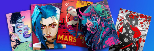
After looking through Displate's collection of posters I found these ethereal cosmic pieces. I wanted to make a banner with this different aesthetic. People enjoy cosmic themes, but it's a bit more niche than Spiderman or Star Wars. It's beautiful, but it won't sell as good as the posters above.
After that experiment, I wanted to see what the graphic would look like on a plain background. I used blue because that is Displate's main colour. The top design is a little eye straining, while the other 2 don't have enough contrast. I wouldn't use these designs in a final piece but I think they were good experiments to conduct.


I realised that the stroke behind the logo looks like Calligraphy ink. These types of ink strokes are popular in Japanese designs and artworks. I thought I could develop something using that idea.

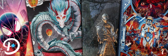
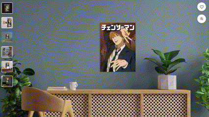
Displate has anime posters. Anime originates from Japan. This banner combines those two aspects.
Displate is a polish brand, so I would not encourage them to use this kind of design for their brand, as it might attract discourse of cultural appropriation. However, if they become a large enough company to make accounts for different regions like this:

Then it wouldn't be a bad idea to use a design like that.
⠁⠂⠄⠄⠂⠁⠁⠂⠄⠄⠂⠁⠁⠂⠄⠄⠂⠁⠁⠂⠄⠄⠂⠁⠁⠂⠄⠄⠂⠁⠁⠂⠄⠄⠄⠂⠁⠁⠂⠄⠄
Due to my time constraints I could only afford to make one banner. I will draw my conclusions in the next post.
1 note
·
View note
Text
‧͙⁺˚・༓☾ ANIMATION ☽༓・˚⁺‧͙
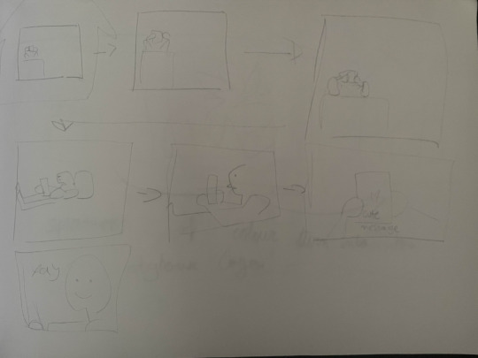
The poster designs showed how timeless metal posters are, but for my animation I plan to showcase how durable they are. I will make a digital storyboard, and follow it to create an animation. My time is tight, so I will only be anle to come up with a single storyboard.
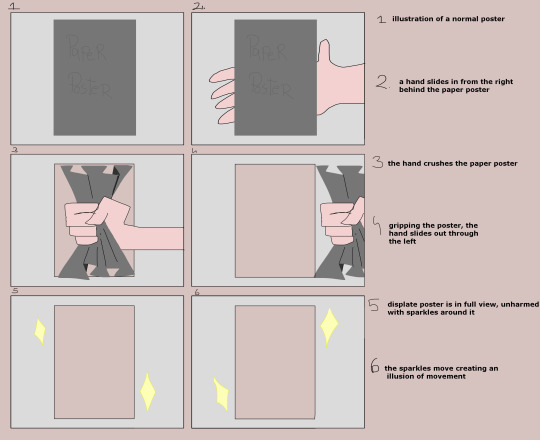
This animation shows durability because you could never crunch a metal plate. If I have time, I will animate the hand struggling to squash the metal.

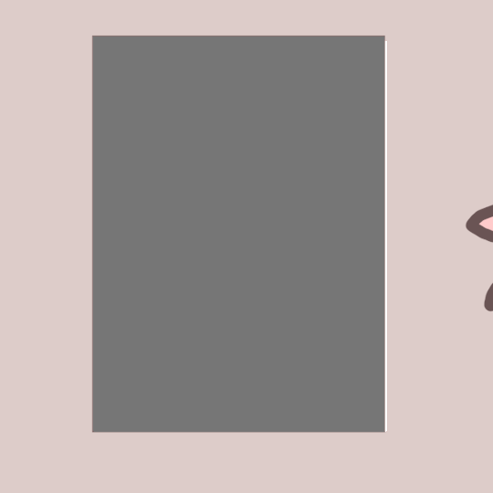
Following the storyboard, this is what the animation turned out like. It's not bad, but there's a few adjustments I can make. First, I want to change the background colour to something clearer, secondly, I could make the poster "fall in" and slam against the wall. The slam without breaking will, again, show its durability. Thus, here is the animation variation, with the above suggestions:

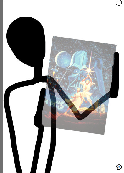
I mentioned I should animate the hand struggling to move the displate posters, and I found the time to do that as well, with my already existing assets. I was inspired by cartoons to make the hand redder and inspired by anime with the way the hand shakes.
I think this animation would've looked better with some text, similar to the variation above.
These animations can be posted on social media. They're different than Displate's usual marketing, which would add some variety to their page.
0 notes
Text
‧͙⁺˚・༓☾ DISPLATE INFOGRAPHIC ☽༓・˚⁺‧͙
To create an infographic for Displate, I will first need to get a hold of their statistics. I was not sure where to get it at first, but then I discovered Similarweb, a service that compiles statistics of any website. This is some of the available information:


With this data, it's possible to make a demographic infographic, and a sales one. I think making a demographic one would be more interesting since I have more data I can use. I will sketch some infographic ideas, using the demographic data.


I thought I should make digital sketches over traditional ones, since they're easier to understand. I also haven't tried this practice before, making it a new experimental process.
⠁⠂⠄⠄⠂⠁⠁⠂⠄⠄⠂⠁⠁⠂⠄⠄⠂⠁⠁⠂⠄⠄⠂⠁⠁⠂⠄⠄⠂⠁⠁⠂⠄⠄⠄⠂⠁⠁⠂⠄⠄
‧͙⁺˚・༓☾ Process

I used Meta Chart to create a pie chart of gender distribution. I thought I could just display the percentages at first, but there is no graphic element if I were to use the numbers. Pie charts are easy to understand, and one of the most effective ways to display data.
At first I used generic colours. I decided to change these colours to fit better with Displates colour scheme. The teal is used in one of Dispaltes banners. I also coloured the icons of people for the same reason.


I realised I forgot to label the bottom left section so I fixed it in the picture above. Compared to my previous infographic, I remembered to add my references on a thin slip at the bottom of the page. It makes my infographic look more believable and professional.
Since I practices making an infographic before, making this one was fairly easy and intuitive.
0 notes
Text
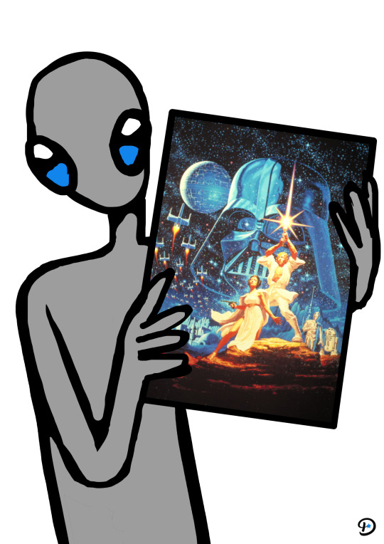
‧͙⁺˚・༓☾ POSTER IDEAS ☽༓・˚⁺‧͙
I came up with some ideas for posters, focusing on some of the most important features of Displate.

The first, third and last poster focus on its durability, while the 2nd poster focuses on its affordability and potential to make a collection out of Displate's posters.
I think the last 2 posters are humorous, but the last one might be a little too intense, as it shows a poster being sat in an activated electric chair. I will draw the poster with the alien since it will appeal to a larger audience, as well as Displate's audience. Displate has lots of Star Wars posters, meaning the customers enjoy Sci-Fi. Aliens are Sci-fi too.
‧͙⁺˚・༓☾ Process

I used the most simple and quick method of drawing, by blocking the main shapes out first, and filling in with colour. I tried sketching more poses, but I went back to the original pose I sketched. I thought it looked cuter and more dignified.


‧͙⁺˚・༓☾ Variation
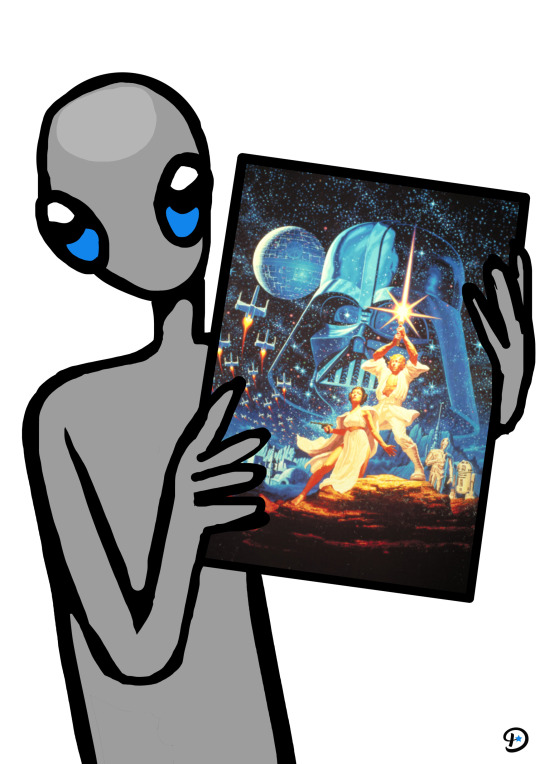
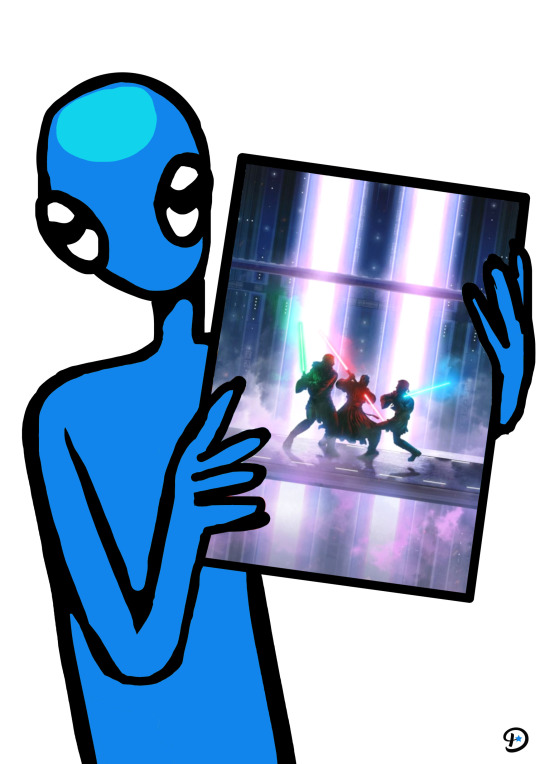
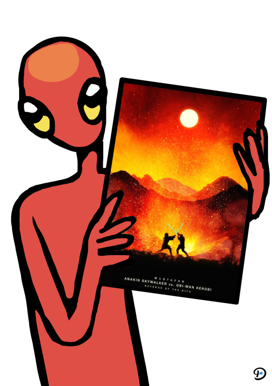

The final versions had the lines around their heads and eyes cleaned up. Aliens of different colours are believed to come from different planets, so I will keep that in mind when adding typography. Red aliens are said to come from Mars, while blue aliens are from Venus. I browsed fiction forums to discover where green and grey aliens are from, and the results were complicated names of different star systems, like Zeta Reticuli. Green aliens are also Martians, but I wanted them all to be different "races", so to speak. I discovered Star Trek has a green alien species named " Orion ". Even if I'm not a fan of Star Trek/Wars, I will use that species name for the green aliens. For grey aliens I will use a general term like... extra terrestrials.
‧͙⁺˚・༓☾ Finals

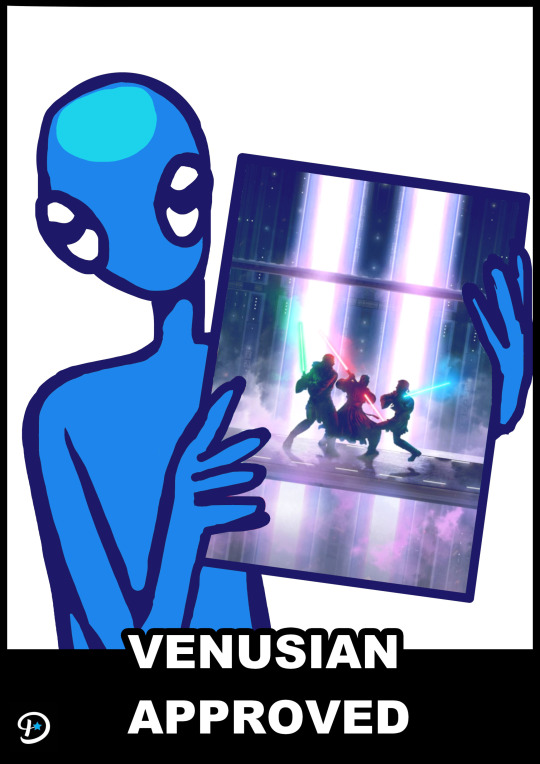
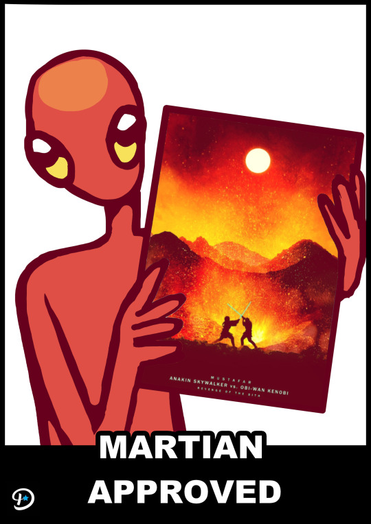

I coloured the lines to make the illustrations cuter and added text as I said I would. They look a bit like internet "Memes", something Displate likes to use in it's advertising.
‧͙⁺˚・༓☾PHOTO MANIPULATION ☽༓・˚⁺‧͙

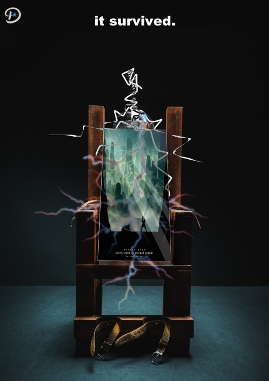
I also tried doing a poster with the electric chair idea I suggested because I knew I make it using photo-manipulation, a technique I haven't used yet. It's a little ridiculous and the poster isn't very easy to see. This experiment was just to try photo manipulation, as I said. I took the electricity graphics from google images and also drew a few lines myself. It's not very obvious due to the electric current, but I edited the poster in a way that would suggest tilting and being lit from above. I also attempted to make it look 3 dimensional with the white outline, suggesting the edge curvature of the poster.

After uploading this image I realised a big mistake. I forgot about perspective and foreshortening. Here is a version more accurate to the real world physics:

⠁⠂⠄⠄⠂⠁⠁⠂⠄⠄⠂⠁⠁⠂⠄⠄⠂⠁⠁⠂⠄⠄⠂⠁⠁⠂⠄⠄⠂⠁⠁⠂⠄⠄⠄⠂⠁⠁⠂⠄⠄
0 notes
Text
‧͙⁺˚・༓☾UPDATED WEB DESIGN ☽༓・˚⁺‧͙

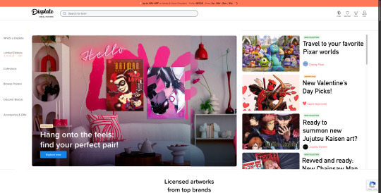
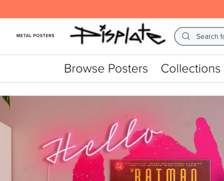
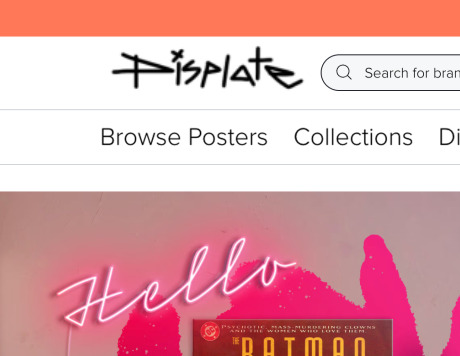
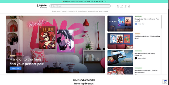
This is the unedited front page of Displate's website. It looks a little boring, and the text doesn't catch my eye, neither do the small featured posters. Below I marked all of the changes I wanted to make

The banner at the top is a countdown for promotional offers, yet blue doesn't give me a sense of urgency at all. I thought I should change the colour to something bolder, or something more out-of-place to get the users attention
I was also determined to enlarge each title displayed on the right, since that will make it a focal point, and encourage users to scroll through that section, seeing all new and popular releases.
I will also try moving the tabs from the top, and line them up along the edge of the page, on the left side. That placement on the top is unusual, and it's a little hard to navigate over it with my eyes.

I was inspired to move the search bar to the left and icons to the right because of Google's interface. I think it's really iconic and easy to navigate placement. It's definitely a successful design, and I will try to achieve the same level of success while making my own redesign of Displate's webpage.
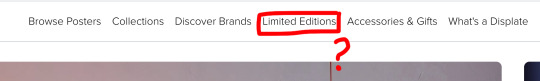
I noticed there's a limited edition tab. I had to look very closely to see it. I should put emphasis on it, since customers might be interested in limited edition posters but might not notice this section at all if they're skimming the page.
I wanted to change all of these thumbnails to poster illustrations themselves, rather than a demonstration of what they'd look like on your wall. First, a customer should be shown the possible product and wonder "how will that look on my wall?". Displate is really successful in showing customers what their purchase will look like in their home, but they aren't very good at inciting them to try it out and experiment. Putting the illustrations over the thumbnails would allow them to be curious, and follow a "show, don't tell" philosophy.

I started experimenting with colours, and making the flash sign brighter. I thought all of these colours are too soft, though green really stood out against the white background. Still, it didn't suggest urgency. I aimed for orange, a colour that's not too bold and not too soft, but dark enough to put emphasis on the " FLASH SALE " aspect.

Below is an example of the updated web page with the changes I wanted to make. I think the right side looks a lot better.

I reordered the tabs and added a countdown below the "limited edition" section. This would better mark it's importance. I think moving the search bar to the left and the profile to the right was not as successful as I thought, but maybe they just need to be lined up better. I made a quick sketch to display my thoughts clearer.
This looked a lot better. I was just missing structure, and I'm glad I caught onto that detail.
While I know I shouldn't rebrand and rework their logo, I really think they should change it, as it would pull the harmony of the website together. The angular look is meant to show ruggedness of metal.

After comparing my reworked website and the original, I realised I liked the top placement of the tabs. I returned them to their places and just enlarged the text to put more emphasis on them. I also noticed the profile icon being so far from the search bar made the website look a little bit disjointed, so I returned them to their original places too. I also made a dark version of the website. White is a little overly-friendly. Considering their target audience, the gamers, it'd be better to also make a dark theme of the website. Gamers are always more likely to use darker apps, like Discord over Facebook Messenger, for example.


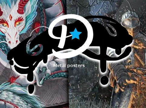
Another thing I noticed, is that the logo is a little small. The original sizing is the figure in the centre. "Metal posters" can also be omitted or placed somewhere else, as shown on the figure on the left.

Clearer size comparison below.

⠁⠂⠄⠄⠂⠁⠁⠂⠄⠄⠂⠁⠁⠂⠄⠄⠂⠁⠁⠂⠄⠄⠂⠁⠁⠂⠄⠄⠂⠁⠁⠂⠄⠄⠄⠂⠁⠁⠂⠄⠄⠂⠁⠁⠂

Here is a final comparison between the original and reworked website. After reviewing the whole post once more, I made some minor changes. I realised that the tabs did not look bad lined up on the left, they only looked bad before since they weren't centred. I also added a graphic around the limited edition tab to bring even more attention to it. I also settled on moving the profile and search bar away from each other.
0 notes
Text

‧͙⁺˚・༓☾ BRAND OF CHOICE ☽༓・˚⁺‧͙
After considering a few brands, I thought I should choose Displate. Displate is a brand that sells metal posters.
Displate's goal is to revolutionize the market, selling posters that are resistant to fading, tearing and degrading overall. The installation of a displate poster is also very easy, sticking them up by magnets on the wall. Traditional posters need things such as tape, pins or blutack to be hung up, which stain the walls and in some cases even rip the paint off the wall. Displate's magnets don't stain and don't pull at the paint job either, making them easy to move around incase you want to reorganise your collection.
This brand was founded in 2013, and has only been getting more popular over the years. In 2017, they became significantly more popular following a licensing agreement with Disney.
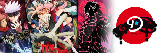
Now, they sell posters of Disney, Marvel, games and anime. One of their most popular posters are from the game League of Legend and it's series Arcane.
Displate has it's own website, and also promotes itself on social media like Instagram, Tiktok and Facebook. The video below contains important information of the brand.
Offering posters with different types of texture is very interesting. A paper poster would never have the option to be textured differently, and even if it had grooves, it'd never shine the same way metal does. It offers a beautiful sensory experience.
Although the marketing isn't bad, I'm not a fan of the logo. It seems generic, and the liquid-like animation on the logo is also outdated.
⠁⠂⠄⠄⠂⠁⠁⠂⠄⠄⠂⠁⠁⠂⠄⠄⠂⠁⠁⠂⠄⠄⠂⠁⠁⠂⠄⠄⠂⠁⠁⠂⠄⠄⠄⠂⠁⠁⠂⠄⠄
0 notes
Text
☾ Change of action
I stared this project aiming to make a campaign for TH, but after truly thinking about it, there is no advertising to rework, making it very difficult to meet the criteria of the brief.
Although I could make advertisement from scratch, that is not what this brief is about. I thought I should change my topic to a more public brand, with more history and a brand that can be accessed easier. Another reason I wanted to change my brand is because of the reception it got. Nobody was very interested in TH when I presented it. I thought I could appeal to niche interests, but it seems that wasn't the case.
There is only a week left in the project, so this very sudden change will be difficult to manage, but with enough work done both in class and at home I believe I can do it.
I practiced making posters, making infographics and website design before. These are all skills I have, and all the skills I should put to use in this last week. I will conduct brief research of other brands I can use, and quickly generate ideas.
I believe this challenge of coming up with ideas under pressure is actually enriching for a creative person. Timed exercises like this are a good practice tool. I refuse to feel stressed, and moving forward I will give it my all.
0 notes
Text
‧͙⁺˚・༓☾ INFOGRAPHICS ☽༓・˚⁺‧͙


Infographics are visual representations of information. Complex data is hard to understand as plain text, and so, it is often displayed as an infographic. The combination of graphics and information lets the viewer understand what's happening more intuitively.
I was tasked with making an infographic out of this information:

These are the steps I followed:


This is an example of that data, put into an infographic:

I avoided looking at it until after I finished my own version, just so I could make something more authentic
I started with sketching the information, making different versions until I produced one I liked.


I really liked the calendar graphic from this infographic. I thought it's smart to have the fallen pages turn into bank notes, signifying how much money you'll need over time, just as the text on the left said.
I made a digital version of it. Only the top graphics are taken from Freepik, while the calendar is drawn by me. The coins are a brush, so they aren't drawn by me, per se.

The background is inspired by light in the dark. It's symbolic of shedding light on the darkness that teachers live in.

The percentages are alarming colours, since an alarming amount of teachers feel uncomfortable with their possible retirement. Viewers are drawn to empathise if there is a sense of imminent danger. The font is harsh for that same reason.
0 notes
Text
Practice animation

While working on the previous animations, I, yet again, had a new idea. This is symbolic of TH's collaborative and social side. Simple gifts or compliments can make someone happy. Below is the storyboard for this animation
I did not follow the storyboard as closely as I could've. I changed the front view from the beginning to a sideview. I thought zooming in on someone's legs from the front is a little awkward. I also had a lot more rotation to animate, which I'm not very good at yet. These were both intimidating aspects I tried to avoid.
0 notes
Text
Animations
I followed the storyboard I made for myself and created this animation in photoshop. It's a little fast, and the ending is a little long. If I were to remake this, I would make the ending shorter.

The colours I used are inspired by TH's teal theme, making it onbrand.
I had another idea while animating the gif above. It follows the same theme, about leaving your own marks, but in a bit more abstract and symbolic way.

Splatters keep appearing until they make a legible shape, TH's logo.
I started animating it, also in photoshop, and, again, following the websites teal theme.

I think this animation has the same issue, being too long at the end. It would also look more interesting if it had some text on it. I could've typed something like "leave your mark" again, or a comment about the splatters.. like "little steps". Splatters are little steps of a bigger picture, the same way characters are little steps in the creation of a fictional world.
0 notes
Text

A storyboard for an animation. This animation is supposed to show process of creation, and how easy it is to come up with your own ideas. " Leave your mark " is an inspiring quote that suggests your creations influence anyone who might see it, therefore leaving a mark of yourself in the world through the things you create.
0 notes
Text


These are some more sketches I made highlighting TH's features I highlighted in previous posts. They're part of my idea generation, and they're all sketches I made before starting the poster in the post right under this one.
I think the first poster is the most creative one. Its a cross section of a house, with different activities going on in other rooms. It was a sketch inspired by the websites name, a toy house. As the caption says, there's no limit to imagination. Playing with characters is no different than playing with dolls, it just gets more sophisticated with age.


0 notes
Text
‧͙⁺˚・༓☾ Poster ideas ☽༓・˚⁺‧͙
While making my posters, I should make it on theme with the features I can advertise. I thought I should make a sketch of my ideas

I want to create a series of posters in different art styles. This variety and diversity is supposed to highlight TH's variety or artists, interests, and art you could find. It's a straight forward idea. To pull all posters together, I will keep typography consistent. That way, it's obvious the posters are part of a series, and aren't standalone artworks
⠁⠂⠄⠄⠂⠁⠁⠂⠄⠄⠂⠁⠁⠂⠄⠄⠂⠁⠁⠂⠄⠄⠂⠁⠁⠂⠄⠄⠂⠁⠁⠂⠄⠄⠄⠂⠁⠁⠂⠄⠄⠂⠁⠁⠂
‧͙⁺˚・༓☾ Liselotte Watkins
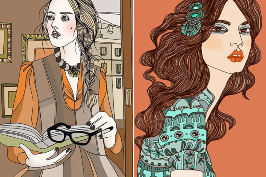
Watkins is an artist known for her variety of work. She does prints, ceramics, fashion illustrations, etc. I will research her way of illustrating and take inspiration from her drawings
The most notable features of her artstyle are the abundance of lines in the hair and fabrics, and the way she draws the philtrum. She uses muted and natural colours, and obviously uses subtle hue and value shifts while coloring the hair and fabrics. The people she illustrates have smooth skin and slightly rosy cheeks. These features make the subject she draws appear very stylish, put-together and elegant. These are all features I am inspired by.
You can find out more about Watkins on CFHILL, an art space.
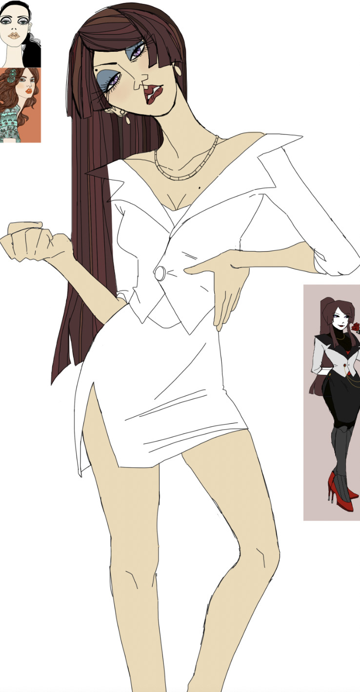
Progress pictures
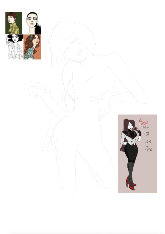


When it came to planning background colours I used Toyhouse's website colour scheme.
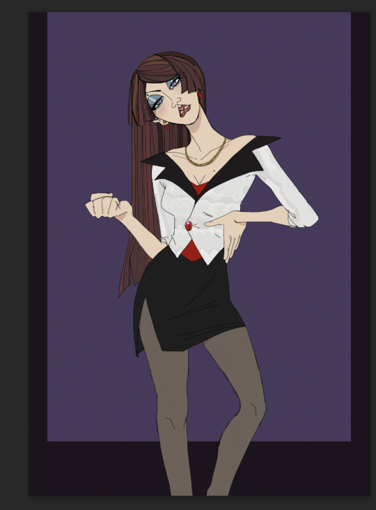
Although the poster was done, I felt it looked pretty empty. I thought about adding text, and since the border of the drawing feels a bit like a magazine cover, I believed adding editorial texts like the examples below would be the most natural course of action


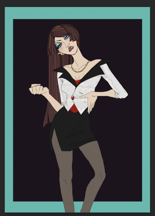
I said I would take inspiration from 4 different themes, and for this specific poster I aimed for an elegant, luxurious and angular look. I illustrated a "femme-fatale" type of character from Toyhouse. I planned to make another illustration of a "maiden in distress" type character, drawn in a more round and delicate art style. These 2 posters would be heavily contrasting and achieve the idea I proposed at the start of this post.

The text from the poster, again, highlights the variety of art and designs you can find. Originally it said something along the lines of "creation is limitless" but I was told that was a misleading caption, leading viewers to believe Toyhouse would have some sort of creation feature, rather than just being an "upload-and-store" site. I changed the caption for a clearer idea of what Toyhouse is about.
⠁⠂⠄⠄⠂⠁⠁⠂⠄⠄⠂⠁⠁⠂⠄⠄⠂⠁⠁⠂⠄⠄⠂⠁⠁⠂⠄⠄⠂⠁⠁⠂⠄⠄⠄⠂⠁⠁⠂⠄⠄⠂⠁⠁⠂
0 notes
Text
‧͙⁺˚・༓☾PITCHING☽༓・˚⁺‧͙
Since Toyhouse was the company I was able to write the most about in my previous post, I decided to focus on this brand while pitching, though I was sure to mention the other brands too.
I went in front of the class, shared my findings, and waited for reactions. I don't think my class has the same interests as I do, since I wasn't met with questions but some confused stares. Although a bit discouraging, I thought I could prove everyone wrong that my choice is interesting and has lots of potential.
⠁⠂⠄⠄⠂⠁⠁⠂⠄⠄⠂⠁⠁⠂⠄⠄⠂⠁⠁⠂⠄⠄⠂⠁⠁⠂⠄⠄⠂⠁⠁⠂⠄⠄⠄⠂⠁⠁⠂⠄⠄
0 notes
Text
‧͙⁺˚・༓☾INITIAL COMPANIES☽༓・˚⁺‧͙
For this project, I want to pick brands that I use or visit often. I also want to pick companies that are also less known, since I have to rework their advertising. A big company would not have advertisements worth adjusting.
My first thoughts were Bluesky, Toyhou.se and Devsisters.


‧͙⁺˚・༓☾ BLUESKY
Bluesky is an up and coming social media and microblogging platform similar to X/Twitter. It has become more popular within the last year, due to user dissatisfaction with X. There is not much advertising that already exists, but there are features worth advertising that I can focus on.
Bluesky was founded in 2019. After research I discovered that its original creation was actually funded by X with the intention for Bsky to be a project. Its purpose was to research how effective a platform where users could thoroughly modify the content they see would be. Bluesky has become an independent company in 2022, ending it's partnership with X.
Bsky still has lots of moderation and filtering options, as well as caring moderators, therefore extreme violence or explicit videos don't circulate it like videos on X do. I often stumble upon extreme violence videos on X, such as fights or crimes, even with filtered words, blocked accounts and preferences set, which really bothers me. I enjoy that Bsky is safer in that aspect and think it's worth advertising.
Most of the population does not like Twitter's rebrand. Bsky has Twitter's nostalgic blue that, when used in advertising, could wittily be used to mock its rebrand.
‧͙⁺˚・༓☾ TOYHOUSE
Toyhou.se, abbreviated as TH, is a character repository, collaborative world building and role play website. It was made in 2014. There is no advertising, since the website remains in a beta state. You can only join via invite codes, which are generated when an existing user purchases a premium subscription.
TH has competitors such as CharacterHub. I searched TH's forums, and many have expressed dislike to CH, saying it looks more corporate, more focused on being a "social media platform" than a character storage site, and forcing users into socialising or interacting with others, resulting in disingenuous exchanges. On the other hand, I've seen users being happy they get more traction or recognition on CH, so it all remains to personal preference. Personally, I enjoy the more private side of TH, only interacting and world building with my closest friends.
There are many features of Toyhou.se I could advertise. Some of them are displayed right on everyones profiles:

I think Bulletins and Library are such nice and considerate additions. It's where you submit and display your written work. These literatures can be wrote in, or out, of character, making them perfect for role play, storytelling, and updates on your profile, content or any other general announcements. This appeals to Artists and Writers. Some people can both draw and write, while some people can only do one of them, or neither. TH doesn't restrict it's audience, so advertising to a broad category of creative people is ideal.
Often, people use the library function to upload F2U/P2U (free/pay to use) HTML profile codes they've made. Although the pictures below are very different, they're all simply altered by coding profiles. So it's not just writers and painters that TH welcomes, but coders too!


Links are also a big collaborative part of TH. Links allow you make notes of relationships between characters, which is often the best part about writing stories.

Worlds - Worlds are exactly what you'd imagine. Uploading word allows you to share a fictional nation, with made up rules, planets, languages and every major aspect of a world. I think creating worlds, new rules, new languages and new traditions is very challenging and anyone who can come up with something like this always deserves exposrure and appreciation for their creation.
Art- If you're only interested in seeing a persons art, independent of characters, the art tab shows all of a users drawings. If they made art of someone else's design, the drawing will be there.
Although TH does not have advertising, they have lots of features to advertise. Coming up with a new campaign instead of reworking an existing one is a risk I'm willing to take.
‧͙⁺˚・༓☾ DEVSISTERS

Devsisters is a game developing company responsible for the Cookie Run game series. They have their own website and different social media pages, like Twitter and Facebook. Devsisters was founded in 2007, but their popularity increased a few years later

Their aesthetic is very cute, and they make use of bright colours. I noticed their engagement on social media has increased with the release of "Shadow Milk Cookie", a highly waited and marketed new character. Shadow Milk's popularity is so high, he even became the profile picture of their official account

If new characters increase the popularity of the game and its traction, making a design contest campaign would be interesting. Design contest are are an ideal way to connect with the player base, and it is often a very sought after event, since everyone wants to have their creations implemented in their favourite games. Some design contests I've research is "Designer Five", an event where participants come up with a design and a set of abilities for their character with a chance for them to actually be used for the game
Designer Five was an event for the hit game IdentityV, and one of the most popular characters to come our of it is the Embalmer. He was released in 2018, but even now in 2025 he receives lots of fanart.

0 notes
Text

‧͙⁺˚・༓☾ INITIAL PLANNING ☽༓・˚⁺‧͙‧
I made a mind map of all the things I could advertise Toyhouse for, both in a professional and hobbyist approach.
People often take commissions, or put their designs up for sale in exchange for real currency. Although the exchange doesn't happen on TH itself, the trades are often planned there. The sales happen via apps like PayPal.
⠁⠂⠄⠄⠂⠁⠁⠂⠄⠄⠂⠁⠁⠂⠄⠄⠂⠁⠁⠂⠄⠄⠂⠁⠁⠂⠄⠄⠂⠁⠁⠂⠄⠄⠄⠂⠁⠁⠂⠄⠄
0 notes