
Don't wanna be here? Send us removal request.
Statistics
We looked inside some of the posts by rebeccamoncrieff and here's what we found interesting.
Average Info
Notes Per Post
0
Likes Per Post
0
Reblog Per Post
0
Reply Per Post
0
Time Between Posts
2 days
Number of Posts By Type
Text
17
Last Seen Tumblr Blogs


Fun Fact
Tumblr has 411 employees.
Text
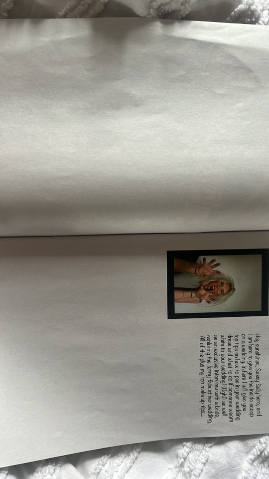
Final product
For my final piece i printed my magazine with the Newspaper club and printed their mini option on a paper feel more than the actual magazine type paper. I was happy with my outcome and i believe i achieved my brief and narrative.
a


0 notes
Text
Digital Sketchbook
Page 22 and 23 i thought would just be another image across the 2 pages as i didn’t want any more writing as i felt as though the last few pages had quite a bit of text so i wanted to break it up.
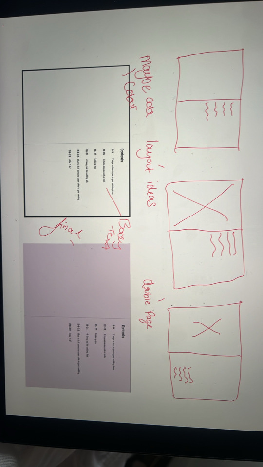
Page 24 and 25 were another tips page so i wanted the layout to be similar to my going to the toilet in your wedding dress page. I added hand illustrations and chose layout ideas similar to the other pages. Again i felt as though this page needed a background colour to break up the white background.

For page 26 and 27 i wanted to use more of my images so i just did another double page spread on 1 image, filling the pages.

To kind of finalise my magazine i thought that page 28 and 29 would be a good idea to give a bit of a guide on what to do after your wedding/ for your honeymoon so i named this ‘ after i do’. I used one of my images we took on my photoshoot which fit perfectly into the idea of this page.

To round off my magazine i just used a 2 page spread with a background colour and a short closing paragraph from the writer.

For the back cover i chose an image that related to the front cover image and had to play around with the lightings to get it brighter as the image was quite dull.I also added a barcode onto the back cover as a lot of the magazines i looked at previously had these on.

0 notes
Text
Digital Sketchbook
Page 10 and 11 i just wanted to keep simple but include more of my images from my photoshoot, so i simply added 1 image onto a double page spread, filling the full 2 pages.
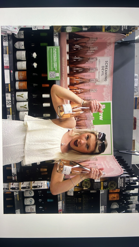
Page 12 and 13 were going to be much more busy as i planned on having this page as an interview page, i found inspiration for this from a different existing magazine but wanted to add my own spin onto it. I had previously interviewed a member of my family and asked her questions about her wedding. For the page i played around with layout ideas and images, i knew that i wanted an image involving alcohol so i made sure i added a image like this in. I also added a wedding like bell in pink to the background of this page as i felt as though the white background was too boring.

Page 14 and 15 i used my comic strip make up photos. This then set the scene for page 16 and 17 as these pages were my make up tips. I again planned out layout ideas for this page and chose out the image i felt worked best as i wanted the reader to clearly be able to see the make up. I also added more hand illustrations onto this page to give it more interest as well as adding a background colour.

Page 18,19,20 and 21 were all going to be my 4 funny real life wedding fails. i originally was only going to have this page on 1 double page spread but i felt as though it was too much and decided to split it across 4 pages which i preferred. Again i looked at ways i wanted to lay out my pages but i ended up changing them during the process anyway. I used funny family wedding images on these pages as well as my text.

0 notes
Text
Digital Sketchbook
I began to begin with my other pages in my magazine and documenting them and their progress within my digital sketch book.
Page 2 and 3 are the first 2 pages and i wanted these pages to have an introduction on what my magazine was about and who the writer was. I looked into layout designs and images from my photo shoots which i wish to use as a photo for my writer. I wanted this photo to be funny and wacky as that is how i feel my writer to be so i picked out the 2 best photos i felt would work the best and came to a conclusion. I made sure to also use my body text on my text. I didn’t want these pages to be too full so i decided to go with a 2 page spread one page being left blank and the other just having the photo on and the text.

Page 4 and 5 i wanted to be a contents page to give my readers an insight to what is in the magazine. When i added my text i felt as though it was too plain so i added a background colour and preferred it much more. I also experimented with layout ideas on this page to see what would look best, i also decided that these pages would be a double spread.
Page 6 and 7 i decided would be a double spread of 2 images. I didn’t want to jump straight in with an article or any of my top tips so i used 2 of my images from my photoshoot that were funny. I decided i didn’t want these to fill the page and i added a black boarder around them to make them more bold. I made sure to not put anything too close to the middle as it may be cut off when the magazine is printed.
Page 8 and 9 were again going to be a double page spread and have on 7 steps on how to pee in your wedding dress. I decided to create this page to give a funny voice for my writer so i came up with 7 funny steps on how you would go to the toilet in your wedding dress. I hand drew illustrations to scan into the page to also add with the funny vibe. I again drew out layout ideas on how i would like this page to look but did play around with it when i created the final page.

0 notes
Text
Digital Sketchbook
Photoshoot 2 plan
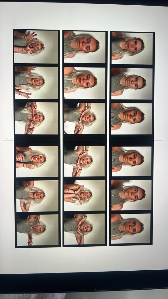
I decided that i wanted to add more photos into my magazine but i wanted a different kind of style to my first photoshoot. This photoshoot would be for a comic strip style page on make up tips and i would like to display this in a way that has bad make up evolving as i do it. I created another plan deciding on what kind of make up and hair style i would have for the photos. I wanted to have a bad/ wacky make up style and messy hair, so i used dark make up and did it really badly and then back combed my hair to make it look really messy. I wanted this page to be funny but from the writers point of view serious and i feel like i achieved that.


0 notes
Text
Digital Sketchbook
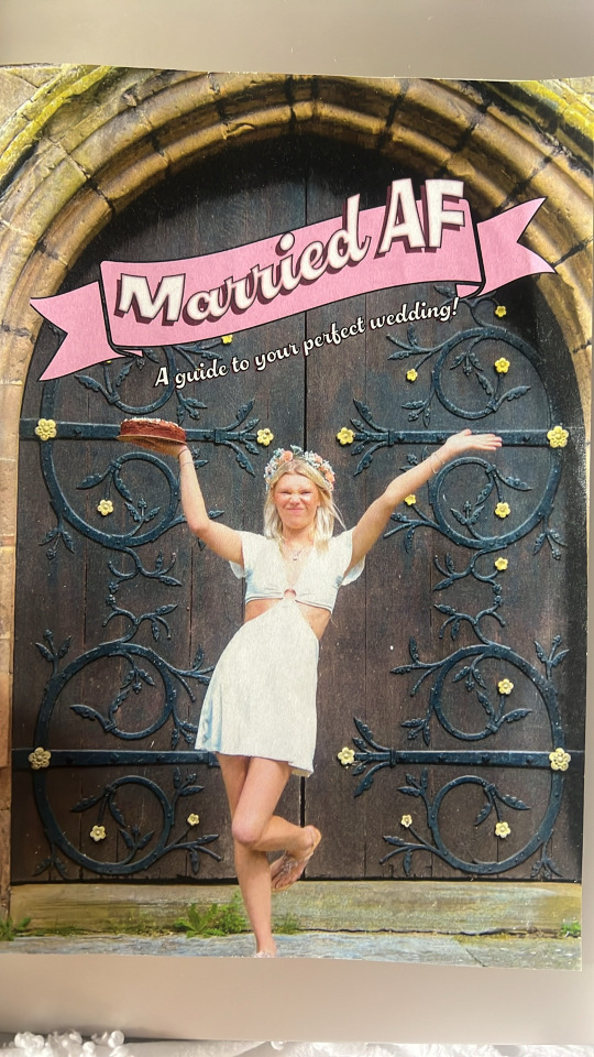
Front Cover
After researching other magazines, I found they had a a really strong front image relating to what the magazine is about, so I picked out 4 images that I liked from my photoshoot that I felt would work for my front cover. I then continued to pick out parts of the photos i liked and disliked about them to come to a final decision. I looked at things like the shade, do they need brightening or darkening? are they funny and silly? is the image strong enough?
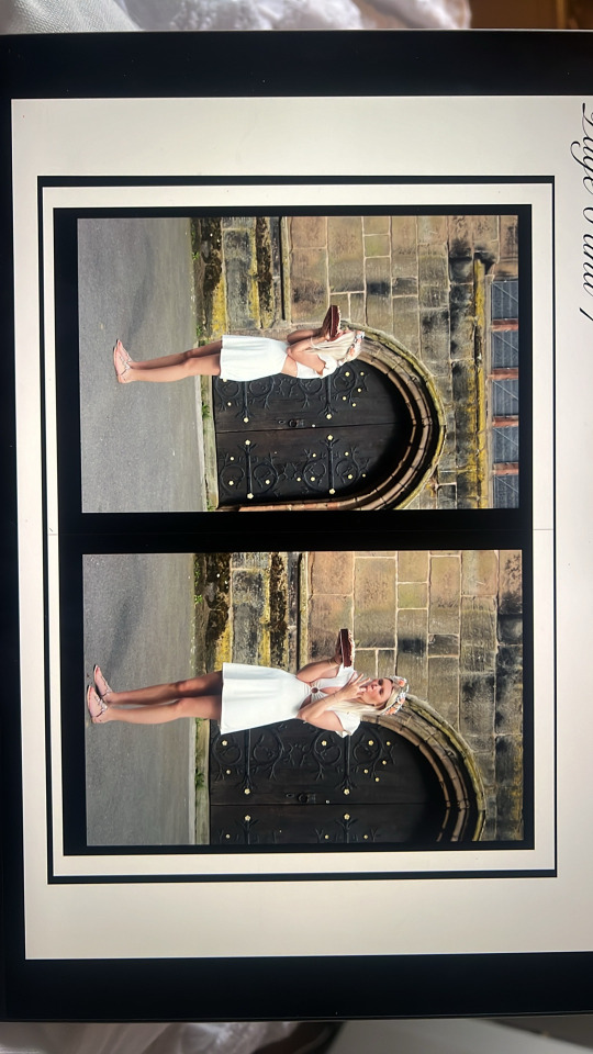
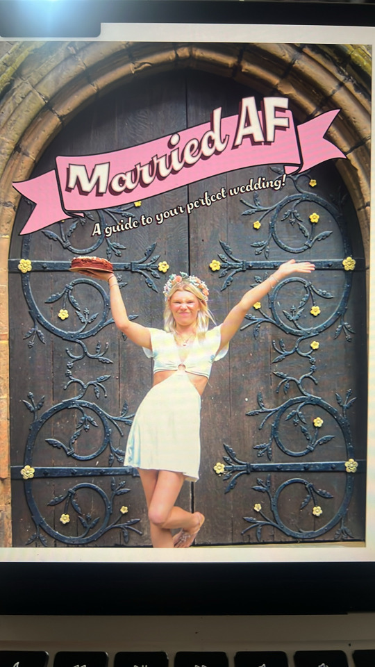
The image below is the final image i chose for my front cover, the original image needed lightening so I used Adobe Lightroom to do this. I chose this image because i thought it was funny and strong as well as relating to my brief, I feel like i achieved this my using the door of a church, a white dress and a cake.


Front cover Inspo
I began to look further into how i would like my front cover to look. I used the Archie and Beano comics as my inspiration, i picked out parts of some of their comic front covers that i liked and used them in my own magazine but giving them a change to fit with my style. The one main thing i picked out was the Love showdown title on the Archie comic front page, i really liked the banner style and bubbly writing and i felt as though it would fit perfectly with my magazine.

Front Cover Title
After looking into the Archie comic front cover i decided that i wanted to create a title similar to that one. I began to create my banner by googling a banner template and copying it into Adobe illustrator, i then began to add colour into the banner, testing different shades until i made the right one. I added my title onto the banner in my heading font Chilli script and playing around with the arc until i found the right size and shape of my title. I then found that the title needed more so i added a black boarder around the white title, a darker shade of pink behind the title to create a shadow and a lighter pink on the inside to create a lighter shadow on the inside. After this i was happy with my title and put it into my magazine to make sure that it worked, which it did so i continued to create a subheading to go underneath the banner. I wanted the words “a guide to your perfect wedding” to be displayed somewhere on the front cover so i decided that under the banner was the best place to put it. I tested the colours on this and found that white with a black boarder worked best.

0 notes
Text
Digital Sketchbook
Photo Editing
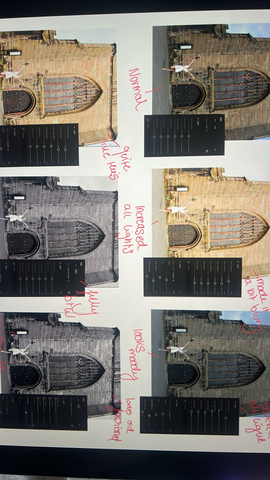
After my photoshoot I believed my photos were quite dark so i decided they needed to be brightened so I experimented the light settings on Adobe Lightroom on my photos, I also looked at what my photos would look like in black and white to create a bit of an old fashioned kind of look. After doing this i believed that just brightening the images they looked a lot better and decided to use those images.
0 notes
Text
Digital Sketchbook
Photoshoot Plan
Before my photoshoot I created a plan so I knew what I was aiming to achieve. I looked into locations, where i would take my photos as well as make up looks, will my make up be simple, chaotic or heavy. I looked into what outfits I would wear and existing photos that inspired me.
I wanted my photoshoot to be funny and informal to relate with my brief, so ideas we had were going to wedding locations such as a church and taking funny pictures like drinking alcohol or eating food. For my outfit I also did not want to make it formal, therefore I did not want to wear a traditional wedding dress, so i decided to wear a casual white dress or playsuit, however after researching weddings and their history, many brides decide to change out of their formal wedding gown and wear a less formal white dress or jump/playsuit at their evening party.

Photoshoot Outcomes
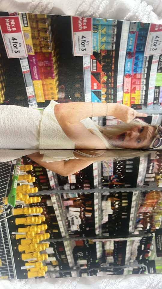
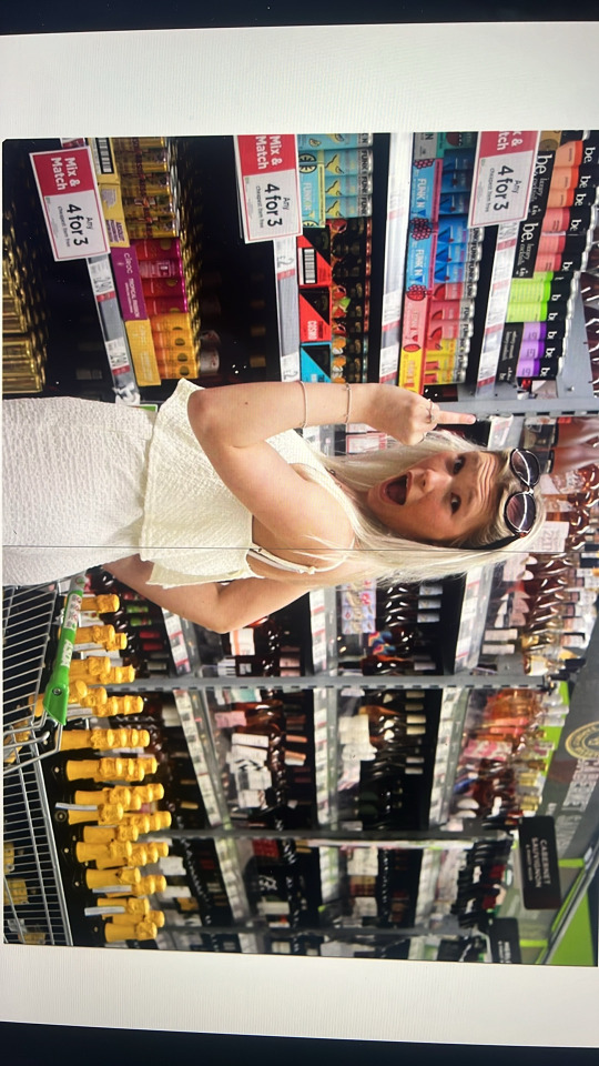
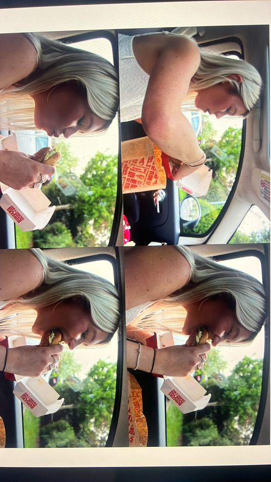
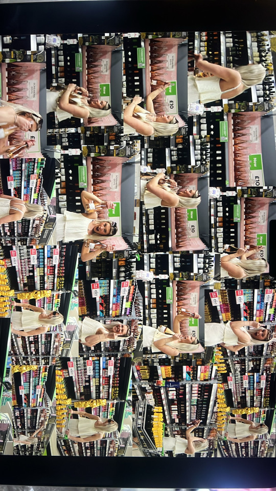
Overall I was happy with my photos, I believe i achieved what I was looking for with the informal funny vibe. We took photos outside a church, wearing a white summer dress, with props like a cake and a bottle of tequila, as well as in KFC car park eating a burger and in a white playsuit and in Asda, our local supermarket, I thought it would be funny to look like i’m shopping for a ridiculous amount of alcohol in a store so that is what we did.

0 notes
Text
Digital Sketch book
Layout Ideas
I used my research on other magazines to create some layout ideas on which i may wish to use within my own magazine.

0 notes
Text
Digital Sketchbook
Font experimenting
For my Magazine I decided that I would like to have my fonts to look quite informal. After researching other magazines I found that the fonts on their magazines were quite bold and bright so i want to make sure that my title font is bold and bright but also not too blocky. I looked at fonts on adobe fonts to help me find one that I liked. They had many fonts on here but i picked out a few to look further into. When looking at these I know I wanted to pick out 3 different fonts, One main font for my main heading, a subheading font for my titles and one for my body text.


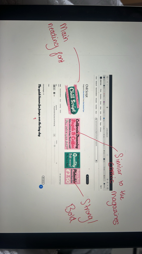
I found many fonts that I liked on adobe fonts. When looking at all the different options I came across an actual wedding font, but I felt as though this font was too fancy for what I was looking for, as well as some fonts being too blocky and or too difficult to read. The fonts I ended up choosing were, Chilli Script for my main title, P22 Nudgewink Pro for my subheadings and Architects Daughter for my body text. I chose the Architects Daughter font for my body text because I felt like it looked like handwriting and that was the voice i was going for, informal and to look like it had actually been hand written.
0 notes
Text
Digital Sketchbook
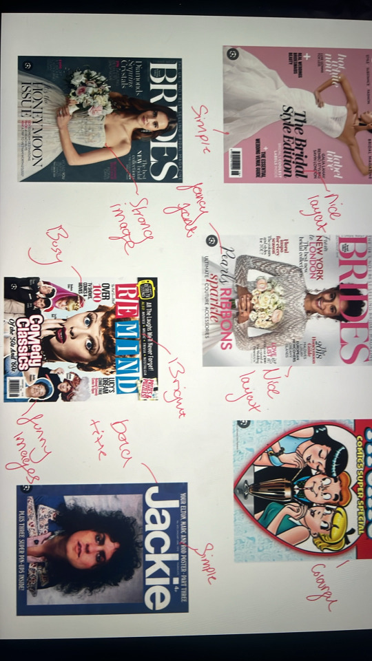
Magazine Research
To expand my research and to help me with my final outcome i began to research existing magazines. I looked at magazines such as Vogue and Dazed to give me some inspiration as well as looking at magazines that actually relate to my brief, such as, comedy magazines, comic magazines and wedding magazines. When looking at these i picked out parts of the magazines that i liked, for example the layout or style of the magazine and used these to create a vision for my final product. I also began to look at parts that i didn’t like so i also know what i didn’t want to include into my own.


0 notes
Text
Photoshoot Inspo
I started to look through pinterest and other photographers photos to see how i would produce my photos in my photoshoot. I made sure i researched funny type of photos and imagery that i could use as my inspiration.


To make mine different i will be wearing casual wedding outfits/ non traditional. For my photo shoot i will wear white play suits or dresses to give my magazine a less formal type of voice as that is what i am trying to achieve.
0 notes
Text
History of weddings
What is a wedding?
A wedding is a ceremony where two people are united together in marriage. There can be many different forms of wedding traditions throughout different cultures. It is a prime function where 2 people can make promises to each other, usually done through vows. According to The Week, the idea of marriage is over 4,350 years old. The first recorded marriage took place in 2350 B.C. in Mesopotamia.
Wedding traditions over time
One tradition that has changed over time is not seeing each other until the ceremony. It was known that if you saw your future spouse before the ceremony it was considered bad luck, however now many couples participate in a private “first look” where they meet in private. Another tradition that has changed over time is the brides maids attire. Bridesmaids attire was considered to have been chosen by the bride and all had to be matching, whereas now many brides allow their bridesmaids to choose their own dresses sometimes in different colours or styles. Another tradition that has changed over time is the throwing rice at the newly weds. During the exit of the ceremony guests would throw rice over the newly weds to celebrate the marriage, whereas now things such as bubbles, petals and even confetti canons are used instead.
The evolution of wedding dresses
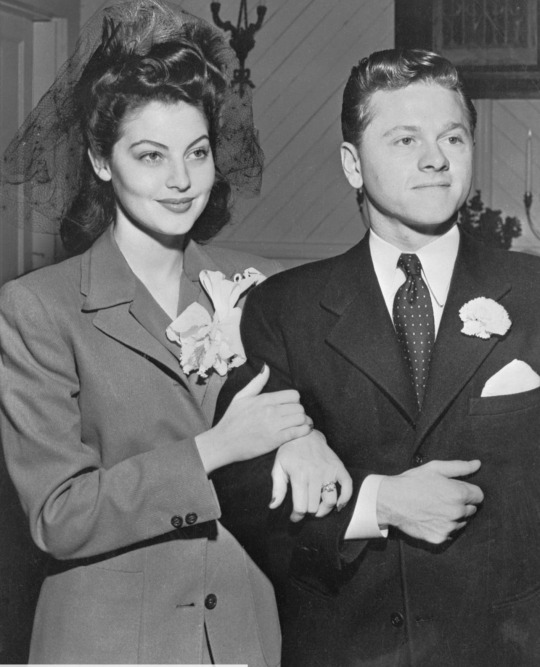
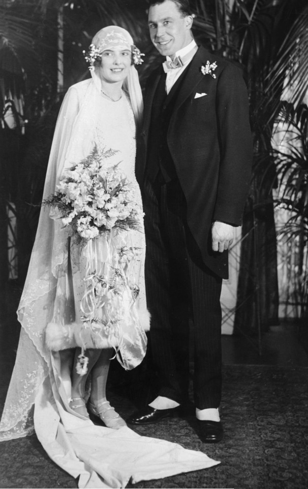
Over time bridal gowns/ wear has evolved over time. Starting with the 17th century the bride would be expected to wear her best gown no matter the colour. Leading onto 1840 where Queen Victoria was credited for starting the white wedding gown trend after she wore a white silk gown when marrying Prince Albert, dress makers then continued this trend. The white wedding gown really took off in the 19th century where embroidered silk, lace, and floral detailing were also popular. In the 19th century, it was also typical for bridesmaids to wear white dresses and veils. A victorian wedding dress was typically a very full body coverage with a high neck, full skirt, long sleeves and gloves. In 1915 brides would go for a simple gown without any extra ruffles or frills, but layers were still strongly in fashion. However here was a big shift in 1920s bridal fashion, as women started wearing sleeker, drop waist gowns. Long cathedral length veils were popular and balanced out the simple silhouettes. Head pieces such as floral crowns also began to evolve over this time period as well as shorter hemlines where dresses would end just below the knee. Brides in the early 1940s were married during the war , so their outfits typically donned formal pieces that they already owned as there was little money and material available for a wedding gown. Queen Elizabeth married Prince Philip after the war was over, however England was still on rations at the time. Her dress was an ivory silk and pearl embroidered scoop neck. Elizabeth Taylor's wedding dress in the film Father of the Bride had a huge influence on bridal trends. Sleek and simple were out, while full skirts, fitted bodices, and sweetheart necklines were in. At the start of the 1960s, shorter shoulder length veils became more popular. Three quarter length sleeves and structured fabrics, like crinoline, were also popular. Elizabeth Taylor's colorful wedding dresses, for her wedding to Richard Burton, started to popularize non-white bridal looks. The mini skirt also started to evolve in the 60s. In the 70s hair ribbons started to replace vails as well as non traditional dresses and people started to wear jumpsuits or matching outfits. Princess Diana's taffeta wedding dress inspired a lot of brides with the "more is more" approach to fashion, with her puffy sleeved and long trained dress. Off-the-shoulder wedding dresses gained popularity in the middle of the 1990s as well as Vera Wang opening her bridal boutique where she specialised in more spaghetti strap style dresses. By the mid 2000s strapless dresses were very popular and brides started adding simple embellishments like lace, to their gowns. By 2010 a strapless dress and a crystal belt was very popular! Kate Middleton made a case for the traditional when she married Prince William in 2011. Soon after their Westminster Abbey wedding, brides around the world started to replicate Kate's lace sleeves. All information for this was found on elle.com, “The Evolution of Bridal Style Through the Years” .


0 notes
Text
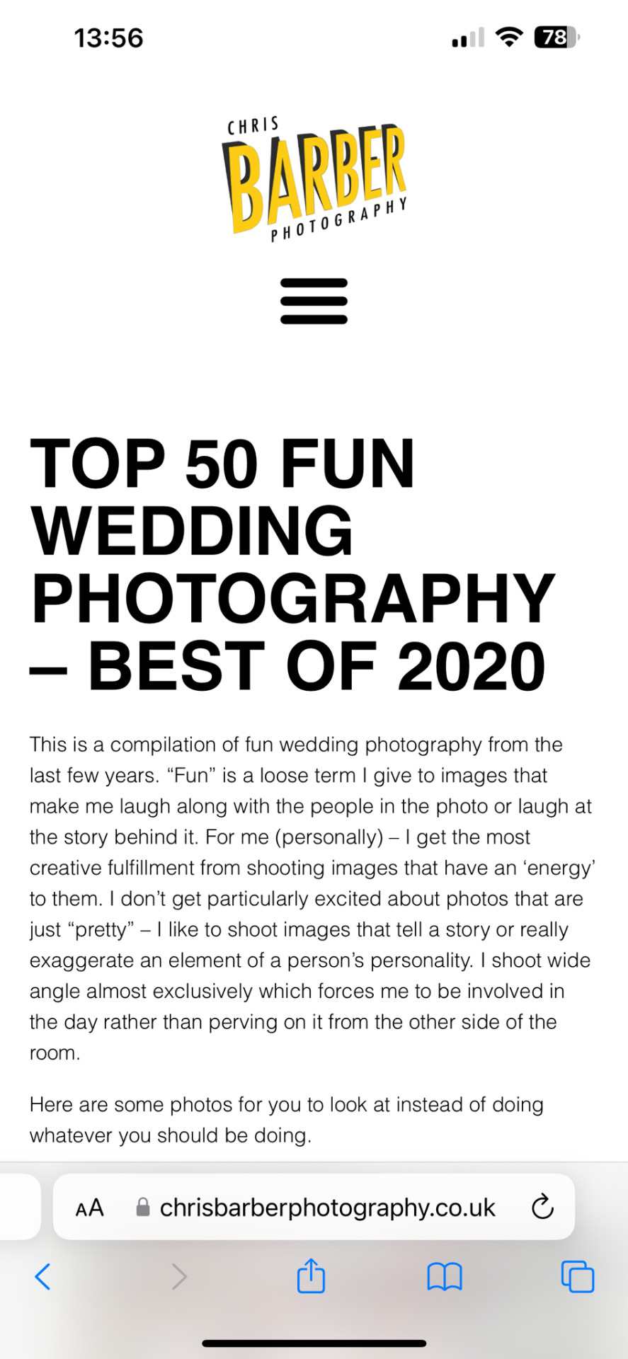
Wedding Photographers
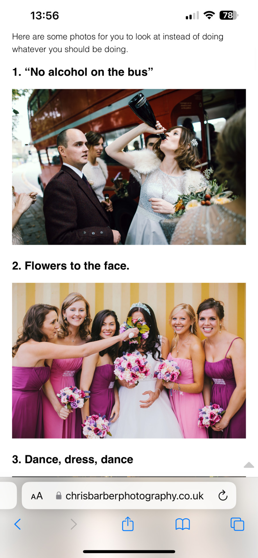
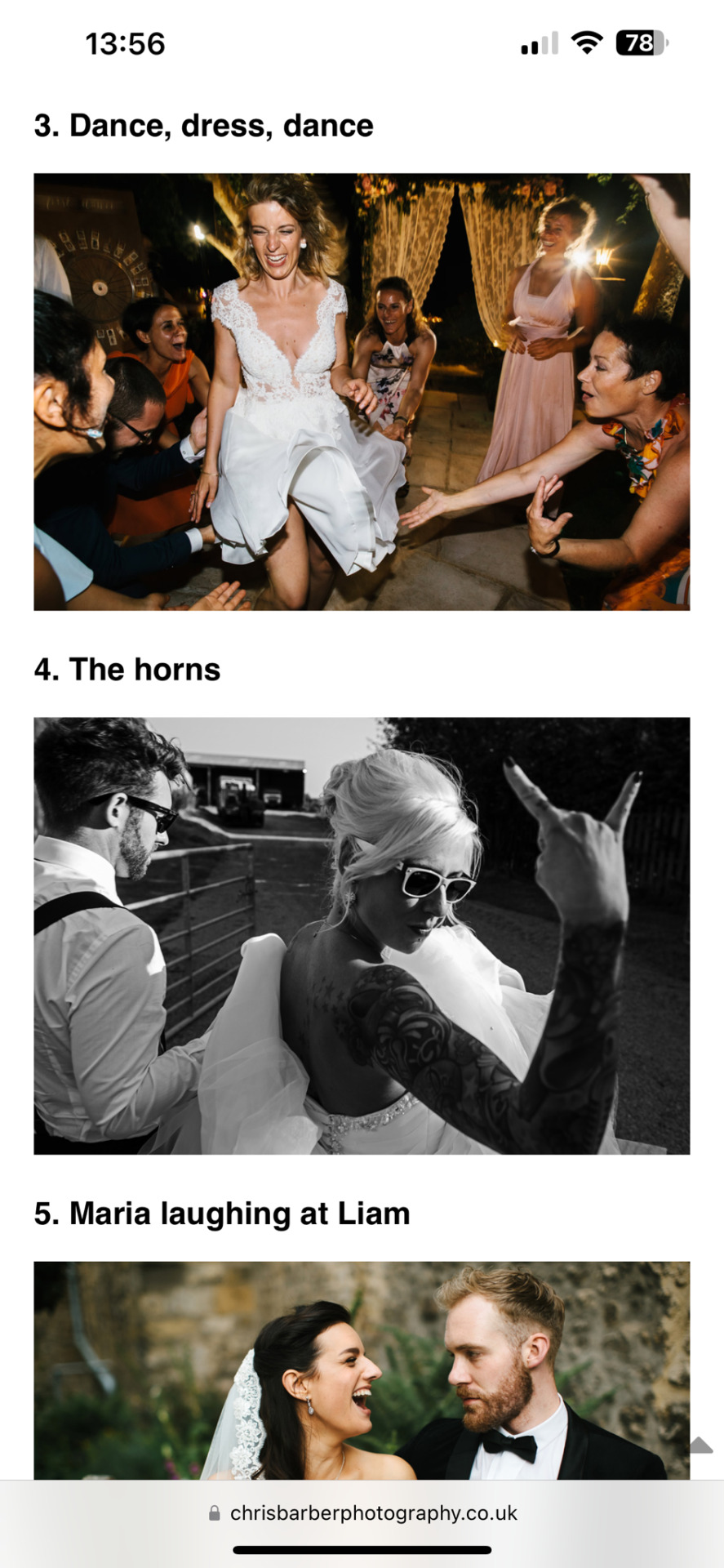
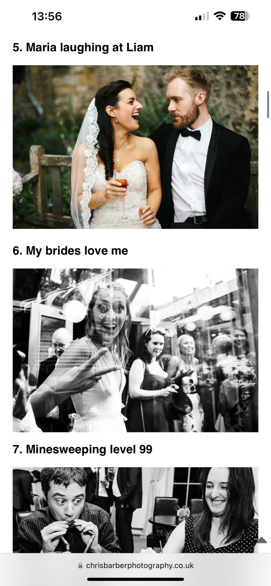
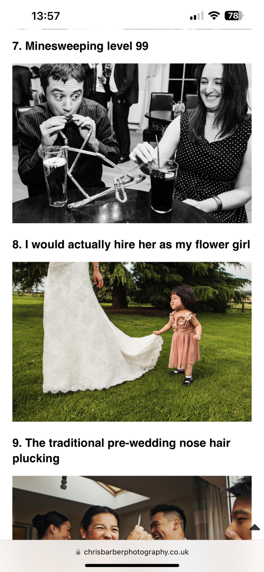
I wanted to look into wedding photographers too help me with my inspiration for my photo shoot. One wedding photographer i found was Chris Barber, he has a website where he has a section called “Top 50 Fun wedding photographs - best of 2020” all of the images on here were fun jokey wedding photos that i would like to use as inspiration for my magazine.
0 notes
Text
Magazine Inspo

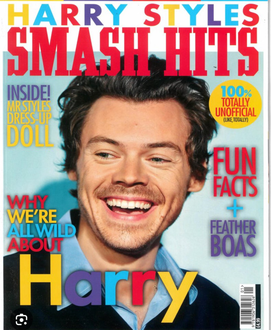
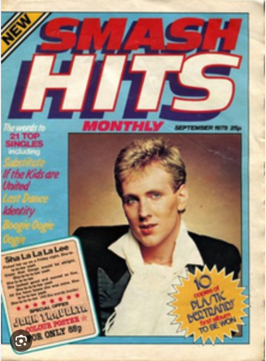
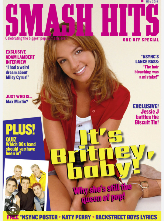


I furthered my research by looking into magazines that more fit the style i was going for. Smash hits was one magazine that i loved as it was bright, bold and colourful it gave a sense of fun and humour which is the vibe i am trying to achieve within my magazine. Another magazine that inspired me was the Jackie magazine. The both have a fun old fashioned kind of style and this is the type of style i would like to achieve. Both of these magazines have a bit of an old fashioned spin on them so i would like to incorporate this style into my work but with more of a modern twist, for example, instead of using traditional wedding dresses in my photographs i will use white outfits, such as a jumpsuit or a dress to create more of a non traditional voice.
0 notes
Text
Less formal wedding outfits/ dresses
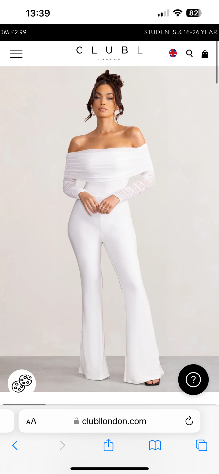
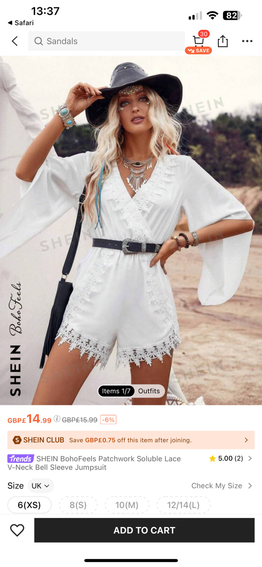
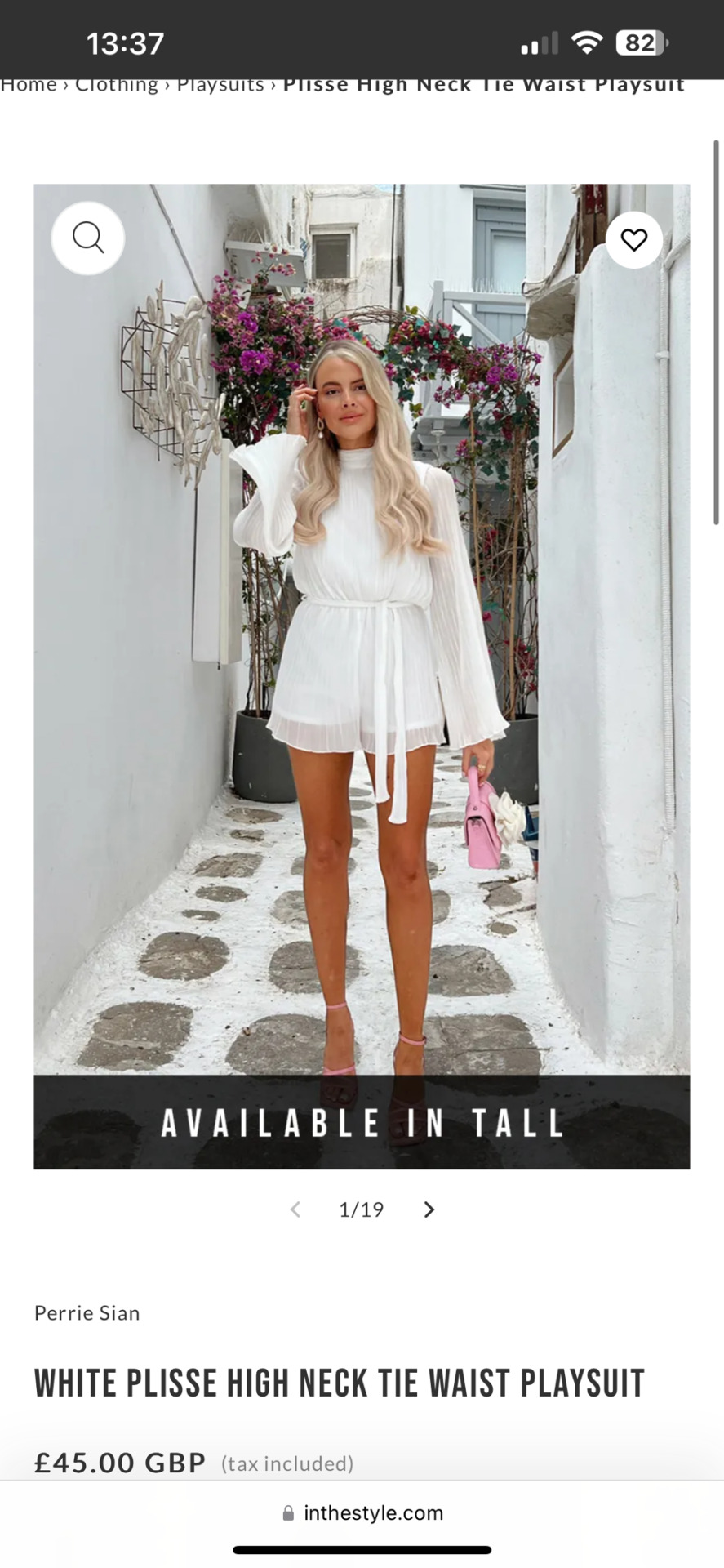
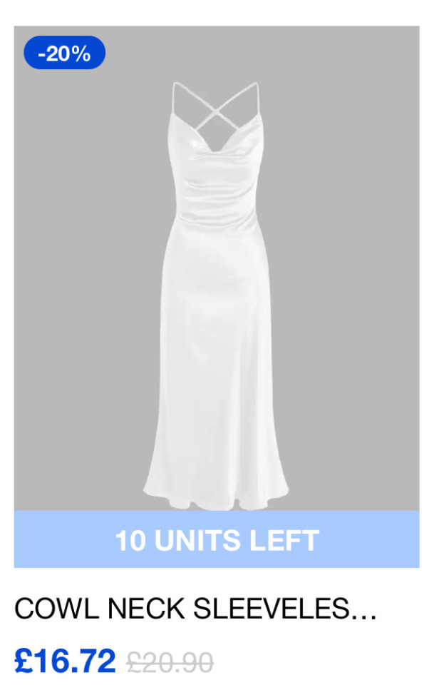
As my magazine is more of a less formal view of weddings, as well as researching traditional wedding dresses i also looked into alternative less formal and less expensive wedding dresses, play suits and jumpsuits. After doing research i have found many brides can’t afford a traditional wedding gown or simply do not want to spend the money so they opt for a more of a cheaper dress or even wedding option. Some brides even have a beach wedding and wear a more simple dress rather than a big wedding gown.
A tradition that has not been popular in the past is wearing 2 dresses on your wedding day. Brides in this generation can have 2 or even 3 wedding dresses for their big day, for example they would wear traditional wedding gown for their ceremony then change into a second dress, usually a shorter or less fitting dress for their reception or evening party.
0 notes
Text
Wedding dress designers
To expand on my research, i researched into wedding dress designers and their gowns…
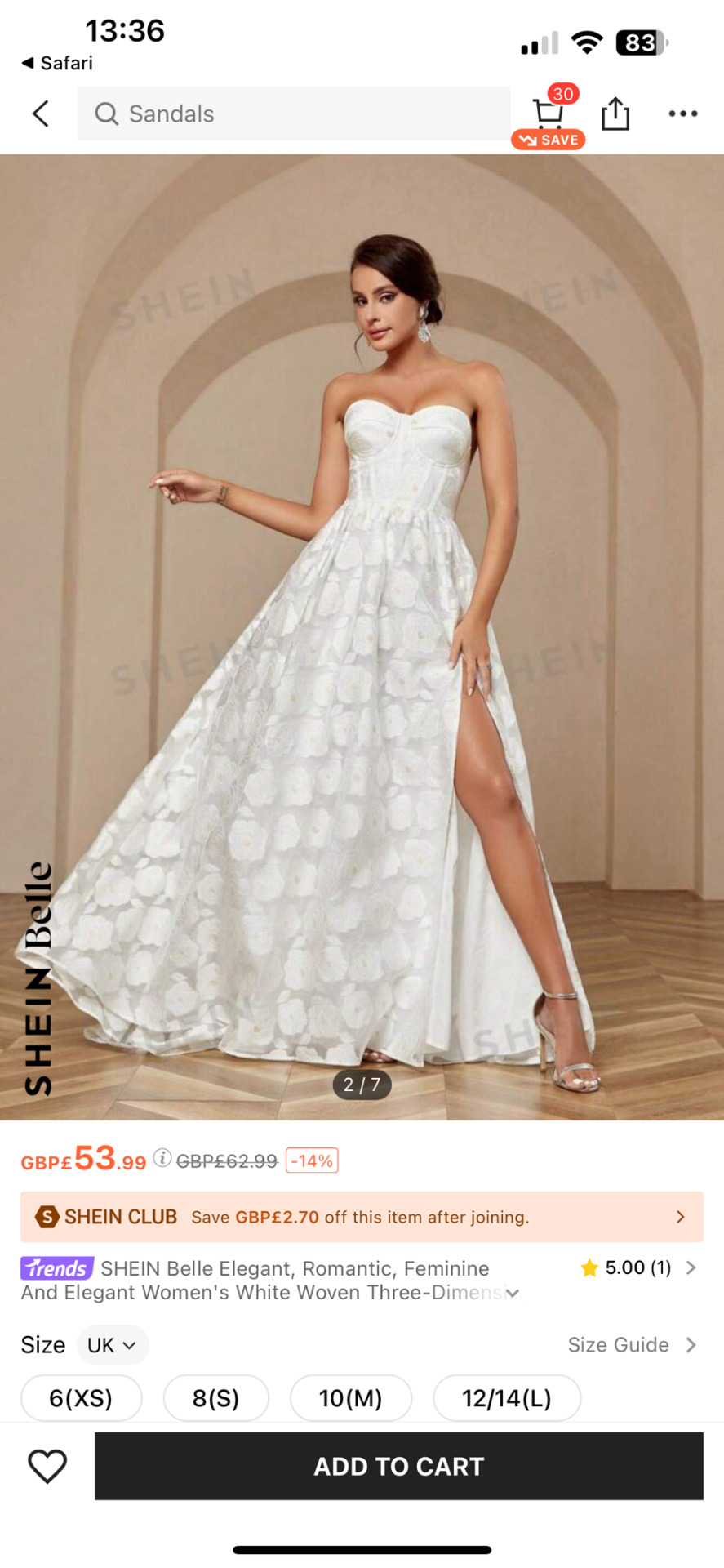
Justin Alexander
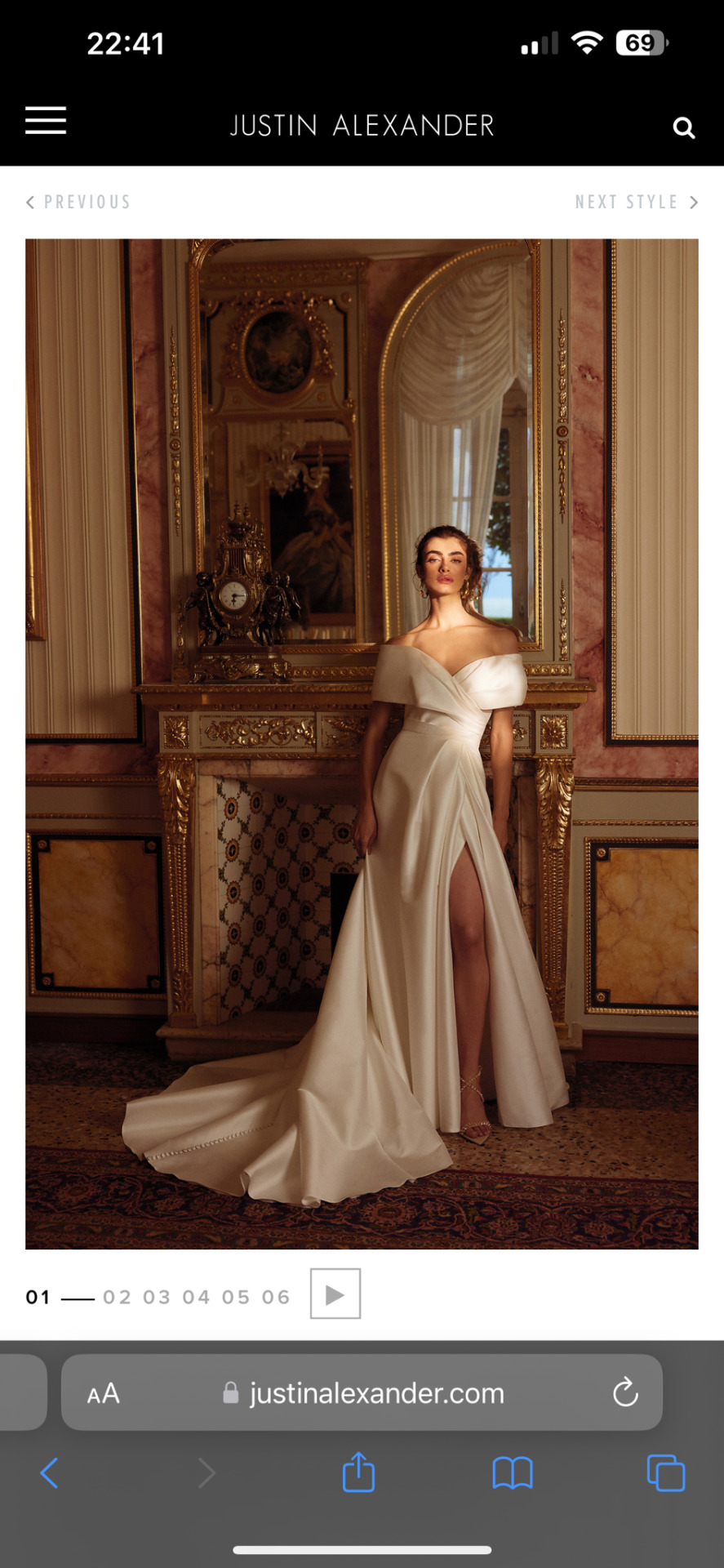
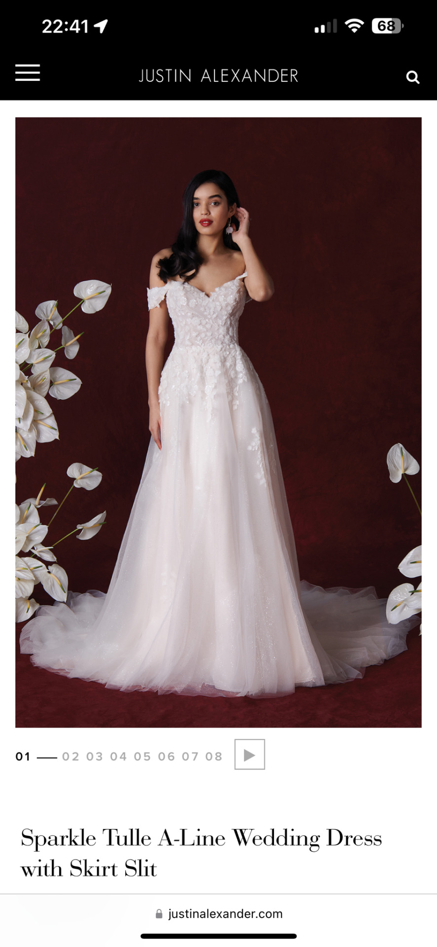
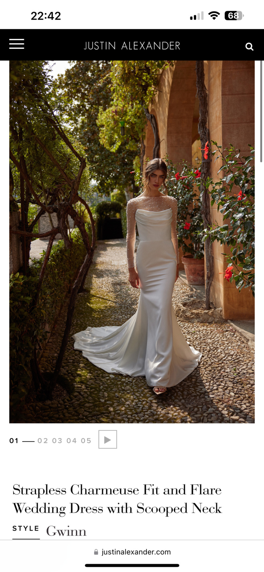
These are 3 examples of Justin Alexanders wedding gowns, He is a bridal designer and manufacturer of mid to high end wedding gowns. He is inspired by the 1950s and 60s collections, He embodies a classic, refined and timeless feel. His wedding dress collection is designed and produced in rich fabrics with hand crafted details to create an elegance with a touch of old Hollywood glamour. His gowns range between £1099 to £3000.
Vera Wang
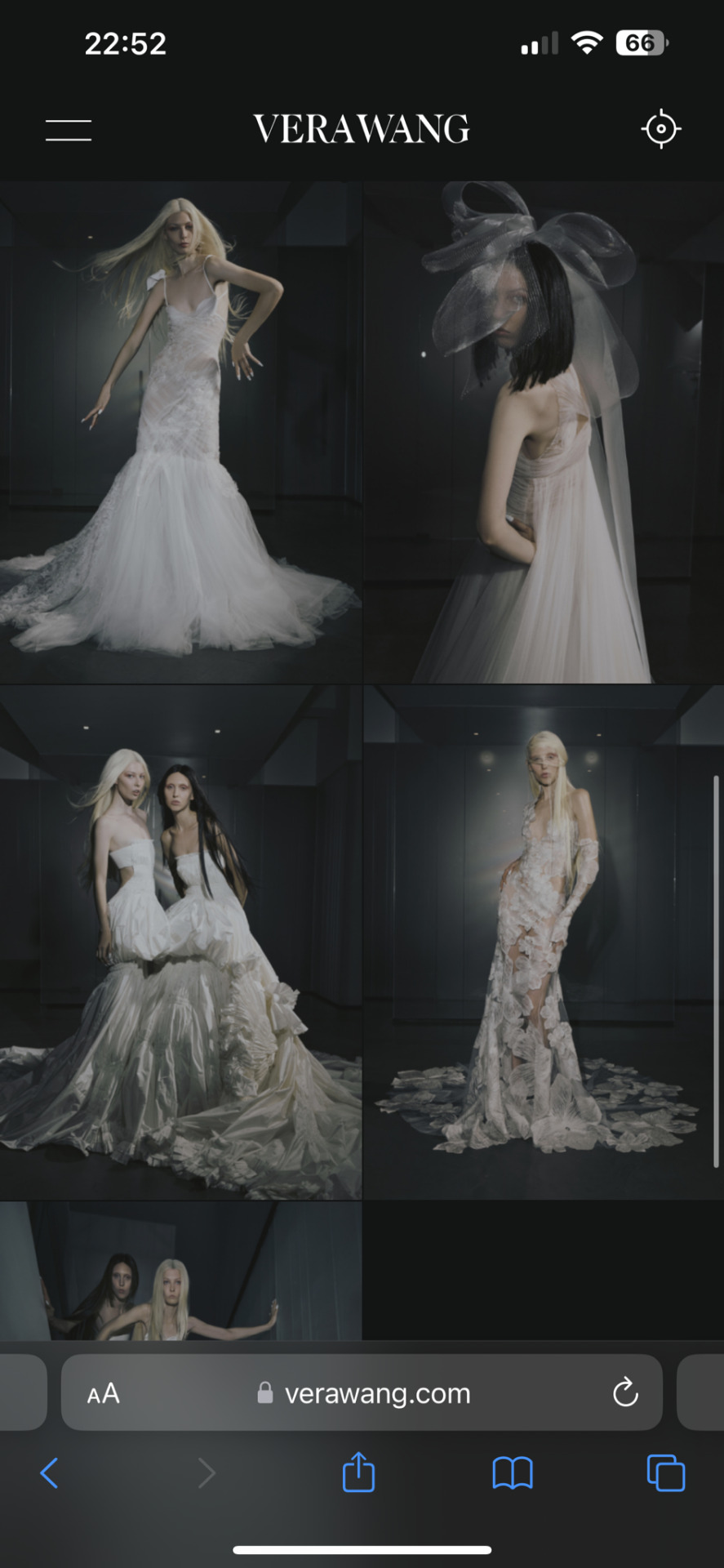
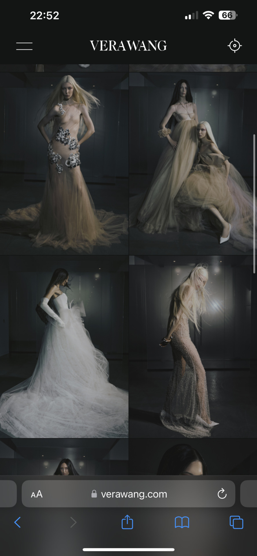
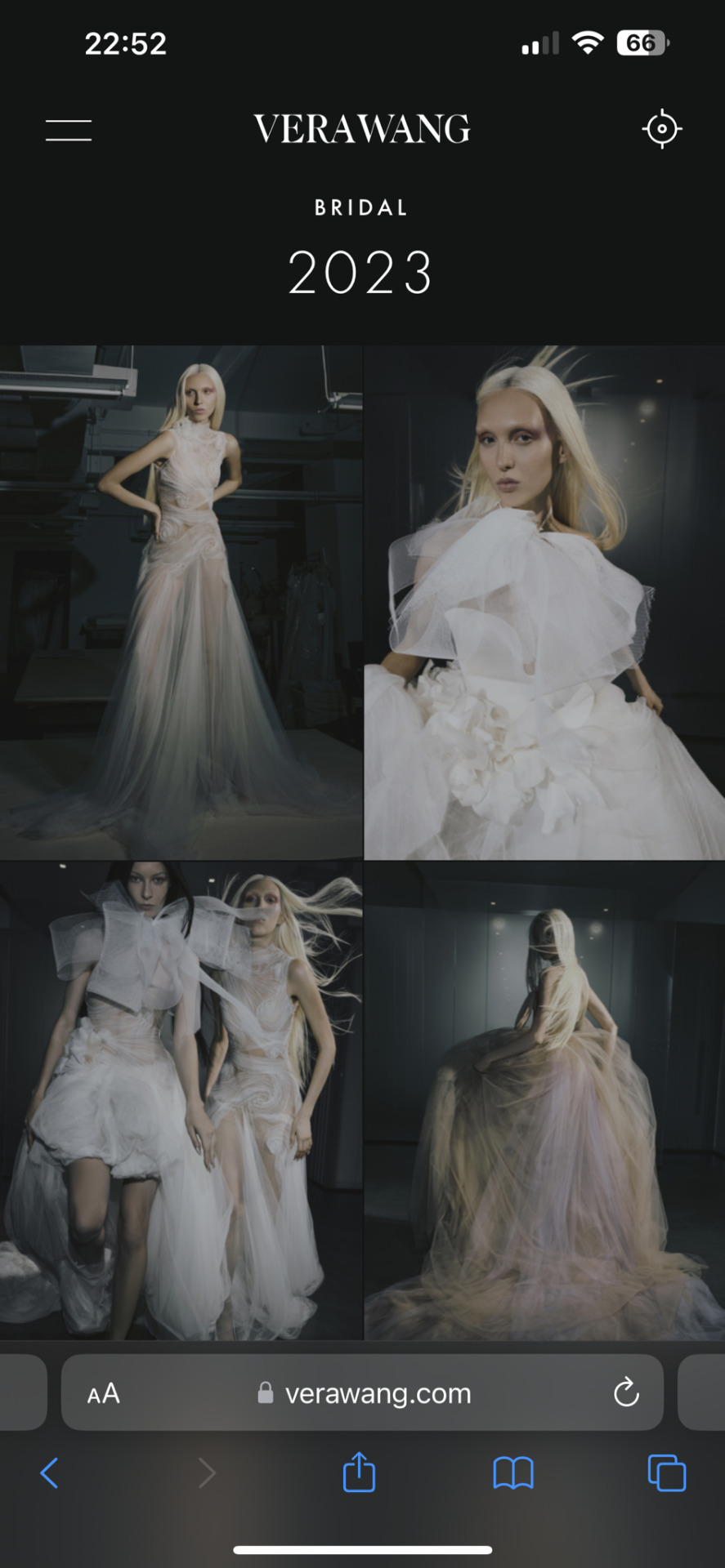
The next designer i looked into was Vera Wang, these are some of her dresses from her 2023 haute wedding collection, dresses from this collection start from $7,000.
0 notes