
Statistics
We looked inside some of the posts by redplatepress-blog and here's what we found interesting.
Average Info
Notes Per Post
51
Likes Per Post
39
Reblog Per Post
11
Reply Per Post
1
Time Between Posts
27 days
Number of Posts By Type
Text
17
Last Seen Tumblr Blogs


Fun Fact
Tumblr posted its first advertisements in May 2012 and subsequently earned $13M in revenue.
Text
Chicago residency - October & November 2016
Artist-in-residence at Starshaped Press, Chicago 18th October to 14th November, 2016 Thanks to an Artists’ International Development Fund grant from Arts Council England and the British Council, I was able to travel to Chicago to spend some time at Jen Farrell’s Starshaped Press. During the month I also went to the Hamilton Wayzgoose in Wisconsin, worked alongside Tandem Felix Letterpress in Chicago and visited several other studios in the city. (Each of these has its own blog post.) However, Farrell was my host for the visit and I want to talk through some of the work I made at Starshaped.
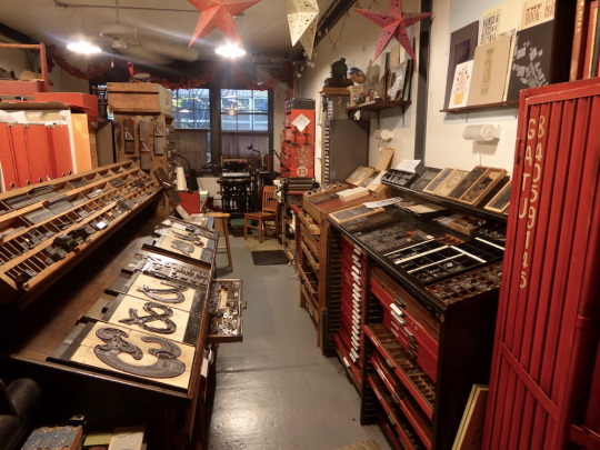
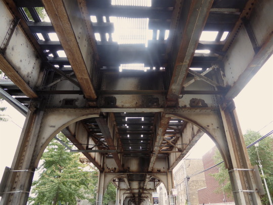
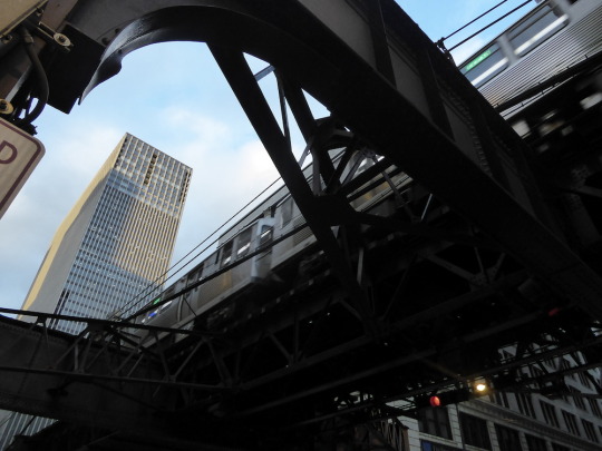
For me, any residency has to engage with the place, the environment around and with the people you’re working alongside. I’d visited Starshaped on my 2015 cross-country US trip and, as soon as I arrived this time around, I was struck by a strange familiarity. The strongest memory by far was the elevated metro system - the ‘L’. Working in the Starshaped studio, the trains constantly rattle past behind the building. You hear them all day and night. (Unless of course we had those classic Wedding Present or New Order records cranked a little too loud.) So, in search of inspiration, I bought my Ventra card and jumped on the brown line to head downtown, into ‘The Loop’.
I’ve been doing a lot of automatic writing while travelling in the past few years. It started while getting early morning/late night coaches to/from my AA2A residency at UCLan in Preston (2014-15) and I’ve continued to use it as a way to generate ideas and unlock new directions. I was also on the look-out for repeat patterns - Starshaped has a reputation for innovative work using metal type and ornament and I wondered how this could affect my own practice.
Underneath the L:
Metal bridge near the Pilsen warehouse district:
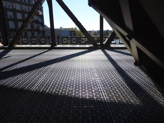
Bridge across the North Branch Chicago River, crossed en route to the Starshaped studio each day:

With all these visual stimuli rattling round my head, I began figuring out a graphic representation. Starting with the idea of the L track supports seen from below and needing to get across the idea of repetition, I realised putting wood letters together created pattern from the negative space. The colour scheme looks to represent the degrading of the supports that hold the L - fading paint, rust and decades-old dirt.
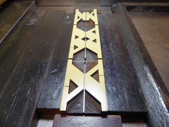

I edited down the writing from the Loop travels into a series of memorable images; mishearings, repetitions and signs. The image above shows me figuring where the text elements should be placed. And below, imposing on-press (using the studio’s Vandercook SP15) and printing that text.


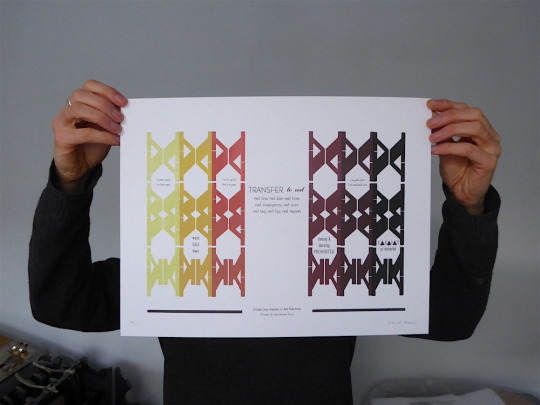
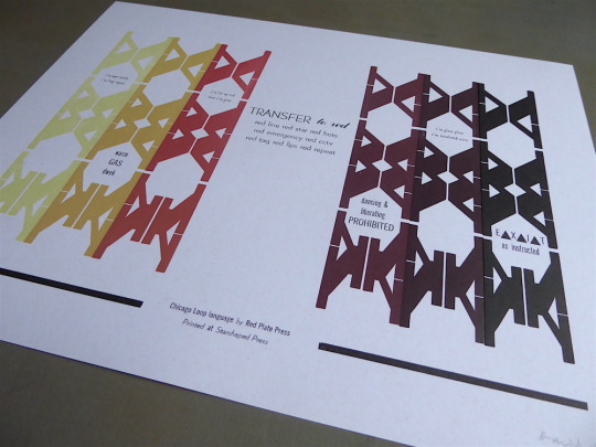
Here’s the final piece - ‘Chicago Loop language’. Hopefully it gets across that sense of movement and input to the senses that you get from exploring a new or less-familiar place. It’s an edition of 25. More shots and a link to buy it are on the Red Plate Press site here.
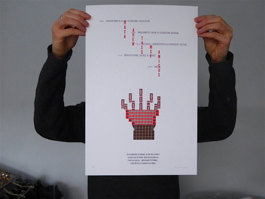
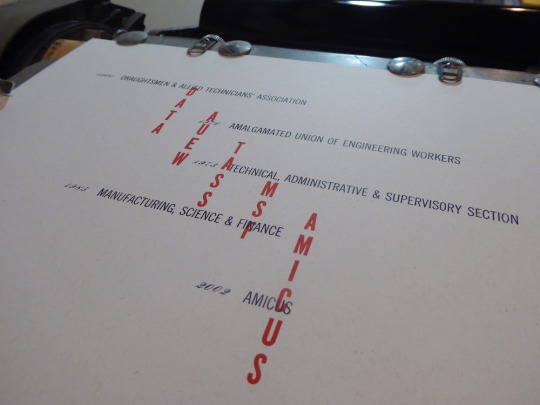
While I was at Starshaped I also missed my father’s birthday back home in England. I know; bad son. In recompense, I made a print for him based on a recent conversation. He’s been retired a long time now, but we were talking about his union membership. He joined the Draughtsmen and Allied Technicians’ Association (DATA) union early in his working life and never left. But, as a lot of unions did between the 1960s and 2000s, it kept amalgamating with other unions, so he was actually a member of five different unions in total.
I wanted to use the studio’s Alphablox to create a sense of the support and connections that unions offer. A hand seemed the obvious image.

The first colour of the Alphablox laid down:

And then the second. You can see the linear and reverse of the Alphablox that allow you to build up and emphasise imagery.

The finished print - ‘Five Decades’. More via the Red Plate Press site.
One last piece that I completed at Starshaped was a record of my 2015 US trip. I kept a record of sage advice, random outbursts and repeated phrases on that trip and turned it into a print made in three layers at the three studios I’ve worked in most over in 2015-16. London Centre for Book Arts (LCBA - kudos to Simon & Ira), Starshaped Press and my own studio. I brought the partially completed print with me to add the final layer: the places visited in 2015 in chronological order.


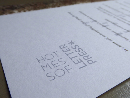
The title (‘Hot Mess of Letterpress’) - comes straight from Starshaped; it’s one of Farrell’s favourite sayings. A proper situation or a right to-do - that’ll be a hot mess. Is this a mid-West thing? I’m guessing it is.
Huge thanks to Jen Farrell and Josephine Gonda for hosting me and being such great company in Chicago. And thank you to the Arts Council and British Council for funding my trip.

3 notes
·
View notes
Text
‘Build me a city on a low dune’
Scroll-making with Tandem Felix Letterpress 9th-11th November, 2016 Elizabeth Isakson-Dado and Jamiel Dado run Tandem Felix Letterpress and I met them briefly back in 2015. Working out of the Lacuna Artists Loft complex in the Pilsen warehouse district, the studio “offers the experience of letterpress printing through events, workshops & private lessons”. They have a naturally collaborative approach and we had been talking about how to work together since I started planning this trip.

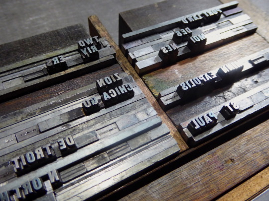
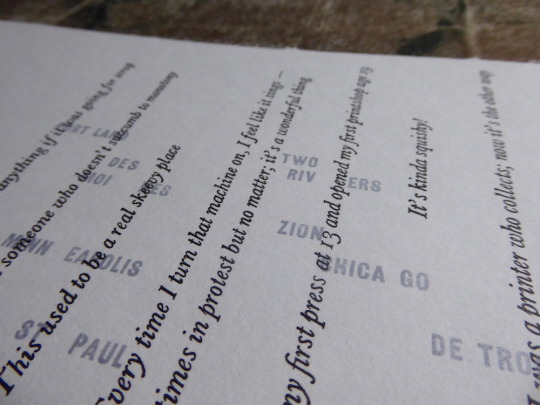
The idea of scroll-making was suggested. They had recently created a set of cliches on cheap wrapping paper and I’d experimented with long text pieces in my residency at Huddersfield Art Gallery over summer 2016. Knowing there was an Open Studio for the Lacuna complex set for the end of the week, we had an event to aim at for motivation. I’d been doing a lot of writing while travelling around the city, often thinking about how the city was built, the land that the grid system was laid out on and the stories people had recounted during my visit. Working with the studio’s wood type collection, the texts were imposed using magnets on a turtle.

Printing onto rice paper worked really well. It was surprisingly strong and, in hand-burnishing each text, I was able to see how the ink took to the paper. Each text panel was printed separately, each time with one person at either end of the scroll while I printed.


Between impressions, it was laid down to dry while I imposed the next panel.


We realised the scroll could be read from either end when displayed, so I edited and arranged the texts to suit.

On the third day, the finished scroll was installed in one of the loft complex’s open floor spaces. It was in place for just one night, the monthly Open Studios event.


Massive thanks to the Tandem Felix folks. It was a total blast to hang out with them and make this piece.
2 notes
·
View notes
Text
More Chicago studios
Spending a month in Chicago meant I had time to properly explore some other studios across this enormous city. (10 miles wide by 40 miles wide, so they say.) My 2015 experience had also taught me to leave days free for new invitations. Less chance of my brain having an input failure.
Columbia's Center for Book & Paper Arts 8th November, 2016 I met tutor April Sheridan at a showing of my work at Starshaped Press and she kindly invited me to visit the Center for Book & Paper Arts while she had a class running. It was a lot of fun watching the students at work and trying not to get in their way. They came from many disciplines, not necessarily related to print, as the semester is an elective.

The studio is well-equipped with five Vandercooks...

...and a very nice type collection.

From a colour palette point of view, it was nice to see one of Sheridan’s students using the black-on-near-black combination. One of my favourites.


+++++ School of Art Institute of Chicago 8th November, 2016 A few blocks walk north through the South Loop area...

...brought me to the School of Art Institute of Chicago. I’d met Martha Chiplis at the Hamilton Wayzgoose - she teaches at the SAIC letterpress shop and she’d invited me to visit and chat.


Students here are mainly from Visual Communication and the focus is on specific briefs, like the information broadside series shown here, worked up over one semester.

Chiplis had been demonstrating pressure printing earlier the day I visited and one of the students was still hard at work on-press using a split fountain.

Chiplis also co-authored the For The Love Of Letterpress book with Cathie Ruggie Saunders (who runs the SAIC shop) - it features work by many of the people I met in Chicago. And there’s no escaping Starshaped Press...

+++++ Spudnik Press Co-operative 13th November, 2016 Down in the area west of the loop in an old loft is Spudnik, a community shop “founded on the premise that art should be a democratic and empowering medium”. There are facilities for screenprinting, letterpress, relief, intaglio, offset and monoprinting and I had time for a quick look at their letterpress facility.

A few people had modestly said things in advance like “ah, Spudnik’s not much, just a little bit of stuff” but there are plenty of open access studios in the UK that would love to have access to a Vandercook, two platen presses and a modest type collection! Students on their courses are making some really nice work.

Sleepytime.

+++++ Vida Sacic 14th November, 2016 Remember what I said about seeing as many studios as possible? Allowing plenty of time and all that? Well, there’s nothing wrong with visiting a studio the morning of the day you fly out. Right? Vida Sacic was someone else I’d met at the Wayzgoose and she kindly made time to talk about her wonderful work.


+++++ Thanks to all these people and studios for giving of their time to talk letterpress with me.
2 notes
·
View notes
Text
Hamilton Wayzgoose 2016
Hamilton Wood Type & Printing Museum; Two Rivers, Wisconsin 4th-6th November, 2016 I was lucky enough to visit Hamilton in summer 2015 on my coast-to-coast research trip visiting studios, shop and museums across the US. I made a pact with myself then to one day attend the annual Wayzgoose in some future year. That time came sooner than I thought, thanks to an Arts Council England grant from their Artists’ International Development Fund (run in partnership with the British Council) and also to the generosity of Jen Farrell at Starshaped Press who helped me out creatively and logistically.
For a proper introduction to Hamilton, skip back a year to my 2015 blog entry.

This post will focus on the events of the 2016 Wayzgoose and I’ll keep it visual. I signed up to take part in every aspect of the weekend and tried to squeeze in as much as possible, from a calligraphy class with Rochester Institute of Technology’s Lorrie Frear...

...to a talk about the M&H Type Foundry (the old surviving foundry in the US) and Arion Press from Brian Ferrett...


The Wayzgoose has a wonderfully open and collaborative nature so it was even possible to look in on the workshops I hadn’t been able to attend, like Claudio Rocha’s specimen session.


Later on, I did get to a talk on Rocha’s work and it was a real highlight of the weekend seeing his freeflowing work up close.

In between sessions, just wandering around the museum, drinking in their print archive, was inspiration enough.

The final event was a print swap and sale on the Sunday morning. Here’s my table ready to go (including work produced during my residency at Starshaped Press on the right)...

...and yours truly trying to shift some prints onto David Shields and Tom Walker.

It’s not possible to thank everyone I met and hung out with, but honourable mentions go to Geri and Jim from Virgin Wood Type and Lindsay from Gingerly Press for the roadtrips up from and back to Chicago. Finally, for some finer quality snaps, the photoblog of Hamilton’s official photographer is right here.
2 notes
·
View notes
Text
Studio visits in the south west - late summer 2016
Semple Press, Devon 1st September, 2016 I’d met Rachel Marsh a couple of times at past letterpress events so when I knew I was visiting the south-west, I shamelessly asked if she minded people snooping around her studio. She agreed. I knew the studio was a shed at the bottom of her beautiful, rambling garden, but 'shed’ drastically undersells it. It’s a three-room (plus overhead storage area) structure that she put together herself.

Inside is a wonderful collection of presses and type, Rachel admitting she has a weakness for wood type. That’s not a weakness in my book. Visually, star of the show is the fantastically restored Arab. Note the matching bike, which may or may not have been a paint test.

And then there’s a Vandercook SP20 that came from North Yorkshire and had to be moved in via the lane behind the shed. (Ask about it if you meet her.) Not many studios have greenery this close to the working environment.

Not a centimetre of space is wasted.

When we visited in the afternoon, Rachel had just started a new print. The first colour was hanging up to dry.

Rachel’s work is fantastic and I was lucky enough to see some of the work up close. Her Semple Press imprint has a great portfolio online, far better than any description I could give. Thanks to her and her partner for hosting us. Oh, I almost forgot - we all went swimming in the sea at dusk. That was pretty special. +++ The Letterpress Collective, Bristol 2nd September, 2016

A flying visit to the Letterpress Collective to beat the city centre traffic wardens and so we didn’t distract Ellen Bills from the job she was working on. Set up by Nick Hand in 2013 in response to the last letterpress printers in the city closing down in 2012, the Letterpress Collective split their time between commissioned work and teaching workshops. There’s also an option to become an open access user, making it a really valuable resource in the region.

The studio has a great collection of presses for all types of print work, from a tabletop Albion and galley proof presses to a Heidelberg Windmill and a FAG 40.


And a really nice looking piece of work (a CD sleeve I think) coming off the press.

+++ Spike Print Studio, Bristol 2nd September, 2016 And an even quicker visit to Spike Print Studio, mainly to ogle over their frankly enormous Vandercook 232P. Charlotte Biszewski is the technician responsible for making it all happen - she’s also behind the fascinating Bristol Set in Print project chronicling the former industrial printers of the city.

+++ Presstival, The Whittington Press, Gloucestershire 3rd September, 2016
And finally, an event I’ve been wanting to get to for years - the annual Whittington Press open day, a part of the village fair but a destination in its own right. People had come from as far as Dublin and Minnesota and it was great to see so many familiar faces. A short history of the press, started by John and Rosalind Randle in 1971 and now including their son Pat Randle (also Nomad Letterpress), is here. It’s also home to Matrix.

There’s almost too much to take in at Whittington, so much fitted so well into such a relatively small space. And pretty hard for a tall person to get around! Here’s my best efforts...


Nick Loaring from The Print Project printing the commemorative posters on the Western.

The view from my stall. This part of the studio featured “the Americans”, as one visitor put it - including Gaylord Schanilec (who I met in St Paul in 2015 and whose book work is simply stunning) and Jeff Rathermel, Executive Director of the Minnesota Center for Book Arts.

The new broadsheet/journal Double Dagger also got it’s launch at Presstival. Featuring a host of great contemporary letterpress folks plus (*cough*) yours truly. Grab a copy here - it’s a truly fine piece of work and I’m honoured to be included.

And finally to finish, Pat Randle’s wonderful Monotype Borders print. Mind blown out. Thanks to everyone for the company and hospitality.

7 notes
·
View notes
Text
Huddersfield Art Gallery residency - summer 2016
Open House at Huddersfield Art Gallery 28th May to 27th August I spent June 2016 as artist-in-residence at Huddersfield Art Gallery. It was part of the ROTOR colloborative series between the gallery, the University of Huddersfield’s School of Art, Design & Architecture and East Street Arts and culminated in an exhibition called Open House. The residency looked at wayfinding and sense of place by using anonymous conversations around the town and interactions in the gallery workspace as source material. I set up a working micro-studio in the gallery, meaning the residency functioned as both a space for production and a physical installation. The result was a set of textual portraits that focus attention on the small details of experience, layering memories and blurring meanings. The overall exhibition functioned as an alternative map of Huddersfield and the gallery. It was a fantastic project to be a part of and I’m very grateful to ROTOR for choosing my proposal. The starting point in late May 2016:

And the launch night on 7th July 2016, complete with improvised dance piece by Gerry Turvey and company:

In between, this happened. I first set up three Adana 8x5 presses in series in the centre of the gallery. This would be both a physical installation, instigating conversations with visitors, and a space to produce the work.

The focus of the residency was on sense of place. Some of the texts were gathered from anonymous conversations with people on the streets of Huddersfield, asking for directions and seeing where it led.

I also spent a lot of time looking at evidence of language and use of text around the town. Looking for patterns, repeats and historical layers to help build up a picture of the work. (More on this aspect via the Huder Hypar photoblog.)


Finding the amazing sculptural work of German artist Fritz Steller on the outside of the stunning Queensgate Market, and reading up on the history of both, was a great discovery. More via the 20th Century Society here.

After running some tests, I found a way to use the presses in series to create a long text-repeat piece that would ultimately wind around the entire gallery space. The texts slowly dissolve into only the most important elements as you move around the gallery. Or, in reverse, they slowly build up into a complete picture.


A lo-fi video showing their creation can be seen here. Some of these conversations were redistributed around the town, with the hope that they’d be found anew.

A crucial aspect of the residency were interactions in the gallery itself with visitors, often prompted by the actual production space as I worked at the presses or setting type. Many of these conversations led to the uncovering of memories as people recalled either their own understanding of the print process or of physical locations around the town. Combined with the discovery of a set of maps due for disposal, these conversations led to a set of texts on repurposed maps.

One of the most satisfying of these conversations was with a man who recognised areas where he grew up to the south of Huddersfield town centre. As the maps dated from the 1890s, some of the houses he and his family lived in hadn’t actually been built, so we spent a long time working out which wood or river they were close to. I learnt a valuable etymological lesson too - one of maps covers Skelmanthorpe, but no-one calls it that. They call it Shat. “Why?!” I asked. Because the people who lived there always worked as stone shatterers. Lesson learned.

I wanted to find other ways to explore layering, both of printed texts and of history - this has started to be a strong current in my work lately. Finding the gallery had light panels available led to several pieces that looked at the representation of light and, again, of specific memories.

The final piece that came together was a large panel of ink roll-offs onto which more associations/conversations were printed. The pieces were arranged into a pattern before being secured loosely together and hung. I was really pleased with the almost fabric-like nature of the piece.


Once the show was fully installed and launched, the final collaborative element of the project was realised. Gerry Turvey’s dance company spent two days in the gallery responding to both my work and the work of Jim Bond, Rozi Fuller and Liz Walker (who worked on the other residency). The company produced a wonderful piece of work which both responded to and expanded on the show. A truly moving end to a great experience in Huddersfield.


youtube
6 notes
·
View notes
Text
London & Brighton, May 2016
May was a great month for letterpress events down in the south-east. I carved a couple of weeks out of my schedule and got on the train.
Alan Kitching - A Life In Letterpress Pick Me Up graphic design festival, Somerset House, London 2nd May, 2016
If you’re reading this, there’s a 99% chance you know of Alan Kitching’s work and The Typography Workshop already, so I won’t repeat his story here. (Start with this Creative Review piece instead.) His lifetime retrospective at Somerset House was fantastic and a nice bonus was that he and his assistants were printing a new piece throughout my visit.

Some of his best known works are his commissions for The Guardian newspaper. It was great to see the originals at close quarters and gave a real insight into his process; it definitely helped me clarify and correct my presumptions and allow time to really understand his approach to design. These pieces are probably my favourites of all his later work. The inking is vibrant and bold but there’s also a brave willingness to leave space that makes a lot of sense to me.

A real surprise was just how good his early work is. Although Kitching acknowledges he took a different direction in the early 90s, his work from his time at Watford School of Art in the late 60s is equally powerful and well-realised to me.

Up close and personal with the Vandercook.

Watching Kitching and his assistants work in the gallery was a real treat too. I was really struck by the inking - it was not shy!

+++++ Ditchling Museum of Art & Craft, Sussex The Village of Type and interrobang exhibition 8th May, 2016
The hottest day of the year so far and a packed-out train down to the south coast from London. All for a chance to visit Ditchling, the arts and crafts village that was home to Eric Gill, the calligrapher Edward Johnston (responsible for the famous Johnston typeface used for London Underground), the painter David Jones, the printer Hilary Pepler and the weaver Ethel Mairet, amongst many others. You can read plenty about the wonderful museum here (and the Edward Johnson exhibition is on until September 2016) but I’ll keep the focus on the temporary exhibition interrobang - An International Showcase of Letterpress Print, shown in the former studio of Frank Brangwyn.

A great selection of contemporary print, interrobang brought together artists and designers mainly from the UK and US, including work you can see above by The Print Project, John Christopher at Flowers & Fleurons and Justin Knopp from Typoretum. In fact, when I visited Justin back in January, Professor Knopphauser was busy planning how to make that big green and black print work on his Wharfedale press.

And a nice chance to see Dafi Kühne’s impressive Januarloch print in the flesh.

Here’s hoping Nathaniel Hepburn and the team at Ditchling run the show again next year.
+++++ Ink Spot Press, Brighton 9th May, 2016
Since I was so close at Ditchling, it seemed only polite to pay a quick visit to Ink Spot Press, run by artist Jane Sampson and a small team of tutors. A well-equipped open access print studio just outside Brighton centre, Ink Spot has two Vandercook SP15s, a FAG Swiss Proof 40 and an Albion...

...alongside an extensive wood letter collection, much of which was rescued from the Printing House Museum in Cockermouth, Cumbria when the museum flooded a few years ago.


Thanks to Jane Sampson for the visit and good luck with the move later this year.
+++++ St. Bride Foundation Wayzgoose, London 15th May, 2016 The final event before I had to return north. Last year’s Wayzgoose was a great way for the letterpress community to get together and show new work, and St. Bride was the perfect place to do it. I met plenty of fascinating and talented people, so a return was a must.


A great day - inspiring conversations, a chance to check out prints that are normally only seen from a distance online and it’s always really nice to talk to people who are interested in your work. Here’s to 2017.
3 notes
·
View notes
Text
London, January 2016
Pixel Press, Stoke Newington, London 9th January, 2016 Ok, I’ve got a little behind again in these reports from my studio visits. Apologies to those concerned. Back in January, after stopping off in Colchester (see this post), I arrived in London town. The main event was a press maintenance workshop at London Centre for Book Arts with the legendary Basil Head, but it also gave me a chance to print a project at LCBA and to poke around the corners of the city where the dark art of letterpress is practiced. My first visit was around the corner from my digs, near Clissold Park in Stoke Newington.

Pixel Press is an artists’ studio established in 2012 by Julieta H. Adame and David Vassie in an old light industrial building. Something of an artists’ complex, they also live on site alongside a host of other artists, makers and craftspeople. They have a really nice approach, definitely coming at letterpress as artists first and foremost, but encompassing graphic design as well. Much of their equipment has come from several years of befriending local jobbing printers and helping them to dispose of their shops when the sad time came to close up. In the centre of the space is a very nice Farley proof press.

And hidden under the plants is an Adana T/P48.

Taking pride of place on the wall is an early piece of Vassie’s, based on a tall story his mum used to tell. I’ve heard different variations of this told over the years.

And lastly a piece of Adame’s from a college course a few years ago. She didn’t have a print to hand, but her conception was that this piece was about the type as much as the print, with the two elements being displayed together for a show. It’s a totally fascinating piece with really unusual and expressive typesetting - contrary to received wisdom, the uneven lines were really tightly locked together and wouldn’t have presented too many problems to print from.

+++++ Paekakariki Press, Walthamstow, London 9th January, 2016 Second studio of the day was Matt McKenzie’s superb Paekakariki Press in Walthamstow, in another light industrial building, hidden away down a side alley. A New Zealander with a deliciously dry sense of humour, McKenzie has assembled an astonishing array of equipment in a short space of time. (The Paekakariki site itself describes the press as “full-blown” and that seems a fair description.) As a publisher of poetry, he has all the tools needed at his disposal...
Heidelberg cylinder (note the very nice Monotype sample prints on the wall):

Casting room (much of which was acquired from Harry Macintosh’s Speedspools in Edinburgh):

The latest collection from the press.

The Paekakariki website is a fantastic resource, both about the press itself but with a slew of useful letterpress advice and history. Much better that I direct you there than waste space here. I look forward to coming down for the biannual E17 arts trail - Paekakariki helped organised a letterpress fair for the 2015 event and there’s a plan to run it all over again in 2017.
+++++ Thames Barrier Print Studio / Kim Vousden, SE London 9th January, 2016 A visit to Thames Barrier Print Studio, nestled on the river between Woolwich and Charlton in a new-build, yielded a pleasant surprise. It was really nice to chat to studio director Carolyn Nicoll about the history of the studio but then I got to spend most of the morning with Kim Vousden in her studio next door, talking shop, distracting her from getting on with proper work.

Describing herself as a “graphic designer, typographer and image maker”, Vousden works with letterpress as an adjunct to her commercial commissions, adding value but also seemingly as a place to experiment and push her practice into unexpected areas, mixing processes and approaches. This shot of her print wall gives a flavour. (The Vic was poorly on my visit; hopefully working again now.)

+++++ The Counter Press, Bow, London 10th January, 2016 The last studio in this report was a surprise visit. After the workshop with Basil Head at LCBA, a gang of us went visiting other studios (including Tom Mayo’s new place which he was still getting into shape, hence no photos), finishing up at The Counter Press, home to David Marshall and Elizabeth Ellis. “Somewhere between a graphic design practice and a traditional private press”, their work is marked by clarity and precision; the actual studio reflects exactly what you’d expect having seen their work. (You must check out Extra Condensed if you’ve not seen it before.)

Amongst around 7 or 8 presses, the studio houses a Vandercook SP20 and a Grafix GX1N.

A lovely end to a great week of London letterpress. Thanks to all the studios who welcomed me and to all the others on Basil’s course at LCBA - inspiring people, one and all.

5 notes
·
View notes
Text
Colchester, Essex - January 2016
St. Botolph’s Print Room @ The Waiting Room, Colchester, Essex 5th January 2016 In a bid to continue my US adventures and meet some more of the excellent letterpress printmakers around the UK, I spent a few days in early 2016 visiting studios in Colchester and London. My first stop was in Colchester, Essex, county of my birth. At the 2015 Wayzgoose at St. Bride’s in London I met Paul Butler from the St. Botolph’s Print Room. He’d offered to show me round if I was ever passing and a stop-off just after a New Year spent with the in-laws in Norfolk seemed ideal.

Paul is one of a small team establishing a community letterpress studio in the old bus station in Colchester. The complex itself is called The Waiting Room and features an event space that hosts events and a regular cafe. The print rooms are actually in the old toilets - the sink room is now the letterpress room and the ladies is being turned into a sculpture and 3D workshop, complete with a working kiln. What sounds a little weird actually works really well as a semi-industrial space because of the tiling and light source from a skylight. The central feature is a Cropper & Charlton Acme platen press although it needs a little more TLC before it can be used regularly.

Paul is a graphic designer by trade so has a good grounding in print and has been learning letterpress since St. Botolph’s first took on donations in 2012/13. One of the team’s big jobs has been working through all the typecases which were badly distributed. Starting with display type, they’ve held regular volunteer sorting days, first sorting into size and then the face. This great print came from one such day. (They’re down to the 10 and 8 point type now.)

The most recent acquisition has been a very nice proofing press. Pulled from the artists’ studios at Cuckoo Farm in rural Essex outside Colchester where Paul spotted it being used as a tea tray, it’s now in regular use, including at some of the workshops held in 2015 in The Waiting Room’s event space.

Last year, the studio also acquired a huge Soldan cylinder proofing press via the John Jarrold Printing Museum in Norwich. This will be a serious work-in-progress but Paul has made a start, visiting Birmingham University’s Print Department to see their Soldan in action. It would be an exciting addition to the studio but it’s too big for the current space. However, that sounds like it might actually fit with wider Waiting Room plans as the whole project will be moving in 2016, hopefully with some assistance from the local council. Good luck to them all and I hope to visit the new location and get some print collaborations going next time. +++++ The Hedgehog Press/Adanaland 5th January, 2016 My second Colchester visit was to Alan Brignull’s home studio. Working as The Hedgehog Press and identifying his immediate environment as being ‘Adanaland’, Alan has been printing since the 1970s when he acquired his grandfather’s Adana 8x5. Working with the 8x5′s size limitations, he has completely mastered the possibilities of small-scale printing, producing a wide range of highly individual work full of charm and personality, including these amazing stamps, often for imaginary countries/locations/territories.


The studio also includes a Model 3 platen and a very nice Farley proof press. An active member of the British Printing Society and currently co-ordinator of the annual ‘It’s A Small World’ compendium, Alan is a true believer in mail art and pre-internet print dissemination. So much so that when I came to write up this report, I realised he doesn’t actually have a website. There’s a Flickr stream and a nice article by Christopher Skinner and, for now, they will have to do. In fact, looking back at my Colchester photos, I realised that Adanaland had also dictated my own visit - I failed to take any shots of Alan’s studio. I like to think this was because I failed to apply for the correct permits from Adanaland’s authorities in advance... This shot of Rambling Urchin prints (to the right) alongside a new print by St. Botolph’s Paul Butler (left) will have to suffice.

+++++ Typoretum 6th January, 2016 Half an hour on the bus outside Colchester is the village of Coggeshall, home to Typoretum. A fully-fledged business employing several staff, Typoretum is a great testament to making a letterpress studio work in the commercial world, with a committed and ever-growing client base of design and advertising agencies. The workshop and office are housed in a purpose-built space alongside founder Justin Knopp’s house.

Justin founded the studio in 2008 though Typoretum technically has a longer history than that might suggest. He first studied by letterpress while a Graphic Design student in the early 1990s at Central St. Martins. He quickly began to build up an extensive type and press collection, often being in the right place at the right time as printers sold up and moved on from the trade.

This was definitely pre-’letterpress revival’ (TM). In fact, Justin’s first piece of print work from the early 1990s is still up on the wall, hiding behind the Wharfedale press that takes pride of place. (Maybe that’s just because it’s such a huge press.)


When I visited, soon after New Year, the studio was back in full swing with Justin finishing off a business card job on the Gietz Art Platen press (from 1963), while fending off questions from yours truly.

Alongside him, assistant Matt was busy proofing a new plate on the Farley.

The studio has worked on some high profile commissions recently, including the design and branding for the Brewdog range of real ales, all designed and printed by Typoretum before being handed over to be used as digital assets.

You can expect to see the print on the left reappear in a forthcoming blog post... As for the right hand print, who really knows when the mysterious Etaoin Shrdlu will make his/her presence known next?

The Colchester area was an unexpected hotbed of letterpress activity and it was great to meet some of the community. As well as the visits I made, there is also David Jury, author of ‘Letterpress: The Allure of the Handmade’ and lecturer at Colchester Institute, plus James Dodds, shipwright, artist and fellow Wivenhoe-resident alongside Jury and Alan Brignull. So, a huge thank you to Paul Butler, Alan Brignull and Justin Knopp for welcoming me so soon after New Year. We’ll sign off with this shot of James Dodds’ exhibition at the firstsite gallery in the town. These were printed on a Western of similar size to the Soldan that St. Botolph’s have acquired.

2 notes
·
View notes
Text
‘Constructure’ exhibition - PR1 Gallery, November 2015
For the 2014/15 academic year I had a residency at the University of Central Lancashire’s print studio. Part of the national Artists Access to Art Colleges (AA2A) scheme, it allowed 24/7 access to the facilities to explore my own practice, with no particular expectations or outcomes. I used it to work on a new portfolio of large-scale prints (roughly up to A2 size) that explored combinations of texture, pattern and text. The opportunity was given to four artists in total and we found ourselves working closer and closer together as the year progressed, so much so that a joint exhibition of our work seemed inevitable. So it was that the ‘Constructure - four printmakers explore structure’ exhibition was born, complemented by a collaborative zine funded by Pushing Print. Hosted in the university’s PR1 Gallery in late November, here’s a selection of shots of my work, followed by examples of the other artists - Bonnie Craig, Jamie Barnes and Benedict Rutherford. Installing the show:


Right to left: ‘four channels glowing’ (2015) ‘Enablers - Gullivers - 2nd April’ (2015) ‘undestroy’ (2015) ‘Tobolsk 16-17.3.13′ (2015)


‘at dawn, by mid-morning, in the afternoon, at twilight, at dusk, at midnight’ (2015) (Sequence of six prints)


‘Codes (For William)’ (2015) (Concrete-skimmed frame by Manchester Custom Framing)


‘tracer fire, unsignals, filter-off //’ (2015) (Greyboard folder containing six prints)

Benedict Rutherford:

Bonnie Craig:

Jamie Barnes:

The ‘Constructure’ zine featuring a four-print collaborative cover and double-page of my contributions:


And finally; an empty space and an artist line-up:


With huge thanks to AA2A, to the wonderful technicians Tracy Hill and Magda Starwarska-Bevan at UCLan, to Rob Evans and Callum Higgins for framing my work and to Pushing Print for funding the zine. All my work from the exhibition is for sale - contact me for more information.
4 notes
·
View notes
Text
USA week 11 - Baltimore, MD
Baltimore Print Studios, Baltimore, MD 13th October, 2015 The final city. Two whole days in fantastic Baltimore but sadly I didn’t catch sight of John Waters. Not an issue because I had a great hook-up with Kyle Van Horn at Baltimore Print Studios who squeezed in an hour between work and more work at BPS (with wife Kim) and then facilitated two more visits the day after at a moment’s notice. Such has been the way of things on this trip.

Kyle and Kim have both been fully-immersed in the Baltimore print scene for many years, since college, and both also work at MICA (Maryland Institute College of Art - more later), Kyle as a technician and Kim teaching graphic design. They set up BPS in an ex-market space a few years ago as an open-access letterpress and screenprint resource for the community. It’s an interesting contrast to other shops I’ve seen on this trip (Signal-Return in Detroit or Pyramid Atlantic in Silver Spring, for example). Whereas those latter two are constituted as non-profits with a board sitting alongside the staff teams (I guess we might call them Social Enterprises in the UK), BPS is a private enterprise owned by Kyle and Kim. Given more time, I’d have loved to talk more about the pros and cons, but when there are prints to ogle and presses to lust after, I prioritised. Here’s the letterpress side of the shop from the front door...

There’s three Vandercooks in the main space (including a model 4 and an SP20) and, as elsewhere, some of the equipment is owned in-house and some is on long-term loan. Kyle and Kim also have an SP25 (in their semi-private space in the back there, with the blue wall) that, in theory, is reserved for use on their own projects - I say ‘in theory’ because they’re both so busy that their own work has taken a back seat lately. Finally, there are a couple of tabletop Pilots for smaller work and a Heidelberg Windmill that, if I remember right, is a project for the future...


Sentiments I can get behind...


Kyle and Kim run introductory courses every fortnight at BPS, alternating between letterpress and screenprint (ie, one medium per month). Testament to what the studio has to offer and their promotion is that they’ve only ever cancelled one course in five years of existence, so there’s clearly a sizeable community in the city, building all the time thanks in no small part to BPS. Their connection with MICA means that they also run inductions for students and it was one such group that meant my monopolisation of Kyle’s time was up...

+++++ Maryland Institute College Of Art, Baltimore, MD 14th October, 2015 Kyle from BPS was kind enough to offer more time the next day to show me round his day job at MICA. Pushing my time in the US to the limit, my flight back across the Atlantic was at 6pm, so I had about five or six hours to make it count. MICA is very highly-regarded art college with an enviable printmaking building that dedicates practically a floor to each technique. (The stone lithography area was especially amazing.) Anyway, here’s the letterpress studio. They have four Vandercooks: a model 4, a Universal 1, an SP20 and an enormous 325G...

You’ll notice all those wild colours. One of the most exciting things about MICA is that they have the Globe company collection, acquired in recent years after Globe’s closure. Much of the collection is still being archived and only about 10% is actually in the MICA studio. Kyle introduced me to Allison Fisher who curates it and she outlined the history. This was all new to me - the easiest way to explain it is that Globe is to R&B what Hatch Show (in Nashville) is to country. Thus, MICA have a stunning collection of concert posters, image cuts, type and general ephemera going back decades.

Each Globe customer (the concert promoters and venues) had their own particular colour scheme...

Some of the type is in virgin condition. Allison explained that’s largely because once a new font had been partially used (and by definition began to pick up dings, scratches etc), the virgin sorts wouldn’t fit the overall aesthetic, thus they remained forever in the case. Some of this type is decades old yet never printed.

Bulging drying rack...

Interestingly, MICA also functions as a job shop and Allison oversees all the commissions they take on, including what sounds to me like a insane print run for Hello Kitty in the past few years. Much of this work comes about through various print brokers who bring client jobs to MICA for editioning.

And my personal favourite, the mighty Arkestra...

+++++ Typecast Press, Baltimore, MD Yet more evidence of a tight knit community, as I’ve found throughout this trip. Allison and I took a drive a short way out of the centre of Baltimore to the Hampden neighbourhood. This is John Waters’ manor apparently, but still no sign of the great man. Typecast Press is the private press of Mary Mashburn, with running repairs by husband Steve. Mary also teaches at MICA, hence the connection. She happily admits that her letterpress journey began with buying a Vandercook under the influence of a gin and tonic a few years ago (admit it: we’ve all been on eBay late at night) and she’s not stopped collecting since. She has two studios in the one ex-industrial building but is moving soon - I’m assuming the pink drapes are essential.

The second studio space contains the platens...


Clever storage solution...

And some nice examples of recent jobs, at least a good portion of which are local commissions, mainly through word of mouth as the press’ reputation spreads.


After Mexican take-out for lunch and the offer of a beer that I couldn’t refuse, my flight time was rapidly approaching. After an epic trip from west coast to east coast, it was finally time to obey the looming visa date in my passport. Thanks to Kyle, Kim, Allison and Mary for their generous time in Baltimore - next time I swear I’ll visit for longer than two days. Next time... already thinking about next time as I say goodbye to this little fella and hop the tram to Baltimore airport. “Domo arigato” to the USA...

0 notes
Text
USA week 10 - Washington DC
Pyramid Atlantic Art Center, Silver Spring, MD (close to Washington DC) 5th-11th October, 2015 This far into my trip and I was starting to feel my brain reaching its capacity. It was perfect timing therefore that I landed at Pyramid Atlantic to be one of their visiting artists for a week. Pyramid is an open access community studio based in Silver Spring, a DC suburb in the north of the city but technically just over the border into Maryland state.

So why perfect timing? On the whole trip, Pyramid was the most similar studio to Hot Bed Press back home in Salford where I’m a member and teach the introductory letterpress courses. Perfect then for a tired brain to not be faced with an unfamiliar, mind-bending new scenario. Run by a small staff team with a solid backbone of volunteers in each area, and a system for ‘associate members’, Pyramid offers screenprinting, etching, papermaking and a bindery alongside the letterpress area.


It’s always a pleasure to see work produced by members displayed around a studio and it gives a great insight into what and how the resources are used. The work here demonstrates plenty of exploration of the wood type collection and some really nice experiments with texture and layering.


As with Hot Bed Press, Pyramid has a small selection of tabletop platens and a 13″ x 18″ proofing press, but they also have a Chandler & Price 10″ x 15″ motorised (ex-treadle) platen (owned by a member rather than the studio itself) and two Vandercooks, a Universal 1 and a 4T. I spent the whole week getting friendly with the 4T (furthest from camera below). The first job - seen in the foreground - was to finish off a print started back at Signal-Return in Detroit...

I produced two variations on a design during the residency, both based on a nice coincidence. My lodgings for the week were with friends who co-organise the Sonic Circuits experimental music and film shows in the city. They use Pyramid’s upstairs gallery space and, as luck would have it, had a show happening the week I was in town. It was themed around the Dada poem ‘Karawane’ by Hugo Ball and online flyers had been appearing leading up to the event, each one removing different letters from the text. I worked up a piece that used this as a starting point using metal type in ever-diminishing point sizes...


Ready to print on the Vandercook 4T...

First print run completed...

And the final piece (6″ x 20″) , using black ink and transparent white (my new obsession)...


And a second variation - entitled ‘Pyrakara’ - on the print (double-size, 12″ x 20″) that included some wood type, again in transparent white. Both these prints will be available on the Red Plate Press webshop - coming soon.

My week at Pyramid, and the work I produced there, felt like an ideal end to my trip, taking inspiration from the people I’d met en route and the new skills I’d developed and turning them into a simple, clean and well-printed piece. Thanks to Laura, Gretchen, Lauren and James for the opportunity and for their support at Pyramid. The studio will be moving location early in 2016 so good luck with that - I hope to return and spend longer at their new facility.
0 notes
Text
USA week 9 - Boston - pt. 2
Union Press, Somerville, MA 2nd October, 2015 Technically in Somerville rather than Boston (think: Manchester & Salford), Union Press is in a light industrial building a short hop from Harvard University. (Check out that very cool old red Golf on the right.)

The press is run by Eli Epstein who took on the space and some of the equipment from a previous press who printed for the Salvation Army as well as local union offshoots, hence the press name.

The shop specialises in poster work produced on two Vandercook SP15s. One of these was inherited from the previous shop (along with some of the type collection) and the other Eli acquired more recently. You can see it being craned into the 1st Floor (2nd Floor for the non-UK folk) space on the Facebook page! This shot shows the two presses side-by-side below the poster wall, a hugely impressive archive of work from the last 5 years which serves as a great portfolio for visiting clients.

All the imagery in the work above was rendered in linoleum and combined with the shop’s solid selection of wood type, a nice mix of gothics and antiques.

And here’s the caseroom while we’re here. This was Eli’s first space in the building, for type and presses, but he’s now expanded into what you saw above. Again, much of the type was inherited from the previous shop but Eli has been adding to it and filling in gaps wherever possible.

Just left of centre in the above shot you can see this imposing surface below - it’s nice to see type being used to create pattern and background.

And the main imposing surface for metal type. Good light for close-up work...

Eli has also worked in collaboration on some more ambitious work. This piece hangs above the door and was created from multiple sheets (13″ x 19″?) on the SP15. If I remember right, it’s an edition of 2! Many thanks to Eli for allowing me to visit at super-short notice.

+++++ Museum Of Printing, North Andover, MA 3rd October, 2015 North Andover is a small New England town just north of Boston and it’s home to an amazing slice of history at the Museum of Printing. Run by a volunteer board, the Museum is helmed by Frank Romano, who worked for the Linotype company in its latter years and wrote a history of the company. Michael from interrobang and I drove up there in his 1978 Toyota Land Cruiser and were lucky enough to find Frank opening up. I left them to talk shop in the Museum’s gallery space while I went exploring...

Here are two shots from opposite angles of the main collection space. I couldn’t possibly list all the presses but two things to note are the gantry to the right in the first photo - the Museum is in the process of moving to a new location and the job of moving thousands of pounds (in weight) has begun. And in the second photo, note the huge drum cylinder flatbed news press in the centre of the room. Dating from 1892, a weekly newspaper was printed on it for 88 years and it is now thought to be one of only three that survived destruction.


In addition to that news press, the Museum also has a Whitlock news press from 1896...

...complete with final standing form. For someone who started their journey into letterpress using an Adana 8x5, this is really something else.

I mentioned that Frank Romano worked for Linotype in the final years of the company. Well, one of the crowning glories of the Museum is that it has all the drawings made by the company for the letterforms.

There’s also a Linotype Elektron from 1962.

This is almost at the point in history that my knowledge crumbles, as technology then moved fast into the world of photo-typesetting. That would be a whole new discipline to appreciate, so I’ll simply leave you with a shot of the Itek Photo Composition machine from the late 1970s.

If you’re planning to visit, the Museum is open on Saturdays through the Fall but will then close until Spring 2016 when it’ll reopen in its new location. Thanks to Frank - I’ll close with two great prints spotted in the main collection space (both uncredited sadly).


3 notes
·
View notes
Text
USA week 9 - Boston - pt. 1
+++++ Firefly Letterpress, Boston, MA 28th September, 2015 After the countryside of upstate New York, arriving in Boston felt a lot like being suddenly back home in the UK. Less grid system, more old town narrow. My first visit was to Firefly Letterpress, owned and run by John Kristensen for over 30 years, after a few early years of dual ownership. Looking back over this blog, I realised I haven’t shown too many exteriors, so here you go. Firefly has been in this building for around 7 years after moving between Somerville and Cambridge. The shop is on the 1st Floor (or 2nd Floor if we’re speaking American).

Firefly focuses on text-based commissions and so uses exclusively metal type and, as John says, if you can cast your own type and not rely on outside sources, you’re in business. The left side of the shop houses the casting equipment. From front to back: English Monotype Supercaster; English Monotype Composition Caster; English Monotype Thompson Caster; Two-in-One Linotype (which casts up to 36 point).

John at work casting on the Composition Caster. The little patch of blue just above his left hand is the paper roll. That roll is run through the keyboard to punch the holes which then instruct the caster on which characters to cast.

Firefly’s commissions include bookplates, broadsides, notices, certificates and wedding invitations - in other words, primarily text-based work where a high degree of typographic expertise is required. Here’s a couple of examples including a tongue-in-cheek (but probably accurate) polemical broadside...


Firefly use two presses primarily. There’s a nice Vandercook SP20...

...and an enormous Chandler & Price Craftsman with a chase size of 12″ x 18″. You know, the size of press that you have to stand on a box to clean up. Either that or have access round the sides and back. It’s a beautiful, beautiful beast and I get the feeling John knows just how valuable it is. It even has an automatic feed (bottom right of photo) but Firefly doesn’t often run large enough jobs to utilise that facility.

Thanks to John for giving up his day to spend with me. And for the spectacular vegan banquet at lunch. I’ll leave you with his view of the Boston skyline.

+++++ interrobang, Jamaica Plain, Boston, MA 29th September, 2015 My second Boston visit was to interrobang, owned and run by Michael Babcock for over 20 years. It’s a traditional shop with a focus on high quality typographic understanding (Michael has a first-rate archive/library) and whether it’s “historically informed classicism, or mid-century modernist design, this is genuine hot-metal letterpress”. Also, you know what an interrobang is, right?

Check out the Isis poster hiding off to the right above. Throughout its history, interrobang has worked on a nice mix of music posters/packaging (especially for bands working in broadly noise-rock genres) and more conventional work like business cards, announcements, stationery and so on. The shop is housed within and around Michael’s home, meaning the main caseroom is in what some of us would have as a dining room (or a parlour I guess).

Here’s some very nicely set old forms - Michael has a precise attention to detail that’s truly impressive. Plus, there’s the interrobang (on its side) for those of you that didn’t click that link above.

The type collection at interrobang is really fascinating. Here’s a shot of the first cabinets of type Michael acquired, from an old college (I think) who had no need for them. Like most of us, you never say no and you work with what you’ve got. Since this time over 20 years ago the shop has gone on to acquire a great choice of faces both workhorse and more unusual, most of them in a wide run of sizes (6 point right up to display size) so every job is achievable with hot metal.

In the same room is a Vandercook SP15 that all jobs are proofed on...

...before being taken to the shop’s production workhorse, a large C&P Craftsman 12″ x 18″ that was bought out-of-state and shipped thousands of miles to Boston. The Craftsman is situated in a purpose-built space behind the house. Built to spec by Michael and well-insulated with a solid floor, it’s a really nice workspace with room to expand.

I’ll fiinsh up the visit with some nice examples of interrobang work which show off the bold typographic style. First up, a handful of show posters...

...plus a very recent piece for a local food and crafts festival.

Thanks a lot to Michael for taking time to hang out and for the journey down the rabbithole of his library - I now have yet more names filed away to investigate. I especially enjoyed lusting after his Bruce Licher (Independent Project Press) pieces. We’ll finish up saying by goodnight to the Craftsman.

2 notes
·
View notes
Text
USA week 8 - Pennsylvania & New York states - pt. 2
+++++ Day 3 - Wells Book Art Center, Aurora, NY & The Bixler Press & Letterfoundry, Skaneateles, NY 23rd September, 2015 Set on the stunning shore of Lake Cayuga in New York state's Finger Lakes region, Wells College was until recently a women-only liberal arts college.

The Austrian painter, calligrapher, type designer and printer Victor Hammer originally established a press at the college in the 1940s but after his departure the concept was put on ice for decades until being re-established in 1993 as the Wells College Book Arts Center. The current Director is Rich Kegler who had previously founded the Western New York Book Arts Center in Buffalo NY. Here he's checking on the form for a broadside that will mark a visit by poet Kiki Petrosino later in the week.

I'm not too familiar with the US college system but sessions at the Center are open to all students to take classes as either minors or majors. There is no specific Book Arts degree programme however, so students come from a variety of disciplines. The shop is in a beautiful building and encompasses several interconnected rooms…

There are at least five Vandercooks used for broadside and poster work, including an SP15, a Universal 1 and a number 4...

...and a great collection of cuts that are all well-proofed and catalogued…

My hook-up with Rich and the Center came about through Jen Farrell at Starshaped in Chicago - she had a residency last year and there's a nice display of her work up.

In one of the two print rooms was another nice link back to earlier in my trip - a piece made by Keegan & Meegan from Portland OR. (I didn't get to see them on this trip but they're on my list for V2.0!)

Rich was then kind enough to let me tag along on a class visit to Michael Bixler's Press & Letterfoundry shop in Skaneateles, further north-east into New York state. Michael teaches a class at Wells but he and his wife Winifred are well known in the letterpress community for his commitment to casting English Monotype book faces such as Baskerville, Bembo, Gill, Plantin and Walbaum. It was really nice to see these faces because they represent much of the type collection at Hot Bed Press back home in Salford. Here's Michael explaining the Monotype keyboard…

…and then demonstrating the Monotype caster. The whole class was able to choose an ornamental mat and cast a selection of 14 point ornament to take away. (My poor rucksack gets heavier.)

Hot metal!

Here's a shot of the Bixler’s impressive type and composition room.

Thanks to Rich for letting me drop by on such a flying visit. Check out his P22 type foundry work as well. He’s also just had an exciting Kickstarter project (with Jen at Starshaped) funded to over twice its target - they’ll be producing a new run of Alpha Blox later this year. (Full disclosure: I’ve signed up for this too.) +++++ Day 4 - Women's Studio Workshop, Rosendale, NY 24th September, 2015 A very brief mention for the Women’s Studio Workshop that I visited on another quick tag-along en route. Founded in 1974 by Ann Kalmbach, Tatana Kellner, Anita Wetzel, and Barbara Leoff Burge, the centre is situated close to the beautiful Catskill Mountains. It’s a fully-resourced open studio and also offers paid residencies for specific proposed projects.

Alongside their other printmaking methods, the studio has a small letterpress facility comprising a few cabinets of type, a Chandler & Price platen and a Vandercook, alongside a handful of tabletops. Here's the main press room, bathed in glorious late summer light.

And I couldn't resist this shot of a tiny 5x3 tabletop.

Thanks to Katie and the team for the visit.
4 notes
·
View notes
Text
USA week 8 - Pennsylvania & New York states - pt. 1
Week 8 was spent travelling through Pennsylvania and New York states visiting shops for just a day or half-day. No printing but plenty of watching, talking and learning. There’s a lot of images so I’ll run them over two posts and there’s a lot more to discover - all the shops are linked in their titles, so just click away for more. +++++ Day 1 - Nickel Plate Press, North East, PA 21st September, 2015
Named after the railroad that passes through this region, Nickel Plate Press is the press of Michael Vickey, alongside his Vickey Graphics business. Michael has been involved in the printing and graphic arts all his life, buying his first press age 13 and setting up his own shop in the nearby city of Erie age 19. His shop has been in its current location for 40 years and it’s a beautiful setting next to Lake Erie and the many vineyards that mark the area.

Originally working purely in letterpress, Michael later made the transition to offset before putting his graphic skills to work in font digitisation. He kept his presses and type all this time and a few years ago made the transition back to letterpress as the offset side of the business started to decline. He now has the capacity to print either in his shop, including on the C&P platen and Heidelberg Windmill on the right at the back...

The press you see on the left above is an ATF Little Giant (model 6). I’d never seen one before and it was a real treat to see it working. There’s a video on the Nickel Plate site here. If I remember right, it’s possible to print 5000 impressions per hour on this press. (Someone put me right on that if I’ve remembered wrong.)

Nickel Plate has an extensive type collection featuring some rare and interesting faces like the Ruskin and Arboret below. It’s been built up over time, carefully considered, much of it foundry type acquired from the closure of large printshops in nearby cities, Buffalo NY and Cleveland OH being a couple.

There’s also a cabinet of wood type but Michael has concentrated on the metal since re-establishing the letterpress side of the shop. His current work includes a great line of stationery, cards and notepads. I’m taking these little fellas back for my Dad! Thanks to Michael for the gift and for taking a day out to host me.

+++++ Day 2 - Virgin Wood Type, Rochester, NY 22nd September, 2015
A short drive east of the Pennsylvania/New York border is the city of Rochester, home to both Virgin Wood Type and The Genesee Arts Center. My host was Geri McCormick who established Virgin in 2010 with her late husband Bill Jones - they had the opportunity to buy the patented patterns from the American Wood Type Company and have combined those designs with new faces, ornaments, catchwords and more.

The shop is housed mainly in the garage workshop space but it also spills into the house. In this shot you can see the cutting areas at the far end in the window, getting plenty of natural light. A photobooth is on the right (the white sheet) and some of the patterns are in the boxes stacked on the right. Finally, and most excitingly, there's a new pattern freshly cut on the surface in the foreground. Matt, Geri's assistant, had been photographing ready for a release show in a few weeks time.

All Virgin's type is cut by hand using one of the origina AWT pantographs. Here you can see Geri tracing the line of the pattern on the right while the tool on the left side of the machine cuts the actual character (immediately under the light).

Matt then takes all the characters to a finishing room inside the house to cut precise final details that the pantograph is unable to. The pieces then go through a finishing process and are 'printed' using carbon paper to check quality, before they're ready to ship to customers.

A couple of posters printed using Virgin Wood Type. The legendary Hatch Show of course but also note the catchwords in the piece on the right. Big AND clever.

Geri is also involved with The Genesee Center For The Arts in downtown Rochester and took us for a tour of the facility. Nice timing as Mitchell, the Director, was setting up to teach an introductory letterpress class that evening. Here's the main print room with a nice run of Vandercooks.

The centre also does outreach sessions, markets and so on, and they often take these galley presses out into the field.

Arguably the crowning glory of the space is a wonderful collection of antique wood type which Geri took pride in showing us.

Thanks to Geri, and to Matt, for taking time out of their busy schedule. I saw a lot more of Virign’s work but space is limited here so be sure to follow the shop to see a whole lot more.
4 notes
·
View notes
Text
USA week seven - Detroit, MI extra
Utley Brothers & Atlantic Press, Detroit, MI 17th September, 2015 As a postscript to my time in Detroit I should also quickly mention two other letterpress shops that I paid brief visits to. Two shops working on very different aspects of the craft in fact. Utley Brothers, based up in Troy MI about a half hour from downtown Detroit, are a large-scale commercial printers running hundreds of thousands of business cards, gift cards, wedding cards etc every week on their offset and digital presses. However, there is also a letterpress component. Utley Brothers had started out as a jobbing letterpress shop in the 1930s running table top platens. Now run by two grandsons of the original Utleys - Andy and Ashley Harrison - the company took another shop - Atlantic Press - under their wing five years ago. John Sanders, who had been running Atlantic as sole proprietor, was approaching retirement and wanted to scale down but still continue printing. So now his equipment is safely merged with the Utley’s and the two shops are focussed on creative business card printing and running team building events in the letterpress shop.
Here’s Andy talking us through the shop. (Joel from Signal-Return is on the left and Andy’s grandfather is in the photo on the wall.)

The Challenge proofing press, used on the team building events to print cards that participants have laid out.

Nice story to this photo below. The shop has a collection of image cuts from jobs printed decades ago, including this one. Recently, Andy got a call out of the blue from someone who’d found this 1940s or 1950s Gospel songbook while clearing out a family house. It has “Printed by Utley Brothers” stamped on it, so this guy finds the company on the interweb and calls Andy to see if he’s interested. Soon after, the book arrives in the mail and Andy is struck by the image. He goes to the cuts drawer and straight away finds the very cut that was used to print the songbook decades ago.

The Heidelberg Windmill that John from Atlantic brought over. Here he’s got a 4 x business card die set up in the press ready for cutting.

And a wall of cards for the Shinola company, famous across Detroit apparently. A big client for the Utleys. Thanks a lot to them for their time and the goody bags!

+++ Salt & Cedar, Detroit, MI 19th September, 2015
A super-quick visit to Salt & Cedar during Eastern Market’s Saturday market day, dodging the shoppers as I pedalled across the market in between print jobs of my own. Run by Megan O’Connell and Leon Johnson, this is a very different kind of shop from Utleys. From the moment you step through the door, there’s very much an art-shop/salon vibe - low lighting, rugs and even a nice glass of wine on a weekend lunchtime!

Salt & Cedar focus mainly on short-run commissions from galleries, institutions and venues and produce posters, books and small edition prints. They also host visiting artists and run exclusive events in their salon space (through that dark doorway above). Megan and Leon also travel frequently as artists-in-residence - Megan had just returned from a few weeks in Paris when I stopped in.
Their presswork is mostly done on a Vandercook SP15.

And here’s a couple of examples of recent work.

Apologies there’s not more photos but the low-lighting defeated my budget camera. More examples are up on their website - many thanks to Megan for her time and the wine.
2 notes
·
View notes