
Side account for art tips and personal doodles (Search for #myart for anything I drew) @flamagenitus is my main!
Don't wanna be here? Send us removal request.
Statistics
We looked inside some of the posts by reference-side and here's what we found interesting.
Average Info
Notes Per Post
929K
Likes Per Post
519K
Reblog Per Post
409K
Reply Per Post
482
Time Between Posts
1 day
Number of Posts By Type
Text
14
Photo
2
Note
1
Last Seen Tumblr Blogs


Fun Fact
Celebrities use Tumblr as well.
Text
*getting water all over the sink and bathroom counter* My work here is done
7K notes
·
View notes
Text
Hey, random writing tip: Instead of having something be a ridiculously unlikely coincidence, you can make the thing happen due to who this particular character is as a person. Instead of getting stuck on "there's no logical reason to why that would happen", try to bend it into a case of "something like this would never happen to anybody but this specific fucker." Something that makes your reader chuckle and roll their eyes, going "well of course you would."
Why would the timid shy nerd be at a huge sketchy downtown black market bazaar? Well, she's got this beetle colony she's raising that needs a very specific kind of leaf for nest material, and there only place to get it is this one guy at the bazaar that sells that stuff. Why would the most femininely flamboyant guy ever known just happen to have downright encyclopedic knowledge about professional boxing? Well, there was this one time when he was down bad for this guy who was an aspiring professional boxer...
I know it sounds stupidly obvious when written out like this, but when you're up close to your writing, it's hard to see the forest for the trees. Some time ago I finished reading a book, where the whole plot hinges on character A, who is 100% certain that character B is dead, personally getting up and coming down from the top rooms of a castle, to the gates, at 3 am, to come look at some drunk who claims to be this guy who died 17 years ago. Why would A do that, if he's sure that B is dead?
Because he's a Warrior Guy from a culture of Loyalty And Honour, and hearing that someone's got the audacity to go about claiming to be his long-lost brother in battle, there is no other option than to immediately personally go down there to beat the ever-loving shit out of this guy. Who then turns out to actually be character B, after all.
42K notes
·
View notes
Photo

I created a color palette challenge. Feel free to use it!
Have fun drawing :)
19K notes
·
View notes
Text
I bet someone post this
I found by called https://shadingreference.com/ has different shading modes.
plus shapes now heads.
PC is best on this.


43 notes
·
View notes
Photo
Just in case you forget this exists.
It exists.
491K notes
·
View notes


Text
Hi! Someone asked for a tutorial of my coloring process. I did it. It was difficult and unusual for me but I hope you like it.


188 notes
·
View notes
Text
Okay! For those who were wondering about alternatives to Google Docs, I think I found pretty much the perfect option: Ellipsus
Besides being online and collaborative like GDocs, a few things I've liked about it so far:
It has a drafts feature, which you can use to track and merge revisions to your doc OR you can use them as sub-documents to store things like your bible--character info, notes, scenes, whatever OR you can break down your story into chapters


Strictly anti-AI, and wanting you to own your writing 100%
Has a built in writing timer, and a focus mode (Strips away the UI)

Aaaaaand….!! What's that...?

Oh yeah, snippet sharing:

and a built in export to AO3

Their plans are to keep this version of the product free, and then create higher end paid versions with more features to maintain a sustainable model that'll keep the product viable. They seem really cool so far. Highly recommend checking them out, if you're in any way interested in degoogling.
2K notes
·
View notes
Text
There really, really should not be any kind of "boring part" that you need to "get through" when you're writing ANY kind of story.
255 notes
·
View notes
Text
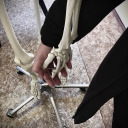
How I Study Anatomy
Everyone says NEVER TRACE!! THAT'S ART THEFT! Ok but we can do a little crime in the name of Learning.
Trace to learn, not to earn.
I like to take my own photos, but you can study whatever you want. Link back to original photos, and don't post copied artwork unless the artist is dead, cool with it, or both.
As always with learning, start every sketch with the intent to throw it away (trash for paper, quitting without saving for digital) This takes the pressure off and lets you make Bad Art, which is very important.
So let's make Bad Art of a Deer because I happen to have one handy
Start with a photo of your subject in a nice/neutral pose with all four feet visible. (so not like me)
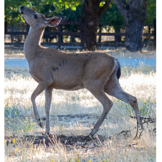
Freehand copy it. Try not to stylize, focusing instead of matching proportions and pose. Don't get too detailed!
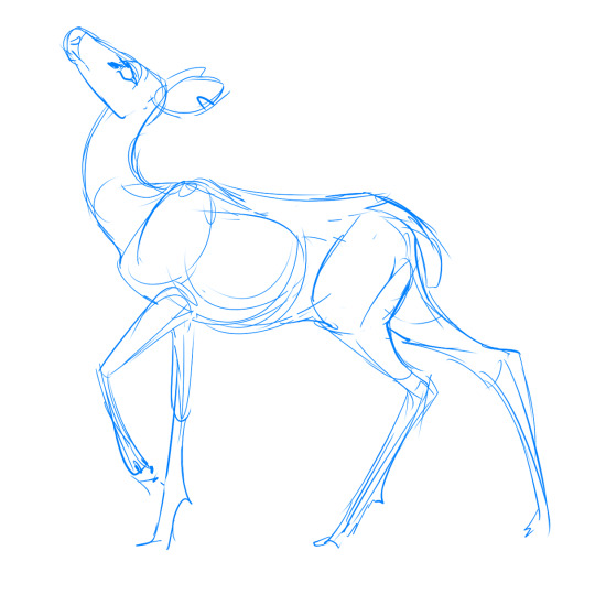
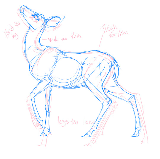
It's ok if your art looks terrible and has broken legs. I've drawn LOTS of deer so I have a leg up. Everyone's art sucks in their own eyes and here's where mine went wrong:
Either lasso-distort (recommended for beginners) or redraw a copy of your first sketch with your reference behind it (scaled to match the main body of your sketch)
Put the original and modified sketches together and compare the differences. Write it down if you want. This shows you where your eyes saw things the wrong size, so you can correct for that next time.
After learning about both deer and yourself, try freehand copying again.
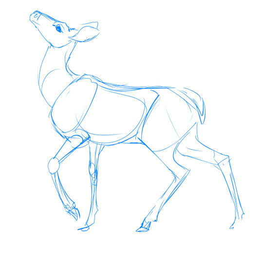
Marvel at your newfound knowledge and skill!
but there's always room for improvement
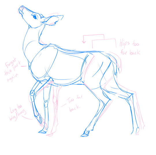
You can stop here and move on to your real drawing, Or do another freehand-fix-compare cycle. I actually overcorrected my "draws heads too big" and veered into "heads too small."

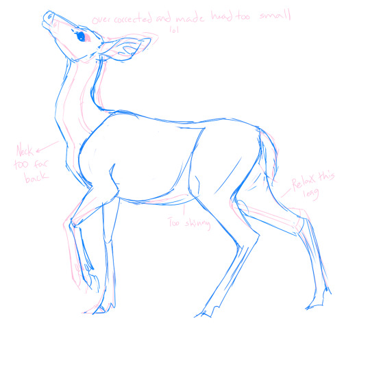
Another note on tracing: Learning HOW to trace is more important than anything you could learn By tracing. Draw the Anatomy, not the outline. In real life, things don't have outlines, they have bones.
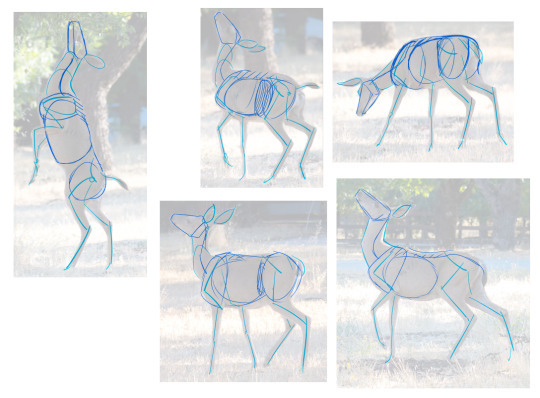
These are from the same shoot which is extra useful for consistency. The lines are minimal and follow where the animals joints are, and only important parts are drawn.
You won't know what Important Parts means right off the bat, which is where in-depth study comes in. You need to do learn the hard parts to do the easy parts right.
Next up: how to study bones and muscles.
36K notes
·
View notes
Text
back in the 00s a single dancing anime chibi gif would feed us for months on end
187K notes
·
View notes
Note
Please can I have some advice about making comics, specifically figuring out panel/page layout? Robber/Robert was beautiful and flowed so nicely
(Sorry, I know that’s a big ask, especially busy as you are! I would be grateful for even the smallest nugget of wisdom!)
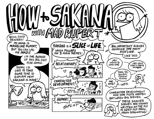


Hey! I know you're specifically referencing Robber/Robert, but all of the tips I gave in my How To Draw Sakana series still mostly apply to the way I make comics!
I plot out important story beats first (and the ending) and fill in little jokes between those mostly on the fly.
Even though RR is mostly digital (unlike Sakana, which is totally traditional), I still thumbnail RR traditionally because it's easier for me to see the whole page that way, and really get a sense of how big each panel and each element within the panel needs to be. All other details are basically omitted at this point, it's really just figuring out page composition. I also write out the dialogue traditionally. Even if I have a good idea of what I want the characters to say in every panel, trying to come up with exact dialogue later in the process always spells disaster for me. So I try to figure out dialogue and thumbnails at the same time.
The 5 in 5 rule is still what governs my panel/page layouts! I feel like the last [5] rule is worded a little poorly: what I mean is that hands can also add a lot to character acting and should be present as often as possible to avoid having too many "talking heads" panels. Even if a page is dialogue heavy, at least having the character gesture with hands or even do a small task (like make coffee or something) during a conversation or monologue will be more satisfying to read. ALSO, BACKGROUNDS ARE GOOD. I know I'm in the minority of people who LOVE drawing very complicated backgrounds, but even a few little lines or shapes or colors here and there behind a character can keep them present in the environment. I always try to Avoid The Void, but it really depends on how important the setting is to your story. I only draw comics with very specific important settings for some reason lol.
RR is in an American comics format (so roughly 10"x15", which is a 2x3 ratio and can scale down to 6x9 for print.) Again, I think it's important to get as much of a sense of how the page will look in the thumbnail stage as possible, without bogging yourself down with too many details. Often characters will just be pegs with circles for heads (and in Rob's case, two little antenna lines that make him look like a cricket), but where they are and how big they are are most crucial. I'd even suggest thumbnailing two consecutive pages right next to each other so you can really see the flow from one to the next.
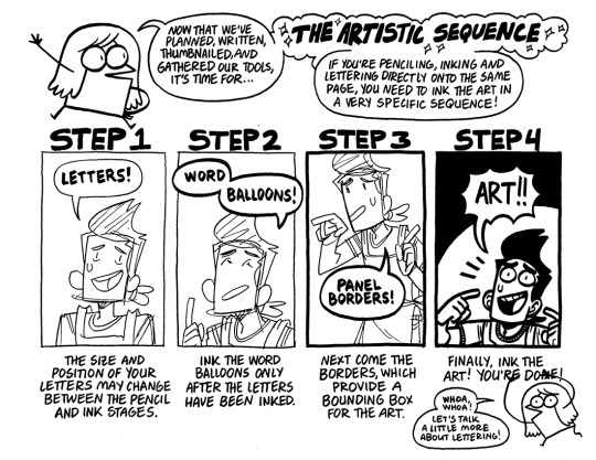
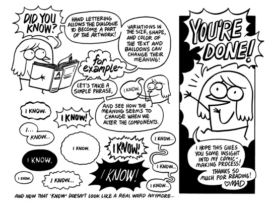
The rest of the pages only really apply if you're thinking about doing your comic completely traditional. Penciling, inking, and lettering DON'T need to happen on the same page/paper, but I'm used to that workflow so that's how I do it!
LETTERING IS STILL VERY IMPORTANT THOUGH. I'm sorry to be harsh, but there's nothing worse than bad letters on a great looking comic. If you're not feeling great about your lettering capabilities, I'd suggest taking some time with tutorials and practice to get something that really fits your comic style.
FINALLY, it's important to go out there and find comics that you LIKE and really study what they're doing, how they're doing it, and why it speaks to you. Currently I'm looking at a lot of Franco-Belgian comics, which are bigger than american or manga sizes, and CHOCK FULL of backgrounds usually. Some day I'd like to make something that looks similar, so I'm using every comic project I make as practice to get closer and closer to that style.
Anyways, I know that's a lot of images and text, so thank you if you got all the way through it, and I hope it's helpful! If there's something specific you're still confused about, I can always try to explain a little more. Thanks!
935 notes
·
View notes
Text
it's funny although a little exasperating how artists designing "princess" or medieval-esque gowns really do not understand how those types of clothes are constructed. We're all so used to modern day garments that are like... all sewn together in one layer of cloth, nobody seems to realize all of the bits and pieces were actually attached in layers.
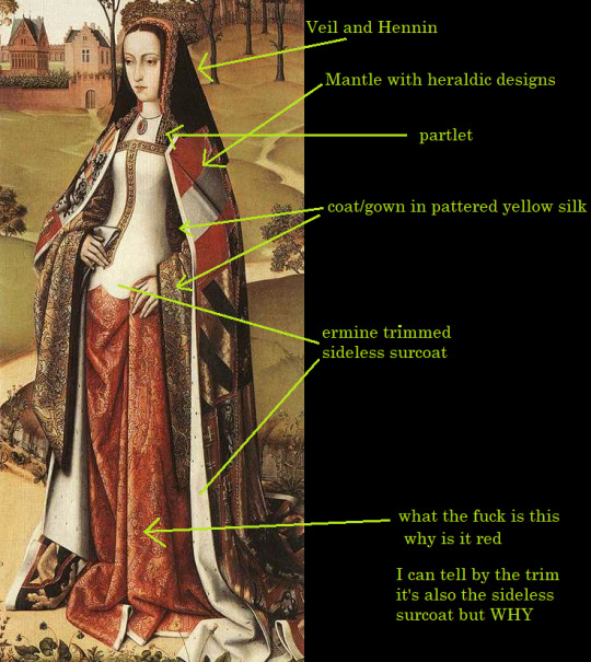
So like look at this mid-1400's fit:
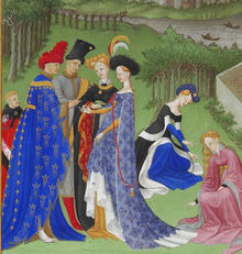

to get the effect of that orange gown, you've got
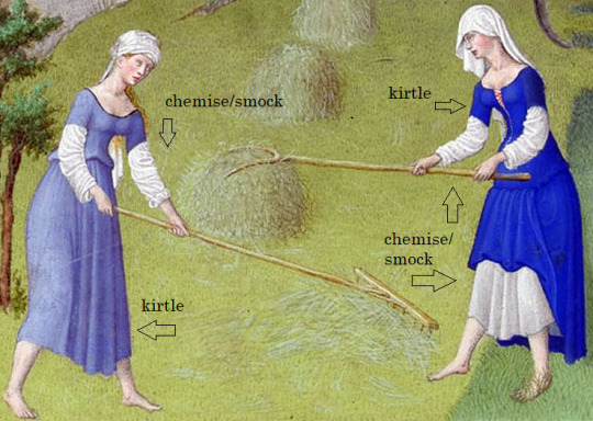
chemise next to the skin like a slip (not visible here) (sometimes you let a bit of this show at the neckline) (the point is not to sweat into your nice clothes and ruin them)
kirtle, or undergown. (your basic dress, acceptable to be seen by other people) this is the puffing bits visible at the elbow, cleavage, and slashed sleeve. It's a whole ass dress in there. Square neckline usually. In the left picture it's probably the mustard yellow layer on the standing figure.
coat, or gown. This is the orange diamond pattern part. It's also the bit of darker color visible in the V of the neckline.
surcoat, or sleeveless overgown. THIS is the yellow tapestry print. In the left picture it's the long printed blue dress on the standing figure
if you want to get really fancy you can add basically a kerchief or netting over the bare neck/shoulders. It can be tucked into the neckline or it can sit on top. That's called a partlet.
the best I can tell you is that they were technically in a mini-ice-age during this era. Still looks hot as balls though.
Coats and surcoats are really more for rich people though, normal folks will be wearing this look:
tbh I have a trapeze dress from target that looks exactly like that pale blue one. ye olden t-shirt dress.
so now look here:
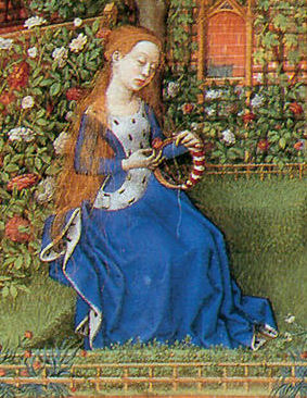
(this is a princess btw) both pieces are made of the same blue material so it looks as if it's all one dress, but it's not. The sleeves you're seeing are part of the gown/coat, and the ermine fur lined section on top is a sideless overgown/surcoat. You can tell she's rich as fuck because she's got MORE of that fur on the inside of the surcoat hem.
okay so now look at these guys.
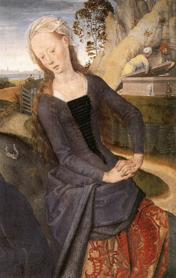
Left image (that's Mary Magdelene by the way) you can see the white bottom layer peeking out at the neckline. That's a white chemise (you know, underwear). The black cloth you see behind her chest lacing is a triangular panel pinned there to Look Cool tm. We can call that bit the stomacher. Over the white underwear is the kirtle (undergown) in red patterned velvet, and over the kirtle is a gown in black. Right image is the same basic idea--you can see the base kirtle layer with a red gown laced over it. She may or may not have a stomacher behind her lacing, but I'm guessing not.
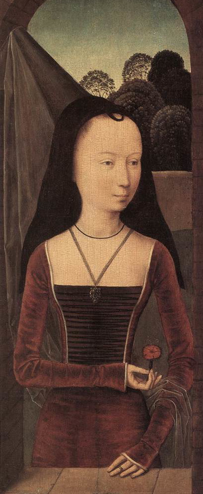
I've kind of lost the plot now and I'm just showing you images, sorry. IN CONCLUSION:
you can tell she's a queen because she's got bits I don't even know the NAMES of in this thing. Is that white bit a vest? Is she wearing a vest OVER her sideless surcoat? Girl you do not need this many layers!
25K notes
·
View notes
Text
They’ve released not just digitized works of art, but also a great many art history texts and art books in general. Just this week, they announced an expansion of access to their digital archive, in that they’ve made nearly 88,000 images free to download on their Open Content database under Creative Commons Zero (CC0). That means “you can copy, modify, distribute and perform the work, even for commercial purposes, all without asking permission.”
88,000 new free images just dropped, to use however you like.
23K notes
·
View notes
Text
Draw an ear with three lines
I can't count how many times over the years I've heard people say that human ears are really complicated and super hard to draw. And they are pretty weird looking things. All the curves and planes can be especially challenging when viewed from certain angles (The one that gets me every time is when you're mostly seeing an ear from behind. Like man, what is that weird flappy bastard).
Anyway. In most of the art I see on Tumblr, ears are drawn from the side (when your faves are smooching, am I right?), at a three-quarters angle, or from the front. Front views can vary a lot depending on how much someone's ears stick out from their head, but side views are more or less the same across the board.
Sooo, I wanted to share a really simple formula of sorts for drawing ears from the side. And if you want to depict an ear from a different angle, I think these basic lines can still be useful—along with a photo references, a mirror, or selfie mode on your phone.
Here ya go:

It doesn't matter in what order you draw the lines, but I recommend doing the outermost one first. And from those three simple lines, you can work out a rough sketch with some suggestions of depth and shading:
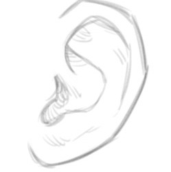
Of course, some people's earlobes attach differently, so you don't get the little curl at the bottom, and there's infinite variation in the specific shapes, but that's the gist.
I hope it's helpful! If anyone tries out, tag me so I can see :)
584 notes
·
View notes
Text


It's done! You can find the Absolutely Ripping It Up pack here.
Tear your artwork. Decay it. Blast a giant hole into it. Go nuts. Note that these are compatible only with Clip Studio!
here’s 200+ freebie brushes | and my brush tag is here ✨
32K notes
·
View notes
Text
YALL. Holly Black has a list of resources she's used for writing her books on the fair folk. I'm OBSESSED. I love her work and world building. it's so true to the heart of faeries
19K notes
·
View notes