
A Reflective Journal for the course interactivity at Malmö University - By A Student
Don't wanna be here? Send us removal request.
Statistics
We looked inside some of the posts by reflectivejournalixd and here's what we found interesting.
Average Info
Notes Per Post
0
Likes Per Post
0
Reblog Per Post
0
Reply Per Post
0
Time Between Posts
6 days
Number of Posts By Type
Text
12
Video
4
Photo
1
Last Seen Tumblr Blogs


Fun Fact
Tumblr is used by 21% of adults online aged 18-29 years.
Text
Old Technology With Interaction-Driven Design.
Introduction
When trying to get a grip of a double edged subject such as interactivity is, with feet in both science and art, can it sometimes be hard to maintain focus on what is important and what is not important. The mind tend to wander in arduous situations to more comfortable solutions rather than the more suitable ones. It is easy to dismiss outdated technology when presented with a task or a paper since there is almost always a lack of time, a deadline or something else which might entice the focus away to a premature illusion of completion.
“If I had asked people what they wanted, they would have said faster horses.” - (Allegedly) Henry Ford.
This quote is used in a lot of discussions regarding creativity and innovation, often meaning that in order to create something extraordinary one need to look forward and beyond the presence into an assumed future. However when looking at old car models do they look very similar to horse drawn carriages. Thus could point out the relevance of outdated technology when designing for something new.
The question that will be worked with in this essay is:
How can literature with outdated technology still be useful for interaction-driven design?
Literature with Outdated Technology
As with the old car model example could more time relevant parables be discussed. Today with smartwatches which has the attributes of an old watch, but the functionality of a computer. The design is the same as an old Rolex, approximately the same size and adjustable wristband to hold clock face, but the interactions, functions and purpose is new.
One foot in the past and one in the future could be an outcome when analysing these two examples. Designing for wearability (Gemperle et al, 1998) is an old paper about design methods regarding wearable artefacts/technology and how to design for that.
In the paper does Gemperle et al (1998) have an example of a pager and portable stereo. The research made did not have wrist based wearables either(Gemperle et al, 1998).
If the text would be analysed without the technology could it be easier to see how the literature still is useful for todays interaction driven design. The body has not been changed in 18 years, only the technology. This could mean that even thou the design in the paper is made with today considered outdated technology are the methods used still relevant today because designing for wearability is not about how to design technology for moving, it is about designing technology around the body with the abilities for moving.
The “Guidelines for Wearability” which is a result of the research conducted by Gemperle et al (1998) could be used as a checklist when designing for wearability. Guideline number 1 is placement. Determining where on the body the artefact should go need to be thoroughly thought of since the criteria of a product can vary since the functionality is different from product to product. The criteria Gemperle et al (1998) used when determining placement for dynamic wearability where areas that are relatively the same size across adults, areas that have low movement/flexibility even when the body is in motion, and areas that are larger in surface area.
Today could these criteria be argued since technology might be dependent on for example strong movements (gyroscope and accelerometer based technology). The criteria for a placement could differ but the guideline itself, placement, is still very much relevant.
If the paper where purely about how Gemperle et al (1998) designed for a wearable music player could it be hard to extract something useful today since a portable music players is a standard feature in all the cellphones today. Fortunately it is about how to design for wearable technology with focus on the interactions. The paper focus on how the body could interact with technology. One could argue that one should design technology around the human interaction instead of designing how one should interact with an artefact, since technology is always evolving. The artefact should be designed for human interaction in order to create long term usage of the product/project, wether it is for human convenience in everyday life or as a mean of development on future projects.
The values of previous research could be seen on the first example with the horse drawn carriage and the first models of the car. The main difference between the two is the engine instead of horses. The other external aspects are pretty much the same. A spacious compartment for steering the vehicle with walls making it more comfortable to manoeuvre, wheels, windows etc. The technical part of the vehicle changed before the exterior design changed.
Gemperle et al (1998) made research on how to design for various body-forms with a tool measuring arcs of different body parts, giving them data to create ideal forms to put wearable technology on the body.
The guideline number 3 in the paper is Human Movement. Human Movement is discussed in several occasions through out the paper and is one of the most important parts when designing for wearability(Gemperle et al, 1998). However there is little research on the study apart from user interviews about their designs based on the arc data. The users where asked about movement freedom and the comfort level they had when wearing the prototypes. These types of questions gives basically the answers good or bad, not why the designs are good or bad. The lack of movement data could indicate that there where not any good ways of collecting and analyzing body movements at the time. Old technology, the technology Gemperle et al (1998) had at their disposal at the time was not able to measure all the data that was needed to create something truly ideal at the time. On the other hand, the old technology based research lays a good foundation for further interaction-driven design research which in the future means better interaction based products and projects.
Relation to work
When designing for the ”bluetooth space” project (“Reflective journal,” 2016), the notion of (outdated) technology taking all of the focus was a problem.
By looking at the work that was made can it easily be seen that 90% of the work consisted of coding the bluetooth functions. The end result on that project turned out to be more or less code with not so much focus on the interactivity itself. Therefore will the project probably be useless in the future as a base when developing new interaction-driven designs for the simple reason that the focus where on the present technology. If the project had another or a complementary design based approach could the work perhaps be of relevance to future projects.
With the Body and Sound project (“Reflective journal,” 2016) was it the other way around. The focus on this project was on the design practice and the interactivity itself. Which made the project more alive. The movements the user made triggered different responses depending on how vigorously the user moved. The difference between the two projects could be that the maturation of design practice had been evolved, or perhaps is it that the technology is different and where unknown (for us) at the time, so it was more convenient to focus on the interactivity primarily and the technology secondarily. With this project where the negativity focus on the technology as well which could have been according to Fokkinga & Desmets(2013) theory about rich experiences where negative emotions enhancing the positive ones, a factor that made the interaction much more enjoyable. This could also mean that in the future could this project be used as some sort of foundation to other design projects since the focus where on the interaction itself and not just on technology.
When working on “Module 2 - Skin and Social” (“Reflective journal,” 2016) was the focus almost entirely on the interactivity. On this specific project was the interaction a handshake and the product was intended to show whether the handshake was good or bad. The technology where build around the interaction and not the other way around which could indicate that even if the technology becomes outdated will the project still be relevant in the future since the interactivity of a handshake will remain the same. Conducting a project in this way makes further development more graspable since it probably is only the technical part that needs to be updated. If the project had been conducted with equal parts technology and interactivity would the parts intertwine and therefore could mean that both parts will need an update.
Realizing how technology could be a distracting aspect of the design-process did make the development of the different projects to have differential approaches and therefore could indicate that the ability of separating technology from design practice is a legit way of creating long term lasting interaction driven design methods.
Conclusion
If the literature is purely about technology could the literature be hard to grasp and put in a newer perspective. However if the literature is based on more than just technology, like design and research, can methods, guidelines and principles be useful for interaction driven design since interaction itself can not be outdated, just used in another way. Even if the technology at the time an article where written sets limitation to the work that has been done, does it not mean that the work is useless. Instead it gives a foundation to work that is in progress and helps in the development of new research and projects. As seen with the first example about the car does previous design and research with old technology have a great impact on designs including current technologies. Old technology could therefore aid current interaction-driven design in numerous ways such as, research, perspective, development and academic.
0 notes
Text
Re-Exam Interactivity
Old Technology vs. Interactivity Based Design-Methods.
Introduction
”Current trends in computing tools are consistent with society’s historical need to evolve its tools and products into more portable, mobile and even wearable form factors” (Gemperle et al., 1998).
This quote is as relevant today as it was 18 years ago. Humans have a genetic need to improve, develop and move forward. No matter at what cost do we move forward. Sometimes without thinking about the consequences. In 1866 did Alfred Nobel discover the dynamite. It was a revolutionary discovery. The development of the dynamite started to flourish and was a big part of the industrial revolution. 79 years later did the first two atomic bombs detonate in Japan. Maybe someone should have stopped and reflected about what the consequences might be if we develop this. This parable might be a bit far-fetched, but still, it demonstrates just how important reflection and consequent thinking are when developing (interactive) products.
”This essay sucks because it was published in 2006. How could this be relevant now when we have smartwatches and is on the verge of having functional AI (Siri, Alexa, Google Home etc)?”
These comments are often delivered during presentations and seminars of articles older than 2 years in the course Interactivity. When reflected upon, are there several sides of the statements that needs to be addressed. In order to design for something new, we need to look at the past and the present. That is common sense, but how deep do we need to look before it is irrelevant to the task or goal one has set or is given? When pondering that subject did a realization occur when relating this to interactivity: Why do old technology distract us from the design methods? This question could be the root to the problem with understanding the complexed topic of Interactivity and designing for interactivity.
Old technology and new design methods
When reading literature that has been given to you as an assignment or a guideline to a task has there been a tendency of skipping the important part when hastily realizing that the work where done when developing, for example a new version of ”Office 98”. In retrospect is it arguably easy to analyze this behavior, the conclusion might be that in fact the text where bad or misplaced in the course, but the reason that seems more believable is that great design methods or ideation tools could be interpreted as hidden behind old out of date technology. The reason this might be a problem for some students could be that they see so many new cool interactivity-based products and projects coming to life that the pressure of creating something ”life changing” makes them skip a step in the education and perhaps forget about truly analyzing a design method. Another reason could be the simple fact that the learning process is still in progress and therefore not knowing what to analyze because they lack maturation. This could be similar to how a touchscreen registers touches, but without a background noise removal filter. The touchscreen removes background noise in order to give a more correct response (Heyer, 2016). This could also be related to Dreyfus (2002) theory of coping with different situations, but without proper knowledge. If the right knowledge is not there, how could one take the right way to the proper solution.
How can the same text be both useful and useless at the same time?
Designing for Wearability (Gemperle et al., 1998) could be perceived as irrelevant since the text lack relevance when it comes to the technology today. It could be that todays wearable technology scene is much more developed then it was 18 years ago. The tests that where made did not include some sort of wristband technology when conducting the user research which considered today could seem strange because we have so much wearable technologies on our wrists, for example smartWatches, pulse sensors etc. New technology has in this case been distorting the credibility because we can actually see how wearable technology has been developed in the last couple of years. It is understandable to be slightly annoyed when thinking of the technology distortions, the negativity has in this case perhaps made it fun to complain about the old article and blinded the reader about the true meaning behind the article and interfere with the ability to properly cope with the information implemented in the article.
However, if the text would be analyzed without the technology could the design methods and practices perhaps be shown in another light, which could be easier for some readers to see clearly and be more reflected upon. The Guidelines for Wearability that are considered during the research conducted are applicable in todays way of conducting research and designing for new products. This could be as stated above where out-of-date technology dims the purpose of the paper which in this case is the design guidelines for wearability. When thinking about this from another perspective does it seem strange how something so small as a copyright mark at the bottom of the page defines the perception of the paper. Maybe this could be where Fokkinga & Desmets theory about enriching product experience with negative emotion applies.
In the article Ten Ways to Design for Disgust, Sadness, and Other Enjoyments: A Design Approach to Enrich Product Experiences with Negative Emotions does Fokkinga & Desmet give examples of Ordinary experiences, which is among others ”Slight annoyance during a work commute”. Slight annoyance during a work commute could easily be converted into ”Slight annoyance when reading a paper when you could do something more fun”. The emotion character on ordinary experience is mildly positive/negative and neutral, which could be why it is easy to focus on a simple line at the end of an article because the emotions are simply to shallow and therefore could be striving to something that triggers more or stronger emotions . If the article would have been controversial or revolutionizing with (in this case) state of the art technology, could it arguably trigger different set of emotions, the notable experiences. The focus would have been on the purpose of the paper instead of something else you could do with your time. An example of notable experience is: ”joyful terror when riding a rollercoaster”. When riding a rollercoaster the focus is on the experience itself, not what to do after the ride as it would be when doing something ordinary. If the text could give the reader an easier passage to creating something that does not yet exist would it perhaps trigger a revelation of what could be created and that would be more like a notable experience than an ordinary experience.
Relation to work
When designing for the ”bluetooth space” project, the notion of old technology distorting the design methods could apply. By looking at the work that was made can it easily be seen that 90% of the work consisted of coding the bluetooth functions. The end result on that project turned out to be more or less code with not so much focus on the interaction itself. The technology took the main focus on this task and the end result became just a reflection on the technology. With the Body and Sound project was it the other way around. The focus on this project was on the design practice and the interactivity itself. Which made the project more alive. The movements the user made triggered different responses depending on how vigorously the user moved. The difference between the two projects could be that the maturation on design practice had been evolved, or perhaps is it that the technology is different and where unknown for us at the time, so it was more convenient to focus on the interactivity primarily and the technology secondarily. With the latter project where the negativity focus on the technology as well which could have been according to Fokkinga & Desmet(2013) a factor that made the interaction much more enjoyable. Realizing how technology could be a distracting aspect of the design-process did make the development of the different projects to have differential approaches and therefore could indicate that the ability of separating technology from design practice is a legit way of creating interactivity or conducting research of a yet unfamiliar topic.
Conclusion
This essay has been touching on several topics but with the intention of reflecting on academic texts and on how to pass obstacles which could occur within the readers perception. It is important to now what triggers negative feelings and how to generate the negative emotions into something constructive instead of letting the negativity nurture the more stimulate action of complaining. The trick is to know what is important and relevant for you as a designer in different contexts and being able to sort out all the possible distortions that may occur due to the reasons stated in the text.
When it comes to coping with all of this is it important to know how to do it in the most preferable way for you personally otherwise could that lead to a long detour which takes both effort and time from the original task.
References
Gemperle, F., Kasabach, C., Stivoric, J., Bauer, M. and Martin, R. (1998) Design for Wearability. Institute for Complex Engineered Systems Carnegie Mellon University.
Fokkinga, S. F., & Desmet, P. M. A. (2013). Ten ways to design for disgust, sadness, and other enjoyments: A design approach to enrich product experiences with negative emotions. International Journal of Design, 7(1), 19-36.
Heyer C. (2016). Module 3: Nuance and Touch and Pixels [Powerpoint slides]. Retrieved from https://mah.itslearning.com/ContentArea/ContentArea.aspx?LocationID=25994&LocationType=1&ElementID=1721162
Dreyfus, H.L(2002). Intelligence without representation—Merleau-Ponty’s critique of mental representation- Phenomenology and the Cognitive Sciences, 1(4),367-393.
0 notes
Text
Exam Essay - Interactivity
Abstract
This is the final paper for the ”Interactivity” course at Malmö University. This paper will show the learning outcomes of a participating student during the autumn of 2016.
This paper will explore different interaction attributes related to the work done by the author in the interactivity course at Malmö University. As a complimentary subject will rich experiences also be discussed and reflected upon.
The question or problem in this paper is how to know when or what design principles to use when designing for interactivity.
Reflective design practice theory
The main focus in this paper will be on the relationships between different interaction attributes, experiences and why this is a relevant design practice theory. In order to start reflecting on interaction attributes do the Aesthetics of Interaction be discussed. Aesthetics means ”the formal study of art, especially in relation to the idea beauty” - Cambridge dictionary. The idea of beauty is based on the observer and therefore is very debatable because the things one observer sees as beautiful does not necessarily means that the next observer sees as beautiful. Beauty triggers feelings, different feelings depending on the observers interests, needs and the situation the observer is in. This relates directly to the dilemmas of Interaction design principles. Good interaction design needs to be satisfying for both the expert user and the novice user. Related to beauty does interaction triggers feelings and to be able to design for feelings do we need to understand in what way all the feelings are triggered. The Interactive vocabulary described by Lenz, Diefenbach, and Hassenzahl, 2013 is a good start on how different feelings are triggered with interaction design and how to design for them in a constructive manner. Slow interaction is associated with appreciation of the moment. Fast interaction indicates a focus on efficiency attaining the instrumental goal of the interaction. An interaction design that requires an investment of time has a different feeling and purpose than a fast interaction which is focused on efficiency. This could be related to an slow artsy film which takes time to understand but after watching is it very beautiful and satisfying. An horror movie with a lot of ”jump scares” is fast but also beautiful to the observer in a different way. The different kind of movies have different purposes and are designed and produced differently. Therefore do different interaction designs principles needs to be applied accordingly when knowing for which purpose the interaction is designed for.
This relates much to the ideas of Fokkinga and Desmets paper about enriching product experiences with negative emotions. To summarize the article is it about enhancing positive experiences by using negative experiences. For example: The negative experience disgust enhances the positive experience of fascination. ”Something disgusting gives a very direct, in-your-face experience that can be intriguing” - (Fokkinga and Desmet, 2013).
The different feelings or perceptions of the user amplifies the experiences and therefore enhances the interaction design. But in order to design for this and how to know what feelings to design for raises a couple of questions.
One question that comes to mind instantly is how to know which design method or idea to use in which project and how to know which design methods are irrelevant to which works. In a course like this when working hard and fast throughout 4 different modules in half a semester and learning so many different principles with essays, materials and findings is there no time to think, there is only time to do. When the question needs to be answered is it important to know what you are designing, for whom you are designing and in what purpose. Designing for wearability is different from designing an ordinary smartphone application. Therefore is there a need to consider different design practices in order to reach different goals. The design methods considered will help to shape the final outcome of the design.
When working on ”Module 1 - Space and Bluetooth” was the focus on interaction design attributes as described by Lenz et al. The ”Interaction Vocabulary” helped to understand and describe the feel of the interactions. ”Desired profiles can be specified by the designers and compared to users’ perceptions” (Lenz, Diefenbach, and Hassenzahl, 2013).
To understand what kind of feelings the interaction has is important. However in retrospect would it have been a lot easier to develop the interaction if the psychological behaviorism design approach which Fokkinga and Desmet addresses in their article had also been researched.
The interaction that was being developed during Module 1 was a ”time-reminder” that was intended to give different feelings to the user with subtle hints. A problem that occurred due to lack of knowledge at the time was how to tweak the javascript codes time intervals to maximize the desired feelings needed throughout the interaction.
If the understanding of how emotions work and what different triggers could be would the Interaction been much better on a deeper emotional level. The lacking of design principles on this task was (in retrospect) a problem whilst working with this. However the project could have taken a very different turn if ”wrong” method was implemented on the work. If the work had been done with a TUI method, the interaction itself would have been something else. Perhaps could the same goals be reached but in a more complicated way than needed.
When working on ”Module 2 - Skin and Social” was there different perceptions of feelings that needed to be addressed. The interaction used was a handshake and the idea was to build something that indicated if a handshake was good or bad. The question that arose was: what defines a good handshake? The interaction vocabulary for this type of interaction could be gentle vs powerful. However to answer this question based on the different attributes is hard because the perception depends on the users feelings and situation. If a person with great power shakes hands with another person with great power with a firm handshake would the handshake be good. But if a person with great power shakes hand with a person without great power with a firm handshake would only the person with great power feel that the handshake was good. Therefore is it hard to generalize what a good handshake is. A bad handshake however is much easier to distinguish. A bad handshake could be too loose or painfully hard. Using Lenz, Diefenbach, and Hassenzahl, 2013, ideas about ”opposite” interaction design attributes did the question change to: what defines a bad handshake? A bad handshake is either to hard or too loose. If a handshake is to hard is it painful, if it is too loose is it somewhat meaningless or disappointing. Because it is (almost) impossible to define a good handshake did the design develop from the bad handshake. Therefore was did final outcome of the product indicate when the handshake was ”bad” and when the handshake was ”not bad”. Using this design principle formed the product in a better manner than the original thought. The original thought was that the indication would be good (green LED) and bad (red LED). Instead did the final product indicate bad (red LED) and not bad (yellow LED).
Lenz, Diefenbach, and Hassenzahl, 2013, made an similar example of this kind of thinking when describing their brainstorming cards with the ”interaction vocabulary and experience card set”. Of corse, this kind of thinking is not perfect. One risk of doing this is that it is easy to only see things from a black or white scenario instead of looking at all the colors in the specific problem.
It is hard to isolate the development of maturation to this course because it is part of a whole program. When looking back at the work done in module 1 and compare it to the work done in module 4. Different problem are addressed in different ways. As an interaction designer do you strive for perfection and perfection is almost impossible to reach because times change and different needs appears or disappears. However this is a half semester period so to show how the designerly practice have mature is to look at what kind of different problems appeared and how they where solved. The problems in module 1 with how to create subtle hints which where to create a feeling of needing to be at another place, would have been a lot easier to overcome if the knowledge generated during module 2 already was known. As said before, if the knowledge from module 2 was already known on module 1, other problems or obstacles would have been addressed.
Conclusion
There is several ways to reach the intended goal when designing for interactivity. There is no right or wrong method to use, however it is important to know or at least have an idea of what the outcome should be in order to have an idea of which methods to consider. As stated in the paper is there several ways to use the design methods. They can be guidelines to know how to design and be used as problem solvers. The big question when designing for interactivity is in the authors on opinion how to know when the design is good enough for public use or good enough to show a stakeholder. The answer to that is up to the designer him or herself to decide.
References
Cambridge online dictionary retrieved November 3. 2016 from http://dictionary.cambridge.org/dictionary/english/aesthetics
Fokkinga, S. F., & Desmet, P. M. A. (2013). Ten ways to design for disgust, sadness, and other enjoyments: A design approach to enrich product experiences with negative emotions. International Journal of Design, 7(1), 19-36.
Lenz, E., Diefenbach, S. and Hassenzahl, M. (2013) Exploring Relationships Between Interaction Attributes and Experience. Folkwang University of Arts. .
0 notes
Text
Module 4 final
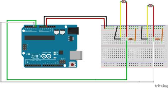
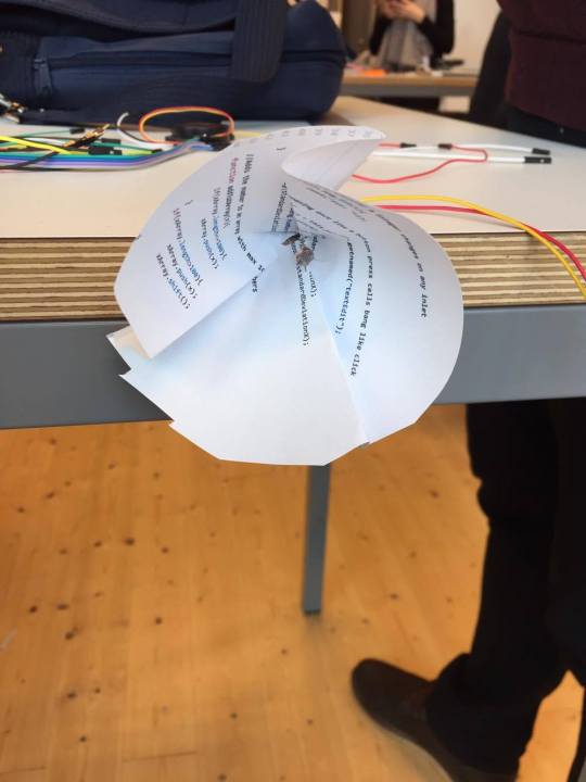
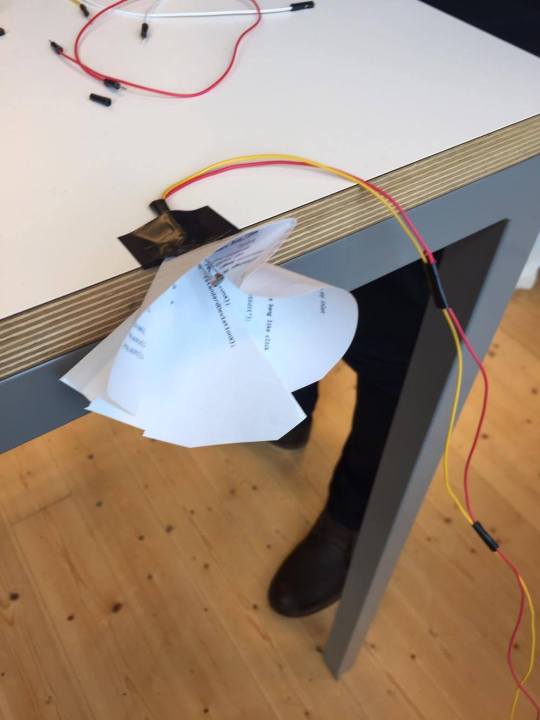
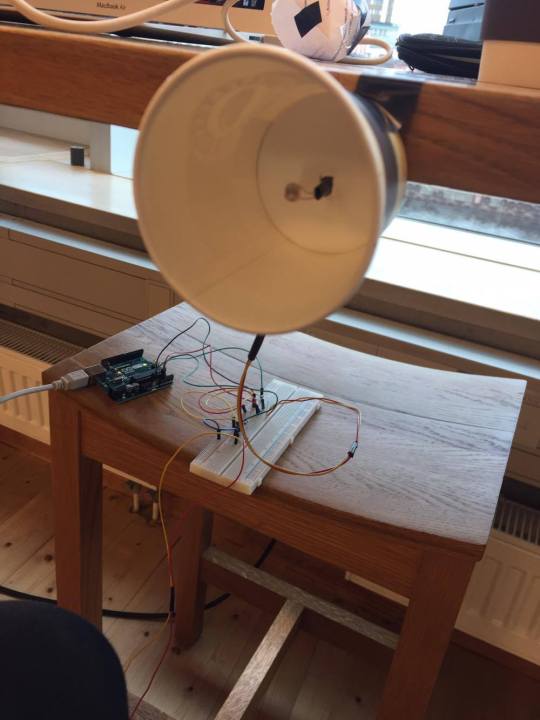
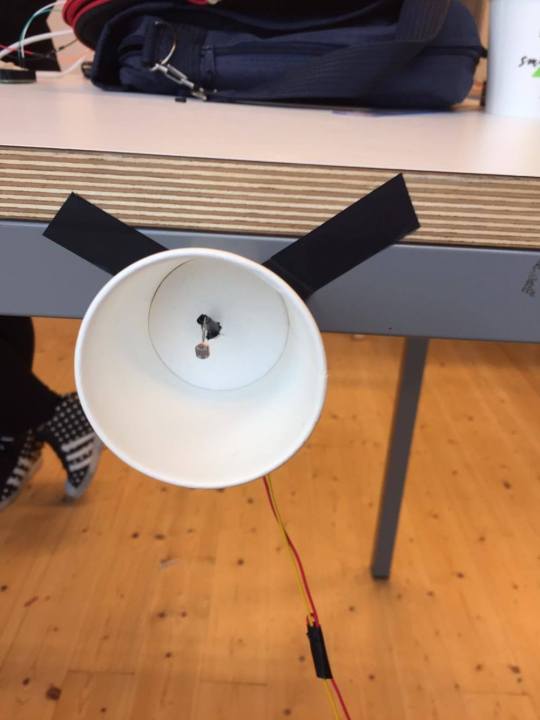
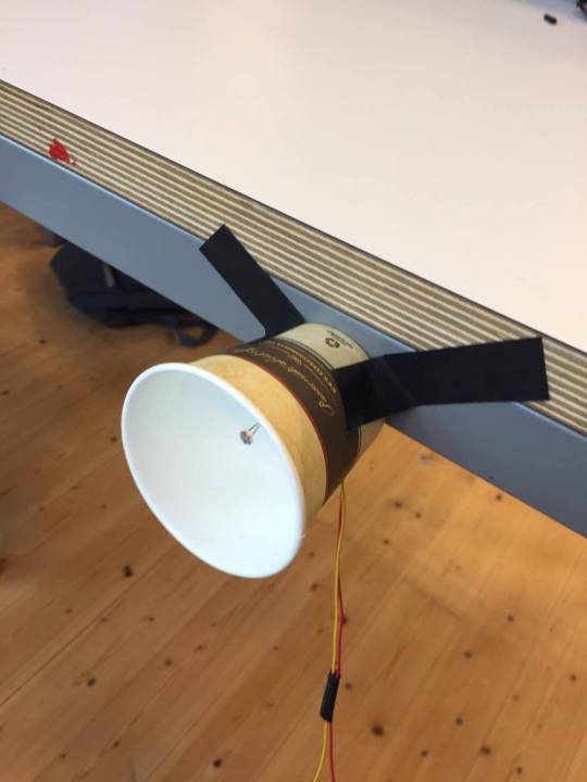
The work with Antonia went pretty well. A lot of time was spent on understanding how ableton worked. It wasn’t the most userfriendly application I’ve seen. Anyways. Sketching. We tried first by putting the sensors in front of the person and made the code so it would make different sounds depending on how close or far from the sensor you where. That was a pretty buggy solution so instead did we put one sensor in front of the user and one behind the user. The code was programmed so if you where close to the sensor in front of you did one sound play and if you where close to the one behind you another sound played. This worked pretty good, but not perfectly. So we decided to isolate the sensor by using rolled up papors in the form of cones. This made the sensor more accurate. But the cones where not even so we choose to use take away espresso cups. This Was the best solution. The presentation went well, even thou Henrik seemed to be in a pretty bad mood. We kept the presentation short and on point. We both did talking and we described our design process and the reasons why the prototype looked the way it did. A mistake we did was not to bring up Tightness, Ambiguity and Openness. Tightness: I think our prototype have a bit if tightness because it is continuous/graduated because the longer you lean, the longer and stronger do the sound play. It is Co-located because where you lean, you get different responses. Ambiguity: Our prototype is a bit ambiguity because there isn’t an obvious use of the prototype. Openness: The design can be used anyhow because you necessarily don’t need to use it the way we used it. You can also used it anytime because there is not any specific place you need to use this.
0 notes
Text
Module 4
In this module I got paired with Antonia. I think we are a good team. I read the texts but I cannot really see how they relate to our work with body and sound yet. For now I think it is because I didn’t get a good impression of them. I think they where just academic articles of something everyone knows but there where not any academic articles about the things “everyone knows” so they made them. We are working with ableton live which is the worst music edit program I have ever worked with. The Interface feels like a bad version of windows 98. Despite of that are we working on a “thing” that makes different sounds depending on if you lean back or forward on a chair. We’re using arduino and two photosensor which reacts on different light settings.
0 notes
Text
Long time no write..
Have been really sloppy with this journal this past week and some days. No excuses. I think it’s the autumn depression that have kicked me off my blog related path... Anyways. Me and Laura had a great presentation feedback-wise! She talked alot. I didn’t get to say anything during the presentation. Answered a question but thats it. Anyways it was great to work with Laura, she has a different way of working than I’m used to so that was educational and useful for me. We did a different kind of work. Instead of having one finished product we presented our work from day one to presentation with 7 or 8 different ways of interacting with a square. I feel like im just writing nonsens.
0 notes
Text
Module 3 - Beginning 4/10 and Drayfus - Intelligence without representation
Yesterday did we have our first lecture on the 3rd module in this course. Clint started the lecture with different types of touch screens and pixels. He told us about resistive screens (scanners and printers), capacitive screens (iPhone, ipad etc) & optical screens. Then it was how they worked and how the data was captured from the screens. After that he talked about pixels. Pretty basic about pixels, what they are and how they work (RGB). After that he went on talking about more philosophical thoughts on actions. There are different kinds of actions that we perform in different ways, with and without some sort of thought process behind. I wish I had read the article for this course before the lecture because the philosophical part got a bit confusing. I didn’t read the article before because it was uploaded on its learning to late. Anyways here’s some notes on the article:
What is meant by 'representations'? Can you think of an example?
Representations are things you do while thinking how to do it and the actions needed to perform a task. A beginner guitar player need to think on which frets to put his or hers fingers and now which strings to strung. Whilst an experienced guitar player doesn’t need to think how to play, he just need to know what to play without any brain representations.
What is the view of Dreyfus when it comes to representations, and what positions does he argue against?
Really hard question to answer - I need to revisit this one. How does Dreyfus' use of the term 'affordances' relate to the ideas of Gibson and Norman?
What might the consequences be for designers? Eg, Dreyfus uses the example of playing tennis with a raquet. If we are designing an object like this, what would make for a better or worse experience in relation to skillful coping?
0 notes
Text
Module 2 - final
This module was nice, we revisited arduino which was nice. Our task was to create something interactive with skin(touch) and wearable technology. I and Mattias created a glove which indicated if you pressed to hard or to soft when shaking hands. Similar to the previous module was there a lack of time in my group because that our first idea was “too dangerous”. Maybe not too dangerous but I got that impression when reading between the lines. Anyways the developing part on the wearable did go well until the point when we realized that our force sensitive resistors where to sensitive. We could measure the force implemented on our product so unfortunately where we out of options so we faked the prototype by adding a sensor on the wrist as well. The presentation went well and we got pretty good feedback. The main problem that emerged from the feedback on our wearable was how to determine the difference from a firm handshake to a “too hard” handshake. So overall did we do well in my opinion.
I think we did well applying the texts we read before the module as well. We had a positive and negative interaction experience with our handshake wearable. The positive is the satisfaction you get from making a good handshake (maybe satisfaction is the wrong word here, cant describe it better now). The negative experience is when you press a hand too hard and you feel bad because you’ve hurt someone with your action. So we have a satisfaction-anxiety kind interaction. It’s wearable, even thou we didn’t have time too put the lights indicating good or bad on the glove. It’s definitively tangible because you can touch it and feel it. The product itself is not digital in the sense of a computer-screen that you interaction so in my understanding is it 100% tangible.
0 notes
Text
Wednesday 28/9
Today we went to school and asked for help with the programming. Our teacher couldn’t help on our problem because the FSR was to sensitive so we decided to fake the programming to illustrate the interaction experience instead. Then we went home to my place and made the last finish on our product.
0 notes
Text
Tuesday 27/9
We met up and started to work on our arduino prototype. We went to school and soldered (lödde) our fsr. Then we went home to my place and started to program the arduino. We wanted to use different pressures to make different things happen. We couldnt figure out how to program that so we decided to do what we could and get help on wednesday(28/9).
0 notes
Text
Monday 26/9
I was sick on monday so I could not attend the class. But I had a talk with Mattias and we decided to skip the whole electric shock idea and do something basic instead due to lack of time. We bought force sensitive resistors.
0 notes
Text
The email
Hi
In the other case there was talk of using 170 volts and above which is a definitive no. Even lower volt like 9 can still be harmful and for that reason think it should be avoided. But the bigger problem is that I think it’s hard to motivate from the perspective of the assignment. Now, I don’t know your full concept but to me its seems like chocking someone is to take a bit of a shortcut.
But let’s have a discussion about it on Monday.
/t
0 notes