
Last Seen Blogs

substanceagainstdepression-blog
Selbsthass

dominantmistressblogpage
Dominant Mistress

learnhossain
learnhossain

squidhop
Squidhop

wiccarts-blog
Art. Witchcraft. Music
Text
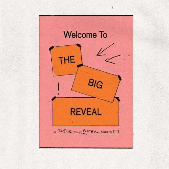
Final poster animation

I made this animation in the same way I made my first test with this method, except obviously with more images. The final outcome used 286 images and while it did take a long time to do, ensuring there was enough detail was worth it to create fluid motion.
Initially I realized there wasn't enough time to read the poster when it uncrumpled. I took the final GIF and put it into premier pro, then cut out a few frames of each poster iteration when it's fully readable and looped them to fix this.
As an outcome I really liked the animation. I think the style is unique, and creates something visually appealing that brings together my points of inspiration well. I think it archives the point of the brief, being to create a poster made to inform about an issue we're passionate about. The point of the animation and design is to inform about the outrageous laws set down by this government, and it is able to do that. I want people reading it to almost have to double-check what's written, as I think the laws really are that bad, so I am really on a shock factor being created.
The issues I have with this outcome do mainly lie with the design, as I really like the animation a lot, however I've already spoken on my issues with that.
0 notes
Text


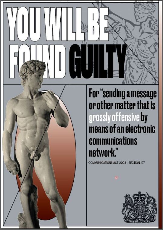
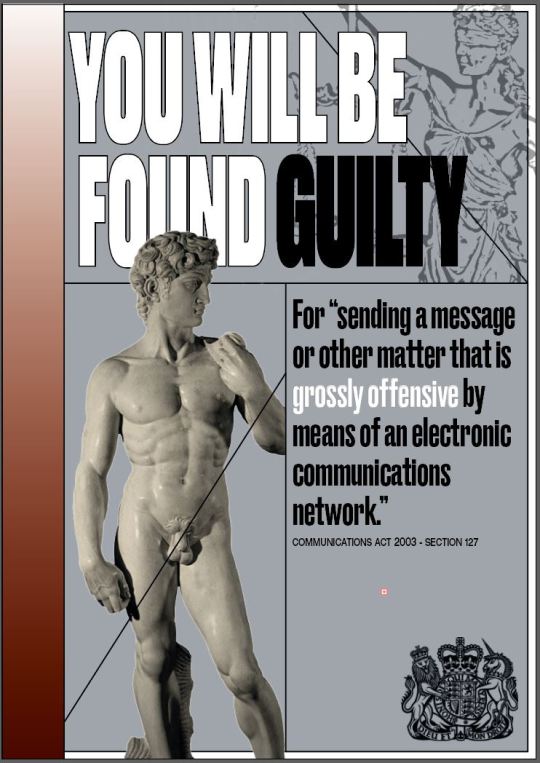
These were the final 6 posters I made. I think they're a huge improvement on my previous design, and they address the issues I was having with legibility and overall impact. They're much simpler, lining up with my plans for the redesign, and I think they have a much stronger visual appeal.
I decided to change the colour of the gradient between each iteration of the poster to create some variation as I think it will help prevent the poster becoming quite as boring in the final animation, although that's mainly achieved through the changing imagery.
I still wasn't completely happy with the design, especially in their still forms, but I struggled to figure out why. I tried to make some adjustments but nothing seemed to really help. I think the reason was partially to do with the fact I still hadn't gown on my art direction at all, so having to draw inspiration directly from that was still something I didn't enjoy.
When I took still frames from the animation however I did like them more. I think the texture added really adds to the posters and creates some extra visual appeal. It also means that displaying the still posters like that have that design style I wanted that came from Anna Mills' work.
0 notes
Text


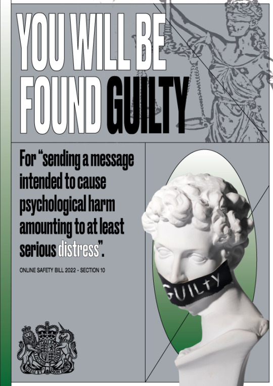
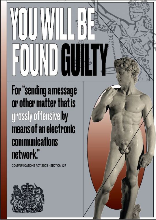
These are the images I used in the poster variations I made, the 2 others coming from the statue of David I've discussed previously. I chose the pictures specific reasons that I felt tied into the laws there pictured with well.
0 notes
Text

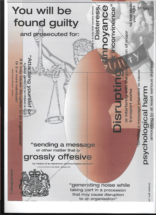
Developing this second version of my poster was similar to the first. I started with the shapes that would make up the structure and added the other visual elements afterwards. There was obviously less in this version but I think it does mean that my outcome is more striking and gets straight to the point
0 notes
Text
POSTER DEVELOPMENT


By now I had found that the best way to fix the issues I was having would be to redesign my poster. I'd since had feedback anyway that my poster design didn't utilise the structure that the geometric shapes created well enough and that did make sense, both for fixing the issue of being able to read the poster and for creating something actually visually appealing.
These we're the sketches for the poster redesign and the do follow a more guided structure in layout witch I think was good for my outcome.
The idea here would also be to create multiple posters, one for each law that I had previously cramped all together in one poster. I wanted to create a layout that I would allow me to change the main image and text with each iteration while keeping synergy between them all when displayed together. I then wanted to create that seamless crumple animation between all the poster variations.
0 notes
Text
ANIMATION RPOCESS


I made this simple drill using After Effects, experimenting with an alternate style of animation. The shimmering glowing effect wasn't too complex to make however did give me an understanding on how to use evolutions with animations. Using evolutions meant that the animation would automatically create variety indefinatly. I was also hoping doing this would be able to give me some more ideas for my outcome, but it didn't seem as appealing to me as my current ideas.
0 notes
Text
POSTER ANIMATION
I tried putting the 2 animations together to see what it would look like but this lead to a big clash in style and I wasn't happy with the results.
0 notes
Text
POSTER ANIMATION
This was the outcome of that animation, and I really didn't like it as much. I feel like it had significantly less character to it and became boring quite quickly however it did help to increase legibility,
0 notes
Text
POSTER ANIMATION

I thought to address this issue I would make an alternative animation that would be easier to read and absorb, and see if it gave me any ideas on where to go next. I wanted to use the typewriter effect shown to us in our AE tutorial and the idea here is that the text would initially slowly, but progressively faster type itself out.
0 notes
Text
POSTER ANIMATION


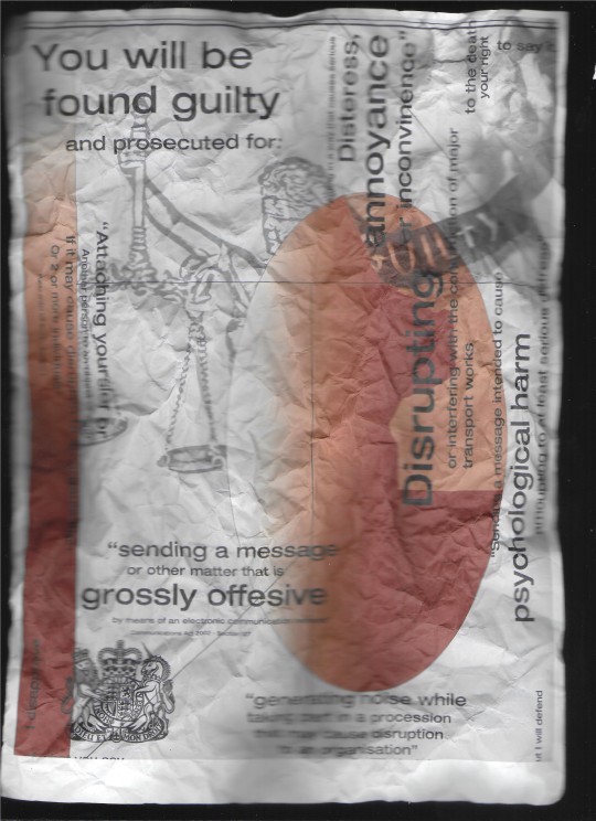
The animation itself took place over 32 frames that I put together in Photoshop and I was really pleased with the outcome. I think it created an animation I was really satisfied with and it has that rough visual style I wanted to create. I think the way the paper crumples up, shifting and morphing between frames creates this really interesting life in the work. The idea behind it did obviously come from my work with GIFS and looking at Anna Mills' work but the idea for the animation also partially comes from my theme on freedom of speech. The animation therefore partially represents how people's criticism of the government can be so easy crumpled up and thrown out.
The biggest issue I had with this was the difficulty to actually read what's on the poster, you have to watch it multiple times to be able to see what's going on so I do want to address that issue moving forward.
0 notes
Text
POSTER ANIMATION


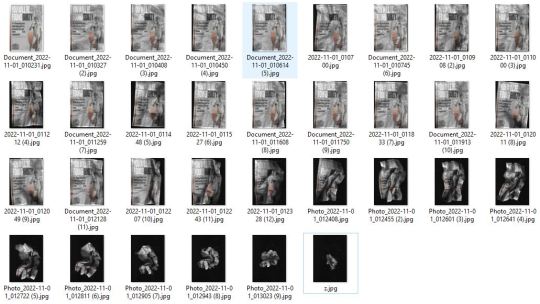
A selection of still from the scanned images. I do really like how when you isolate the specific images they almost look to be captured in motion.
0 notes
Text

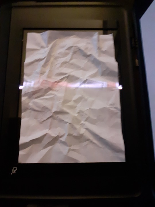
I could now start to work on this animation idea I had developed. I printed out my poster design and by hand crumpled it up over time, scanning the paper with every significant shift in form.
0 notes
Text
ANIMATION PROCESS
Making A GIF
Before continuing with my idea to create a crumpling animation I wanted to finish of my work with GIFS by making a very simple animation of my poster design with the different elements appearing over time. I don't think this is at all interesting but it does bring together my work with GIFS and my poster design.
0 notes
Text
Animation Process
Just to see how it looked I used the GIF on a solid black background and I do like the result of this. I tried to think of ways to develop it further but I couldn't think of much besides again overlaying it onto footage so I decided to leave this as is, as I now had developed a stronger idea to experiment with.
0 notes
Text
Animation Process
Experimentation
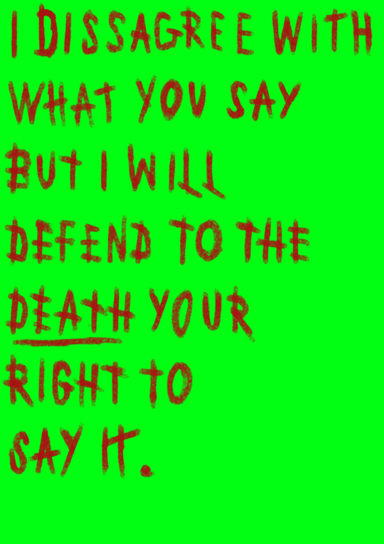
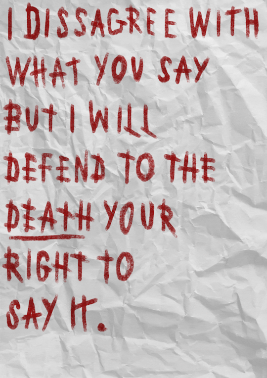
I wanted to make one more piece of experimentational work using this green screen GIF method. I wanted to make something more large scale, so I used the quote “I disagree with what you say, but I will defend to the death your right to say it”. I feel as a quote this is incredibly relevant in this project and my message behind the work I'm making, and I did include it in my first poster design. The meaning behind it represents so well my stance on freedom of speech in this country. I made this using more frames and also added a paper texture behind one variation of the GIF where I animated the words to smudge out.
I didn't expect these to come out amazingly as it is just experimentational work to create ideas from.
I did get from this, combined with Anna Mills' work, the idea to animate a poster by having it physically crumble and uncrumple, witch I will try moving forward.
0 notes
Text
ANNA MILLS
I think Anna Mills' work fits in really will into this part of my project, and allows for some artist research in a project that focuses on mainly contextual research.
The work she creates almost all focuses on animation, creating GIFS, and bringing shapes to life.
The main aspect of her work I like is how she creates an almost lofi style. She accomplishes this by a lot of times repeatedly scanning the pages of an animation to create imperfections in the work like varied crumples in paper and morphing to letters and line.
0 notes
Text
Animation Process

Utilising Greenscreen (development)
I developed this green screen animation further by overlaying it onto video footage. I adjusted the colour of the footage, increasing the yellow hue, to create contrast between the video and the GIF. I used footage of the previously mentioned battle of the beanfield, as I felt it fit with the tag I use "REVO", coming from "revolution".
0 notes