
Statistics
We looked inside some of the posts by rhiilustrates-blog and here's what we found interesting.
Average Info
Notes Per Post
0
Likes Per Post
0
Reblog Per Post
0
Reply Per Post
0
Time Between Posts
2 months
Number of Posts By Type
Text
17
Last Seen Tumblr Blogs


Fun Fact
The most popular pages on Tumblr are about Minecraft, GIFs, and David J. Peterson.
Text
Reflecting on Exhibition
I think for me and my group personally, the most difficult part of the exhibition was communication between all of the groups. This had made certain things more difficult than it should have been, for example, the hassle of the deadline dates and some people not reading the brief fully which left them to miss important things out on their pieces.
I do feel that the curation was successful during the time of the exhibition as we worked well as a team, supporting each other etc as well as communicating with each other well. We were able to set up sufficiently and everyone was pleased with the outcome.
Although parts of the exhibition were stressful, the opening night was successful and I would like to be able to do another exhibition, where it may be my own exhibition, as this experience has given me an insight on how to prepare and organise for one.
This had utilised my talents as I haven't worked in a team in this environment for a while so it was a good feeling to be able to be a part of that. I also love decorating and love home-type things so to do be able to be in charge of setting up the exhibition and to be apart of choosing what we were going to use to decorate with was really fun.
What I would do differently, is either using something simpler to hang up the prints or to make sure the magnets were big enough to hold the prints. Although this wasn’t necessarily anyone’s fault. It just felt very time consuming and using something like trouser hangers would have been a lot easier and quicker.
As this is the first exhibition I have ever done, I would want to learn more skills and a more of an insight on how to organise an exhibition from being to being able to get funding to design a logo for the event.
Although this was a team effort so it was not in my control, I think I would also do differently is the communication between all the teams. For me personally, maybe to speak out more if someone is suggesting/saying something that isn't quite right and to let them know. All I know is that in the future I definitely would want better communication when working in a big group. I would leave behind the miscommunication and take away from this experience is that being prepared for an exhibition is very important and its good to have a theme so that all work ties in together.
0 notes
Text
Preparing for Opening Night
We went to Jacob’s market the day before to start setting up as we didn’t want to leave it all on the day of opening night. This is where we started putting up the decorations, figuring out where the mood board was going to go, where the stall was going to go so people could sell their work, drinks etc.
The 24th of October was the Opening night and private viewing of our exhibition. On this day, we had a meeting with the lecturers about the exhibition about working as a team, as there had been miscommunications between different groups. I felt like we should have had this meeting sooner instead of having it on the day of the opening night of the exhibition.
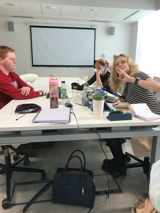
After the meeting, the curation team and any extra helpers headed over to Jacob’s Market to finish getting the venue ready. This day mainly consisted of putting the prints up on the wall. Harry, Sam and Robyn brought the A-boards (that were used for the stall) and the A3 prints and Bett brought the A2 prints later on in the day.
I set up the mood board, where people could put their thoughts about the exhibition. This was moved around a lot as we ended up using a projector in the end. This consisted of having everyone's names and a logo that was involved. I designed a little ‘share your thoughts’ poster (see below) so that people knew what this was for. I used the 3 pop colours so that it tied in with the whole theme.

The information cards were stuck onto mountboard and were cut out to go next to each of the prints by Sam and Robyn.
Below are some images of the curation team and extra helpers setting up the venue over those past two days:

What we found the most difficult of this process was putting the prints up on the wall. As I said that the magnets were the wrong size, this meant we had to double up on each of the corners, using pins underneath the prints so that the magnets would stick. We then had to use command strips to put in the centre of the prints so that they would stay up. This was very time consuming as we needed to make sure it was all lined up and straight. We did come up with the idea of using hangers to hold up the prints after deciding that framing the work would be too expensive but was suggested the using magnets was cheaper and easier. I feel like using hangers would have been an easier suggestion.
Below are some pictures once the exhibition was finished:

0 notes
Text
Creating my work for the Exhibition
On the 1st of October, I first created a mind map (see below) to get ideas running as I wasn’t sure what to do for my piece. This involved things like what the word ‘portal’ meant to me, which was kind of spiritual, a doorway to a parallel universe, paranormal etc.

At the time, I was doing my dissertation, discussing how make-up has an effect on the modern world in today’s society, so I kind of wanted to do something make-up related for my piece. In the mind map, I came up with ideas of how I could do that.
On the 2nd of October, I then did a little research on how people have incorporated portal on their face and researching how I could create my own. I then drew some thumbnails (see below).


On the 4th of October, I chose my two favourite thumbnails and created finished roughs of them. I went for the having a portal inside someone's glasses and someone upside down with their hands kind of holding the portal on their face.
For the actual portal on the face and sunglasses, I wasn’t sure what to put in it at first but I decided to put symbols of my star sign in it. I wanted it to have a celestial/universe vibe but not just have stars in it. Before I came up with this idea, I found difficult to figure out what I was going to add in the portal.
Upside person with a portal on face rough:

Portal in someone’s sunglasses rough:

On the 7th October, I then chose the ‘portal on the face’ rough as I liked this one the best and if it was going to relate to my dissertation then this would be the best option. I decided my pop colour was going to be yellow (although I ended up using all 3 colours without really realising), as I felt with this piece the yellow would really stand out.
On the 14th of October, I then finished my final piece for the exhibition. it originally looked like this:
On this one, I felt like the yellow didn’t stand out enough for me.

So I added a grey mesh colour over the top of my piece apart from the bits where it was yellow.

This was my piece in the exhibition:

The one thing I would change is the portal to look more like it was painted on using make-up. Although I do like this piece and I feel it was successful as it hit the idea I wanted to have, I wanted to the portal to look like it was painted on the face rather than it looks like it has been stuck onto the face.
As I was drawing this piece I videoed myself because I wanted a small video of the process to go on the artivive app, as I thought this would be interesting for people to see the sort of ‘behind the scenes.’ The video was me creating the actual portal. I thought this would be the best part to show my process as the theme was Portal. I know that the video was a little long but I wanted to show people the process as not many people see that and just see the final piece.
Screenshot of the video:

0 notes
Text
Preparing for Exhibition
On the 3rd of October, we visited Jacobs Market, which was the confirmed venue for the exhibition. This was done by the location team. The curation team visited the venue because we wanted to see what the room was like, how big it is etc. Below are a few images of the venue:

After the curation team had been discussing and researching about decorations, I decided to create a list of things that we mentioned so everyone could take a look at the list and decide what we think we should have for the opening night. (See below)

We wanted the theme to be geometric/80s but mainly wanted lights that matched the pop colours. We decided we were going to organise the prints into what pop colours they had to go with the fairy lights.
By the time the opening night came, we had got fairy lights, LED candles, memo boards, geometric fairy lights, magnets, LED lights, geometric stationery holder, page holders and post-it notes and mount boards. Although the magnets were the wrong size (this was an innocent mistake) and didn't hold the prints on the wall very well, so we had to get pins and command strips to help hold up them up onto the wall. We also didn't use the mount boards for the prints but for the information cards.
Robyn created a 3D model to give us an idea of what the opening night would look, mainly having the coloured lights matching the prints (see below).

0 notes
Text
Creating the Brief
As part of being in the curation team, we were in charge of the brief.
We decided we wanted a Pop Colour or colours so that all of our work would tie in. Robyn sent us different shades of 3 colours and the curation decided each shade for the 3 colours using poles in a group chat. These were the decided colours:

We also decided that each person would have no more than one piece so that the exhibition looked cohesive. It was originally A4 but after seeing how big the space was, we then changed to A3 but then ended up using the A2 prints that Bett and Liam printed out. We put our A3 prints for sale.
For the theme of the exhibition, the curation team agreed that we could have no restrictions and kept it very opened as long as their work included at least one of the 3 colours.
I feel like the deadline was the most difficult part of the brief and the whole preparing of the exhibition. This is where there was miss-communication mainly between curation and the rest of the group. The deadline was originally the 20th of October (if you were handing in traditional work, then it was by the 21st), but this was then changed to the 17th October by the project managers (we were not properly informed by the changes). This was to give us enough time to print, although we ended up using the A2 prints that Bett printed out. When it came to the deadline, people were not serious about this and ended up handing in between the 17th and 21st October and was said that apparently, the 17th was a ‘soft deadline.’ This was irritating as I feel a deadline is a deadline.
Another thing that we found difficult, was when it came to the deadline, we found that people had not read the brief properly, so some didn’t have any pop colours in their work even though we made it clear that you needed at least one of the colours in your work. Also, their pieces were the wrong size, although this was more understanding as there were a few changes to sizing, because of the venue being bigger than we first initially realised. Others didn’t give us their work in the right format. This meant the curation team had to chase some people to re-send and explain that they needed certain things in their work. This left people feeling irritated, but if people read the brief properly this wouldn't have been much of an issue.
Below is the curation team finalising the brief on the 2nd October 2019:
This was the final brief:


0 notes
Text
Deciding Roles and Themes
To decide what role each person would have, we would write our names down under the name of the role we wanted to do. The roles were project manager, location and logistics, branding and design, curation, promotion and private view/events. There was a lot of swapping around but eventually, everyone was happy with their choices.
I chose the role curation along with Charley, Harry, Jesicca, Robyn and Sam. The responsibility that came with curation were: writing the brief after the theme was decided, selecting and mounting work (although we wanted a venue where it would fit everyone’s work), hanging and labelling again. During the preparation of the exhibition, my role within the curation team was to keep tags on who was buying things so that we could get the money back from the funding (this was managed by the project managers).
We decided the theme as a class where we spitballed possible ideas that we could do for the exhibition. These included Halloween, nature, white noise etc.
We all eventually ended up agreeing on the theme ‘Portal.’
Once the theme was decided, the design team created logos, where we would also decide as a class what the logos would be, that was used to promote the exhibition.
0 notes
Text
Going for Stone Poster
After I created the Christmas logo for FoutmuttsTV, Haydn had asked me to create a poster for his upcoming student short-film Going for Stone. I agreed to do this as it was more advertisement type of work.
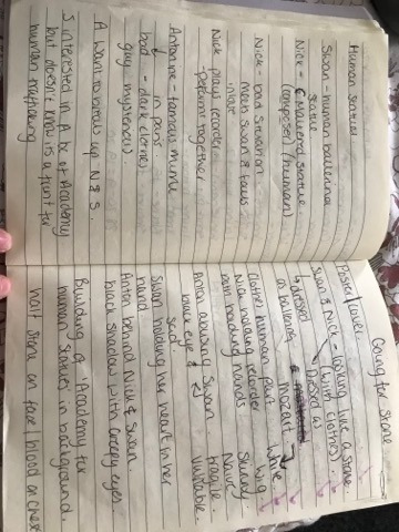
On 20th December I had a video chat with the Director for this short film, Nicole Subeva, who explained what the film is about and what she wanted for the poster. Below are my notes from the video chat.
I then created notes of my own for the 3 of the characters that were going to be in the poster, which was then followed by roughs of the characters (see below).

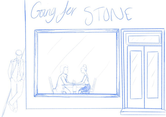
I then created a rough of the poster and sent it to both Nicole and Haydn.

Although Nicole had liked this rough, Haydn had another idea for the poster that felt it would be suited more for the film. Below are my notes for the change of idea.

Below is the rough I created after Haydn’s notes. Haydn was more pleased with this rough as well as Nicole.
This was the final piece for the poster (see below). I created the poster as soon as possible as they had already started promoting the film and needed the poster for their social media.

I think what I found the most difficult about doing this poster was having to redraw the idea. I prioritised this as it took longer to complete the poster, but this meant this was successful as I was able to complete this piece so that Nicole and Haydn could use it as soon as possible. This felt good as I have been mentioned in their fundraiser credits and they have mentioned me on their social media.
I learnt to be able to adapt to changes that clients make and to be to recreate their new ideas, although I wasn’t expecting the change. I also learnt to be able to communicate with 2 clients of the same brief at different times.
If I were to re-visit this poster, I would have made the outlines and facial features of Nick and Swan darker so that you could see it a lot better. They looked fine on their own but once they were added into the poster, I feel like they blended into the background. I also would have consulted Haydn about the original idea I had discussed with Nicole before drawing the rough so that it would have saved time and I could have created the poster quicker.
0 notes
Text
FourmuttsTV
I attended the Create & Collab event at the University. This is where students from all courses could come along and meet other students, as well the student enterprise, potential clients and organisations in an attempt to collaborate with them. Olivia and I had met Jennifer Stevens who worked for PetsFi. Jennifer is very heavily involved with dogs and attends dog-friendly events.
I emailed Jennifer to see if she wanted to meet, to discuss potential work for myself. we met with Jennifer on 11th December who introduced us to Haydn Waikling who also worked with Jennifer and explained the business is called FourMuttsTV. This organisation is based on dogs, so they share stories of dogs, events for dogs, dog shelters etc. Olivia and I both shared work we’ve done in the past and they agreed that we would be their illustrators.
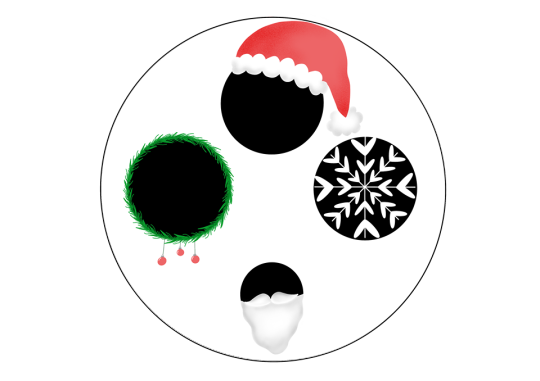
On the 16th December, I had met with Hadyn and Jennifer to discuss what they wanted from us. They already had a Logo but wanted us to expand on their logo as well as creating headers for their social media’s. Below are my notes from this meeting.
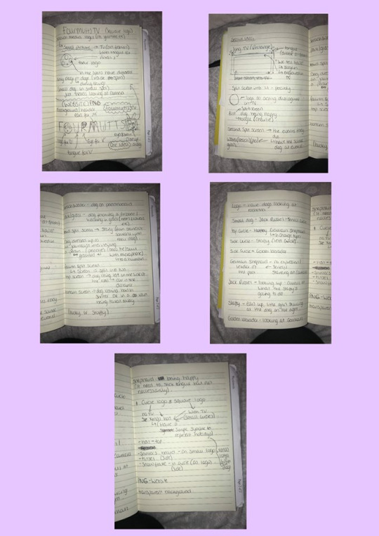
They wanted their logo to look Christmassy but needed it as soon as possible as it was Christmas at the time. What was successful with this is that we met with them on Monday and I had done the Christmas logo by Wednesday, so I was able to deliver this logo really quickly whilst still achieving what they wanted.
This was the original Christmas logo (see below).

Jennifer had responded with:
“Hi Rhiannon!!
This is amazing, thank you so much for getting this over so quickly!!! You absolutely hit the brief!
Would you be able to change the snowflake to a white snowflake on a black circle? Also if the beard could be a bit more silver on the bottom dot that would be great!
Best, Jenx”
I took on her constructive criticism and retouched on the logo and resent the final piece for this logo. (See below). What I have learnt to prepare for this, is to be open-minded when clients want you to change something slightly.
As Olivia and I were both their illustrators, I stuck to the logos and she created the headers. I then created their next logo. This is where they wanted different dogs in the black circles of the logo, all looking at each other (see below). When I met with Jennifer and Haydn, they had spoken about specific dogs to go on this logo. They wanted to have different types of dogs to show that no matter what breed they were, all dogs are welcomed in their organisation. Also, specific dogs were put onto specific black circles depending on their personality. For example, the German Shephard was at the top as they are known for being a leader.

What was difficult about creating the main logo, was that (as I’ve said before) my technique for drawing dogs is very time consuming and I had started to get other work experience, which was the poster for the short-film and Haydn needed the poster as soon as possible, so I focused on that. I feel like my own weakness during this was my time management. When I was asked to create the poster for the short film, I should have managed my time so that I could work on both of them at the same time and got the logo to them quicker. If I could do something differently, it would defiantly be my time-management.
When I was communicating between Jennifer and Haydn, I felt like I kept them more updated about the logos and tried to give them a date to when I would finish the logos. This would let them be aware of when they were going to get the work and it also gave me a deadline to work towards.
I had some more opportunities from working with FourmuttsTV as Haydn was also working on a student short-film and had asked me to create a poster for that. Also, Olivia and I are currently working on another header for FourmuttsTV
0 notes
Text
TSB Charity Raffle
I was asked by a friend to be a part of their Christmas Charity raffle they were having in their work. The winner would receive a voucher where I would draw a loved one or pet of their choice.
To prepare for this, the friend who had asked me to take part created a little voucher for whoever won (see below), where it had my details and social media accounts so that they would be able to contact me.
Once this was done, I kept in mind that someone was going to message me explaining that they had won this voucher.

The winner messaged me on the 2nd November claiming they were the winner and what they needed to send to me. Although they sent me a message at the same time I was doing my dissertation, I explained that I couldn’t do it for a couple of weeks but would let them know once I had started it. They were ok with this and stated they wanted it before Christmas as it was going to be a gift for a friend.
At this point, as I was so busy with other priorities, that when it came to doing this, my communication wasn’t the best as what it normally is, as I had forgotten to let them know once I started it (they had messaged me asking when I think it was going to be done a few weeks after telling them I couldn't start it right away). I also had to extend how long it was going to take for me to draw purely on other priorities, although I let the winner know that it was going to be done by Christmas.
They had sent me a picture of their friend’s dog that they wanted me to recreate (see below).
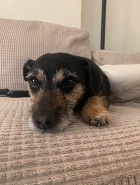
Below is my drawing of the dog.

This utilised my talents as back in the summer, I had started to draw other people’s pets and loved ones, so I had improved my talent of recreating images of pets when it came to drawing this dog. I also had never been involved in a raffle where I would offer someone something for winning so it was good to try and learn something new.
This was a little difficult as my technique of drawings animals is very time consuming as there is a lot of detail, so was difficult to get it done by the time the winner had wanted it, although this is one of the most successful drawings I have created of someone’s dog. Both the winner and I were very pleased with the outcome.
I think I will leave miscommunication between myself and clients and organisations behind as it can seem very unprofessional and could lead to a loss of clients in the future. This is something I will do differently, just to always keep clients updated whether it's a quick message about being delayed or when I know I'm going to get their work done by etc.
0 notes
Text
University Alliance Christmas Card Competition
One of my lecturers had emailed me about the Christmas card competition that the University Alliance holds every year, which I decided to enter in. Below is the link to the brief that they had created for this competition.
https://www.unialliance.ac.uk/wp-content/uploads/2019/10/University-Alliance-Christmas-Card-Competition-Brief-1.pdf?fbclid=IwAR0hJDYeQeadPIWIf9iAMuo4COru8jlSE8Cq--ztD40JsBYDIyYNPejlkM4
When reading the brief and finding out who the University Alliance is, I started to concentrate on how they've formed a sense of community with all of the Universities so I wanted to show that within the card as well as making it Christmassy.
At first, I created thumbnails to get a sense of the idea of what I wanted to do for the Christmas card (see below).

I then created roughs from the thumbnails I liked best (see below).
The first one is of carolling at a front door, as this has been a tradition for years and it’s a great way to bring people together, so I thought this would be a nice idea to represent the community.

This rough is a more simple idea, using baubles as the universities coming together in the form of alliance.

I decided to go with the first rough as I liked the idea of showing carolling as a metaphor for bringing the universities together as a community. Also, the second rough was similar to the poster I had done for Alfie Poulter Cosmetics so wanted to do something different.
They provided us with colours that they wanted us to mainly use as these were colours of their logo and brand (see below).

The image below is my final idea for the Christmas card. This is where I found new artistic skills and improved my technique. I had started to add texture onto my drawings, which I now do on most of my illustrations.
This is the email I had sent to matilda along with my final idea for the Christmas card:
“Hi there!
I am Rhiannon Lowery, a 3rd-year Illustration student at the University of South Wales. Below is my entry for the Christmas card competition.
The 3 People represent the Uni’s coming together as a community and working together, so I thought it would be a nice idea to have coral singers singing together to represent that as well as representing Christmas, along with the door reef.
Many thanks
Rhiannon”
Although I had left it to the last minute due to other priorities at the time, so I felt this piece was a little rushed. If I was to re-visit this piece, I would add facial features so it was more clear that they were singing and make it more seem they were actually outside a house rather than just have a door.

I sent my card to Matilda Embling, who is the communications and engagement officer for the university alliance. I had later received this email, once the winner was chosen:
“Hi there,
Many thanks for entering our 2019 Christmas card competition. We received some truly fantastic designs and the standard was extremely high.
Unfortunately, this year your entry was not the winning design.
Our winner will be announced on our website later today, so do have a look and do consider entering again next year.
If you have any questions about the competition or the judging process, do not hesitate to get in touch.
Kind regards Matilda Embling”
Although I was disappointed in not winning, I was pleased with the design that I found represented the University Alliance and kept to their colour scheme for their brand. In the future, I would like to enter into more competitions so that I can try and get myself and my work out there for potential clients.
What I would have done differently is defiantly have more control of my time management at the time so I wouldn’t have rushed it and would have had time to add the little details just to improve it more. This is something I have already built on since creating this card and will continue to build on so I am able to balance my workload. I also plan to keep improving my drawings skills which I am doing every day as I was pleased to have a new technique.
0 notes
Text
Alfie Poulter Cosmetics Promotion Posters
During writing my dissertation, I wanted to message some small businesses that were maybe interested for me to create any posters for upcoming promotions they had. This is where I decided that I wanted to be a freelance illustrator.
Alfie is a self-employed beauty consultant who has given me treatments in the past. I knew that she has her own social media for her work, where she frequently uploads sales shes having, before and after treatments etc.
I messaged Alfie to see if she had any upcoming promotions that I could illustrate for her. She had never done anything like this before, so I suggested that it could be Christmassy, as it was Christmas at the time or to be a specific design to go with a specific. I had them came up with roughs to show an example for an offer for Christmas (see below).

Below was her response to these roughs.
“They look amazing !! thank you! I was thinking of doing like a ‘send a friend’ offer where, if you and your friend come for an appointment on the same day you get like a buy one, get one half price sort of thing ??? I can always sort all of the details it would just be nice to have the ‘bring a friend’ or ‘send a friend’ thing on there with the ‘buy one get one half price’ (you may be able to word it better than me)”
I had asked if she wanted both posters or just the one. She mentioned that she like the baubles idea and suggested that I could create a theme that's more general so she could use it all year round. I offered to do both so she could have a Christmassy poster as well as a general poster.
She was opened minded about what the general poster would like as long as it was simple so that it matched her logo and brand. She then sent me her logo to show the colours she uses (see below).

Below, is the original finished poster. I wanted to add in the green and yellow/gold to try and relate it to Christmas more as they are typically the colours you see around Christmas as well as red.

This was Alfie’s response:
“That looks amazing!!! Do you think there’s any way that the baubles could be like different coloured pinks & white, Like my logo? (Just so it matches the theme of my page really) if it’s too much trouble though please don’t worry, that honestly looks so cool!!”
I understood what she meant and explained I was trying to get more of a Christmas vibe. I explained that the pinkish baubles are the colours from her logo and asked if she wanted different shades of those two colours for the other baubles.
This was the final poster:

She was a lot more pleased with this poster as it matched her brand and logo more. She uploaded the poster onto her Instagram story during Christmas time.
For the general poster, I wanted to incorporate the treatments she does. For example Eyelashes, make-up, nails etc, but still keep it simple and on-brand.i started drawing nail polish, eyebrows, eyelashes, eyeshadow palette, lips and lipstick. I was then unsure of what to do with these illustrations so I put them in a line and copied and pasted them and realised I could do a repeat pattern with these drawings.
Below is the final idea for the general poster:

She was also very pleased with this poster, and I presume she will use this poster in the future when she has this offer running again.
As Alfie was very opened about what the posters would look like, so at first, I found it difficult to come up with a poster that was on-brand as well as it looking Christmassy for the Christmas poster, and having it simple for the general poster. Although I did enjoy coming up with these posters as it utilised my talents and I was able to be creative in my own way. I felt like the posters were successful as Alfie were pleased with both of the finished product and felt like they were on-brand with her business.
During working with Alfie, I learnt that when a client is open to ideas, be aware of their brand, logo and colours so that it ties in with their business as well as incorporating your own style. Also, communicating with Alfie, it was very chilled to talk to her but still professional.
What I would have done differently is I would offer to create more posters for her promotions as I never mentioned it after creating the ‘Bring a friend’ posters.
0 notes
Text
National Museum Wales Logo
Over the summer, I was looking out for emails involving work placements and live briefs and I came across creating a logo for the National Museum of Wales. As I no longer wanted to be a children’s book illustrator, I wanted to do something along the lines of advertisement work and was interested in creating a logo.
I contacted Sarah Younan, who is the Youth Engagement Coordinator at the Museum, explaining that I was interested in creating a logo for the Hands-on Heritage project and asked what she had in mind. Below is the email, Sarah replied with, explaining that it includes 4 strands. She also attached other current logos that the museum has so the main logo of this project would tie in with other logos.
“Hi Rhiannon Thank you for your interest. It’s a pretty open brief, but the logo is for the youth forum projects, and they are led by young people, so maybe something that isn’t too old fashioned and museum-ey? The project is called Hands on Heritage, and in Welsh, that’s Dwylo ar Treftadaeth – ideally, the logo should incorporate both languages, as our museum logo does too. We’re also funded by heritage lottery fund, so the logo you design will sit with the museum and the heritage fund logo quite often, so would be nice if they looked ok together I’m attaching the logos Finally, it’s a project that promotes inclusion and diversity within the heritage, we’ve got 4 strands; -black history/minority representation/diversity theme -environment/extinction/climate change/pollution theme -LGBTQ+ history theme -‘life till death’, cradle to grave (basically human experience, mental health and just trying to get through life) theme Maybe the logo you design could be our overall logo, and then you could tweak it to have versions for our different strands? Like using colours or little symbols/drawings? Also, we sometimes put on music and events and art, sometimes we try to do some activism – so if you design a basic logo and then create a few different versions we could use for different things we do that would be perfect. Thank you I hope this helps Looking forward to your designs Sarah”
After, reading this email, and thinking about what I could do for these logos, I created a few roughs and sent them to Sarah. The first 3 images (below), were for the main logo. I originally tried to tie all 4 strands in each of the logos, but Sarah had suggested having an empty version of the heart logo as the main idea. For the 4 strands, I kept to the heart logo and having an illustration inside to represent them (below). Sarah explained that the filled ones for the strands hit the theme really well.
(Top 3 logo thumbnails for the main logos):

I then created a new version of the main logo (see below), going with the heart shape and added foliage in between the words to make it seem more heart-shaped, although Sarah suggested not to have the foliage in between the words as she thought it wasn’t necessary.
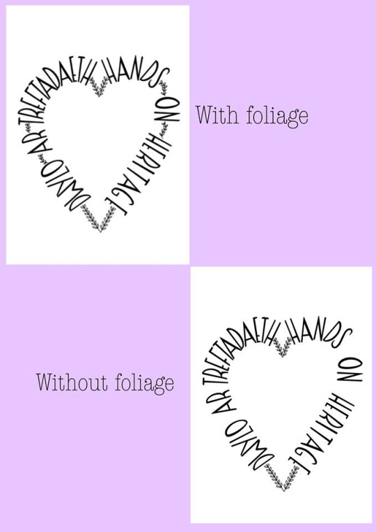
Below are the final logos for the main one and the 4 strands:

As Sarah was seeing the Youth Forum behind the ‘Hands-on Heritage” on the 17th August, she wanted me to complete the designs so she could present them to the forum to see if they liked them or not.
After the 17th August, I hadn't heard from Sarah for a month, so on the 11th September, I emailed her asking if she was still interested in my logos. She had replied with:
“Hi Rhiannon
I’m sorry for the lack of feedback and apologies for not getting in touch with feedback. So I liked the logos and so did the youth forum, we sent them on to our communications department who sent them on to the senior management team who then explained to us that they are undertaking a museum-wide rebranding over the next two years and don’t want us to use any new logos until that point.
Thank you for your work and I’m sorry, this type of blocked pipe way thing is very common in large organisations
My best wishes Sarah”
What was difficult was not hearing from Sarah in that period of time and wondering if they had preferred someone else’s logo idea. After emailing Sarah, I was relieved that the youth forum liked my ideas and was planning to use my logos if not for the re-branding of the Museum.
A few months later, I and a friend attended the Create & Collab event at the University, where Sarah Younan was also attending. I was able to speak to Sarah, who remembered my logos and offered me more work from the museum which I will be doing after January.
I felt like my logos were really successful as Sarah explained that they were hitting the theme really well and related to the project.
What I would have done differently would have been to email Sarah sooner after not hearing from her after the 17th August instead of leaving myself wandering.
0 notes
Text
Week 6- Zine
This weeks brief, we were given a task to create a Zine. A zine is a type of printing technique using a photocopier. We were told, we could do whatever we wanted within the Zine so I chose to do the TV show, Rupaul’s drag race. I absolutely love the show and thought it would be fun to draw famous, iconic moments.
Firstly, I needed to figure out what moments I wanted to draw from the show so I did a storyboard of each page.

After figuring out what I was drawing, I then began to draw each page. I used A3 paper and split it in half to create an A4 side. I did this because, when you photocopy the zine, you have to photocopy 2 pages together so I thought this would be easier. I used watercolours pens for every page. I had bought these pens and was eager to try them out so I thought, why not try them on my zine?
This is my front and back cover. I originally did this to see what it would look like on pink card but I really liked it. I liked the contrast between the red and pink on the front cover.


I really like my Zine. I had a lot of fun drawing and creating it. I think it looks fun and amusing. I liked using the pens, because it made the drawing bright and bold which is what I wanted. As it’s about drag queens, they tend to use colours that stand out so I wanted to use bright colours.
0 notes
Text
Week 5- Creating a narrative from 2 images
For this weeks brief, we were given 2 random images and had to create a story from one image to the other. I got given an image of a cowboy rodeo-ing and a badger.


I listed lots of different ideas that i could do with these images, but i liked the idea of the badger dreaming of a cowboy catching worms for him to eat. He then wakes up hungry and goes to hunt for worms. This is an image of my thumbails for each of the pages.

These are my final images

I didn’t want to add a lot of colour to each drawing as I wanted the story to be really clear. I also didn’t want it to be black and white as I thought it would make it look boring. I wanted to make it look fun even though its a strange story. I decided to use fineliners. I don’t really use them often for my work so I thought I would try something different. Also I was using them in my “The life and death of a frightened story” and I liked the way it made the narrative look. It doesn’t give you a block colour and it gives detail. It creates shade and tone.
I like my narrative as I like the story because it sounds stupid but also shows how strange dreams can be. Although it was hard coming up with a narrative based around the 2 images, once i had an idea, I enjoyed creating it. I also like the transition from the cowboy catching worms to the badger sleeping.
0 notes
Text
week 5- creating a narrative from 2 images
In class, before being given the brief, we got to choose a title starting with “The life and death of..” and pick 2 words to finish that sentence off. Using this title we then had to create a story. I chose to do “The life and death of a frightened snake”. i thought it would be a fun idea to do a story where the snake is scared of things that it normally eats, and in the end gets eaten by a small bird.
These are the sketches i drew for each page to get an idea as to how i would draw the animals.

This is my title page. I drew arms on the snake to show its frightened. I also made the words “frightened snake” wobbly to try and show frightened. When words look different, you tend to say the word differently in your head which is what i wanted.

The first image is the animals/insects behind a bush looking at the frightened snake.

Then the second page is the snake coming across the spider.

The third image is the snake coming across the Butterly and the fourth image is when the snake is hiding behind a bush after seeing a small mouse.
On the fifth page, the snake starts crying as a small bird comes towards and the sixth page is the small bird eating the snake.

I used fine-liner to create these images, using brighter colours.
I like this narrative because its iconic as the snake is the one being scared, so its quite humorous in that sort of sense.
0 notes
Text
Week 4- Illustrate an Idiom
For this weeks brief we had to choose to an idiom to illustrate. After searching for idioms to draw and chose two that I liked best which were: ‘don’t put all your eggs in one basket’ and ‘let the cat out of the bag’.I did a few thumbnails on both of these idioms and decided to do ‘don’t put all your eggs in one basket’, as I had better ideas for this idiom than the other.

After choosing my idiom, I then did more thumbnails for that idiom so that i could choose the one i liked best. i then chose the top right thumbnail as i liked that one the best. I like the fact that I've drawn a hand going to put an egg in a basket rather than just a cross over a basket, like i did in the first one. it also looked simple.

I then did a rough sketch of my chosen thumbnail. I decided to add in extra things to make it look like a scene. I tried to make it look like a kitchen, i wasn’t really sure why, I thought it would like a bit boring if it was just the hand and the basket. The medium I chose for this was watercolour and watercolour pencils. I thought this would help tell my idiom. I used this rough as a trial and error with colours and if watercolour would look okay before adding it onto my final drawing.


This was my final outcome for my idiom. I do like this as I think it is easy to read what the idiom is but I feel like that adding the extra scene wasn't necessary as looking at it, it didn't help show what the idiom is. I think just adding the table for the basket would of been more appropriate. Also the colour of the eggs are a different colour to what I wanted them to be as they are more yellow than orange. This was my own fault as I added too much yellow but I still think you can tell that they are eggs.
0 notes
Text
Week 3- Scavenger hunt
For this week’s brief, we were split into groups and were told to explore Cardiff, having a list to find objects, sculptures and well known buildings. As well as finding this articles, we then had to sketch them. Each object on the list had points next to them and enable to gain these points we had to draw them. So the more drawings you had of different objects, the more points you had. It was unfortunate that only one drawing counted within your group, so if you all drew the same object, only one drawing would count. We all met up later that day to find out who had the most points.
For this task I used biro as I usually use pencil to draw my sketches but wanted to try a different material. I liked using a biro as it gave my drawings a more sketchy look. The only issue I had is, if I went wrong I either had to start again or try and cover up that mistake. Also we only had limited time, so my sketches didn’t look the best as I would quickly draw them so that i could find the next object, sculpture or well known building, so this made it difficult to like my sketches.


0 notes