
Artist and musician (currently studying MFA, Margaret St. School of Art, Birmingham, UK)
Don't wanna be here? Send us removal request.
Statistics
We looked inside some of the posts by richard-md-scott and here's what we found interesting.
Average Info
Notes Per Post
41
Likes Per Post
35
Reblog Per Post
6
Reply Per Post
0
Time Between Posts
30 days
Number of Posts By Type
Photo
13
Text
4
Last Seen Tumblr Blogs


Fun Fact
130K people were victims of a chain letter scam that affected Tumblr in May 2011.
Photo


Richard Scott
four selections from Bleed series (2017 - present)
acrylic ink on paper, 29.7 x 42cm each
#richard scott#abstract art#contemporary abstract art#contemporary art#experimental art#feedback#abstract drawing#dots#minimal art#modular art#lattice
9 notes
·
View notes
Photo


refractions
9 notes
·
View notes
Photo

particle dynamics test animation
#richard scott#dots#experiment#surface tension#experimental art#emergence#particle dynamics#science visualisation#test
4 notes
·
View notes
Photo

Richard Scott
Entropy study (2018)
acrylic ink on paper, 59.4 x 59.4cm
#perceptual art#diagrammatic art#entropy#algorithmic art#parametric art#parametrics#contemporary art#abstract art
7 notes
·
View notes
Photo

logarithmic wave interference in Inkscape
0 notes
Photo
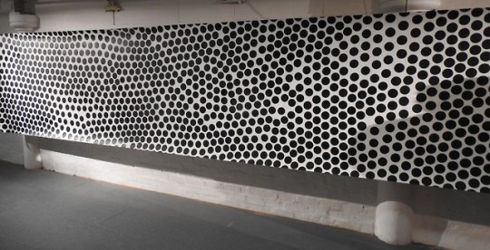
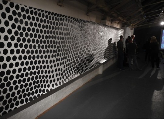
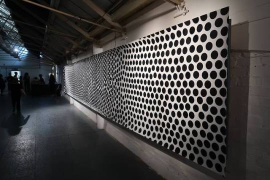
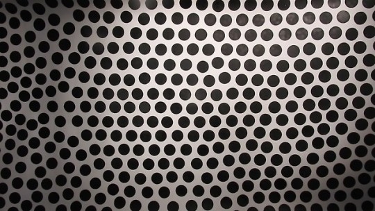
Richard Scott
Discrete continuity, a 2-dimensional space-filling exercise, 2018
spray paint on paper, 1.5 x 10m
This was the centrepiece of my solo exhibition as visual artist-in-residence at Ideas of Noise festival in Birmingham which happened over several venues (this part was in Vivid Projects) at the beginning of August 2018.
The title is a reference to the work of Antoine Beuger (Dutch composer and founder of the Wandelweiser group/movement), who borrowed the phrase “discrete continuity” from his poet friend Oswald Egger.
Beuger’s piece silent harmonies in discrete continuity was written for Marcia Hafif, an American monochrome painter. (You can hear it online here)
photos by Alan Van Wijgerden and Andrew Scott
0 notes
Photo


Richard Scott
Orbit/Rotation drawings #2 and #3 (2018)
board marker on paper, 75 x 75cm
#richard scott#interference#gestalt#abstract art#contemporary art#geometric art#abstract drawing#dots
2 notes
·
View notes
Photo


Richard Scott
Quasicrystal studies
calligraphy ink on paper, 2018
24.2 x 12cm each
#gestalt#perceptual art#op art#contemporary art#crystallography#order#disorder#abstract art#patterns
1 note
·
View note
Photo

installation shot of my first two Orbit/Rotation drawings, taken by Clive Roberts at the Assemblage show in February this year at the International Project Space, Margaret St. School of Art, Birmingham. These were made with board marker and the use of a pizza tray as a stencil.
#richard scott#permutational art#perceptual art#geometric art#abstract art#mathematical art#algorithmic art#abstract drawing#contemporary art#interference
1 note
·
View note
Photo


Richard Scott
6-colour distribution studies (calligraphy ink on paper, 2016/17)
#richard scott#perceptual art#form = content#abstract art#permutational art#geometric art#abstract drawing
0 notes
Photo

pleased to announce that 2 of my drawings (including this one) are going to be in the RBSA’s Next Wave 2018 exhibition in September!
Entropy study (2018)
Pencil and acrylic ink on paper, 60 x 60cm
0 notes
Photo

I’m looking forward to being visual artist-in-residence at the experimental music festival Ideas of Noise, from August 3rd-5th 2018, which is being held at Vivid Projects and The Edge in Digbeth, Birmingham
This is a photo of my desk at home after finishing a drawing recently which you can see in the window (Entropy study, acrylic ink on paper). This and much more will be in the show 1 month today!!
The exhibition will be free and part of the August 3rd Digbeth First Friday. If you want to have a look at the rest of the festival, check it out here - there is some fantastic music happening...
https://ideasofnoise.com/
3 notes
·
View notes
Text
Technical Methods, Materials, Workshop Practices
When it came to trying to recreate the drawings in the darkroom, I had my settings all planned out thanks to my last visit: contrast at 40; aperture at 0; exposure time at 15 seconds; bulb height at its maximum. This assurance allowed me to focus on the “content” of the image and its relationship to that of the drawings instead of the mechanics of the tools I was using. This relationship is interesting - the effect of my hands on the coins was somewhat related to the effect of my pen in the stencilled circles but differed in a few ways.
Most significantly, the coins could move again after being placed. This put a limit on how exact the positioning could be (especially considering that when moving coins around a piece of unexposed photo paper in a darkroom, it’s quite hard to see clearly with just the red light on), but it also made it possible for more “group-like” formations to evolve – there is a knock-on effect from, for example, pushing one coin into a group of other coins, which results in a clearly visible formal continuity. This was also possible in the drawings, but to a lesser extent: formal continuity in these was primarily brought about by building circles in a particular order/direction so that the circles placed afterwards are always having to fit around those placed first. Reflecting on this after making the recreations made me realise that in many ways the manner in which I had made the original drawings was precognizant of the process of arranging coins for the photograms. The placing of the stencil for each new circle in a consistently adjacent position to the previously drawn circles can be understood as imitative of placing real objects next to each other and allowing their hard edges to prevent overlap and set a maximum degree of proximity. In this sense the photogram became a logical conclusion (or at least next step) of the drawings.
With this in mind, here is the first drawing recreation I made, below and on the right, next to one of the ink drawings from a couple of months ago. For this first recreation I tried to keep the hexagonal formation as flat and even as possible, so I could use it as a sort of reference point of maximum proximity. I’m very pleased at the level of similarity - I would have to look carefully to check one is not just a negative of the other! (N.B. Coincidentally, the size of the coins relative to the size of the photo paper I’ve been using is almost perfectly proportional to the size of circular stencil relative to the paper I was drawing on previously, so I’ve been able to make almost to-scale recreations.)

The next two I made were attempts to replicate as closely as possible the specific type of form I had been drawing: by creating a rift in the edge of the shape, just to the right of the top, which is mediated and reduced further towards the centre as the extra space is filled in different ways.

I was very pleased at how these two above came out - in the one on the right especially, there are visible fault-lines which are evidence of real “group-like” formation and have come about as specific repercussions of the “knock-on” effect I mentioned above.
For the next couple I did, I wanted to push the possibilities afforded to me by the nature of the coins further than I had managed with the drawings, trying to really exploit the group-like formation element and knock-on effect:

The one on the left can be described as a singular instance of a knock-on effect, and is by a long way a more even and consistent group-like formation than would ever have been possible by drawing by hand. The one on the right is an extreme example of the same, and in a way, could be the first step into a new territory of relational forms - those less constrained by the natural tendencies of their parts.
In the end I didn’t get the chance to explore any further the Linda Francis-like accidents of my first darkroom session but that is one project for next term. I feel satisfied that I carried out my original aim with these experiments well and that I learnt a lot about making photograms. In addition to gaining this technical know-how, I feel that going through this process - and, especially helpfully, also documenting every stage in this blog - really set me off on a journey of examining my understanding of the relationships between certain distinct “rudiments of art”, and two of them in particular: material and content. This relationship has come to be the focus of a lot of my thinking over the last few months and I’m very excited to continue exploring it...
1 note
·
View note
Text
Technical Methods, Materials, Workshop Practices
I needed to really get my head around the parameters I was working with when it came to photograms. It turned out that in my next darkroom session, I didn’t manage to do nearly as much as I had hoped (see my aims at the end of my last photogram post), as there were more permutations of variables than I had realised, but I’m glad that instead of rushing through I decided to simply spend this time running a series of systematic tests to examine the relationships between these variables: the distance of the bulb from the backboard; the contrast; the aperture; the exposure time. I had in mind one of Justin (the print technician)’s maxims: “if you’re not testing, you’re guessing”. It took some time but I thought this was a very good principle to work by - it would save time in the long run by being sure from the beginning what the limits and options are instead of having to go back and try and recreate things which might have occurred by chance. It also allows some perspective to really think about which characteristics are important and which aren’t.
I set up a diamond shape using my pennies on a glass plate. The first two shots I took were intended to try and cover the whole range of contrast options. I wanted the highest contrast possible between my black and white, which I discovered doesn’t mean the highest contrast setting available, as extremes of contrast detract significantly from clarity. Each picture is split into 9 strips, going from a contrast setting of 170 down to 100 and then 50 on the left and then from 40 to 30 then 20 on the right. I kept the aperture the same throughout (fully open: F0) and switched between exposure times (30, 20 and 10 seconds), trying each of the three for every different contrast level. The height of the bulb for both of these I kept at the level where, when turned on, the short edges of the rectangle of light lined up with the short edges of the paper (this was around half-way up the arm).

These came out less neat that I was hoping. If I had adhered strictly to Justin’s testing/guessing maxim the previous time I was in the dark room I would have known or probably been able to guess the reason for this! Anyway I learnt from these two that adjusting the contrast all the way down from 170 to 20 didn’t make any difference what with the other settings as they were - the lines between the strips weren’t visible at all.
For the next pair I moved the bulb right up as far as it could go, remembering the effect this had last time. For the one on the left I did a similar thing with the contrast and exposure time - I tried three contrasts (50, 40 and 30), and three exposure times for each one (again, 30, 20 and 10 seconds). For the one on the right I decided to try adjusting the aperture too. Here I kept all exposure times at 30 seconds and went back to higher contrasts (130, 100 and 70) to see if the aperture change made a difference compared to my first sheet, trying 3 aperture levels for each contrast level - F0, F2 and F4 (F10 being the maximum, i.e. the smallest hole; the setting which lets the least light through). For these and then also for the rest from this session, I kept the bulb right at the top of the arm, a far away as possible from the coins as possible.

Now, it’s hard to tell with these scans, but the one on the left is actually really nice and crisp. The contrast settings are at a level where the exposure time differences are visible (the vertical strips of varying darkness), and the areas with the darkest backgrounds (the 30 second strips) are just about perfect for what I’m after I think, certainly in terms of straight-up clarity of edge between black and white. The one on the right seems to indicate that jacking the contrast right up will make for quite blurred edges regardless of changes of other parameters.
The first of next pair (number 5) I split into two halves: both kept a consistent exposure time of 30 seconds and tracked the aperture from one extreme to the other (six horizontal strips - F0, F2, F4, F6, F8 and F10 from bottom to top), and the left half had the contrast at 50 whilst the right was at 30. For the 6th shot, on the right, I tried directly compensating the aperture and exposure time: six vertical strips, going left to right with exposure times of 10, 20, 30, 40, 50 and 60 seconds and at the same time apertures of F0, F2, F4, F6, F8 and F10. In theory, the amount of light being exposed to the paper would remain (very) approximately constant, because as the aperture narrows to let less light through, the exposure time increases to let it through for longer.

So from picture 5 I learnt that I need to stay around the lowest (i.e. widest) aperture settings. In fact, with a 30 second exposure time, at contrast levels of both 30 and 50, the F0 section is the darkest, which is what I’m after. Picture 6 turned out to be a really useful test, because it clarified for me that even with a long exposure time, high/narrow aperture settings create blurred edges. The clearest part of this one was, again, the F0 section, and, surprisingly in fact, a 10 second exposure didn’t seem to darken the black much less than the 30 second exposure of picture 5.
For the last two shots I took in this session, I decided to try something slightly different - I had noticed previously that, even in some bands of unchanging settings, there was more blurring at the edges of the pictures than there was in the middle. I thought this might be something to do with the angle of the light in relation to the glass plane and the refraction through it (at the edges of the page the angle is smaller than 90 degrees, which is what it is in the middle, directly below the bulb). To test this I offset the whole sheet several inches to the left and also closer to where I was standing, so the diamond shape was right at the corner of the backboard. Then for the last shot (on the right) I bypassed the glass plate altogether and put the coins directly onto the photo paper. For both of these I kept the aperture at F0 and the exposure time at 10 seconds because that was the best combination from the last test. Also the contrast I left at 40.

They both came out really clear - the only difference was that the one on the left (which still had the glass plate) had very thin black outlines of circles which crept into the edges of the white ones I talked about this in the last post - I thought then that the reason for this was the refraction through the glass. I know think that much of the blurring of edges in previous shots from this session is probably caused by the same thing. These disappear in the one on the right where there was no glass plate. Out of all of these, the one which looks best is this last one - without the glass.
I might have saved myself some time by doing this in the first place! But I did learn a lot about the aperture/exposure time balance and the nature of contrast through all the tests with the glass plate, and I think it’s just this last problem (black circle outlines) which is solved by removing it and putting the coins straight on the paper. I think I’ll do this when making the drawing recreations. I will lose the functionality of being able to easily replace the photo paper without disturbing the coins, but the thin outlines do spoil the image for me (although it’s hard to see them on the computer screen) and having to replace the coins each time does, in a way, also bring the process closer to the process of drawing because of the time factor which is allowed to return (at least to an extent), which I think is interesting. It does make me think that, in many other situations (perhaps all situations in some way), there is a tension between time and the degree of control one has over the processes one puts into motion.
I’m looking forward to seeing how this tension makes itself known when trying out some drawing recreations next time.
1 note
·
View note
Text
Technical Methods, Materials, Workshop Practices
So my research into screen printing took a bit of a back-seat one I started getting into photograms, as I came to see the photogram as a more stimulating area to explore. While the work I was doing in the print workshop remained concerned with making pleasing reproductions of images I had already generated on the computer, the photogram became a tool for bringing together the creation of content in an image with its method of production, which, as I have mentioned before, I see as a more interesting - perhaps even “purer”, although that qualification raises some other questions in itself - way of making art.
All the same, I didn’t want to give up on the screen printing, partly because it was the main “workshop practice” I had been wanting to explore before I started the course, partly because I do still very much consider it a technical method I would like to improve upon, and partly because I think the way I view the difference between this process and that of making photograms represents an important aspect of my understanding of material and its relationship to content.
After my initial run of 20 x 20cm prints which I sent to Hot Bed Press for their 20:20 print exchange, I wanted to try making some larger ones. I sort of went in at the deep end by jumping up to more or less the largest screen size available to me in the workshop and prepared a 65 x 65cm image. Again, this is one of the grids I generated on the computer using code that was compiled specifically for the purpose of making these pictures. I think using these images for screen printing practice is a good idea because the clear binary B/W colour scheme combined with the very sharp edges of the squares together leave almost no room for error - discrepancies are very obvious and can therefore (in theory) point clearly to areas for improvement. So the results of these first two attempts were frustrating in a sense, because I felt that it will take a long time to get what I see in my mind’s eye: a perfect, clean and even print - I suppose, ideally, hard to distinguish from the printout from the digital printer (although the depth of colour in the screen prints clearly surpasses that of the digital printer). These are photos of the first two results:

These two were done a few days apart using the same screen. The first one (on the left) was relatively encouraging as it mostly came out pretty well after the first pull. There is a faded-looking band along the top, and I tried to get rid of it by re-flooding the screen and pulling it several more times. This didn’t work, in fact it made some of the nice clear black edges that came from the first pull look messier as they bled into some of the white. Johnny, a PhD student who spends a lot of time screen printing and who has been giving me some advice said that he thought the reason for the paler band was that the squeegee I used was a wooden one instead of a metal one (these are innately less rigid it seems).
I washed the paint out of the screen, came back to it a few days later and came out with the print on the right. This was clearly much messier than the first. Justin the technician quickly saw that the reason for this was that I had washed out the screen too thoroughly and had erased some of the image. The image on the screen acts as a resist and only lets ink through the empty areas, but I had widened those empty areas by cleaning paint off too forcefully and taking the emulsion off with it.
So I had to decoat the screen fully and prepared myself to start again from scratch next time I was able to come into the workshop. This means coating a new screen with photo-sensitive emulsion and exposing the digital printout to it in the light box upstairs.
0 notes
Text
Technical Methods, Materials, Workshop Practices
The original idea when considering photograms was to try and recreate some of the ink drawings I’ve done over the last few months partly as a way of seeing what it’s like to try a totally different method to theoretically “do the same thing” and partly to see what possibilities are created specifically by doing it in a non-linear or non-time-orientated process (as distinct from the very linear nature of drawing). These are three drawings from the series:

The pictures were all outlined in pen at first, using a circular stencil, and then the circles were filled in with acrylic ink, using a paintbrush. The size of the gap between circles was as carefully controlled as possible - using the stencil allowed me to place each one next to the last at a distance precise to a fraction of a millimetre just by eye. I built the perimeter of each hexagon, progressing anti-clockwise from the top centre until I met the beginning again and then continued inwards from the perimeter to fill the shape. The natural impossibility of arriving back in line with the initial circles (even carefully controlled parameters only go so far when applied to the human hand and eye) resulted in fractures in the shape which were then “ironed out” when building in from the edge. The idea was that the same process applied a number of times will always be different and that the series will map out a collection of snapshots from the range of space-filling possibilities.
The photogram recreations are going to be done by arranging pennies on a glass plate between the photo paper and the light source. The reason for the plate was so I’d be able to take a shot, then swap the exposed sheet for a new one, then rearrange the coins slightly and do another shot, etc. This process will differ from the hand-drawn method in a number of ways, and, structurally, the resulting images would be less tied to the procedure of following the perimeter round and committing each circle to its position on turn because the coins won’t be fixed in place - they will be dependent on larger movements of groups of coins pushing against each other with a knock-on effect.
During my first session in the dark room I shot a handful of small sheets and adjusted the settings on the enlarger a bit, so I could get a feel for the effects my adjustments were having.
I started by raising the glass plate off the backboard with a penny under each corner so as to get the shortest possible distance between the glass and the photo paper beneath, then arranged some coins in the middle. I then took my first two shots, adjusting the contrast in between them.

It seemed that I was right about getting the crisp edges - the ratio of the distance between light source and glass to the distance between glass and paper is related to the question of focus when enlarging negatives, but in the case of photograms, as there is no negative, the closer the glass suspending the coins is to the paper, the crisper the edges will be, (when enlarging a negative, the two distances need to be proportional to one another). Also, changing the contrast slightly made no visible difference, I think because the black areas of the paper was already getting really pretty saturated with light and couldn’t get much blacker.
I was very pleased with the level of clarity I managed so quickly - I felt I had already sort of immediately found my ideal way of producing these, but I wanted to get an idea of the sort of effect playing around with these distances would have, and some interesting things started happening...
The second pair of images were shot when the glass was raised off the board by a CD case on either side, instead of pennies (so, approximately 6x higher). It’s hard to tell with the quality of the scans I was able to upload to Tumblr but there are actually some thin black lines near the edge of the white circles, as if the adjacent circles have outlines a couple of millimetres from their own edges which are only visible in the white areas (they’re clearest just within the top of the upper of the two central circles). The only variable I changed before making this second pair was the height of the plate, so I am guessing this is caused by refraction through the glass.

For the third pair I added another 4 CDs on each side so at this point the plate was a good 3 or so inches higher then the paper. I also lowered the lightbulb to its maximum to push that ratio as far as it would go the other way. I knew there would be some form of blurring but I was quite surprised at how they came out:

It seemed to me that the lines in the second pair probably were indeed refraction and now in the third, the angle of that refraction has increased so the black circle outlines are wider and the edges are more spread out. Also, there is bleeding where the white circles touch each other; the small amount of light that can get past blurs the points of contact. The one on the left is darker because I increased the exposure time. I’ll have to do some practice balancing the contrast and exposure time because I’m interested first of all in heightening the clarity of the pictures, which I think will be done with maximum effective contrast (simply setting the light to its highest contrast level - with yellow at 0 and magenta at 100 - in practice I think won’t do it as it has to be relative to the exposure time)
Second of all I’m interested in the emergent nature of these fragments of outlines, and would really like to try and push that a little further. Those last two photograms reminded me strongly of particular works by two very interesting people, both of them among my favourite artists but between whom I hadn’t really seen a connection before: The American Linda Francis (1943-) and the Dutch artist and sculptor - and I think also architect/designer - Arie Jansma (1907-1992). I’m not sure because there’s almost nothing written about him online and little more offline it seems. But he appears to have been interested in crystal-like formations of small circles too and I think they might even have been photograms. Below are two of his pictures from the late 60s on the left, and an untitled drawing from 1992 by Linda Francis on the right:

The comparison with Francis’ drawing is, in a way, superficial because my blurred refractions came about in a very different way to her erased charcoal lines, but I did find the compositional similarities striking! A central part of her work at the time was about time-orientated processes, and in a sense that’s the very factor I’m trying to bypass by making photograms, but my drawing practice certainly owes her a lot.
The relevance of the Jansma pictures to mine, I think, is more significant because with his it’s the focus level, or ”resolution” and the positioning of the circles which together determine the individual shapes and cumulative effect of the “circles” themselves, and this I find very interesting (c.f. my last #technical methods 2017 post where I spoke about seeking to make work whose content is intrinsically also its method of creation).
I’m going back into the dark room tomorrow and if I’ve got time would like to try and do some recreations of drawings and also some refraction experiments, but first I’ll do some testing to get the contrast/exposure time balance clearer in my mind.
#technical methods 2017#photograms#photogram#abstract art#margaret street#richard scott#linda francis#arie jansma#contemporary art#geometric art
3 notes
·
View notes
Photo

Richard Scott
28,997 red dots (2017)
marker on paper, 75 x 75cm
0 notes