
Statistics
We looked inside some of the posts by rightbrainawake and here's what we found interesting.
Average Info
Notes Per Post
32
Likes Per Post
27
Reblog Per Post
5
Reply Per Post
0
Time Between Posts
5 days
Number of Posts By Type
Text
15
Last Seen Tumblr Blogs


Fun Fact
Tumblr is available in 18 languages.
Text
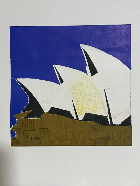
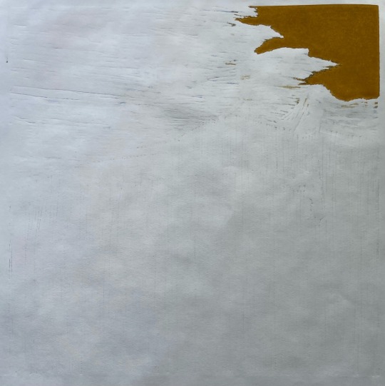
A new way: Chine-Collé (Sydney Opera House study)
I wanted to move forward and I had a picture that I had some difficulty in working out how I was to achieve the print. It was the Sydney Opera House, I see it quite often during winter months when we spend most weekends in the city. I wasn’t looking forward to engraving the fine details of the tiles that one sees when they view the sales in the sunshine.
It was then that I recalled a post on Reddit by engraver Reinis Gailitis: Work in Dark
There he printed a lino onto some paper and then used this as a chine-collé with a copperplate engraving on top to glue/secure the print. I am not a professional and I didn’t want to go full copperplate expense, so I went to the cheaper drypoint etching acrylic. So I made my jigsaw linocut to frame the basic colours and allow for the necessary negative space. As this was a process study I went back to 150 mm x 150 mm size.

I then cut my drypoint plate to the same size and proceeded to cut into the plate, the detail that I really didn’t want to add into the lino, whether in a separate plate or as a reduction. This was a study to see if there was a way that I could work out how to achieve something, albeit more technical, but in theory with much less work.

So away I printed my lino onto Shin Hosho White rice paper 60 gsm, and here I learnt a trick. Previously is was soaking my paper for 10 mins, this is a little crazy for such light and fragile paper. So, taking advice onboard from Andy I did the in and out of the bath with the paper and the pat dry. To assist with the lift off of the ink from the lino, you rub the lino with some talcum powder prior to inking up.


These prints then were left to dry.
On my next press visit I had made up the inks for my drypoint plate of intention and away I rubbed the inks into the plastic burrs that I had made to create the picture detail.


I then grabbed the trimmed to size previous lino prints on the rice paper and brushed on some Yamato rice paste onto the printed rice paper, soaking the paper lightly through with the glue.


Then aligning the prints on the drypoint plate I put it and the final print paper into the press. In such an instance the registration is not super important as the whole print is contained within the plate to be printed and the registration is actually within your design and the equal sizing of your plates and prints.
Voilà Sydney Opera House…without crazy detail required in the lino, also if not a study I have a reproducible set so long as the burrs remain in the drypoint plate.
There you go… this changed my process for this and my future printing to:
Mix up inks
Talc up lino plate
Prepare jig and press
Apply inks
Quick dip in water and print simple cartridge paper proof
If ok proceed or revisit ink and reproof.
Re ink plate accordingly
Address plate in registration jig
Dunk each page side to side submerging and removing in a water bath.
Pat dry the paper to ensure there is no surface water.
Place paper using dowel and hole punch holes (or other).
Place acrylic backing and sheets of newsprint.
Place felt.
Print away.
No more having to hang print out in the sun to dry…..

#printmaking#artists on tumblr#original art#art#landscape#linoart#linoprint#chine-collé#chinecolle#printmaking process#sydney opera house#art study
0 notes
Text
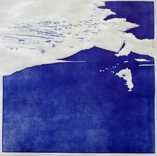
Reductions : Get over it i.e. build a bridge
So now I was going to get a little crazy with layers as I wanted to build the view of a bridge that I had driven over during a recent holiday.


In addition to a colour pencil quick study I have also been doing some watercolour studies, just small ones to get things clearer in mind.
I was very conscious of the influence of greys and how dark they can become. So I went in easy…


I wasn’t sure of the mixing of the dry inks, as the yellow had dulled with the grey and then my like for bold colours kind of took over. This is where I lost a little control over the print.


I had to peg it all back and jigsawed the last layer to avoid adding three more….

The result was a great piece, that was finally wrestled into control.

#printmaking#artists on tumblr#original art#art#landscape#linoart#linoprint#reduction linoprint#jigsawprint#weejasper
0 notes
Text
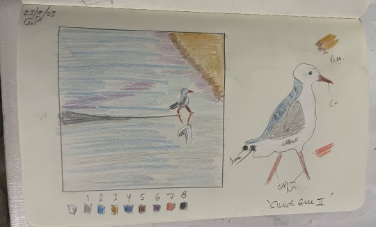
Second Reduction with all the learning
So, this was the first reduction lino that I started, but as it turned out it was the second to be finished; I will explain.
Like trees, I went with birds, but with copying subject I ensured I had a decent composition: the reflection of the bird on the shore in the water as it drained back to the ocean down the beach in the afternoon of long shadows.
My process was:
Make up ink
Prepare jig and press
Ink up the plate
Print simple cartridge paper proof
If ok proceed or revisit ink and reproof.
Soak a page for 10 mins in a water bath
Soak additional page in at 5 min mark to speed things up.
Ink reduction plate
Take out paper
Pad dry with towel
Address plate in registration jig
Place paper using dowel and hole punch holes.
Place sprawl sheets of newsprint
Place felt
Print away…….
Hurry back to start again
This was great and I could, while I built up a sweat, keep to the 5 mins between prints so I could maximise my time at the press.
The issue was the second print…..Did the paper have to soak again? What was the rule…..The paper had me questioning myself.
If I ran it through dry then the image was removed considerably. If I ran it through with only 5 mins of soaking then it wasn’t so badly misaligned, but still very noticeable.

( 5 mins soaking vs. 10 mins soaking i.e. the original socking time )
So, this meant that I needed to soak each paper for the exact same time as the original print.
Paper has memory!
This is why this print didn’t finish first (below are the cartridge paper proofs).
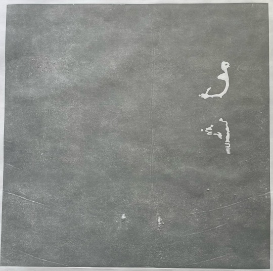
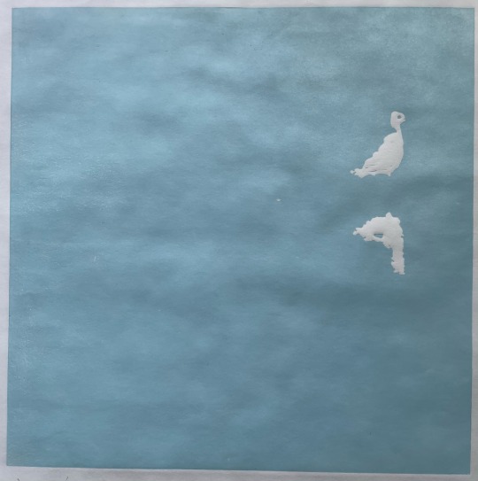

It turned out well, I just lost too many with my paper memory learning….. you will notice again that I didn’t follow the initial colour plan, seems I constantly adapt.

Insight from Andy, as I had to hand paint the orange (feet and beaks) and black (flight feathers and eyes). I now place a piece of acrylic between the newsprint and the felt to reduce the amount of movement between the press and the paper around the relief pieces of negative space I had carved away.
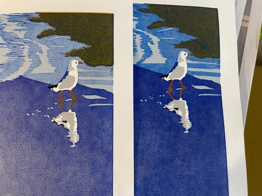
#artists on tumblr#original art#printmaking#art#linoart#linoprint#mixed media#reduction linoprint#reduction linocut#silver gull#seagull#reflections#beachvibes
2 notes
·
View notes
Text
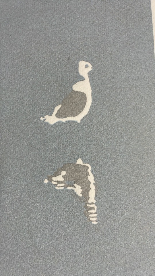
First Reduction - Adapt as you go
Although this is titled first reduction, it is not the first one I started, but the first I finished. I will explain in a following post.
I had come back from country Victoria, we were visiting family, in doing so one sees different scenes to living in the city. I had spotted some geese on the side of the road and found myself enthralled with their comic gathering; the gaggle amused me so.

The intent was to use colour, as before, yet after the second grey went down I had realised that the first layer was way too dark and therefore the second layer, being darker, was even further from where I needed it to be, so I changed tack.

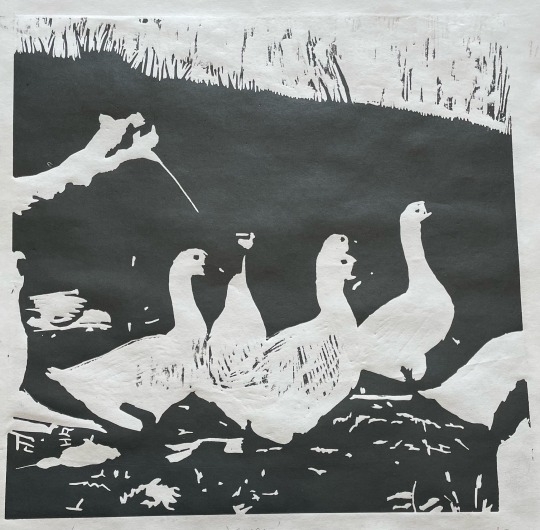

Where once I was going to add yellowed greens and orange (refer sketch), I was now going to finish it off much simpler as a greyscale reduction which still conveyed the amusing gaggle I had seen.

What this did prove, and will be further explained in my next post, was that my makeshift registration jig worked quite well.
#artists on tumblr#original art#printmaking#art#linoart#linoprint#greyscale#geese#gaggleofgeese#reduction linocut#reduction linoprint
8 notes
·
View notes
Text
Getting ready for Reduction Lino
My previous experiences led me to the wonders of linoleum and what I can do with it. Reading a couple of books, I found that they progressed to Reduction Lino.
I gravitated toward it, I am not a spontaneous creative, and this was something that required planning and layering of inks (dry and wet) to produce the desired picture.
I intend to stick with things that I am familiar with, places and things that I have seen - sometimes I have taken a reference photo to assist.
I then realised that I needed a registration for my prints, a device to hold both paper and plate in the same place over and over, week after week. This meant that I needed to work out lots of things:
What size Lino?
150 x 150 mm, or;
300 mm x 300 mm, or different?
What paper size would be required? What could I use effectively and economically?
I picked a nice piece of 300 gsm with 25% cotton that I could get pretty cheap when it was on sale (the cotton gave it some strength). It was in a sheet of 500 mm x 700 mm, and if torn in half it gave me two sheets of 500 mm x 350 mm which was rather ideal to print bulk 300 mm x 300 mm prints while I am learning and experimenting.
With paper known I could now layout a jig for registration. I had looked up Ternes Burton pins, but decided to go with a simple hole punch as I had the length in the paper to do so.
I bought a piece of particle board, some balsa wood and some down and away I went. The balsa wood was great as it is 2.5 mm thick and my linoleum was 3.0 mm thick. I copied the frame type registration of my previous print with the collagraph border and went for it.
I used an old four hole, hold punch and then drilled holes and put dowel in place to use as my wooden registration pins for the paper.
I also found that the balsa wood could also shrink the frame to hold a 150 mm x 150 mm Lino square easily.


It looked strange, but would it work?
1 note
·
View note
Text
Combining what I had learnt
So I decided, as the term was coming to an end, to combine what I had done and do what many do , go big. I thought of a unique composition using all of the elements that I had leant:
Collagraph: using elements to bing textures to a piece.
Lino: relief printmaking whereby you cut away that which you need for negative space.
Knowing: it is much easier to make art about what you know, it becomes from you and who better to show your perspective than you.
Composition: art, at least for me, needs to have substance.
Colour: I prefer to not have things monochrome, but there is a balance to be sought.
To help with this I did try one new element, as it is good practice in learning: Jigsaw. This is a means where you cut the plate, in this case the linoleum, into pieces which then allow you to colour them differently and print in the one go.
To aid this I used some smarts and some advice, I made a collagraph border to contain, and in many regards register, the jigsaw Lino pieces. This also made the colour vs. monochrome easier.
So I went to a subject that is ever apparent where I live; Seagulls - actually Silver Gulls.
I expanded my life and added art after finding out, traumatically, that I have a chronic disease, so the composition was much about stages of life. I am sure that you will recognise your interpretation of those stages, it will depend on your life situation, spent time and mileage.
So here it is.


I was asked why I only did four prints by Ronda, my teacher, I think I answered “I don’t have that many friends”…. What does one do with so many prints of so many things when they are done?


Different challenges ahead.
#collagraph#artists on tumblr#original art#printmaking#art#linoart#linoprint#seagull#life cycles#jigsaw#feathers#colours
1 note
·
View note
Text
Composition or nothing
I liked the last one, so I tried another. In fact, I picked another tree that I liked a short walk from the last.


I tried it in different colours also, but I did not feel it the same way.
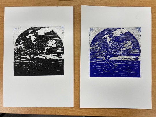
Then is occurred to me. Without the vista it is a different picture. I realised then it was not the trees but the composition that I could produce from the environment. You cannot just do what you see it also has to be something worthy of being seen.
I then looked to different cutting methods and took my learnings with me onward.


The first one monochrome from the plate and the second is colourised with some iridescence medium to add light off the ‘water’.
1 note
·
View note
Text
Transferring colour
So beyond the pleasant production of scene by adding watercolours to the print, which is nice.

There was an additional method which I was keen to investigate: press transfer of watercolour or gouache unto a print.
I found that the best plate was the same dry point plastic, or acrylic as this was resilient enough to go through the press and remain plate like. My attempts with laminated photocopies of my plate was not so spectacular as the small fine grooves in the laminate did not do any favours to the reenergising process with wet paper. Neither did simple overhead projector plastic pages - they were not robust enough for the transfer.
Assisted by both Rhonda and Louisa (from the next studio watercolour class), the following procedure was:
Using the print plate as a guide paint using straight watercolour or gouache onto a decent thickness plastic plate where you wish for colour to be present on the print. I used a photocopy of my plate as a stencil underneath the plastic.
Dry the watercolour or gouache plastic with a hairdryer so that it is only the pigment remaining.

Wet your dry print (yes the printed ink from your linocut needs to be dry) in a water bath for 1-2 mins.
Set your print onto a vertical press (I used an old screw type press) with the dry point/acrylic registered on top of the print.

Cover with multiple sheets (3-4) of newsprint as water will be lost to the sides.
Tighten the press as tight as you physically can and leave in place for 1-2 minutes.
Lift the press and gently peel the plastic transfer plate from the print and voilà.

It is a nice process as it can allow you to transfer texture of brush strokes to your print that you wouldn’t normally see with watercoloring.
You need to limit your water or you will allow the pigment to go where it wants to i.e. all over the print and even off the paper.

You need to use a vertical press or you are going to end up with the pigment catching a wave in the direction of your press and the colour will not be limited to your print boundaries.

#artists on tumblr#art#printmaking#original art#landscape#linoart#linoprint#linocut#mixed media#watercolour#gouache
7 notes
·
View notes
Text
Evolving to Lino
It was from this point that I jumped.
I had read a great deal and I wanted to wade back into linoleum, something that my generation all did at some point at high school but with old and tough dried out, and useless tile.
What would it be like if I did it now?
Applying the same adage as before, do what you know and see all the time, I picked a vista of a nearby point where I surfed as a kid, a viewpoint that is almost immediately recognisable to locals but would be neither here nor there for anyone else i.e. the perfect place to commit to Lino for experiment, and using a local vernacular: Pwoint.
I surprised many, including myself, with the enthusiasm that exhibited whilst both drawing, transferring and then cutting this first, middle age, Lino square of 150 x 150 mm (6” x 6”).

I very much enjoyed the process of cutting, the human interface with the tool and when the material was removed.
I was enthralled but that which remained, imagining what it would produce when ink was rolled over it and through the press it was submitted

To be honest, I was not expecting much from my first attempt - in particular as I had left it as a monochrome black & paper white print…but wow was I impressed and then by virtue of this print I think I was hooked. So not only now on the printmaking process, but the way in which I could communicate with my cutting away that negative space as a record into the linoleum.
It was then with this print that I could experiment further, and try out and attempt to perfect process. A lovely study it ended up. It is a plate that I print when ever there is leftover ink and I feel inspired.
2 notes
·
View notes
Text
Multi-plate Collagraph
Where to from here?
I had now experimented with collegraphs, colours, and colouring in. My brain it then: what is next to try? What else can I do? There is a lot of talk about multi-plate so why not that?
I looked into it and it seemed to be something right up my alley. To create a picture, actually a scene, with multiple colours and with collagraph, then one needed planning and repetition - and also registration.
The trick, so I surmised, was to have the same scene on each plate, the same size, and then place the texture of the colours desired into their prospective positions. So I went about making a scene. I was looking at some old photographs from around my local area and I saw one of some shops near to a train station. What intrigued me about the photo was that there were two vanishing points, one for each road, on either side of some shops. So for this experiment I drew up a easily repeatable scene with…
A skyscape section: A foreground section:


A road detail section: A building detail section:


The hope was that these four pieces, I am not sure why I chose four, would provide different textures and different colours to produce the desired scene.
The colours were printed one after the other, wet ink on wet ink. I was not understanding as yet the missing of overlapping colours, as you can se each section was exclusive to the colour and there was no planned or intended overlap or mixing. I did two different colour prints over a couple of weeks, the process was very labour intensive even for such small plates (~ 100 by 100 mm or 4 by 4 in).

One thing I did learn what that when any subsequent print was made that ink would be transferred back to the next and further subsequent plates and off the print - diminishing the first colour and all later colours until the last colour was printed. I tried another colour set to see what else could be achieved…

Lots of learning and understanding of process with these studies and experiments.
0 notes
Text
You know who…
While my brain was wondering on what and where I could take mixed media colouring in, I tried to go a little further with multiple coloured collegraphs to see how far I could go.
Again, using what was in front of me, and like many artists the thing that is always available is a self portrait. So using some of the left over leaves as a beard and some material, some tape, some glue and some string I built a reversed self portrait based on a photo I took with my brother-in-law while sitting in the sunshine (I was wearing a hat that he had left a year or so previous and I had adopted from that time on).

The process was enjoyable and the plate turned out kind of nice. Inking it up was a little difficult with the different colours, different textures and response of the collage items to take up ink.

The print, and textures of the collagraph were quite nice. It is hard to be critical of something that is yours and of you - guess that is why self portraits are used.

I was happily reassured by a comment from a teacher, Andy, recalling his studies and a classmate submitted only the plates (no prints) as part of their thesis.
This provided me with the clear understanding that the making of and the plates themselves were art, both before and after printing. You can see this is what I use as my identifier.
I did print “ink free” to emboss the paper and then added some watercolour to see how that would transpire.

Lots to explore with such a technique.
#artists on tumblr#collagraph#original art#printmaking#art#mixed media#self portrait#watercolor#embossed
4 notes
·
View notes
Text
Colouring in
I was now somewhat unstoppable as I tried to quell my minds desire to make use of the new things that I had learnt to achieve in print. Not wanting to leave the bounds of collagraph, but to try and bring colour in in different ways I was intrigued as to how I could combine my previous and amateur use of watercolours into use.
So again I used something that was easy and at hand. My children, wife and I are beachcombers as we stroll alone the local beach of an afternoon at least a couple of days a week. During this time we pick up shells or intriguing size, and shape ( including disfigurement) and colour. So this was it.
The process of placing the string down onto the mat board was one that left my fingers with a great deal of PVA glue to be removed in more fingerprint prints than I would like to recall, using small craft ice block sticks proved better.

I found that the cracked glue, either from the drying process or the dried glue’s reaction with the clear varnish that I used, gave off a nice effect when printed, a natural appearance of shading in a disorganised hatching.

From here, as it was printed using oil based ink, I was reassured over and over by Rhonda my teacher, that they would not run should I add watercolours to the dried print and paper. The process then producing my first watercoloured print for the mixed media pile. First I made a print with almost no ink.

Then I watercoloured away……could it be that simple?

Make a print and then simply add colour, like a child with a stencil or a colouring in book?
Was there other ways to do this?
Was there another technique which could be used to further this outcome?
I dived in……
0 notes
Text
Using what I knew
As you can imagine I was hooked.
I enjoyed the response from using string, and different twines. The differences in diameter provided pleasant responses in the print and paper.
Due to my frustration with my outputs I looked into how I could combine printmaking with my previous artistic output and familiarisation: watercolours. To my surprise and excitement I found it to be quite common and those outputs from experienced artists was quite endearing.
Was this then something for me?
So I looked into what I could do in order to make then most out of my printmaking press time and then back that creative output with adding watercolours to the prints, post printing class.
What to print first…?
I was sure that I heard in the past that it is best to do what you know, or what is right in front of you. So this is what I did. The first plate that I tried, with twines, was my thumb print. Easy enough to have it model for me and divulge its secrets in constant availability and pose - it is still attached - so here we go.

The difficulty presented in the printing was the height of the twine, I used some of my watercolour paper 100% cotton to provide the best possible structure to withstand the printing process.

Again, my want to move away from the plain black continues and I made the prints with a mixture of black and some ultramarine blue. You can see that the blue did not present itself so much until I made the ghost print.

3 notes
·
View notes
Text
Using colour
I was excited about the possibilities.
But I was not too hooked on the simple or traditional black and white, colour is so much more thought provoking and powerful. So what to do next…. I was in the city one weekend with the family and I was showing my young children the joys kicking through the fallen leaves in Fall/Autumn and it gave me an idea. I could use the leaves and try and emulate the colours of Fall somehow in the print - it is very much a season of colour change.
Making the plate was a bit of a troublesome process as the leaves were dry and therefore no longer able to be easily stuck down, using standard indoor wood PVA glue. Furthermore it was difficult to protect the plate with varnish as the leaves were not completely secured to the mat board. Regardless, and handful of maple leaves, some corrugated cardboard, grass, unused staples and some felt provided the components for my move into colour.

For the fall colours I used a bright yellow and crimson and mixed the intermediate orange from them.

I used the trees/leaves as the barriers of the transition from the yellow of the winter sunshine to the red of the shadows of the Fall colours.

The initial print show great shapes and colours…

I am still familiarising myself with the correct amount of ink to add and then remove, so it is with the ghost print that the real textures are visible and the colours are lighter and more subtle.

I am not sure which I like better, each has its appeal…
In any case I am ready to look at different ways to bring colour into my prints.
0 notes
Text
First step
I have found printmaking, it is a wonderful thing.
I had previously only been a #watercolour painter, and I am enjoying the technical process involved in printmaking as I find a great number of similarities between the two, at least in the way that one has to build a picture from a base up. The common understanding that you begin and preserve the white paper is helpful, as opposed to other forms where the opposite is common of dark to light building of colour.
I joined a class at my local art gallery, Hazelhurst, and was producing collagraph prints with differing success.

Here I experimented with as many different texture producing things as possible in order to see what could be produced as outcomes in the printing process: corrugated cardboard, string, hessian, crêpe paper, paper doilies, cling wrap, glue along with some improvised punctures of the mat board also cutting and removal of the paper cover.
This plate, shown above was then covered in a sealant of varnish and dried under a hot hair dryer to enable printing straight away - what fun!
As this was my first print it was clear that I was not yet aware of how much ink was in fact too much, this is a key learning of course.
Too much ink and the print does not show much of the collagraph as the ink does not allow for any discernible change to be seen between different components of the collage, too little and there is no ink to record any of your textures onto the paper.
The amount of ink, and the amount of pressure applied is related just to add to the variability of printmaking. Too much pressure will draw out more ink, and too little pressure will only touch the surface of the collage. When this is combined with different ink types and different ink minerals, then the technicality of print making is just starting to present itself to you.
I am lucky to enjoy and appreciate experiment, I did not expect fantastic results straight away and learn to enjoy the process.

You can see that I did two prints, the original print - of the ink that I applied and then run through the press, and the ghost print - the same plate reprinted without adding any further ink.
Yes, my first print had way too much ink. I can make out the detail mainly because I laid out and put the collage together. Some of the scraping I did with some tarlatan, of course I did not remove anything close enough, hence one can see those scratch marks.

This ghost print is much better is showing the different elements of the collegraph. The string collects a great deal of ink on one or both sides, similar to the corrugated cardboard which is provides a more subtle line. The hessian (or tarlatan) does come out quite well as does the crêpe paper. I was interested in the difference between the section where the crêpe was cover with masking tape to produce a muted effect of the texture of the crêpe paper.
With the ghost the paper doilie detail is far clearer, and my use in attempt to symbolise the sun can be seen (with a long bow). The different clouds of cling wrap and cut away board produce different effects in the apparent sky. What is was most surprised was the small punctures did really bring out some interesting tonal texture in the printed surface (an almost emu skin effect from my perspective).
I am using this blog to simply record my works and progress, if you do get something out of it then it is great also - let me know.
3 notes
·
View notes