
Statistics
We looked inside some of the posts by rmitea and here's what we found interesting.
Average Info
Notes Per Post
30K
Likes Per Post
21K
Reblog Per Post
10K
Reply Per Post
46
Time Between Posts
8 hours
Number of Posts By Type
Photo
13
Text
4
Last Seen Tumblr Blogs


Fun Fact
Tumblr is used by 21% of adults online aged 18-29 years.
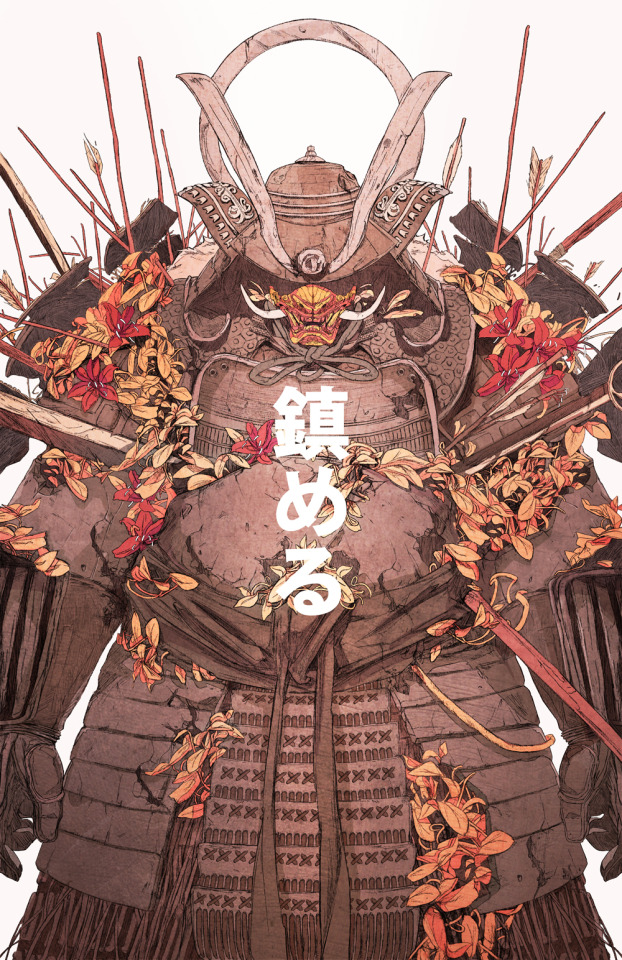
Photo


Ly, C. (2020). ‘Ask Me Anything’ Vaporwave Zine. Here it is, one week late, the result of my blood, sweat and tears. My Vaporwave zine. I ran into problem after problem trying to put this together but at long last, it’s done and I’m relatively happy with how it turned out. Of course, I can’t help but compare myself to my peers - their work was amazing and this doesn’t even come close to being as good as the work of some others. Nonetheless I did my best and I’m just glad it’s over. This zine was fun to do but oh boy was it stressful. I started out planning to do a video. I’d compiled all my assets and spent weeks watching tutorials trying to figure out how people did some of the intricate glitch effects on their photos. I even learnt how to code so I could create a “voice” for my character - he was supposed to speak in Animalese (like Animal Crossing characters). But after weeks of experimenting, frustration and Adobe After Effects crashes, it just wasn’t going to work out. Luckily, the knowledge I’d learnt from the tutorials was easily transferable to Photoshop, which is where I did the bulk of the zine. For the intended aesthetic, there were some rules that I set for myself in order to successfully emulate the feeling and message that vaporwave usually delivers. I didn’t limit my colour palette, but I ensured that blues and purples were the main colour scheme throughout. To emulate the mocking of consumerism, I ironically included many well known consumer brands, including the likes of Coca Cola, Nintendo and Fiji water. It’s also in vaporwaves name to work under aliases and not give credit to people, so I redacted all real-life name mentions throughout the zine. As the zine progressed the pages would get less and less serious before ending on the error screen-like bibliography. If anyone bothers to translate the Japanese, it also get more and more crude in the later pages. All in all, I just wish I planned to do a still zine from the beginning. Given that a video format might have been cool, it was way too ambitious of a goal given the limited time frame and my non-existent video editing skills in After Effects. However, I’m glad that I did spend the time to learn the basics as I now have really solid foundation for when I’m ready to finally properly learn how to use the program. This semester has been a fun exercise in creativity and the zine was the perfect way to end everything off!
22 notes
·
View notes
Photo
Perhaps the most provocative piece of design work of our generation. The energy is unmatched.

6 notes
·
View notes
Photo
This is such a nice, simple piece that does what it sets out to do: spread joy and positivity. The colours are bright and punchy where they need to be which allow for the rainbow to stand out. Everybody could use a little bit more rainbow in their life!

Louis Vuitton Rainbow by Pawel Nolbert
Artwork created for Louis Vuitton and their #LV initiative, as rainbows painted by families of LV employees appeared in store windows worldwide, spreading the message of joy and positivity in the challenging times of the global pandemic.
—
Pawel Nolbert is a color artist & image-maker. He explores color, expression & visual languages, and works with brands, to create strong visual work
T D B: instagram • twitter • facebook • newsletter • pinterest
148 notes
·
View notes
Photo
Noma Bar is one of my all time favourite artists. Her negative space drawings are so clever and oftentimes take on political meaning. She is probably best known for her book cover work, most notably, for Margaret Atwood’s ‘The Handmaid’s Tale’. One of my biggest design goals is to one day create a well thought out negative space artwork similar to the work of Noma Bar.


Dystopian Trilogy
George Orwell’s 1984 and Aldous Huxley’s Brave New World join Margaret Atwood’s The Handmaid’s Tale to complete our dystopian trilogy of books featuring the designs of Noma Bar.
All three books are out now.
4K notes
·
View notes
Photo
The work of SeerLight is always extremely calming to look at. The subtle movements, soft colour palette and the simplicity of the drawings all come together to just somehow lower you blood pressure just by staring at some moving pixels.

“Rainy Morning” by SeerLight.
415 notes
·
View notes
Photo
Just some really cool looking Japanese-inspired art.
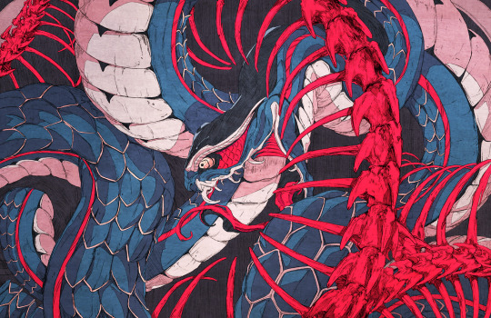
40% off everything in my store! https://society6.com/belgeist
11K notes
·
View notes
Photo
I’ve always been fascinated with one-line drawings, especially with the works of Dane Khy. I struggle to wrap my head around how people are able to portray so much without so much as lifting their pens. How does one visualise where the line is supposed to go to still show shape and form without shading or anything of the sort. People who are able to do these kinds of drawings are the masters of line.
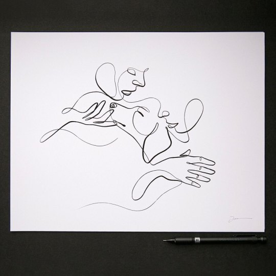
Three things I’ve been focusing on all combined into a single line: portraits, dogs & hands . Honor the Bond No. 3 . 11x14” signed prints available on my website withoneline.com/store . . . . . #withoneline #rescuedog #honorthebond #customportrait #lineart #singleline #onelinedrawing #minimalisttattoo #tat #fineline #dogsarefamily #artforsale #interestingart #adoptdontshop #supportsmallbusiness #doglife🐾 #unconditionallove❤️ #continuouslinedrawing #gicleeprint #abstractartwork #petlife #createeveryday #dogmoments #onelineart #singlelinedrawing #inkart https://www.instagram.com/p/CAbsaHJA82O/?igshid=15gykvg3skrt2
3 notes
·
View notes
Photo
Spirited Away, my all time favourite Studio Ghibli movie. I basically grew up with this movie on repeat. The visuals in this movie are still some of the best hand drawn animation I’ve seen to date. There’s always so much subtlety in every movement. The fantastical storyline combined with childhood curiosity were the perfect combination in creating a thrilling adventure that would remain a classic for years on end.


SPIRITED AWAY (2001) dir. Hayao Miyazaki
3K notes
·
View notes
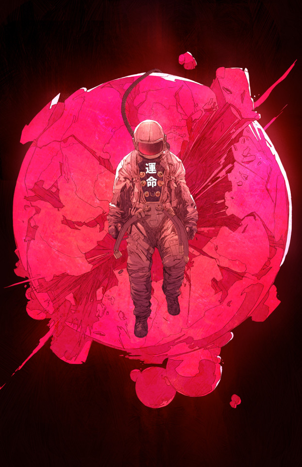
Photo
This is a really cool surrealist piece. I like the chromatic aberration and punchy colours used.

Tuned In
724 notes
·
View notes
Photo
Hieu’s art has been an inspiration to me for a long time now. Combining anime influences with abstract elements and fantasy, kelogsloops pieces depict a sense of stillness an serenity which makes the artwork feel quite ethereal. His works often combine is signature red an blue colour palette and gold leaf accents to create beautiful masterpieces such as this one.

Nine
prints | tutorials
7K notes
·
View notes
Text
This is absolutely breathtaking! The combination of different ‘fonts’ are perfect, the materials used are very fitting, just the whole aesthetic of this poster is just 😚👌 I love this SO SO SO much!
My question is.. How can design be more sustainable?

Working from home has been a challenge. Had to push my skills and boundaries to complete this assignment. I had in mind to use fresher ingredients but thought better since I wanted to focus on the sustainable part of my question.

Everything is reusable. I had everything in my pantry: black sesame, macaroni, lentils, lemon thyme, oregano and adzuki beans. My unit smelled lovely for a while.
It took me a few days to complete, I played with different layouts and type choices.
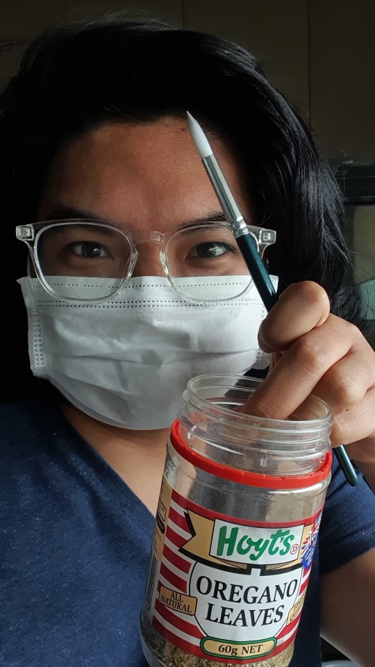
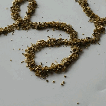
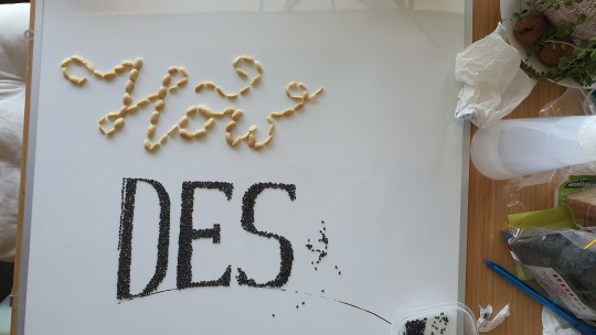
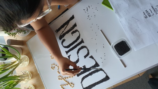
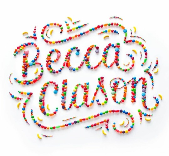
I was inspired by a popular artist Becca Cleeson
Final piece:

I think I will try this method for other design, it was challenging but it made me really aware of shapes and forms I was creating, like the thickness of the calligraphic part, the tracking and sizes. But I needed lot of patience, slight movements would have changed it all. Steady hand and time needed!
10 notes
·
View notes
Photo
The fact that you did this all by hand is unreal to me. The finished product is superb! The organized chaos, consistent colour scheme, provocative imagery - this is undoubtedly Dada. My favourite part is probably the bibliography. The little Coles dude really ties everything together. Amazing!!
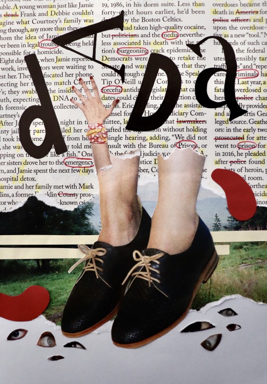
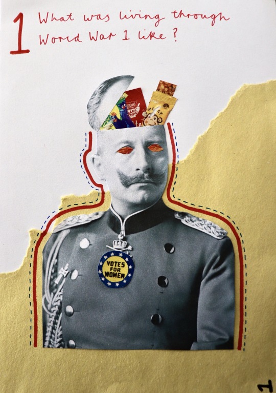
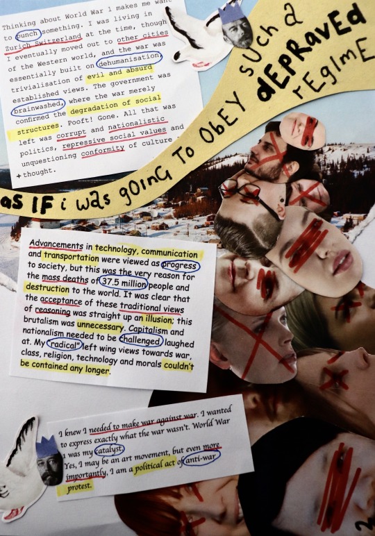
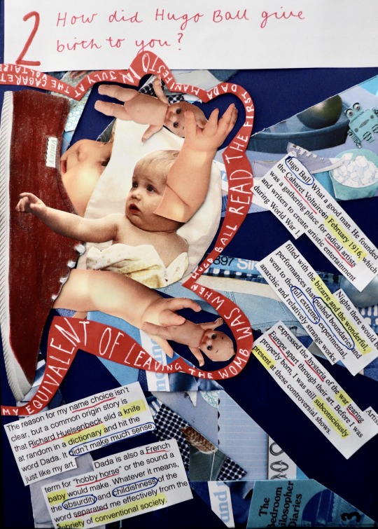
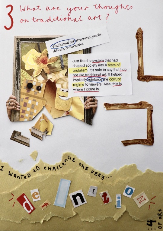
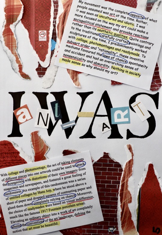
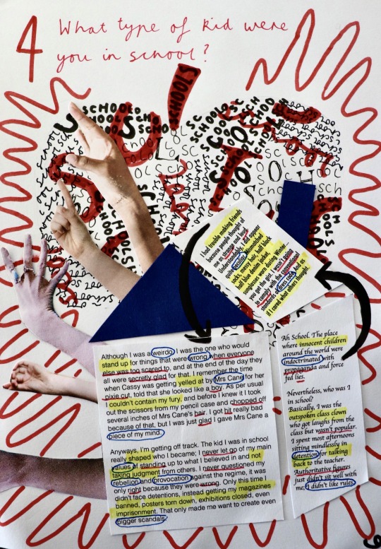
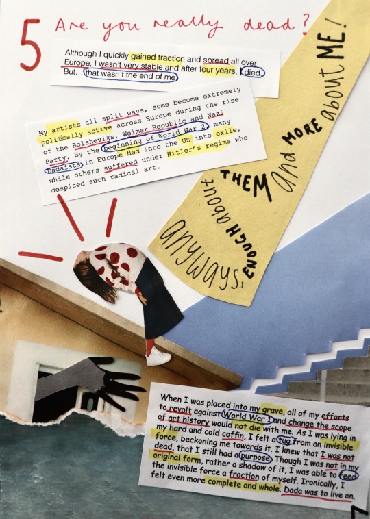
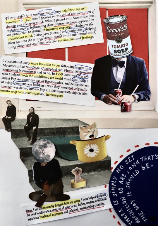
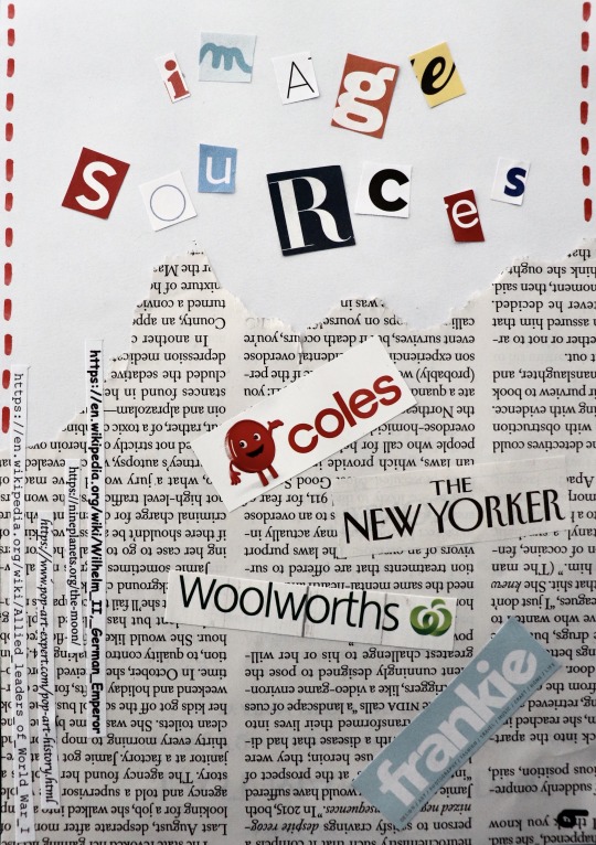
Finished Zine!!
I can’t believe I actually managed to finish! This zine, though fun, literally has consumed my life for the past few weeks, always at the back of my head. This has definitely been the most time I’ve spent on an assignment and it was the best feeling finally getting to vacuum all the tiny bits of paper on my floor and clear away my magazines haha.
There’s quite a bit I’ve changed since last time I uploaded. After receiving feedback from Bailey that my text was quite un-Dada, looking more like a magazine, I spiced it up by using random (and some ugly) alternating typefaces for each paragraph, to make them look as if they were different bits of text cut from a newspaper, a method used by many Dadaists. I also highlighted/underlined/circled important words with my primary colour scheme, giving the words more personality.
I decided to stick to a red, cursive type for my interview questions to give it more contrast from the rest of the pages with its elegant appearance, and enlarged my question numbers to give them more hierarchy.
Making the rest of my zine pages was challenging. Having to adhere to the nonsensical/humorous/weird/chaotic aesthetic of Dada, as well as relating my collages to my questions, as well as creating layouts that still had some structure and thoughtful design choices, was a lot to juggle. I had to think about each element of my designs extremely carefully. After a while, I started to stray from Dada and forgot to fully emulate its style, instead kind of just making collages with no style. I also started to lose creativity and found it hard to come up with ideas from my magazines. There were times where I spent hours doing things that would usually take 15 minutes. With all these slumps, I found that detaching myself from the zine and looking at other existing designs, whether that be Dada art, general designs, or zine designs, proved to be really beneficial in re-inspiring me with new ideas and a fresh perspective. Taking a break away from the zine and coming back to it another a day was also useful.
After learning all about the importance of colour in my colour & info class, I decided to stick to primary colours. Limiting my colour palette was a really good choice, where my pages altogether have a sense of harmony. As my pages have quite a lot going on, limiting my colours helped make them more digestible to view. It was however quite hard having to find specific things to collage with the added limitation of colour. Most of the time I overcame this by looking deep into my magazines, but other times I physically coloured in objects, like the red shoe on question two, or added in coloured paper, like the windows on the second last page.
Once I had all my draft pages ready, I spent yesterday sticking everything permanently down and fixing things I was wanting to change to the pages, such as rearranging layouts, adding more hand drawn aspects, changing my interviewer typeface, using the same yellow coloured paper etc. It was much easier to refine and improve my pages when I already had their general appearances figured out, where I found it a lot harder to start my pages from nothing, as more ideation was required.
Overall, I’m glad that I was able to push through any obstacles and make my first ever zine. It is such a completely different style to what I usually produce, and although difficult, it was really good to push myself out of my comfort zone and explore another style of design. This was also the first time I really delved into collaging and it was very interesting to both explore the endless ways to approach collaging and to have to somewhat rely on chance and spontaneity when flicking through a magazine. Some of my favourite aspects of my collages were non-intentional (e.g. accidentally dropping something on my page) and that’s why I love collaging: it has no rules. I’m really happy with how my zine turned out and I’m definitely going to do more collaging in the future!
31 notes
·
View notes
Text
Couldn’t have said it better. This semester has been chock full of ups and downs but there’s no doubt that it went be in the blink of an eye. Huge props to all the tutors who adapted this course to be online so readily and so well. Looking forward to what the next semester holds!
Thank You

Designed by @adriansfolio
Wow, this semester done and Communication Design is in the books. It’s crazy how 6 months has gone so fast and I wish I did this class face to face and meeting all the students in my class. But I would like to thank Karen, Andy and Bailey for this semester, showing me all these new aspects of design. Exploring to different movements, typefaces, designers that I did not understand previously. Thank you, Andy and Karen for going out of your way and providing content for not only myself but for everyone. Andy always made the lectures funny and exciting for me and Karen I deeply appreciate insightful knowledge. I would like to say thank you to my teacher, Bailey. I knew we did not get to know each other properly, but you truly helped me a lot in this subject, getting feedback from you for my designs really helped. The fact you started class early in the morning and always willing to help and ask if we have questions shows how great a teacher you are.
For myself I learnt a lot and from now on I want to get myself out there, be proud of what I design and surrounded myself with design students friend who together embrace our creativity. Looking back yeah sometimes I was stress, felt tired, sick of working, irritated and alone but that did not make me give up. This is my dream and I will keep practicing, I will showcase my work to everyone and not be afraid to be who I am. I am still learning to appreciate myself and I will follow my passion of design through the ups and downs.
Thank You Karen, Andy and Bailey
It’s been a pleasure
✌️
24 notes
·
View notes
Photo
The personality and chaos that exudes from this zine brings me immense joy. 😌 I’ve always sensed an eerie aura from the CBS logo and this just confirmed all of my suspicions.


DA ZINE :o
I appreciate all the compliments in my previous post on the zine :)
I think im about done with it though, I might or might not send it over to Ben and see what he has to say. I don’t mind if anyone comments anything I should fix or do before submitting.
My last page is a further reading & bibliography page but the hyperlinks only work in the pdf version so no point in uploading that (and no drawings on that page so you didnt miss out on much)
But holy moly what a journey this was. I went ham but I know there are plenty of improvements I could’ve made with the drawings. That’s what I hate about working with three week old drawings, I just dread about the things I could’ve done to make it better, but then again, I don’t want to sink hours fixing things when I could use what I’ve learned in the next drawing or project, allowing me to keep moving forward. I think being a perfectionist can disrupt your momentum and burn your creative thinking which sometimes puts you down into a creative slump. Even though I find perfectionism to suck shit sometimes, it may affect you differently and be a good thing for your creative process.
Anyway I think this might be my last post for this journal, I might keep using this to blog archive cool stuff I’ve found, I’ve never used tumblr until this journal and I’m having a grand time, I hope you guys do the same :)
cya next semester everyone (hopefully not online)
90 notes
·
View notes
Photo
I did not know how uncomfortable reverse-stress fonts made me before seeing this. So naturally I did more research to see what else I could find and stumbled upon this absolute monster.

Fresh Fonts (2018), Standard high contrast vs Reverse high contrast, Retrieved from https://www.getrevue.co/profile/freshfonts/issues/19-the-inverted-issue-107770?utm_campaign=Fresh%20Fonts&utm_medium=email&utm_source=Revue%20newsletter I cannot describe the visceral rage that arose inside me upon laying my eyes in this abomination 💖🧚♂️✨ I never want to see something like this again. 😍🌸⭐
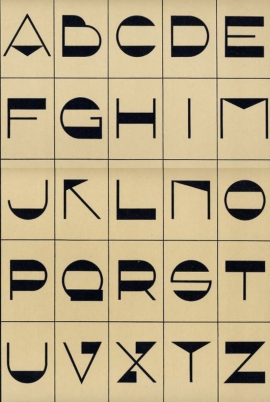
Font, 1920′s
4K notes
·
View notes
Text
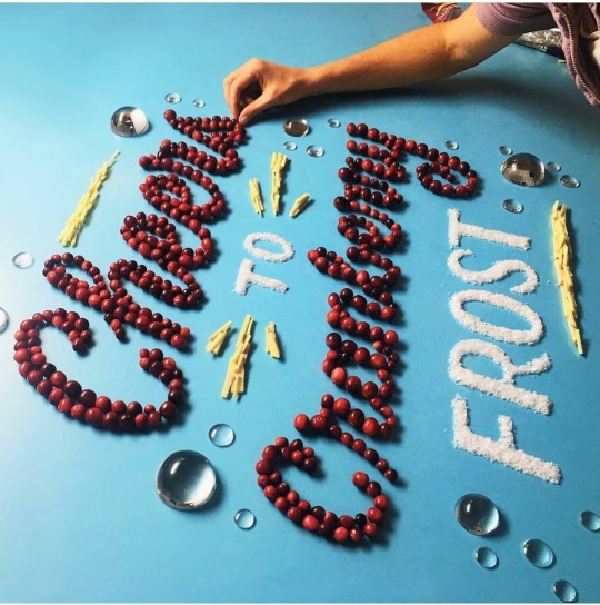
Wonderful work for a magnificent organization! Your piece is coming along nicely and I can’t wait to see the finished product. The disappearance of gumball machines was actually one of my thoughts the other day! I remember always dropping my spare change into the big gumball machines where the the gumball would slide down this marble track-esque contraption and be absolutely mesmerised by a falling piece of gum. Maybe they can come back in the future with some sort of pay-pass system. I’d spend my days tapping my card on gumball machines if that were the case.
Week 11 - RCH Me and UooUoo Art Trail
Earlier this year, I was elated to find out that I was chosen alongside 99 other artists to be apart of The Royal Children’s Hospital 150th anniversary. To celebrate, an art trail has been organised featuring a unique sculpture called a UooUoo deigned by Alexander Knox.


This is still a long work in progress but it’s been a great chance to get some space during quarantine. This was my first time working with something of this scale and in three dimensions. The progress is going a lot slower than I expected because the paint I chose needed several layers to be opaque. However, it’s been a lot of fun and having a chance to chat with other artists and seeing the other sculptures around me evolve each week is super inspiring.

Here is the story behind my gumball machine design that I submitted for my application of this project:
Maybe they are becoming extinct but I don’t see any more gum ball machines. Maybe it’s because they’re specifically designed to be short and only to be in a child’s line of sight but maybe because we stopped noticing the “childish” things that spark a young person’s imagination and joy. Nowadays I just see young people on their phones or iPads, and while they’re amazing devices invented from amazing imaginations, where did the all gumball machines go?

Shown are some progress shots of my work and I am excited to continue working on this project. It will be completed at the end of July and all 100 sculptures will go on display around Melbourne and Geelong city in September through to November. At the end of this will be an auction for the sculptures where the funds will raised will go back into the hospital. I’m so incredibly looking forward the finished product and art trail and hunting down my fellow Me and UooUoo artists.
3 notes
·
View notes
Text
I really like how you played on the concept of consumerism as well as consuming food and drink. The pyramid can also relate to the universally known food pyramid which adds an extra layer of meaning, showing what is most widely consumed on the bottom level. Really interesting idea and very well executed!

“HOW IS DESIGN CONSUMED?”
When asked to create an open ended question, I thought of how design relates to my life. I had a few ideas along the lines of “is design sustainable?” Or “When will design end?”, but as I was considering how design impacts me personally, I realised that whether or not I notice it, all things are design in one way or another. It could designed by nature, by companies, by brands, or by artists.
The final product for our first assessment for Communication Design studies. Honestly I’m really proud of this work and the way it turned out. The idea here was to use materials that have a designed purpose either physically or aesthetically that we as consumers use everyday.
The composition of the design is supposed to grow and grow into a sort of pyramid in terms of balance. This intends to emphasise how much we as a society consume design, regardless if we are aware of it or not.
2 notes
·
View notes