
A reflective blog on my MA Photography research project
Don't wanna be here? Send us removal request.
Statistics
We looked inside some of the posts by robwilsonimages and here's what we found interesting.
Average Info
Notes Per Post
1
Likes Per Post
1
Reblog Per Post
0
Reply Per Post
0
Time Between Posts
6 days
Number of Posts By Type
Text
13
Last Seen Tumblr Blogs


Fun Fact
Tumblr’s website traffic is steadily declining.
Text
Blog Reflection
Robert Wilson
Blog Post 13
8th January 2020
The final task that is set for this blog is to complete a written reflection.
This is the first blog that I have written, and initially, I was doubtful about its academic value. However, its development has turned out differently to my scepticism. It has been both a challenging and rewarding experience, and I feel positive about its worth.
Challenges
The main challenges have been threefold.
Firstly, and perhaps the biggest challenge, was the demands on my time presented by the blog. My posts have been substantial in length for reasons I discuss below, and it has taken up a somewhat disproportionate amount of my study time during this semester. This was not just the time taken to write and refine the blog, but also time taken to research and develop the ideas that I wanted to write about. However, I feel that by managing my time sensibly, being systematic in my approach to the problems that arose, understanding that not every post will be as strong as every other, and communicating effectively with my tutor, I have met this challenge reasonably effectively.
Secondly, I had never previously written or learnt about art formally. Learning the metalanguage of the subject and the analytical concepts, for example, Panofsky’s Iconography, added an additional challenge to the blog.
Thirdly, the blog has demanded that I look at my own work and consider and critique it as art in the context of the canon of relevant photography. In the past, when I considered my work, I judged it mostly in isolation or against the work of the photographers I admired and was trying to learn from. This blog in particular has forced me to look at my photography critically in the wider universe of art photography. This is not always an easy thing to do. I am quite protective of my photography, but this critical engagement has been highly beneficial.
Rewards
Because I have had to critically engage with my work, I now feel that I have a much better understanding of who I am as a photographer and why I work in the way that I do. My photographic process is no longer simply about making images that pleasing for the eye. Now, I want to explore photographic subjects in depth and to give others the opportunity to find meaning in what I do.
I now feel I have the skills to talk and write about art photography and how my own work relates to it. Writing posts that were substantial in length was excellent practice and the experience gained should demonstrate its worth going forward. Not only am I now able to relate, compare, and contrast my work to that of important names within my field, I can now communicate this much more confidently.
The production of this blog has been rewarding. I have thoroughly enjoyed learning more about myself as a photographic artist and how I can relate my work to the photography world.
Moving Forward – A Future Challenge
One challenge that has emerged from the blog and its related reading and analysis is the question of where my own photographic practice for my project rests. I have established that perhaps it is not entirely deadpan nor is it documentary or landscape although the work can relate to all three, but the question remains unanswered. The answer may turn out to be that it does not really matter, but it is a question that I will continue to revisit and continue as the programme progresses.
0 notes
Text
Is my work deadpan?
Robert Wilson
Blog Post 12
3rd January 2020
In the two previous articles, I examined the factors which, after analysing the relevant literature, were the main defining features of deadpan photography. This article examines whether my own work fulfils these criteria and can be defined as deadpan. It is worth noting that the final judgement on whether my images are deadpan is not truly mine to make. That judgement is for future reviewers of my work. However, it is appropriate for me to consider where my own work is situated in the now vast photographic universe.
Defining my own work
The images that I am creating for There’s nothing to see here in Scarborough are a major departure from the type of work that I have created over the last twenty years. As outlined in a previous article, my work has mainly focused on travel documentary and landscape images. The work in my project appears to be very different from this. A key question that has arisen about this new work is whether it can be defined as deadpan. This article will attempt to answer this question by considering the nature of three images that I have selected for inclusion in the final submission for Practice 1: Art and Design. The analysis will use the four key categories that were outlined in the previous two articles. These are (1) objectivity and detachment, (2) composition and technique, (3) lighting and aesthetics, and (4) visual experience.
Image 1
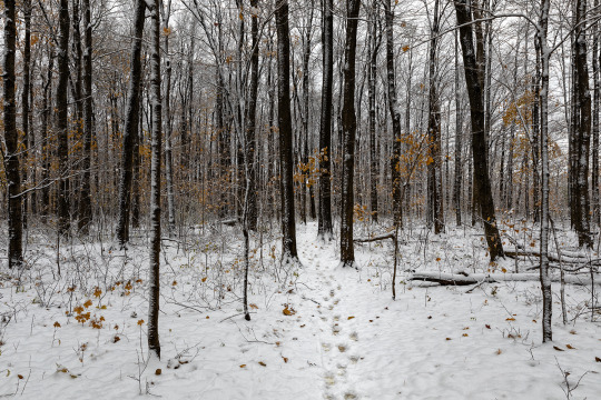
Robert Wilson – A path through the woods, November 2019
This image can be considered quite beautiful on its own without any reference to the rest of the project’s work. It is finely composed. As the title suggests, a path, slightly off centre, leads through the woods before disappearing behind the trees. A line of autumn colour crosses the image at the upper third. On the right, a fallen tree meets the crossing of horizontal and vertical thirds.
The image has power and does provide a visual experience. When, like much of the deadpan canon, the image is displayed on a large scale, its impact increases. The viewer is pulled in, and is drawn up the path, into, and through the picture. We wonder what we will find behind the trees. We can be confident that ‘the eye can get lost’ (Soutter, 2013, p. 31) here in the image.
The lighting and aesthetics of image meet the requirements of deadpan. The day is grey and overcast. The lighting is clean, but flat. The picture is without shadow. The colours are elegant and muted.
However, this image does not truly qualify as deadpan as it is not truly detached or even objective. The image is optimistic and sentimental. A commentator, who I asked to review the images, enjoyed the image, but described it as ‘Hallmark-like’. It appears to reflect the happiness that I felt when I captured it; to have discovered this magical winter environment in a busy urban sprawl was a genuine joy. Therefore, I must accept that A path through the woods, November 2019 does have several deadpan elements, but does not truly fulfil the criteria due to its emotional content.
Image 2

Robert Wilson – Golf course and public housing, October 2019
At first glance, this photograph may pass as a deadpan image. The lighting, which is flat and even, is entirely appropriate to the style. However, this is the only feature of the image which qualifies.
The flag situated just off centre, along with the positioning of the green, and the branches of the tree providing a frame, may initially hint at a harmonious composition. This harmony is broken by the fence running at an angle atypical of deadpan photography’s symmetries and straight lines.
This image is neither objective nor detached. There is nothing ‘cool, detached, keenly sharp’ here (Cotton, 2014, p. 81). This is an image that reflects my own anger at the scene in front of me. The golf course, a symbol of wealth and status, is juxtaposed against a graffitied block of public housing. The contrast between privilege and poverty is stark. There is no conventional deadpan visual experience here for the viewer either. The fence rings the golf course and we are kept out. The outsider is not wanted here; the course is for members only.
Image 3

Robert Wilson – Abandoned Café, November 2019
Of the three images this is undoubtedly closest to the ‘cool attitude of impartiality’ (Soutter, 2013, p. 37) that Bernd and Hila Becher ascribed to their iconic industrial images. There is no artifice in the image. When I considered the capture, I stepped back, planned the composition, and took a photograph; I felt completely detached from the scene before me. My only focus was creating the image.
The consistent and even lighting in the image bears comparison to that in the work of Frank Breuer. It is a cloudy day and the sky is a light grey. There is no indication of time of day. There are no shadows. This is classical outdoor deadpan territory.
The image is successfully composed. The red door is situated at the intersection of two lines of thirds. The image is bisected near the centre by the telegraph pole with the two halves providing an interesting contrast to each other. The café nearly fills the width of the image and dominates our view.
Finally, the image does provide a visual experience particularly when displayed at a large size. It compels the viewer to look and think. At a superficial level, it is simply a ‘straight’ photograph of its subject. Yet, it generates a response. The viewer is invited to consider the café and its fate without being pushed to a conclusion predetermined by the photographer. The same commentator who described the first image as ‘Hallmark’, noted that this image created a sense of pathos within him. Therefore, when this image is considered in isolation, it is fair to conclude that it is a fine example of deadpan.
Conclusion
It is reasonable to conclude after analysing these images, that There’s nothing to see here in Scarborough does not entirely sit within the genre. However, the work does contain many elements in common with deadpan, and it is an influence on the project as a whole. As I move forward towards the modules Practice 2: Art and Design and Major Study, the critical question that I must answer is whether I wish to make the work wholly reflective of the deadpan genre, or if I should continue creating images that sit slightly outside the mainstream genre. This will be a challenging and interesting dilemma to resolve.
References
Cotton, C. (2014). The Photograph as Contemporary Art. 3rd ed. London: Thomas and Hudson.
Soutter, L. (2013). Why Art Photography?. 1st ed. Abingdon: Routledge.
0 notes
Text
Defining Deadpan 2
Robert Wilson
Blog Post 11
30th December 2019
This post follows on from the previous article which discussed two features of what can define an image within deadpan.
As we discussed in the previous article deadpan requires technical skills of the highest order along with the appearance of objectivity and detachment with regards to its subject matter. This though is not all that is required to meet our definition of modern-day deadpan photography. This second article discusses the nature of lighting in deadpan and the visual experience that the images themselves are intended to create. Finally, we briefly discuss the outdated labelling of deadpan as ‘Germanic’.
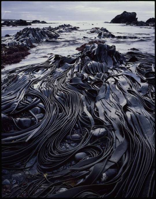
Lighting
Sholis (2006, p. 42) notes how Frank Breur consistently photographs ‘against near-white skies’ which could be taken ‘at any time of day’. Similarly, Cotton (2014, p. 101) describes how Simone Nieweg’s ‘diffused light from an overcast sky is perfectly matched to her thoughtful and subtle observations.’

Simone Nieweg - Waldrand in der Dämmerung, Schiefbahn, 1997
This same uniform grey sky is also visible in Gursky’s Rhein II. It is also a consistent feature in the Bechers’ industrial images. On this evidence it is possible to conclude that to be considered a deadpan image a photograph should be taken with flat, grey, overcast skies.
Yet, this is not the case. The deadpan portraits of Rineke Dijkstra and Thomas Ruff are taken indoors and clearly do not feature the same overcast skies. Dijkstra’s portraits are created with light that is generally flat, soft, and even. Ruff’s, on the other hand, appear to use direct diffused flash that light the subjects features without hard shadow. Additionally, much of the work of Gursky, Struth, Candida Höfer and other major deadpan photographers is taken indoors.

Rineke Dijkstra - Almerisa, Wormer, 1996
What the viewer discovers when perusing the canon of deadpan images is not that this photography requires a particular type of light, but it does require an even, consistent light. You will find no gloriously saturated sunsets here.
Visual Experience
Through the early 21st century, deadpan is not only dominant within art photography, but arguable in modern art as a whole (Soutter, p. 47). Galleries are filled with images that are often enormous in scale and ‘contain so much detail that the eye can get lost inside them’ (p. 31). The stress then, particularly in the images of Gursky, is on how deadpan photography produces a spectacular vision and experience for the viewer. Soutter (p. 41) argues that the art world accepts that images on this scale ‘signal tremendous ambition and demand to be taken seriously.’
Andreas Gursky – Shanghai, 2000
What of humans in this elaborate visual experience? In Gursky and Struth’s work humans are often reduced to mere specks when alone or ‘are usually minute and densely packed in a mass’ (Cotton, p. 84). In Gursky’s Shanghai, humans are present, but they are entirely subordinated to the image itself. Their presence matters as they give the image scale and confirm that this is a very human environment, but their identity is an irrelevance.
Yet this grand vision is not the only way deadpan can be produced. For example, Cotton notes that ‘Deadpan photography has a great capacity for capturing the wonder of the man-made world in elegiac manner.’ (p. 93). Certainly, the canonical industrial images by the Bechers do not require an enlarged scale to have this elegiac impact; they could be considered as banal, but in reality they show a soon to be gone industrial age with pathos and a keen eye for detail (Adler, 2016, p. 67), and there can be no doubt that they still provide the viewer with a singular visual experience.
It is also important to consider the impact of deadpan portraiture. This work, often printed in large scale, again strike the viewer with considerable impact. They are generally made straight on and, as we discussed above, in an even, consistent lighting.

Thomas Ruff – Portrait, 1988
In these images, as evidenced by the above portrait by Ruff, the viewer is confronted by the subject. The photographer seems to make no judgement about them which reflects the appearance of objectivity and detachment discussed in the previous article. We, the viewer, make our own judgements about the individual featured.
Whether they show crowds of dealers in a spectacular image of the Chicago Board of Trade, the most banal scene of a pile of shipping containers, a black and white cement factory, or a young woman staring directly at the camera, successful deadpan photography should provide a visual experience for the viewer that makes you stop, look, and consider the content and implications of the image.
Welcome to Germany?
Deadpan photography is consistently labelled as being ‘Germanic’. Bate (2016, p. 75) notes that,
‘The conventions of Atget or Sander, for example, are now revised and developed in the work of German art photographers like Andreas Gursky, Thomas Ruff, Candida Höfer, and Thomas Struth to mention only a few.’
Cotton (Cotton, p. 82) describes how this description arose from the Bechers and the nature of their teaching at the Dusseldorf school which grew from the work of the German New Objectivists in the 1920s and 30s.
Whilst deadpan may be ‘Germanic’ in origins, this categorisation does not tell the whole modern story. Deadpan is now a photographic approach that features practitioners from across the globe.
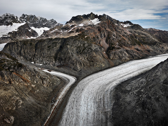
Edward Burtynsky - Glacier Catchment, Scud River, Nothern British Columbia, Canada, 2012
Canadian Edward Burtynsky has completed projects on environmental subjects such as the Anthropocene, oil, and water that are as spectacular as anything produced by either Gursky or Struth. In Japan, Naoya Hatakeyama produces images that Cotton describes as containing ‘breathtaking magic’ (p. 93). Britain’s Dan Holdsworth creates images that are the very architype of deadpan. Deadpan is now a global photographic endeavour.
Conclusion
This and the previous article have attempted to construct a framework that allows a broad definition of deadpan photography. It is not exhaustive, and a longer and more thorough investigation could easily reveal more. However, it has shown that there are commonalities among deadpan photographers despite the disparate nature of their work. It has also shown that whilst deadpan has its origins in Germany, it is now a global photographic movement.
References
Adler, D. (2016). The apparatus: On the photography of Thomas Ruff. Art, 75(2), pp. 67-87.
Bate, D. (2016). Photography: The Key Concepts. 2nd ed. London: Bloomsbury.
Cotton, C. (2014). The Photograph as Contemporary Art. 3rd ed. London: Thomas and Hudson.
Sholis, B. (2006). Frank Breuer. In: T. Demos, ed. Vitamin Ph: New Perspectives in Photography. London: Phaidon, pp. 42-43.
Soutter, L. (2013). Why Art Photography?. 1st ed. Abingdon: Routledge.
0 notes
Text
Defining Deadpan 1
Robert Wilson
Blog Post 10
23rd December 2019
This article is the first of two which discusses and defines deadpan photography. I have chosen it for these entries after discussions with my tutor about how my own work relates to the genre. This article will attempt to find a definition of deadpan before a subsequent post relates it to my own work.
Deadpan is ubiquitous in modern photography. A cursory search of the internet reveals that it dominates the art photography market with images selling for millions of dollars. Despite this prevalence, it is difficult to find a single definition of what constitutes deadpan photography. This necessarily brief two article series attempts to create a framework for defining photographs as deadpan by extracting and developing the themes discussed in some of the key photography literature as well as drawing from observation of the work of important deadpan photographers. This framework is fourfold:
1. Objectivity and detachment
2. Composition and technique
3. Lighting
4. Visual experience
After analysing each in turn, we discuss another factor which is often used to characterise deadpan, and that is whether the photography is ‘Germanic’ or not. It should be noted that for reasons of brevity, we focus on deadpan in terms of individual images rather than its typological use. This article will discuss objectivity and detachment.
Objectivity and Detachment
According to Cotton deadpan is ‘cool, detached, keenly sharp’ with ‘emotional detachment and command’ (Cotton, 2014, p. 81). Its modern form grew from the work and teaching of Bernd and Hilla Becher and is most notably connected to their typographical work of water towers, mines, cement factories, and other such industrial structures. Their approach derived from the early twentieth century work of the ‘new objectivists’ such as August Sander (p. 82) and was a direct response to the humanistic ‘The Family of Man’ style that appeared in post-war Europe and America (Soutter, 2013, p. 36). Souter describes how the Becher’s work was autonomous and committed to objectivity as they defined it (pp. 35-39). She defines objectivity as ‘a plain, straightforward attitude, uncoloured by opinion or emotion’, but goes on to note how that objectivity carries ‘different connotations in each specific context’ (p. 32).
The categorising of deadpan as objective and detached is not confined to history; it permeates the analysis today. For example, Adler describes how the Bechers’ former student Thomas Ruff’s images are described,
‘Like a mantra, critics are fond of beginning any discussion of Ruff’s project by citing an appropriately chilly context of German photographic objectivity, identified with the teachings of Bernd and Hilla Becher, which Ruff absorbed while at the Düsseldorf Kunstakademie.’ (2016, p. 67).
This labelling of cold objectivity does not tell the entire story of deadpan. Sholis (2006, p. 42), describing the work of another Becher student, Frank Breuer, notes that whilst his photographs are defined as deadpan, Breuer’s work does contain subjective and idiosyncratic elements. Soutter goes further still and reveals how, ‘Art critics find pathos in the work, and also flashes of comedy’ (Soutter, p. 43) in his images.
Frank Breuer – Untitled (Somerville, MA, USA), 2004
Additionally, it must be noted that no matter how objective a photographer intends to be in their work, an element of subjectivity is impossible to avoid. As Cotton (p. 86) states, ‘the personal politics of the photographers come into play in their selections of subject matter’. We are inevitably subjective when we choose to photograph something. How then are we to respond to the subjectivity paradox that this and Breuer’s work makes most apparent? Perhaps, we should accept that there is room for the artist’s own idiosyncrasies in the construction of the work and define deadpan as giving the appearance of objectivity and detachment.
Composition and Technique
Andreas Gursky’s extraordinarily successful large-format work is based around what Cotton describes as ‘surface perfection’. She goes on to inform us that Gursky intends to ‘convince us that each scene could not have been more fully described than from his chosen perspective.’ (p. 84). This ‘perfection’ and ‘perspective’ is illustrated in striking fashion by one of Gursky’s lesser known images Amazon.
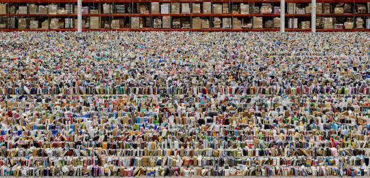
Andreas Gursky – Amazon, 2016
The picture shows an almost unending rows of books that form the depository in such compelling fashion that it is difficult to imagine it be being photographed so successfully in any other way. Bate notes that Gursky has achieved a ‘mastering of viewpoint’ (2016, p. 131) in his work. This powerful use of viewpoint makes us ‘detached critical viewers’ (Cotton, p. 84).
It is not only Gursky who has achieved this level of compositional virtuosity. Soutter points out, when discussing the work of Gursky’s contemporary Thomas Struth, that this refined technique is to be expected in the work of all the Bechers’ former students (Soutter, p. 45).

Thomas Struth – Drydock, DSME Shipyard, Geoje Island, 2007
There should be no surprise that the wider group of deadpan photographers had a technical impact beyond their own work. Soutter, with some amusement, describes how photography students in the early millennium would,
‘…simply choose a subject (preferably something that comes in many variations) and shoot… using uniform composition and immaculate technique. Instant art!’ (p. 42)
The technical aspects of modern deadpan do not end with the attention to viewpoint and composition though. Blank (2011) describes how Struth has embraced digital processing in his image production relatively recently. On the other hand, Gursky’s use of digital technology has long been discussed. For example, Nanay (2012, pp. 95-97) discusses how modern imaging technology has become vital to Gursky’s creation and production of images. It is well known that Gursky’s arguable most famous image Rhein II, which was created in 1999, does not exist in reality and is created from digital composition.
The literature stresses that modern deadpan photography emphasises viewpoint and compositional skills; it is therefore correct to acknowledge that these are a crucial defining factor. Additionally, the use of digital processing and production techniques must be acceptable when defining an image as deadpan.
Conclusion
This article has illustrated how the appearance of objectivity along with technical and compositional virtuosity are critical factors in what defines an image as deadpan. The second article will focus on the lighting of deadpan along with its creation of a visual experience. It will also discuss the categorisation of deadpan as ‘Germanic’.
References
Adler, D. (2016). The apparatus: On the photography of Thomas Ruff. Art, 75(2), pp. 67-87.
Bate, D. (2016). Photography: The Key Concepts. 2nd ed. London: Bloomsbury.
Blank, G. (2011). Social Memory and its negatives: Thomas Struth's documentary of absence. In: T. Struth, ed. Korea. Seoul: Gallery Hyundai, p. n.g..
Cotton, C. (2014). The Photograph as Contemporary Art. 3rd ed. London: Thomas and Hudson.
Nanay, B. (2012). The Macro and the Micro: Andreas Gursky's Aesthetics. The journal of Aesthetics and Art Criticism, 70(1), pp. 91-100.
Sholis, B. (2006). Frank Breuer. In: T. Demos, ed. Vitamin Ph: New Perspectives in Photography. London: Phaidon, pp. 42-43.
Soutter, L. (2013). Why Art Photography?. 1st ed. Abingdon: Routledge.
0 notes
Text
A Thematic Analysis of Robert Adams’s The New West: Prairie
Robert Wilson
Blog Post 9
17th December 2019
This post will make a necessarily brief analysis of a photo essay in Robert Adams’s ‘The New West’ (1974). The purpose of this entry is to practice applying a photographic analysis methodology to set of images before I apply the same analysis to my own images for my project ‘There is nothing to see here in Scarborough’. I have selected Adams’s work as it informs my own project work in both its content and approach.
The Analysis of Photography
Photographic analysis is problematic. As Langmann and Pick note, ‘The act of looking at and interpreting photographs is profoundly impure.’ (2018, p. 103). However, there are tools available for the viewer, the most famous being Barthes’s punctum and studium in Camera Lucida (1980) which provides a framework for analysing individual photographs from a personal perspective; the punctum in any given photograph is likely to be different for the individual viewer. Alternatively, Shore (2007) creates a paradigm for understanding a photograph as a physical object in The Nature of Photographs. Whilst these are both vital and useful neither Barthes nor Shore provide the researcher with a method for analysing a photographic essay. Langmann and Pick go further still in their description of the difficulties.
‘Interpretations of photographs are multiple and shifting, depending on the researcher’s purpose, perspective and audience, and the chosen interpretive approach.’ (2018, p. 103)
Whilst they note that the individuality of the researcher affects the interpretation (p. 127), they offer several frameworks to aid the scholar in their task. This article uses one of these paradigms: a thematic approach which ‘explores and identifies common themes and threads across entire data sets’ (p. 104). It also takes a contextualist approach where the researcher finds their own meaning in the data but recognises that current social factors affect the interpretation (p. 111).
The New West: Prairie
The New West is a highly regarded monograph of five visual essays by lauded American photographer Robert Adams. The work is not without its challenges. In the introduction John Szarkowski admits that, ‘…some viewers might find it dull’ (Adams, 1974, p. ix). However, he goes on to note that many others may discover ‘nourishment, surprise, instructions, clarification, challenge, and perhaps hope’ (p. ix) in the images. The collection is thoughtful, meditative, and without hyperbole.
At the natural level the images in the book are simple. They show well composed landscapes in the west of America. We see roads, fields, new towns, cities, shops, vehicles, and, in the later plates, people. Beyond this, when viewed at a conventional level, the work tells a story of human settlement, development, and expansion into frontier territory; the geography of The New West is new.
The images are monochrome with the majority taken in harsh, direct light, a technique somewhat unusual in modern landscape photography. This has resulted in images that are most often in a high key eschewing the darkened dramatic skies and deep contrasts that are often seen in monochrome landscape.
There are ten images in the first essay Prairie, and it is the themes of these images that are analysed here at the intrinsic level. As stated above, this is a contextualised analysis (Langmann & Pick, 2018, p. 111). Whilst we analyse and view these photographs through our own particular lens, the world as we understand it affects our judgement on these matters. We examine the two interconnected main themes which arise from analysis of the image data. Despite being first published in 1974, these critical themes appear even more relevant today than upon first publication.
Theme One: The Vastness, Inhospitality, and Endurance of Nature

Robert Adams – Farm road and cottonwood. South of Raymer, 1974
In six of the images the viewer looks directly across the prairies. In all but one of these images nothing is included to curtail the endlessness. The other image, Along Interstate 25, terminates in distant mountains, so far away as to be barely visible in the harsh light of the day.
Much of the land appears to be empty. Not a single human is visible in any of the images from Prairie. The land is not inviting. Adams states that ‘The outlying plains are still verdant, with ranges of grass to scan, and infrequent but lovely trees by which to measure spaces.’ (p. 3). Yet, this loveliness is not evidenced by the pictures themselves. No hint is given to the colour of the landscape under the midday light.
This use of repetition and redundancy here is significant. Adams stresses and wants us to understand that this is an enduring, tough environment where nothing appears hospitable.

Robert Adams – Pikes Peak, Colorado Springs, and the highway from the prairie, 1974
Even the urban areas, which appear in the final two images of the essay, appear to be there under the sufferance of nature. The sublime mountains loom above informing the viewer that the town is subordinate. This sufferance is illustrated effectively by another image entitled Along Interstate 25. This picture shows the banks of a highway fenced at the top with growing foliage reclaiming the ground. No matter what we build here, the plants return. Our presence is impermanent.
Nature here is vast and unwelcoming.
Theme Two: Human Encroachment
The other critical theme that emerges from the image data is one of human encroachment. As we noted above, there is no person visible in any of the images. Yet, human presence is a consistent factor throughout the essay. We may be physically absent, but our impact is not.
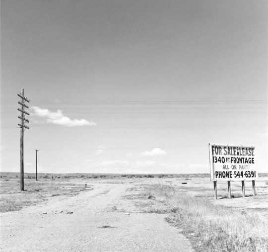
Robert Adams – Along interstate 25, 1974
Along interstate 25 features the almost endless prairie that we discussed above, but our impact is unmistakeable. Telegraph lines and poles slice through the sky, and in the front right of the image is one of the ultimate symbols of the invading human, a for-sale sign.
However, the impact of humanity is shown most starkly and in the most shocking detail in an image entitled On Interstate 25 which shows an animal, perhaps a rabbit as roadkill.

Robert Adams – On Interstate 25, 1974
There can be no mistaking the impact of humanity in this image. We did this. Our intrusion caused the death of this animal.
When viewed at an intrinsic level, Adams presents and plays off against each other a powerful contrast in the two themes: nature endures yet it is threated by human expansion. Human presence in Prairie is an ugly one. This is unmistakeable. The human settlements featured in the essay are blights on the landscape. The other signs of our encroachment show damage or hint at further destruction. When viewed in the context of our human population explosion and the climate crisis, his essay points a finger and challenges us to consider our impact on the landscape.
Conclusion
This article has attempted a thematic analysis of the essay Prairie which features in The New West. It has, because of necessary brevity, only focused on the two most striking themes that emerge from the images. This process of analysis has proved to be both useful and insightful. It should enable the application of a more detailed and thorough future analysis for the project There is nothing to see here in Scarborough.
References
Adams, R. (1974). The New West. 1st ed. s.l.:The Colorado Associated University Press.
Barthes, R. (1980). Camera Lucida. 2010 ed. New York: Hill and Wang.
Langmann, S. & Pick, D. (2018). Photography as a Social Research Method. 1st ed. Singapore: Springer Nature.
Shore, S. (2007). The Nature of Photographs. 2nd ed. London: Phaidon.
0 notes
Text
Rejecting Strong Images: A Challenge
Robert Wilson
Blog Post 8
11th December 2019
This post is a reflection on the challenges of selecting work for submission. I am currently going through the process of choosing work for the assignment for the module Practice 1: Art and Design. The procedure of selecting work is not simply a case of identifying the images that I feel are the strongest, but of identifying a coherent series. Here, I examine the images that I have decided to exclude and my reaction to them. It must be noted that the images that have been selected for the project are discussed here but are not shown as they are not yet available for public consideration. Please accept my apologies if this causes any confusion or ambiguity.
How to Reject Images
The images that I have made for my project There is nothing to see here in Scarborough for its initial draft in the module Practice 1: Art and Design have been collected in a series of research walks. These walks were made in the district of Scarborough starting on the 22nd October 2019 and will continue until the conclusion of the project. The images were made in a variety of different weather conditions from bright autumn sunlight to the hours after winter snowstorms. The images reflect a variety of light conditions and compositions. I have already recorded over two thousand images, and this number will clearly increase. Initially, this was edited down to fifty-nine. The final submission will be twenty images that should form a coherent narrative. The biggest challenge that I am facing with this process of inclusion and elimination is the rejection of images that I feel are meaningful and of genuine merit.
The challenge of rejecting images is not new. It is an issue familiar to anyone who has completed a substantial photography project. At the completion of The Americans Robert Frank had at least five hundred rolls of exposed film (Day, 2011, p. 41). This was edited down to just eighty-three final photographs which must have presented an enormous editorial and printing challenge. The approach he used is instructive for my own project. Day (p. 42) notes that Frank used a very different approach to Henri Cartier-Bresson in how he selected his images. He describes how Frank,
‘…departs from Bresson in his subordination of the photograph’s ‘moment’ to his overall intentions. The wonderful images left out of The Americans testify to this…’ (p. 42).
Additionally, he aimed for ‘the exact and most appropriate moment of communication’ and ‘This was more important than a beautiful print.’ (p. 43).
The key conclusion we can draw from this is that Frank believed the message of the The Americans was more important than the strength any single image. This then is a key message that I must take for my photographic project.
In additional, Volk and Currier offer helpful advice when it comes to the exclusion of images from a portfolio. Your portfolio should be ‘concise’, ‘convincing’, and ‘clear’ (p. 6), and,
‘To start, take out any pieces that appear to be redundant, or offer the same idea, demonstration or method. If they simply repeat something that is already well presented, you should consider removing them.’ (2015, p. 7).
Adopting their advice allowed the simple removal of many of the fifty-nine images that had passed the initial editing phase. However, this was not a sufficient process with regards to a number of images. It was only by the application of Frank’s approach and the placing of the message above the single image that I was able to eliminate three images that I felt had considerable merit. It is these images that I discuss below.
The Excluded

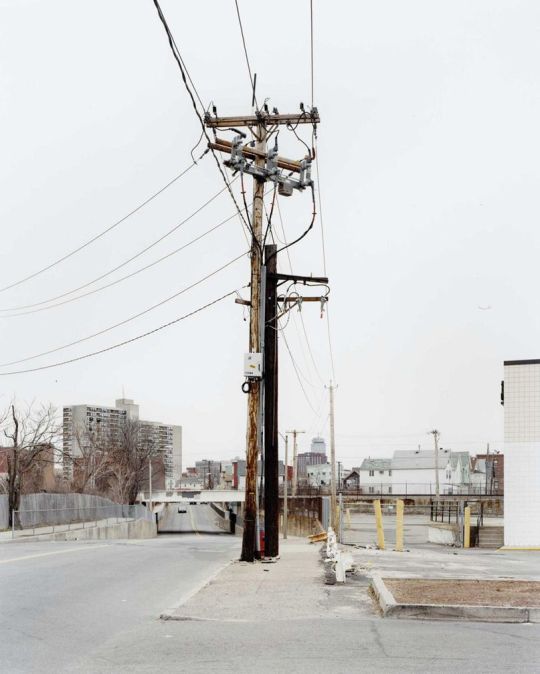
Rob Wilson – Petrol Station II, October 2019
I initially envisaged this striking image Petrol Station II to be the signature image of the whole project; it was undoubtedly the most difficult to reject. Printed at a large size, the image has considerable power. One viewer, a professional photographer, described how it reminded him of work by the renowned colour photographer Pete Turner. The near perfect evening light gives the image’s colours a vivacity that has not been enhanced by digital correction. Despite its power and my initial hopes for it, this image simply does not work when included in the overall project.
I rejected this image for two reasons. In the images that are currently included in There is nothing to see here in Scarborough, the subjects that I have photographed have either been recorded as a whole or I have stepped back and included as much of the subject as I can. However, this image is a detail of a roof. In that respect, it does not match the compositional themes of the project. Secondly, it is lit in an entirely different fashion to the rest of the project: the other images that have been included feature an overcast sky without shadow.
These two issues made its inclusion impossible.

Rob Wilson – Children’s Play Area, October 2019
Like Petrol Station II, this was another image that I initially felt had an important role in the project. The image is recorded in the same inclusive straight-on style as many of the accepted images. I consider the project images to have been photographed in what Cotton (2014, p. 81) describes as a ‘deadpan’ style which is a ‘cool, detached, and keenly sharp type of photograph’, whereas this image is colourful and bright with connotations of reflection on childhood. Additionally, and as with Petrol Station II, this image was captured in beautiful light, this time early in the morning. It simply does not fit with the project’s narrative and style. It is for these reasons that it has been excluded.
Rob Wilson – Autumn at a Pond, October 2019
Although this image is again striking, it was the easiest of the images to exclude. This image would clearly have a future in the project if its subject matter were bright, beautiful landscapes, but in the case of There is nothing to see in Scarborough, it is clearly unsuitable. Like Children’s Play Area, this is a bright, colourful photograph taken in beautiful morning light. It simply does not fit.
Interestingly, these three images work together as a group. I considered including all three together because they function well as a unit. They illustrate the beauty that can be found here in Scarborough in a colourful and effective fashion. However, this beauty is still apparent in the images that have been accepted for the project but is shown in the ‘deadpan’ style with overcast grey skies as I discussed above. To have included these images would have created a subsection in the project that did not relate or work with the rest of the images.
Concluding Thoughts
The exclusion of these images was difficult. I feel that they are some of the strongest that I have taken as part of the project research. Yet, they simply do not fit into the project as a whole. It is only by applying the same prioritisation of the overall message over individual image as Robert Frank that I was able to reject their inclusion. However, this rejection does not imply that these images will be consigned to an archive which will never be seen again. These photographs have a future, just not as part of There is nothing to see here in Scarborough.
References
Cotton, C. (2014). The Photograph as Contemporary Art. 3rd ed. London: Thomas and Hudson.
Day, J. (2011). Robert Frank's 'The Americans' The Art of Documentary Photography. Kindle ed. Bristol: Intellect.
Volk, L. & Currier, D. (2015). No Plastic Sleeves. 1st ed. Burlington: Focal Press.
0 notes
Text
What is your methodology?
Robert Wilson
Blog Post 7
3rd December 2019
For this post I was asked to create a description and justification of my methodological decisions. It describes why I have chosen Grounded Theory with longitudinal element for ‘There is nothing to see here in Scarborough’. It also shows how this project connections to the ‘Iterative Cyclic Web Model’.
Methodological Justification
There is nothing to see here in Scarborough is a research project which is intended to describe the Toronto district of Scarborough. The project is so named because Scarborough is often stereotyped as being dull, boring, and somewhat dangerous. It is often portrayed in insulting terms with epithets such as Scarberia and Scarlem (Basu & Fiedler, 2017, p. 33). I hope to show that the title is ironic and that, in fact, there are things to see in Scarborough.
The research that will be conducted takes the form of a series of images that will build a theory which intends to explain the research questions asked about Scarborough. These questions are:
1. What defines Scarborough?
2. How are economic and demographic changes affecting the districts landscape?
3. What is the story of modern Scarborough?
4. What impact does the climate have on the district?
These questions reflect my curiosity about my new place of residence and are intended to enable initially free, but increasingly focused exploration of Scarborough as a place as theories begin to emerge. The first three questions were formulated during the initial conceptualisation of the project. The fourth was added at the beginning of Practice 1: Art and Design and reflects my increased understanding of Scarborough as a place.
Additionally, my project manifesto states that I intend ‘To tell a story of modern Scarborough through my eyes.’ Qualitative research is subjective in nature, and I recognise that any theories that are generated about Scarborough are from my perspective. A different researcher carrying out the same study would likely find different theories. The manifesto reflects this.
It will be implemented by applying Grounded Theory with an additional longitudinal aspect; the image-data collection will be executed on a continual basis from late 2019 until the programme concludes in 2021. The data collection is both iterative and developmental. I can find no evidence of a previous project of this nature being implemented in Scarborough. Therefore, the series of images produced, if successful, may generate new knowledge about nature of Scarborough as an urban environment.
Candy (2006, in n.g., 2019) initially defines practice-based research as,
‘An original investigation undertaken in order to gain new knowledge partly by means of practice and the outcomes of that practice.’
In addition, Candy and Edmonds importantly note that,
‘If a creative artefact is the basis of the contribution to knowledge, the research is practice-based.’ (2018, p. 64)
By these definitions, this research is practice-based. It can also be defined as ‘practice as research’ as practice and research cannot be separated in the chosen research paradigm. The images that I take that will form both the project data and the ‘creative artefact’. The data will not just inform practice but will be the practice itself.
These features of the research project render it suitable candidate for the application of Grounded Theory. I, as a resident and researcher, had little understanding of Scarborough when I began this project; I had only questions. An open and questioning approach combined with a lack of any fixed notions about Scarborough make Grounded Theory an ideal candidate for this study. This absence of specific knowledge directs the project to Glaserian Grounded Theory, which demands this open approach, rather than Straussian, which may build on preconceptions about the subject at hand (Hernandez, 2008). As I discussed above, I have now lived in Scarborough for several months and have an increasing understanding of the district. The original research questions that I formulated have remained the same, as they still indicate my intentions for this project, but with the addition a fourth question about the climate.
It is appropriate to include a longitudinal element to the project, and the fourth research question reflects this. The research will take place during three modules that combine for forty-eight weeks of programme time. Scarborough has a variable and often extreme climate. The winters are long and brutal, the summers short and hot. The weather has a clear impact on life in the district. It also affects how the district looks. Examining these effects can add depth and breadth to the study. It would clearly be a lost opportunity not to consider the consequences of the climate on Scarborough when considering the delivery period.
The research fits the iterative cyclic web model proposed by Smith and Dean (2009, p. 20) shown below. This can be applied for two reasons.
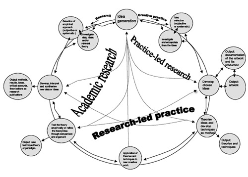
Smith & Dean’s Iterative Cyclic Web Model (2009)
Firstly, the research has an academic basis. This will include the canon of relevant photography including Uncommon Places (Shore, 2015), A Common Destiny (Delsaux, 2008), and The Americans (Frank, 2008) among others. It is will also examine the relevant critical literature. Additionally, the academic research will explore the geography, demography, history, and culture of the Toronto district of Scarborough. The knowledge gained from this facet of the research process will continually inform the practice-led research and research-led practice illustrated in Smith and Dean’s model.
Secondly, the nature of Grounded Theory instinctively links it to this model. Grounded Theory is iterative and generative when implemented effectively. For this project, Scarborough will be researched in three iterations. The first takes place during the module Practice 1: Art and Design. During this current module, my research, which is taking place in late-autumn and winter, is focused on the geography around where I live. The second in Practice 2: Art and Design. Here, the research will explore the themes and theories that have emerged from Practice 1 on a wider geographic basis during the summer and early autumn. The third and final iteration will be part of Major Study: Photography. This will examine the theories of Practice 1 and 2 in greater detail across the whole of Scarborough; it will take place from late autumn until Spring. This practice, in the form of creative outcomes, has already begun to generate theory during the first iteration. In the second iteration the initial theories generated will contribute to the creative outcomes which will generate further theory. This iterative and cyclical process will, for the purposes of this programme of study, be repeated and concluded during the major study.
The application of this model will allow the project will inform and generate itself. If successful it will include all the outputs listed in Smith and Dean’s model. The images as objects should constitute ‘artwork’. The images as research output will create ‘theories’ both as practice-led and academic research. Finally, the project itself will constitute a ‘research publication’.
The study will be built using the Grounded Theory paradigm but will also have a longitudinal basis. This article has attempted to justify this and to demonstrate that There is nothing to see here in Scarborough is practice-based research, but also meets the criteria to fulfil the Iterative Cyclic Web Model.
References
Basu, R. & Fiedler, R. S. (2017). Integrative multiplicity through suburban realities:. Urban Geography, 38(1), pp. 25-46.
Candy, L. (2006). Practice-based Research: a Guide, Sydney: Creativity & Cognition Studios.
Candy, L. & Edmonds, E. (2018). Practice-Based Research in the Creative Arts: Foundations and Futures from the Front Line. Leonardo, 51(1), pp. 63-69.
Delsaux, C. (2008). A Common Destiny. 1st ed. New York: The Monacelli Press.
Frank, R. (2008). The Americans. 11 ed. Gottingen: Steidl .
Hernandez, C. A. (2008). Are There Two Methods of Grounded Theory? Demystifying the Methodological Debate. Grounded Theory Review, 7(2).
n.g. (2019). IDI. [Online] Available at: https://idi-study.com/module/32931/learning-path [Accessed 3 12 2019].
Shore, S. (2015). Uncommon Places. 2nd ed. New York: Apeture.
Smith, H. & Dean, R. (2009). Practice-led Research, Research-led Practice in the Creative Arts. 1st ed. Edinburgh: Edinburgh University Press.
0 notes
Text
Reflections on My Photographic Development
Robert Wilson
Blog Post 6
25th November 2019
This post takes a very different tone to the previous entries. It is a short reflection on my own development as a photographer. I do this by sharing and briefly discussing several images that I have made over the last 20 years. I feel that this is appropriate to do at this time as I believe my approach to photography has changed considerably, and is continuing to change, since beginning this programme of study.
Photographic Beginnings
I was relatively late in joining in the world of photography. I did not to take pictures that were anything other than snapshots until I spent one year travelling in Australia at the age of 30. This was in the year 2000. There were several Australian landscape photographers who caused me to be interested in photography, but it was the work of the late Tasmanian wilderness photographer Peter Dombrovskis that made the greatest connection with me. I found his work to be the most accessible and resonant. His photographs are simple in their composition and colour but are profoundly beautiful.
Peter Dombrovksis – Giant Kelp, 1984
As a result of this, my early photography was generally limited to landscape and cityscape work. I had neither the confidence nor the interest in developing my skills in other directions at this.
One picture from this time remains important to me today.
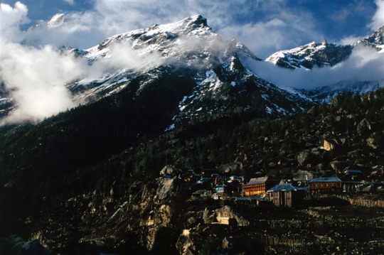
Robert Wilson – Ratchem, Himachal Pradest, 2002
A print of this slide still adorns my parents living room wall. However, this scan of the original slide does not do justice to the image which is much sharper and more colourful than appears here. This image first taught me the usefulness of juxtaposition in photography. The village, beautifully lit by the spring sunset, contrasts with the sublime mountains.
The images that I produced during this period and for the next few years are generally simplistic and cliched. I accept that most of my work during this period is of limited interest or value. This is partly due to a lack of resources on my part. Slide film was expensive, and I was generally unwilling to experiment or take risks with my photography. Equally, I did not study photograph’s culture and traditions or have anyone I could receive useful feedback from. However, I did focus on learning the technical aspects of my camera and slide film photography. This learning has stayed with me and continues to prove beneficial.
The key moment in improving my photography was a switch to digital imaging. Digital cameras allowed me the freedom to experiment with the images that I was making. I was no longer hindered by the cost of developing film. The other major factor was my wife who I met in 2005. She is a talented photographer in her own right, and she encouraged me to be more experimental and open in my approach to photography.
Human Curiosity
A switch to a digital SLR camera allowed me to take greater risks in my images. I became more interested in photographing my fellow human beings. As a result of this, my work became increasingly humanistic in nature. This curiosity about humanity has stayed with me and, whilst people themselves are not the focus my MA project, I am certain this will remain.
My experimentation in recording life led to literal risk taking.

Robert Wilson – Red Guard, Tiananmen Square, Beijing, 2009
The contrast between these two members of the Red Guard is fascinating. Both are obviously very young, but the concentration of the officer on the right contrasts well with the slightly jaunty angle of the other officer. Upon reflection, capturing this image was not entirely sensible and could have potentially caused trouble for me in an authoritarian country.

Robert Wilson – Exhausted Construction Worker, Abu Dhabi, 2012
This image is from an extended personal project that I undertook during my years living in Abu Dhabi. This man was involved in the construction of a new royal palace and, like his colleagues, would have been forced to work in conditions that were atrocious. These men work long hours in extreme heat for appalling pay. For this project I took portraits of many of these men.
I still regard the images that I took for this project as the strongest body of work that I have completed. If I was still living in Abu Dhabi for this programme of study, it’s further development would have undoubtedly been the focus of my major project.
I regret that I have never presented these images for publication. However, I did not do so while in Abu Dhabi to protect both myself and the subjects of my photographs. The UAE Government is notoriously sensitive to any perceived criticism, and highlighting poor working conditions would be seen as critical, and Westerners are regularly detained.
The Influence of Steve McCurry and National Geographic
During the years from 2008 until the start of this course, the National Geographic photographer Steve McCurry was a particularly important influence on the images that I produced. He is not without his critics. In the New York Times, Teju Cole described McCurry’s work as ‘astonishingly boring’ and pandering to stereotypes of India (2016). He also received a considerable criticism for his apparently incompetent use of Photoshop to manipulate his images (Cade, 2016). Despite this, his work has been informative and educational.

Steve McCurry – Pakistan, 2002
McCurry pays particularly close attention to composition and colour in his images; he also uses closed shade effectively in lighting his portraits. By learning from this approach, I was able to capture many images that were effective and popular among my peers.

Robert Wilson – Almost Saintly, Jodhpur 2017
This image is obviously a direct homage to McCurry’s portraits. It was taken as part of a self-generated assignment in the city of Jodhpur, India. I set myself the task of producing National Geographic style photographs that created a portrait of the city.
I am happy to admit that my assignment was unoriginal, but I was pleased with the images that I collected. The assignment also helped me understand myself more as a photographer. It made me understand how I should work and encouraged me to view my project research in an iterative and systematic way. I photographed a scene until I generated images that I wanted. I revisited places on multiple occasions so that I could immerse myself in the area. The project was deeply satisfying on a personal level.
The most well-known of all my images was taken at Geghard Monastery in Armenia.

Robert Wilson – Geghard Monastery, 2013
This image has been viewed online more than 40,000 times. It has been stolen and used for advertising. It has also been used to create religious memes. Whilst I recognise that the image is beautiful and can be seen as meaningful and perhaps even spiritual, it is not an image I particularly enjoy. I feel that the light through the window aspect is a cliché even if it is a successful one. I do not want this image to be seen as the key representation of my work.
An image of mine from this period that I enjoy much more and is, I believe, more representative of my colour photography during this period was taken in the Nepali city of Bhaktapur.

Robert Wilson – Orange Seller, Bhaktapur, 2015
The influence of McCurry on the composition and colour of this image is obvious and undeniable. Yet, this is an image I am proud of. The photographic conditions on this day were extremely difficult. The morning was foggy and the light poor. The image also took enormous patience. I waited for some time before this man pushed his bike out of the alleyway. For me, this is the key image of my work from this period.
My Photography Now
My curiosity about humanity is still reflected in my current work. This is most clearly reflected in a series of images that I took which documented the Shia Muslim festival of Ashura here in my home district of Scarborough.
The most striking of these images is of a young boy skipping prayers and looking at me.
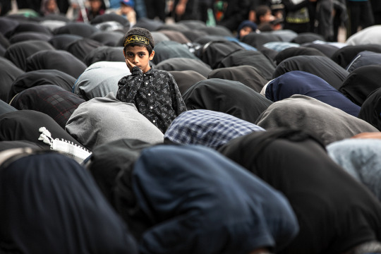
Robert Wilson – Skipping Prayers, Toronto, 2019
Whilst photographs of a festival such as Ashura could easily be misinterpreted when seen context-free, this boy’s slightly mischievous actions speak of some of the universalities of childhood: curiosity about something ‘over there’ and not what you are doing, and a rebellious unwillingness to always follow the rules.
Since starting this programme of study, I have also returned to my photographic ‘roots’ in landscape photography. However, my intentions in my landscapes now are more about conveying emotion and meaning than simply producing a beautiful image. This desire to express meaning in my images is a direct result of my studies and exploration of a wider array of photographers.
When time allows, I am currently working on a series of images of Iceland that intend to highlight the impact of the climate emergency, the power of nature, and the fickleness of the weather.

Robert Wilson – The Vestrahorn, 2019
The Vestrahorn is a much-photographed mountain. Yet, most images are beautifully lit colour photographs taken on a fair-weathered day. I want this image to be the opposite. This image was taken in hostile conditions that made photography extremely difficult. The mountain here is ominous, but still beautiful. The weather is dramatic and threatening. I deliberately toned this image to highlight these features.
In my project for this MA programme, my work is beginning to draw together the two interests that I have discussed in this reflection. I am still infinitely curious about humanity, and I am attempting to combine this with urban and suburban landscapes.
Robert Wilson – Abandoned Café, Scarborough, 2019
Although this image has not been selected for my submissions for the Art & Design module that I am undertaking, it is representative of the work that I am currently producing. There is no human presence here, but human interaction is unmistakable; this is a theme that is beginning to emerge and develop in my current image research. I am able to follow my photographic instincts and relate my work to my curiosity about human life, but it is leading my work in a direction that it has never taken before.
Concluding Thoughts
This article has focused on the key points of my photographic journey. My development as a photographer has not been an even process, but I am convinced that the points on my voyage that I have discussed above were key to reaching my current level of photography. However, it is undertaking this MA that has given me a level of focus as well as a systematic and critical-thinking approach that I believe has already strengthened me as a photography practitioner. I am confident that this improvement will continue through the coming modules.
References
Cade, D. L. (2016). Peta Pixel. [Online] Available at: https://petapixel.com/2016/05/06/botched-steve-mccurry-print-leads-photoshop-scandal/ [Accessed 2019 November 2019].
Cole, T. (2016). The New York Times. [Online] Available at: https://www.nytimes.com/2016/04/03/magazine/a-too-perfect-picture.html [Accessed 25 November 2019].
0 notes
Text
Can I critically read my own images?
Robert Wilson
Blog Post 5
20th November 2019
Previous blog posts have been about critical thinking, reading images, applying theory, and critical reading when discussing the work of well-known and influential photographers and artists. In this post, I analyse one of my own images. I apply the same techniques that I have discussed previously to discover if it can be critically read. The purpose is question whether there is meaning in the type of images that I am producing for my MA project. The image that is analysed here was included in an assignment for the module ‘Creative Industries: Global Perspectives’. It is representative of the style of work that I am developing for ‘Practice 1: Art and Design’. The image is analysed on a physical and depictive level (Shore, 2007), before I interpret the image and finally attempt to apply Barthes’s concept of ‘punctum’ (1980) to the image. My main purpose is understand what the potential response is when the key question from Moore’s study (2013, p. 511) is asked: Is my photography work ‘bullshit or not’?
Analysing Petrol Station in Sunlight, 2019

Robert Wilson – Petrol Station in Sunlight, 2019
In purely descriptive terms, this is a photograph of the roof of a petrol station. The roof is white, yellow, and a striking red. This is contrasted against a vivid blue sky. In the sky, sitting just above the roof are some soft white clouds. In the bottom right of the image, there are the tops of trees, which are a healthy green, but are seemingly pushed to the edge of the frame. Under the roof, it is mostly dark, yet a small line of reflected sunlight catches the viewers eye. At a simplistic level, the image is composed in a basic fashion: blocks of strong colour are used to attract the eye.
Yet, there is more complexity to the image. The eye is drawn to the thickest part of the red line towards the left of the image. Despite being much thinner than the yellow, it dominates. The viewer then follows the line to the trees before circling to the sky, then the clouds, and back to the line before noticing the small line of reflected light on the underside of the roof. Additionally, the clouds also manipulate the viewers perception of depth. They appear as close to the colourful front of the roof as the parallel lines below it.
At its core, the image is ironic. Superficially, the image shows a petrol station roof that looks stunning in the morning light. Yet, the petrol station is an unambiguous representation of one of the most destructive industries on Earth. How can this symbol of climate change be so striking and beautiful? The vivid blue sky and healthy-looking trees seem to hint that everything is fine with the world and that a beautiful summer’s day is upon us. Of course, this beauty is the irony; the climate emergency is a reality and the destructiveness of the petroleum industry a key culprit.
A final question remains regarding the image: is there anything that can be interpreted as Barthes’s punctum? Above the roof, there are two small areas where the trees seem to creep into a forbidden area. The line of roof and sky should be uninterrupted, yet it is not. These meet the definition of punctum by being both accidental and catching the viewers attention. We can also read meaning here.
Science demonstrates that there
‘…has been a variety of climate perturbations on timescales ranging from multi-million year to sub-decadal, inferred to have been driven, amongst others, by variations in palaeogeography, greenhouse gas concentrations, astronomically forced insolation and inter-regional heat transport.’ (Zalasiewicz & Williams, 2009, p. 139)
Whatever the causes, nature has always returned to dominance after these periods of climate change. These ‘rogue’ tree branches hint that nature will endure even if destroy our own way of life. They indicate that nature will fight back; it will attempt to reclaim what truly belongs to it.
The image is certainly attractive at a superficial level. It is pleasing for the eye in its use of colour and composition. However, it is fair to conclude that whilst the image may appear quite simply, it can be critically read in terms of its irony and our escalating climate emergency. Although this image will not be included in the final MA project, it does indicate that images of this nature do fulfil the aims of the project.
References
Barthes, R. (1980). Camera Lucida. 2010 ed. New York: Hill and Wang.
Moore, T. (2013). Critical thinking: seven definitions in search of a concept. Studies in Higher Education, 38(4), pp. 506-522.
Shore, S. (2007). The Nature of Photographs. 2nd ed. London: Phaidon.
Zalasiewicz, J. & Williams, M. (2009). A Geological History of Climate Change. In: T. M. Letcher, ed. Climate Change: Observed impacts on Planet Earth. Oxford: Elsevier, pp. 127-142.
0 notes
Text
Critical Reading in Practice
Robert Wilson
Blog Post 4
13th November 2019
Critical reading and analysis is a key feature of any programme of study. This post features my analysis of part one of Roland Barthes’s Camera Lucida.
An Analysis of Roland Barthes – Camera Lucida, part one
Camera Lucida: the studium and the punctum
Camera Lucida (Barthes, 1980) is a seminal text within photography; it permeates theory at every level and across disciplines. Brian Dillan writing in The Guardian (2011) describes it as, ‘… a distinctly odd volume to have attained, in the 30 years since its publication, such a canonical place in the study of photography.’ For the photography student, it is unavoidable. A search on Google Scholar reveals over 14,000 results. It is for this importance and ubiquity that this text has been selected for analysis.
The analysis here will concern itself most with part one of Camera Lucida. The section deals primarily with two ideas still seen as critical to photography analysis today; these are the concepts of studium and punctum. Barthes notes that there are elements in photographs that catch his attention (pp. 23-24). It is these elements which cause him to formulate the studium as an
‘…application to a thing, taste for someone, a kind of general, enthusiastic commitment, of course, but without special acuity.’ (p. 26)
and the punctum as
‘… this element which rises from the scene, shoots out of it like an arrow, and pierces me.’ (p. 26).
These elements provide the tools to analyse an image. For Barthes, it is the punctum which separates the image from the mundane. Fried (2005, p. 545) and La Grange (2005, pp. 84-85) emphasises the ‘involuntary’ or ‘accidental’ nature of the punctum. La Grange goes on to describe Barthes rejection of a Bruce Gilden image where nuns are deliberately juxtaposed alongside transgender individuals as unsophisticated.
Current views
We have entered what can be described as a post-photography age, a passing marked by the transition from traditional analogy images to digital. Despite this, Shurkus (2014) notes that the punctum is still important in photography today. It is an enduring concept even in a changed photographic world.
However, whilst Camera Lucida, studium and punctum are ubiquitous in photography academia, not every commentator concurs with regards to its continued value as a tool of analysis. Tolonen states that it
‘… describes an experience of photography that is wedded to the past; it describes little about contemporary, commonplace experiences of photography, which are largely incorporated around practices of identity and consumption where death, mourning and loss are anathema, and discounts the multiple platforms that allow the image plague to continue unabated.’ (2012, p. 329)
Sentilles (2010) makes a curious analysis of Barthes’s use of ‘theological language’ in the book. She notes that,
‘The meditative stance expressed by Barthes is not an adequate response to photographs, in particular, to photographs of suffering…’ (p. 528).
She goes on to argue that this apparent inadequacy offers an opportunity for theology, specifically Christian, to contribute to photography culture and theory (p. 529)
These criticisms raise the critical question with regards to Camera Lucida: does it still have value in today’s environment where we are overwhelmed by images on Instagram, Facebook, Twitter, and other such social media?
Is Barthes still valid?
Barthes produced his theory after studying and analysing photography as a spectator (Barthes, p. 9) of pre-digital images, rather than as a photographer, well before the arrivals of Tolonen’s ‘image plague’. Does this mean the end of the validity of punctum and studium as useful analytical devices? A cursory examination of Instagram, the most popular image sharing website, does reveal this ‘image plague’ where overwhelmingly the images are derivative, repetitious, and meaningless; they are also generally digitally manipulated and edited.
It is important to note that modern digital manipulation does not preclude the spectator from applying Barthes’s tools. As Manovich (2003, p. 245) states,
‘Digital technology does not subvert “normal” photography because “normal” photography never existed.’
Photographers have been manipulating their images throughout history: one only needs to compare early and later prints of Ansel Adams’s Moon and Half-Dome. Equally, a stray hand that was present in the negative of Dorothea Lange’s Migrant Mother has been removed from most prints of this mythologised image. There seems no good reason for manipulation as a reason to reject Barthes.

Dorothea Lange – Migrant Mother, 1936 (Note the hand in the lower right of this version.)
More importantly, it can even be argued that the ‘image plague’ supports and strengthens the validity of punctum and studium. A vast number of these image are superficially attractive and have a ‘general, enthusiastic commitment’, but there is nothing to ‘pierce’ the spectator (Barthes, p. 26); they satisfy Barthes’s very definitions. Applying his terms demonstrates the disposable nature of these photographs. It allows us to reject the overwhelming majority of these images as only containing studium. (It is perhaps questionable whether most Instagram images even feature studium.)
An issue with the ‘involuntary’ nature of the punctum does arise when analysing the tableau photography of artists such as Gregory Crewdson and Yinka Shonibare. For example, Shonibare’s satirical series Diary of a Victorian, which Cotton (2014, p. 56) describes as an ‘obvious reference’ to The Rake’s Progress, is full of elements that should ‘pierce’ the spectator and meet the definition of punctum. Yet, everything in the image is intentional.
Yinke Shonibare – The Diary of a Victorian Dandy 1900hrs, 1998
Therefore, we must recognise that the unintentionality required by Barthes’s punctum is a weakness when viewing and analysing tableau photography. However, this does not render the paradigm worthless. The overwhelming majority of photography that we see is not of this nature and Barthes’s framework can still be applied. It does suggest that perhaps the definition of punctum could be broadened to include the appearance of unintentionality.
Still useful after all these years
That Barthes’s concepts are still discussed, written about, and used almost forty years after the publication of Camera Lucida suggests that the book and its ideas are still valid for photography theory. It may be, as suggested above, that the definition of punctum needs to be expanded in the light of modern art photography, but as Geoffrey Batchen (2008, p. 88) states in his discussion of Camera Lucida as a history of photograph, it ‘remains a good place from which to begin’.
References
Barthes, R. (1980). Camera Lucida. 2010 ed. New York: Hill and Wang.
Batchen, G. (2008). Camera Lucida: Another Little History of Photography. In: R. Kelsey & B. Stimson, eds. The Meaning of Photography. Williamstown: Sterling and Francine Clerk Art Institute, pp. 76-91.
Cotton, C. (2014). The Photograph as Contemporary Art. 3rd ed. London: Thomas and Hudson.
Dillan, B. (2011). The Guardian. [Online] Available at: https://www.theguardian.com/books/2011/mar/26/roland-barthes-camera-lucida-rereading [Accessed 13 11 2019].
Fried, M. (2005). Barthes's Punctum. Critical Inquiry, 31(3), pp. 539-574.
La Grange, A. (2005). Basic Critical Theory for Photographers. 1st ed. Jordan Hill: Routledge.
Manovich, L. (2003). The Paradoxes of Digital Photography. In: L. Wells, ed. The Photography Reader. Abingdon: Routledge, pp. 240-249.
Sentilles, S. (2010). The Photograph as Mystery: Theological Language and Ethical Looking in Roland Barthes’s Camera Lucida. The Journal of Religion, 90(4), pp. 507-529.
Shurkus, M. (2014). Camera Lucida and Affect: Beyond representation. Photographies, 7(1), pp. 67-83.
Tolonen, J. (2012). Photography degree zero: reflections on Roland Barthes's Camera Lucida. Continuum, 26(2), pp. 327-330.
0 notes
Text
Grounded Theory and Photography
Robert Wilson
Blog Post 3
4th November 2019
For my MA Photography project, I am considering the use of Grounded Theory as a research methodology that I can apply to my photographic data collection and analysis. Before I can implement this research paradigm, it is important to consider its suitability for use in a photographic project. This article will examine how a photography project can generate a theory which demonstrates the potential of Grounded Theory for the medium.
Robert Frank’s The Americans: the creation of a theory of place in photography
Grounded Theory is a qualitative research methodology that was first revealed to academia by Barney Glaser and Anselm Strauss in their ground-breaking work The Discovery of Grounded Theory (1967). Strauss’s successor and collaborator Juliet Corbin summarises Grounded Theory as
‘… a form of research the purpose of which is to construct theory from data. The methodology is carried out through a set of data gathering and analytic procedures. Procedures should be used flexibly and reflect the analytic task at hand. Researchers can’t pick and choose among the procedures deciding to use some and discard others. It is the flexible use of procedures that lead to the development of rich and dense theory that fits the data and that offers insight and solutions to the issues and problems of participants.’ (Corbin, 2017)
Whilst Grounded Theory was originally used in nursing studies, it has now become widely applied across academic disciplines. This article will explore the appropriateness of Grounded Theory as a framework for photographic research. It will not provide cases of photographers using Grounded Theory as there is no explicit evidence in the literature that photographers have consciously applied the paradigm but will illustrate its suitability for photography by showing how artists can built theories within their work. To do this, we will examine the clearest and most well-known example of a photographer creating a theory – Robert Frank’s The Americans (2008).
The Americans and its Theory of America
Frank’s The Americans (2008), first published in 1958, was not initially popular, and the majority of reviews were critical. Yet, it has come to be regarded as a seminal work of documentary photography. Uniquely at the time, the work was not solely about aesthetics or creating a single narrative but constructed a theory of America. The book is not an ode to American, but is,
‘…ambiguous, destabilized, ‘moving’ photography that engages the viewer in a dialogical process rather than transmitting a ready-made story with its pre-packaged values and assumptions.’ (Campbell, 2003, p. 214)
The book turns a critical eye on America and that America is, most particularly, one of flags, of automobiles, jukeboxes, and religion, and of racism. It must be noted that Frank’s theory of America does extend beyond the three features above, but for the necessity of brevity, this article will focus on these alone. For greater exploration, the reader is encouraged to engage with The Americans itself as well as Robert Frank's 'The Americans': The Art of Documentary Photography (Day, 2011).
Flags
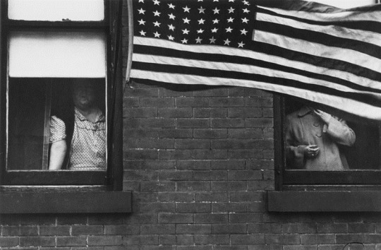
Robert Frank - Parade – Hoboken, New Jersey (1955/56)
The Stars and Stripes is central to the arrangement of the book (Day, 2011, pp. 71-76). They are the placeholders that begin each new ‘chapter’ (p. 71). In each of the images that feature the flag, the people present are subordinate to it. For example, in the opening image of the book Parade – Hoboken, New Jersey, Day notes that the women in the image are
‘… marginalized, cramped into the corners of the composition. They appear no more important in the image’s visual hierarchy than the wall which divides them. These women are fitted into this block not because it suits them or is a desirable residence, but because there is nowhere else they can go.’ (p. 72)
As we proceed through the book, the flags continue to appear. For example, in Fourth of July – Jay, New York, a tattered flag overshadows a party, yet the participants are seemingly unaware of its presence. In the last image to feature a flag, the amusing Political rally – Chicago (the second image in the book to carry the name), the bandsman is subsumed by his sousaphone: the instrument dominates and his identity is hidden (pp. 75-76). In Frank’s America, flags are a constant theme, and even if the responses of those featured in the images are not consistent (p. 76), the people themselves are always of secondary importance.
Automobiles, Jukeboxes and Religion
Frank’s America has three religions: Christianity, jukeboxes and cars. Christianity, represented by crosses both real and implied, features throughout the book. Juxtaposed against this are both the automobiles, which are not new, but are ‘older models, junked cars, or accidents on the side of the road’ (Mortenson, 2014, p. 425), and the jukeboxes which serves as altars for people of every background. The country worships before all three.
Robert Frank – Political Rally – Chicago (1955/56)
Political Rally – Chicago (the first image to carry the name) is the first of the implied crosses to feature. The figure, with arms spread wide and high, appears almost crucified on the cross formed by the window above. His expression is either triumphant or a grimace of pain. Halfway down his chest is a black patch. This maybe shadow but appears more like a stain. Was this the entry point for his Spear of Destiny?
This image and Jehovah’s Witness- Los Angeles feature implied crosses, but the work also features multiple ‘real’ crosses. Christianity is the overriding faith in the book, but Frank shows that it is not the only faith.
Robert Frank – Covered Car – Long Beach, California (1955/56)
In Covered Car – Long Beach, California, the anonymous car has become the altar in the church of the automobile. As Day (2011, p. 62) points out,
‘The photograph depicts a car covered in a cloth. The cloth appears to be silk, perhaps a parachute or something similar. The richly adorned car stands between two palm trees, which create the impression of a portico. The car thus becomes an altar, complete with altar cloth.’
For the rest of the work, the automobile is a frequent feature. It is a constant facet of everyday life in The Americans. Its variety of appearance include as a simple mode of transport, at a funeral, as an intrusion, as a place to sit during a movie, and finally as a place of rest in the final image of the book. The presence of the car cannot be escaped and it is an inclusive faith. However, only one other image consecrates the automobile as overtly as Covered Car – Long Beach, California, and that is St. Francis, gas station, and city hall – Los Angeles.
Robert Frank – St. Francis, gas station, and city hall – Los Angeles
Here, the statue, which Frank names as St. Francis,
‘…preaches directly across a deserted highway, into the sun. … St Francis is famous for his sermon to the birds. … Here he preaches to an audience of automobiles.’ (p. 88)
The cars appear, flock like, crammed between the two buildings waiting on every word. By being blessed or preached to by St. Francis, the image inescapably marks the cars as part of America’s religion.
Robert Frank – Bar – New York City (1955/56)
In Bar – New York City, the jukebox glows ethereally as if beckoning converts with a mystic light. Day (p. 143) describes it as ‘a modern-day Gabriel trumpeting in song the arrival of a new age’ and notes that the figures present in the bar seem to take little notice of its radiance. This jukebox wants to convert more to its cause even if, as in this image, few are listening.
However, in images such as Candy Store – New York City, the jukebox, like the car in Covered Car – Long Beach, California, becomes an altar. This time surrounded by young people who informally worship at it. Like the car, the jukebox is inclusive in its conversion of followers. This is illustrated effectively by Café – Beaufort, South Carolina. Here, a small African American baby is sprawled face first on the edge of a large cushion. The child is dwarfed by an enormous jukebox which seems to watch over the child in a protective, almost angelic fashion. Despite the child’s potential exclusion, on account of its ethnicity, from much of what 1950s America has to offer, the jukebox is there for him or her regardless of background.
Belief and its paraphernalia, conventional or otherwise, is a consistent theme of Frank’s America. It is one of the key theories that underpin The Americans as a critical description of 1950s America.
Racism
Whilst racism is frequently alluded to in the book, one images confronts it directly. That picture is both the book’s cover and arguable its most well-known. It is Trolley – New Orleans.
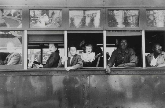
Robert Frank - Trolley – New Orleans (1955/56)
The message of segregation is clear in this picture of a racially divided America. The white passengers are in the front and the black passengers the back. They are separated by a divide. However, the image offers us more than a simple reading. As Sturken and Cartwright (2009, pp. 19-20) note,
‘It is as if the trolley itself represents the passage of history… The trolley riders seem to be held for one frozen, pivotal moment within the vehicle, a group of strangers thrown together to journey down the same road that would become so crucial to American history…’
This analysis can be taken further still. In the centre of the picture, we see two children, innocent of expression; it is they who are necessarily the central focus of the image. It is the minds of children that are to become the battleground. If the children cannot be persuaded of the folly of racism and segregation, then America’s future is a bleak one.
Racism is also seen in a wider but less overt context than segregation in the South in the image San Francisco.
Robert Frank - San Francisco (1955/56)
In this image, Frank surprises and photographs a black couple relaxing above an apparently wealthy white-washed suburb. However, they are separated from it excluded from the gleaming buildings and affluence. Professor Maurice Berger, writing in the New York Times notes that,
‘Rather than a neutral observer, Mr. Frank looms over them, an active, unseen participant — a surrogate for the intimidating whiteness that shadowed the lives of black Americans, no matter how liberal their environment.’ (2015)
It is clear from these two images as well as others in the book that the racism of mid-1950s America is an integral feature of Frank’s theory. Whilst is never again confronted so overtly as in Trolley – New Orleans, it is a constant theme.
The Connection to Grounded Theory
Grounded Theory did not exist as a research paradigm when Robert Frank was completing his work on The Americans. If it had existed, we can be confident that Frank would been neither aware nor interested in its potential as a photographic research tool as his great project was not an academic exercise. However, this does not obviate the realisation that he created a theory of America in his work. His theory is individual and subjective, but, nonetheless, it is a theory.
Since its creation Grounded Theory has consistently shown that it can be an effective method of generating theory in research. Additionally, it is axiomatic that qualitative research methods in general are subjective in nature. Therefore, if we accept that a body of photographic work can generate theory, and Frank’s work suggests the truth of this, it seems entirely appropriate to accept that Grounded Theory can be used a method of theory generation for a photographic research project.
References
Berger, M. (2015). The New York Times. [Online] Available at: https://lens.blogs.nytimes.com/2015/01/15/robert-frank-telling-it-like-it-was/ [Accessed 6 11 2019].
Campbell, N. (2003). 'The look of hope or the look of sadness': Robert Frank's dialogical vision. Comparative American Studies An International Journal, 1(2), pp. 204-221.
Corbin, J. (2017). Grounded Theory. The Journal of Positive Psychology, 12(3), pp. 301-302.
Day, J. (2011). Robert Frank's 'The Americans' The Art of Documentary Photography. Kindle ed. Bristol: Intellect.
Frank, R. (2008). The Americans. 11 ed. Gottingen: Steidl .
Glaser, B. & S., S. A. (1967). The Discovery of Grounded Theory. 1st ed. Chicago: Aldine.
Mortenson, E. (2014). The Ghost of Humanism: Rethinking the Subjective Turn in Postwar American Photography. History of Photography, 38(4), pp. 418-434.
Sturken, M. & Cartwright, L. (2009). Practices of Looking: An Introduction to Visual Culture. 2nd ed. New York: Oxford University Press.
0 notes
Text
Reading Images
Rob Wilson
Blog Entry 2
28th October 2019
The previous article discussed the necessity of applying critical thought to your images as a photographer. In this entry, I shall apply ‘Critical thinking as a careful and sensitive reading of the text’ (Moore, 2013, p. 514) to two of Stephen Shore’s images from Uncommon Places (2015). ‘Uncommon Places’ is a critical resource for my own MA project. It serves as both an inspiration and a reference point. Therefore, an understanding and detailed analysis of the book is vital as I move forward with my own work.
Reading Stephen Shore’s Uncommon Places
Reading and interpreting a photograph is difficult. As Burgin (2003, p. 131) states:
‘The intelligibility of the photograph is no simple thing; photographs are texts inscribed in terms of what we may call ‘photographic discourse’, but this discourse, like any other, engages discourse beyond itself, the ‘photographic text’, like any other, is the site of a complex ‘intertextuality’, an overlapping series of previous texts taken for granted at a particular cultural and historical conjunction.’
Henri Cartier-Bresson’s most famous image illustrates the challenges of understanding this ‘intertextuality’ of meaning.
Henri Cartier-Bresson, Behind the Gare Saint Lazare, 1932
Cartier-Bresson’s own words illustrate his feelings and intentions about his work. It applies perfectly to this image.
‘Above all, I craved to see the whole essence, in the confines of one single photograph, of some situation that was in the process of unrolling itself before my eyes.’ (1952, in Scott (2007), p. 212)
This is photography’s decisive moment, yet it is viewed in multiple ways. For Time magazine (2015, pp. 190-191) the jumping man ‘evoke[s] the dancers in the poster behind him’, and the image was ‘a masterpiece of form and light’. For Clarke (1997, p. 208), ‘The image is full of humour, of irony, but also full of implied philosophical reflection on what the moment might mean and how it is to be read’. Philip Jones-Griffiths viewed the photograph very differently. For him, the photography was a harbinger of the doom that was to strike Europe. He noted the Jewish name on the wall, the wreckage in the water, and the man jumping ‘into the unknown’.
‘He (Bresson-Cartier) was Nostrodamus. He predicted what was going to happen to Europe in that one single image.’ (The Genius of Photography, 2007)
There is no single reading of any one image. Fortunately, the work of photographers, cultural theorists, and semioticians has provided us with means with which to analyse and interpret photographs. A particularly useful toolset was provided by Shore himself in The Nature of Photographs (2007), most particular the four factors used to consider images at a ‘depictive level’ (pp. 37-96). These are: flatness, frame, time, and focus. Additionally, Bate (2016, pp. 25-43) offers a guide to semiotic analysis, most usefully in his discussion of rhetoric in photography (pp. 35-43). It is these tools that will be used to ‘read’ two images from Uncommon Places (Shore, 2015).
Placing Shore’s Work
Shore’s Uncommon Places is difficult to place in any particular photographic genre; it is neither conventional landscape photography as notably made by Ansel Adams, Edward Weston, or Faye Godwin, nor is it documentary photography produced by Henri Cartier-Bresson, Don McCullin, Raghubir Singh among countless others. Yet, it contains elements of both. It documents American towns, cities, parks, and life, but is formalised in the style of classic landscape photography as, like many of the most notable landscape photographers, Shore made the images using a large-format view camera which requires a notoriously slow and meticulous shooting process.
Soutter (2013, p. 34), when discussing Church Street and Second Street, Easton, Pennsylvania, 1974, states that:
‘The viewpoint of the image places us right on the street and makes us aware of the photographer’s physical presence.’
This is not just true of this image, but of all those in Uncommon Places. The viewer is there on the street next to Shore as he works. Equally, the German photographic artist, Hilla Becher, felt that Shore represented the places he photographed with warmth and fondness (Soutter, 2013, p. 34). His generosity towards the geography of American and attention to detail are present in every single image.

Stephen Shore, Horseshoe Bend Motel, Lovell, Wyoming, July 16, 1973 (2015, p. 23)
Like much of Shore’s work, many would consider it banal. The image, with its absence of people, feels deliberately static. Yet, analysis reveals a meticulously composed image. When we first examine it, the viewer’s eye is drawn to the sign on the left for ‘Horseshoe Bend Motel’. Our eyes pause for a moment before moving to the vivid first rainbow and the larger hotel sign on the right. We then move forward in a shallow ‘C’ curve through the picture from the lorry and its trailers, to the old trucks, before we finally rest on the green car. It is only on a further viewing do we notice the second rainbow.
The physical photograph itself may be flat, but the image is full of depth and detail. The placement of the vehicles, at clock points, is remarkable. The lorry is at almost two o’clock, the aquamarine truck at three o’clock, the blue truck at five, and the green car at seven. The framing suggests a world continuing beyond. The roads heading out of the frame hint that a journey lies beyond what we see. We cannot see the front of the green car. Where does it point? What is in front of it?
The America of this picture is in 1973 and it is a dark time in its history. It was the year of the crimes of Watergate. US involvement in the Vietnam War was reaching an unsuccessful conclusion with the withdrawal of American troops and the initial release of POWs. The Cold War with the Soviet Union was, despite summits between the two, still at its height. From October, the global economy is rocked by the Oil Crisis introduced by OPEC as a response to the backing of Israel during the Yom Kippur War.
Yet, in the image, time seems lost. The place appears slightly dated and forgotten even for its time; the blue and aquamarine trucks far predate the image hinting at a more innocent pre-Vietnam America. However, beyond some slightly overgrown grass, the scene is not shabby or broken. The hotel signage is well kept, but their dull browns emphasize the forgottenness further still. It is devoid of human life. The hotel sign begs us to return, but the viewer will only return to the picture and not to the place nor to the America before Vietnam. Yet, there is a hint of hope. The rainbows and clearing cloud encourage us to look to a brighter future and better things to come for the Horseshoe Bend Motel, and for America itself.

Stephen Shore, Church Street and Second Street, Easton, Pennsylvania, June 20, 1974 (p. 55)
This image, also of an everyday scene, offers us a single-point perspective on a street that recedes into the distance before it turns right and disappearing out of sight. Beyond the road is a wooded suburban area of trees and houses that intimate at further worlds beyond the frame. Above, the sky is bright, but overcast. Little shadow can be seen in the picture. Our consideration of the receding street and sky is interrupted by a large grey and green building. In front of the building sits a striking red VW Combi, the vehicle of choice for hippies in the 1960s and 1970s; it is a symbol of alternative exploration and travel.
Above the Combi, caught in time, is a boy sitting in the window. On the window, below the boy, something illegible is printed. It is only a very close examination that reveals the writing is the sign for a dentist’s office. This close examination reveals a final surprise: the boy has breathed onto the window and created a fog. Without the boy and his fog, the picture would be, as is consistent with Uncommon Places, beautifully composed. However, there would be little of further interest. He and his fog are, without a doubt, perfect exemplars of Barthes’s punctum (1980).
We, the viewers, consider who the boy is and why he is at the dentist. We also question what his relationship is with the VW Combi. Is the vehicle there to collect him? Is it his mode of escape? Most of all though, we wonder why he has blown a breath-fog over the window. Is it some small act of rebellion, is he keeping himself amused, or is it just boredom?
Shore himself, when discussing this image gives valuable insight.
‘I am relying on the descriptive power of the camera to make a complex picture that the viewer moves their attention through. So, what I am doing is creating a small world for the viewer to explore rather the impression of what its like to look through my eyes.’ (MOMA, 2015)
It is through that descriptive power that we are brought into the picture and our attention drawn, most particularly, into the boy’s world. He signifies the frustration that everyone who has lived in a dull suburbia has felt: a desperation to break the monotony and a desire to find something interesting to do. It is through his escape route, the hippy’s Combi, that his desperation and desire can possibly be fulfilled.
At a superficial level, the two images are similar. They feature scenes of everyday America that are initially unrelenting in their ordinariness. Yet, careful consideration reveals to the viewer universal truths about our suburban geographies: the hope and promise of brighter and more interesting futures among the banal. This leads us to a truth about all the images in Uncommon Places: there is always something more going on beneath the surface.
References
Barthes, R. (1980). Camera Lucida. 2010 ed. New York: Hill and Wang.
Bate, D. (2016). Photography: The Key Concepts. 2nd ed. London: Bloomsbury.
Burgin, V. (2003). Looking at Photographs. In: L. Wells, ed. The Photography Reader. Abingdon: Routledge, pp. 130-137.
Cartier-Bresson, H. (1952). The Decisive Moment. New York: Simon & Schuster.
Clarke, G. (1997). The Photograph. 1st ed. Oxford: Oxford University Press.
MOMA (2015). How to see the photographer with Stephen Shore. [Online] Available at: https://www.youtube.com/watch?v=T029CTSO0IE [Accessed 30 October 2019].
Moore, T. (2013). Critical thinking: seven definitions in search of a concept. Studies in Higher Education, 38(4), pp. 506-522.
Scott, C. (2007). Street Photography: From Brassai to Cartier-Bresson. 1st ed. Lond: I.B. Tauris & Company Limited.
Shore, S. (2007). The Nature of Photographs. 2nd ed. London: Phaidon.
Shore, S. (2015). Uncommon Places. 2nd ed. New York: Apeture.
Soutter, L. (2013). Why Art Photography?. 1st ed. Abingdon: Routledge.
The Genius of Photography. (2007). [Television Series] Directed by Tim Kirby. United Kingdom: BBC.
Time (2015). 100 Photographs: the most influential images of all time. 1st ed. New York: Time Inc Books.
Wells, L. (2003). The Photography Reader. 1st ed. Abingdon: Routledge.
0 notes
Text
How can I use critical thinking as a tool for my creative practice?
Rob Wilson
Blog Entry 1
22nd October 2019
Defining critical thinking is more challenging than is often assumed. It is generally accepted to be a learnt rather than innate skill, and anyone working or studying within academia should possess an understanding of what it is. However, there is no single accepted definition. In fact, Fisher (2001, pp. 2-5) gives four different definitions developed during the 20th century. A useful short definition is provided by Paul and Elder (2006, p. 4), ‘Critical thinking is the art of analyzing and evaluating thinking with a view to improving it.’
In an instructive study, Moore (2013) analysed how seventeen academics working at Australian universities defined critical thinking. Whilst all stressed the importance of critical thinking to a university education, their views of critical thinking were diverse. Their responses were placed in a frame of seven different definitions. Two of their definitions are particularly useful for the application of critical thinking within creative photographic practice. These are (pp. 510-518):
1. Critical thinking as judgement
2. Critical thinking as a careful and sensitive reading of the text
The application of and focus on these facets of critical thinking to our image making can enable the creative photography practitioner to produce images that are sophisticated and intellectually stimulating.
Critical Thinking as Judgement
When we read a text or, in this case, view a photograph we make a judgement. If we do not make a judgement, then what we are reading or viewing is of little use. As one of Moore’s subjects earthily states (p. 511), ‘I like to say to students – would it profit you to read the entirety of Aristotle’s work, and form no view whether it’s bullshit or not?’.
Judgement is a consistent theme within photography (and, of course, art in general) particularly when viewing the work of others. Whether this judgement always represents critical thinking is a matter of some debate. For example, William Eggleston’s first solo exhibition at MOMA was famously described in the New York Times as "…Perfect? Perfectly banal, perhaps. Perfectly boring, certainly." (O'Hagan, 2010). Time and more thoughtful judgement have not supported this view; Eggleston is now one of the most revered and admired figures in photography.
However, as a creative practitioner, exercising good critical judgement, rather than just judgement, when reviewing your own work is vital. We must challenge ourselves about its value. Our critical judgement is our quality control. If the work cannot meet our own standards, it is unrealistic to expect them to meet anybody else’s. To again use Moore’s subject’s robust terms, we should consistently ask if our work is ‘bullshit or not’.
We can make that judgement by critically reading our own work.
Critical thinking as a careful and sensitive reading of the text
Whilst Moore’s subjects were discussing academic writing, here our ‘texts’ are photographs, but we can apply the same reasoning to them. The ability to critically read a photography is central to photography theory, and, it can be argued, is what makes photography interesting as an art form. This is not to say that photographs are always readable in this way. Stephen Shore (2015, p. 192) is particularly dismissive of ‘camera club’ photography. He feels that images of this nature have ‘no particular intentionality, no real aesthetic intelligence behind the photograph. It was about making pleasing pictures.’ If we, as creative photography practitioners, want to produce work that is of value, we should be aiming to create work that can be critically read.
In Image of Imperialism, the first essay of Understanding a Photograph (2013), John Berger gives a detailed analysis of an image of the dead Che Guevara. He compares the photograph to Rembrandt’s The Anatomy Lesson of Doctor Nicolaes Tulp and Mantegna’s Lamentation of Christ. His reading of the photograph is educational and insightful.

Freddy Alborta, Che Guevara Dead, 1967

Rembrandt, The Anatomy Lesson of Dr Nicolaes Tulp, 1632

Andreas Mantegna, Lamentation of Christ, 1480
Barthes (1980) goes even further and provides us with a framework for critical reading of images. His studium is what creates a general interest in an image, but it is the punctum, a small feature of the photo – a ‘sting, speck, cut, little hole…’, that ‘pricks’ the viewer and is ‘poignant’. For example, in the photograph below, taken by Nadar, the leading portraitist of his day, Barthes’s punctum is the folded arms of the boy on the left.

Nadar, Savorgnan De Brazza, 1882
One of the most famous photographs ever taken, Dorothea Lange’s Migrant Mother, has been critically read in multiple ways. This is described in detail in the opening chapter of Photography: A Critical Introduction (Wells & Price, 2015).

Dorothea Lange, Migrant Mother, 1936
For example, Fisher (1987, in Wells, 2015, pp51-53) makes a feminist analysis of the image and argues that it makes Lange the ‘mother’ of documentary photography. Addtionally, Pultz (1995, p. 93, in Wells, 2015, pp53-54) analyses the image through its pose and analogises the image to a painting. Finally, Beloff (1985, in Wells, 2015,p54) wishes to iconise the image:
‘Such is the power of the camera that we can easily think of photographs as having a kind of independent reality. Dorothea Lange’s Migrant Mother is a picture that has entered Western consciousness. She is not a mere representation.’
To make a judgement about a photograph, the viewer needs to be able to read the picture. That reading can be made in thoughtful, calculated terms as is outlined above, but equally it can be as simple as the viewer saying, ‘I like this picture because…’. As we desire to be sophisticated creative practioners of photography, we should strive to produce images that demand more than only the second type of reading. (It should be noted that there is absolutely nothing wrong with enjoying a photograph simply for its aesthetics.) Applying critical thought to your work as a creative practioner of photography is vital. It is a skill that enables us to produce work that distinguishes itself from the prosaic ‘camera club aesthetic’ that Shore is so sceptical and dismissive of.
This article has attempted to show the importance of critical thinking in our creative practice and how its application can enable us to produce sophisticated and readable images. This leads to one more thought-provoking question in terms of how and when we apply our critical thinking skills to our image making: Should our critical thinking skills be applied while we are taking photographs, should those skills only be applied afterwards when editing and reviewing our images, or should there application be constant throughout the whole image making process? The answers are beyond the scope of this article but are perhaps questions that should be considered by all creative photographic practitioners.
References
Barthes, R. (1980). Camera Lucida. 2010 ed. New York: Hill and Wang.
Beloff, H. (1985). Camera Cultural. Oxford: Blackwell.
Berger, J. (2013). Understanding a Photograph. Kindle ed. London: Penguin.
Fisher, A. (1987). Let Us Now Praise Famous Women. 1st ed. London: Pandora.
Fisher, A. (2001). Critical Thinking: An Introduction. 1st ed. Cambridge: Cambridge University Press.
Moore, T. (2013). Critical thinking: seven definitions in search of a concept. Studies in Higher Education, 38(4), pp. 506-522.
O'Hagan, S. (2010). Was John Szarkowski the most influential person in 20th-century photography?. The Guardian, 20 July, p. online.
Paul, R. & Elder, L. (2006). The Miniature Guide to Critical Thinking: Concepts and Tools. s.l.:The Foundation for Critical Thinking.
Pultz, J. (1995). The Body and the Lens: Photography 1839 to the Present. New York: Harry N Abrams, Inc.
Shore, S. (2015). Uncommon Places. 2nd ed. New York: Apeture.
Wells, L. & Price, D. (2015). Thinking about Photography. In: L. Wells, ed. Photography: A Critical Introduction. Abingdon: Routledge, pp. 9-74.
1 note
·
View note