
Don't wanna be here? Send us removal request.
Statistics
We looked inside some of the posts by rodpupo2 and here's what we found interesting.
Average Info
Notes Per Post
30
Likes Per Post
26
Reblog Per Post
4
Reply Per Post
0
Time Between Posts
9 days
Number of Posts By Type
Text
6
Last Seen Tumblr Blogs


Fun Fact
Tumblr has a 66 index score for customer satisfaction in the US.
Text
Research: Project Defuture The Future
Randolph Lamonier
Randolpho Lamonier, is a visual artist from Minas Gerais, born in 1988.
He developed several works, specially photography articulated with other languages. He deals with several daily experiences in the city as a form of work, in which photography leads to multiple forms of symbolic exchange.
His work moves between different media, with a leading role in the practice of textile art, drawing, photography, video and installation. In his research, word and image are always together and tend to talk about micro and macro politics, urbanities, sentimental lies, chronicles, diaries and multiple crossings between memory and fiction.
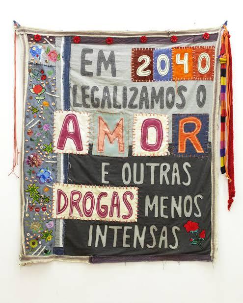
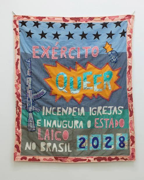
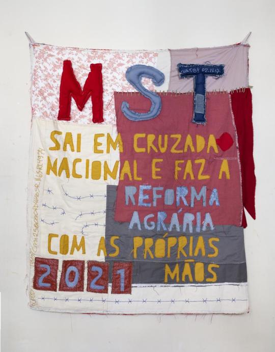
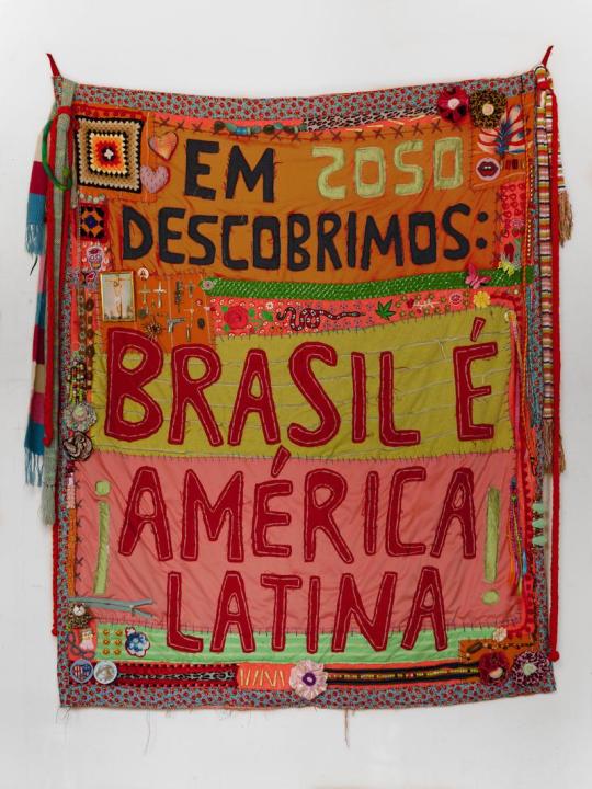
The work done in fabric and embroidery brings sentences like: “ In 2040, we legalized love and other less intense drugs”, and is part of a set of creations in which Lamonier elaborates predictions based on thoughts about the present. “ I always create these works from guidelines that I consider urgent”, explains him.
In the words of the artist himself: “I make flags with what I have. I have never been so foreign. I draw poems, calls for help, war cries, everything is very urgent. The air is contaminated, the floor is covered with debris; sheets, pots, ropes, concrete, broom. Under the rubble the seeds grow in a hurry”.
Perhaps something more interesting than his incredible flags, are the themes he addresses, most of the time making a prediction of the future, about things that could happen in Brazil.
He is indignant with everything rotten that has in Brazil, from the corrupt government, the uncontrollable drug trafficking, the misogynistic society that still exists in Brazil and in several Latin countries, up to the violence itself.
He creates these flags in order to have some kind of hope for Brazil in the future, creating an utopia, where the problems would be thrown away.
David A Smith
Is a British designer who is specialized in lettering.
He started his own company own sign writing company in 1990 and after 13 years sold the business in 2003 to concentrate more on hand crafting lettering and glass gliding. His main techniques include water and oil gliding, acid etching, French embossing, screen printing and sign writing.
His career in sign writing began in 1984, when he left Westlands school in Torquay, age 16 and was apprenticed for 5 years with Gordon Farr & associates. They were a traditional sign writers, who had come up through the ranks and Gordon, had an uncanny ability to paint letters, accurately laid out, without even a sketch. Under their tutelage, David became an accomplished draftsman, and a accurate letter painter.
This gathering of talented sign artists, carvers and muralists experts. David passion for creating elaborate, ornate mirrors&reverse glass signs of distinction.
In 1992 he set up his own business in England dealing every aspect of sign trade from vehicle graphics to 3D installations.
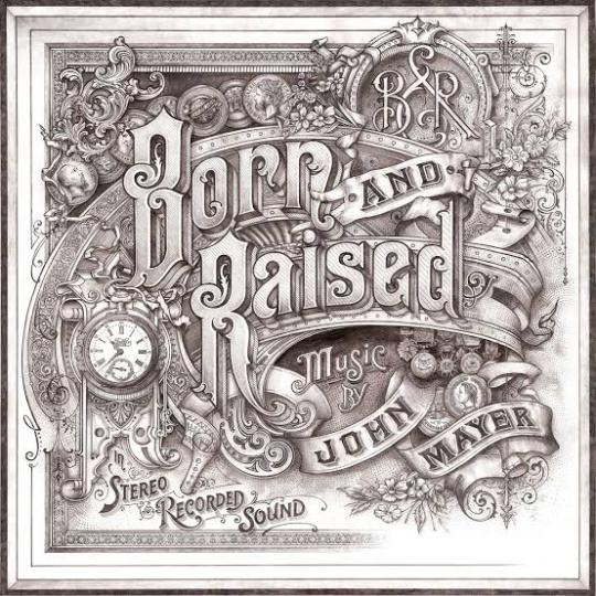
In 2012, Smith was hired by the singer John Mayer to design the album cover, of ‘Born and Raised’. The cover was styled like 1900 trade card.
He has also worked on posters and other merchandise associated with the album and single.
He was also commissioned by Jameson Whiskey to design a st.Patrick’s Jameson Whiskey bottle for the brand.
David sold the business, to concentrate more fully on gilding, painting e acid-etching glass, adding cutting, so that he could fully replicate the Victorian glass work he admire so much.
Thomas Burden
Burden is a senior designer at the design boutique “I Love Dust”.
He likes to produce work that references the pieces of vintage tat and printed material he gets from car boot sales and junk shops. Thomas Burden has created work for book covers, ad campaigns, music videos and magazine editorial to packaging, and even animations.
Thomas Burden was always encouraged to be creative, he was allowed to draw murals on the walls of his house, when he was very young. He had many references to do his drawings, in his grandparents house, full of Alpine memorabilia and indigenous art.
Toys weren’t allowed in Burden’s life as a child, so he was always looking at catalogs full of brightly colored things.
So in his works he tries to transmit that nostalgic journey to his childhood memories.
In each work there is a maximization of colors and textures and his great influences are: the film director Wes Anderson and the artist Mark Ryden.
On his own words: “ I was lucky enough to have a pretty idyllic childhood. I grew up sailing and skiing and traveling, so our house was full of souvenirs that parents collected, along with various bits of old boating junk and pieces of old cars”.
As an 3D illustrator / Art director from UK. He had worked with many different clients such as Nickelodeon, The New Yorker, Apple, McDonalds, Penguin, Bloomingdales and Ford.
His signature style is mainly the toys that he was never allowed as child, combined with fairground / neon signage and anything bright and fun that catches everyone’s eyes. He create works in Cinema 4D, also using the Adobe Illustrator, Photoshop and After effects.


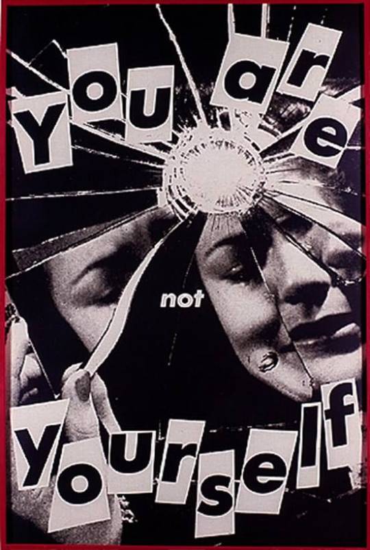
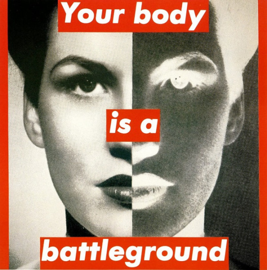
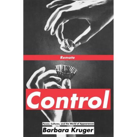
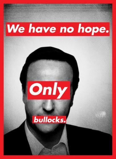
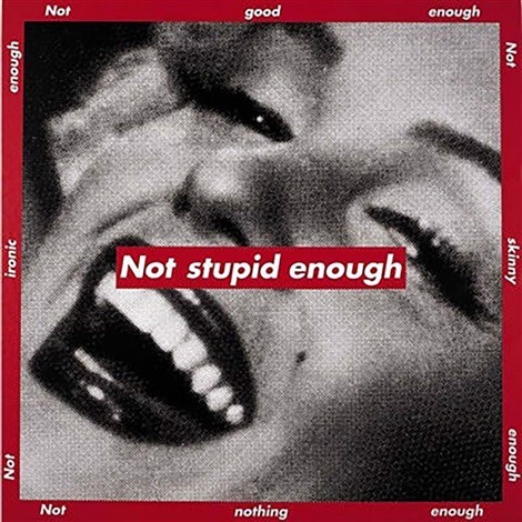
Barbara Kruger
Barbara Kruger is a postmodern artist who was born in 1945 in New Jersey. Having grown up in a middle class family, her first job was as an operator. In 1965 she graduated from The Parson Design School in 1965 and worked as an art director in different magazines. By breaking some barriers of the modern art, Kruger and other women artivists ( art + activism) demonstrated not only against the bonds of patriarchy in society, but also within cultural production. Being an artistic medium an environment built largely by male hegemony, feminist art presents itself as a mean of liberating women. Her works examine stereotypes and the behaviors of consumerism with text layered over mass media images. Rendered with black and white, with a red background, Kruger’s works offer up short phrases such as “Thinking of You” and “I shop therefore I am”. Kruger uses language to broadcast her ideas in a myriad of ways , including through prints, T-shirts, posters, photographs, eletrônico signs and billboards. Despite the work of feminist artists of the twentieth century to change the way women are portrayed in the art world, today this representativeness still confined by a backward ideal. Thus, the work of Barbara Kruger proves to be even more relevant and undoubtedly necessary today.
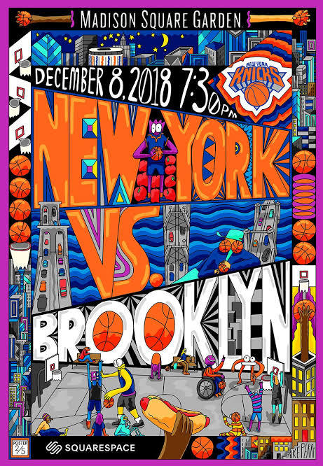
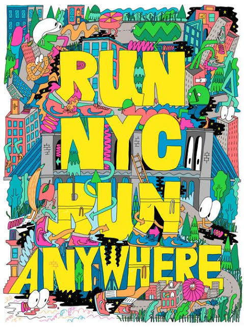
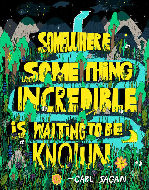
Mike Perry
Mike Perry is an artist that makes paintings, animation, sculptures, books, public art installations, monographs, silkscreens and more. Mike Perry was born in Missouri, United States, and grew up in Kansas City. He started drawing at the age of four. He attended to the College of Art in Minneapolis, and earned a degree in graphic design. Mike Perry's style of using extremely vibrant colors, and making totally stylized designs with a lot of personality is something that draws my attention mainly. His letters are always around a totally imaginative space, which can be both a forest and even a city. The creativity in making those compositions for his posters is something very captivating, not necessarily making a poster that matches with the reality, but doing something perhaps lysergic. His works can be considered love notes to the abstract, unknowable future that is all possible in the present. Illustrator Ana Benaroya said that , “Mike Seems like a modern surrealist to me. His works feels like a childhood memory of slipping down a giant water slide during summer. Slippery and wet and innocent but not innocent. His drawings feel like they just fell right out of his brain onto the paper”. I think he is a great influence, especially for this project. Because I'm wanting to go overboard with the lyrics and the drawings, wanting to do something totally experimental, doing something absurd and creative at the same time. And with this nature theme, I want to make posters with extravagant animals and unconventional scenarios. How he uses photoshop and Procreate for most of his work. I would like to use Photoshop again for this job to continue to learn painting techniques.
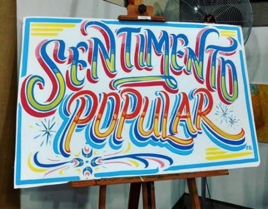
Filipe Grimaldi
Filipe Grimaldi is a lyricist and designer. He has been working in the graphic design market since 2006 and, in recent years, has been focusing on the study of manual techniques of calligraphy, lettering and letter painting, migrating part of his work to the development of letterings and commercial decorative painting.
He even give practical classes in ateliers of other institutions. His works can be seen on walls, slates and thousands of plaques that circulate around with his characteristic traits.
Filipe Grimaldi works on the primary chromatic contrast, a key element for the graphic construction of the alphabet.
Letters, words and sentences are organically raised, avoiding the precise math of right angles.
I met Filipe Grimaldi at EBAC in 2019, when he taught a class of typography, teaching how to make a freehand letter. I was impressed, because I saw great perfection and lightness when he drew those letters.
In addition to using several very vibrant colors in his works, even looking like a lettering of an entertainment show.
He even painted on a mural at EBAC, where even I had the opportunity to give a light brushstroke in one of his letters.
For 13 years, Filipe has been specialized in manual techniques of calligraphy, lettering and letter painting. In his own words: “ My authorial research and commercial activities ended up leading me to rescue the calligrapher profession, an almost extinct activity in the development of technology and printing and clipping machines”.
Currently, he teaches typography and calligraphy, for college students, with the goal of encouraging people to try more hand-made letters.
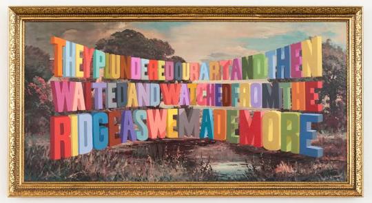
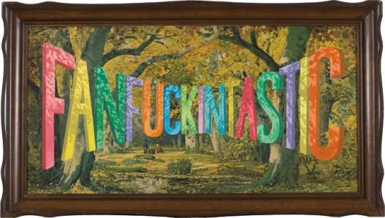
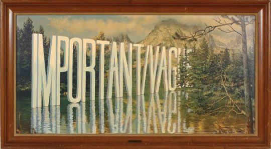
Wayne White
Wayne White is an American artist, typographer, cartoonist and puppeter. A former set and character designer for the television show Pee-Wee’s Playhouse, White produces ironic, often subversive imagery. On Pee Wee’s Playhouse where his work for his set and puppet designs won three Emmys; he also did many voices on the show. He is best known for his word paintings composed of oversized, three dimensional text painted onto cheap landscape paintings he finds at thrift stores and markets. In 2000, he began painting words and phrases, on thrifted lithographs. “When you think about it, you’re surrounded by giant letters and words everywhere”. White said once. “We don’t take for it granted, but the whole American landscape is nothing but a giant letter forms”. One Journalist said his opinion about White’s paintings: “the weirdest landscape painter in America, White uses master painting techniques to create the illusion of words and phrases surreally disappearing into the horizon or jutting out from each lithograph’s place setting.” White’s famous “word art” paintings hang in museums and galleries across America. His paintings features technically proficient and wildly colored phrases that are funny and sarcastic. And critics have praise White’s series for being entryway to the artist mind. Over the past years, White has worked primarily as a fine artist with solo exhibitions of his paintings and sculptures in galleries in New York and Los Angeles. In 2006, he created a giant head sculpture, with a giant lettering next to head. This marks one of White’s other passions, which is sculpting, and he like to exaggerate on the expression, of the characters that he is sculpting.
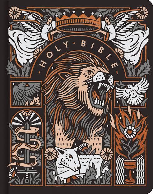
Joshua Noom
Joshua Noom is a famous illustrator who was born in Australia, in 1988. He is very popular in the social networks, specially in Instagram, where his minimalist illustrations and typography have earned him over 60,000 followers. He had created several illustrations for musicians and major brands like, Miller High Life, Sony, and Warner. Today Noom lives at Florida, and he is specialized in detailed and bold illustrations combined with an organic sense of typography. One of his most recent works, was recreating the Bible’s cover, with many other Christian artists. Each artist offers a visual entry point focused on a particular biblical theme or passage, setting a tone of reflection as readers engage with the Bible. I’ve been looking at Joshua works, and I really like the feeling of gritty and inky that he puts in his illustrations. Some of his works feels military inspired and masculine, while other pieces feel soft and feminine, like some vintage postcards that he produces. Something that Josh uses in most of his work, and that connects with my posters, is the use of wild animals and different situations. It can either make a tiger surfing, or even protest posters for the preservation of wildlife. He has a very intense passion for animals, and he enjoys drawing them in very expressive ways. With strong colors, with its minimalist style, and texts with different fonts around it. In a interview Josh even discusses his style “ My inspirations for my style are mostly from music and other art, but one artist that I’ve been diggin’ is Mark Conlan. My style has just kind of developed over the time and I think I will probably keep evolving. After many attempts of trying new things and figuring out what works for me, and what doesn’t for me. I prefer to draw in a more minimalist style, specially using my ink pens. Animals are one of my inspirations, specially here in Florida, we got many different species of birds and reptiles, so like to sit somewhere, and draw any animal that appears, and try to create a composition with different typefaces, to make future posters.
1 note
·
View note
Text
Research: Project Finish
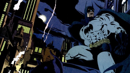
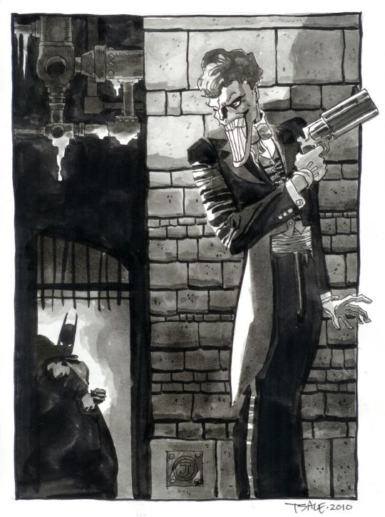
Tim Sale
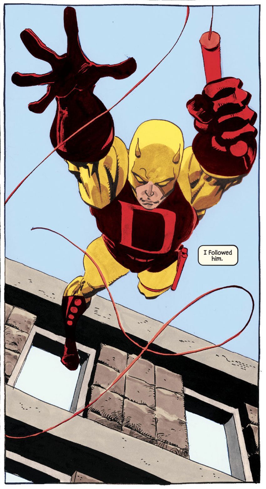
Tim Sale is a famous comic book artist, who had worked in several titles along with the writer Jeff Loeb, including Batman, Spider-Man, Superman, Daredevil, and many others.
Tim Sale was born in may of 1956, in New York, where he studied visual arts, spent a good time of his life in Seattle, and today he lives in California.
For some years he drew his art privately, only to please himself. When he found himself working at a fast food in his late twenties, however, he decided to try to sell some of his work. This led to an association with Thives’ World Graphics, a fantasy anthology series, where he illustrated stories.
What most marks his work is the dramatic aspect that he manages to obtain in the characterization of his characters and in the scenarios he creates, making the stories unique and immortalizing the characters.
The union of Sale’s art with Loeb’s engaging narrative has become the perfect marriage for mysterious plots.
One of the most striking characters worked by Sale was Batman, which he drew “The Long Halloween”, “Dark Victory” and “Halloween”. He was able to fully transfigure the dark aura of Gotham and his Dark Knight. He also worked with Superman in the saga “ Superman for All Seasons”.
Both of The Long Halloween and For All Seasons are what is known as “Year one” comics. These works take their heroes back in time to their earliest days of crime fighters.
His main tool is watercolor, which he uses with mastery. Sale's palette of colors is something really impressive, always drawing and painting his characters very delicately, and calmly. His style is very cartoonish, although this does not diminish his art in any way, on the contrary, his style is very unique and characteristic.


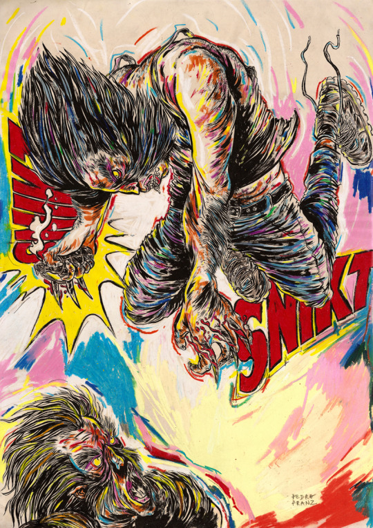
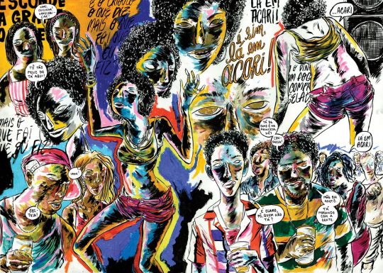
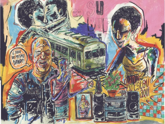
Pedro Franz
Is a Brazilian comic book artist, who was born in Santa Catarina and has a degree in design.
He has been publishing several comic books and participating in exhibitions in Brazil and abroad. As an illustrator, he has published works several magazines and books, and regularly collaborates with the Piauí magazine. As a graphic designer, he is a contributor to the Par (Ent) Esis platform. He has comics translated and published in English and Spanish, and has good international recognition, thanks to his publications.
But what is most impressive in Pedro's art, perhaps is his intensive use of colors. Mixing various shades of different colors, mixing different compositions. In addition to sometimes using characters from pop culture, with his elaborate style.
Despite liking traditional comics, he has always published and worked for national publishers, often with authorial works.
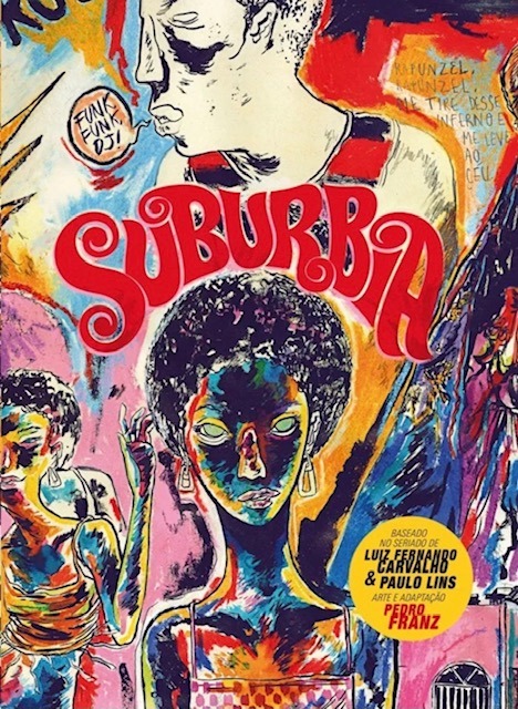
Perhaps his best known work, which was even published in the United States is the comic “Suburbia”.
Suburbia tells the story of Conceição, a girls daughter of enslaved rural workers, who flees to Rio de Janeiro in the early 1990s. In the city, Conceição begins to work as a cleaner and to get involved in the world of funk, slums and poverty.
His drawings are extremely surreal, not exactly following a traditional way of making comics, with several images spread across the page, with different shapes and sizes, with extremely strong colors, mainly valuing blue, purple, yellow and red, as his main colors.
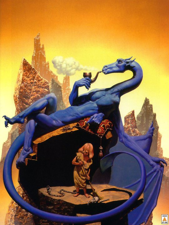
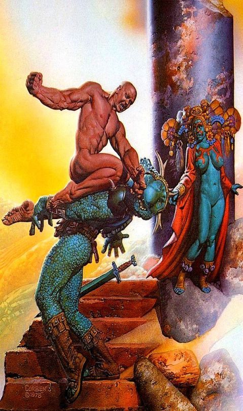
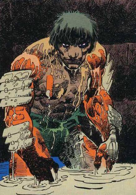
Richard Corben
Richard Corben was one of the contributors of elevating the comics to the category of Art, and of its unparalleled style of great influence among many current artists.
Richard Vance Corben was born in Missouri, United States on October 1940, in a family of farmers in the middle west ( where he started reading comics), and lived in Kansas City. There he studied Fine Arts, got married, had a girl and started working in local cinematography animation company. At the same time, he started to create and publish some underground fanzines. From the begging it was clear that he was interested in science fiction, eroticism, and total rejection of institutions ( the Army, the Church, etc), mixed with a lot of humor.
At a young age, Corben was an aficionado of bodybuilding, just like everyone who was interested in a persons aesthetics. The first character that he created, was Rowlf, a dog who took on a human form. In the beginning of the 1970s he amplified his work ( and his fame) in some underground magazines. And in 1971 he started working for the Heavy Metal publisher where he created one of his most famous characters, Den a large muscular man, who was always naked, and always after some adventure.
Corben has a very particular style, with unsettling mixture of caricatured, often satirical grotesque and intense,convincing realism. Never before had such wildly cartoonish worlds proved so convincing.
Also he can handle an exponentially higher standard because of his ability to use colour to show the effect of light on whatever he’s depicting. The way that he mixes light and colors in certain panels to differentiate those elements from each other, is something to admire.
Corben worked in a few mainstream comics, he always preferred to work with authorial works or working in specific themes like fantasy and science fiction comics and not so much on superheroes.
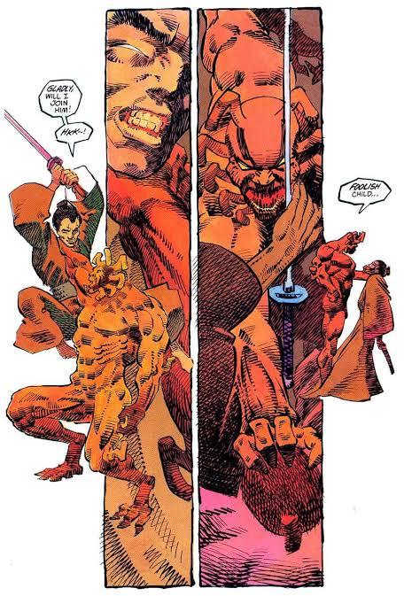
But probably the most famous mainstream comic that ever worked was the character Hellboy, along with writer Mike Mignola.
Hellboy is a series of comics that has a lot of mysticism, Norse mythology, horror and monsters. Something Corben certainly agreed to do, without thinking twice.
Richard Corben is one of my favorite artists, with a style that is perhaps not as realistic as an Alex Ross for example, but the humor and beauty that he puts in his characters is very unique.
Corben died on December 2, 2020, leaving a great legacy, for the world of comics and arts, with a very unique style and extremely stunning worlds.
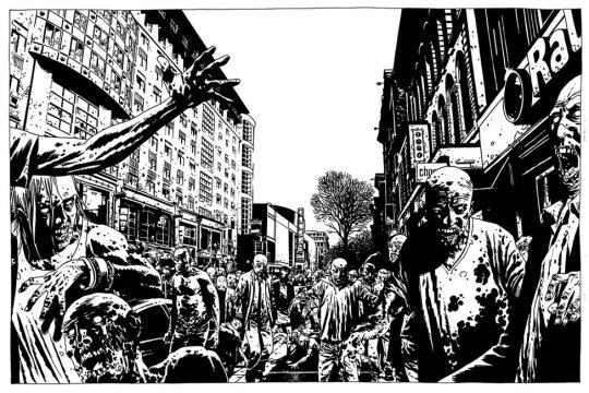
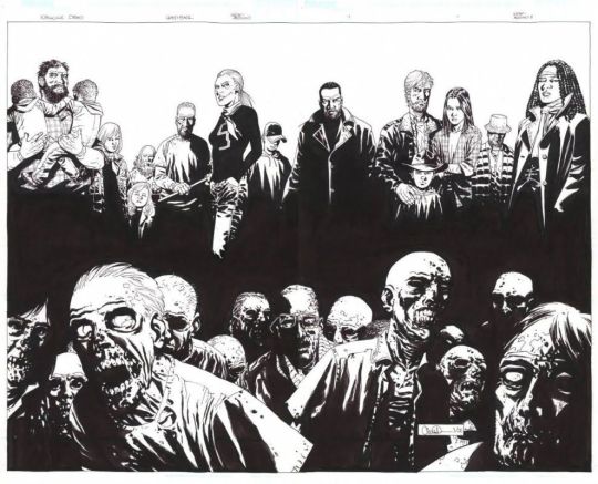
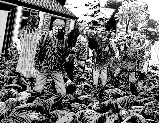
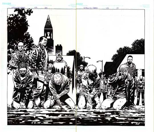
Charlie Allard
Charlie Adlard is a British comic book artist, who have worked on the comic industry for over 25 years. He spent the majority of his time since 2003 working in The Walking Dead along side with writer Robert Kirkman , until the last issue on 2019 He started reading comics when he was very young, and he said that he was very lucky to have influences of American comics and the more high art, such as Asterix and Tin Tin. He was fascinated by European comic books artists like Moebius, Alberto Uderzo and Herge. He started his career as many British artists and writers, working on 2000 AD, with characters such as Judge Dredd, Armitage and eventually Savage. In the United States he started working with the X Files, Astronauts in trouble, and of course The Walking Dead. Adlard started in The Walking Dead from issue 7, and brought a slightly different style, from the previous artist. Adlard's art is very cartoonish, but the universe of The Walking Dead still doesn't get silly because of it. Quite the opposite, the dirt and rot that Adlerd puts on his characters and the world, only sustains what a horrible world it is to live in. Many readers complain about Adlard's style, being very simple, that his characters are very similar, and sometimes it is difficult to identify them. But I believe that although his style does not vary much, when it comes time to show a horde of zombies, a devastated city, people feeling despair, and extremely disturbing scenes, Adlard manages to excel. Adlard's main tool is ink. All The Walking Dead magazines are in black and white, and he manages to give a lot of depth to the scenarios and characters using only a few ink stains. Today Adlard is doing some comics, mainly for DC, but says that he does not intend to work with Kirkman and zombies again, because he wants to explore other themes, and to innovate his drawing skills.
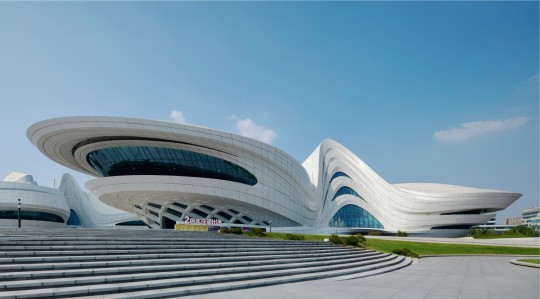
Zaha Hadid
Zaha Hadid was one of the most important and well known figures in contemporary architecture and design. With a singular trajectory, marked by a versatile, bold and out of the box style, she was the first woman to receive Pritzker Prize for architecture and was also the only female representative honored by the Royal Institute of British Architects with a golden medal. Zaha Hadid was born in Iraq, more precisely in the city of Halloween, in Bagdá, in the year 1950. Her family was of high class, her father being an important politician and her mother an artist. Still young, she traveled and studied in other places of the world, like London and Switzerland, but it was in her native land the she got her first formation, when she graduated in mathematics. At the age of 22, in 1972, she enrolled in one of the most famous independent schools of architecture in London, and there she gave the starting point to her career by studying and creating an important connection with the Dutch architect Rem Koolhaas, a figure that encouraged her and opened the doors for opportunities. Later in the 1980s, Zaha Hadid decided to open her own office. This, Zaha Hadid Architects was born, which made her name and talent recognized worldwide. Known for her works with futuristic lines, clean and pure forms, as well as the fragmentation of architectural design. Her projects and discussions raise issues that put architecture and its future to the test. This is because the architect seeks in her works to interrelate design, architecture and urbanism. I knew Hadid and some of her works, but it was the recommendation of my teacher Lauren, that I should look for this architect. As my project takes place in the future, she recommended that I look at some works by Zaha Hadid to get inspiration when creating the scenario for the comic. I find it very interesting how her works have this futuristic aesthetic , because it reminds me of science fiction films like Blade Runner with those skyscrapers and buildings with different shapes and sizes that are extremely imaginative that could only exist in films. With unique works and projects, famous for their exuberance, futuristic elements, curves, non linear shapes, distortions and fragmentations, Hadid inspired and generated fascination both for her constructions around the world.


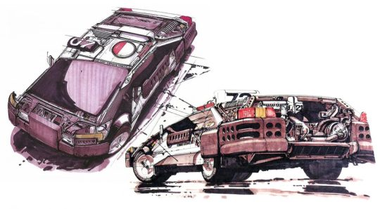
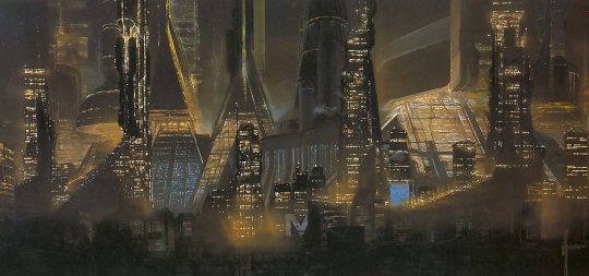
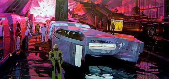
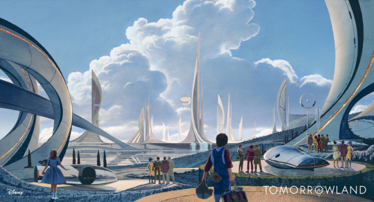
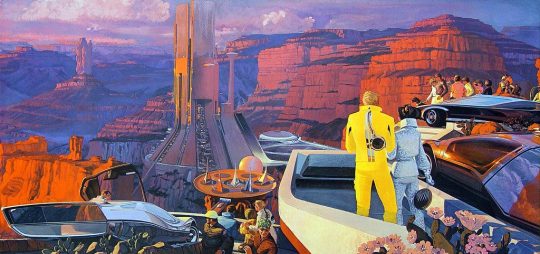
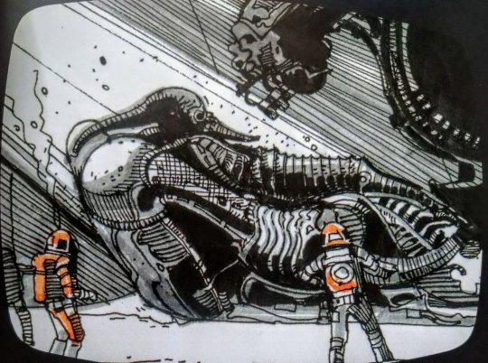
Syd Mead
Syd Mead was a designer, best known for working on films such as Aliens, Blade Runner, Tron and Star trek. Mead was born in Minnesota, United States, on July of 1933, but five years later he moved to a second house in the western of United States prior to graduating from High School in Colorado in 1951. Some years later, he did the Art Center School in Los Angeles, where he graduated with great distinction in 1959. He was immediately recruited by the Ford Motor Company. At Ford he worked in the advanced styling department, creating futuristic concept car designs. But his imagination went beyond cars and he began to imagine clothes, helmets, buildings and scenery from hyper advanced civilization. After Ford, he also worked in other big companies like Chrysler, Sony and Phillips. After that he started migrating to the concept art world of movies. Mead is really important for generation of writers of science fiction, because many of them were influenced by Mead’s colorful paintings. Mead never wrote a novel or short story. He imagined the future in his mind and turned that imagination into illustrations. In 1979 he designed the extraterrestrial spaceship for the first film “Star Trek” in the cinema. Ridley Scott called Mead to design the buildings and flying cars of the futuristic Los Angeles “Blade Runner” in 1982. In 1986 he was hired to design the space station and vehicles of the movie Aliens directed by James Cameron. Almost at the same time, the designer created the electronic world of “Tron” for Disney studios. The same ones who hired him in 2014 to design the futuristic city of “Tomorrowland”. Mead died in 2019 after three years of lymphoma, he was 86 years old. He was a great influence for many designers and science fiction writers and illustrators, due for his creative worlds and automobiles , Elon Musk quotes Mead as one of his major influences, on visions of the automotive future and design in general.
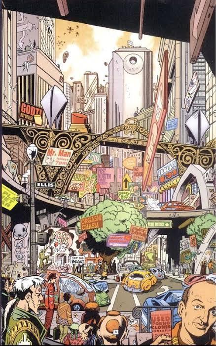
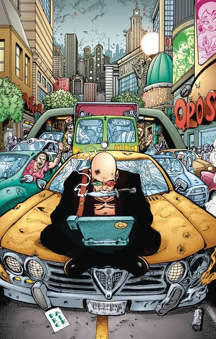
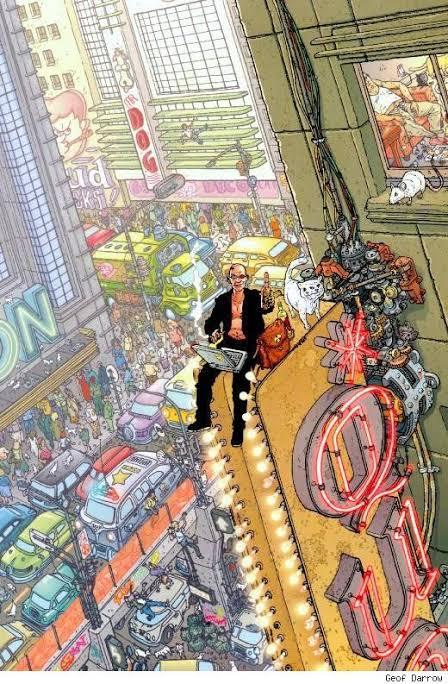
Transmetropolitan by Warren Ellis and Darick Robertson
Transmetropolitan is a comic written by the British writer Warren Ellis and the American illustrator Darick Robertson, published by the Vertigo label, and falls within the cyberpunk genre, and the problems that rampant technology will cause us.
Throughout the 60 issues of Transmetropolitan, Ellis and Robertson build a chaotic and brilliantly alive future, presenting a sci-fi society with a peculiar mix of elements of cyberpunk, political dystopias, bioengineering and transhumanism, sexuality, economics and much more.
In a dystopia, in a not so distant future, the journalist Spider Jerusalem is isolated for fiver years in a hut in the forest, but he has to return to the city to earn some money.
Throughout the comic, amid a nihilistic aura that humanity has no salvation, the author- Warren Ellis - criticizes the consumerism and futility. The illustrations, of Darick Robertson, is full of excesses as the environment should be, a brand of the style of the 1990s.
The search for the truth is the central theme of this work, and in the midst of all this we found ourselves in a investigative odyssey that involves the lowest scum of that society ( thieves, murderers and rapists) until reaches the highest of the scum ( the presidency).
This background allows the work to touch on the most profound social themes, and without fear of saying what needs to be criticized, this is where Transmetropolitan shines, and provoke deep reflections on issues such as racism, the influence of media, the power of religions, the education, and many other themes.
In short, Transmetropolitan dissects and criticizes everything, it points out the flaws, the lies and the hypocrisy of each one. It’s a study about the problems of democratic society in the 21th century.
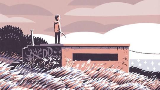
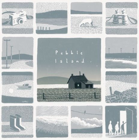
Jon Mcnaught
Jon Mcnaught was born in 1985, London, England. He work with drawing comics, and work as an illustrator, printmaker and lecturer. After spending several years on the Falkland Islands during his childhood, which will inspire his second book, Pebble island. The book pass years after the war, where he tries to recreate his childhood, with aspects of his curiosity, when he was exploring abandon bunkers, where it was just part of landscape, or somewhere where he could play. His work has essentially been landscape print-making (often situated in the city), but with quite simple intention of capturing the sense of space, light, time etc. His work is mostly about that, places that he was interested in depicting, and trying to reproduce the visual. He want the characters to feel like elements of a landscape or an environment ( he preferes to focus more on the background, than the characters itself). But usually he uses figures and postures to suggest expressions rather than close ups showing facial features. What I like about Mcnaught's work is that they are simple designs, but the colors are very vivid. The way he constructs the scenarios is very invective, because it doesn’t need to be extremely detailed, he just needs a few lines to show what he is talking about.
13 notes
·
View notes
Text
Research: Project Do It Again
R.M. Guera
R.M. Guera is a comic book artist that was born in Yugoslavia but has long time moved to Spain where he currently lives. For several years he made comics that were published by publishers from Yugoslavia, and then he worked for French and Italian publishers, where he made comics of the famous cowboy Tex.
His work is not well known in American publishers, he prefers to work for European publishers, where his style is best seen by Europeans, as it is not such a commercial trait.
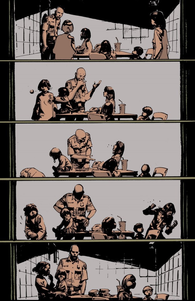
However, he did an American work in 2007 at Vertigo Comics (part of DC comics) along with writer Jason Aaron, called Scalped.
Scalped is a very interesting comic, mainly because of the thematic, because it shows a little known reality, where Native Americans live in very precarious reserves, in the United States, where the local population is hostage of drugs, violence and organized crime.
We accompany the character Dash Badhorse, where he is an undercover agent, in the criminal organization of the character Red Crow.
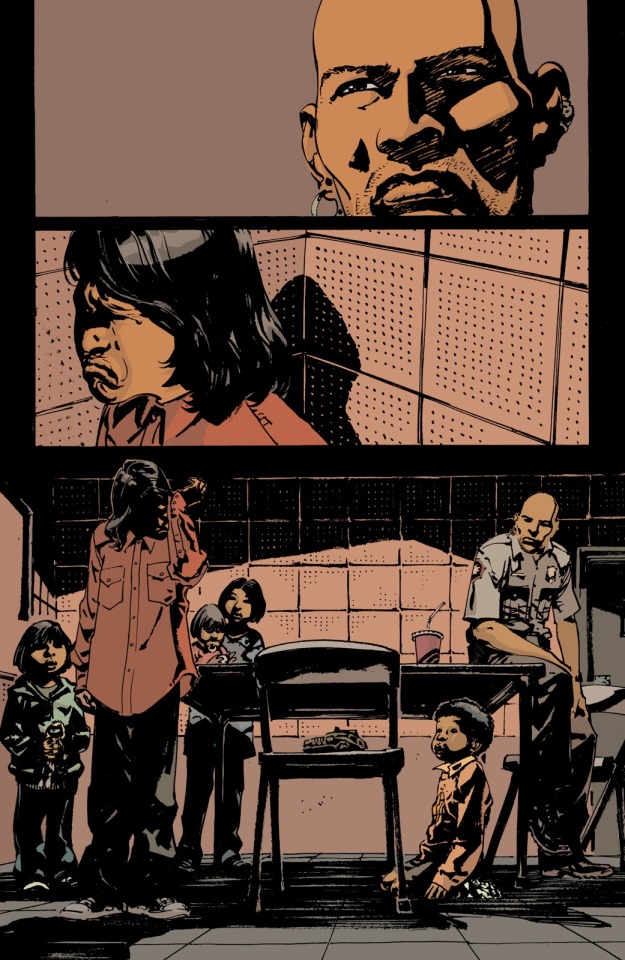
Aaron's text is very good, but what most impresses me is certainly Guera's art. The scene transitions are very well done, extremely well-detailed, and extremely well-planned action scenes, sometimes framing the character, in his facial expressions, sometimes in his hand ready to pull the trigger.
But sometimes, text is not necessary to explain a scene. In one of the arches the character Dash needs to explain to some children that their mother died. He turns to the eldest son, and explains the situation. The boy collapses emotionally, while his siblings cannot understand the situation, because they are too young.
It is interesting to see how the image speaks for itself, without needing the text to explain the situation.
Guera has a very characteristic drawing style , every time you read a comic, and pay attention on the art, you will know that it’s from him. I think his style really dialogues with the comic, after all its a very dark violent environment where the story takes in.
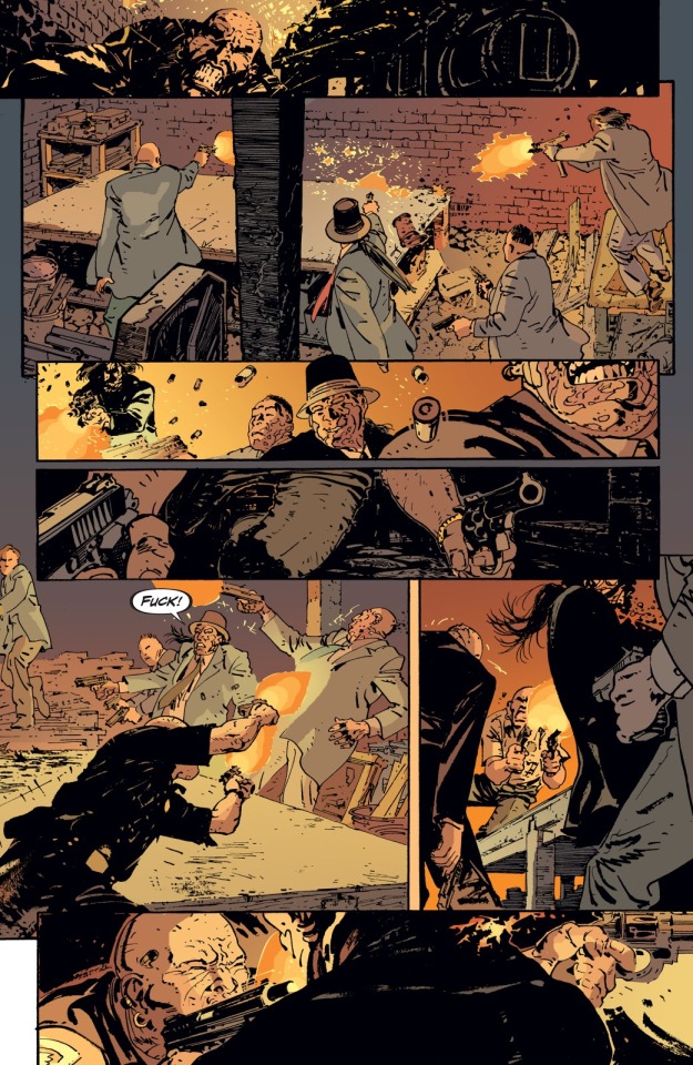
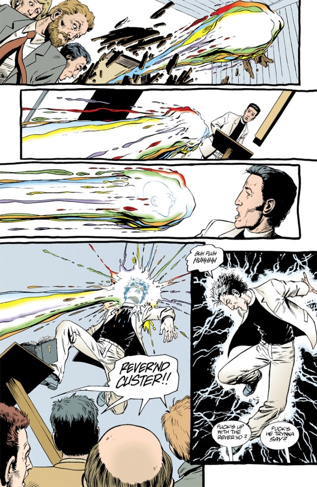
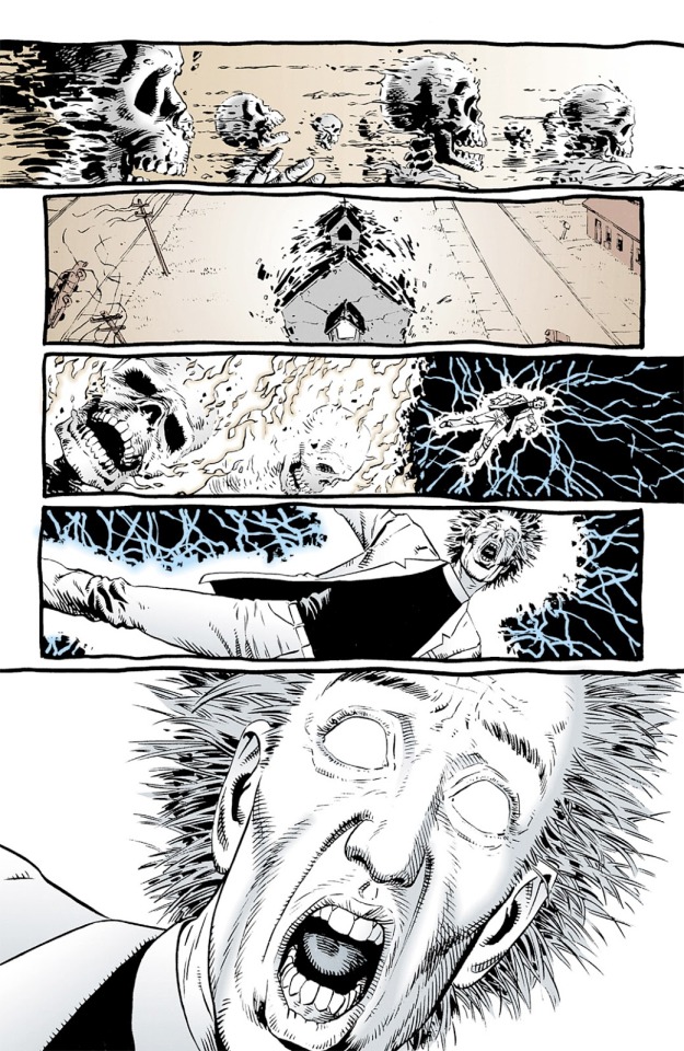
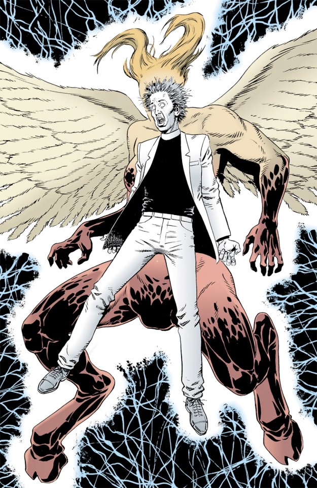
Steve Dillon
Steve Dillon was a British comic book artist, who worked in several titles both in Marvel and DC comics. He is best known for his partnership with writer Garth Ennis on Hellblazer, Preacher and The Punisher.
He was a fan and originator of comics from a young age: among his earliest creations was an adaptation of Escape from the Planet of the Apes, when he was 14.
After three months on an art foundation course, Steve landed his professional comics work in 1978, aged 16, when he was hired by Marvel to draw Nick Fury.
In 1980 he went to draw numerous strips for 2000 AD, including Judge Dredd, Mean Arena,Tyranny Rex, Harlem Heroes and Happy Hazard.
When he was hired by DC in the end of the 80s, he started working in the title of Animal Man, and later making a partnership with Garth Ennis. In 1991 they teamed up on Hellblazer, about a chancer magician called John Constantine, who roams the streets of London, trying to resolve some paranormal issues.
The DC series was a critical and commercial success, and the two went on to create their best known series, Preacher, in 1995.
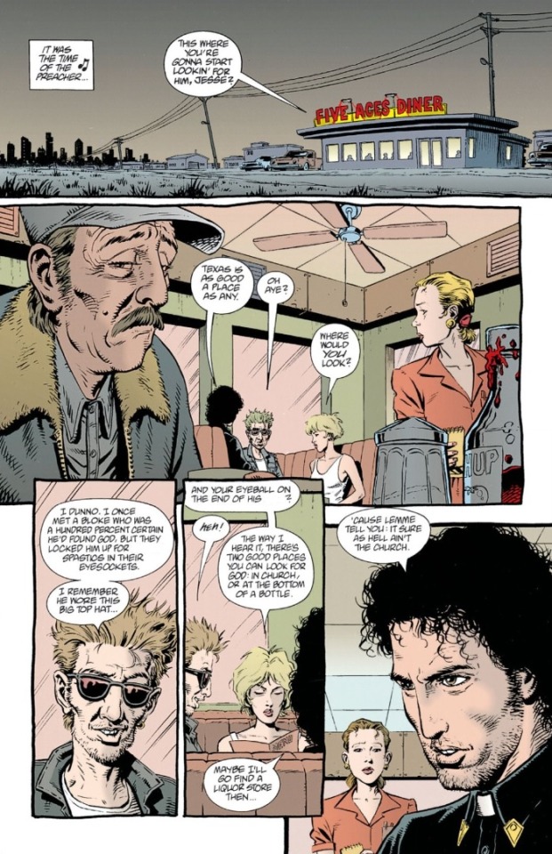
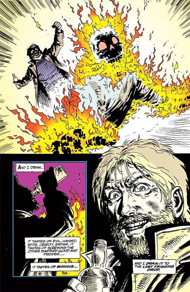
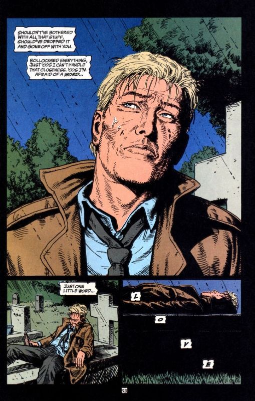
Preacher tells the story of the disillusioned Reverend Jesse Custer, who goes in search of an absentee God, accompanied by his ex girlfriend, Tulip, and a Irish vampire called Cassidy. It has themes of theology, over the top sex and violence, dark humor and importance of friendship and love.
Dillon’s work was characterized by concise layouts, subtle manipulations time and space, and remarkably expressive cartooning style that gave his comics and emotional resonance unlike any other.
With spare background and typically uncomplicated layouts, Dillon has always made very much out of very little. Minimal composition tell a panel to panel story focusing on body language, choreography, and mood. In the comics that centered more on character, dialogue, and atmosphere.
Dillon died on 22 October 2016, in New York City. The cause was complications of a ruptured appendix.
Despite this, his work continues to be publicized, and adored by several readers who appreciate a somewhat cartoonish trait but with very real expressions.
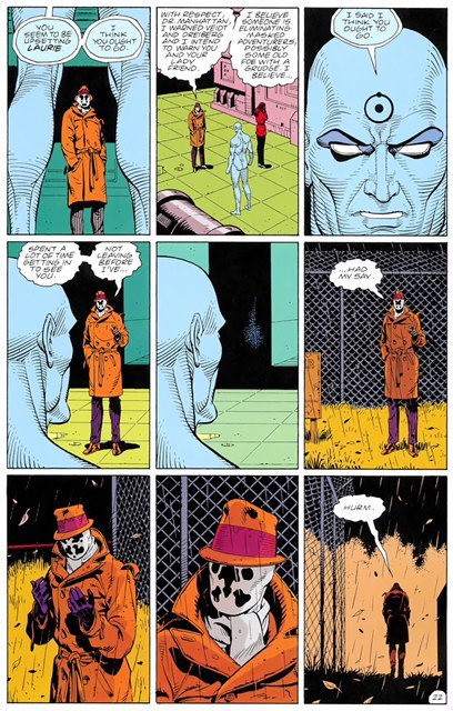
Dave Gibbons
Dave Gibbons is a British illustrator, who’s famously known for being the co-creator of one of the most acclaimed graphic novels “Watchmen” together with the writer Alan Moore.
Gibbons, first work in the United States was with the Green Lantern, by DC comics began his career drawing science fiction comics, in 2000AD and in Dr. Who.
With the arrival of his work in the USA, Gibbons soon became a first name in the market. In another partnership with Alan Moore, he designed the story Superman- The man who had it all.
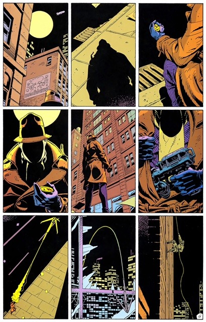
However it was Watchmen that made Gibbons career. Together with Alan Moore, they published the 12 issues limited series during 1986-87. It became one of the most best selling graphic novels of all time, and the only title to feature on Time’s “Top 100 Novels”.
Gibbons was responsible for look and design of this groundbreaking comic, and his collaboration with Moore has proved an enduring influence on later generation of readers and writers.
Gibbons pioneered various instantly recognizable styles. In Watchmen, he perfected a stark new twist on the nine panel comic layout that was at once intensely narrative driven and packed with symbolic depth. Through all his work, Gibbons has also managed to express one of the most influential visions of future: an unnerving blend of cyberpunk and steampunk that transcends both into something else entirely. By visualizing the machines of the future- the zeppelins and cigarettes in Watchmen for example.
Gibbons manages in many of his pages, to make a scene without any dialogue, and to show all the action of the character. His color palette is very interesting, because in Watchmen, because it is a decadent New York, he values colors like pink and yellow, to show the signs of adult stores and women selling their services. In addition to the red itself to represent all the violence that occurs in the city.
Eduardo Risso
Eduardo Risso responsible for the drawings of the great 100 Bullets comics, By Vertigo and one of the most awarded and respected illustrators today.
He was born in Cordobá, Argentina and started for real, in Buenos Aires, at Editorial Columba. But before that, in 1979, he did little things for La Nacion, an important Argentine newspaper. He made a page for a Sunday magazine for children, and another for research, with only a few drawings. Everything to earn some money.
Risso did a lot of work for European publishers during the 1980s. But it was in the 1990s that he started working for American publishers like Dark Horse and DC, but especially in 1999 he started working with writer Brian Azzarello in 100 Bullets. Is a pulp detective novel, bringing the aesthetic rigor of noir to the dirty streets of the contemporary United States, filled with gangs, profanity, drugs and violence.
The story follows people who had their lives destroyed, and they receive a briefcase with revealing evidence about who screwed them, a gun and a hundred untraceable bullets.
The distorted, almost cartoonish features bring humanity to this world full of dangers and contradictions.
Risso has an unique way of drawing his characters and the environment, rather than clogging with details the dozens of American cities through which the history transits, he defines the iconic landscape of each with economic features, usually using light and shadow to shape characters and objects- which are often depicted only as silhouettes.
Its pages and silent sequences flow between close up and detail planes. The framing are different from the usual, regardless of the action portrayed.
Risso has mentioned, that he doesn’t read much comics today, because he dedicate much of his time to work and family. When he read something, he prefer a novel or a book. The reason for doing that is because he don’t want to be influenced, to maintain his own style.
Geroge Perez
George Perez is a Puerto Rican-American comic book writer and illustrator, known for his work on several titles, including Avengers and New Titans and Wonder Woman.
Perez’s family moved from Caguas, Puerto Rico in 1940 and settled in the Bronx, New York, where there was and remains a large Puerto Rican community. Perez started drawing at the age of five. Eventually, his family moved to Queens, where Perez often visited a comic book store called Comic Hut Mike. He was fascinated with comics and their illustrations.
Perez started working in the comic book industry in the 1970s. Perez had embarked on his own professional career, which included the saga “Sons of the Tiger”, an action adventure strip published in the long running Marvel Deadly Hands of Kung Fu magazine and authored by the prolific comic writer Bill Mantlo. He and Mantlo co created the White Tiger ( comics first Puerto Rican superhero).
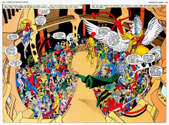
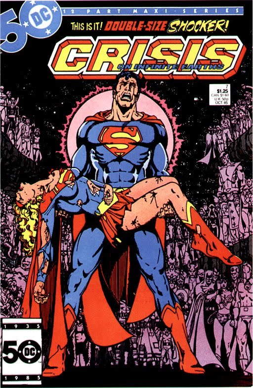
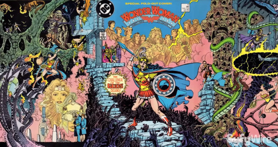
Perez started working in DC comics in the 1980s, where he collaborated with the writer Marv Wolfman, where they had worked with DC biggest saga, Crisis on Infinites Earths. Crisis supposedly characterized each DC unique character of ownership, in a story that radically restructured the DC universe of continuity.
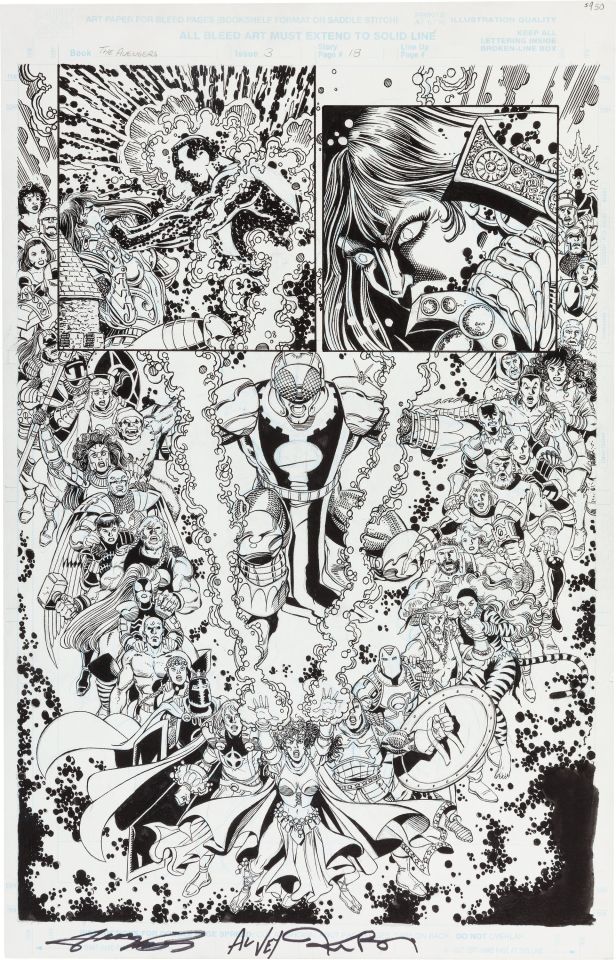
Perez comics are exemplars of the classical narrative style of comic art, refining a set of formal practices that adapt page and panel layouts to match their contents in a manner akin to classic Hollywood cinema, deploying formalism for narrative purposes. Pérez and his peers also display an abiding interest in the image, incorporating the visual frames and narrative strategies of newspaper, film, and television as they depict worlds saturated and shaped by these media.
1 note
·
View note
Text
Research: Storytelling project
JOCK
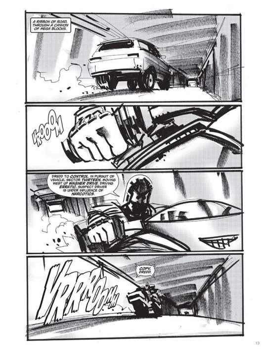
Mark Simpson, best known as Jock, is a Scottish comic book artist and illustrator. He began his career in 1999 working on the British comic book publisher 2000 AD (where most of the British artists and writers, began their career, before going to the major leagues like DC and Marvel), and started working with characters like the Judge Dredd.
The artist began his career in the USA with The Losers, at Vertigo (a subdivision of DC comics), and some issues of the Green Arrow.
He also have worked with conceptual arts for various films such as Iron man 3, X-men days of the future past, and Star Wars episode VIII.
I have known Jock for a while, I have seen many of his works in the comics, and he is known for working mainly with covers, where he does extremely surreal works, mixing various types of colors, and always uses a lot of shading, not worrying if the characters are in the correct proportion, because that is not his proposal.
But I know he did some works as a sequential artist, like The Losers, for example, where he makes extremely tight pictures, always focusing on the expressions of the characters, and especially on the hands that he most likes to do.
His storyboards or sketches are very different, because his drawings do not follow the traditional way of being centered on the pictures, many of his characters are jumping over the pictures, to show the size of the action scene that Jock wants to do.
It is worth remembering that he mixes his drawings made with pencil and nanquin, with digital, often taking pictures of different landscapes or scenarios, and drawing over them, and mixing with his drawn character to make an interesting composition.
Despite all this, he has a very peculiar style, which many people complain about the lack of movement and poses that his characters does. That his lines are also very dirty and dark. But Jock says, that this is his way of drawing, that he likes to have a not so commercial style, like many other artists. He likes to play with colors and likes to draw his characters, in a little more simple poses, and glorifying the background.

Saul Bass
Saul Bass was an American graphic designer and filmmaker, he’s known for designing movie posters and title sequences.
For 40th years, he worked with Hollywood greatest filmmakers, such as Stanley Kubrick, Alfred Hitchcock, Martin Scorsese and Billy Wilder.
Bass was born in New York in 1920, to a Jewish family, he was all ways drawing when he was a child.He graduated from James Monroe High school in the Bronx. He studied part time at art students league in Manhattan, and moved to Brooklyn College, where he had classes with György Kepes, a famous Hungarian painter and photographer.
He began in Hollywood in the 40’s, designing prints for films like champion (1949), death salesman (1951) and the moon is blue (1953).
He became widely known for creating the title sequence for Otto Preminger’s The man with the golden arm (1955), which’s about a jazz musician, addicted to heroin. Bass decided to create a poster which dialogues with the controversial subject, so he chosed the arm as the central object, as is a image which relates with heroin.
For Alfred Hitchcock, he provided memorable posters, like Vertigo(1958), North by Northwest(1959) and Psycho(1960).
For Martin Scorsese he had done the posters of The Goodfellas(1990), Cape Fear (1991), the Age of innocence (1993) and Casino (1995).
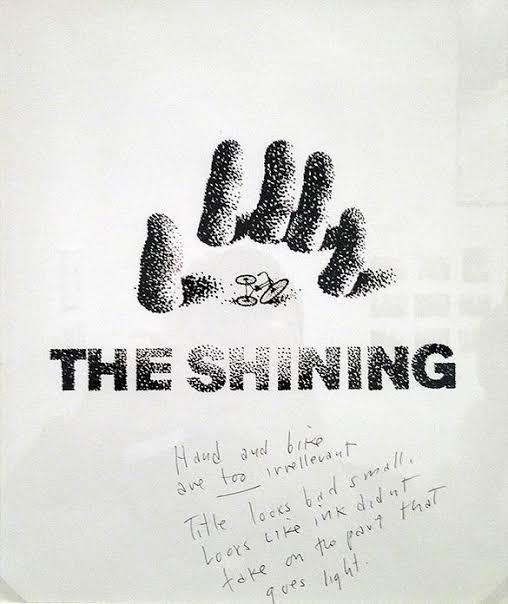
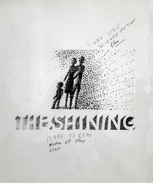
For Stanley Kubrick, he designed Spartacus (1960), and probably the best poster in his career, which is the poster from The Shining (1980).Kubrick, however, wasn’t amused. On the sketches themselves (which were later discovered in his personal affects) he wrote “Looks like science fiction.”Title looks small, looks like the ink didn’t take on the part that goes light,” and “Maze too abstract and too much emphasis on maze,” and, the most scathing of all, “Don’t like artwork.”
More discussions followed, and Bass agreed upon an illustrative approach of a large head peering through the title.As Kubrick instructed, the poster evokes both “terror” and the “supernatural.”
Bass once told,that his main goal for his titles sequences is “try to reach for a simple, visual phrase that tells you what the picture is all about and evokes the essence of the story".
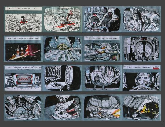
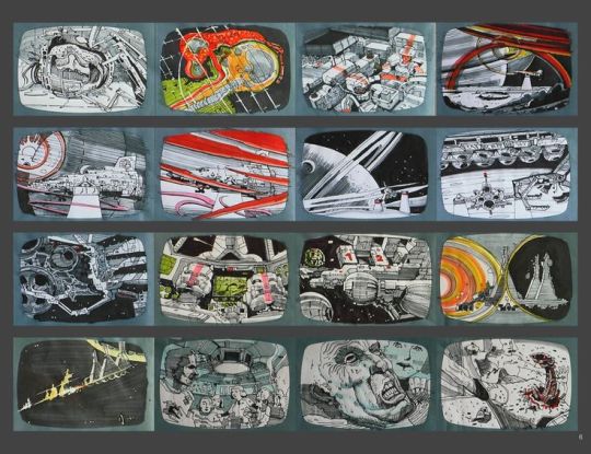
James Cameron
James Cameron is a famous film director, which is for having two of the greatest box office films of all time, which are Avatar and Titanic. In addition, he is always revolutionizing in special effects, always bringing something new and revolutionary, but it all starts on his drawing desk, with his sketches and storyboards.
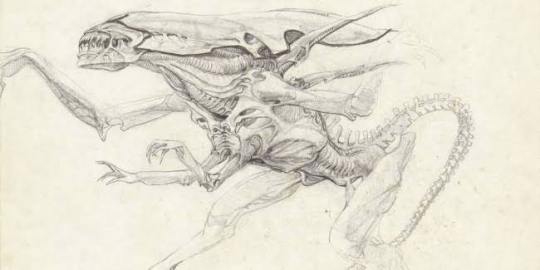
James Cameron has always been known for creating extremely interesting worlds, and completely out of the ordinary. Starting with the film Aliens, the sequel to Ridely Scott's film, where he expanded this world by creating an ecosystem for the aliens, in addition to showing futuristic equipment, for the space army that faces the aliens.
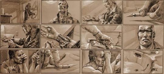
He also created concepts, for the Terminator films 1 and 2, where it was an idea never before seen of a robot that travels in time to kill a person. Its detailed perfectly drawn storyboards show one of the most interesting scenes in the film, where the terminator does a self surgery, revealing his true form.
And finally, once again creating a whole world, with a fauna and flora never seen before in the movie Avatar.
Cameron always wanted to create worlds, so he putted everything on a piece of paper when he was a child, where later, he took courses of drawings and did art colleges, to get a clearer idea of how his worlds and characters could be.
Before being a director, he wanted to be a writer and an artist, but he never thought his ideals could be just in a book, he wanted to expand these ideas in a way never seen before.
Perhaps what impresses me most about James Cameron, besides being a creative force, is all the care he takes with his works, he said in an interview, which he always preserves all his storyboards, even from those films that he never made or did not work, and said that almost every day, he sits at his drawing desk and tries to come up with possible scenes for any film he is making. And when he creates an interesting scene, he tries to invent a whole story, to get to that specific scene.
https://issuu.com/dteditore/docs/spidercameron-screen-eng/1?ff

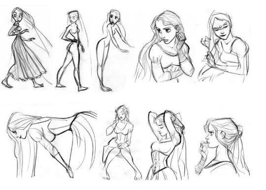
Glen Keane
Glen Keane was born on April 23, 1954, in the city of Philadelphia, United States. Early on, he became interested in art while watching his cartoonist father Bill Keane draw. After finishing high school, he turned down a scholarship to play football and signed up for CalArts- California Institute of Arts.
Keane signed up for the painting program, he wanted to be a visual artist. However, his application was accidentally sent to the animation department, then Film Graphics. The college vetoed him to change course, so he stayed there.
Glen’s passion for painting helped him tremendously in animation, since the first skill an animator must have is knowing how to draw. Do not simply draw, but really know anatomy and how to give the illusion of weight.
His first work was Bernardo and Bianca in the kangaroo land. In the following years Keane worked on other features such as the Hound and the fox, Oliver and his gang , treasure planet, and the list goes on.
But it’s was at the time called the Disney Renaissance that Keane stood out. He animated Ariel the little mermaid, Beast from the beauty and the beast, Aladdin, Pocahontas, Tarzan, and most recently, was Rapunzel (Tangled).
At the time, Keane and the animators, had to use the traditional animation (by using paper), so him and his crew had to plan, all the scenes and poses, by doing storyboards, and later drawing on the paper frame by frame (the frequency to project a film in the cinema is twenty four frames per second, twenty four drawings in total were needed for each second of animation seen on screen).
There is no professional on the animation field, who does not know the name Glen Keane. He is the reference to all of them. What sets him apart, is his passion for his characters. During the production of the animations, Keane understands them and is thus able to perform better.
4 notes
·
View notes
Text
Research: Persona Project
Ronin by Frank Miller
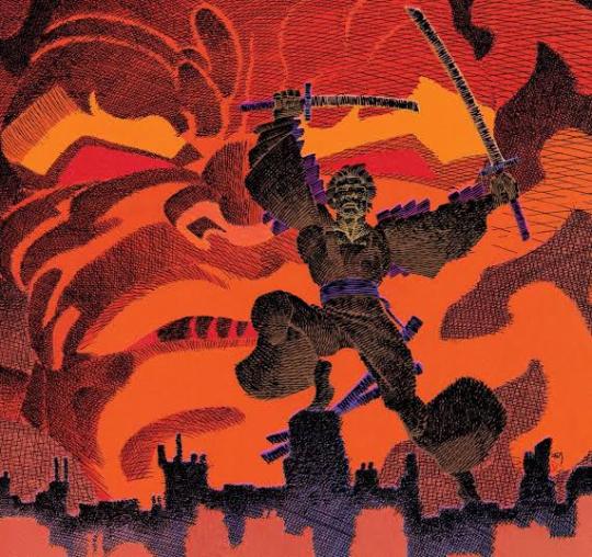
Ronin was a comic released by DC comics in 1983, and was created by Frank Miller, who besides having worked on the script, also worked on the illustrations.
Ronin is a internal evolution of the author, something that translates into a leap in quality in his work, transforming and aesthetically renewing his work.
It’s like stepping out of his comfort zone to face challenges to innovate.
Frank Miller stood out for his ability to break models, to shape a canon to a new look. And when he got to DC, he had a lot of new ideas involving the past and future, honor, society, discipline, technology, science and ecology. Miller’s mind amalgamated all this essence that culminated in this miniseries, overcoming any obstacles and marking the industry.
Ronin is the story of a past and a future that come together through science. From feudal Japan to the most decadent and technified New York, a samurai without a master, will return to solve the mistakes of the past, and do whatever it takes.
Miller brings with Ronin his interest that he already showed in other comics, which is the Japanese tradition, molding a crucible in which the past and future are mix organically, when technology is the next step in evolution. New York is engulfed by artificial intelligence that replaces the obsolete, the rotten and the dead, with the new and pure.
But for me, the best part of the comic, apart from the script and the whole idea of setting, is certainly the art.
The art of Ronin, maybe not for everyone’s taste, because it looks quite experimental and surrealist.
However, Miller broke new grounds with new page layouts, playing with the text, the thickness of the lines, close ups, cut plans and pictures, violence, death and pain like never before seen and felt in a comic book.
With a super stylized, bold and almost surrealistic streak. This led to a rejection of the miniseries, but it was necessary because Miller opened up, a new path in terms of narrative and composition of art, and invented new graphic tools with which he went in the direction of the unknown.

Josan Gonzalez
Josan is a renowned for exploring themes related to science fiction, dystopia, and above all, cyberpunk. He has already stated in an interview that he is strongly inspired by big names like Moebius, Katsuhiro Otomo - creator of Akira - and Geoff Darrow.
Gonzalez likes to create characters full of personality and compose scenarios rich in details. Josan has a very characteristic artistic artistic style: he uses complex line arts, flat colors and limited color palettes.
Being born in Spain, Josan starts reading comics since he was a teenager and this will influence later in his artistic aesthetic.
Initially he adopted a more painterly style which evolved later in the line work. Despite being always passionate about art he never thought it would make a real career from it. He succeeds in publishing his own books and working for big names such as Dark Horse and Boom Studios.
People is considering Josan’s work as being part of Cyberpunk genre, but the artist doesn’t like to classify them. He enjoy creating illustrations without establishing rules, just giving shapes to a futuristic world. Many of Gonzalez characters are linked by cables, which are a perfect metaphor for linkage human-technology. For a lot of artwork the artist get inspiration from religious imagery. Providing his characters with catholic and Hindu symbols. Mostly this happens, because of his catholic background in Spain. Another aspect, is showing people’s addiction with technology, which keep them repressed. Even if the artist explores different social questions his main goal remains the illustration and making interesting and timeless.
some of his most recent works are, for example, is the cover of the new edition of the science fiction book Neoromancer, and the steelbook art of the game Cyberpunk 2077.
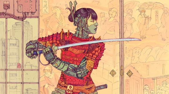


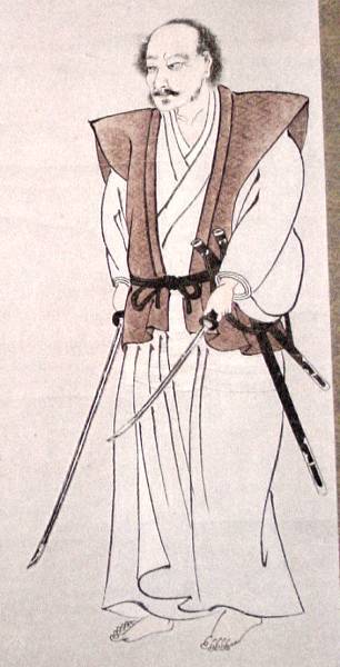
The Story of Miyamoto Musashi
Miyamoto Musashi was Japan’s most famous samurai. He is credited with authoring the most important treatise in Japanese strategy, the “Book of Five Rings”.
Musashi Sensei, as his disciples still call his fighting style, lived from 1584 to 1645.
Musashi dedicated his life to reach perfection through the art of the sword. He fought and won more than 60 life and death duels, and was never defeated. He made contact with other art forms, such as painting, sculpture, calligraphy and poetry, in addition to Zen meditation and Buddhism.
Musashi was born in the province of Harima during one of the most troubled periods in the history of Japan, when the last great battles of the time of the samurai took place.
At the time, it was common in Japan for the same person to change his name at different stages of life. In childhood, Musashi Sensei was called Shinmen Bennosuke. It is believed that he received the first Kenjutsu (famous Japanese martial art) instructions from his father,Shinmen Hirata.
At the age of 13 he won his first duel, and won the second duel when he was 16 years old, as reported in The Book of Five Rings.
In his book Musashi says that his strategy to deconcentrate the opponent and beat him was to arrive late at the place of the duel. On the way, Musashi carved a sword out of a broken paddle and with this sword he dealt a blow to Kojiro winning the duel, which, although fast, is one of the most famous in the history of the samurai. The duel was immortalized in a monument on the island of Funajima representing the figure of the two warriors.
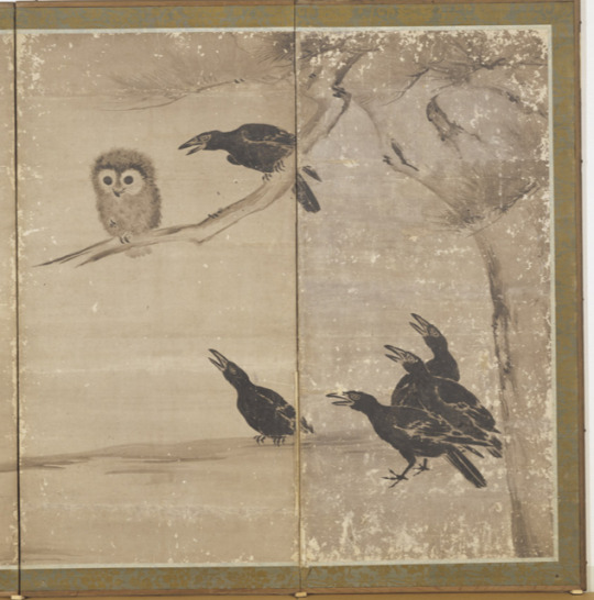
The Funajima duel was a turning point in Musashi’s life because from then on he began to reflect on how he had won so many duels and to dedicate himself to the task of leaving a legacy for future generations. It was from there, too, that Musashi began to dedicate himself to other arts such as painting and poetry.
He worked primarily with a style of ink painting, creating minimalist, monochromatic works portraying nature.
The last years of his life, Musashi spent as a guest with his friend, and then isolated himself in the cave of Reigando where he dedicated himself to meditation and practice of his art writing his Book of Five Rings right there.


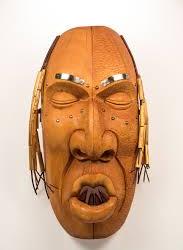
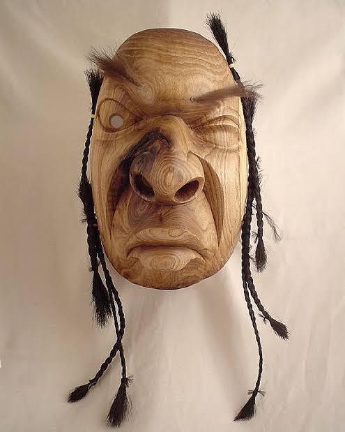
Ned Bear Mask Artist
Sculptor Edward (Ned) Bear has combined study in Native education with an Honours Diploma from Vancouver college.
He has an extensive knowledge of Native art and culture, Bears has also made contributions to change as a curator, guest speaker and juror.
Bear was born in the town Frederecton, New Brunswick, Canada. When he was young boy he was inspired by a Native elder carver, and later on he received a formal training at New Brunswick College of Craft and Design, where he became the first aboriginal student to graduate. Bear received additional training at a Indian Federated College in Nova Scotia.
Bear created sculpted masks and marble or limestone figure forms. His masks are approximately three feet high and are usually carved from butternut. Each mask is adorned with horse hair ( symbolizing the free spirit), bear fur ( symbolizing healing) and metal ( symbolizing something which is of the earth). Each mask tells a story and offer a modern interpretation of traditional spiritual beliefs.
When creating art, Bear considered himself to be simply a vehicle through which energy flows from the eternal Great Spirit to the medium he is using. He doesn’t create any sketches for the masks, he said that he allows the great spirit to guide him through the process.
Ned Bear made significant contributions as an instructor of Native art and culture, a curator, a guest speaker, and a juror.
The indigenous sculptor died on the Christmas evening of 2019, at the age of 65. “ We delve into so many past wrongs of our lives that we forget to revel in the present. Learn to capture what you may never have again, now. Do what makes you content for this time, and begin to realize the true purpose of life”, said Bear.


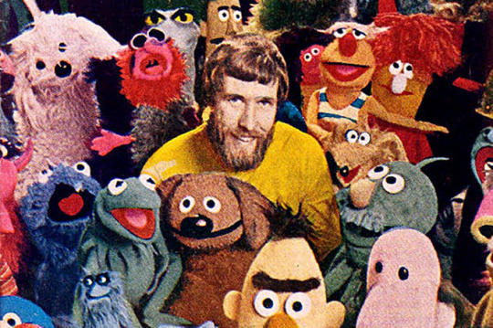
Jim Henson
Jim Henson was an American puppeteer and filmmaker, and most known for creating the Muppets, and directing most of their movies and tv shows.
In the 1960s Henson and his future wife, Jane Nebel, created a puppet show on Washington television station and kept their jobs through the school years, developing the first Muppets (including Kermit) on a one minute television show called Sam and Friends.
The success of Sam and Friends led Henson to create his own company in 1958, initially called Muppets,inc. and many years later, The Jim Henson Company.
Part of the resounding success of Henson’s puppets was due to their innovative view that puppet controllers did not need to be hidden by physical objects while controlling them.
By instructing the camera controllers to focus on the puppets and keep the controllers out of sight, he allowed the puppets to dominate the TV screen and acquire more lively and similar behaviors to real people.
From the productions of Sam and Friends, many characters emerged who became famous over the years and who would become part of the famous cast of the Muppets, including their most famous member, Kermit the Frog.
The Muppet Show, which premiered in 1976 and was produced in England, gained an international audience ( it was shown in about 100 countries) and was soon followed by the film The Muppet Movie (1979).
Henson was able to create an interesting set of characters by developing innovative ideas with a sense of rhythm and humor that won an audience for both children and adults. His works are remembered in part for promoting positive values in childhood such as friendship, magic or love, themes that appeared in most of his works.

Research: Persona Brazilian Folklore research- Lobisomem
The legend of the werewolf is known practically all over the world. It defines him as being, part man, part wolf, who was cursed with lycanthropy ( the act of becoming a wolf).
The one who is cursed, becomes the werewolf on the nights of the full moon. Some variations of the legend say that lycanthropy was the result of the pact of one man with the devil.
Once transformed into a werewolf, the person frantically sets out in search of victims to kill them. Modern popular culture has spread the idea that the werewolf is vulnerable only to silver bullets or sharp objects made of silver.
Naturally, the legend of the werewolf arrived in Brazil through Portuguese, during the period when they colonized Brazil, in our country, the legend arrived and took on different characteristics in each region.
Some studies have concluded that there is no such legend among indigenous people. The closest to that were legends who believed that men or women could become some animals of the forest.
This legend in Brazilian folklore ended up acquiring elements present in its Portuguese version. Thus, it was common to believe that the werewolf was the man born after the mother had seven daughters, although versions of the legend say that if seven sons were born, the eight son would also be a werewolf.
In the north, of Brazil, the werewolf was the man who was in poor health, and the one who was anemic would eventually would become him. Once transformed, it feeds on the blood of other humans to make up for the poor diet as one of them. The transformation took place from Thursdays to Friday nights.
In the south, in turn, the fact that turned the man into a werewolf was incest. In Brazil, there was no record in the folklore of the belief in transformation of women into werewolves. In the folklore, only men becomes werewolves.
In the interior of São Paulo, it was believed that this being tried to invade the houses to eat children. Many believed that the werewolf went after, especially, unbaptized children.
One of the ways in which the person turned into a werewolf, was if he seriously injured with certain objects. One of these objects was a bullet bathed in candle wax from an altar.


11 notes
·
View notes
Text
Research: Draw Draw Draw Project.
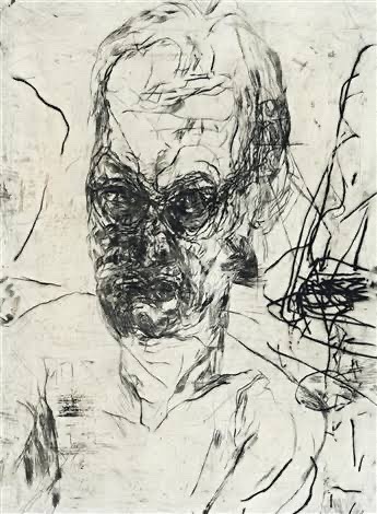
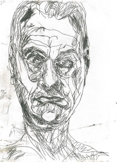
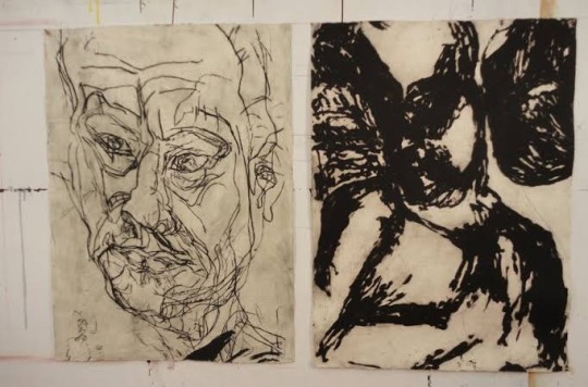
Mike Parr Mark making artist
Parr's performances explore physical limits, memory and subjectivity. They often depict self mutilation or extreme physical feats.
Parr spent his childhood in rural Queensland, Australia. He was born with a deformed arm, and this physical feature is prominent within his art work.
Parr’s impression taking is a striking contrast, both emotionally and visually to his video/ installation work, composed of beautiful engravings featuring many different types of lines, using the mark making technique. Parr was fascinated with observation and the possibilities and responses of memory distortions.
Parr’s early work was designed to get a reaction from the audience, although he also focused on exploring issues of identity, memory and states of being. He particularly used his body as a performative tool, often using his prosthetic arm and testing his body’s physical limits through resistance challenges.
In the early 1980s he started a collection called “the self portrait project”, Parr’s self portrait studies first took the form of painstakingly hand drawn copies of performance photographs. Subsequent drawings acknowledge accidental blurs and smudges, with parr generating purposeful distortions through the introduction of a mirror and manipulating the grid.
Life after death collection, combines charcoal, pastel and acrylic on paper; it depicts the artist’s face over and over, in varying states of distortion, as though disappearing or disintegrating.
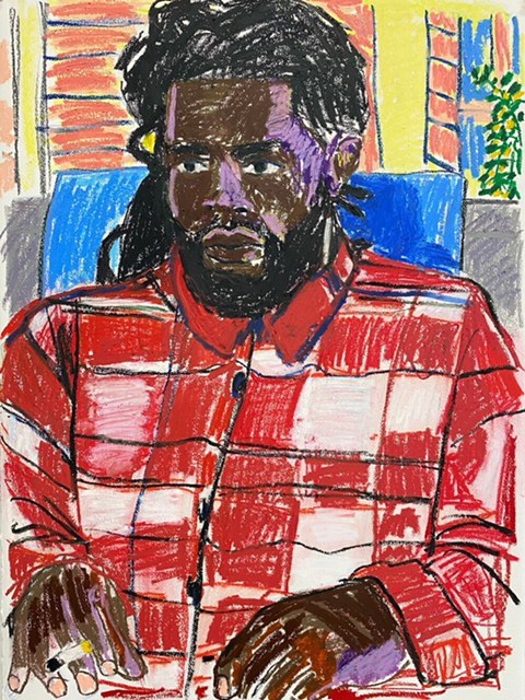
Paul Verdell
Is an American artist, who is specialized in drawing portraits of many different people that he can find as reference, by using different kinds of colors and lines with his crayons.
Verdell was born in Long Beach, California. At the age 13, his family moved to Fremont, Ohio.
Paul Verdell paints and draws a variety of people with plenty of personality. Like most artists, he has drawn since he was little, but didn’t make a real go of the medium until he was in his mid 20s. That he was decided to go back to school, enrolled in Bowling Green State university, and took a painting class when the first semester came around. Paul eventually developed his unique artistic style, by doing drawings, that him doesn’t consider that good, but he is comfortable with that style. His mark making technique is assertive, created with force and with energy. Paul’s work may seem as if it has loss control imbued within the lines, but his artworks are also vividly representative of the person or object he’s depicting; it’s delicate balance that he’s mastered without purposely pushing his style in a certain direction.
What I like most about his work, is his use of colors, with oil pastels , where he creates different tones on the skin of his characters, using the technique of mark making, which is perhaps more impressive, since it is a very different or unconventional technique for making portraits, that’s why it’s so interesting.
With time, he realized how much colour and expressiveness the textured medium adds to the canvas, and started to experimenting with more and more different types of colors.
The artist isn’t trying to make a statement with his work. In his words, “I’m just here to paint. The viewer can take whatever that want to take out of it”.
Saul Steinberg
Romanian artist by birth was one of the most important artists of 20th century. A designer and cartoonist in the publishing industry from 1936 to 1999, he spent a considerable part of the 20th century publishing in prominent magazines on the world stage, specially in the New York. The famous cover for the New Yorker that showed the view of the world according to the average American.
In his drawings, Steinberg’s lines seem to reinvent themselves as they progress, creating different kinds of shapes and sizes, sometimes using one single line.
Steinberg’s greatest contribution was his demonstration that the drawn lines is equivalent to thought. Indeed, Steinberg is rarely concerned with outward physical appearance and is much more interested in what and how people perceive what they see. His interest in the human psyche isn’t academic. His playful, childlike doodle quality maintains an elegant deftness that succinctly describes a wide range of subjects. His quirky way to draw, sometimes reminiscent of Dada art, also crossed over into the fine arts world.
much of the humor and mystery in his work occurs in the way he relates humanity’s lack of understanding.
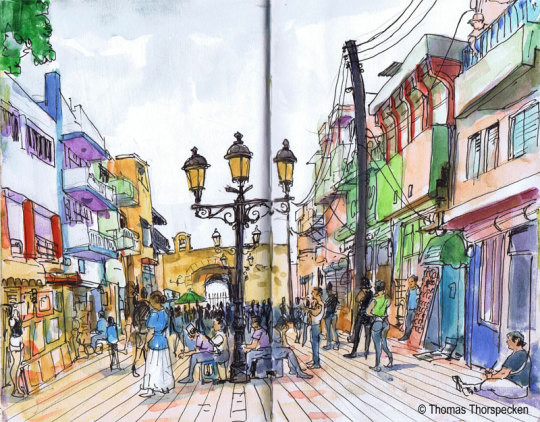
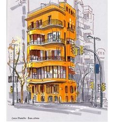
Urban Sketching
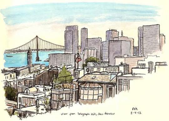
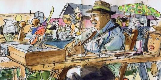
The drawings of urban spaces are gaining more and more admires, and this work certainly has a good baggage to please this audience, as it addresses a range of drawing techniques, which ranges from elementary theory to the more specific technique used by illustrators this modality.
Techniques and perspective tips combined with the composition tips presented in the work, are a combination that certainly makes all the difference when choosing and enhancing the scene that we will sketch, whether it be designing buildings, mansions, parks, people, animals, etc. the inclusion of the curved perspective is also another highlight, as it goes beyond the usual three vanishing points that the author usually address. The techniques, in this sense, are not many, but the author certainly selected those that generate the most impact. The watercolor for example, is his primarily tool, where he uses for the most of his drawings.
This book has been very useful for me for a long time, even today I use it as a reference. I always preferred to draw on my desk, with a reference photo. But I know that I need to let go, and learn to draw outside, just by watching, and trying to finish quickly.
I live in São Paulo for a while, and sometimes when I walk I always have a small sketchbook in my pocket and a watercolor kit. Sometimes I paint trees, sometimes buildings with interesting shapes and colors, from time to time some birds. Anyway, I learned a few things from this book, although I still prefer to draw in my studio, calm and do the drawing with all the time in the world, it is very important that I draw what is around me, so that I learn to train my eyes, in addition to drawing totally random things, which sometimes the internet cannot provide.
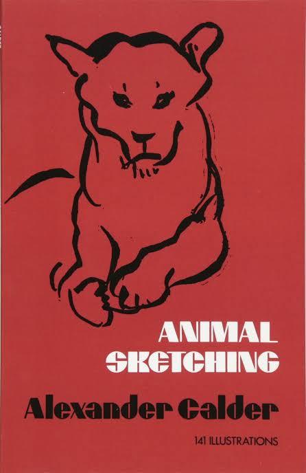
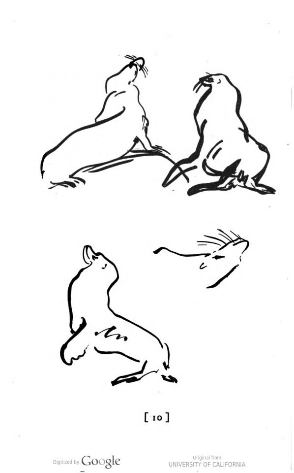
Alexander Calder Animal Sketching
Alexander Calder is a renowned sculptor and inventor of mobiles, and here he brings the simplicity of lines and spirit of movement to the art of animal sketching.
The purpose of the book is to help people like me to draw animals as we can see them.
Calder captures the emotions and attitudes of animals in a few quick lines, the person can quickly obtain a lasting groundwork in animal sketching.
This book really helped me, because I drew animal few times, and I was always thinking in the proportions and finalizing the drawing, but I learned that before doing that perfect drawing, I have to understand the movement and the poses, not necessarily making a masterpiece right in the begging, but train and have some fun on doing it.
This book contain several animal sketches, like cats, dogs, deers, cows, horses. All this animals doing different poses and actions for training.
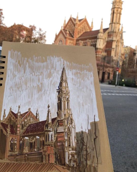
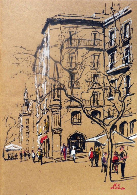
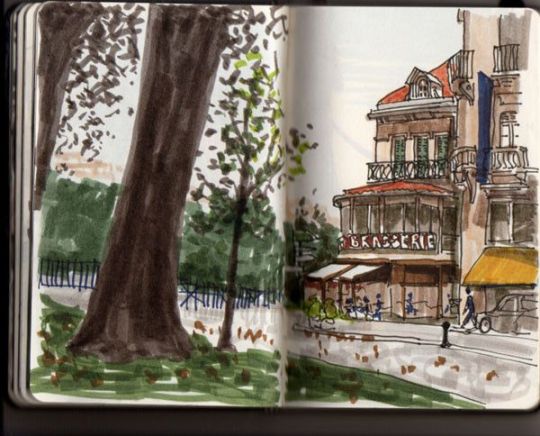
Juan Linares
Juan Linares is a Spanish illustrator and painter, who specializes in drawing mainly different environments (Urban sketching), from streets to buildings with a different style of architecture. He mainly understands the perspective and depth of the environment. Uses various types of materials, such as acrylic markers, even alcohol-based pens. But his preferred tool, of course, is watercolor, which he always uses, when walking in the streets of his city Barcelona, where he paints narrow streets, with the small bistros, from the famous La Sagrada Familia church made by Gaudi.
Linares says, that he’s been drawing professionally since 1984. Starting his architecture studies. He drew in sketchbooks, notebooks, and in blackboards. He has a preference in drawing food and buildings.
What I like about Linares's drawings, is the way he can put light and shadows, besides the buildings being magnificently well done, very carefully and calmly (he explains that if you are drawing in some environment it is good to be calm, and patience without feeling the need to finish quickly).
He has traveled to some places in the world, including Brazil itself, where he sketched the museum of Niterói, designed by the architect Oscar Niemeyer, besides the Christ the Redeemer in Rio de Janeiro.
Juan Linares is a great artist, and I really admire the passion he puts in each of his drawings. And I wish to see more of his works, of famous architectures of the world.
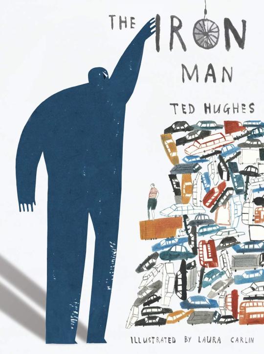
Laura Carlin
Laura Carlin was born is Glastonbury, England. She studied at Buckinghamshire university, followed by The Royal College of Art.
Laura has illustrated many children’s books for Walker Books Ltd, including The Iron Man by Ted Hughes which won many awards, specially praising for Laura’s illustrations.
She has also drawn for a whole host of publications including The New Yorker, The Guardian and Vogue, among many others.
Laura’s works frequently touches on emotionally complex subjects and adult themes of loss , social injustice and environmental change.
As an illustrator Carlin has worked with several contemporary children’s authors including Nicholas Davies for her book The Promise about a young thief whose life has changed after stealing a bag of acorns and Michael Morpurgo’s book The Kites are Flying ! , a story centered on the conflict between Israel and Palestine.
One of the reasons why, I like so much her work, it’s because she has the ability to convey a plethora of emotions through the smallest details on the pages, combining with childlike drawing style and with a sentimental narrative, it’s very brave of her, to do books for children, with such difficult themes to explore.
Research: Show and Tell Project
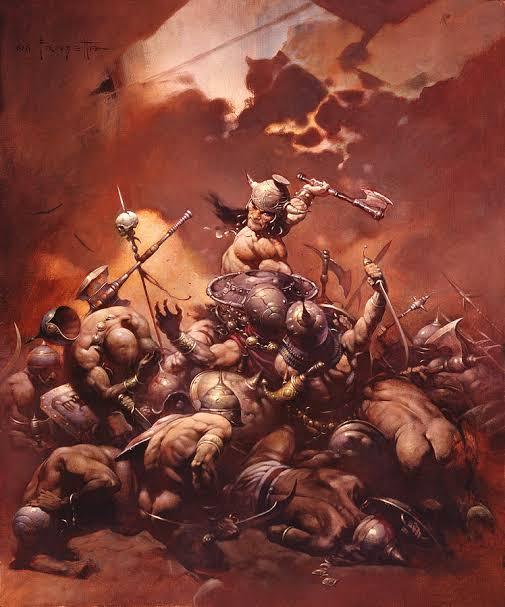
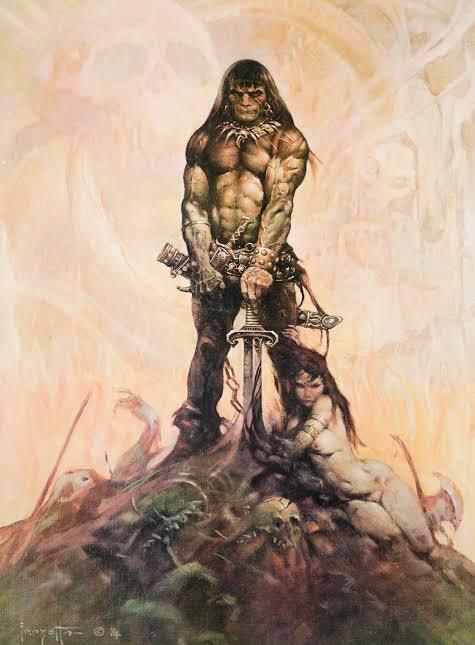
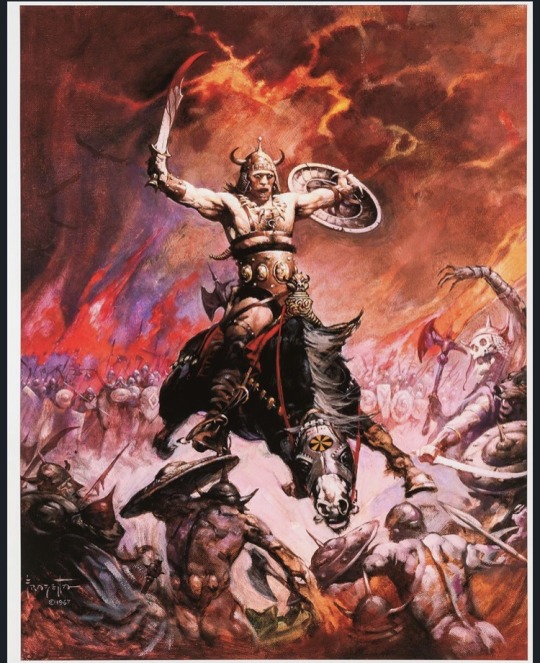
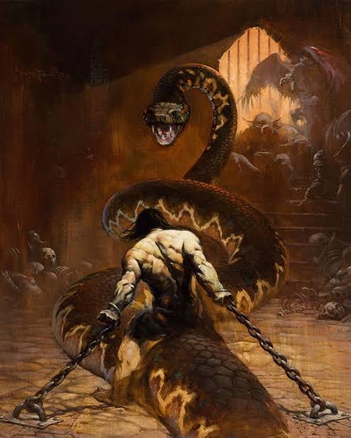
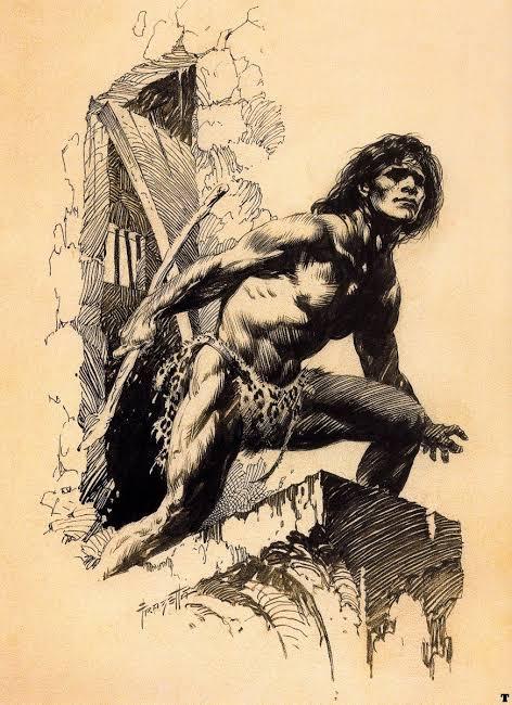
Frank Frazetta
Frank Frazetta was an American illustrator and painter, who became extremely well known for having defined the look, of the character Conan the Barbaro, created by Robert. E.Howard in the 1930s.
Frank was born in Brooklyn, New York, and from an early age he showed his skills as an artist. As a child, at the age of 8, he studied at a small art school called Brooklyn Academy of Fine Arts.
His illustrations are inspired by the great painters of the late 18th and 19th centuries, who portrayed mythological legends.
For me it’s not just the wonderful color palette he used, the wild and original streak or the phenomenal technique he developed. Of course, these things are fundamental, but in my understanding, the most important thing is that he defined practically everything we know in terms of visuals, mainly in the fields of fantasy, witchcraft, barbarism and even a little bit of science fiction.
His paintings defined some characters that we know today, like Tarzan and John carter, that he brought a new life to the characters of Burroughs, not to mention the images of Conan, who made the illustrator famous. Imagine that before him, the Sword and Sorcery look did not exist. The Conan that appeared on the covers of books since the 30s of the last century gets to laugh today. Frazetta was the first to understand the world created by Robert E. Howard.
The reason I chose frazetta as a reference is because I like fantastical worlds so much, and I love to learn anatomy, and frazzetta understood a lot of that, with his extremely vibrant colors, and extremely strong characters, who faced terrible monsters, who disturbed the peace.
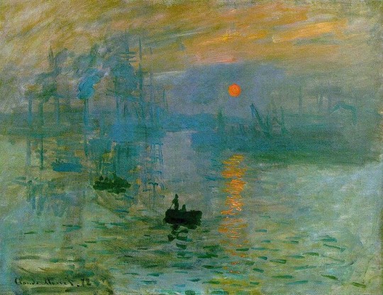
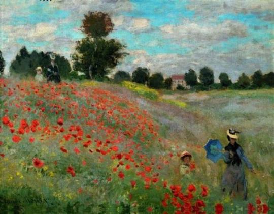
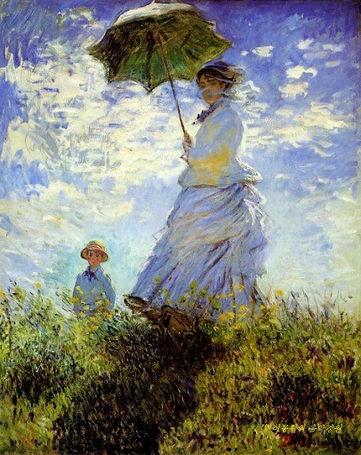
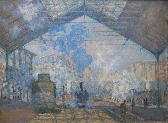
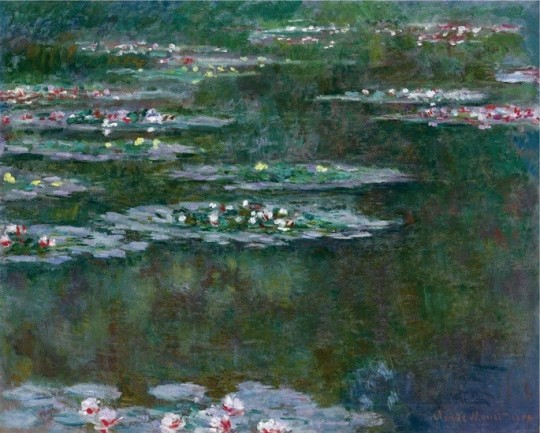
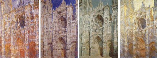
Claude Monet
Claude Monet is the main and most dedicated representative of the impressionist movement. He always preferred paintings outdoors, regardless of weather conditions,in order to capture all the effects of nature. Early in his career he was misunderstood, especially by his family, resulting in financial difficulties for years. Only around the age of 40 did he start selling his paintings, he died as a rich and well known artist.
He started to paint from a very young age which earned him some money, selling caricatures, with the money he bought painting materials. In 1858 he met Eugene Boudin, a landscape painter who encouraged him to paint outdoors. The following year he moved to Paris to specialize his techniques. At that time Paris attracted the most varied artists in the world and there Monet met Camille Pissarro and Manet among other avant-garde artists.
In 1874, the first impressionists exhibition was held in Paris, featuring works by Monet, Renoir, Degas and Cezanne. The term Impressionism, derives from Monet’s painting called Impression, Sunrise (1872).
It was the art critic Louis Leroy to call the artistic movement: Impressionism. It was a way of understanding this type of painting that did not follow the standards established by the academy and its realistic paintings.
When looking closely at an impressionist work, you see only separate brushstrokes that look like blotches without contour. Seen from afar, the brushstrokes organize for our eyes creating shapes and luminosity.
His works of art followed, as a main theme, the landscape of nature.
He worked harmoniously with colors and lights, creating beautiful and strong images. In the artistic context, is good to mention the series of paintings that he made on the Cathedral of Rouen (1892-1894), where the artist portrayed the constructions at different times of the day, with variations in brightness.
Monet and the impressionist artists, were no longer interested in themes related to the nobility, to the church, or to producing portraits that were true to reality. They wanted to see the painting as work in itself.
Ridley Scott
Ridley Scott is one of the most well-known film directors of all time. He made several films of different genres, but his most well-known genre is science fiction, making films like Alien, Blade Runner, The Martian and Prometheus.
But before before of being a director, Scott was applying to the Royal College of Art, one the most acclaimed art colleges at the time, to be a designer.
Scott always liked drawing , but he saw that he had no way of being a painter. His teachers always argued that his paintings were more illustrations than paintings.
So he saw that the Royal College of Art, had a particularly strong Graphic Design Department, which would give him a more specific creative target and a broader canvas. He was accepted by the college, and started his studies in 1958 and finished in 1961.
In his words, he considered design college to be extremely competitive, everyone in his class tried to compete with each other to see who was better. And Scott realized that he needed to fight hard to be among the best. “It could be very competitive, with no much being given away and everything kept close to you chest. You observed all the time, watched everyone else did and tried to do better and be the most original”.
Since graduating, Scott has said that he has become extremely perfectionist, and has tried to do as much of his work as a designer and a filmmaker in the best possible way.
After working as a set designer, and director in British television, he began in 1967 to direct commercials, eventually numbering more than 2,000 for his own company. His attention to visual stylization in his commercials, including distinctive atmospheric lighting effects, continued into the feature films that he began to directing in 1977.
In 1979 Ridley Scott releases what is considered his debut film and his masterpiece, the movie Alien. Starring Sigourney Weaver as Ellen Ripley, Scott is credited with having a heroine take point in the ensuing hunt aboard the Nostromo spaceship. Scott’s paintings and illustrations are close to pointillism with tiny points that result in images of high definition and extreme detail.
A highly detailed approach marks his style. His eye for composition, lighting, and design seems to explain his ability to visualize a movie in his mind. He claims to have and eidetic memory and the ability to recall images with high precision.
https://www.youtube.com/watch?v=tjD82nKybUA


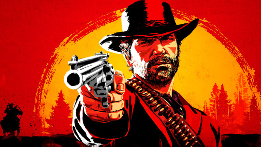
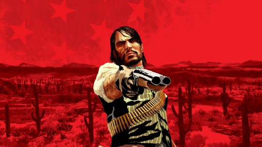
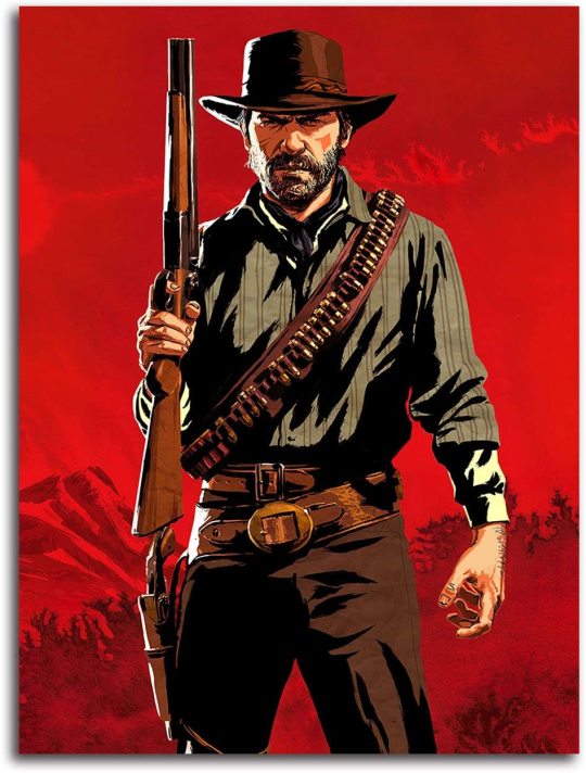
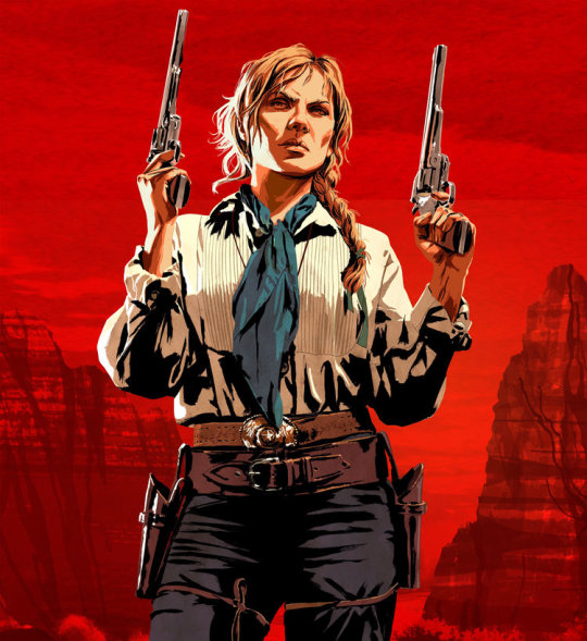
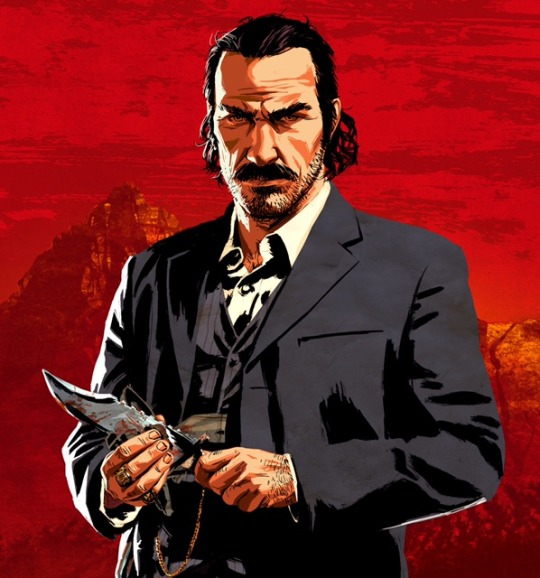
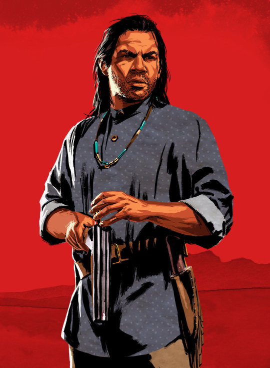
Roxie Vizcarra
Roxie Vizcarra is an artist, who worked as the senior illustrator of Rockstar Games, who worked closely on the iconic Grand Theft Auto v and Red Dead Redemption 2 marketing campaigns.
The Peruvian-American artist was just out of college- she earned her bachelor’s degree from the Parsons School of Design in New York- when she was approached by Rockstar games in 2009.
Vizcarra was Rockstar game’s first female illustrator. The first project she worked on was Grand Theft Auto IV: Liberty City.
The first game Vizcarra worked on since its inception was the original Red Dead Redemption, released in 2010.
Vizcarra draws her art from spaghetti western movies and holds the work of “Golden age” illustrators such as Bob Peak and Robert McGinnis in high regard.
For most of her career, Vizcarra’s process began by drawing in sketchbooks (she’s a fan of traditional ink), which she then uploads and adds digital colors through Photoshop.
However, for a year or two she has been using Procreate on the IPad, which is very flexible for her purposes. She also takes references photos when she doesn’t have a clear idea of what the illustration should look like, either of others or of herself, in the desired pose.
Vizcarra shows unusual humility; she insists on not taking credit for herself and repeatedly refuses to attribute specific drawings to one person or another, or to go into the why’s and how’s of illustrations.
Vizcarra’s work is really interesting, and it explores the more of the side of markenting. In making covers and posters extremely flashy for the public, and in addition to using references to posters from old western movies, maybe that is what attracts me the most. I really like the western theme, and I always liked the way she created the poster for games like red dead redmeption 2 and GTA, with extremely warm colors, with references of very old artists, who perhaps few remember, but she always tries to put some of them into her work.
Show and Tell Digital Collage research
Terry Gilliam
Is a famous American-British director, screenwriter, animator, artist and comedian, and who is known for directing and acting in some of the films of the English comedy group Monthy Python, in addition to making films that are extremely difficult to understand, as if madness were the main character in all his films.
Terry Gilliam began his career as an animator and photographic cartoonist; one his first jobs was for the Help ! Magazine.
Gilliam preferred cut-out animation, which involved pushing bits of paper in front of camera instead of photographing pre-drawn cels. The process allows for more spontaneity than traditional animation along with being comparatively cheaper and easier to do. He also preferred to use old photographs and illustrations to create sketches that were surreal and hilarious.
Gilliam was one of the founders of Monty Python. At first, he was accredited as an animator ( his name appeared separate from the remaining 5 members in the credits), later he also joined the series as an actor. Their animations linked the sketches of the program and defined the group’s look in other types of media ( such as Vinyl discs, book covers and the opening sequence in the films).
Gilliam polished a unique style, created fantastic worlds, worked with great stars for the biggest studios, and sweated tight budgets to execute his vision, not always sharp but always brilliant.
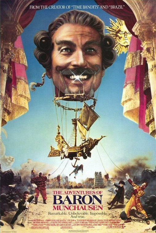
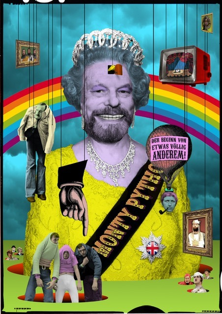
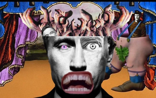
Caco Neves
Caco Neves uses digital collage as a platform, he created, for the past 10 years, illustrations for zines, magazines, advertising pieces, vignettes for TV and the web and, more recently, he was summoned by the Vogue art team to create the cover for the Vogue Experience 2017.
After spending a season in London, where he learned to give movement to his creations with the techniques calls Motion Collage, Caco returned to Brazil and, in a moment of creative rest, when he was creating for himself and not for a client, worked on a psychedelic vignette, then he sent it to MTV, to see if they liked the style, and they asked to use this commercial but to make some adjustments.
For Caco, the success of digital collage in the last decade is a reflection of the time we live in. “ The internet brought access to images- digital collections became public- and photoshop became popular.”
He has worked for several national and international companies, and his work is very dear to his collaborators, very much for his creativity, and for the choice of technique.
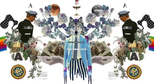
0 notes