
Don't wanna be here? Send us removal request.
Statistics
We looked inside some of the posts by rorymedia-blog and here's what we found interesting.
Average Info
Notes Per Post
0
Likes Per Post
0
Reblog Per Post
0
Reply Per Post
0
Time Between Posts
3 days
Number of Posts By Type
Video
7
Link
2
Text
8
Last Seen Tumblr Blogs


Fun Fact
Mobile Tumblr US users spend an average of 4.04 minutes per session on the app.
Text
The Magazine Advertisement

Reviewing and Refining Upon Final Layout:
When reaching the final layout I experimented around with different colours and decided this the above version is the one I preferred most. Below is a couple different versions which I tried however I do not think they are as effective.


For a bigger version of the final magazine:
https://drive.google.com/open?id=1dqlJvFeAvwVZqy6lRUml571pqv2HisxR
0 notes
Text
The Digipak Design
The Outside

The Inside

The Individual Parts of the Digipak:
https://drive.google.com/open?id=1zKi_8MFwXT69gb5O12k3Cb_Oedf31XbA
0 notes
Text
Creating the Front Cover for my Digipak

To start with I took a picture of the girl from the music video, Charlotte. I then put this onto Abode Photoshop and used the pen tool to get rid of the background.

I added a gradient to the new white layer to make it have a dark grey tint which gets lighter towards the middle, like a vignette. I then rotated the photo slightly because I wasn't happy with the original angle and wanted her head to be parallel to the page, not tilted.

Next I started to use smoke brushes to give the hair the effect I wanted to capture. Rotating the canvas using ‘Ctrl+r’ and resizing the brush gave me flexibility and allowed me to create strokes at different angles.

I did not like the inclusion of her lips in the piece so I chose to remove them by going back and changing the size and angles of my brush strokes. I felt the face looked more curious and mystical without them.

I used the ‘liquify’ filter effect to stretch out the image so that I could have the brush strokes go further and not be limited by the harsh line of the bottom of the photo. I froze the area which I did not want to stretch; the face.

I then did the same as I did before using the various smoke brushes to create unique strokes. I experimented around with lots of different ones until I found what I thought looked best. This stage included lots of going back and re-tweaking.

I added a gradient map and changed the colours to blue and white to give the piece that water-like feel.

I changed the background so that it was purely white as I felt it looked better like this.
The Final Front Cover:

0 notes
Video
tumblr
These are a few of my better double exposure drafts so far. I wanted to get some practice in before making my final digipak front cover design. Creating these has provided me with some good experience but I will need to do some further drafts if I wish to create a more advanced product like some of the examples I looked at for inspiration. Due to the complexity of some of them I will need to do additional research as to get a better idea, while also using my intuition and experimenting for myself on Photoshop.
The link below I used as a rough guideline to help give me a basic idea of how to create double exposure photography using Adobe Photoshop CS6:
https://blog.spoongraphics.co.uk/tutorials/how-to-create-a-double-exposure-effect-in-photoshop
These are some of the other photos I composed:


0 notes
Text
Digipak Cover Inspiration


I decided to do some research into double exposure as I think it looks amazing if done correct to a decent standard. After a quick bit of looking, I picked out these ones as some of my favourite from a simple google search. I think the integration of two or more elements infused and entwined together in one piece is incredible, especially where the light from the original image comes through just enough to complete the piece like in the fourth example of the man looking down:

0 notes
Text
The Final Product
youtube
This is the final form of the music video. After my audience feedback, I chose to make a few different changes from the original draft. Most noticeably, I have now colour graded all of the footage so that shots are much more vividly and lively. I will make a post about my colour grading process and problems I encountered during it in a later post.
0 notes


Video
youtube
Here is some specific feedback I got for the first draft of my music video. Overall I am happy with the comments that were made because it was encouraging to hear that there was a lot that they enjoyed about the video. I will take everything into account and start re-editing. The main improvement that I think needs doing is colour correction on all the footage to improve cinematography, enabling the video to look more like a professional product.
0 notes
Video
youtube
This was some general audience feedback I got for the 1st draft of my music video. To start with I just wanted to gage the original reaction to the music video. Unfortunately I do not have the second half of the footage since my phone ran out of storage space and the video got deleted.
The two main points that were mentioned in terms of constructive criticism:
The fact the video goes from being at the beach to in the mountains skiing was a bit random. Although yes it is quite random, the video is a concept music video and therefore has no story line to it. This means there are no continuity constrictions and rules of disjuncture are different to those of a short film for example. I personally like the fact that it transitions to the mountains because it matches the drop of the song. I mean this in the sense that the drop of the song tastes the listener to a new place, a great place, one where they can be lost in the music and return back to normality once the drop has finished. It creates a sense of freedom and loss of control which I feel I have mimicked in the way I transition from the beach, to the mountains and back again.
The camera was a little too shaky in the shot in the first coloured walls scene (1:23) and could be a little smoother. I agree with this point as well as, it is a shaky shot however this was done on purpose in attempt to emphasise the beat of the music.
They also stated that they really liked the transition between the two sea shots at 2:14 and the final ‘Rbw Productions’ effect at the end, in the second half of the feedback recording.
I will get some specific feedback to the first draft of the music video then collate the responses and make appropriate changes.
0 notes
Text
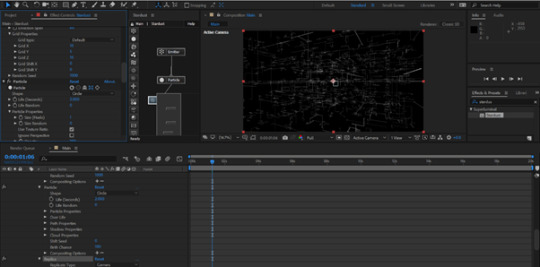
Creating my Production Company Logo
youtube
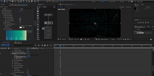
Screenshots taken during the process:
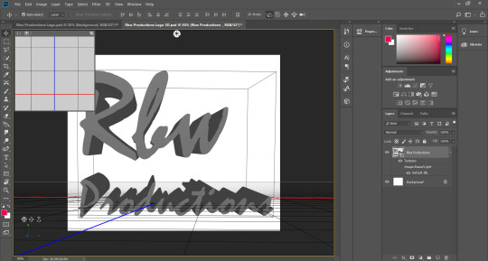
I started off creating the writing on Photoshop. I originally was going to make a 3D logo however I like not like the look of it and instead decided to go for a 2D one.

I then went into After Effects and started to create my animation.


For a closer look at any of the screenshots:
https://drive.google.com/open?id=1AZyU63p0POFnB-1DOARH8iqMERow6G1c
0 notes
Video
youtube
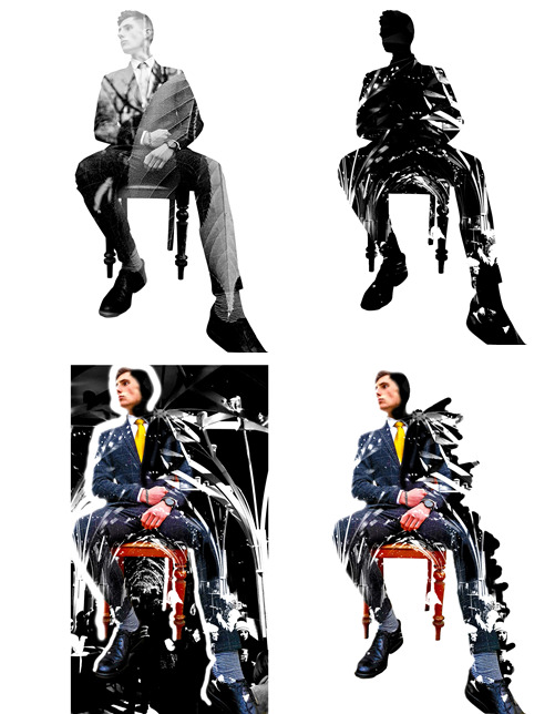
This is a short video to show the process I undertook to create the Disintegration Animation I used in my music video.
0 notes
Text
Creating A Earth HUD
youtube
Screenshots taken during the process:

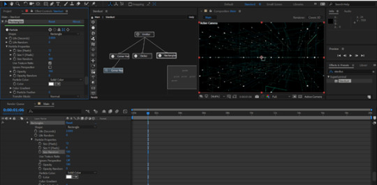


For a close look at any of the screenshots:
0 notes