
Statistics
We looked inside some of the posts by rose601project1 and here's what we found interesting.
Average Info
Notes Per Post
0
Likes Per Post
0
Reblog Per Post
0
Reply Per Post
0
Time Between Posts
3 hours
Number of Posts By Type
Photo
17
Last Seen Tumblr Blogs


Fun Fact
Tumblr’s reach among the 26-to-35-year-olds in the US is 11%.


Photo
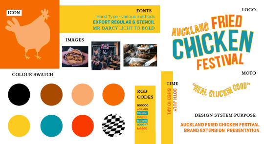
Type exploration: font examples from Adobe that work well in a grouping
0 notes
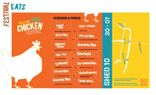
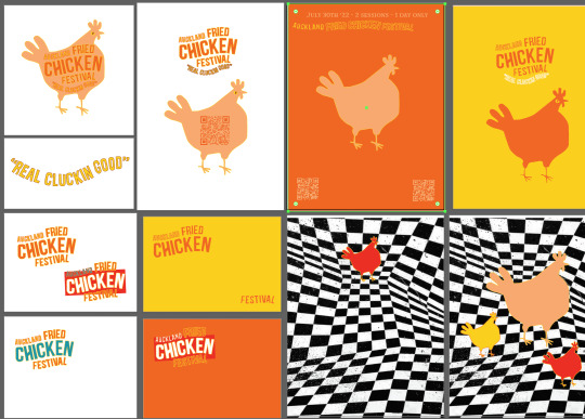
Photo
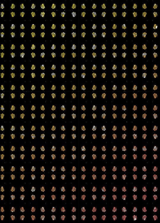
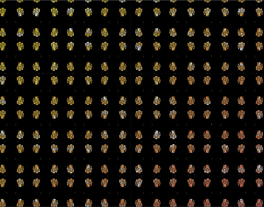
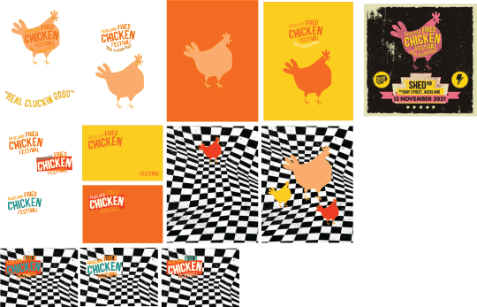
i created this background by shrinking and repeating the FCF logo, then tessilating it in a rectangular grid. The colour gradient makes it dimensional and on brand i believe.
0 notes
Photo


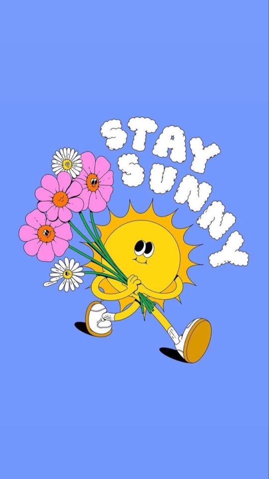

more inspiring cartoon illustration imagery from pinterest
0 notes
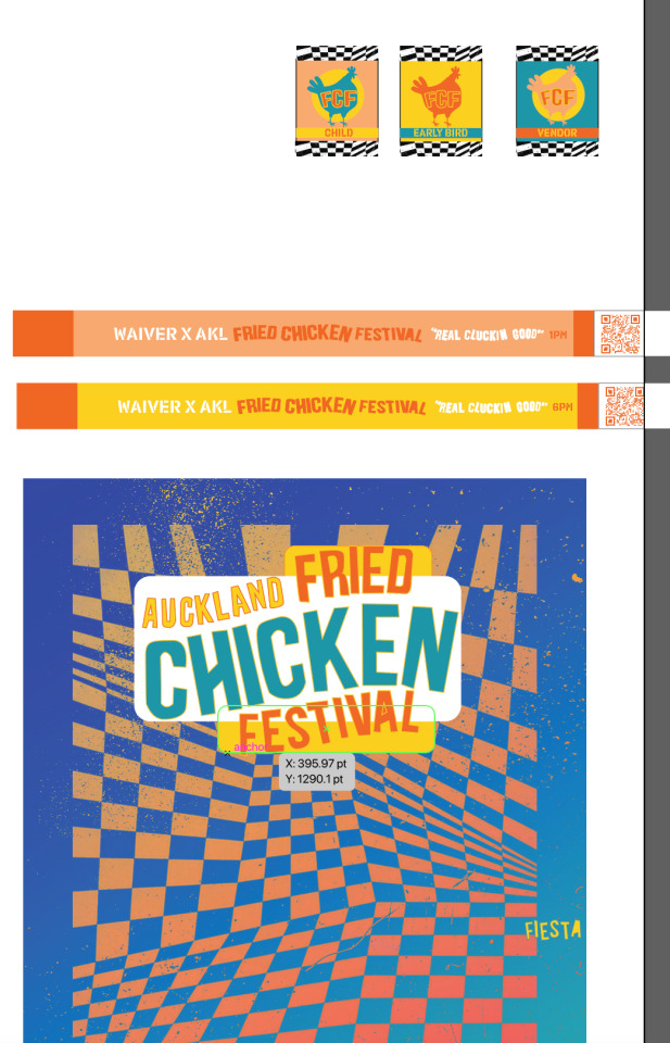
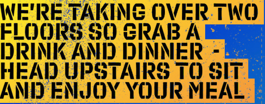
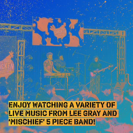
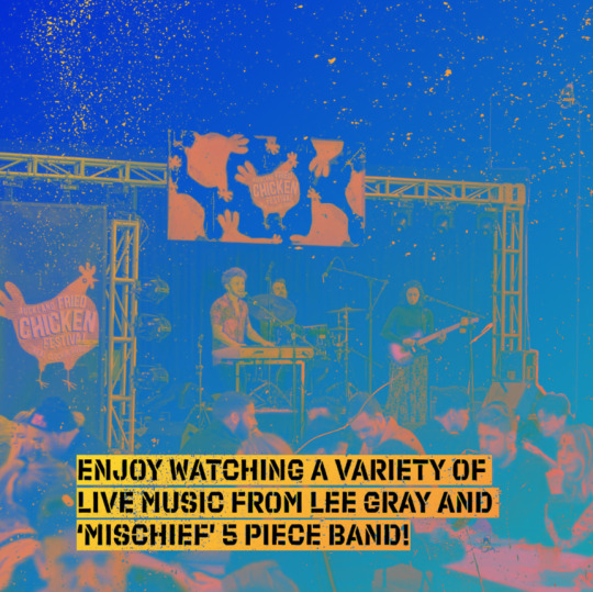
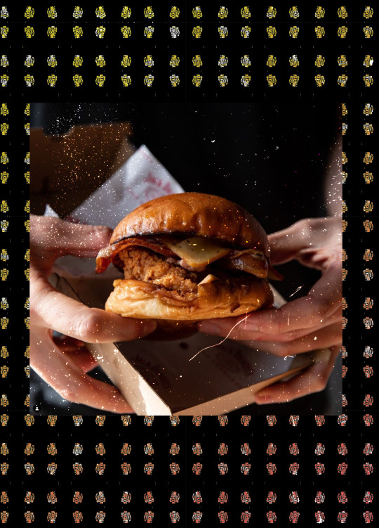
Photo
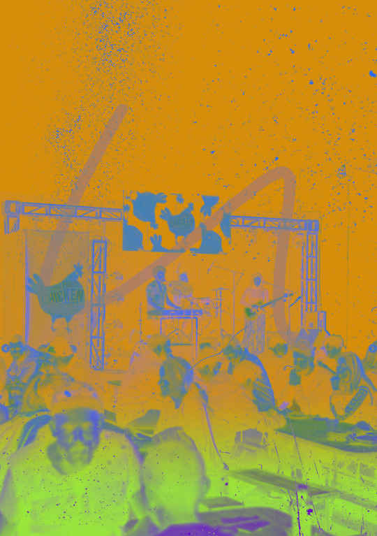
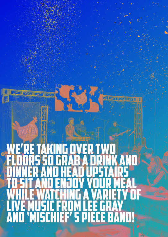
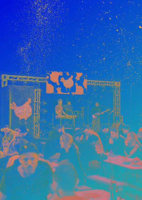
overlay iterations and developments
- quote extracted from website advertising - featuring band imagery from FCF instagram
0 notes
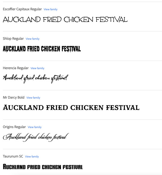
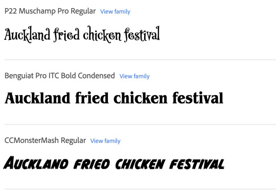
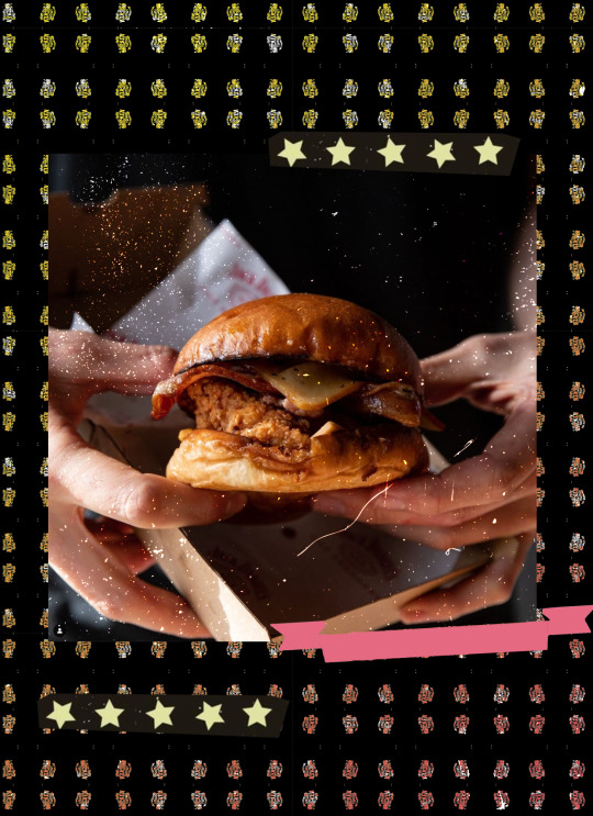
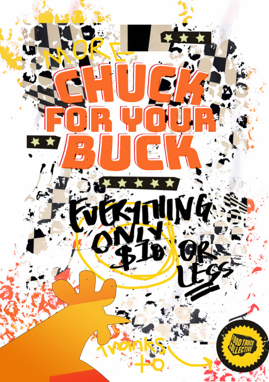
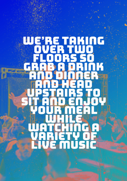
Photo
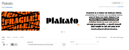
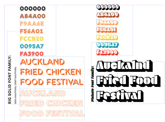
text imagery that captured my attention - the artwork in context pulled me in thinking about FCF immedietly... when I trialed it though it felt very heavy and only good for headers and titles as artwork... I also trialed Rig Solid fonts and the weights were more adaptable with a wider body of work
0 notes
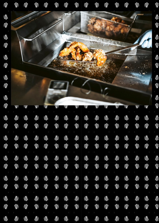
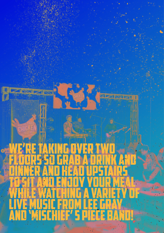
Photo


I created some pop contrast tones by inverting an existing warped image from another test. I like these - they effectively capture your attention i feel
0 notes
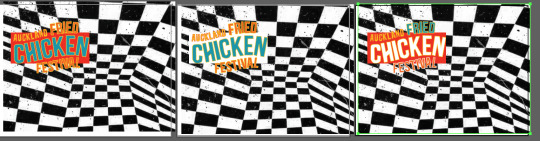
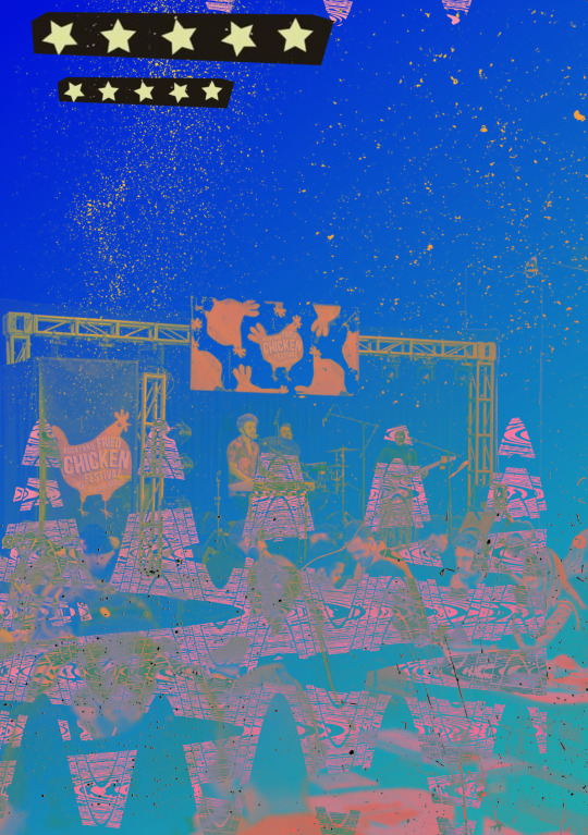
Photo
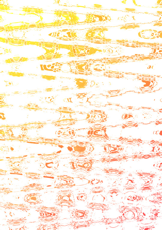
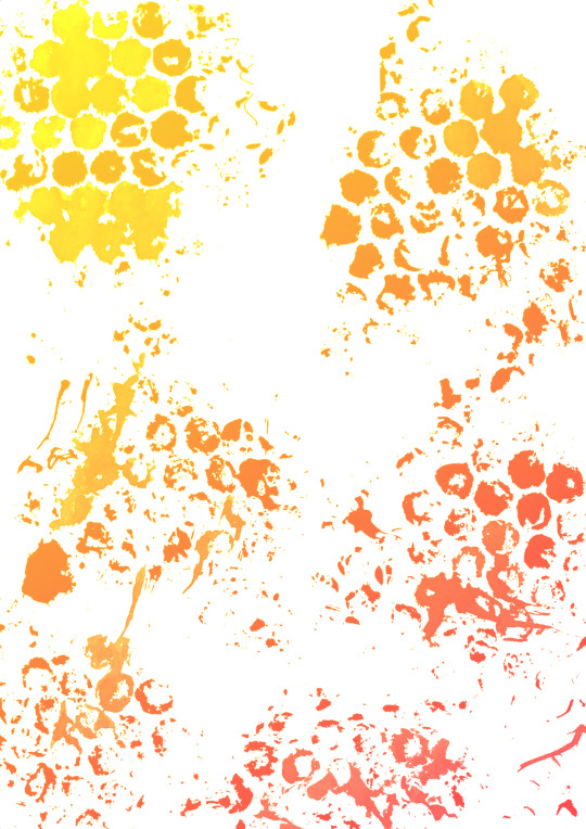
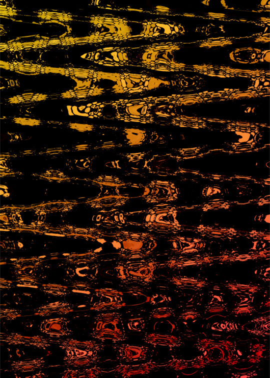
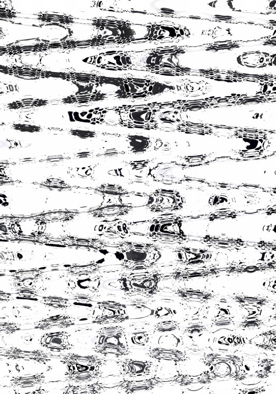

i creAated my own textured background by using a bubble wrap brush on adobe from first year m&m... you can see that clearly in the second image. I then played around with the warp tool to explore what this technique could do for me... Using the orange/yellow/red colour pallette I generated some interesting textures to play with for this project
0 notes