
Statistics
We looked inside some of the posts by rosiemellor and here's what we found interesting.
Average Info
Notes Per Post
0
Likes Per Post
0
Reblog Per Post
0
Reply Per Post
0
Time Between Posts
8 minutes
Number of Posts By Type
Text
17
Last Seen Tumblr Blogs


Fun Fact
In 2020, 27% of US Tumblr users had an annual household income of over $100,000.


Text

Logo designs
I used the pen tool in illustrator to trace the names of these venues from the flyer archive. I wanted use these in my zines as each page is going to be about a diffferent venue.
0 notes
Text

Map design
I initially really struggled to develop my map idea and get it to work cohesively with my imagery and colorscheme because my idea was to have it bright, bold and psychedllic. I stripped this idea back and thought using the grey colourscheme of the buildings could work. I wanted to somehow pinpoint where the locations were and thought using my ink experiments could work. I like how this idea turned out and that it gives reference to the venue spreads in which I will include the addresses.
I was going to use different icons and have label each place specificallly but I think that would overcomplicate the design so I chose not to.
0 notes
Text


Building on the design of spreads
I started apply the images I took into spreads. I think the effect of erasing the windows works really well and makes the images more interesting.
I’ve also decided to stick to one colourscheme, as this will help me focus on the composition and the contrast between the black and white imagery and the bright yellow colour adds to it aswell.
I want to now look back at flyers from each venue and use any interesting type, logos or images i can add to give a sense of character and uniqueness to each spread.
0 notes

Text


venues
I wanted to explore some of the venues and locations around Bournemouth. I originally wanted to explore more but I was struggling to pinpoint the exact locations - as buildings have changed over the years since. I used Adobe Lightroom to turn the photos black and white and edited the photos to have more contrast. I thought this could be an interesting baseline for spreads. I thought erasing the windows on photoshop I thought I could addmy own experiments or imagery to it.
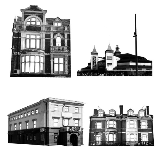
0 notes
Text


Through my research I liked the idea of designing a map that I could use in my zine pinpointing exactly where these events were - so people could visualize them. I use this specific map as it was quite a simple design and could easily be edited. I initially drew a rough sketch and scanned it in - but preferred the outtcome of painting digitally.
0 notes
Text


exp
I wanted to mention PLUR movement within my work as it was important when understanding how and why the underground scene grew within the country and to understand why communities within Bournemouth would be drawn to this. I’m not sure these layouts really work for me or would work together cohesively with my other spreads.
I think establishing a colourcheme and simple layout structure would help
0 notes


Text
Layout experiments


I started to experiment with how I could combine my ink and scan experiments into my zine spreads. I used the contrasting colour of yellow as it relates to the smiley face symbol of the underground scene.
I really like how the large spread turned out, i think the scan experiments makes the spread a lot more visually interesting as it adds to the composition
0 notes