
Statistics
We looked inside some of the posts by rossnelsonn and here's what we found interesting.
Average Info
Notes Per Post
7
Likes Per Post
7
Reblog Per Post
0
Reply Per Post
0
Time Between Posts
2 days
Number of Posts By Type
Text
3
Photo
9
Link
1
Video
4
Last Seen Tumblr Blogs


Fun Fact
70% of Tumblr users say the Dashboard is their favorite place to spend time online.
Text
IXD503 and IXD504 Submission
It is hard to believe this is my final University submission. I want to thank my lecturers for an amazing four years. I have learned so much and I have made some amazing friends. The course has also helped me get an amazing job at Rapid7. THANK YOU!
Edible - IXD503
V2 High Fidelity Prototype
Wireframe Prototype
Prototype Screen Recording
New Screens and Sketches
Launch Strategy
Promotional website
Major Project Posts
So Whats New this Semester?
Edible Login
Searching for an Item of Food
What must the Menu include in Edible
Support for Edibles Users
Location Settings
Some Tips!
Inspiration - Dark Theme Apps
Edible Dark Theme
New Food Bank Feature
Research
The Last Semester
Designing Final Pages
Notifications
Starting to Research Usability Testing
Usability Testing Research
User Testing?
User Testing vs Usability Testing
Steve Krug - Don’t Make me Think, Revisited
The System Usability Scale
What do I need to ask?
Research - Promotional Websites
Edible Promotional Website
Three Steps to a Successful Mobile App Launch
Corona Virus and Food Banks
Questions for Usability Testing
Should Dark be an Option for my Users
Why Include Dark Theme
Dark Theme Design Standards
Edible - IXD504
Edible - Colophon Report
3 notes
·
View notes
Photo

Additional Food Bank Feature
I just remembered that I never posted an update that I made to the food bank locator. After conversations with my lecturers and Mark from Fathom, I decided that I would add a list of food that the food banks were running low in stock of. Having this will be useful for the food banks because people who want to donate don’t often know what foods they require the most.
1 note
·
View note
Photo

Edible - Dark Theme
Creating the look and feel of a product is one of a designer’s primary responsibilities. I decided after a lot of research into the benefits of giving the user the option to change their theme to a darker UI, that I would pursue this and give Edible a dark makeover! After experimenting with various shades of greys and blacks, I finally chose a colour palette and it was time to start recreating the look and feel to my product. I stuck to using one accent colour to give a minimalist feel to the app. I have created all of the main flows in dark theme along side what I had before in light theme. I left some screens out such as some of the notification toggle switch states. This is because I was having problems with Invision due to the amount of screens I have in the prototype. Dark mode can be activated through theme settings on the app. Creating this meant that I had to go through and reconnect every dark version of the screens that I had done previously for the original light theme. It was all put together in the same Invision Prototype.
1 note
·
View note
Link
Inspiration: Apps using Dark Theme
Before finally committing to designing Edible in dark theme I had a quick look at whats out there. Dark mode is one of the most in-demand features of 2020. By inverting colours on your screen, you are decreasing eye stain, improving the readability of content and saving battery power. As we know practically everything can be viewed in dark mode these days.
WhatsApp WhatsApp has long been top of the list and after many requests from users, the company omened by facebook has finally brought the feature to its messaging service. For iOS users, WhatsApp direct messaging is mostly black and grey, on the other hand android users see something closer to blue and grey.

Instagram
This is an example where dark mode can only do so much. When a large part of your feed is photos, the app still lights up in a room no matter what colour the background is. However, the dark background of instagram makes it less harsh on the eye.

Microsoft Outlook Microsoft finally joined the dark mode train in August 2019. This makes emails stand out against a true black background and the accent colours are muted without getting lost in the dark interface. The company plans to extend this dark mode to Word, Excel, Powerpoint and the rest of the Microsoft Suite in the not too distant future.

Others Twitter, Youtube, Wikipedia, Slack, Reddit are among many of our favourite tools using dark mode. More and more apps are rumoured to be getting dark mode soon but this is just a some of the big names already using it.
0 notes
Photo

Some Tips!
In the menu, I have also added some information in the form of a carousel with visuals of the app. This is for users that would like a quick overview of what all can be done on the app. It explains about how to find food in your area and how to start up a conversation with a user who is listing food. It also tells them how they can list an item of food or locate a food bank if that is their preferred option.
0 notes
Video
tumblr
Location Settings
Edible is an app which requires your location to function properly. It is needed to find food that other are listing within a radius to the user. If the user wishes to search for food that is not in their area, they can type in alternative locations to see availability.
0 notes
Video
tumblr
Support for Edible’s Users
This page is vital in my app so that users can deal with common concerns and questions. It is the go-to destination for finding answers for specific questions relating to Edible, for example, how can I list an item of food? FAQs are simple and quick and I was careful of the content I added. When deciding what to include in the FAQ, I imagined what concerns the users might have and focused on answering these.
Organisation is key so it was also important to organise the questions and answers into a certain format. People scan pages so that questions are sized to enhance the usability of the page. I also didn’t want to over do it, so the questions are relevant to avoid overwhelming the user. If they are unable to find a satisfactory solution to a question I have added a button that will enable them to contact support. From here, they can added a description of their problem or a screen shot.
0 notes
Photo

What must the Menu include in Edible?
Users rely on menus to find content and use features. Too often, menus can be a problem. Parts of menus can be confusing, difficult to manipulate or simply hard to find. So as shown above, I have used a simple burger menu. For me, it is a pretty obvious solution to hiding navigation on the small screen. As you can see from the screen shot, I have used icons that are instantly recognisable to users and I have stuck to terminology that is regularly used for these features.
Since Edible is an application that allows users to interact through messages and allows users to search for items of food in their locality, they must be given the freedom to change or disable some of these features. Edible will notify users in many different cases, such as another users is requesting an item of food or if an item has been posted near you. A lot of users will not want these notifications every time one of these situations happens. For some this could be seen as an annoyance. It is important for designers to give their user freedom to disable all or a specific type of notification that they don’t wish to receive.
Edible will show listings in your area so I wanted to include a settings that allows users to update their location to change what listings are being posted in that certain area.
If the users have any problems, be it with using the app or a situation in which they are meeting up to exchange food, they will need a place where they can report their problem. So I have added an FAQ and a help forum.
0 notes
Video
tumblr
Searching for an Item of Food
I feel the search is one of the components that is most commonly skipped or not properly thought out, when a lot of designers are working on their products. However, in reality if you handed your designs over to an engineer to build what you have designed and you have just left a static search bar, they will ask a lot of questions. How does the user cancel their search, what empty state will the page show if what you were searching for couldn’t be found are just a couple of examples. For my major project, it was my goal to leave nothing down to your imagination in the design of this app. I wanted to have a prototype that I could have built with minimal confusion about how it functioned.
Therefore, searching is a fundamental activity in my app because it is the main tool for finding a certain item of food that the user wants in the shortest time. I wanted to make it visible as well as recognisable by using an input field with an industry standard, magnifying glass icon followed by ghost text. It is prominently positioned at the top of the listings page. The search was a vital component that I wanted to flesh out.
0 notes
Video
tumblr
Edible Log in
Before the user decides if they want to create an account or use one they have created previously, I designed a screen that will give them that option. I already had completed the sign up process so just needed to design the login. I wanted to design it to be as intuitive as possible. These screens are the first steps a user takes when they first open the app. Typing on a small screen can sometimes be annoying and prone to errors. So I wanted to keep it simple with just 2 input fields which the user can enter either their email or phone number and a password. I added an image with an overlay to give the design a more inviting feel.
I have also added social media as an option for my users to login because sometimes this is a preferred option. Providing the user with these options should simplify their experience.
0 notes
Photo

So what’s new this semester?
With the majority of Edible being designed in the first semester, I still left myself design work to complete. Before this semester started, there was a lot of screen and components to be added. I wanted to be able to design a new login for Edible that would be more inviting for users whenever they first load up the app. I also wanted to explore how the search function would work in the app which is something that often gets left out of designs.
Before semester 2 started, I didn’t have a menu that functioned. There was only one thing that you could interact with and that was the User Profile. I planned to include settings for the user’s location, notifications and theme. I also wanted to add a place where my users could come if they needed help with a situation or a problem with a feature in the app.
From discussions with my lecturers and a critique session in Fathom, I spoke about adding in a way for food banks to communicate to people through my app about the shortages of certain food items they are running low on. In my next string of posts, I will be walking you through some of the changes and features that I have added into my prototype this semester.
I planned to get usability testing done but after a quick conversation with my lecturer, he told not to worry about this because of the current situation with the Corona Virus. However, I also know Paul said not to worry about the dark theme when I suggested it because it was a lot of extra work. However, I wanted to challenge myself and see if I could complete it.
0 notes
Text
Dark Theme Design Standards
I have decided that I am going to design a dark mode option that Edible users will be able to apply through their theme settings. There is lots of advice on how to approach this and here are some points that I need to consider.
Avoid pure black. Dark theme does not need to pure white on pure black. Material design recommends #121212, which is a dark grey, as the background colour. The most obvious reason for using this dark grey colour is because it reduces eye strain and it is also easier to see shadows on grey. These are lost on pure black backgrounds.
Avoid saturated colours on dark themes. Saturated colours can look great on light backgrounds, but they can be harder to read on dark backgrounds. It is advised to used colours in the 200 - 250 range which are the lighter tones because they are more readable.

Meet colour contrast standards. Just make sure that your content remains legible against a dark background, by using backgrounds that are dark enough.
Use appropriate light colour for text. Pure white is #ffffff but this is too white, so it is recommended to use a slightly darker white. Remember it is important to strike a strong contrast.
Consider the emotional aspect of your design. Dark and light themes evoke different emotions and they do not communicate in the same way. This is due to the fact that colours are actually perceived differently depending on their background. So it is important to remember that “a dark mode does not (always) have to be derived from an existing light theme”. Don’t try to fix it just take advantage of it.
Communicate Depth Just like in light theme, it is necessary to create hierarchy and emphasis important elements in the layout in dark theme. Drop shadows are frequently used in light theme to create visual hierarchy. These have to be avoided in dark mode, as they are not visible. To distinguish between the different levels of content, it is preferable to use different shades of grey. It is also recommended not to use light or coloured shadows as they are unnatural to the eye and don’t bring anything to the layout, like regular shadows do.

Allow users to switch from regular to dark mode. "It’s tempting to let the system decide when to on or off dark theme. However, this design decision can lead to bad UX. By doing that you’re taking control from the user and make the system decide for them.” So it’s better to use auto enabling in a dark theme. User should manually do this if they wish to use dark mode.
Test your design in both light and dark mode. Have a look at your design and see how your UI looks in both modes. Adjust if necessary. Consider testing at night time with lower lighting.
https://uxplanet.org/8-tips-for-dark-theme-design-8dfc2f8f7ab6
0 notes
Photo
Why include Dark Theme?
Dark theme has a tech and design look to it, it looks new and it is marketed as a solution to problems that the user experiences, such as eye strain, persistent headaches and so on.
It is a personal preference - light text and other elements on a dark background. Some people find that it is a solution to eyestrain and headaches as science shows that the human eye is more used to light-on-dark which is known as positive polarity. Others view dark theme as a distraction because colours are emphasised. When we see something in positive polarity, our pupils constricts and in return we see sharper, more detailed images and text.
In dark-to-light mode, the pupils dilate and can cause blurriness, therefore making text harder to read. As a result, more strain is put on the human eye to focus and this leads to eye strain and headaches.
Dark theme works well when we want to scan a screen quickly looking for visual/coloured elements. Even before dark mode became “a thing” many UI’s were already dark. Take the Bloomberg trading screens what I wrote about in my dissertation. The content stands out well and important information can be easily found.
1 note
·
View note
Photo

Should Dark be an Option?
The topic of dark mode is an interesting one from many perspectives and one that I have been thinking of implementing into Edible. Before deciding to proceed with this I wanted to research further into the history of light and dark themes.
Computer screens were originally in what we called dark theme because the capacities of the cathode ray tubes back then. Back then ways were adopted to make computer interfaces resemble paper. As people started to use computers and word processing became the norm for every corporation, they had to work in a familiar looking environment and that environment was paper.

Human beings programmed to live during the day and sleep during the night. This is more or less how we live out lives, but certain professions do upset this scenerio and the pattern is sometimes reversed. Evolution has enabled us to see dark objects and against light backgrounds, for example birds flying in the sky. It is an inbuilt part our brains.
In 1988, Dannemilliar and Stephens did research which showed that a three month tends to be more attracted to dark on light pictures rather than dark on light ones. Black text on white ground is more readable.
Then dark backgrounds were added to Windows, iPhones followed in 2018 by Google and WhatsApp and the remainder year on year. Dark theme is basically light coloured text, icons and UI elements on a dark background. I will look into the benefit of light and dark in another post. But one of the key benefits is that it requires less energy to display on most common technologies.
0 notes
Text
Questions for Usability Testing
OVERVIEW
To conduct usability testing in-person with 5 participants
To get a good cross section of ages and genders to match my user personas
To be completed in a 30-40 minute time frame
To record the sessions via zoom call
To find any pain points
To provide evaluation of the usability testing
USER TASKS
The prototype assumes each participant is a first time user of the app.
How to make an account
Find out how quickly they are able to determine how to list an item of food
Find how easy it is for them to search for food near them
Can they find food banks in their locality?
How easy is it to change profile settings
Do they understand the icons?
Do they understand the content
How difficult is it to delist an item
How easy is it to edit an item
How to edit a profile
INTERVIEW SCRIPT
Thank you very much for agreeing to take part today. As you know, I have designed and built a mobile application that will bring neighbours and the community together to share any surplus food that they can give away, rather than disposing of it in the bin.This app will enable you to list any food that you wish to give away for free or you can browse to see if there is anything that you might be able to use and save it from being thrown out.
The primary focus of this meet up is to see if you can perform a few tasks within the application. I also want to see where improvements can be made and value your thoughts and opinions as to where the app performs well. This is a judge free zone There are no right or wrong answers and I want to create an app that is easy to use for everyone. Your feedback will be most helpful, so please feel free to say whatever you want. Let me know if something doesn’t make sense. The more you tell me, the more I can iterate to make a better user experience.
Prototype testing
So just imagine that you have just downloaded the Edible app from the app store and that you are a first time user with limited knowledge of what the app has to offer.
PROTOTYPE TASKS
1.Onboarding
Ok, you have downloaded the app. At first glance what is familiar to you? Can you set up an account? Was that as you expected?
2. Home
What do you think of the brand? Does it imply recycling of some kind? Where would you look to browse for food? Are the icons easily recognisable?
3. Browsing for an item of food that is up for grabs.
Can you find by category? Can you find it by What's near you? Has the lister more than one item advertised? Is there anything else that you would expect to see on this screen?
4. Listing food
Where would you look if you wanted to list an item of food? You have decided to list a box of cornflakes, so can you start the process? Can you upload the photo? Do you see what categories have then to be filled out? Can you fill in the available times in the time format? Do you then know how to post it? You see you have made a mistake. How do you edit the listing?The item is not wanted, so can you delist it?
5. Finding a food bank.
If browsing or listing is not for you, but you would prefer to give directly to a food bank, where would you look To find this information? Is the information relevant? Can you find the nearest food bank? Does that food bank require anything that they are short of?
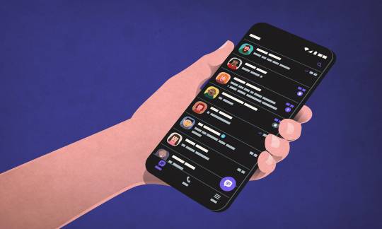
6. Messaging
So how would you contact a lister about a certain item? What details do you feel you need to include in a message if you are the lister? Can you report abuse?
7. Miscellaneous
Can you give the lister a rating? If you need to find an answer to something you didn't know, where would you look? You have got a new phone. Can you change your mobile number? What is your impression of the icons? Are there any improvements that I could make? Finally what is your overall impression of the app?
SUS Questionnaire
This will be scored from 1 to 5 and results calculated.
I think that I would like to use this system frequently.
I found the system unnecessarily complex.
I thought the system was easy to use.
I think that I would need the support of a technical person to be able to use this system.
I found the various functions in this system were well integrated.
I thought there was too much inconsistency in this system.
I would imagine that most people would learn to use this system very quickly.
I found the system very cumbersome to use.
I felt very confident using the system.
I needed to learn a lot of things before I could get going with this system.
All that is left to do is to perform these tests, then iterate and repeat until I have a good experience on my app.
1 note
·
View note
Photo

Coronavirus and Foodbanks
It has taken this horrible pandemic to make us sit up and change our routines. Over the next weeks and months, everything will change from how we eat, to how we survive, to how we reach the end. It is no longer about me, but rather we.
So when I came across this article in The Independent online, I felt I had to write a short post.
“Real hunger” is affecting Britons on a scale not seen in decades as food banks are hit by the dual impact of soaring demand and dwindling supplies due to panic buying sparked by the coronavirus pandemic, charities have warned.
British households have stored an estimated £1bn worth of goods in their homes during the pandemic, according to figures given at the latest government press conference, creating shortages despite manufacturers having produced 50 per cent more food than usual in the last week, as shoppers ignore assurances that supply chains are robust.
This is the foodbank plea by Justin Byam Shaw
“People are stockpiling and no longer wish to donate food. Food banks rely on members of the public and that has dried up. They just can’t keep going,” he said.
“For the first time in my lifetime, we’re starting to see real hunger in London. It’s incredible that in the 21st century we are seeing actual hunger. It’s completely unprecedented.”
This is what one lady said about her food bank in London.
“It’s very scary because everyone is walking around with bags and trolleys full of food stocking up for the next few months, while I’m worrying about whether I have enough food to feed the children this week,” said Angie Fowler, a mother of three who depends on the Chalk Farm food bank in northern London. “If this place closes down, I don’t know what we’ll do. We have no backup.”
A component that I have been considering adding to my app is one that will enable foodbanks to notify their local communities when they are in short supply of certain items.
This feature is a vital inclusion in this app. However, no one foresaw a crisis like COVID - 19 and now, more than ever, food banks are crying out for help. A staggering 90% of items at food banks are donated by the public. It's such a pity that my app is at concept stage but this would be an ideal way to reach out for donations because, over the next few months, people will come together to help one another. I have no doubt that they will support food banks once this initial stage of panic passes.
If the dramatic scenes have left you wondering how you can help, you might be considering donating to your local food bank.
0 notes
Photo

3 Steps to a Successful Mobile App Launch
People are spending more time on smartphones primarily using mobile apps, which now account for more than 90% of internet time usage on smartphones. Further, Statista forecasts that by 2021, the total mobile app downloads over Google or Apple cloud will jump to a stunning 258 billion.
So how do I stand out in a crowded field, where I am vying for my customer's attention? What do I need to consider as I plan my launch strategy? Research by App Annie has shown that an average smartphone user has more than 80 apps on their phone but uses only about half of them each month.
Here are 3 steps to a Successful Mobile App Launch
1. Clearly communicate the app’s value. By doing this, you will create active users. Make sure that they understand the app and how it will benefit them. If you just communicate that you have an app, it will not reward you in any way, the point you want to get across is its value.
2. Develop promotional materials that explain the app’s value There are a few ways to do this.
Offline promotions To introduce a new app, you could place a promotional message in public areas, such as reception areas where people are waiting to be seen. Also, you could create flyers that users can take with them so they can learn more about the benefits and what they will gain from using the app. Billboards are also a great way to get a message across, it's surprising what people notice when they are waiting at traffic lights etc.
Online promotions Use your website and social media to announce your app, again, clearly communicating the benefits.
Video A video is a powerful tool that can help give customers an understanding of what your app can do, gain insight into the experience of using your app and become interested in trying it out. Run the video on a loop as part of your promotions and embed the link in your social media, website, and email communications.
App Stores Apple (for iPhone) and Google (for Android) app stores are another great vehicles to communicate with potential new users of your app. Make sure the language you use to describe your app is informative, discussing both its functionalities and benefits. Use plenty of screenshots to indicate how it works. Once app downloads have been acquired through your promotional strategy, then you need to educate users as to how they can get the most from the app and conduct activities that engage them in using it. Easy and clear mobile app onboarding is a must, and usually within the first 30 days of download.
3. Steps to a Successful Mobile App Launch In this stage, you should consider using mobile app messaging, treating your mobile app as a direct communications channel to your customers – in this case, the ones who have downloaded your app! Mobile app messaging enables communications between enterprises and their mobile app users, using in-app messaging and push notifications.
3 Steps to a Successful Mobile App Launch blog
How To Launch Your App Successfully With A Social Media Campaign
0 notes