
Don't wanna be here? Send us removal request.
Statistics
We looked inside some of the posts by rs1fmp2021 and here's what we found interesting.
Average Info
Notes Per Post
0
Likes Per Post
0
Reblog Per Post
0
Reply Per Post
0
Time Between Posts
1 day
Number of Posts By Type
Text
12
Video
2
Link
1
Photo
2
Last Seen Tumblr Blogs


Fun Fact
Tumblr has a 66 index score for customer satisfaction in the US.
Text
EVALUATION
Throughout my project, I have used a range of techniques/ processes for my practical, studio based, outcomes such as screen printing, mono printing, dry-point, collage. These all helped me get a better understanding into what kind of things I could make for my final outcomes. The ‘weird heads’ collage workshop actually was used in one of my final outcomes by being scanned in, then digitally manipulated and made into a poster format. However, a lot of my processes/ techniques were digital such as my animations which required to be made in photoshop or illustrator to make the vector graphics then imported into after effects. Also, I made digital collages which was something new that I hadn't done before, however helped improve my collage skills and highlighted the importance of composition and colour. It also took some readjusting to get the same style for example, using the polygonal tool to create the rough, scissor cut, edge. I did lots of experiments to get the best set of outcomes as some I found didn't look right which I recorded and uploaded onto my tumblr blog (I used tumblr to show my journey from the start to the end of my project.) There were quite a few materials used throughout my project like ink, photocopier (to experiment with colours and layouts), lino and lots of others which helped me create unique designs. I did lots of research throughout my project which helped form my designs as by looking at other peoples work gave me ideas and inspired me to try it. For example, at the beginning of the project I looked into an artist called Paolo Beghini who created artwork to help bring awareness to social media addiction and I really liked his style of presenting social media addiction as another addiction which gave me my own ideas which did make it into the outcomes. I did some primary research by looking into people below and above my age screen time which helped me get an idea of roughly how long we were spending online and also allowed me to create some facts which I used in my outcomes.
In my opinion, I have achieved what I set out in my proposal which was to bring awareness to social media addiction and to help the user actively reduce their time on social media. My audience is teens and young adults who have grown up in a social media heavy society and thought the best way to reach this audience would be via social media which sounds counterintuitive but my campaign sets out to reduce the time you spend on social media not to stop using it completely. However, i still wanted my campaigns audience to be reached another way which i did by creating some posters and billboards and also some animations which would be used on bus shelters, outside shops or even in toilets to remind people so they can make a conscious effort, for example while waiting for the bus, to not use their phone. My project has no set theme which is how i wanted it to be with lots of different processes and techniques to create a variety of different looking campaign posts and i think it works well. My campaign uses a rough colour scheme which is consistent throughout all my posts and is the only theme continued through my campaign so it allows the user to notice and recognise they are all part of the same campaign set. I met a few problems along the way which i overcame such as for my carousel post where i used separate artboards to start with but this meant i couldn't see what the design looked like all together which was how it would look when on my instagram account so this meant i had to put it into one whole artboard but took a while to get the correct size which i did by trial and error. Also when posting this design on my instagram it was hard to get everything in line so i had multiple tries to get the design running smoothly without any noticeable jumps between the slides. I did lots of learning in this project in nearly all the softwares such as illustrator and using the effects to create a cool looking type post, photoshop using the layer mask tool which i learnt in a workshop and then used later on in my outcome to make the type look as though it was looping around something. Finally, in the after effects I learnt lots of new stuff, from using the displacement map to being able to export my animations. I could definitely develop my project further if I had more time like making more posts for my campaign which I would have liked to do.
My final outcomes are my social media campaign, logo, posters, and animations. I presented my outcomes in a few different ways such as my carousel post. I put the 4 squares onto a bigger, A4, page with a grey background so then you can see the whole design. I also used lots of mockups which I found on mock up world to present my posters and billboards. As then I could get an idea of how they would actually look in the real world and as there were so many mockups available I could find ones that work best for my project. I also used an actual instagram profile account to post all my campaigns and some of the experiments and developments. I then used google sites to present my whole final major project which was a new software i had to learn. It took a while to see what things you could do such as snapping the images so then they go the same size. I had to upload my animations to youtube first and then embed the link into my sites. I went with having my logo at the very top by itself so is the first thing you will see. Then I put my carousel post below and then the 3 other posts below it all in a row. Followed by some of my mockups, poster designs and animations and I was really happy with the layout and how everything goes together. I completed all the work I targeted for and originally only set out to make 3 campaign posts but ended up with 4 and then to push my project further I made 2 animations which I was only going to do if I had time. Overall, I'm extremely pleased with how my outcomes turned out and think they all have a unique twist and would interest the viewer to look into my campaign and then hopefully reduce their screen time.
My strengths were definitely the digital processes and more specifically would be my campaign posts and posters as even though I enjoyed making my animations I felt they weren't as good as I thought and wanted them to be so they would be my weakness. Many of my designs were improved by multiple things such as my peers giving feedback such as on the cigarette post they suggested the idea of having the type all over the front of the box which helped improve the design loads. Also, sometimes by me just taking a break and getting back to it later helps as when i look at something for a long time without a break i feel less inspired and lack creativity. Also my outcomes were decided from me and my tutors talking about them as i originally wasn't going to do the posters and instead do instagram story designs but by talking to my tutors helped me realise by doing the posters would reach the audience better. Over the project, I have learnt many new effects that I can create in illustrator and photoshop which i used in my final outcomes. Also, creating vector graphics is something new I've learnt and how to use the pen tool and then the shape builder to create some realistic looking designs. I also developed my old skills such as screen printing which i first did in year 1 and then during my fmp and created some cool looking outcomes. I had a timetable that I used for my project and planned where I thought I needed to be by certain dates. I also made to do lists so I could tick off and see what needed to be done. There was lots of problems along the way as we started the project during the national lockdown so I had to keep on top and complete all the workshops i was set.
0 notes
Video
tumblr
ANIMATION:
This is my stop scrolling animation as mots of the campaigns i saw had a few animations too so i thought i would make another so i had two. I started off by creating my type in illustrator. I wanted to create the stretched and distressed look on some of the letter which i did by converting into outlines and then moving the letters anchor point. So as you can see in the below screenshot i changed the p, r and o. I then made loads of copies so when its animated it can scroll down. I like how it turned out and think it makes the animation look more interesting. I then saved and added it into after effects. The first thing i did was made a new composition and then i found an image off google of a gradient which is needed for the displacement. Then i added in the type and used the position tool to make it look like its scrolling upwards. After this, i right clicked on both layers and clicked ‘add comp’ so then the effect would work. I searched for the displacement map which creates the cool effect and adjusted the luminance until i was happy with how it looked. This created the main part of the animation and i’m really happy with how it looks and is intriguing. I also like the simplistic text and only has the campaign name which is a reminder in itself to stop scrolling on social media. However, i wanted to keep going and make it look even better as on the bottom screenshot it was quite boring even after i played around with different coloured backgrounds. I had the idea of making a liquid moving gradient. So i made a new composition and then searched for 4 point gradient in the effects panel and then changed the colours to what i wanted. This took a long time to get exactly how i wanted it to look. I then copied this layer and moved and adjusted the colours a little bit and then changed the blending settings top overlay to make the colours flow together a bit nicer and so its less harsh. I went with colours that are predominant throughout my campaign which are blues and purple and then i also went with a dark grey so then my campaign all looks and feels part of a collection. Also i think the colours look quite good together as most are next to each other on the colour wheel so the colours flow well. Then i opened the keyframes and clicked on all the colour points then moved the cursor to the end of the animation and added more key frames. Then i could move the colour points to different places however i decided to not move them that far as i didn’t want the background to be the main focus of the animation but rather a nice extra layer of interest. This also meant the black type wouldn’t work on the background as most of the colours are dark so i had to change to white text and then do the whole process again but i’m happy with how it looks in the end. I think it catches the eye as its such a interesting effect and thats exactly what i want so people view and read my campaign. The animation itself was quite simplistic but with the gradient background it helps it stand out more.


These are some of the screenshots from after effects that i spoke about in the text above.
0 notes
Video
tumblr
ANIMATION: i decided i wanted to make an animation to help bring my design to life and i had the idea of using the billboard maze design and actually having something making its way through it. I decided to go with my logo going through the design so it links to my campaign. I then opened after effects and started animating with the position tool. I opened a new composition and then added all the designs. Then i put a keyframe moved my logo to where i wanted it to go and then another key frame then moved again. I did this till my logo had reached where i wanted it o which was the facebook logo. I had a bit of trouble getting the logo to move at the same speed throughout the entire maze but through trial and error i got it to travel roughly the same speed. However, i made it go a bit faster on the longer lines otherwise it made the animation long and boring. After doing this i realised the animation with just the logo going through the maze was quite boring and wanted to add some more so i decided to make it like a game with a starting screen. So i added some text that says ‘start game’ with square brackets as i think they made the text look more like a button. Then using the scale option on the transform tool i could make the text pulse which i think creates the starting screen vibe. Then, i made the maze blurry while on the start screen so then the type stands out and you can clearly read it. I then thought it would be a good idea to have an end screen which i did by doing the same effect but it says you win and then i have some more information about my campaign and a fact so it links back to my campaign and the viewer knows how to find it. I then exported and then sent it to my phone and then using an app called videoleap i started adding my sound effects. I decided to go with the pac man sound while the logo travels through the maze so it links to the old school game style. Overall i’m very happy with my animation and i think it turned out very well.
0 notes
Link
ANIMATION RESEARCH: This is the break free animation which is about social media addiction and i found on behance when looking at campaigns and inspired me to make my animations. The first thing i noticed that is consistent throughout the entire video is the monochrome colour scheme to show its an important issue and this isn’t a ‘light hearted’ video. Secondly, the artist users patchy grey parts on the screen almost foggy looking which creates this cool effect and could be to link to the idea that when you’re addicted to social media your surrounding environment becomes patchy and you don’t notice whats going on. The video is based around a character who does the same tasks and how he relies on his phone for most of them such as setting his alarm, watching tv, getting on the bus, messaging. The scenes on the bus is good as he holds the phone in the middle of the screen once again emphasising the blind spot in front of him and how we wouldn’t notice whats going on right in front of us. He gets messages from his friend and as the video progresses they sent more and more messages as he don’t reply suggesting how our social lives are affected causing strained relationships which is an actual cause of social media addiction so the video is informative. The thing that made me chose to look into this video was how it connects with the audience and how it shows stuff that is relevant to you such as on tv he’s watching shows that many people from my generation and age would watch which shows how anyone can be affected. Then we see him watch drop his phone and then the screen goes black and gives the audience a break which often is used to show a change has happened. He then read an article titled ‘social media is killing your life’ and then the computer screen goes black which means he’s turned it off and then next he’s seen on the bus without a phone and then walking into his friends birthday where theres cheering heard which signifies the end of the video as he has learnt that he don’t need social media constantly. The animation is quite short but covers a lot of things so i really like it and also can take this into my own animation by keeping them under 30 seconds if possible so the viewer don’t get bored and leave it.
0 notes
Photo


MOCKUPS:
These mockups are from mockup world which i liked and had a wide variety of different types on billboards and electronic ones at different places. I had to edit my designs a bit to make sure they fitted correctly on the mockups. Also the mockups had options to have lights and reflections on which i tested and saw what looked best.
0 notes
Photo


FAILED DESIGNS:
These are some of my ideas that i started making and then gave up on them for one reason or another such as the idea didn’t link well with my theme or some of them i just didn’t like enough.
0 notes
Text
Poster design

I started off with this poster design by making a mouth using the pen tool which i did free handed and it took a while to get the lips equal on both sides and to get the correct lip shape.

I then started working on the tongue also using the pen tool and i just created what i thought it would look like and didn’t worry about how realistic it was.

I then started adding the extra details such as the shadow on the tongue so it adds highlights and shadows and also a shadow behind the tongue so it looks as though it actually goes into the mouth and the poster don’t look as flat. I also put the inside of the mouth in and rounded the edges so it didnt look pointy and look weird.

I then made the pills once again with the pen tool. Then got different social media logos and i ended up going with snapchat and twitter, as the logo colours are yellow and blue which are both primary colours so work well together. The idea behind this design is to once again reinforce the idea that social media is extremely addictive like some people get addictions to pills and thats why i chose to have pills being taken. I also made some more shadows and highlights to make it look better.

I then started working on the background and as i have used the wavy lines throughout my entire campaign it felt right to add them here. I then put a darker green bar along the bottom so it stood out but also didn’t stand out too much and keeps with the green theme. This box is made for text so i could add some information into the poster like i saw in my research.

I then felt the design didn’t feel complete so i worked on some type to go into the background which i think looks cool and the words slowly get closer together creating a cool perspective effect.

This is my final poster outcome and as you can see i completely changed the mouth shape as i wasn’t completely happy with the mouth before and i wanted to make it more rounded and i think it looks much better. I also felt the pills were too irrelevant and needed to have a bigger focus point so i made them bigger and also added shadows on them to once again add some highlights and shadows to make it look as best as i could. I also filled in the bottom part with a shocking fact and also a rhetorical question so it interacts with the audience. I think the green and pink work well as they’re nearly complimentary colours. I also like the idea behind it and links to my other post where i portrayed social media addiction as another addiction and some of research the artists have done this idea.
0 notes
Text
Edited for billboard design

I then wanted to convert the poster using the same concept and design into a horizontal format so it could work on a billboard. So this meant creating more of the maze and i also wanted to include the stop scrolling type and so the maze fitted in.

I then wanted to link the type up with the maze so i started with the hashtag and made the lines go vertically up and also the ‘s’ links up so it feels more included in the design and not just put there. I also started playing around with different colours again as i didn’t want to use the same colour as the poster.

This was the final design of the maze and i wanted to try the luminous yellow colour with black lines which i liked so i saved as one version of this outcome as i can use different colours on different mockups to have some variety.

This is was my other outcome with the cyan blue and white lines. I like how this design look and while its quite a simple concept its very eye catching and if you only see it for a couple of seconds you’ll see the main focus of the design which is the campaign name, #stopscrolling.
0 notes
Text

I started by creating the tiktok logo using the type builder shapes from the workshop as i hadn't used this social media yet.

My idea was to have the social media logo incased within a maze or at least what looked like a maze and I never intended for it to be functional. So I started off by adding squares then using the direct section arrow to round the edges so I started forming outlines that resembled a maze.

I then made another box to set how big I want my design to be and then starting filling in the space. I also created space and dead ends so it felt more like a maze.

I tried keeping all the lines the same width apart so it would look better however sometimes they were a bit wider or thinner.

I also then decided that I wanted the corners squared and not cornered as its harder to make mazes that have curves and corners.

I continued progressing with my maze...

I then made the stop scrolling text and put it at the bottom and then edited and added more maze to fit around the text. I also wasn’t happy with the tiktok logo as i felt i didn’t fit the box right so i changed to the facebook logo which i think fits much better. Also started experimenting with the background colour.
I really liked the pink background so saved as one of the final outcomes for this design. I also connected the ‘g’ up because i think it looks cool.

This was my final outcome and i’m very pleased with how it looks and as you can see i changed the second lines to straight corners as i think it looks better which once again took some adjusting. I also made the lines white again as the white worked better with the pink background and stands out more. Im also happy with the meaning behind it and how its a maze for social media and how you can get lost and even trapped in the maze linking to when you get stuck scrolling. I also want to make this into a billboard too.
0 notes
Text
Poster/ billboard research

This one is my favourite design as its very busy and theres lots going on in the poster and it made me stop and look at it. Firstly, he is injecting the social media into himself and then releasing thumbs ups from his mouth which is a weird concept but helps explain social media addiction without having to use any text. I really like how the thumbs up look when coming out of his mouth and how they twist around each other and also the fact each one is slightly different which makes it look interesting. The background is of an average room but everything is monochrome so the design doesn’t overwhelm the viewer as theres lots going on. The design could be made to look busy to suggest how chaotic social media can feel and how quickly everything changes.

This design is a very simple concept with a phone that has lines going through it to make it look like a jail cell. This links to the theme of social media addiction as you become a prisoner to your phone. You can see faintly the universal ‘no profile picture’ photo in the phone maybe to suggest it could be anyone and no one is safe from it. The background is plain red which is bold and makes it stand out and allows for the viewers eyes to be directed to the middle where the main design is.

This one is like something i had in mind where i convert social medias into pills. I like how the pills are all different sizes and shapes which makes it look cool and interesting. I also really like how some are off screen and you can only see part of it. I also think the darker blue background works well and don’t overwhelm the viewer. They have added shadows as some extra details which helps it look even better and definitely something i can do to help improve my own work.

This is a poster advertisement for psiphon which is a VPN to promote twitter and as with a VPN you can access apps even if they’re banned in your country. However this caught my eye and could relate to my theme as the twitter bird logo has had its mouth tied up which could suggest so stop tweeting and spending time on social media. I also like how they have made it 3D and then added shadow so it does look like its coming out the screen. The background is red and is textured with shadows and highlights which looks really nice.
0 notes
Text
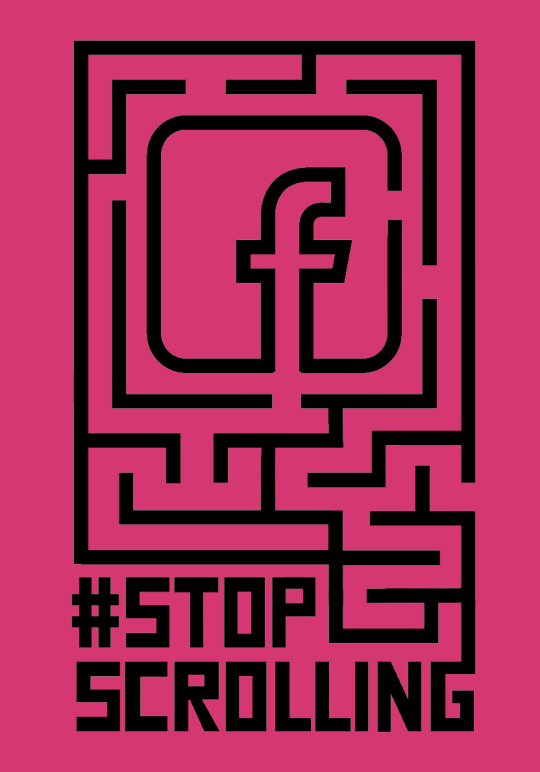
Post #3

I started off with the intentions of creating a border so i could add text in the middle to make an informative post however as you can see i changed the idea behind the post. However, in this screenshot i started by typing out my campaign name and then forming it into a square shape and then copying and pasting into outlines as i thought this might look cool

I then made a few changes to it and i really like how this looked however it felt underwhelming and incomplete and this is when i decided to change the idea behind the post...
Going to effect > distort and transform and then changing the scale around and making loads of copies i could create a really interesting looking design and then by changing the angle of the type i could create an even better looking swirly design.


I then played around with different colours and line widths and i stuck to my colour scheme i have used throughout all my designs which is mainly cool colours. Also the border width looked good however it was too thick and it got dark too quick in the photo above which i didn’t like. I also didn’t like how there was a hole in the middle so i sorted that out by adding more copies in the distort and transform menu tool...

This was the final outcome and i really like how the spiral keeps going inwards until it slowly fades into darkness creating this really cool vortex effect where it feels like its sucking you in and links to how social media sucks you in and you get addicted. I also changed the line width and i really like this as it separates the letters but without looking too thick. I then removed added it onto a black background so it matches the outline. Overall i’m very happy with this design and adds some variety to my social media campaign with some posts like this very type heavy and others more focused on the vector graphics.
0 notes
Text
Post #2

This is what inspired me to make this post as they have portrayed social media addiction as another addiction, smoking, which is a cool idea and highlights the importance and amplifies awareness. I like how they use the warning label to put information about social media instead of saying what they actually put.
I started off making the box i google a picture of a cigarette box and used it to see the angles of everything but i free drew it with the pen tool.

I wanted to have the lid open so then i could have cigarettes coming out of the top and i struggled to get the lid to look right and here you can see it didnt look good.
I finally got it to look right and this was the final box design.

I then started working on the cigarettes using circles and rectangles then merging them to create these. I wanted to keep the box and cigarettes simple looking as i knew i wanted to add shadows and highlights so i felt it was best keep details to a minimum.

I then turned the box into a live paint and using the live fill bucket i did the box in a grey colour making sure parts where light wouldn’t be able to get to was darker grey so it gives the design some depth and a light source. I copied and pasted and arranged the cigarettes in the box and so they go gradually downwards which looks cool. I also put some slight shading on them to make them pop out some more. I started working on the box cover and how it was going to look.
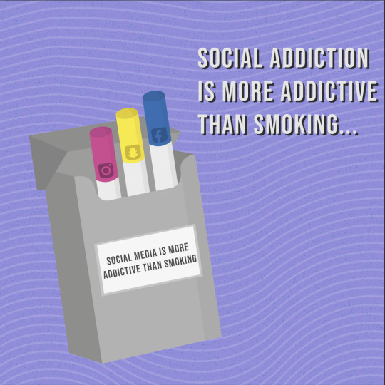
I then changed the colours of the cigarettes again to match the social media icons i was using such as the snapchat logo with the yellow and i think this looks good. I put all the logos onto a rounded square background so they look roughly the same and then made this into an arch as an effect so it looks like its wrapping around it. I chose to with 3 main social medias i use which is snapchat, instagram, and facebook. I also took this into a photoshop document and worked on the background and i copied and pasted the previous background i used for my other posts to once again keep the consistency. I also worked more on the box packaging and type and how i wanted to make this post more factual and have a shocking fact to make the viewer stop and think.
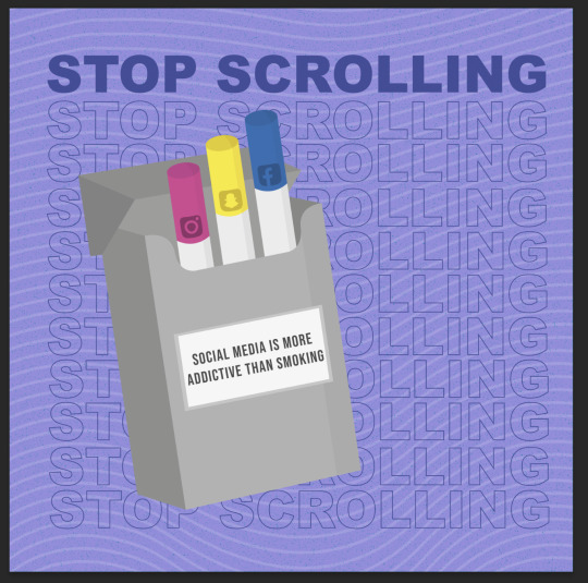
I then put my campaigns name onto the background with the top line being full font and then i repeated lots underneath with just the outlines so it doesn’t take away attention from the main design piece. I wasn’t happy with the way the text was not standing out enough and thats what the whole design is based around and the message may be confused.
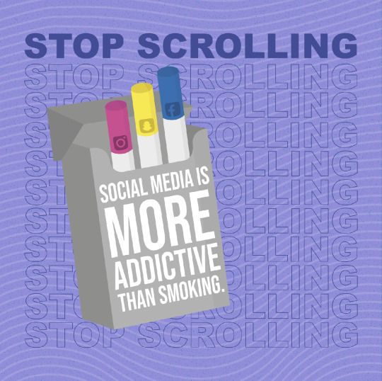
I then had the idea after seeing the artist Oscar wilson and how he uses type to fill up an area to change the whole front of the box to the text. I used the text tool to type out each word separately and then i enlarged some of the words that i wanted to stand out the most for example, ‘more addictive.’ I chose to go with the fact social media is more addictive than smoking as the whole design is of a cigarette box and the cigarettes are the social medias which i think shows how because it isn’t talked about much however its still an addiction that is in some cases worse than smoking.
0 notes
Text
Oscar Wilson
He graduated from the graphics and print-making course at Leeds in 1994 and established his studio in 1996. He now lives and works in London. When he first started he was mostly influenced by 80s and 70s BMX and skateboard culture now he is more graffiti style and uses type to create shapes of objects. He is a vinyl collector and has a love for music.

This piece uses text in a way that forms a sushi shape. The use of colour matches the typical colour of sushi making it look realistic. He also uses a gradient of green around the edge as is dark green on the light and gradually gets lighter emphasising the realism. He also uses an almost neon colour orange for the chopsticks to stand out and catch the viewers eyes. I also used this for inspiration and used a purple background. I also think by using sushi to showcase the variety of restaurants London has to offer is as good as sushi is recognisable as Japanese food. The type is bumpy and fun. I believe it’s intended for adults living in London to try different types of foods instead of going to the same places.

This one is Christmas related and is emphasised by the use of colour which is green and red which are associated with Christmas the green in the background is more dulled and less vibrant to not distract off the main piece. He also uses lots of type to form the present shape. All the words are easy to read and are related to Christmas. The words ‘merry xmas’ are at the top making it the first thing you see. I also like how he uses blank lines for the edges so it still can have straight edges that make the present shape. I also like how the text gets smaller as some points create a cool effect.

This one is to advertise an environmentally friendly bottle. I like the use of the photo in the background showing the environment to show people what they are destroying. I also like the idea of having a picture for the background as it creates an interesting effect. I think this is aimed at adults and elderly people as most kids have grown up in a world where it’s good to recycle whereas the older generations weren't as aware of global warming. I also like how the type matches the colour of the background making it all fit well so doesn’t overwhelm the viewer. I also like the use of a photo of a bottle lid on the top so you can fully tell it is a bottle. Also the natural curvature of the type may suggest the naturalness of the environment. They also use facts such as ‘30%’ making it educational and telling the viewer exactly what they’re buying.
I might use this style on the cigarette box for my social media grid post as this will help the type stand out while also looking good.
0 notes
Text
Post #1 outcome

I started off typing my campaign name ‘stop scrolling’ using the font bebas neue as i like how it looks and easy to read.

I then made it into a symbol so it could be used later on.

I created a circle and then deleted one of the anchor points. I then went to Effect > 3D > Revolve that opens up the pop up menu...
I then clicked on the pull down menu at the top and selected by symbol i made. I then adjusted the text to fit across the page.

I realised that just putting the name once wasn’t enough to fit nicely across it so i went back and changed it so it looked much better. As you can see it makes this cool effect where the text wraps around the ball.
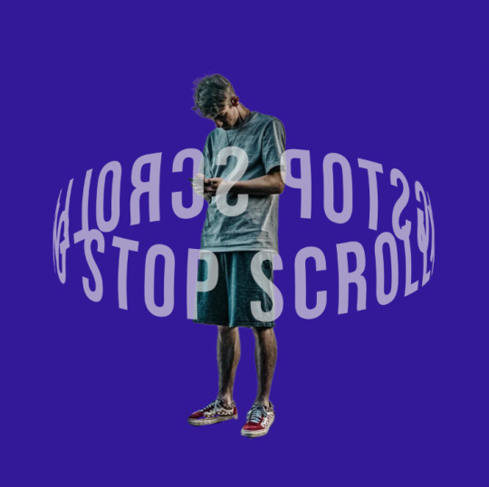
I then found an image of a person looking down at his phone as that links to my theme and then removed the background by selecting the magic wand tool and then select subject. I then used the workshop where we used layer masks to make the text look as though it was actually going around the person.

I started off by clicking the mask button on the layer and then lowering the opacity so i could see what i was getting rid of. Using the black paint brush you can remove the parts of the type i didn’t want and if the person was in front you wouldn’t be able to see behind him so i got rid of that bit.

It took a while to get it right and sometimes i deleted too much and had to redo it by changing to a white brush which puts the image back. I also had the hardness lowered slightly so it creates a softer edge which helps it flow better from type to image. Also as you can see in the background i was testing different background colours.

This is my final outcome i decided to go with a cyan background and then used the wavy lines i used in my carousel post so it keeps it consistent. Also i think it adds a nice layer of detail and fills the page well. I also copied and pasted the type and changed it to black so it creates a shadow which i liked so i kept it. The idea behind the post is to be a reminder that many people don’t realise or don’t admit to social media addictions and how he is oblivious to the stuff around him. I also want to hopefully have the words ‘stop scrolling’ in each post so the viewer will be able to quickly see what the campaign is called and whats it about.
0 notes
Text
final logo design.

These were my initial sketches of my logo ideas that i drew to get an idea of how they would look and to just get my ideas on the page so i didn’t forget any. Some i made myself and others were inspired by the research and more pinterest logos. Some of these ideas i started making on illustrator and those were my overall favourites.

I started off with 3 circles and arranged them in this formation to create the flower like shape. I then merged the circles together so i could use the direct selection tool to pull out the bits where the circles meet so they didn’t dip in too much and makes it less harsh.

I then changed it into outlines so i could see inside better. I used the pen tool to draw out the 3 lines.

I then started drawing out how the logo would look with the curved lines and sometimes it took a couple of tries to get it how i wanted and to make them all look the same otherwise it would look bad.

This is how the final logo outline looked and i could use this as the logo and would still be recognisable.

I then turned this into a live paint and then using the live paint bucket i could fill in each segment. I wanted to go for each big part to be a different colour and then the smaller parts all the same so it almost creates a ‘wavy’ 3D look.
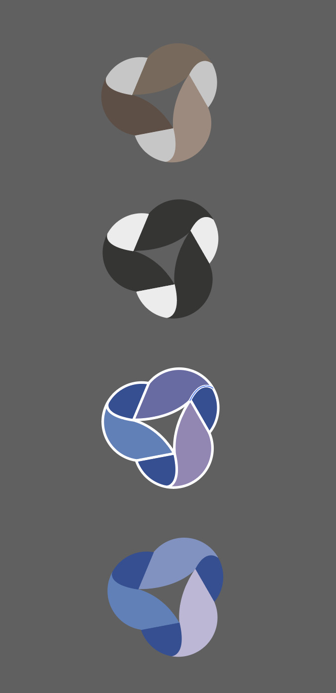
I started off trying lots of different colours such as the brown but felt it didn’t match the company or campaign so i kept trialing them. I then thought of making possibly a monochrome design with the black however it didn’t look right. I then used roughly the same colours i used for the other campaign post and i really liked how it turned out. I then thought about maybe adding an outline however after getting feedback and reflecting i found without the outlines it looked best. Im really happy with how my outcome turned out and the idea behind it is a full circle as my campaign is about addiction and the idea of a circle is together like a sense of unity. I also just really liked the idea and how it would look and think its very modern which the campaign is very current as its addressing problems that we are dealing with in our current society. I also think the blue/ purple colour scheme links to the theme as its often associated with technology.
0 notes
Text
Potenial final logos

I created a series of logos to see which one i preferred. The one i was close to picking for my final logo was the top left one with the wifi bars as i think it looks really good and i like how the top of the ‘f’ is the first bar of the wifi bars. I also chose to encase it in a circle so it could fit in the instagram profile picture circle. I used the same font for all the logos and kept working on them into i was happy so as you can see at one point they were all apart but i created them into outlines and moved them about and also linked the l and y up so it flows nicely into each other. The others i felt were too basic or were too similar to other logos i’ve seen and i wanted my logo to be unique and fun. However i really like the gradients used on the other logos and think they work well. Im also very pleased with the bottom left one with the cube with gaps in so it sort of resembles a camera lens or focusing thing which also uses a subtle gradient. In my opinion the worst one is the bottom right as the font is bad and it doesn’t fit in the circle well and soon gave up on that logo. Overall i’m very happy with my logos and think the top right one which i chose to be my logo was the best one.

This was my making my ‘wifi signal logo’

I then copied and pasted the f so i could make a curve for the signal bars.

I then smoothed it out so it looked nicer using direct selection tool.

I then joined up the ‘l’ and ‘y’ and also started working on the wifi bars by using the shape builder tool (sell below) by creating a circle and then drawing lines either side and then selecting the part i wanted and then deleting the other lines leaving the bar.


This is the logo and even though i didn’t use this concept i will use the type and font in my other logo as it will work and i really like how it turned out.
0 notes
Text
logo research
I started to look into logos that are relevant to my theme.

This one uses a circle with a point coming out which could resemble a ‘message’ icon but also could maybe to show a location. I really like the idea and how they have made it very simplistic yet effective. Then they have made it into a gradient using bold colours, red and pink, which work well together as they are next to each other on the colour wheel so have a smooth transition. I also like how they have made two options where one is the logo on a white background the other is opposite with the logo made from negative space so it can be used on a range of different things. I will keep my logo minimal as many modern logos like this one do.

This one is another cool idea with the letter being incorporated into the speech bubble. I like how the tail of the y flows into the bubble so it looks good while also not taking away the overall look of the speech bubble. If i did something like this i could change the letter in the middle to relate to my company maybe have the whole name within the bubble as its quite short (lyfe) They have also gone for a red colour which is a primary colour so stands out.

This one wasn’t purely made for a tech company however the idea they have used could link well with my theme. They have made the letter curve at the bottom to form a bowl/ wifi bars. I like how they curve at the end of the line to fit around the ‘e’ so it looks better. I could use this idea and have a wifi bar thing above my letters. I like the san serif font and its simple and easy to read so it works well. Also i like the use of a small ‘i’ with the dot when the rest are caps. I also think its important that your logo can be used in greyscale such as this one and i will make my design suitable to be used in monochrome.

This was another simple yet effective logo once again uses the ‘message icon’ so the viewer can get an idea of what the logo company is about however i think i want to make mine a bit different and not use the typical speech bubble as it is used lots. I like this one and how the bubbles overlap and the colours overlap, so the pink and the blue would make the purple colour so looks right. They have also used rounded the corners to make it look less harsh and more light hearted. The type after the logo is a san serif font which is easy to read and i like how they have slightly edited the ‘t’ and ‘q’ to have the sloped ends to match the speech bubble looks so it all feels the same and consistent. For my logo i want to have the logo and then the name of my company after so then they can be used together or separately.

The next logo i saw was this one which is clever as it uses circles to create the look of a profile picture person which links closely to my theme, but also creates the letter ‘g’ which makes it very effective and look good. I really enjoy the simplicity of the logo and most of the logos i looked at were simple so i will keep this in mind when making mine.

This logo uses the outline of the letter ‘u’ with lots of breaks in the line which creates an interesting look. Also where the lines end they have put a ball on which reminds me of electrical wires linking to the technology theme which im looking for. They have also put the gradient into the outline using the colours orange and pink which are bright and stand out.

This one caught my eye for its unique design and how the letters are made and formed into a square uniform which looks really good and this could be done like this to resemble a QR code which relates to my theme. I also like the consistency of the line widths and makes it look better.
0 notes