
Don't wanna be here? Send us removal request.
Statistics
We looked inside some of the posts by rudielton-rowleyzine and here's what we found interesting.
Average Info
Notes Per Post
0
Likes Per Post
0
Reblog Per Post
0
Reply Per Post
0
Time Between Posts
8 days
Number of Posts By Type
Text
8
Last Seen Tumblr Blogs


Fun Fact
Tumblr has been providing a Korean-language service since 2013.
Text
researched zines from self published be happy
Tittle: Particles
Release date: April 2017 / Toulouse, France
Artist: Anne-Camille Allueva
Link: http://selfpublishbehappy.com/2018/02/particles-by-anne-camille-allueva/
Description: Particles is a book about the process of creation and the appearance of the photographic image. Particles is made of cuts and close-ups of common situations, simultaneous movements between exposure and exclusion. I intend to explore how dust can be used to investigate the photographic gesture or even can produce other images.
Likes: I really like how minimal it is. It has a low fi look to it but could also come across as something modern. I also enjoy the textures and noise and grain in the photography.
Dislikes: To me the content was not very intriguing or eye catching. There could be more content on the page or colors even though I like the minimal look it has.
Title: Car Paintings Vol. 1
Release date: September, 2017 / Chicago, USA
Artist: Evan Jenkins
Link: http://selfpublishbehappy.com/2018/01/car-paintings-vol-1/
Description: CAR PAINTINGS VOL. 1 is the culmination and first installation of an ongoing project that began in 2013. The book is comprised of close-up photographs of automobile surfaces that have been dented, scraped, customized and repaired over time. While first focusing on formal elements and "painterly" gestures, the images simultaneously reflect on automotive, cultural, and personal histories.
Likes: I like the textures and bright colors, I also like how all the cars in the book are very rusty and worn out which shows a variety of textures. I also enjoy the front cover and the clipping mask effect that has been used to put an image in the text.
Dislikes: All the photos are very close up I would like to be able to look at the cars and there whole body’s with the rust and scratches.
Title: Al otro lado
Release date: June 2006 / Sao Paulo, Brazil
Artist: Misha Vallejo
Link: http://selfpublishbehappy.com/2017/11/al-otro-lado-by-misha-vallejo/
Description: This is a visual project about the everyday life of the inhabitants of Puerto Nuevo, a small village located on the Ecuadorean side of the border with Colombia. Colombian displaced people who fled armed conflict between the FARC guerrilla, drug dealers and their government, founded this village in a hard to reach area of the Amazon Rainforest. In this border town, violence and poverty do not distinguish between nationalities. Here, the border is omnipresent and does not exist at the same time. This is a village where its inhabitants do not know what it means to live in Ecuador or Colombia, but certainly know what it is to live on the other side. The book combines a classical documentary approach with facsimiles of everyday life objects and vernacular photographs made by the inhabitants of the town before leaving their homeland. “Al otro lado” is a book that lies on the brink between documentary and art photography. It explores an issue that is avoided by mainstream media and therefore not well known, talking about it in a literary form. The result is a touching portrait of exile.
Likes: I really like the theme of the zine and how this zine shows a small village and the conditions people live in in more impoverish areas. I also like all the photography and I found the front cover very intriguing.
Dislikes: Because this zine is almost like a documentary series it would be nice to have some dialogue explaining the photography and moments captured.
Title: Weltreise
Release date: October 2015 / Berlin, Germany
Artist: Christoph Kohlmann
Link: http://selfpublishbehappy.com/2017/08/weltreise-by-christoph-kohlmann/
Description: The work "Weltreise" (World Tour) is dealing with the perception of everyday spaces in a wealthy society shaped by digital communication. Gentle social criticism and a good amount of admiration for the world go hand in hand, and lead to dry images full of subtle wonders. A world tour - mostly photographed in Berlin and it's surroundings - sure there's a bit of irony in it. But the title is also raising sincere philosophic questions: Where's the everyday ending and where's the journey starting? Isn't "the world" around here, too? Can and should something only be fascinating if it's unfamiliar and exotic?
Likes: I like the simplistic concept of just documenting elements of your day to day life and I also like the simplistic look the book has especially the front cover.
Dislikes: Some pages were left blank so it feels like they could be filled with more photography or some dialogue.
Title: How We End.
Release date: February 2016 / NYC, USA
Artist: Hannah Schneider and Kate Stone
Link: http://selfpublishbehappy.com/2017/05/how-we-end-by-hannah-schneider-and-kate-stone/
Description: How We End. is a book of 41 illustrated short stories chronicling the romantic history of an unnamed and unreliable narrator. Each story details the moments in which she realizes a relationship is over. The images are a visual representation of where that moment took place. They collage public imagery, sourced from the Internet, with private, intimate narratives to create scenes that are just as distorted and fragmented as the stories themselves. Break-ups are nothing if not one-sided, skewed. The book is about intimacy and heartbreak, but it is also about the way we communicate and the way truth deteriorates every time we tell a story.
Likes: I really like the layout of the zine and the typography and fonts used it looks like its been made in the Swiss style. I also really like the color scheme and think the light pinks, grays and greens work well together. I really like the creative photography and the different layers each peace of work has.
Dislikes: It can be a little confusing see how elements of the photography represent the stories told.
0 notes


Text
What was your final idea?
The final idea was to create a zine that displayed a collection of portraits that I shot in a variety of locations. Each double page spread fits a theme whether it’s the location or the color scheme that links the photos together. There is no text so it’s simply a variety of photos which you can contextualize how you want.
How did you arrive at this idea?
Because my first idea didn't go so well and I didn't have time to finish it I went with photography because I have always been interested in photography and I liked the idea of almost creating a small library/collection for some of my photos so I decided to make my zine purely about displaying photography.
What inspired you?
I have been tacking photos of things for a long time and it all started when me and my friends would explore abandoned buildings and urban environments and I would simply document the experiences with my camera and take photos.


I then tried to do more portraits and street photography because I really enjoyed looking at the covers of magazines like national geographic and vice which had some good portraits of people from all sorts of backgrounds in lots of different locations around the world which I liked.


I've also followed some photographers that I have taken inspiration from like. Annie Leibovitz and brandon woelfel.
There work:


What specific approaches did you practice?
Zines are made in all sorts of ways with all sorts of materials but I wanted to create something that looked sleek and professional so I went with something more common which was just simply printing on paper and that was it because I wanted it to look something like a vice magazine so I spent more time making the layout of the pages look more professional this is why I did not want a boarder on my zine and I wanted each page to be filled with print and color.

What went well during this final production stage?
I really like how it looked and I think It looked nice and clean when I cut all the edges off so there were no boarders on the pages. I really like how I made the hole page filled with print and there were no boarders or columns and I also Enjoyed how colorful the pages looked at the end.
What issues did you encounter along the way?
I had the hole problem with my first idea because I wanted to create something that looked finished but I wouldn't have time to make that piece of work to a high standard.
How did you overcome these issues?
I got rid of my first idea and did something that I would be able to finish in time for example for my final idea I already had taken some of the photos for my zine which helped me put everything together quicker but I did also go out and do a shoot specifically for the front and back cover of my zine.
What have you learnt during this project?
Once again I need to manage my time better weather its choosing an idea that will take less time to create or to spend less time on research and more on final development.
What would you do differently if you could do this over again?
If I had the time I would purely focus more on photography and maybe pick a theme so I could do a small documentary series on something or focus on just one section of photography weather its taking photos of food, black and white, film or even wildlife.
What do you like about your zine?
I like how the final product looked for the most part and I like how its simply a book filled with photos were you can just open and look at the content without reading anything.
What don’t you like about your zine?
I don’t like how the theme of the zine is not very complex and I could of come up with a better idea for a photography zine if I had more time. I also wanted to print my zine on double sided semi gloss or photo paper because it was a zine about photography so It would of been interesting to see how that looked.
0 notes
Text
Here is a more in depth look at how I created the pages for my zine.
The front cover.
for the front cover I took a photo in a location that had this high large metal spiral stair case and on one of the walls there was a row of three windows going down letting in light onto the stairs. I picked this location to be my front cover photo because I liked the metal stairs and the metal grip texture they had on them and I also liked the light that the windows were letting in which lit up sections of the stairs. Also because theirs this big hole in the middle of the stair case I thought it would be a good place to put some text for the front cover of the zine. I told my model to go a flight of stairs down from me and sit opposite me and have his legs dangling off the stairs with the sets of windows behind him so it would project sections of light onto were the model was siting.
Another reason why this location worked well is because it was reasonably well lit in day time which allowed me to have a reasonably low iso. You want to have the lowest iso possible to reduce grain in your photos but because my model was far away and I wanted lots of the stairs in focus I had to increase my f stop so I could get things in focus but this makes your photos darker because your letting in less light so then I had to turn my iso up to around 300 so It left the photo a little dark and faded but that’s okay because I can change that all in Photoshop. And then also because I didn't have a tripod with me and I was using a model I had to use a quick shutter speed that made the photo bright enough and so slight movements in my hands or slight movements of the model wont make the photo out of focus and blury.
Here is the Photo.

I then went into Photoshop were I edited it.
I wanted to make the photo have a dark metallic blue look to it so my main technique for editing the photo was to go filter then camera raw filter which almost brings up a mini light room were you can change all sorts of things about your photo in one place. The things that I changed most was I turned the clarity up on my photo and I also Changed the temperature of the photo to make it look more blue. One thing that I did was create a radial filter and I put it over the model in the photo and this allowed me to increase the clarity around the model and also make it slightly darker which makes the model look better lit and one of the things that I have experienced is if you turn up the clarity too far on someones face it can make it look unnatural and wrinkly so that’s why I avoided this. Another thing that you can do is change the hues and saturation of your photos so I used this to make my photo have a tint of blue in it.
Here is the edited photo.

The next thing I did was add text.
I Wanted to make it look like the text was under the stairs in the photo so what I did was use the text tool to wright the word capture and I scaled it so the c and E in the word were slightly overlapping the stairs. I then used a mask so I could erase parts of the C and E using the brush tool with a black and white fill to make it look like the text was under the stairs.

Now that I had done that and made it look like it was under the stairs and like the models foot was in front of the text I wanted to add some shadows to make it look more realistic. I did this by simply creating a new layer and using a light grey brush to paint in the shadows and then I masked the layers to get rid of sections of the shadows that were going onto the stairs and onto the models shoes.


I then created a layout for the pages of my zine. I could of used in design to make my layout but instead I wanted to use Photoshop and then I could just drop my pages I made in Photoshop into in design. For my layout I made the pages size A5 and each page would contain two photos apart from the front and back cover. What I did was take the two photos that I would use for the page and enlarge a copy of those photos and and then fade each photo together once again using a layer masks which leaves the page looking like this.


I would then place the two images on top of the enlarged ones and added a drop shadow to them so they would stand out against the background. I did this by wright clicking my image layer and going into blending options and then clicking on drop shadow which gave me a box were I could customize and create a drop shadow. I used guide lines to keep all the photos in my zine level and have the same placement on the page and I used the same drop shadow for each image. I lastly grouped each page layout so I had 8 groups for my 8 pages and then exported the 8 pages as jpegs.

I then went into in design and set up my document. I made it so there would be 8 pages and they would be double sided. I then dragged and dropped my pages into in design and made sure that my photo covered the whole page and that the whole photo was visible. another thing that I did was get rid of the columns and boarders in in design so my work filled the whole page.
I then setup all the printing settings with help to make sure everything had the wright placement and was in color and order for it to be turned into a small zine. I simply then printed the pages making sure both sides of the a4 paper had print on them and then I arranged my pages and stapled everything together.
Here is a digital copy of the pages for my zine:


0 notes
Text
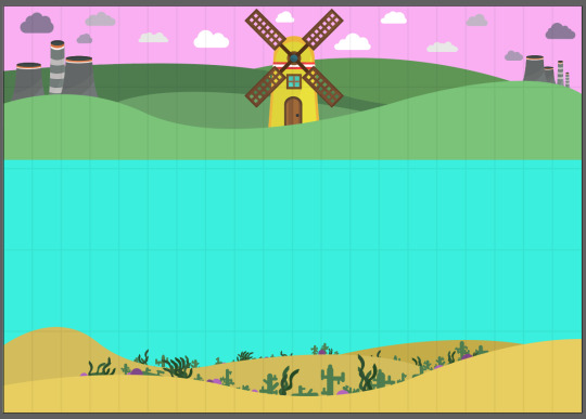
For my zine I wanted it to be a large illustration and at the beginning you only get to see a slither of the illustration and it grows a bit bigger on each page. In the middle of the illustration It would be very happy and bright and the idea is to have a happy whale in the ocean with Rowling hills and a windmill behind it. As you get to see more of the artwork you see that the ocean and world becomes more polluted with rubbish and power stations and the end page it shows the whole illustration but the whale is dead in the water because of all the pollution in the water that you weren't able too see at the beginning.
Here are my sketches for this design


I started to create this in illustrator but It was not turning out how I wanted it to look. Unfortunately the amount of detail that I wanted to add I didn't have time make and I didn't want to print something that was not 100% finished so I decided to stop with this idea and create something that I would be able to finish in time and still look good hopefully to a high quality. Here is the how far I got with my first idea.

The second Idea was to simply make a zine which was filled with some of my photography. Almost like a mini portfolio but I just wanted something that was nice to look at and something that you didn't haft to read and you can just flip through the pages and look at the content. I wanted to make each double page spread relate to each other so I put photos with similar locations or color schemes together so it was like each page had a different theme. For example if there are more woodland or nature photos they would go together and if there were neon lit photos I would put them together.
Each photo has a model in it and the photos would be mainly portraits this is because I enjoy portrait photography and I like my photos have something important in the middle too look at like a model and then nice interesting scenery around them.
This zine is a collection of portraits that I shot in a variety of locations. Each double page spread fits a theme whether it’s the location or the color scheme that links the photos together. There is no text so it’s simply a variety of photos which you can contextualize how you want.
How was it made.
Step one: I took a large amount of photos in a variety of places and in different styles and then I sorted through them and picked the best ones.
Here are some of the photos taken from the shoot for the front cover.


Step two: I edited the photos using Photoshop and light room.
Step three: I created a layout in Photoshop for the photos to go on. the background of the photos relate to each photo as it is a section of each photo which then fades into other photos to create the background which the photos go on top of.
Step four: Set up the finished boards in in design and print.
Step five: staple and cut the print together to create my small zine.
Here are two photos that I could have picked for the front cover.


Here is the final front cover.

0 notes
Text

I went to a printing shop in Nottingham called dizzy ink were I could look at different printing methods and look at what they do and there work as a printers.
After looking at some of there work everything looked a little bit like it had been screen printed or looked like they had been printed in a similar way or style to andy worhol this is because the printing method they specialize in is ricegraph printing. Also after looking at some of there work it reminds me of some of Tyler the creators work and this is because at dizzy ink they are able to print florescent colors and Tyler the creator uses lots of bright florescent blues and yellows for his clothing brand golf wang.


Risegraph printing is a way to duplicate and print things on a large scale quickly, from what I learnt Its done a little bit like screen printing because you have a stencil which the ink goes through. The printer at dizzy ink uses large ink drums filled with different colors and florescent ones too and then you put that ink drum in the printer and there printer makes a stencil of what they want to print, that goes around the drum. Commonly with risegraph printing the ink is soy and also made from bananas this is the case with the ink at dizzy ink.


they have lots of different resources at dizzy ink they even have a machine that stacks your paper into a neat pile. One of the things that I liked and thought was nice is that they give out a sheet of paper which shows all of there colors that they print from standard colors to florescent and this way you get to see what the ink will look like on paper.

0 notes
Text
I went to Lee Roseys Cafe to look at the large zine library to help me with idea generation and inspiration. This trip also showed me how zines can really be about what you want and can be printed and presented in many different ways.
I liked this zine called keep it sweet because just by looking at the cover you can more ales tell what its about. One thing I like about the zine is that there are sweets going down the spine of the zine which I thought was very creative. This zine talks about sweets and sweet things from there personal favorite cakes and candy's to recopies and songs from films like willy wonka. Another nice little thing that I enjoyed about this zine is that they put in a little golden ticket from the willy wonka films and this fits with the zine and its content.


I enjoyed looking at this zine because It has a very simple layout and its mainly just nice artwork and images. The zine is called Fluorescent Inflorescence and contains drawings and images of flowers but all the images are very bright strong clashing florescent colors hence to tittle. I really like this one and was nice to look at but I mainly enjoyed this because of the bright strong high saturated colors.


One common approach that I spotted is that there were lots of creative ways that the books were binded together and some of them had different clasps and handles. I really like the use of this cocktail stick to bind the pages together on this zine about alcoholic drinks.


Another zine that I like was a zine called UFN and this zine contained random photography of things like ashes and spoons and then there was a little bit of text or dialog talking about the image in a poetic story form. I Liked this zine because the images had a very washed out look to them and I liked the layout of the image with text underneath it in a font that looks like it had been written on a type writer.


Some of the zines were story's some with just text some with just images and some with images and text. I really like this zine because its a story made of just images and I really like the illustrations that are a little bit weird and creepy and I also really like the simple color scheme of the light pink and black/blue. It almost looks like everything had been drawn with a Biro and I think this gave the illustrations some texture. One thing that the zine reminded me of with the weird illustrations and colors is a book and tv show called the moomins.


There were Lots of zines in different styles and a variation of different content I personally like the ones that show art work and have more of a modern layout but one thing that I liked and might incorporate into my work is the colors. There were a few zines with artwork that were very colorful and had bright florescent colors like pinks yellows and blues. I really like this color combo and it reminds me a lot of the cloths the rapper Tyler the creator wears and his clothing brand golf.


Here are some more zines that I looked at.


0 notes
Text
Whats ZINE?
zine is short for magazine or fanzine. A zine usually self published work of original content such as texts and images. Simply a zine is self published magazines that is printed, because they are self published they are often simply printed on a photocopier. Zine is a very widely used median to show your work so you can put prity much anything in there but you would usually have one theme or topic/subject for each zine.
When did zines start becoming popular?
Zines have been being made for years but the first zine was potentially made in the 1930s called The Comet which was a science zine and it started a trend of sci fi zines being made. The zine used to be called fanzine because at the time it was usually science fiction and science fan creations but the name got shortened to zine which became something that was not just science based but a zine could be anything. sci fi still stayed a popular topic for zines to be made under but in the 70s there was more technology and print shops making it cheaper and easier to make zines on a larger scale, Previously zines had been produced using mimeographs which push ink through a stencil to make multiple prints but this took time. Zines became a large part of the punk scene were they were a little more DIY than the previous ones created. These zines had a more grungier handmade feel to them and were based on music artists like The Remones and Joy division, people would also put band interviews into there zines which would potentially make there zines more popular. In the 1990 zines were a large part of the female punk scene and lots of them were devoted to riot girl music and politics.
today zines are still popular and with modern technology it can be free to create zines as people put there zines on the internet. Some universities have there own zines and there is even independent zine libraries. Famous people also have zines and each new zine created is unique and different in its own personal way
Why did people / groups / collectives / artists use zines?
zines can be a fun creative thing that anyone can make with basically no skill needed. People can use zines just to get creative or they can be personal and something about your life or maybe your trying to tell a story through your zines. In the 70s lots of political punk zines were made so people also use zine for getting your opinion out there or they could be about rebelling against something and your movement. People use zines to publish what ever they want into the world.
What content can zines contain?
Once again a zine can contain anything you want and can be about what ever. Zines allow people to create something and self publish something them self's leaving it all up to you the creator and publisher what you want your zine to be about and contain.
What are the common printing methods for zines?
Zines can be printed in many different ways. Because they are self published its up to you what sort of quality you want the paper and prints to be. Some people just print them using a photocopier or a home printer but if your looking for something more unique or high quality you can go to a printers were they have a variety of printers for whatever look your going for whether its a low fi look or something modern and sleek. There are lots of methods of printing depending on the look your going for, for example you could screen print and even engrave especially if your trying to create textures. Maybe if your looking for something a bit more sleek and modern you could do Flexography printing or Xerography for more flexible pages. And you could use offset printing which you can create both a more retro diy feel and a smooth classy feel to your work/pages.
How can you set up a zine for print?
The most common way is to use software like Photoshop if you really want to spend time building layouts but there is also software with pre made layouts like in design which is adobe software used for publishing things like books and flyers.
List some materials that can be used when creating zines?
You can use so many things and different materials when creating a zine. You can use cardboard and paints, fabrics and things like string if you want to sow pages together. The possibility are endless you can really use most things from pencils to pressed flowers. You can also just make everything strictly digital and use software to create your zines content.
0 notes