
Hello, My name is Rusty Kagee and I am loving husband and father to 3 beautiful children.I also happen to be a Computer Animator. I enjoy all thing animation, and I am some what of an anime nerd.
Don't wanna be here? Send us removal request.
Statistics
We looked inside some of the posts by rustykagee and here's what we found interesting.
Average Info
Notes Per Post
0
Likes Per Post
0
Reblog Per Post
0
Reply Per Post
0
Time Between Posts
21 days
Number of Posts By Type
Text
17
Last Seen Tumblr Blogs


Fun Fact
70% of Tumblr users say the Dashboard is their favorite place to spend time online.
Text
Mastery Journal
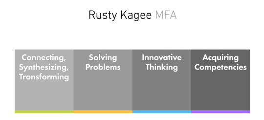
1. Mastery: Personal Development and Leadership
Probably like everyone else in the class, I was very nervous about heading down a different path and trying to obtain my graduate degree. I just finished my bachelor’s in computer Animation and was looking to head into the industry. I found out quickly that It was going to be very hard for me to land a job, and I was told that getting my master’s would help me tremendously. So, I dove into my graduate’s degree, not sure of what I was doing, or even if I could do it. In the mastery class, we learned about my peoples who had obtained mastery over their chosen field, and at the time, it seemed so far away. It was discouraging, but at the same time, I wanted to be just like those people one day. So, I started the class doubting it If I could even complete it, to ending the class, daring anybody to stop me. That class helped to set my will for completing this graduate degree. This class helped me with my thesis because I had to argue mastery over the DLO’s, and if I had not taken this class, I would not know what mastery truly meant.
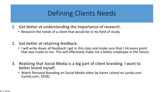
2. Defining Clients Needs
In this class, we learned just what research was. I had no idea how important it was to design, and just how deep one needs to go to understand their client's needs. Having to develop mind maps, to think outside the box and develop unique ideas was a new concept to me, and it took me a second to let go and open up. This was also our first time with logo creation and the concept of iteration. Having to create so many logos for our chosen city, helped me to craft a unique design that I would have never created if not for having to sit down and just throw every idea at the wall. This was the class that I started to gain a bit of confidence and began thinking that I could actually reach my goal. This class also helped me to be more decisive about my designs and not to get too complicated. We learned through our readings in this class specifically that the best designs are the simpler designs, and that translated directly to my thesis project.
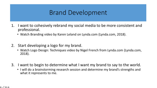
3. Brand Development
This class was our first-time using InDesign, and even though I worked in this particular software before, we went much more in-depth. This was the first time we were able to learn about the significance of color to a brand, and how typography affects its visual identity. This class solidified the significance of the Adobe Creative Suite to media design, and the design industry in general. This class helped me to make sure that everything from narrative to the color pallet is cohesive. This helped me to argue mastery over the Connecting, Synthesizing, and Transformation section of my thesis project.
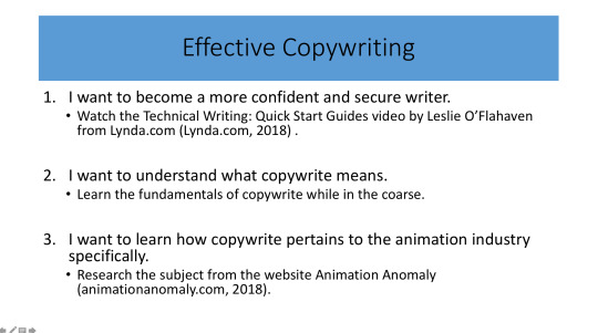
4. Effective Copy Writing
This was the class that I learned I was a horrible writer, and I had no clue just how much work it would take for me to learn how to get better. I knew about APA style formatting but had no clue how complicated it was. Correctly using intext citations and understanding how to reference each correctly was my biggest weakness. I would get confused as to what exactly was the correct way, and even though I finished with a good grade, it was by far the hardest class for me during my graduate studies. This class helped me to begin understanding APA and have been working diligently ever since to get better. This class directly helped me with my thesis project when it came to Copywrite and making sure that I was creating a professional and academic website that was clear and precise.
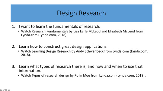
5. Design Research
In this class, we learned the significance of voice and tone when it came to creating a unique brand. This was the first time we were able to create a narrative for our chosen city and put it together with the research and logo creation we completed the class before. The culmination of these pieces was our very first vision board. The vision board also gave us a chance to learn about layout and color management. Having to create a color palette that connected well with the chosen city, and conveyed the emotion outlined in the narrative was hard but very gratifying. We also touched on visual hierarchy and how that could draw the viewer's eye through the vision board. From this class, I took away newfound respect for layout and the visuals (color, typology, hierarchy) of any brand design. This class helped me to create a story when it came to my thesis project. The instructor kept reminding us that telling a good story was a needed attribute to get a good grade on my thesis project.
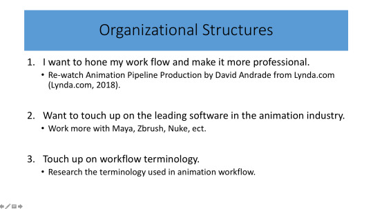
6. Organizational Structures
This is the first class where I was able to combine the skills I gained in my undergraduate studies for Computer Animation and the new-found skills I have gained through my graduate studies. Having to create a Dynamic vision board was so fun for me because I was able to do something different, and boy did, I take it far outside my comfort zone. I was able to fully animate my dynamic vision board, even if it was a bit abstract. Because of this, I gained a great deal of confidence, and that lead into a motion graphic we were asked to create for our chosen city. This is where I was able to put everything together and create one image with the motion that would encompass everything we created about our chosen city.
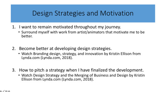
7. Design Strategies and Motivation
This class took over the mantel as the hardest class for me when I had to step outside my comfort zone. I have always been a quiet person, content with blending into the background, and never really being the face of anything significant. So, when I knew we had to interview people face to face, I just wanted to quit. In the past, if I have to do essays or speak in public, I would just take a zero because I was that afraid. This was something I had to break, and it took everything I had to complete the task. This class even just for a moment, helped me to push past my boundaries and step out of my comfort zone. This class helped me because the information I gathered from the research in the class I used to argue mastery over problem-solving in my thesis project.
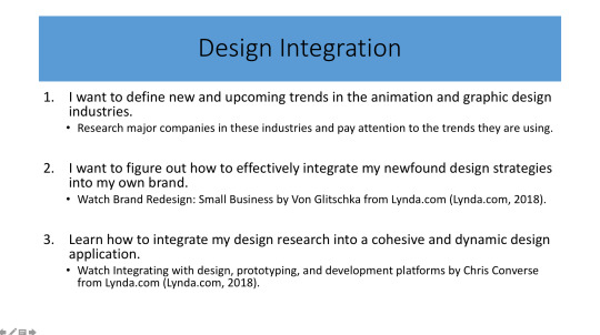
8. Design Integration
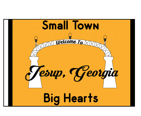
This is the class where we began developing the brand visuals for a city near us, and because my chosen city, was Jesup, the city I live in it made it a more personal assignment. I wanted to do the best I can, and we were allowed to create a dynamic vision board for the city, which again let me tap back into my skills as an animator. This class also allowed us to create a design brief for the city, and that was essentially a road map for the rebranding of the city. This taught me how to create a tailor-made set of design /criteria for the rebranding. This class also helped me to understand that as a designer, I must not leave any detail to be discussed. This class also helped me to argue mastery of Problem-solving in my thesis website because it was in this class I created my problem statement and began creating what would end up being my design for the city of Jesup.
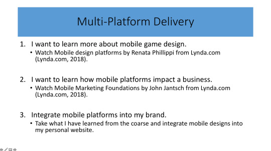
9. Multi-Platform Delivery
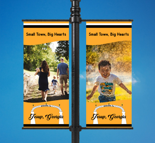
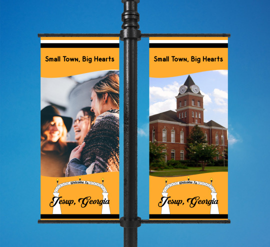
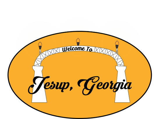
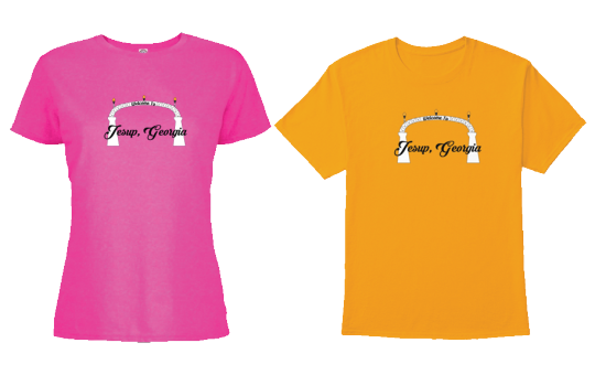
In this class, we were finally able to create assets for our city, four to be exact. This allowed us to connect all the information we have been creating for the city, into what could be real physical visuals assets for the city. In my case pole banners, billboard, decals, and apparel, each one conveying the new logo and branding guidelines. We also completed a brand guide, yet another way to convey the guidelines and what is expected so that the design stays on brand. This class also showed me that even though I think the assets connect well with each other and the brand, that this may not be the case. The instructor thought my pole banners were perfect but thought the other assets were bad. This helped me to understand that I need to pay attention to the details and make sure that every aspect of the design is cohesive and makes sense together. This class helped me to understand the importance of the physical media assets, and these assets helped me to argue my mastery over innovation on my thesis website. I was visually able to show how my design was superior to that of the existing design for Jesup as well as its competitors.
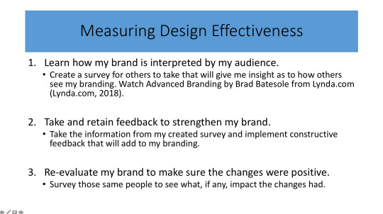
10. Measuring Design Effectiveness
This is the class where we created our own surveys about our new brand redesign, and how well it connects with the city. We had to determine our target audience and then survey that audience to get feedback on what they thought about our design. This gave us clear qualitative and quantitively feedback quickly and helped us to determine if we were on the right track when it pertains to the design. It helped me to understand that surveys are important to design because it gives us important information from the target audience so that we could cater to the design or product specifically to them. Even though the survey information was not directly used in my thesis project, it gave me the confidence to know that the design was strong and I was able to argue this in the innovative section of my thesis project.
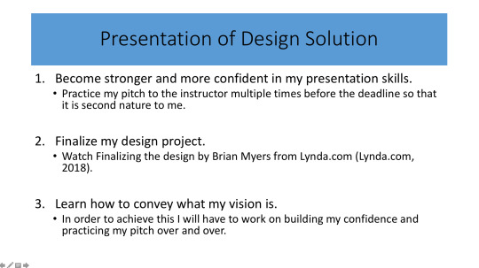
11. Presentation of Design Solution
This, by far was the hardest class for me, in which we had to create a thesis website. The most difficult part for me was trying to argue mastery over the four DLO’s. I knew how I felt about them, and could even articulate those feelings somewhat successfully, but it was hard for me to figure out different ways to argue the same point, and then provide examples so that I could showcase that my designs were the better option. To me it seemed counterproductive because I am usually not one to take apart someone else’s design and express what I feel is wrong about it. However, I eventually began to understand that without critique, especially in the design profession, no one would grow to become better. With the knowledge, I was then able to argue my mastery over the DOL’s with much more confidence. The first part of the class helped me with determining the layout for my thesis website. Because we created an abstract of the website, this helped me to determine if I was on the right track and if there was a section lacking, it gave me time to come up with a solution. This part helped me to create my thesis website.
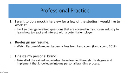
12. Professional Practice
In this class, we began learning about the moral and ethical duties of a designer and what copyright in tells. We also were able to learn what an experience map is and how they can be used to determine the wants and needs of the target audience. The experience map was just one more tool that a designer can add to their bag of tricks to help understand and connect to the client/audience. Leaving this class, I have learned just what being a professional design is and how to be morally reasonable and ethically sound.
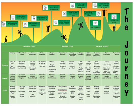
This is my Experience Map with this assignment we were asked to convey our journey through this graduate program, how we felt, what we were thinking and what actions we took to get through each class. We had to visually convey the emotions we felt and also showcase our personality.
0 notes
Text
Mastery Journal Reflection
With our time in the Media Design Masters program coming to an end, we are tasked with listing the three most valuable takeaways from this month. This month had been the most difficult by far, and I have gained so much knowledge that it was hard to decide, but one stood out right away.
Takeaway 1 Peer feedback.
I have never had a problem with giving or receiving constructive criticism, but I have always found it challenging to take into consideration and what not to. I tend to just take what was given to me and change everything, not thinking that it is only feedback and not a rule. Throughout the past month, I have begun to understand that If I feel like the feedback doesn’t fit the vision I have for the assignment, then I don't have to make that change. It has just happened though that I have been given some really fantastic feedback this month, not only from the instructor but also from my peers. They have been very informative and have backed their opinions with cited work, which made taking the feedback much more straightforward. Lawless and Crabill (2019) state, “A good designer will need to learn to take the feedback from their peers, clients, and bosses to solve a particular design problem.” (Lawless; Crabill, 2019, para. 1) I won’t state that I am perfect when taking constructive criticisms
Peer Review
Takeaway 2 Story Telling
This month I have learned to become a better storyteller. This has helped me with my thesis website and can be a way to convey my thoughts and feelings creatively. Elmansy (2018) states, “During the design process, storytelling is used to understand the underlying problems that consumers face when using a product or a service, and then use this knowledge in reflective practice to formulate the solution which is tested by the consumers. Hence, storytelling contributes to the different stages in the design process for different purposes in each step.” (Elmansy, 2018, para. 3) It helped me to set a backdrop for the creation of the website, and at the same time inform the viewer on the processes used to complete each assignment.
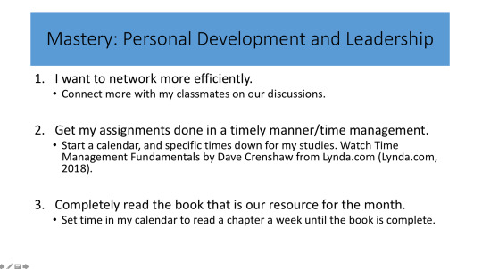
Takeaway 3 Time Management
Time management has always been a struggle for me and is something that I continually have to keep my mind on. This meant I had to change my thought process, I would spend loads of time doing work and would end up with very little to show for it. It would be very discouraging every time I would spend hours on an assignment I was not able to complete. I finally realized that I was just doing busy work, and that is very different than getting work done. Mind Tools (2019) states that “Good time management requires an important shift in focus from activities to results: being busy isn’t the same as being effective.” Once I figured this out, I was able to adjust how I worked and it became easier to complete my assignments in a timely manner.
References
Elmansy, R (2018). The Role of Storytelling in the Design Process. Retrieved from
https://www.designorate.com/the-role-of-storytelling-in-the-design-process/
Lawless, K; Crabill, S (2019). How to give and receive a good design critique. Received from
https://www.aiga.org/how-to-give-receive-design-critique
Mind Tools (2019). What is Time Management? Working Smarter to Enhance Productivity. Retrieved from
https://www.mindtools.com/pages/article/newHTE_00.htm
0 notes
Text
Mastery Reflection
This month we were tasked to create a questionnaire, one that would help to determine if the brand design package we have been working on is on the right path. Meaning that it makes since for the city of Jesup, and the surrounding community. The questionnaire was to test the strength of our research and design, which we have created over the past two months. The questionnaire was more difficult having to only use 10 questions and that was the first thing I learned from this month’s assignment, use as many questions as necessary. If I were able to have used the paid subscription to gain access to more questions, I would have done that in a heartbeat. The lack of questions hindered the results and is glaringly obvious when comparing it to some of my classmates.
The second thing I learned was just how important an introduction is, I have always been weak when doing an introduction. Whether it is on a report, research paper, or in the questionnaire I need to get better with introducing the public to one of my projects/designs. Hillary Collins explains this about introductions, “State who you are and why the data is required, and give, if necessary, an assurance of confidentiality and/or anonymity, along with a contact address and telephone number. This ensures that the respondents know what they are committing themselves to, and also that hey understand the. Context of their reply’s”. (Collins, 2010) Doing this will help to prevent any confusion the respondents might have about the questions supplied.
The creation of the questions is very important and was a great lesson learned this month. I kept the them short, but only because that is what I would have wanted if I were one of the respondents. Then I remembered what Hillary Collins advised when she recommended, “When compiling questions, keep them short, simple and to the point; avoid unnecessary words. Use words and phrases that are unambiguous and familiar to the respondent”. I need to remember in the future to use vernacular that is simple and easy to understand. To realize that the respondents aren’t designers and may not understand the lingo. (Collins, 2010)
Collins,H, 2010. Creative Research. Retrieved from
https://ce.safaribooksonline.com/book/design/9782940439676
0 notes
Text
Mastery Journal
st of the research that was completed this month, was learning about assets and their importance to the brand. Understanding the city and what assets would be best suited for the city’s needs. In this case physical assets made more since and would be the most practical application for the city. Because the city is already equipped with Pole banners and Billboards, it is literally as easy and switching the present assets out with the redesigned assets. With the bulk of the cost to the city, coming from the production of the assets. Adding the vinyl decals, stickers, and apparel helps to diversify the brand and extend to more of the community. Each asset is tangible and connects really well with the brand.
The design problem for the city, was just an all-around disconnect. Whether it is generational, racial, religion, or political stance, there is just a divide that seems to be standing, and this design is the solution for this problem. The design had to show unity, give off a sense of warmth and be welcoming. You have to see these assets and get a sense that all involved care for each other and have everlasting bonds. This was achieved by using science as well, smiling is contagious and is proven to raise the moral of those that come in contact with it. Most of the imagery uses the color palette to convey that warming feeling, but the imagery also consists of many peoples smiling. This rebranding’s main purpose is to bring about opportunities for connection and fellowship. Bringing together those whom otherwise would not normally take part in the city’s activities.

Taking into consideration that this is ever evolving industry and considering that I am pretty much new to it my work is solid. I am a perfectionist so not at any point is it perfect or finished. Everything could always be worked on, tweaked to be made better. This design is not revolutionary in any way nor is it unique, but it is a breath of fresh air for my city, and that what means the most. It’s a chance to begin to grow new foundations, friendships, and
I have become more proficient in the adobe suite software, Illustrator, InDesign, and Photoshop. Each day just trying to learn one more new skill I can add to my arsenal. This has been a whirl wind, and sometimes I find myself grasping at tidbits of knowledge hoping I can make them stick. As I grow and become more confident in my skillset, I know I will be able to adapt quicker and become more efficient.
This month has been the toughest for me by far, and that has kept me a bit off tilt. Normally I am not one who like to be uncomfortable, but this is my opportunity to make myself better. I have gone from being content staying in my box, too looking out from the inside knowing that I can handle anything that is thrown my way.
I started off the month feeling confident and quickly found out that there is much more work I need to do. I’ve been building confidence in my work, and my thought process when it comes to tackling issues that would otherwise throw me off. I am seeing a much more confident person emerging and I am enjoying that feeling of just meeting something head on and completing a task that has given me problems thus far. I am very proud of the content I have created this month and am now starting to understand just how this all fits together.
From here and into the near future I want to build on these techniques I have learned and begin to cement my personal style and design sensibility. This growth is exhilarating and keeps pushing me to test my limits and then push further than I thought I ever could.
0 notes
Text
Design Integration Master Journal
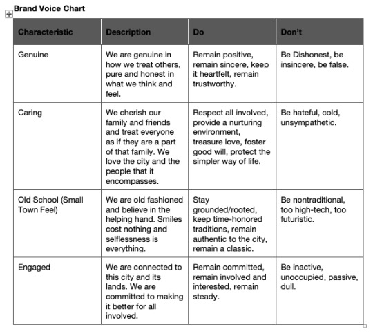
This month we done deeper in to the branding process, and in the case the re-branding process. We took what we have learned in previous classes and added ways to consolidate our findings during research. These consisted of a Brand Vice Chart in which we were tasked to compile all the characteristics that connect with our client, in this case our chosen city. This chart also contained a description for the characteristic and the Do and Don't sections for the brand.
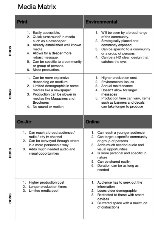
We also had to figure what types of assets we were going to use for the rebranding, whether physical/environmental or Digital, we had to way the pros and cons of each. The chart that was used is called a media matrix and the findings are listed below.
We were also tasked with creating a tagline, mission statement, and an introductory paragraph for our chosen city. These were to fully convey and strengthen the thoughts and feelings of the brand.
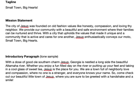
Each of these steps were designed to help us figure out our brand and what we wanted our brand to convey.
Connecting/Synthesizing/Transforming — What research did you conduct and utilize to arrive at the design decisions you present. How did you connect the research to your design work? What information did you synthesize and pull from the research and how did you transform the information into what you've presented this month?
This month we had to figure out a unique problem that faces our chosen city and as always this entelled way more research than I could have imagined. Before we could solidify what the problem was we had to complete the 4 W’s which dissects the problem we think is facing the city and who could be affected by the problem. The we have to determined what the outcome of the problem could be for the city and why it matters. This gave us the confidence to continue on in the class knowing that our research is solid.
The Four Ws
Who is affected?– All the residents of the city of Jesup. You have children to young adults who for the most part can’t walk down their street without fear of drugs and gang violence. The parents are worried for their children, and both children and parents are in desperate need of places that offer a safe and secure environment. Places that focus of the family and promote good clean fun. This is something that every resident will benefit from.
What is the problem? – The disconnect from what the city feels it represents and what the residents experience and see. A good bit of the higher ups in Jesup are older and have been in power for many years. They have become complacent in their positions and see no reason for change. Making it harder is that fact that they hire from within the family so it’s much harder to progress in any capacity. There is a heavy feeling of despair for most and they are yearning for something new and different. Some growth that gives hope that change can and will happen and break the cycle of complacency.
Where does it happen? – This problem is defiantly physical and physical branding in needed to convey the sentiment of the campaign. It has to be visual and in a physical space where all have to partake in it. There is something to be said for digital branding, and from my interviews social media has a massive presence and could defiantly help to drive attention to the physical branding options. A multifaceted approach could be the best fit for the city and its residents.
Why does it matter? – This problem statement matters because it is the epicenter of the divide in our city. We need things that will bring the community together. No matter of age, race, or religion we all are in need of something the promotes good wholesome safe fun.
Adding this to the research we completed last month, really helped to single out a real problem for the city.
Problem Solving — What design problem were you solving? What design problem does the medium you designed for solve according to the industry? How did you solve the problem? Restate your design problem to help explain this section.
The problem this month was trying to figure out a legitimate solution for the problem statement, one that made sense and really and truly fixed the issue for all those involved. We were again tasked with curating 3 possible solutions for the problem statement and to explain the rational behind our choices.
Tentative Problem Statement Revision.
The citizens of Jesup need a way to come together because a generational divide is being formed separating the town in two.
Solution 1- Creating a new brand identity that retains that small-town feeling by using a related color palette, but at the same time bring in elements that are on trend and up to date.
Jesup’s mascot is a Yellow Jacket and in this town Gold and Black are not just colors. They run deep in our community and these colors along with white will be our color palette. This is a simple way to give the older generation the since of normalcy, that small town feeling that they fight so hard for, and at the same time these colors are well known to the younger crowd and would not be met with any hesitancy. Jonathan Openshaw explains our connection with color this way, “Like all human senses, sight is influenced by nature and nurture, making the study of colour and wellbeing incredibly complex. On the one hand, the perception of colour has a biological basis. The human eye has two channels for receiving and processing visual information: rod cells, which control the perception of light and dark and focus on tones and movement, and cone cells, which react to red-green-blue (RGB) colours. We also know there is a strongly inherited aspect to colour perception, with men being around 16 times more likely than women to be colour-blind.” (Openshaw, 2016) This is more scientific then I wanted to go right off the bat, and I know this is speaking about color in biological/inherited terms when pertaining to the body. I like the word he chose, nurture, and I am also of the opinion that you can be cultivated by your family and your surroundings to love certain colors as well. I believe these colors can evoke nostalgic memories for the older generation. Then we introduce new fabrics, patterns, and a logo that will also satisfy the younger citizens as well.
Solution 2– Creating a brand identity that conveys Jesup’s love for community and diversity. Showing that Jesup is only as strong as the community that surrounds it.
With this solution we can still use the same color palette or even deviate from that and go with a brand-new color pallet. I believe a new color palette would work best here, defining the hands and showing an accurate representation of all the peoples that jesup holds so dear. For this rebranding solution the devil in in the meaning behind it all. We will have hands from all diversities/background reaching out to grab another. This will culminate in a circle which surrounds a well-researched and thoughtful typography for Jesup. Again, without its citizens, those that build it and keep it going, those that surround the city and give it meaning, Jesup would not be the city it is nor have the potential to grow and thrive. This retains the small town feeling the older generation craves, bringing the community closer together, and will also give the younger generation a sense of meaning, like they are seen and will be heard.
Solution 3– Creating a brand identity with the future in mind, banking on growth and community driven word of mouth.
We will plan and design for the future, understand that that design will evolve with the city and as the city grows the design can grow and elements can be added or deleted at any point. This is in hopes that we can snag a few chain restaurants and maybe a few activities centers like a bowling alley or a trampoline place like a sky bounce. This would integrate the hope for growth in the imagery used throughout the rebranding and also consist of uplifting and hopeful quotes/statements. These can be well known or come from citizens within the community. We chose a diverse group of individuals to create these quotes and then we integrate them seamlessly into the design. The color palette here can be as bright and diverse as the community, and really catch the eyes. No pastels here, but bright, vibrant, and eye-catching colors that will help to make every person in the community feel welcomed and wanted.
In this case I knew that if I were to try and change the colors the community would revolt, so the first choice was the best solution. It was also hard to figure out a tagline for the city, after choosing the solution because My head kept leaning towards the small town theme. With some help from my instructor I was able to cut it down to a small but very strong tagline.
Innovative Thinking — How does your work compare to others in the industry? How did you approach the subject of innovation? How is your work innovative?
My work is innovative in the way that nothing has even been done like this before in my city. No really branding has been submitted nor does it feel like the city cares much about it. So being able to curate this strong design and really an experience for the city seems to be innovative in its own way. After all the research came the fun part, the vision boards, and from last month to this month I can really see growth in my decision making and confidence.
Static Vision Board

Dynamic Vision Board
vimeo
Acquiring Competencies — What did you learn overall throughout this process? Any new software? Techniques? Skills? Explain.
We have been working with the same softwares and we have built onto the techniques we acquired last month, but this month we dove deeper. We learned about voice and tone and how they can positively effect a brand if the the research is done correctly. The Media Matrix was also really cool to see, and be able to actually talk and dream about practical re world design assets. Breaking them down and trying to understand the pros and cons of each helped me to understand that design yet again is much more than I ever thought it could be.
Since I started this program I have doubted the reason for doing so. I wanted this master’s so that my wife and I could someday open our own graphic design business, but lately watching all these major businesses files bankruptcy and close has scared me just a bit. It had me rethinking the whole idea, but then I had to realize that things happen. I will never get anywhere in life If I refuse to take chances. I also keep telling myself that I am learning, and I am learning a lot and with each new tie bit of information I am getting better and beginning to produce projects that are clean and professional. From here I will not doubt myself and I will keep pushing till I make those dreams a reality.
I also want to produce something that can become real. I know that what we are working on is sort of fake, but what if I was able to put together such a great design that it could be real. I walk around my town now and I can see it, what is lacking and how it could be reworked. It’s something that drives me and I enjoy the creative freedom. I am going to work towards making this real.
0 notes
Text
Mastery Journal
This month we were tasked with rebranding a city or community near us. One that that had 3 to 6 areas were there was little to no thought about their identities and how they are perceived by the community. With our locations chosen, we were then tasked to go out into the community and capture these locations in photo so that we could showcase them to our fellow students and instructor. We had to give a brief description on these locations and explain why these specific locations were chosen. The following is the photos taken for this months assignment and a brief description.
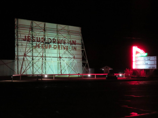
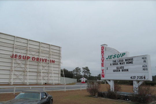

This is the Jesup Drive-in and it is the oldest remaining drive in theater in Georgia. Opened its doors in 1948.
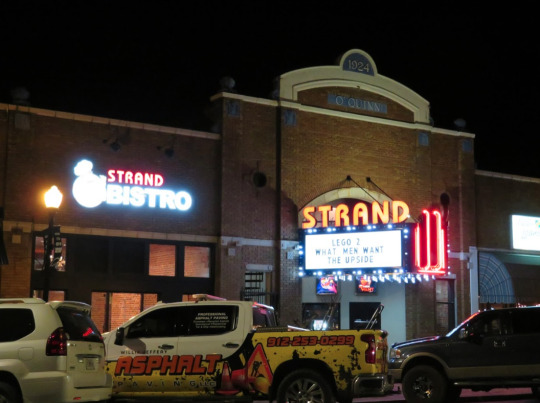
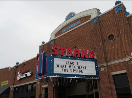
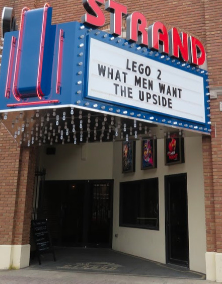
The Historic Strand Cinema, which opened its doors in 1924, was remodeled in the late 1980′s and turned into a 2 screen movie theater.

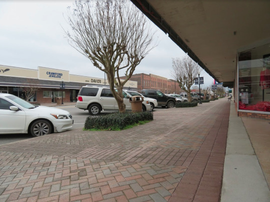
Downtown Cherry Street, is the heart of the city and divides the city in half. Mom and Pop stores lines the street, and even the Historic Strand Cinema calls Cherry Street home.
Bill Morris Park, is where the city of Jesup’s Recreation Department calls home. In the midst of building new state of the art complexes for Baseball, Soccer, Football, among other sports , Bill Morris park is your home for all things sports related.


Rayonier Jesup site is the world’s largest cellulose specialties plant and was opened in 1954. Rayonier is a huge driving force in employment for Jesup which now sits at 840 employees and contributes approximately 1 billion annual economic impact to the region. For these reasons I chose Rayonier as a focal point of interest for Jesup.
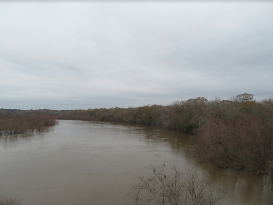

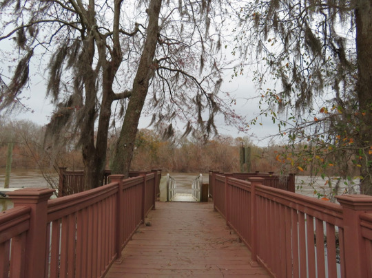
Every child in Jesup grows up on the Altamaha river. It literally cradles the town and is the life line of the city. Rayonier uses it for hydro power, and families flock to its sands bars to fish or take in the sun. There is great fishing, in which the state record blue catfish was caught, weighing in at a staggering 93 pounds. Fun Fact the Altamaha is the 3rdlargest contributor of fresh water to the Atlantic from North America and has the largest tributary.
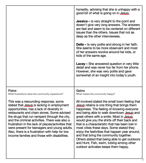
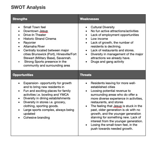
With these location chosen and photos taken, we were then tasked with going out into the public and conduction in person interviews. We were instructed to do research and come up with questions that would give us a more well rounded understanding of the city, and how it’s residents perceived it. Following our interviews we were tasked with completing a design brief. One that would help us in the next few month build a strong brand for the city. With in the design brief we learned about Empathy maps and SWOT Analysis and how these are used in the industry to help with the branding process. These were even more in-depth and helped us tap into the thoughts and feelings of the city and it citizens, to really understand the give and take between the two. Following are screen shots of the completed Empathy Maps and SWOT Analysis.

With these completed then it was our final assignment to construct a Problem Statement, a problem that the city is facing, and one that can be solved through design, and the create and Elevator Pitch which would be a short 60 - 90 second video expressing your solutions and why you think it is the best solution for the city. The following is the formulated Problem Statement and the subsequent Elevator Pitch.
Problem Statement
Based on all the information compiled from my research, interviews, and personal experience living in the city of Jesup, the problem is that the older population has different wants and needs than the younger population and there needs to be a way to connect the two. Some common ground that can appeal to both the older and younger residents of Jesup and help promote generational understanding
Elevator Pitch
vimeo
With all the information conducted and the design brief and elevator pitch complete, we will move on to the next class and build upon the structure we have completed and go on to tackle the branding itself.
Connecting/Synthesizing/Transformaing
I used a multitude of research this month to drive at my design designs and that began with research into my city. By checking online into the history of Jesup, and by sifting through all the webpages that make up the cities Website. I used in person interviews to get an understanding of how the community feels about the city itself. What they feel makes Jesup unique, and what the loved about the city. I also needed to understand what the felt was lacking in the city, and what they felt the city needed to them engaged. We were also given many links to videos or websites that explained in detail the steps we were taking like:
1. Design Briefs - Author - Terry Lee Stone
2. SWOT Analysis - Authors - Watermark, and Jordan Devos
3. Empathy Maps - Author - Jordan DeVos
4. Elevator Pitches - Authors - Aimee Bateman, Todd Dewett, and Jodi Glickman
With this amount of information at our finger tips we were able to put together and thorough and well rounded Design Brief.
Problem Solving
Honestly the biggest design problem was ironically the problem statement and figuring out just what it was. While conducting our interviews, and completing our research on the city, one glaring problem came out and that was the lack of activities in the city for the youth in the community. This was expressed across the board in my interviews and being a part of the community myself, I know this to be true. So at first there could not be any other problem that needed to be solved. I found out very quickly that this was not a solid problem to solve because for the most part it could not be solved by design. That would have me building a brand for something that is not yet here, and the purpose of the assignment was to rebrand the city, and that meant was was here currently. So wit that out the way I still needed to figure out what the problem was I was trying to solve, and one that also kept pooping up was the disconnect between what older residents want for the city, and what the younger generation needs. I took this problem and ran with it. As I continued it all fell into place and the problem statement constructed was a huge help in completing my elevator pitch.
Innovative Thinking
From the beginning this rebranding was suppose to be something brand new. Something that brought a breath of fresh air, and something that the city of Jesup has never encountered. Now this brought on complications because it also needed to feel familiar and carry a nostalgic feeling. This is something new for the city and has never been done before, so if done correctly could really be a big hit. Taking elements that feel nostalgic, or carry a small town feel, and then add current elements would satisfy both the older and younger generations and help to bring them closer. This is innovative in nature and has never been accomplished in my community. This is why my rebranding design is and will be innovative.
Acquiring Competencies
What I learned from this process, and what I will take away with me, is the process of completing a SWOT analysis and Empathy Map. Completing these two assignment taught me just how much goes into the branding process and that it takes much more research than one would think. It also taught me just how important these steps are, and I now understand why a designer would want to go through the pain of gathering this data for a client. It gives them all the ammo needed to produce a great design and therefore give the client a design they will be proud to call their own.
Reflection
This month has been hard, every step was something different that I had never done and so each step meant I had to step outside of my boundaries and make sure I completed the assignment. I am a very introverted person and so the thought of going out into the community and having to conduct in person interviews was very difficult for me. Now it did help that we would also interview friends and family but again this was still a hard step for me. In retrospect if not for those interviews I would have been lost when it come to the Empathy Map, SWOT Analysis, and Problem Statement. So I am glad that I was able to complete the interviews and really get the information that I needed.
I really want to take the information gathered this month and move on to produce a really thoughtful and clean branding. I have an idea of how I want I want it to look, but have no clue how I will get it done. It’s something in my head, and I can see it, but I can’t explain it in words. So from here I want to be able to take what is in my head and bring it to life. This is what I want to do going forward, and I want to do the city of Jesup justice. I know this is just a fictional assignment, but I still feel obligated to make it the best I can.
References
Bateman, A, 2018. How to Create a Perfect Elevator Pitch. Retrieved from
https://www.lynda.com/Business-Skills-tutorials/How-Create-Perfect-Elevator-Pitch/728380-2.html
Devos, J, 2018. Design Problem Statements - What They Are and How to Frame Them, Retrieved from
https://www.toptal.com/designers/product-design/design-problem-statement
Dewett, T, 2018. Pitching Your Ideas Strategically. Retrieved from
https://www.lynda.com/Business-tutorials/Pitching-Your-Ideas-Strategically/737755-2.html?org=fullsail.edu
Glickman, J, 2018. Pitching Yourself. Retrieved from
https://www.lynda.com/Business-tutorials/Jodi-Glickman-Pitching-Yourself/721917-2.html?org=fullsail.edu
Stone, T, 2013. Running a Design Business: Creative Briefs, Retrieved from
https://www.lynda.com/Design-Business-tutorials/Running-Design-Business-Creative-Briefs/114320-2.html?=fullsail.edu
Watermark, 2017. How To Build A Successful Brand With A SWOT Analysis. retrieved from
https://blog.watermarkadvertising.net/build-brand-with-swot-analysis/
0 notes
Text
Mastery Journal and Reflection
This month we learned about motion graphics and how when done correctly it can enhance any graphic design. Whether it was reading Animated Storytelling: Simple Steps for Creating Animation and Motion Graphics by Liz Blazer, who takes a thoughtful yet comical approach to learning the basics of motion graphics, or the countless hours of footage that I sifted through on Lynda.com and YouTube, I was able to learn the foundational skills needed to become extremely proficient in motion graphics. I was able to start working in After Effects which in turn would help me build skills that would aid me in my assignments, like completing a Dynamic vision board and a motion poster.
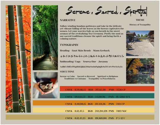
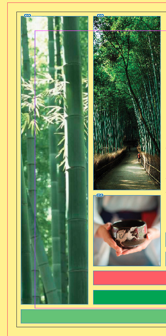
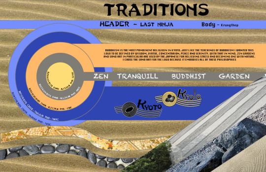
My biggest issue with the designing for a city was that it all had been done before, how can I take unique attributes about a city and use them in a fun and innovative way. As I watched and watched ads for my city (Kyoto, Japan) I realized that everything was photo realistic and straight to the point. Nothing was light, playful, and gave a sense of childlike wonder. I then decided that it was my job to connect with this side of Kyoto’s promotion and I took a more Illustrative, cartoony approach. I still would evoke the spiritual side of Kyoto but in a way that even a child could understand. The decision-making became much easier when I knew where to start from.
Throughout this process I was able to gather a murid of new skill that will stay with me far into the future. Learning the basics of After Effects has given me tools that supplement that of which I learned while I was getting my Computer Animation Degree. Already being adept at Photoshop, Animate CC, InDesign, and Illustrator this game me one more tool that I could you to help with my designs in the future. One example would be that in my motion poster I was looking at way to take an image of water and make it move somehow. In a way that was believable but was still keeping with the integrity of the original image. This was hard, but as I began to get comfortable with AE I came across Turbulent Displacement and I was able to tweak the setting to complete a very believable motion in the water. Its abilities like this, that I have learned throughout this month, and ones that I will take with me as I head out into the industry.
Organizational Structure has been one of my favorite class here at full sail and because of the skill I have learned while taking it, I know I will be a strong candidate for employment as I enter the work force. I mean the end all be all of going this far, and spreading yourself this thin, it to graduate and get a good job. That is what will happen and that will be my future.
vimeo
This is my Motion Poster for the city of Kyoto, Japan.
vimeo
This is my Dynamic Vision Board for the city of Kyoto, Japan. This was taking our Static Vision boards and adding motion.

This is my Static Vision board for the City of Kyoto, Japan. This was an accumulation of research so that we would be able to complete a well structured design plan.
References
Demetriou, D; 2018. Everything you need to know about seeing cherry blossom in Japan. Retrieved from
https://www.telegraph.co.uk/travel/destinations/asia/japan/articles/japan-cherry-blossom-sakura-guide/
McGregor, L; 2017. Bring Your Film Marketing To Life With a Motion Poster. Retrieved from
https://www.premiumbeat.com/blog/create-marketing-motion-poster/
Motion ADS, 2017. What is a Motion Poster? Retrieve from
https://www.motion-ads.com/What%20is%20a%20Motion%20Poster.html
0 notes
Text
Mastery Journal Reflection
This month was eye opening for me in the sense that I had no clue about many of the subjects we covered in the class. When it came to the intricacies of layout and typography there was much that I had and still have to learn. But what I was able to retain and use in my design did help me to clean up my design and cohesively dial it in to where it was very close to my initial idea for my vision board.
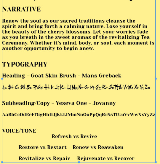
Grids and hierarchy were two concepts that helped me to make essential connections in my vision board. Being able to set a grid to help provide placements for assets on my board was a huge help in decision making. Being OCD I tend to need everything to be placed perfectly and the grids fed into that need for there to be symmetry and cleanliness. Even though we were only working on a single sided paper this month, I was able to use the information given from our reading to help with my vision board. Ambrose and Harris advised that, “In the symmetrical grid the verso page will be a true mirror image of the recto page. This gives two equal inner and outer margins. To accommodate marginalia the outer margins are proportionally larger” (Ambrose; Harris, 2011). I was able to use this to set my outer margins and subsequently the spacing for my entire vision board. This is also true when it comes to hierarchy in the fact that it helps with placement of where text needs to be, and the significance of each. To be able to place emphasis on certain wordage on my board was a great tool to have and learning about hierarchy and rules that govern how to use it was so helpful this month. Ambrose and Harris explain that, “The text hierarchy is a logical, organized and visual guide for the headings that accompany body text. It denotes varying levels of importance through point size and/or style” (Ambrose; Harris, 2011).
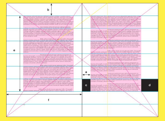
Image retrieved from Basics Design 02: Layout

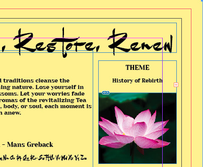
When it came to problem solving, this month I was faced with one problem specifically. When I first completed my vision board, I had an idea of a spiritual oasis. A place to get away and find yourself, or at least relax and let go of your worries. So, I took a stance of history of rebirth. Show natural elements of Kyoto’s landscapes and traditions that were known to eliminate stress and worry. What I didn’t think about was the word rebirth would be taken literally and the visuals I had painstakingly chose for my board would not connect with the theming. So, I had to go back a rework my narrative, visuals, and key words to reflect the rebirth theme. Even though it was something different that my original concept, I was able to use my new research to help refine my concept and I think it ended up much better than the first.

One common practice I used this month was working with the baseline grid. This was a new concept to me and I honestly still get confused with it from time to time. I was able to use the baseline grid to position all the elements of my vision board, so that it was visually consistent. Ambrose and Harris state, “The baseline grid is the graphic foundation upon which design is constructed” (Ambrose; Harris, 2011). They also go on to state that, “The baseline grid provides a guide for positioning elements on the page with accuracy, which is difficult to achieve by eye alone” (Ambrose; Harris, 2011). This is nothing innovative on my part, just standard design practice but in the future, I hope to understand this concept much more so that I am able to raise the level of my designs.
Image retrieved from Basics Design 02: Layout
The three concepts from this month’s teachings that have helped me improve the most was the Grid, Passe partout, text handling. Each one of them on their own helped to strengthen sections of my board, but together helped me to cultivate and very clean linear and geometric design that I am proud of. Again, being OCD I gravitate towards tools that help keep assets neat and in their specified place, however I do realize that this boxes me in hinders my creative process. That is something I am aware of and will be diligently working on to alleviate. The first image below showcases how the grids helped me to clean up my vision board. The second image shows my application of passe partout, and the third image shows how I used text handling to set hierarchy and leading for the typography section.
References
Ambrose, G; Harris, P, 2011. Basics Design 02: Layout (second edition). Retrieved from
https://ce.safaribooksonline.com/book/graphic-design/9782940447169
0 notes
Text
Mastery Learning Project: Project Reflection
This past month has been one of the hardest for me personally and has pushed me far beyond my comfort zone. I am not a strong writer and the thought of having to complete anything with writing scares me. I am however wanting to be the best graphic designer I can be, and if copywriting is what I need to be great then so be it. I just had to convince myself that I could do it and be good at it.
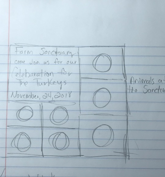
One of the first assignments we were asked to complete was 6 sketches of print ads that we wanted to complete for our non-profit. This month I chose Farm Sanctuary as my non-profit, and I honestly knew nothing about them or the information they stand for. After a good bit of research, I began to understand what my client was needing, and a few ideas sprang forth. These of course were rough sketches, but it helped to spark an idea that I ultimately ran with. The sketches helped me to clear my thought and come up with strong ideas for my print ads, and the more I began to sketch the clearer my concept became. In his book Advertising: Concept and Copy, Felton quotes Ansel Adams who is a photographer, she states that, “There is nothing worse than a sharp image of a fuzzy concept” (George Felton, 2013). This was a statement that stuck with me, and I wanted to make sure that the ads I chose to go with, were strong in Concept as well as image.
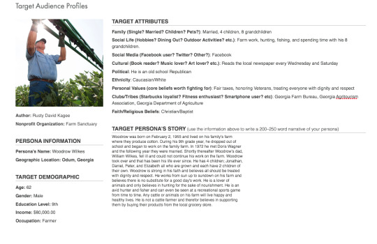
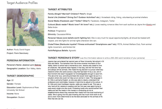
The next assignment was one that I surprisingly enjoyed. We were asked to come up with profiles of what would be our non-profits target audience. I again did a good bit of research to compile information on those that Farm Sanctuary were already targeting, but I then wanted to broaden the scope. I was able to be creative and come up with two very different personas that fit within the scope of the project, but I was able to make the feel real to me. I think that is what made the assignment personal enough to get me to go all in on the personas.
With my three initial comps, there were two ads that I worked hard on but didn’t fit the assignment. One was a flyer type ad for a petting zoo held by Farm Sanctuary in the attempt to receive donations. The other was a straight forward ad for the company but did not have a call to action or any rational for that matter. The third was the product of the Idea that I came up with while working on my sketches, and that was an ad featuring a farm animal, and the ad would look like it was completed by said animal. This by farm was my strongest ad and one that I was very confident in. This add gave me an opportunity to tell a story or create a narrative through the eyes of the animal itself. Felton states, “Once you think of yourself as a brand’s storyteller, then all your product research is less to find stray factoids than to dig into that brand’s history and reason for being, the narrative that accompanies it” (George Felton, 2013).
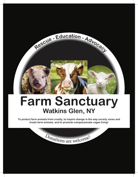
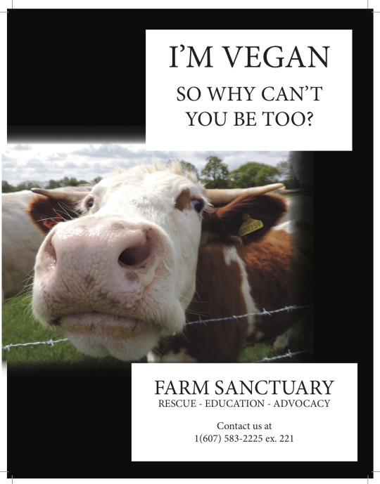
With feedback from my instructor, I realized that the third ad concept was something to dig further into, and with her suggestion I used that concept and created two other ads that compliment the first. Each ad would consist of a different animal (cow, chicken, pig) would contain information about and a few quotes from Farm Sanctuary. This would make this print ad series cohesive and hit on the issues that Farm Sanctuary is trying to bring awareness too. I was able to craft a series of print ads that I was very proud of, and at the same time cultivate a running theme though out, so that these could easily transfer to other types of advertising mediums.
Felton, G. (2013). Advertising: Concept and Copy (3rded.). New York: Norton & Company.
Initial Sketches


Target Audience Personas
Initial Concepts
I unfortunately can not find one of my initial concepts, it somehow got deleted.
Final Concepts


0 notes
Text
Vision Board Final


I went back and tried to rethink all three boards. How could the be more professional, express what I want them too, and also be clean. Because I was so stuck to symmetry and everything having to be perfectly spaced apart, I know that it hindered my creative expression. So with these new boards I wanted to think objectively and really let the boards speak for themselves.
0 notes
Text
Initial Post


This class and what we have learned here has all been new for me, I am coming from an animating background and design is similar in some ways and much different in others. Threats for me are other candidates who have an extensive background in design, and those who are well versed with the Adobe Suites line of software. I am a novice when it pertains to InDesign and Illustrator, so I just need to buckle down and learn more. I will make sure I try working in these specific software’s until I am able to bring to life whatever is asked of me.
I am very strong when it comes to the research and logo design aspect of the class, and I am able to step outside my own box and see things is a very different way, and that so far has been a strength for me as well. I want to remain confident in what I know I do well, and work harder on that which I do not.
My biggest weakness when it pertains to the vision boards is that I am a stickler for rules, and that tends to hinder my creative thought process. I began to get stuck on symmetry and making everything look perfectly in order. This is due to my OCD, and when I saw some many of my classmate’s vision boards, I knew I wasn’t anywhere close to where I need to be. This is something I will defiantly work on, so I can further my design sensibilities and be able to think outside of the box.
0 notes
Text
Peer Review and Reflection
Task 1 Ive never done anything like what we have done this month, so this is all new and I am just trying to soak it all in. For me, at least for this month, I found that making the process for the logos easier was better for me in the long run. I did as much research on the city as I could, and the mind mapping process made it very easier to pick assets that I thought would flow well in a logo. I did however find myself updating my mind maps throughout the month, because I would find something new about the city I didn't come across in the initial mind mapping sessions.
Once I was ok with how much research I had done, I moved on to using the assets I chose in the mind mapping session, and began developing the structure of my logos and how the assets would interact with the text. By choosing the text format first, I was able to chose an asset that complimented the text. As the process moved forward I found myself making more simpler, smaller and concise logos. I began to understand the process and trust that I was making the right decisions.
The liner design fits me and my process this month in my logo designs. I would come up with a concept and work on it once or twice, but I felt that the end result was a strong logo. I look forward to learning more about logo design and branding so that I can obtain a more complex routine and become more fluent in the design process.

In the last phase, I honed in on my the simplistic approach and began using more unique assets to pair with strong but more fluid font typing.
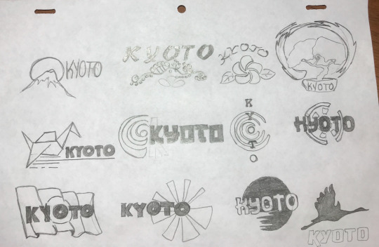
This set was created during the second phase of logos, and you can see I have moves to smaller and simpler designs. I am still using assets that are uniquely Kyoto, but I have adjust the size and worked in more interesting font styles.
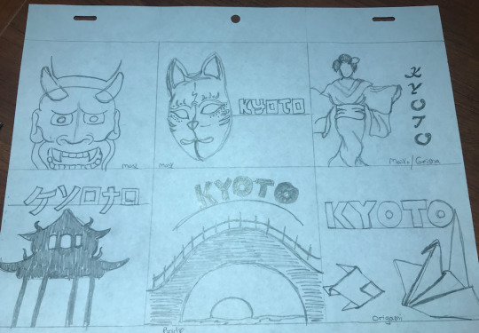
With these logos, I just began choosing assets that I knew screamed Kyoto, Japan. They take up most of the logo and I think there is much to work upon here.
Reflection
While most of the feedback I received was good, a few did suggest that a few of my sketches were a bit to detailed. It was suggested that I try to simplify some of the logos so they could translate better to the client. I tend to forget that I am not the only one looking at the logo’s and I need to make sure that they convey what I am trying to get across. With this feedback I take this into the next course and keep in mind that I need to make my logos in such a way that it can be understood by anyone.
Reference:
OGrady, J. V., & OGrady, K. V. (2017). A designers research manual: Succeed in design by knowing your clients understanding what they really need. Beverly, MA: Rockport, an imprint of The Quarto Group.
0 notes
Text
Action Plan
This one is kind of hard for me, because I don’t know what to expect from my upcoming classes. I honestly just want to take it day-by-day and hone the skills needed to be a good professional graphic designer. For the next twelve months I am going to give every once of thought and energy I have to make sure to take every class/project seriously. I want to make the most of the curriculum and absorb all the information I can so that when I graduate and enter into my chosen field I can put my best foot forward. My expectations after completing my master’s degree program is starting my own graphic design business with my wife. She is a very talent individual in her own right when it comes to graphic design, and is the reason I chose Media Design in the first place. I want to make my mark in the industry and set a standard of excellence that will be associated with the name Kagee for years and years to come.
0 notes
Text
Mastery Journal Reflection
Having more self-management opportunities is somewhat different coming from my undergraduate studies, so I will have to stay diligent and work hard on time management. I think of myself as being a strong communicator and I know that is a large portion of the design world. Being able to convey your thoughts on a project clearly so that everyone understands your intent is very important and I know that I can get stronger in this area. I’ve never had a problem with any form of feedback/criticism, but I do want to work on taking in that information and being able to implement them cohesively into my design.
I am coming from an animation background, and I don’t have much experience when it comes to design/graphic design. So, I am worried I am much further behind most of my fellow classmates when it pertains to design. This is something that scares me because I am already at a disadvantage. I knew this coming in, so it is something I am willing to overcome. One other fear is that I am not able to retain the information I need too in the class to make the connections that are asked of us. I have always been artistic, and I know I can do it, but I do let doubt creep in every now and then.
0 notes
Text
Inspiration 3
My inspiration this week is the new Overwatch Animated short. It is full of beautiful movement and an engaging story line. The colors are vibrant when needs and the music is cohesive to the emotion of the short.
Retrieved from https://www.youtube.com/watch?v=q7j2d6YCQbg
0 notes
Text
Inspiration
This week my inspiration is a quote from Dr. Randy Pausch who stated that, “Experience is what you get when you didn't get what you wanted. And experience is often the most valuable thing you have to offer.”This is an immensely profound statement, and I will remember this when trials and tribulations head my way.
Pausch, R. (2008). “The Last Lecture reprised.” https://www.youtube.com/watch?v=BODHsU3hDo4
0 notes