rwillustration
Rubys Fashion Illustration Blog
17 posts
Don't wanna be here? Send us removal request.
Last Seen Blogs
myneighboursstuff
Untitled

drapeslosangeles
Curtains and Drapes Los Angeles
palazzocontemporaneo
Palazzo Contemporaneo
palazzocontemporaneo
Palazzo Contemporaneo
bird-gone-human
The Human Bird's Awesome Blog
Text
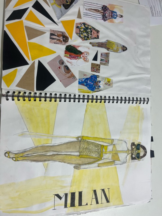
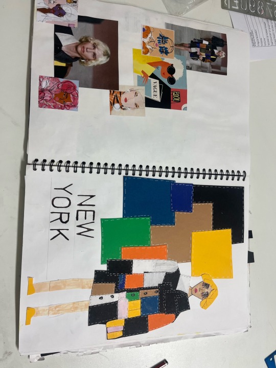
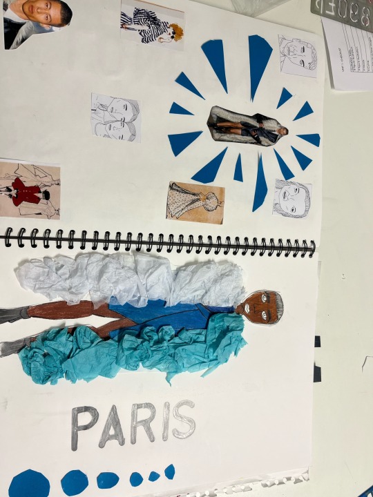
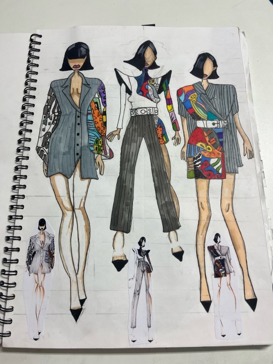
These are my ss23 catwalk looks where we had to choose our four catwalk looks one from each place [Milan, Paris, London and newYork] and eight illustrators and combine them together to make an illustration. My favourite piece of all is my Milan piece as the catwalk look and the illustrators I chose worked really well with the piece. However I’m not happy with my Paris look as the illustration isn’t really relevant to the illustrators styles that I had chosen. To improve next time I would try to use styles that work well with the illustration and try to control my time management for the pieces .
0 notes
Text
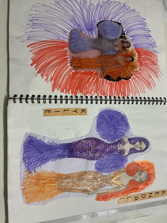
This is my met gala piece where we had to choose an image from the met gala and illustrate it to our best ability. I chose Kendal and Kylie Jenner which was my favourite garments out of all. For this illustration I used pro markers along with filigree to create the effect on the garment. I’m really pleased with this piece and love the small details within the illustration. However, next time to improve I would try to make the feathers more realistic and less like lines.
0 notes
Text
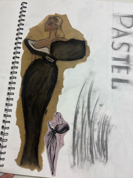
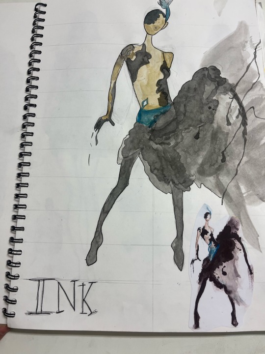
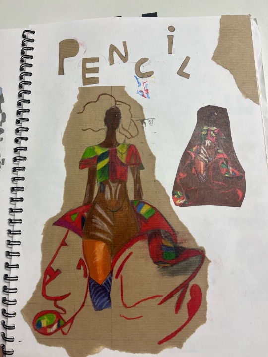

These are my 6 quality media illustrations where we had to experiment with the use of different media to encourage different use of media in future pieces. The six media’s used are pastel, ink, pencil crayons, pro markers, collage and watercolour this were to show us different skills and ways to present our work. I’m pleased with the way all of these turned out particularly the pro marker pieces these really boosted my confidence with using pro markers as I believe the attention to detail works really well with the pro markers. Im not too happy with the water colour, collage and pencil faces this is because the water colour piece was ruined by the illustration on the other side of the paper, the collage piece looks rushed and untidy and the pencil piece doesn’t have a face because I drew the face too small. Overall this task really helped me work with other media’s and boost my confidence with using them.
0 notes
Text

This is my final stylised face illustration where we had to combine both a style and an imagine into an illustration, for this illustration I used a style with a small head as the lady on the photograph didn’t really have any detail on her face so I thought it would work well however, in this instance I was incorrect. I’m not too happy with this piece of work as there’s no attention to detail and the style doesn’t really fit with the image. To improve next time I’ll use an image and style that fits well together to ensure it works well and use a media that works well within the illustration.
0 notes
Text
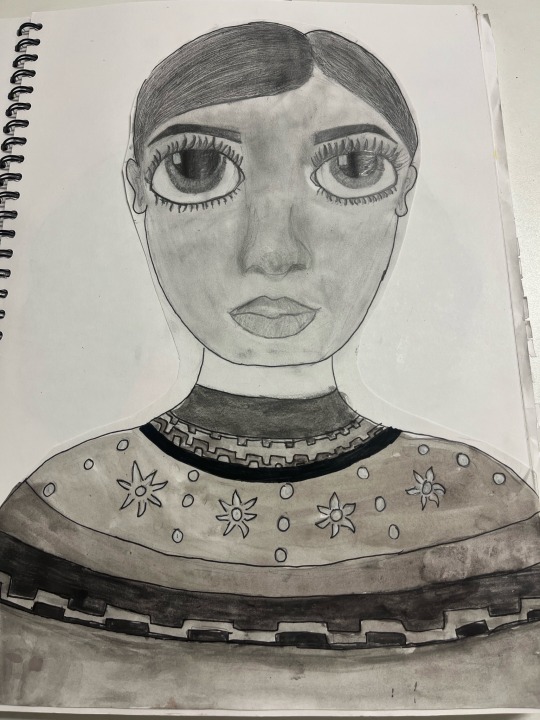
This is one of my stylist faces where you had to pick an image and a style and combine them both within your illustration, for this illustration i chose a style with big eyes and used pencil to bring out the big eyes and pay attention to detail. ’m pleased with the way this illustration turned out although there’s a few points on this illustration that I could have improved on such as the overall head shape and the nose. To improve next time I can try to improve the shaving within the face such as the Under eyes and cheek bones. This illustration really improved my confidence with drawing eyes.
0 notes
Text
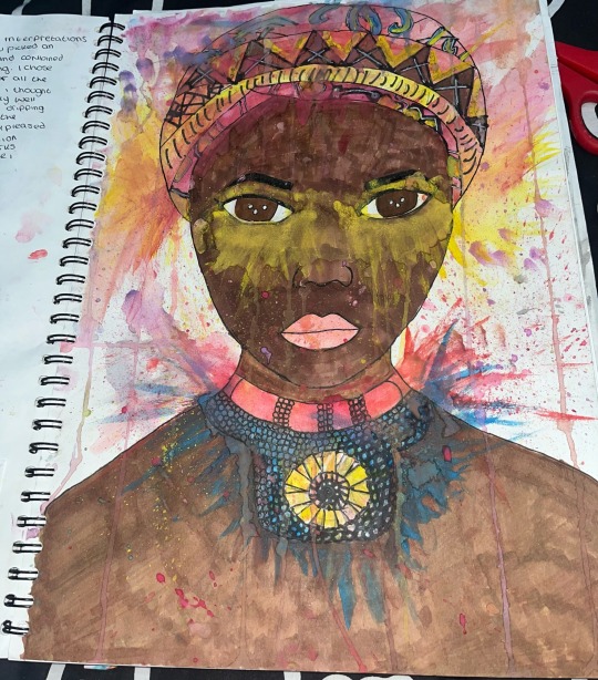
This is one of my stylist faces where you had to pick an image and a style and combine them both within your illustration. I chose a water dripping style for this image because I thought it would work really well with all of the colours and patterns within the necklace and the headpiece. Im really happy with this piece of work as I think the image worked really well with the style and the dripping of all the colours makes a really good effect. This illustration really improved my confidence on drawing faces and different patterns.
0 notes
Text
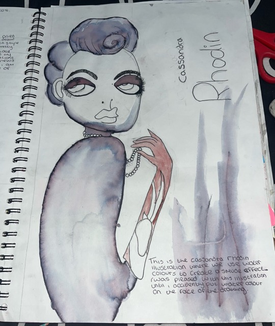
This is my Cassandra rhodin illustration where we tried to recreate a piece of her work by illustrating her and using a marker pen and water colours to create a smudging effect. I was really pleased with this work as I believe it looks like the image given and the watercolours and smudging effect worked really well. However some of the watercolour came off of the lines and smudged too much in places I didn’t want it to be like on the jawline.
0 notes
Text
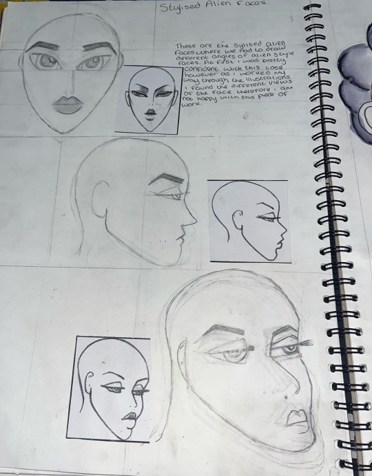
These are my stylised alien faces where we were given three alien faces with different face angles and proportions. At first I was really confident with this task as the first alien face doesn’t look to bad however as we move on to the next two alien faces I found them really challenging to get the different angles and views right. I didn’t enjoy this task due to the different angles of the face being really challenging especially the third face. The last illustration is the one I’m least happy with as it took multiple attempts to do and still looks messy.
0 notes
Text
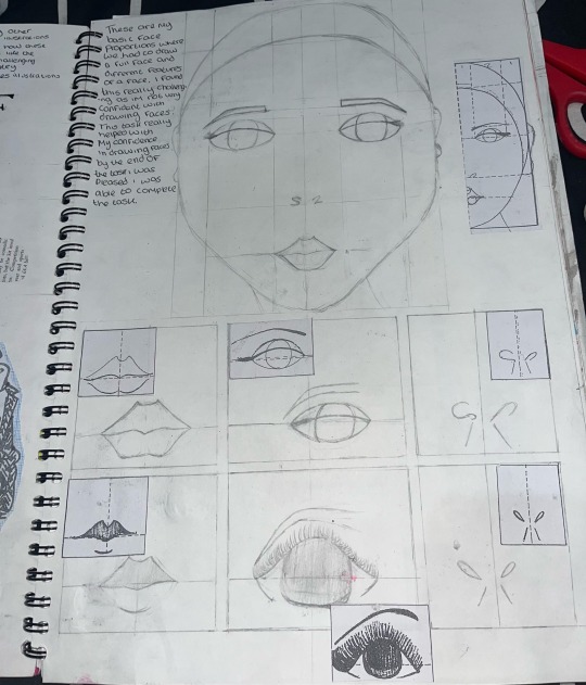
These are my basic face proportions where we had to draw a full image of a face and six different features underneath this from the images we were given. I found this really challenging at first because I wasn’t overly confident with drawing faces before this piece of work. This task really helped me improve my face illustration work and by the end I was really pleased with these pieces of work because they all look quite similar to the images given.
0 notes
Text
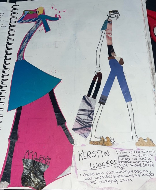
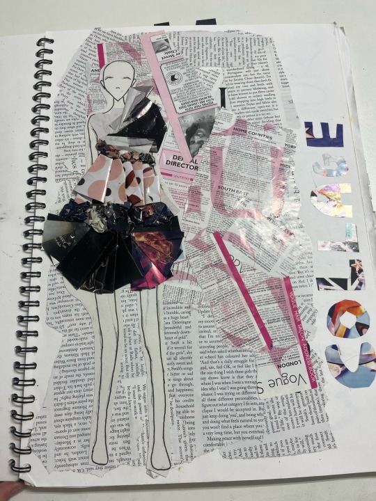
This is my kerstin wacker piece of work where we had to illustrate two pieces of kerstins work and cut out magazines to collage the illustrations. I really enjoyed doing this task as it wasn’t too complex and I really enjoyed tracing the image onto tracing paper and cutting out the magazines in different patterns to make the illustration look good. The least successful part of this work is the second image as it doesn’t look as appealing as the first piece of work. I believe I could have cut out different patterns on the magazine to improve this.
0 notes
Text
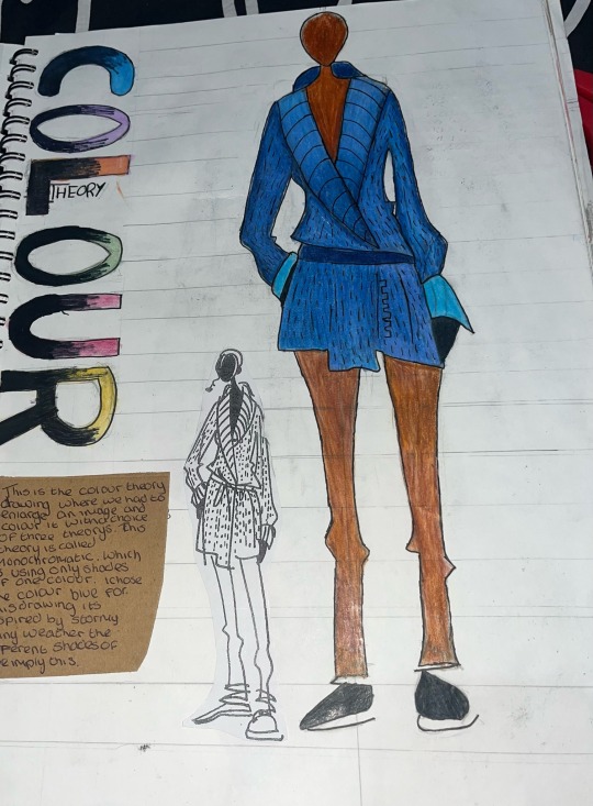
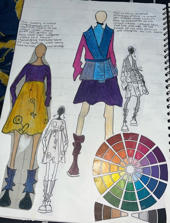
This is the colour theory task where we had to enlarge and rescale the three images we were given and choose one of the three colour theory’s to apply to the illustration. For the first image the colour theory I chose was monochromatic which is using different shades of one colour. I found this first illustration frustrating as it was difficult to draw each detail from the picture. I’m also not to happy with the colour theory applied to this drawing as the different shades of blue aren’t really visible and could be better next time. For the second illustration I applied the complementary colour theory which is opposites on the colour wheel I chose purple and yellow as they are two different colours that seem to work really well together. I found this illustration hard was the image was really hard to enlarge and to sketch the details. For the last illustration I chose the analogous colour theory which is where you pick colours that are next to each other on the colour wheel. Overall I’m not really impressed with this illustration as I don’t think the colours go to well together and the images details was really hard to sketch.
0 notes
Text
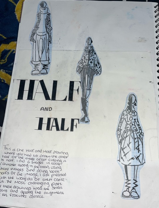
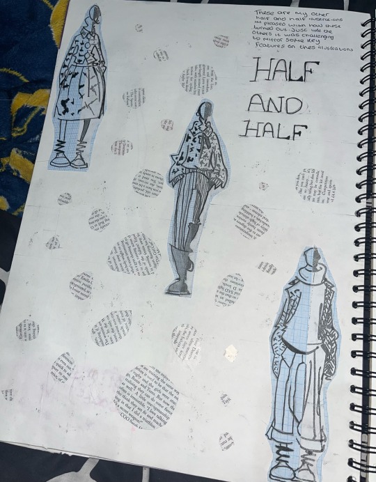
These are my half and half illustrations where we were given three images and had to chop them in half and draw the other half based off the image creating six pieces of work. These are one of my favourite pieces of work as I believe these look really good. I found this task easy as we wasn’t drawing a whole image only half and then coping the other half. I’m really happy with how these came out as they all look in place. The only challenging part of this task what the little details within some of the pictures that was super challenging to draw onto the other half of the illustration.
0 notes
Text
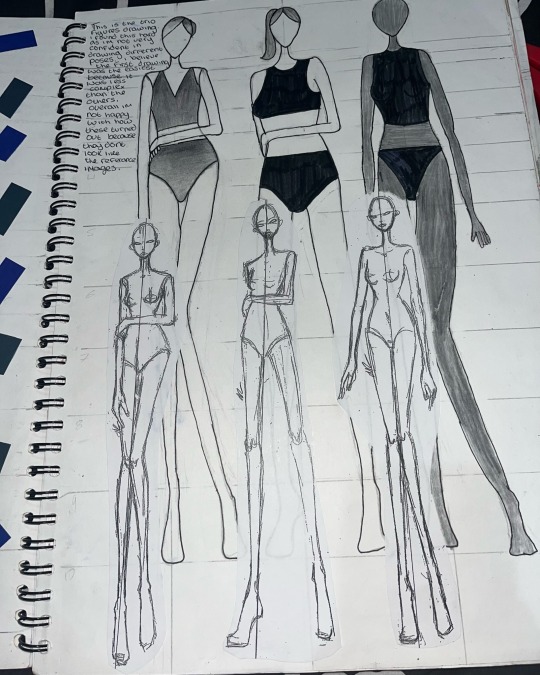
This is my trio illustrations where we had to draw three illustrations in different poses based off the images given. I found this method challenging as I’m not too confident on drawing different angles and poses in my illustrations. I used the 9 figure grid reference for this piece of work as I found that it was the method I worked best with. I found that the first illustration was the easiest and was the most successful of the three as I was most confident with the pose and didn’t find it too difficult however as we go down to the other two the difficulty progressed slightly. The second illustration wasn’t too hard for me she just looks slightly different from the image and her arm looks slightly odd and finally the last illustration I found the hardest due to the way the figure is posed in the picture.
0 notes
Text
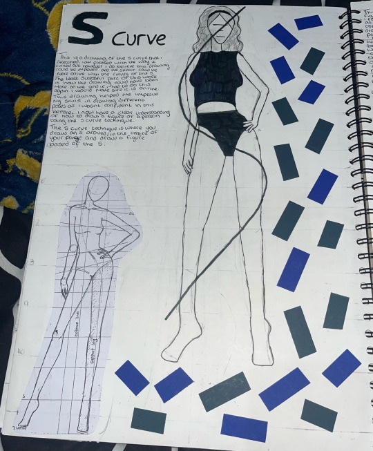
This is the s curve illustration that I sketched where you had to draw a posed figure based on the letter s. I really liked this method as it helped me improve on drawing different poses in my illustrations and my confidence on my posed illustration work. However I do believe there was things to improve on such as the enlightenment of the illustration and the s could have been better but overall I’m happy with how it turned out.
0 notes
Text
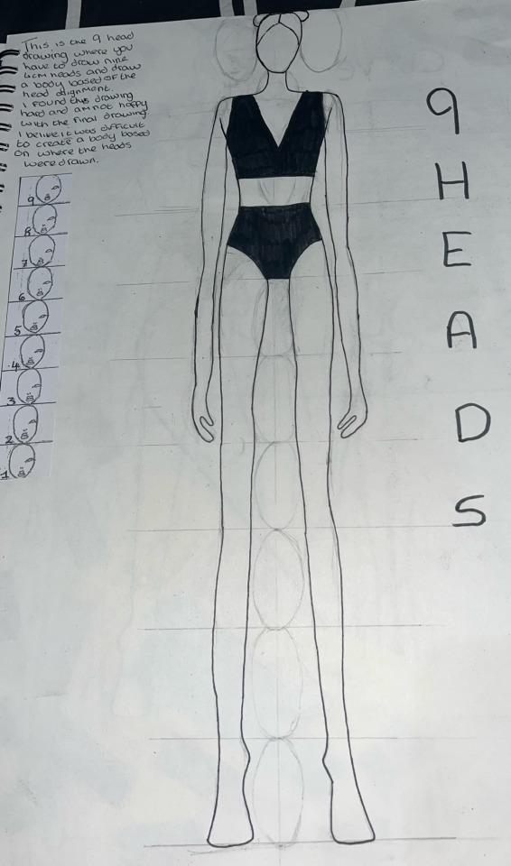
This is the nine heads illustration where you had to draw nine four cm long heads and draw a body based off the head enlightenment. I didn’t like this method as i didn’t understand how to draw the body based off heads. I found this method really challenging due to not having any measurements or guidance on where each body part is supposed to be. Im not overly happy with this illustration because I believe her shoulders look very broad making her look quite manly, her arms and legs are quite long also making her look a little off.
0 notes
Text
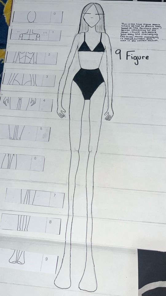
This is the nine figure grid reference illustration where you had to draw an illustration based on nine sections of an image. I liked this method because it’s another technical method and I prefer this to free hand. This one was very similar to the eight figure illustration but is more complex and has more sections within it. One thing I found challenging about this piece of work was drawing the right thing in each section and making sure everything is even because my drawings needed to line up with each of the sections. Overall I’m not too pleased with this drawing because she looks untidy due to her legs being really wonky and thin.
0 notes
Text
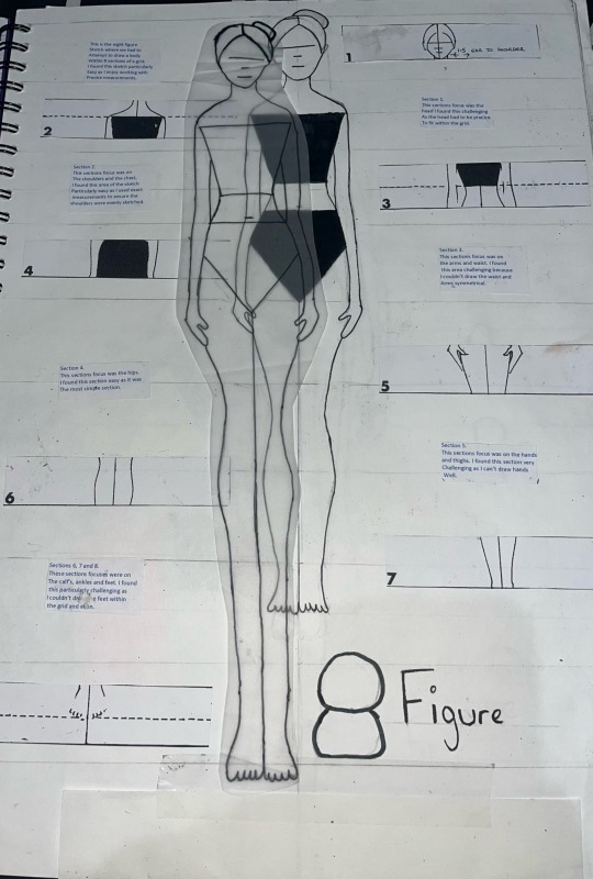
This is the eight figure reference where we had to illustrate a figure based on eight sequenced sections. Each section has a different part of the body and has to be identical within the illustration. We then had to extend the body onto tracing paper and make the legs longer. I liked this method as it’s uses technicality and math to ensure each body part is lined up. I am quite pleased with this piece of work as I didn’t find it too difficult and she looks symmetrical. However, I don’t like the hands and the feet and believe that can be improved for next time.
0 notes