
Statistics
We looked inside some of the posts by samischrader and here's what we found interesting.
Average Info
Notes Per Post
14
Likes Per Post
6
Reblog Per Post
4
Reply Per Post
4
Time Between Posts
6 days
Number of Posts By Type
Video
2
Photo
13
Text
1
Last Seen Tumblr Blogs


Fun Fact
Women make up for the other 50% of Tumblr’s audience.
Video
youtube
Now You See Me? Camouflage Project
My documentation of my camouflage project.
0 notes

Photo


QUESTIONS I HAVE
How will I get to my spot without being seen?
How will I get the cardboard to stay attached to my head or above it?
What if someone comes and cleans off all of the fliers before I execute my plan?
What if someone comes and rents the space right in front at the last minute?
Will it help if someone rents the space for a fund raiser or not?
Will this even work?
How will I record from both sides?
RESEARCH: DIFFERENT TYPES OF DISGUISES
Mimesis: Resembling something not of interest to the observer
Self-decoration: Covering oneself in materials from the environment
Disruptive Coloration: having high contrast coloration that breaks up outlines, so observers fail to recognize the object.
Dazzle camo: bold patterns of contrasting stripes, deceiving enemy about the ship’s heading.
¬ The intention of dazzle is not to conceal but to make it difficult to estimate a target's range, speed, and heading.
I will combine Self-decoration with dazzle camo to conceal myself within the space between the two panels of the billboard.
Source:
Wikipedia
https://en.wikipedia.org/wiki/Dazzle_camouflage
Imperfect camouflage: how to hide in a variable world?
https://royalsocietypublishing.org/doi/10.1098/rspb.2019.0646
Dazzled and Deceived
http://eds.a.ebscohost.com.proxy.lib.iastate.edu/ehost/ebookviewer/ebook/bmxlYmtfXzQ1MDI0N19fQU41?sid=f1a64652-c167-4b70-8afa-bf3eb37547a3@sdc-v-sessmgr02&vid=0&format=EB&lpid=lp_1-2&rid=0
EXICUTION
Plan: To combine Self-decoration with dazzle camo or mimic camo to conceal myself within the space between the two main panels of the billboard. Using cardboard to cover my body on the front and back, then covering the cardboard with fliers that a percent. I will then stand between the gap of the two panels of the billboard. My back and front will be covered so from both sides of the board I will be “invisible”.
Goal: The goal is to not be noticed for a minimum of ten minutes. If longer then great, but due to the heavy traffic flow the likely hood of not being noticed when approaching the area will be unlikely.
Tactic: The tactic will be to combine a self-decoration with dazzle camo. Self-decoration will be applied by using the current flyers and posters present. The fliers will be applied to the cardboard pieces, that will be painted with an exaggeration of the billboard texture. I will attach the posters to the dazzled cardboard pieces and myself.
Possible problems: The area is very heavily trafficked so getting to the location would be nearly impossible to get to without being noticed. In addition, the space right out in front of the billboard can be rented out.
Documentation: I plan to do a video documentation with my phone. Liz and Kayla will be helping me so they will record be from both directions using my camera phone while I hide.
13 notes
·
View notes
Photo


Project: Research Description/Steps
Study/analyze the area
Research other examples
Should be able to talk about approach based on research
Should be able to talk about approach based on research
Pick approach
Poster Diagram Graphic of approach
Execute
Document execution with video or photos.
> Document execution with video or photos.
Wednesday 13, 2019 | 11am-11:40am
Location/Structure Description:
The location is right inside the Design College building on Iowa State University campus. It is a stand-alone structure used to display event posters, ads, clubs, etc. The structure itself is a stand-alone billboard structure located between two elevators and the main front entrance of the building. It is made up of metals and wood. Neutral colors of a silvery, charcoal gray metal, is the majority of the billboard. There are two benches that are made of a light wood. I would estimate an average of 25 posters or more are on each side of the billboard structure. The posters range from color to black and white. Most common colors are ISU gold and cardinal red for posters.
Traffic Flow/Human Interaction:
Walking around the area and observing it from a far I noticed the area has heavy traffic flow. No one stops to look at the space unless they are waiting for the two elevators, which are located right behind the structure. Even than most people are looking at their phones rather than the billboard. The occasional by passer will stop and tie their shoe on the seating bench. At least one young student did before leaving the building. Her friend stood and waited for her while she tied her shoe. The girl tying her shoe did not look at the posters, but her friend waiting did.
Saturday 16, 2019 | 2pm-2:30pm
Location Description
It looked like nothing had change really. There are still as many posters here as there where on Wednesday.
Traffic flow
There was practically little to no one here. I might have saw a total of four or five people. The time here was uneventful. There could have been something going on in another part of the building or more people here than what I was, but I was unaware of their presence.
Monday 18, 2019 | 10:50am-11:30am
Location Description
The billboard structure remained roughly the same, but a rectangular folding table was placed before it. Along with the folding table where three chairs from the main sitting area on the other side of the steps. Three people sat in the chairs and a small eight and a half by eleven sheet of paper was taped to the front of the table facing the main doors. The paper said Pizza $3 a slice.
Traffic flow
When I first entered the area there where a LOT more people hanging around than any other time or day I’ve been here before. For the first time people where actually sitting on the bench and standing around talking. It felt much like a social and community area. I thought it was mainly due to the table set up in the center entry way, because a group was selling pizzas for a fundraiser. After about five minutes my question was answered; it was an ISU tour group with parents and their kids waiting for direction for their guide about the next location. Which was lunch. The table in the center of the entry way changed the traffic flow quite a bit. Many people where stopped by the new addition to the atmosphere and the smell of dominoes pizza. Many people stopped at the table to get pizza or to just talk. After the tour group left no one seemed to sit on the bench again. Things seem to die down compared to the commotion of the tour group and fundraising table. The people at the pizza table attracted most of the crowds and created a different movement threw the area than what was previously established. People either went to the table or had to find a new path around it. No one seam to avoid the table thought, which was interesting to observe. Students not interested would just walk right pass the table, clearly not concerned with their step count that day.
Conclusion
The area has a heavy traffic flow during the weekdays, so if I want a crowd to be present that would be the time to test my experiment. If I want little to no people present than a weekend would be ideal. Since I have the opportunity to get a great response form a large crowd, I will execute my experiment on Monday or Wednesday between 11am-1pm. For optimal traffic flow a time between classes. Another thing to consider is the poster designs hanging around. Do I need to create posters/flyers, or can I use what is already there for my disguise? Do I need to even use posters/flyers? How elaborate do I need to go for my disguise? Since most people seem to walk right past the area do, I want to try for something simplistic and push my ability to disguise? One thing is clear, I will have to prep my disguise in a different area before going into my designated space to avoid detection. Perhaps have one of my classmates helping me, Liz and Kayla, throw some kind of distraction so I can sneak in from the other side to minimize detection.
0 notes
Photo


Substitution Project – Reflection
Starting off on the project I thought of a list of things I could do, but with the time limit of 10 minutes, I decided to go with a PB&J sandwich. My first attempt was successful in everyone creating their sandwich in a timely manner and having small variations, but the task was too simple and there was too much noise in the background of my video. The task was completed in under 5 minutes and the greatest variations was the about of PB&J was used on each sandwich. The video itself was taken in one shot, at one angle and had too much movement with not pauses between steps. I only did two attempts and prepared nothing in advance before shooting the video.
I avoided doing too much research on the variations of making PB&J’s and different food tutorial videos so I would not be influenced when first attempting to make my own video. Exploring my own path to creating my content and finding the final result was somewhat freeing. It was not successful, but the first steps should never be a success. After getting feedback from the group, I knew I needed to make my process more complicated and have a more elaborate result and clean up my video tutorial. I started off looking up different ways to make a PB&J. Some being more elaborate than others, but trying to keep the time limit in mind and knowing I have never created and edited a video before I wanted to keep the task bearable. So, I opted to go with the PB&J roll-up. I then looked up different video tutorials for making food. Taking note of the angles, pacing, music, and the different moods of videos. For food making it was either an upbeat mood or relaxing kind of mood. Next I wrote out and sketched an outline of my steps. Noting when to pause and add different camera views.
I decided creating short clips and putting them all together at the end would give me more manipulation can control over the video editing process. I lost track of how many attempts I did, but there where at least 2-3 attempts for each clip and a total of 16 clips I used in the final video. I then had to look up video tutorials for video editing and found Premiere Rush was the simplest to work. Still took some time, but in the end, I felt the video was at a good pace and had nice angles. At least for a beginner like me.
Heather was able to complete the task in a timely manner. She said the video was a nice pace, the music kept her calm during the process, and over all the project was nicely done. She did note that if the video was for instructions to shorten it and to think about target audience. If it was for children, maybe showing the process of taking the lids off and putting them back on. Also, I should show all of the materials needed in one shot instead of three. I agree with all of those statements. I wanted to also add making the task even more complicated. I felt like the roll PB&J was still too simple and could still be worked on. In addition, my lighting could be better and cleaning up after each step to get rid of crumbs would help clean up the video and the space more. The music was a great success I think, but the rest of the video and the task itself could definitely use some work.
0 notes
Photo


Everyone completed the task under 10 mins and there was little variation. The most variation I had was the amount of peanut butter and jelly was on each sandwich. I need to make the end product more advanced and have more steps within the video. Needing to also pause after each step and have less movement between steps to help emphasize each step. Reducing video noise to help focus the viewer to the actions and zooming up on my actions more. Starting off with a story board of my steps will help me organize my actions and steps better.
0 notes
Photo


WRITTEN REVIEW OF THE BEAUTIFICATION PROJECT
With Beautification Project One, I struggled with a lot in the beginning. I was unsure the context of the project and the different levels of beautification. I understood how visually something could deceive a person, but I did not understand and never looked into the how or why the deception was even necessary in the first place. Threw out this project I tried to understand these different levels of deception of beautification and the pros and cons of each of those levels, but now I can confidently state I did not fully understand the full impact these different levels had. I do not even think of them as levels so much now, but rather different perspectives. If a designer is skilled enough to fully understand these different perspectives of beautification, than it would be a powerful skill set to wield. Especially in the world where advertisement is such a dominant field.
Relating now to my design for the project, I believe my beautification redesign was strong. Blue Buffalo focuses so much on the story of nature for their branch of Nature Dried Dog food that obscuring their story and image to that of a science story was a strong approach. I struggled so much in understanding the beginning portion of this project, that I felt like I missed an opportunity to create more than one flavor of dried dog food packaging.
So, my end goal is this. Rewrite and breakdown the different levels of Beautification. Better defining Blue Buffalo’s manipulation of the different levels of beautification; truth-bending, mode, perceptibility, and level. Second, I plan to create one, if not two, additional food flavor packaging design(s). One for chicken and duck. Just to show more variations of the design packaging and branding identity.
Company Overview
The company I focused on was Blue Buffalo’s dry dog food. The company was recently under attack for promoting their dog food to be some of the healthiest dog foods around, but now can actually cause health problems later on in the dog’s life. Studies show the lack of or substitute of wheat in dry dog foods can now cause health problems for a dog’s heart later on in their lives. This got me thinking, how did Blue Buffalo get this reputation for being some of the best and healthiest dog for you can buy? Why did I fall for their brand and spend all this money I probably didn’t need to, without doing the proper research on the food itself? Their packaging is nice, yes, but I believed it for more reasons than it just looking nice. I believed their dog food to be the best, because it seems the most natural, healthy dog food I could get for my dog. When the truth is the dog food is not natural at ALL! It is dry dog food, thus it had to be processed in some way. Blue Buffalo intrigues the consumer with their story of nature and playing off the idea that natural food is good for you it is good for your dog. A “natural” diet like the wolf’s is the best diet for you pooch, but we all know the truth. The truth is house dogs are not wolves and do not need to kill something to eat. They are eating processed, dried dog food given to them around the same time every day.
Research Overview
Truth-bending | On Standby
Makes Consumers believe:
Blue Buffalo reminds consumers their dogs are descendants from wolves, so they need a natural diet and we have just the one for you. True that dogs are very descendants of wolfs, but they are bending the true by putting the full truth on standby. Yes, dogs are descendants of wolfs, but very VERY distant descendants. Almost to the point that they aren’t even family anymore. Or at least the family that should never meet up for family reunions.
Mode | Overstating
Makes Consumers believe:
Blue Buffalo is telling a story of nature with their packaging. Practically screaming how natural their food is and how this is the closest diet your dog will get to that of a wolf. They are overstating the nature story and the natural side of this food.
Perceptibility | Covert
Makes Consumers believe:
Blue Buffalo is clearly food for your dog but is covertly it is dried dog food. Meaning it is not as natural as me might like to think.
Level | Connotative
Makes Consumers believe:
Blue Buffalo’s dog food is grain free and all-natural meat based, like what wolfs eat, must mean it is good for your house dog than.
0 notes
Photo


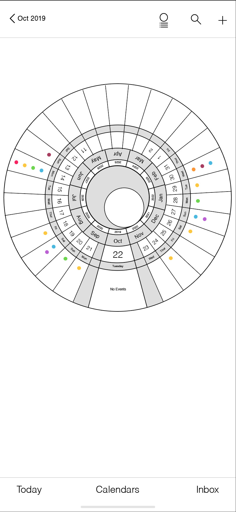
Skeuomorphism Redesign
So after much tweaking, learning how to use Adobe XD and making more tweaks in there I finally came up with my final-ish design. The features of the app is that the layers would move in a locker combo style. Where each layer would be able to rotate when the viewer would drag the dates around. By double tapping on the calendar view as a whole you would be able to zoom in to where ever you need. Just like the calendar app on the iphone now, there would be two viewing versions the viewer can choose from. Where you could view the calendar month as a whole, or in this case the entire calendar year as a whole, and the calendar month and day with the list of events you have below. Due to time I was not able to create all 365 days a year, but I am interested to see how much more I would like the calendar if I did. Looking back at the design aspects I learned that I need to make the text a bit bigger for easier readability. That is the most I would have to say I need to change for the look as a whole. Class Response:
Most everyone in the class agreed that this form of the calendar app is something they would utilize. Stating that the full view of the round calendar year as a whole was easier to read, but enjoyed the idea how the calendar not only follows the days events, but the lunar cycle and the seasons better. Making them think of time as more than a line moving forward. Over all I feel like the skeuomorphism approach I took was a successes. There is much that the design could use and a lot more I could utilize, but changing the way people perceive time itself is skewed and changed.
0 notes
Photo


I had a pretty good idea where I wanted to go with this project design. So my next step was moving it to the computer. I knew I wanted to try and make the calendar app better than what we have now. While working on the digital version of my sketches it occurred to me that someone might have actually tried this before. So I did a quick search, and what would you know someone did. Luckily the design I decided to go with was different enough that I did not have to start completely over. The comparison ended up being very useful. I was able to experiment with someone else design attempt and figure out what was working and what was not. The biggest problem I realized was that their design was TOO simplistic that it become harder to read the calendar. Also, their design did not allow space for events, which is kind of the whole purpose of the calendar? So sticking close with the design the iphone was already using I created a circular version of the calendar. Tweaking things here and there as I played around with the calendars complex layout.
0 notes
Photo


This is my notes from my 15min presentation about the history of the calendar and icons. We discussed the interest and idea in brining back the original layout of calendars. Or more playing on the idea of time and how we think of time as moving forward and never back. That the measurement of time is on a single plain. A straight line that keeps moving forward, but yet our holidays, birthday, months and dates are annual. They happen yearly and the year itself is made up of months that repeat when we get to the end of the line. The calendar lines up with the circulation of the sun and moon which move in a circular motion around the sun. So playing on the idea of the calendar being round, again, would defiantly change peoples perspective and interaction with the calendar. Or at least that is the hope.
0 notes
Text


Purpose
Personal or cultural schedule by time, day and year.
Most historical societies are day, solar year, and lunation (the moon or lunar eclipse)
Slide 2
The first calendars are believed to have been created during the last glacial period, by hunter-gathers who employed tools such as sticks and bones to track phases of the moon or seasons.
Slide 3
During the Neolithic Era, stone circles, like Stonehenge where build in various parts of the world, especially in prehistoric Europe.
Ø Thought to have been used to time and predict seasonal events such as equinoxes or solstices.
Ø No recorded history of this time. So little is known of their calendars or timekeeping methods.
Slide 4
Ø Methods of Sexagesimal (six-a-gess-mal) timekeeping, now common in both western and eastern societies, where first established nearly 4,000 years ago in Mesopotamia and Egypt.
Ø The Babylonians (todays Iraqu) used a year of 12 alternating 29 day and 30 day lunar months, giving a 354 day year. In contrast, the Mayans of Central America relied not only on the Sun and Moon, but also the planet Venus, to establish 260 day and 365 day calendars.
Ø This spread over the Central America.
Slide 5
Ø Eventually led to the great Aztec Calendar Stone.
Ø Our present Civilization adopted a 365 day solar calendar with a leap year occurring every fourth year.
Slide 6
Ø In 45 B.C.E. Julius Caesar introduced his calendar.
Ø Making January 1st the start of the new year, because it was always the date on which the solar number and the golden number where incremented.
Ø The Church tried changing this, because they did not like the parties that happened
Ø But since 1600 most countries have used 1 January as the first of the year.
Slide 7
Arrow < >
Purpose: Is a graphical symbol or a pictogram, used to point or indicate direction.
Ø Has been used as a symbol for less than 400 years.
Ø Early map making and diagrams the arrow is illustrated as an archer’s arrow.
Slide 8
Empirical origins
Engraved into the pavement of the ancient Greek city Ephesus in the first century AD, is a symbol of a footprint and a women’s face. Believed when united is read “Walk in the direction that the food is pointing towards to reach brothel.”
Slide 9
Ø Pointing fingers are also used in early printed texts and manuscripts.
Ø referred to by a variety of names, including printer’s fist, pointers, and manicules
Slide 10
One of the earliest uses of the arrow being used toward symbolizom was in Bernard Forest deBélidor’s treatise Hydraulic Architecture, published in France in 1737.
Also around this time arrows where being used in maps to show water flow.
Slide 11
abstraction & variation
> By the mid-to-late nineteenth-century, there is a shifting trend in how the arrow is rendered.
Ø For Swiss typographer and designer Adrian Frutiger, this is the essential and defining feature of an arrow that will communicate its basic function.
Ø English cartographer Emil Reich is credited with pioneering the application of arrows for analytical and pedagogical uses in his book, A New Student’s Atlas of English History.9
Slide 12
In 1922, German mathematician David Hilbert introduces the arrow symbol to represent logical implication, so that a formula may read as follows, “X implies Z,”
Slide 13
Today the arrow is used all over the place and in many different forms.
Slide 14
The magnifying glass is commonly used as a symbolic representation for the ability to search or zoom, especially in computer software and websites.
Slide 15
One of the earliest traceable uses of a magnifying glass in a user interface was created by Keith Ohlfs
Ø Ohlfs wasa graphic designer and illustrator for NeXT in 1987
Ø responsible for designing the graphical elements of the UI in the NeXT Workspace Manager
Ø his choice of icon for NeXT’s Find feature might have set the precedent that we’ve been following ever since
Slide 16
Window Control
View a list of events: In month view, tap to see the day’s events. (Tap again to return to month view.)
Slide 17
Is new and only used mainly in newer iphone icon systems.
Not a lot into on it so I broke it down.
Slide 18
The three lines in apple products has represented customizing ones space or files. Customize Controls, then press and hold next to the controls and drag them in the order that you want them.
Related back to the file icon, just a simplified version.
Slide 19
File icon relates back to the idea of filing data, history, etc. into archives.
Ø Archives contain primary source documents that have accumulated over the course of an individual or organization's lifetime.
Ø A system used for thousands of years. As far back as second millennia BC.
Ø Where they would store stone tablets.
Ø The ancient Chinese, Greeks, and Romans would also store and organize their papyrus scrolls.
Slide 20
Window history
> First used as a way of lighting and letting smoke escape.
Ø In the 13th century BC, the earliest windows were unglazed openings in a roof to admit light during the day.
Ø Later, were covered with animal hide, cloth, or wood.
Ø The Romans were the first known to use glass for windows, a product first made in Roman Egypt
Slide 21
First time translated digitally on PC’s Xerox program
Apple took that idea of icons to navigate and tried to simplify it the Lisa Office system
We now see drag and drop file copying, movable windows and fancy new icons today.
Slide 22
Meaning add to
Addition
The + is a simplification of the Latin word and "et"
Slide 23
Ø The study of mathematics has existed since ancient times. Multiplication tables and other math exercises have been found carved into Babylonian tablets from some 3,700 years ago.
Ø Nicole Oresme's manuscripts from the 14th century show what may be one of the earliest uses of the plus sign "+”
Ø Before the P and M where used in mathematics to represent adding
Ø The Maltese cross was another attempt at a plus sign, but when writing fast it does not work as well.
Slide 24
Robert Recorde, the designer of the equals sign, introduced plus and minus to Britain in 1557.
Since then the symbols that have become entwined with our conception of math.
0 notes
Photo


Blue Buffalo’s dry dog food pretenses focuses on the story of nature and the idea that this food for your dog is natural and made for the wild pet you own.
I focused on redesigning the dog food packaging to emphasize the science that goes into making the dog food. Retelling the story of Blue Buffalo’s dog food, so that the pretense will change from a nature story to one of science.
Design by Sami Schrader
________________________________________________________________
Sources/Credit to:
Bag Mock-up: <a href=”https://www.freepik.com/free-photos-vectors/mockup”>Mockup psd created by aleksandr_samochernyi - www.freepik.com</a>
Stock image of scientist: Photo by Chokniti Khongchum from Pexels
0 notes
Photo


Blue Buffalo’s dry dog food pretenses focuses on the story of nature and the idea that this food for your dog is natural and made for the wild pet you own. The target audience is fully aware that this is dry dog food and not anywhere close to what your dogs wilder ancestors, the wolf, actually eat. It has been processed in someway to become dry food for well... your house dogs. Not wolfs.
I am focusing on redesigning the dog food packaging to emphasize the science behind the dog food. Retelling the story of the dog food, so that the pretense will change from a nature story to one of science.
0 notes
Photo


Design Beautification Analysis of Blue Buffalo dry foods packaging.
Blue Buffalo has build a strong brand for being some of the highest quality pet food one can buy for their cat or dog. Creating a brand that represents your pets roots to the wild and making sure your pet get the same quality food their wilder relatives get today. Promoting a grain-free diet and exotic ingredients. But is an all meat diet what your pet really needs?
The truth is your dog and cat are not these wild animals. Your dog is far off from being a wolf and your cat is not even close to being the size of a bob cat. And if you are willing to spend a lot of money on pet food it is unlikely your pet even lives outside. With those facts in mind, your pets require a different diet than an all meat based “natural” diet like a wolf or bob cats. Recent studies have shown that an all meat based diet for your pet can have long term side effects and can lead to heart problems as your pet gets older. That unlike animals that truly live in the wild your pet needs a small portion of wheat in their diet along with the vitamins and protein.
Blue Buffalo overstates that their pet food is natural. Though we all know that dry dog food is processed and made to last several months. Their design on the packaging uses images of wolfs for their dog food and highlights the meat flavors by making the packaging different colors to make the viewer over look the fact it is not truly 100% natural meats.
They make the viewer perceive that their pet food is made with your pets best interest in mind. That your pet is a beautiful, wild creature, who deserves the best “organic” like pet food out there. Even with a new tier of dog food that doesn’t have any of the substitute grains that are supposedly the cause of Canine Heart Disease (DCM), but costs a whole lot more then your average Blue Buffalo dog foods. Why would you spend so much money on dog food if it WASN’T going to be the best for your pet.
Design Changes:
They have six different tiers of dog food. The lowest tier is the only dry food with actual grain in its ingredients, but is also the most dull design. A simple blue and cream color, informative text, and their logo. Nothing else. I would focus on this design being the most appealing and informative. Being honest with their information. Changing their lowest tier dry food to one of the highest tiers.
0 notes
Photo


Truth and Lie in design.
Are birds really dinosaurs? Can you make a dinosaur from a chicken egg?
1 note
·
View note