
Statistics
We looked inside some of the posts by sammygoestoischool and here's what we found interesting.
Average Info
Notes Per Post
0
Likes Per Post
0
Reblog Per Post
0
Reply Per Post
0
Time Between Posts
12 days
Number of Posts By Type
Text
11
Last Seen Tumblr Blogs


Fun Fact
In Q3 of 2020, 31% of US users access the Tumblr app daily.
Text
NATIONAL SOCIETY OF BLACK ENGINEERS HACKATHON


In March at the very beginning of my curiosity about technology and design, I decided to join my first hackathon. It was called NSBE. The National Society of Black Engineers. It was a hackathon where the prompt was to encourage us to group together and model an innovative piece of technology that would help people in a way that hasn’t really been seen in our current markets. My teammates and I, pictured above, decided to use Auto CAD software to create a medication dispenser that would dispense the correct daily medication dose without being prompted by hand movement, as a form of accessibility in innovation. We dreamed that this technology would have an app, an ability to control its function at any given point without being near it, and determine the parameters for its function.
It was a really cool hackathon, and although we unfortunately didn’t win. I had learned so much, and made some amazing friends. Prior to that hackathon I had never knew about nor used AutoCAD a day before it, and after the hackathon I spent the following weekend exploring its options and seeing what ways I could explore 3D modelling on my own time!
0 notes
Text
SPACE EXPLORATION ENGINEERING


A few weeks later, also in March I joined another hackathon. I was really excited to be in community with other students who were also motivation by technology and tinkering with it. Seek was really cool, because we were specifically tasked with coding and constructing a mini robotic rover made out of styrofoam, wheels and a raspberry pi chip, to travel across different obstacle courses. Essentially a toy rover inspired by the full scale rover shown in the photo above.
The coding was fun for me, I did a good chunk of it with the help of another teammate, I hadn’t coded for a robot before but the hackathon prepared us adequately with a weeks work of modules to watch and prepare with, along with a supportive discord channel for any questions. But the physical construction of our rover was where I got to watch and learn, as the girls and guys on the team who attempted to construct the best configuration for our rover were engineering majors. Actually I was one of 2 non-engineering majors in our entire group, so that was really nerve-wracking. But I still learned so much, and despite having 3 mechanical engineering majors on my team, our robot did nothing but glitch across the obstacle course. But it was still worth it because it was hilarious to see it do that in spite of our best efforts.
0 notes
Text
RELATIONSHIP B/W COVID DEATHS + INCOME


This might seem a little different from the hackathons I showed before, but this is because around October, when I had started learning a significant amount about geo-visualization, accessibility and audience interpretation it, I started to relate everything I learned in this class back to User Experience and User Interface design. The heart of the course’s content overall was a discussion on how to create visualizations of geographically significant data, that relayed the most honest and easily interpretable version of the message possible. That meant we discussed User Interaction design with maps often. Especially in relation to concepts like the colour of maps. Should maps displaying demographically data, be in colour schemes that would be harder to interpret for people who suffer from colourblindness? For example people with Protanopia, where the red cone in vision doesn’t exist and people see in ranges of greens and blues light. This was important because this might mean a maps colour choice could obscure important data for some people!
The reason I included this map above was to show that this type of education, this urge to look beyond my perspectives and account for others was something I exercised as I created the map. Determining the colour of the dots, their shape, what colour scheme of cholorpleth map I’d choose left me trying to maximize the heart of the data and reduce potential for confusion or misinterpretation as much as possible. Without haven taken a UX/UI course, I felt the content of this course was one of the important first steps in entering that education for me
0 notes
Text
ISCHOOL TOUR


In November, I saw that ischool was offering tours on eventbrite. I and another potential student, but for the masters program signed up and we toured the building. Above are some of the photos that impressed me when I stepped into the space so much that it only served to make it concrete for me that this is where I’d like to be a student. Seeing the students walk around, chatting idly while catching up on homework, seeing the pods that functioned as a form of cozying hub, seeing the architecture and how inviting it was to spend hours there without necessarily feeling like you’re stuck in an oppressive academic space but rather an exciting and open one, seeing how casually our tour guide spoke to the front desk like they’d been friends for sometime, and hearing the encouragement from my guide about how inviting of a school it was and how supporting it was really made me want to do diligently conduct an impressive application because I wanted to belong in that space too.
0 notes
Text
MALARIA


In December I did a final project on the malaria index for each country according to WHO boundary data. The project was a flexible chance for every student in class to take their own spin on geographic disease and vector data visually, using all the resources and tools we’d covered up until that point in the semester. Many of my friends in class did a classic map using ARCGis, many others did a Story map, where an exhibit of text and images told a story about the geographic disease data and region of their choosing, and I chose to do an ARCGis dashboards visualization that presented malaria data like an interactive map. In the photos above I show my project on desktop, and present side-by-side images on the separate data that can be explored. And just below there’s a video showing what the same data looks like on mobile. The mobile feature was really impressive because it meant that the same message would be reached without compromising on device compatibility.
Interactivity had really been emphasized during that semester. Not only because it wasn’t the easiest to integrate into our projects, considering how limited our time spent learning Python was, therefore making it a heavier project. But also because it was an ideal way to invite engagement in our visualization projects. My professor mentioned that the option to interact with data, and let audiences explore it for themselves left a bigger impression on their digestion of it.
I understood that idea, similarly to the way many people explore unfamiliar things with touch more than just sight alone. The option to interact and tangibly influence something novel to you, builds an innate confidence in comprehending it. This was important because the data we were using was health data, so I really wanted to do something that left an impression.
I also added a brochure I made in canva, to function as an way to provide more context on malaria in addition to the dashboard. The brochure had a QR code sending one’s browser to the website. I was very proud of this project!
0 notes
Text
KEBRA AND CONFERENCE DIGITAL EXHIBIT
In March I did a digital exhibit/museum for a medieval studies course. What interested me in this course was how closely it related to digital humanities and how digital humanities, and ischool was tied, I found it really interesting to take a course that taught so much about medieval history and did so using a breadth of disciplines.
It’s inclusion here is to show that this was another really cool chance for me to explore interactivity in digital spaces, and also for me to brainstorm ways that the user experience of my exhibit could be improved if we spent longer on this unit in class. The ability to travel a map, and attach a location to a stories setting an time appropriate artifact from a digital museum archive was also really fun. And I also got to see my classmates projects and see how they set up their Omeka neatline map.
0 notes
Text
S.A.D
In April, myself and 2 other girls formed a transnational solidarity journal using google sites to form as an informative website on topics of transnational issues globally. It was a project that meant a lot to us, especially as one of the girls was Sudanese herself, so highlighting the displacement crisis happening this very moment felt appropriate and crucial. Our names formed the Acronym S.A.D, which felt hilariously fitting, considering the context of the project. As you can likely guess my name formed the first letter of the acronym, and I still laugh in my head when I remember the genius idea ‘D’ had to suggest it as the title and how clever we found it. It was 12am at Robarts, during overnight exam hours so you can imagine that we all found the silliest things hilarious being as tired as we were.
Our professor personally reached out to us on taking a project in that direction. And remembering that reminded me I wanted to include this in the blog. Because hopefully one day of I ever get the chance to help someone in another stream of academia designs their own informative website, that the power of the design supports the power of the message.
0 notes
Text
IMMIGRATION, MAMMOGRAMS, NIA
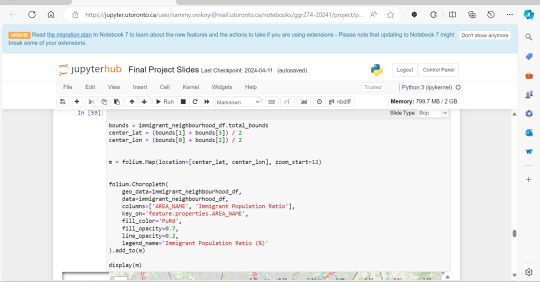
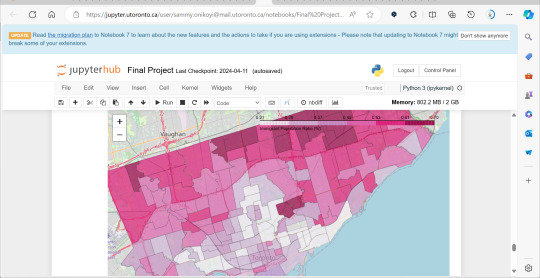
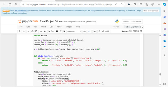
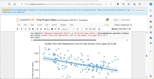
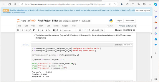


A significant amount of the courses I picked in second semester, were intentional, even if not immediately coherent, in providing me some type of exposure to the resources I know UX/UI designers and other careers use often. So in April, at the end of the semester I did a final Python based project in jupyterhub using Python to compute data, complete multiple regression analyses, make interactive maps of Toronto’s neighbourhoods with pop ups, and explore relationships between two separate statistics to see if there was a statistically significant relationship.
This research based Python project not only provided me with more confidence in coding moving forward, but also gave me a chance to see how even social sciences use coding languages in their work to help them efficiently sift for relationships that they could further investigate. Which is what I did! Combined with the results above I found papers in academic journals that also pointed to a relationship between lower sexual healthcare utilization (in this case mammograms and Pap smears) in neighbourhood improvement areas, in different age groups of women and in immigrant women to Canada. Which suggests to me that lower sexual healthcare utilization in immigrants women might be an overlooked concern that needs more support.
0 notes
Text
SAMMYGOESTOISCHOOL.TUMBLR.COM
And *drumroll please* We’ve arrived at May where I spent a good portion of the month when not juggling my summer class and part time job (yay employment 😪) coding and editing the HTML for this blog. It was a lot of fun, and I found that even without using my research on HTML to supplement things I might not have understood right away, that my knowledge on Python went a really long way in kind of mentally translating some of the rules I learned in Python, to HTML.
I really loved how it turned out, and it was actually a very kind woman at ischool over email that encouraged my idea of this. I was insecure in my transcript and felt I wanted to try something to impress and I’m glad I went for it! I hope it shows a-lot of what I’ve been trying to show about how in every piece of education I’ve received over the year, if I could find a way to translate it to UX/UI I tried to. And in this case coding, colour schemes, and accessibility made up a lot of education that I wanted to apply to this project too.
0 notes
Text
DIRECTORY
Hello, My name is Sammy and welcome to my BI application blog! On this website you can find a feed that shows you a portfolio of things I’ve done that’s helped my understanding of the UX/UI discipline as well as links on the side of the window that will take you to different pages.
In order to help you navigate your way through this website I have a few tips and tricks!
☆ This blog is interactive. The parts that are interactive are the feed, and the buttons along the side border of it.
★ As you scroll down it’ll take you through a year of my experiences, from March 2023 to June 2024, it covers a whole year of different things I felt were important or pivotal in getting me any closer to my goals before I applied for the BI program.
☆ At the bottom of each page is the button “next” in pastel green. Click on it to continue scrolling through.
★ The green dots serve as buttons on the side of the navigation, contain links that will take you to other pages within the blog. You can hover your cursor over the dots the title of the page will be displayed, and you’ll have a view of what the page displays. The first button is the feed, the second button is a page that explains why I want to join BI, the content is a bit squished so I suggest hovering your cursor over the text box and scrolling with the mouse, the third button is a short Q&A about me and I also have my biography there, the fourth button is a fun facts page about myself, and the fifth button just returns you back to the feed!
If you have any questions please don’t be afraid to reach out to my assistant, her email is: [email protected] she typically responds in 1 business day.
0 notes
Text
THE END OF THE BLOG


In June, actually today, I ate a cool looking croissant and finished this project at a lovely cafe. It wouldn’t be a blog if there wasn’t an obligatory very aesthetic looking food post, so in keeping with the theme, here was how I spent the early afternoon, and that was me on my walk after. Thank you for reading along, or even skimming along. This was all well worth it.
See you.
P.s September 12th is actually my birthday, know what I would love more than anything in the world? 👀 ( *whispers* An admission offer wooooooohooo !!! But no pressure)
0 notes