
Hi, I’m Sanat. I design interfaces for WhatsApp at Facebook.
Don't wanna be here? Send us removal request.
Statistics
We looked inside some of the posts by sanatrath and here's what we found interesting.
Average Info
Notes Per Post
1
Likes Per Post
1
Reblog Per Post
0
Reply Per Post
0
Time Between Posts
48 minutes
Number of Posts By Type
Text
5
Last Seen Tumblr Blogs


Fun Fact
Tumblr.com is the 103rd most visited website in the world.
Text
Templates in Google Docs

Providing better defaults for starting a new file. 2015.
The problem
Google Docs, Slides & Sheets templates were rudimentary, outdated and hard-to-find. Last updated in 2012, they lacked new docs features such as custom colors or web-fonts, used tables for formatting, weren’t mobile friendly, and could only be accessed from a separate gallery location.
I was asked to simplify and beautify the experience by allowing users to choose from a brand new set of pre-designed templates & themes right from the Docs homescreens.
To comply with my non-disclosure agreement, I have omitted and obfuscated confidential information in this case study. All information in this case study is my own and does not necessarily reflect the views of Google.
My role
I joined this project in it’s early stages to co-direct the visual design and create an array of fresh responsive templates for the editors.
In the initial stages, I worked with 3 visual designers to come up with design guidelines. Later on, I led the effort to implement designs with in Google Docs, Sheets & Slides.
Creating a vision
I joined 3 other visual designers in a week long visual design sprint to design an ideal creation experience for Docs, Sheets & Slides. By the end of the sprint, we had come up with 10 ‘beautiful-by-default’ sets of templates and created guidelines to make document creation smarter along the following lines:
Customization: How do users save a scheme that they created? How do they stylize all images in a theme?
Preview: What’s the best way to see a bird’s eye view of your template?
Suggestions: How can themes inspire paraphernalia? How does the system suggest grids or font pairings?

Designing down from a vision
After the sprint, I had to scale down the designs to see how they fit in the current apps. I recreated the static designs in native Docs editor to test their feasibility and responsiveness. I soon realized that I needed to make several aesthetic compromises to the design vision due to technical limitations. For example:
In early 2015, Google Docs didn’t support multi-columns. I had to decide if we wanted to use tables for visual columns knowing that they don’t render well on mobile or use single columns for all templates. This was a problem for resume templates which were mostly 2 columns. So, we decided to support tabled resumes on desktop but hide them on mobile to prevent undesirable broken experiences on mobile.
I identified several easy wins and got them fixed to make our templates look better. For instance, a no-margin feature was added to support full bleed images in templates. I updated the default typography in Docs to be more hierarchal & readable.
Docs didn’t support lighter font weights. So, I changed the text contrast to make the fonts visually lighter while making sure they match an accessible contrast ratio. At the same time, I pushed for having font weights available for Docs, Sheets & Slides. I created mocks & a prototype for font selection and shared it with the team. This was launched in April 2017

Over the next month, I created around 40 templates for Docs & Slides complete with original assets while revisiting them multiple times to incorporate feedback from several rounds of UX, PM, Legal and a11y reviews.

With the surplus stickers I created for the projects, I started maintaining a team wide repository of my illustrations and kept adding to it. My illustrations are still used throughout the team in multiple G Suite products.

The impact
Templates were launched in Sept, 2015 as a part of Google Docs ‘Back to School’ bundle to great feedback from press & twitterati.
Business Insider: First look: Google is taking fight against Microsoft Office 365 to schools. Templates provide a pre-made setup to make eye-catching and easy-to-read papers, forms, and reports. "It's like having a talented graphic designer just a few clicks away," says Ranjan.
TechCrunch: Google Docs gets smart typing, templates, smart Sheets and more. They’re exactly what you’d expect, giving you templates for work, education, letters or making a resume. Super user friendly.

A month after launch, templates continued to have a positive impact on the Google Docs experience. Document creation from templates (vs blank documents) increased significantly from 1% to 14%. As a result of the templates launch, 28 day active usage for Docs increased by 40%.
For confidentiality reasons I have omitted the actual values for these metrics.
0 notes
Text
Office Compatibility Mode

Empowering users to edit Office files right in Docs Suite of apps. 2015.
Today, Google Docs, Sheets, and Slides users can edit Microsoft Office files natively in the mobile apps instead of having to convert them to Docs format. This integration for Office editing was an enormous challenge as it accounts for roughly 35% of Docs, Sheets and Slides mobile usage.

My Role
I spearheaded the UX direction for two key project priorities: first, deprecate the Quickoffice apps on the Play Store and second, replace the fragmented Quickoffice integration with a more efficient file conversion system in order to create a consistent viewing/editing experience for our users.
To comply with my non-disclosure agreement, I have omitted and obfuscated confidential information in this case study. All information in this case study is my own and does not necessarily reflect the views of Google.
Part 1: Deprecating a highly used framework
Quickoffice, acquired by Google in 2012, had a significant number of install base. Although Google had added all the Quickoffice features to Docs, Sheets and Slides apps, there was still a high usage of the Quickoffice app. We needed a way to deprecate Quickoffice and seamlessly migrate it’s users to the Docs, Sheets and Slides apps.
After going through the existing implementation and understanding the underlying framework, I highlighted 3 issues that could be enhanced by the design solution:
A prompt to migrate to Docs apps would be shown the first time users launch Quickoffice. Users needed to be given enough context and reasons to migrate, making it a more inviting experience as opposed to 'forcefully' moving users over.
Users of Quickoffice would need to migrate to one or more among the 3 apps (Docs, Sheets and Slides) based on the part of Quickoffice that they actually used and were interested in.
A substantial user base would land from an external application (say following an attachment in Gmail). There needed to be a fine balance between blocking the user from accessing the content and letting them know the options to install Docs, Sheets and Slides.
Design for seamless transition
After several rounds of feedback from stakeholders, I proposed a system of contextual in-app promos that understood the users’ ecosystem of Quickoffice apps along with their entry points, intents and file format usage.

The system of promos ensured 2 things. First, users should experience the least interruption in the apps they genuinely use. Second, the users should not wait for an app to load only to see a promo that they cannot use it. For example, opening an Excel file from Gmail would show a promo for Google Sheets with a fake Quickoffice context while loading the actual app in the background so that the user experiences an illusion of speed.
The impact
The Quickoffice tombstone launch resulted in more than 30M individual installs with a 17.8% click through rate and a noticeable 20% decline in the 7DA usage of the app in the first month of launch.
Part 2: Integrating a more efficient technology
With Quickoffice integration in Docs, Sheets, & Slides, Eng had to maintain 2 separate code bases and it bloated our .apk size a great deal. We planned to swap the Quickoffice engines with a unified single code base. However, there were significant challenges introduced due to the technology change. Google Docs are in the cloud and are always saved. Editing Office files (could be local or on a cloud), required different technical approaches to save and make sure there was no data loss. In addition, though Docs is very compatible with Office, in many cases, saving an Office file using Docs technology would lose some information. It was important to communicate to users any losses due to these issues.
The success metrics were to not see any drop in the number of users editing office files using Docs
I realized that the business goal was to maintain the same behavior and experience even when the new backend might not support all data types as the Quickoffice technology. I relied on data that we had on how often users edit files, and how frequently users could expect any losses and designed appropriate notifications to the user.
I sat down with the product manager to find all the different places where the user could notice a difference in behavior. We gathered more than 100 different flows & edge cases owing to multiple states, inputs, endpoints and actions possible. As a next step, I boiled down the differences to ~10 by introducing staggered checkpoints & reusing design patterns. The final design came out to be a mixture of consistent messaging and special cases for high latency situations when saving large files.

For cases where users actually saw any kind of data loss, I iterated multiple form factors and UI text using an experiment framework (released to trusted testers). After continuously testing with users, feedback from stakeholders and copywriters I was able to come up with an optimal warning dialog that saw ~20% more conversions than other options.

This dialog was well received by our trusted testers, and Play Store feedback showed no increase in frustrations from the warning or fidelity issues highlighted in the warning during launch.
Rollout & impact
The new engine replaced the old Quickoffice technology in silent rollout. It reduced the apps .apk sizes dramatically and improved code health. Post launch, we didn’t see any user complaints and the no significant drop in editing rates.
What I learnt
Your app is what your UX is: In purely Engineering driven projects that involve code consolidation, never compromise on the user experience. In these cases, the best design option is the one where users don’t notice any difference.
0 notes
Text
Giggles App

A second screen application to learn jokes in sitcoms. 2014.
The problem
Being on the outside of an inside joke is no fun.
Landing in the US for the first time in 2012, I had to quickly make myself familiar with 200 years worth of culture, education and lifestyle. A big part of this was the conversation I had with my friends in grad school. However, I often found myself unable to understand the seemingly funny cultural references and failed to laugh with folks. It was getting hard to blend in when I wasn’t getting the jokes.
This wasn’t just me. As Henry Jenkins points out, networks and media have created a convergence that has created highly generative new cultures. Inside jokes describe this group’s identity, create a bond of uniqueness & a distinct blend of language that smooths out social interaction. However, an exposure to local television content can develop certain sociolinguistic skills that can in turn help foreigners identify unique inter-cultural ‘clues’, including the overarching parallax of humor.
With my masters thesis, I decided to try just that -- Help users understand humor in TV shows so that they can get familiar with a foreign culture.
Background: a medium and an agent
According to Scarborough USA+ Study done in 2012, 52% of users prefer watching sitcoms to any other shows. 20 of the top 50 TV shows on IMDB were sitcoms. Time magazine’s list of the top 10 most social shows included 7 comedies. Given the pervasiveness of sitcoms, they can be good purveyors of the aforementioned cultural ‘clues’.
Additionally, I hypothesized that a second screen application that users can follow along with their favorite sitcoms, would be the ideal way of providing contextually relevant content. An NPD Group study from 2012 found out that 87% of people are already using at least one second-screen device during TV watching. Further, viewers using a sync app on a second screen have 26% higher engagement than viewers doing solo TV viewing.
Research
Although there were a growing number of companion second screen apps in the market, only a few of them catered solely to the genre of comedy.

To understand how users view and appreciate sitcoms, I conducted a survey to know more about TV viewing experience of 60 participants.

Making sense of it all
After the first round of formative analysis, I found that the app needs to cater to multiple user types interested in different tasks at different points of time throughout a TV show. For example:
Viewer experience: A viewer’s experience can range anywhere between naive (new to the show) to seasoned (an ardent follower).
Type of tasks: Viewers would either like to find the humor themselves (exploration mode) or want some assistance finding them (explication mode).
Timing of the interaction: Viewers would focus on the TV content during the show and actively interact with the app before or after the show.
However, a user’s goal remained the same i.e to gain popularity in their social circle. Thus, the app had to be on the active side to helps users generate ‘talking points’. Majority of these could be solved with these use cases - uncover the hidden humor, identify the local references, and help users follow the characters on screen.
With the variables and use cases at hand, I could draw a multivariate task matrix to find touch points to facilitate a viewer’s migration from one experience level to the other.

From this exploration, I observed a few patterns:
1. Naive users would spent time before the show to find reviews. Experienced users would engage in watching gag reels and interviews, or sharing metadata after a show.
2. Intervals are critical for viewing missed humor. Experienced users watching the show during reruns would be interested in reference clips from the future episodes to relate to instances of foreshadowing.
3. During the showtime, viewers with less familiarity would want to be told about a joke or a character, while experienced viewers will try to spot humor by themselves and share snippets with the community.
Kicking off the design
For a proof of concept, I picked an episode (Season 2 Episode 3: Amigos!) of the Arrested Development and analyzed it manually. With the help of multiple fan sites, I selected 26 jokes in the episode. I split these into 4 types of humor:
1. Easter Eggs or background jokes: An intentional inside joke, hidden message, or feature in the show.
2. Recurring gags: These are repeating humor that appearing in multiple instances throughout the entire show.
3. Foreshadowing: This is where the author explains certain plot developments that may come later in the story.
4. References: These are radical intertextuality are connections across multiple shows or textual structures.
I mapped these jokes with their timestamps in the episode to help development of the design in a later stage. Then, with my use cases in mind, I sketched the interactions as a storyboard.

Video mockup
Before starting on a prototype, I iterated on the concept sketches. I considered that a second screen app should not disrupt the immersive viewing experience of the TV. Instead, the interactions should be subtle and seamless, providing essential details on demand. The viewer can save content for referencing later during interval or after the show ends.
However, it was hard to visualize all the moving parts of the app in static sketches. So, I created a rough video mockup in After Effects to understand the interactions necessarily in the final prototype.
youtube
I shared this with fellow designers in design critiques for feedback. Based on the feedback, I created the final app flow.

Prototype
I created the prototype for user study in HTML5 & Node. The client app on the tablet communicated with the video player running on the browser using socket.IO.
youtube
Evaluation
I conducted fifteen minute long 1:1 sessions with 14 participants of the age group 22-28. Half of the participants were native english speakers, whereas the other half were non-native with english as their second language. All of the participants had mentioned comedy as their favorite genre of TV show. 3 of the 14 participants had no experience with Arrested Development, whereas 5 considered themselves to be experienced viewers.
The session was split into 4 segments - a background interview, a free-run direct observations, and cognitive walkthrough followed by a brief semi-structured interview. During the direct observation segment, participants were asked to watch a shortened 5 min version of Episode 3, Season 2 of Arrested Development, and concurrently use the companion application on the iPad. The sessions were video and audio recorded for note-taking purposes. The sessions were conducted in a quiet lab with a TV and a couch with minimal interruptions.
Findings
I coded the data from the user study into behavioral, empirical and design pain points. The top 3 pain points evident from the data were
Viewers get fewer jokes than they think they do: Before the study, 11 of 14 participants said that they get 90% of jokes in a comedy show. However, participants scored an average of 48% in the Game mode. This is 35% less than the expected 83% mark.
Understanding increases with experience: Seasoned viewers got 62% of the jokes in average, while naive users scored 23%.
Non-native viewers get more jokes using the app: Non-native participants scored 39% compared to 53% by native users.

There were some major pain points with the app’s usability. These had mostly to do with the interruptions caused during the show watching. I created affinity diagram with the feedback from the user study to help formulate design recommendations for each screen. The pain points were posted in red; the concerns and negative feedback in yellow; and the positive feedback in green.

Final Design
The updated design followed on Shneiderman's mantra - overview first, zoom and filter, then details-on-demand. The changes focussed on removing interruptions caused because of the need to do small careful interaction.

The app in its default state showed snippets of the jokes and the characters on the screen. On swiping up, a more detailed view of the current joke will come up; whereas as on swiping down the character map was shown along with the details of the selected character. Swiping left revealed the previous jokes which could be bookmarked by clicking on the star icon. These interactions help the app seamlessly extend into various modes in lesser time and keep the focus of the viewer on the show.


Takeaways
There are 3 big learnings from the entire process:
Countering omniscience bias: People tend to overshoot their confidence in general cognition. For example, the viewers expected to understand more that three-fourths of all jokes in a TV show. Whereas in reality, they got about half of jokes. Applications should be designed with the assumption that majority of users find it hard to comprehend the functionally designers take for granted.
Affordances change between mediums: Bookmarks work great for books and browsers. However, they don’t communicate the same meaning in the context of watching TV. Instead, ‘starring’ better applies to the action of saving for later.
Reward, not shame: One of the findings from the study showed that users do not like to be tested while watching a TV show. Instead of showing the number of missed jokes and embarrassing a user, it would be more rewarding to show the number of jokes they understood. Incentivizing rewards can enrich the experience of joke finding even further.
1 note
·
View note
Text
Jukemonkey

A jukebox that finds tasteful music based on a group’s collective mood. 2013.
The problem
Music recommendation approaches in 2013 were mostly around a single user’s preferences observed from existing listening behavior. There weren’t great services that used emotion as a quantifier to create playlists for a group of people in a party scenario. Our goal was to create a device or a software that could instantly understand the musical mood of a group and start playing songs without them having to sit and scroll through artists, albums and songs.
Does mood affect music?
Compared to emotion, mood is a less intense state, but lasts much longer, e.g., days or hours instead of minutes. Mood affects how we behave and make decisions and, more importantly, is an important social signal that others leverage to better interact with us. Hence, mood is a tractable target for machine learning and is more useful for enriching context awareness.
We identified that the key technical questions that arise in such a problem space are :
How to automatically determine the mood?
How to adapt the content to the mood?
How to personalize the mood information?
How to optimize client application?
There has been a lot of research on techniques or methods to tackle the above mentioned questions, especially on how to track the mood of the users actively, and on creating models which can effectively map mood to music. MusicSense is one approach that tries to provide contextual music recommendation by automatically delivering music pieces which are relevant to the context of a Web page when users read it. Similar, EmotionSense is a mobile phone based adaptive platform whose key characteristics include the ability of sensing individual emotions as well as activities, verbal and proximity interactions among members of social groups. Facial expression recognition and Audio speech recognition have been used previously to evaluate and establish mood states. The general consensus was that mood classification is subjective but it can be useful for finding music that suits one’s current state of mind.
We sought to find applications that users preferred in order to identify suitable underlying frameworks and API that could potentially be used to retrieve/generate music playlists based on mood. We conducted an online survey which had 10 questions and focused on the following aspects:
Usage of social media
Selection of music while in a group
Influences on choice of music
We received 46 responses in total.
Key findings

We realized that not everyone uses social media. We discovered that majority of the participants indicated that they rarely depicted their actual emotions on facebook and twitter. This was a key finding which led us to conclude that we could not use social media to effectively and accurately determine a person’s mood and we decided to eliminate this idea and use another approach to determine mood.
We learned that taste in music significantly changes with mood as well as location/setting. 83% agreed that music changes with mood, and 71% agreed to the fact the music varies with the surroundings.
We also determined that while playing music in a group, people either depend on one person to lead the group and play music or the group comes to a consensus on common preferences.
The survey questions with genres helped us identify the kind of music people like to listen to in various moods and settings.
Design considerations
Our focus was on creating and designing a novel device/application and we assumed the use of an existing framework which would allow us to select music or generate play lists based on mood, however, we also formulated the following design considerations for music selection:
Use user input to identify mood and preferences
Use users' current context - mood/location and associated preferences
Use collective mood of a group to select music
Use individual user’s data to train the classifier to personalize mood inference
Use active feedback to decide what to play next and what not to
Interaction within a group
Everyone should have a say with no bias from others
Provide a simple way for people to reach a common consensus
Everyone should have control over the music being played (universal remote)
Everyone should have control over the volume of the music
Preliminary ideas

Anonymous voting: Using a remote to control a music player, each user in a group can input the desired genre or mood. The player selects the mood/genre to play based on the majority vote.
Geolocation detection: The system plays music appropriate to the location of a users. It can detect whether it is stationary or in motion, and if the type of location is a university or workplace or a cafe to play music and set volume appropriate to the setting.
Pebble polling: The system facilitates participatory music selection and active feedback. Users ‘vote’ for their mood by placing a mood pebble onto the corresponding emotion tray. Te device plays music based on the emotion maximum pebbles are in.
Converging on an Idea
After considering the pros and cons of our preliminary concepts, we decided to focus on mood as the determining factor for music selection. There was a certain appeal in using a tangible device to play music due to the nostalgia for the era when people used radios and cassette and cd players. This motivated us to create a tangible device that would consider the user's active input. We believed that the novel disks depicting emotions from one of our concepts would be an interesting and fun way to interact with a tangible device and thus created disks which we call "emotokens".

JukeMonkey presents listeners with an enjoyable experience using emotokens as an identifier for mood.
How it works

To implement the device, we used an NFC (Near Field Communication) enabled android phone and for the emotokens, we used android NFC tags. Each emotoken has a mood encoded in it, which is depicted on the tag by a monkey expressing the corresponding emotion. As we aimed to create a minimalistic device, we decided to integrate four basic controls - skip song, change mood, pause song and change volume. All options except changing the mood are provided as visual icons on the display. To change the mood, users can eject the inserted emotoken by lifting a lever. On doing so, the inserted emotoken slips out smoothly from a slot on the side of the device.
Evaluation & feedback
We conducted an evaluation of the device by doing a think-aloud session with 4 participants and observed how they interacted with the device in a group. Below are some of the key points based on the feedback and observations:
Participants felt the device would be useful in children’s education and could be used to teach speech and rhymes.
Participants were curious to play with it and see what kind of music the device played for each emotoken.
The interaction gained more focus than the intention to play and listen to music.
One participant exclaimed, "I would never use the sad token". This indicates that people might not reveal their true emotions to the group unless they were comfortable with them. People might also tend to choose a emotion/mood that they wished to be in rather than what they were actually experiencing.
All participants agreed that the device was very simple to use and operate.
One participant mentioned that the device could be used as a medium of expression for young children, older adults and people with speech impairments. They felt that the device might be a subtle way to communicate how they were feeling without them having to explicitly state it or talk about it.
Final Design
A dual approach to decide and play music, alone or in a group. A product with both tangible and digital interactions, customizable yet stand alone, catering to all levels of experience.
We found out that users enjoyed interacting with the 'cute' monkey and play music so easily.

However, they also wished to access the device without having to coming over to it every time - a dual approach to decide and play music, alone or in a group. So, we introduced Jukemonkey remote - a mobile app that lets users add in their emotokens or vote on songs. This adds more data points for the system to learn from the preferences of a group.

What I learnt
Aesthetic bias is real: Users are drawn to products that are well designed and provide novel interactions. Visitors at our annual showcase were fascinated by the ‘cuteness’ of our device and were eager to try out several emotokens. Kids turned out to be the biggest fans ofJukeMonkey and took turns to use it.
Anonymity is essential in virtual groups: Users find it hard to voice opinions in a group scenario. With our prototype, we found that some people might not want to speak up in order to change the volume or skip a song. At the end, a single person might end up controlling the device.
0 notes
Text
Peerspot
A VR app that lets users decide between transit options in Georgia Tech campus. 2012.
The problem
Georgia Tech has the Tech Trolley - a bus system that runs round the campus to transport students in a hurry. However, it wasn’t very reliable and was subject to constant delays due to traffic. In such situations, students had to wait and then run to their classes. Further investigation showed that delays in the trolley service ranked as the most frustration-inducing aspect of navigation around our campus. So, a few of us set out to help bridge this gap in intra-college transit by notifying users about trolley delays and suggesting to them alternative mode of transit ahead of time.
Finding a quick, convenient, efficient transit option for Georgia Tech students navigating the campus without confusion!
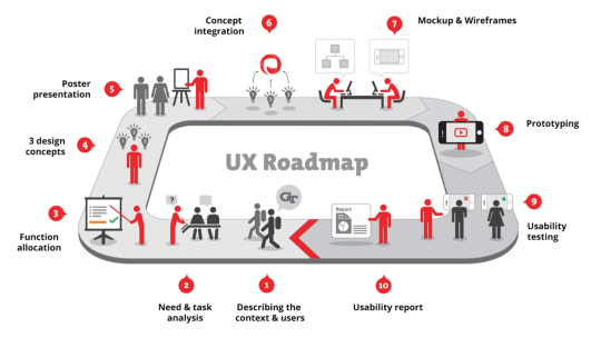
My role & process
I was the interaction designer in a four person team along with a UX researcher, a front end and a backend engineer. We followed a 10 step UX process that that followed task analysis, conceptualization, converging on a design, mock up & wireframes, prototype and design validation. I was responsible for concept mock ups, wireframes, visual design & presentation.
Kicking it off
We found that Georgia Tech provided a few options to ease transit inside the campus.
The Tech Trolley: It ran at a regular intervals and was free of cost. But there wasn’t any information in place to indicate the waiting times or location of buses running. This caused unnecessary delay at the bus stop.
ViaCycle: ViaCycle gave students access to bikes anytime for free or for a low fee. It had a digital locking system and GPS location detection. However, the system was not very popular and had a limited availability on campus.
GTBuses: GTBuses were more advanced and gave real-time visual information of location of buses within the campus.
To know more about the transit issues of students, we did in-person interviews with 12 participants and received 26 responses to an online survey sent out to student groups. Analyzing the data, we inferred that the preferred modes of transport on campus, apart from walking, were the trolley and shuttle services followed by bike.
64% of the respondents mentioned that they were late due to delays in transit.
48% of the participants blamed their delays on unreliable bus service and long wait times.
33% said that they prefer bikes if viaCycle rides were free.
Making sense of the data
After gathering data, we created personas & task flows to identify the various touch points in our service. We also created a list of design recommendations addressing the ‘problem space’.
Provide real-time and efficient Trolley tracking: Users need more information around the trolley running on the campus.
Display interactive maps and way-finding graphics: By providing interactive maps to the users, we can significantly improve the likelihood finding places/ routes on the map and decrease the time taken to complete the task.
Provide information about bikes available: A system that would point participants to free/rental bikes nearby would considerably improve cycling in campus and decrease the time taken in transit.
Help in decision making: Help users in making decisions between available modes of transport to reduce the cognitive load & increase efficiency.
Converging on a design
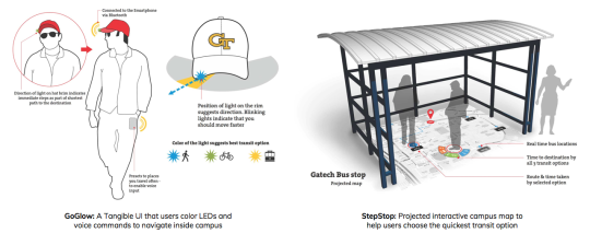
After several brainstorming sessions to develop as many divergent ideas as possible, we narrowed down to 3 concepts - a tangible cap, a bus stop installation and an AR app for the smartphone. We presented our ideas at various demos to receive feedback. We finally decided to converge on the AR app idea while adding the positives from other concepts.
Development was made considering the iPhone 5 in mind. Initial low fidelity wireframes were sketched on paper and then transferred to CorelDRAW as high fidelity wireframes.
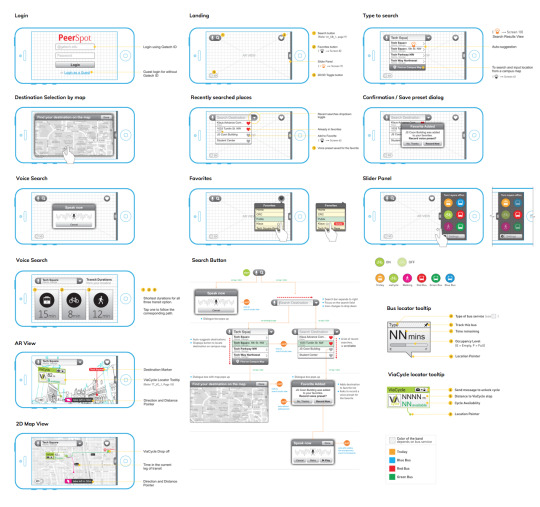
I used proto.io, JustInMind Prototyping tool to create iterations of the app. It was helpful to play with the interactions in the design. Once we were satisfied with the design direction, we built the entire app using Jquery mobile and Wikitude API.
youtube
Evaluation & Findings
For evaluation, we recruited 4 participants through word of mouth, as well as enticement through a varied selection of donuts, in the GT student center. Participants were asked to use the prototype and think-aloud through a few bench mark tasks. After the cognitive walkthrough, they were a series of qualitative questions regarding the prototype system's interface and functionality.
The overall impression was positive. Users commented on the novelty of the AR view and the ability to identify locations of real vehicles and places as well as occupancy and availability. Most thought that the system would be especially useful to users who were new to the campus.
Although the system as a whole received praise from a technological innovation standpoint, the functionality of the system was subject to critique. It seems that no matter how many interesting features were included, some users could not see past its use as another alternative to NextBus.
What I learnt
Always remember to take photos. This helps a great deal when you circle back to document the process.
Think out of the box. Brainstorming sessions really are most productive when group members come in with sets of unique ideas, and then are able to combine and refine them together. Some of our best designs were developed through inclusion of aspects from multiple other ideas, which were then refined to cover divergent types of models, systems, or modes of interaction.
Remind participants that it is a prototype. We found that participants in our study would often comment on the speed and stability of the system. Although it may have been useful to allow a given user free reign of the system in the evaluation process, too much freedom detracts from the time necessary to complete the given tasks and may lead to unrecoverable system instability.
Simpler is better. We got several points of feedback from users that they would prefer 2D maps over AR. So when an simpler, conventional UI can do that job, we shouldn’t introduce novel complex models in the experience.
0 notes