
Don't wanna be here? Send us removal request.
Statistics
We looked inside some of the posts by saxonbettsunit1 and here's what we found interesting.
Average Info
Notes Per Post
1
Likes Per Post
1
Reblog Per Post
0
Reply Per Post
0
Time Between Posts
22 hours
Number of Posts By Type
Photo
14
Text
3
Last Seen Tumblr Blogs


Fun Fact
The average Tumblr user visits about 67 pages every month.
Photo
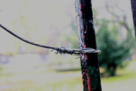
I improved this assignment by focusing more on a minimalist approach, simple but effective,more zoomed in and focused on one thing.to make the viewer focus on the contrast between man made and nature and makes you as the viewer focus directly on the difference between man made vs nature and the meaning/narrative. also i have changed compositionally for example one of my images have frame within a frame
the original didn’t have much composition or meaning/narrative behind the shot compared to this time around.i did this because i didn’t like how it looked as the green was to bright i wanted a abandoned, mold/mossy look.
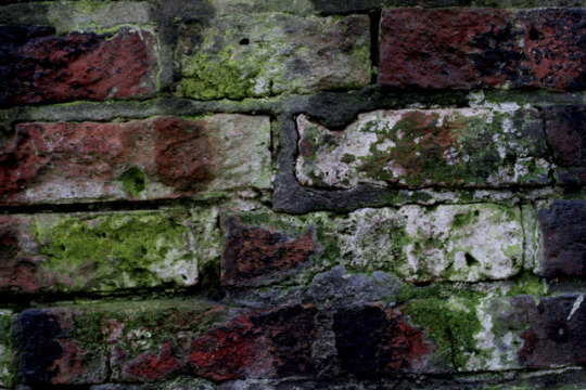
image one- final; the creative process i followed was kind of a the nature is taking back power from the man made things in everyday life which once took over the nature ruining the natural bright beauty a bit like the image of taken in keelung taiwan at a abandoned building (see previous post) as within that picture the nature (trees) have overgrown the flats and regained control hugely of the abandoned building abit like that image
the planning i did was thinking ahead,thinking of locations which has moss and looks kind of abandoned.i also had to think ahead of how the conditions going to be like eg sunny and washed out colour or high contrast rain.the stylistic decisions i did was close up,cropped high contrast,range of colours; reds,green.blacks,cream.
the post production techniques i used was high contrast and lowering the exposure as this makes the image darker but strong colours so its like it being a dull day with a strong glow of nature.so its like gives nature power as its more vibrant.
the settings used for this image was ISO 3200, aperture of f/4.5, shutter speed of 1/40, setting manual with lens at 34 mm.the composition of this image is cropped and patterned and symmetry.the narrative of this image is the nature (the moss) is regaining strongly control of the environment from the man made products. hence the high contrast on the moss.the lighting of image is fair even with the editing and the dull conditions i had to take the pictures in.slightly dark to create effect i wanted to create.(dull,high contrast to create a negative vibe but give power the the colour [the plants/moss]) the framing of the picture is slightly off but is okay because its just cropped symmetry.i think it brings realism to the image as its not perfect like the situation.
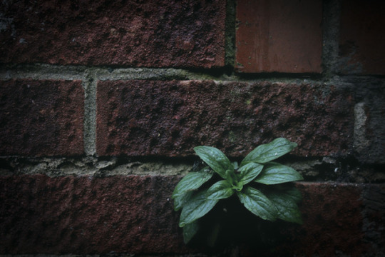
image two-final; the creative process for this image was inspired by the image take by David Gibbeson and lovell d’souza (images from the previous posts) from the dull kind of one thing to focus on but mine is dark instead of b&w or pale.
i had to think how could i use my inspiration and make it my own to portray what i could of the topic within the time given as i dont have the resources to go to nature parks with the time given.i had to think what lens i would need to use i ended up using a kit lens as i didn't need to zoom in massively.
i shot symmetrically as symmetry is usually aesthetically pleasing and that was man made and the nature ‘ruins’ that symmetry but makes the image more interesting as it brings colour instead of dull red/brown and grey.
the post production i used on this image was high contrast and low exposure i dehazed the image and lowered the saturation to replicate the photographers who inspired me to take the image like this/edit the image like this
the settings used for this image was ISO 3200, aperture of f/4.5, shutter speed of 1/40, setting manual with lens at 35mm.the composition of this image is similar to the image before being symmetric,patterned and cropped however the composition is ruined by the nature growing out between the bricks.the narrative of the image nature is regaining control of the modern landscape of man made material.the lighting in this is pretty dark but isn't dimly lit which gives the nature a glow from contrast.the framing is food as it follows the rule of thirds rule.
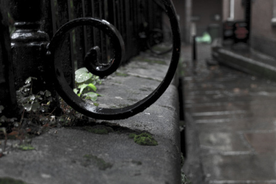
image three-final;the creative process i followed for this image was again inspired by both david gibbeson for the simplisticity and lovell d’souza for the dull colour as if its black and white but does have colour. had to have a image how roughly i wanted it to look like to be able to achieve which is visually pleasing.the stylistic decision made was frame within a frame. i made the vibrancy really low so the only thing which really has colour is the moss which gives the natural moss power and attention.also changed the contrast higher and lowered the exposure to darken the image. to advance my point/view
the settings used was ISO 400,f.number f/4.5, shutter speed 1/40 with camera setting manual with a zoom of 35mm.the composition is frame within a frame which makes the moss glow like its important.the narrative is nature regaining control and it will fight back if you try to remove it with man made materials.the framing was from within a frame.
image four- review;i tried to do frame in a frame but it had shallow depth of field as i didn't change the aperture to high also it was too bright.my sources of inspiration was man vs nature in general mixing it with compositonal technique frame in a frame. i tried this as i thought it would work and look aesthetically pleasing as it would look like man made is trapping nature/natural however didn't turn out the way i wanted it to turn out.i had to think when capturing this image how it would look and what would look aesthetically appealing to the eye.it didn't get edited as it didn't make my final shots when reviewing them.
the settings on this image was ISO of 400 with aperture of f/4.5 and shutter speed of 1/40 seconds the camera settings in manual with a lens of 35mm.the framing is at a angle.the narrative behind this image is man made is trapping nature/natural behind bars.
my images are about man vs nature and how man(made) is taking over but gets abandoned over the years and nature just takes back the land.i communicated that narrative via my images of places in the local area which have regained nature my theme is high contrast low exposure throughout the set of images i believe i was successful in doing so. as i used compositional techniques such as frame within a frame and rule of thirds and symmetry which makes my set of images aesthetically pleasing and enjoyable to the viewer.
im satisfied with my final piece of work as these compared to before as these images have a theme and better constructed compositional techniques unlike my original attempt.i believe i have told a story as they have a theme of man vs nature and how they was edited.
i am satisfied of my work as they tell a story which originally they didn't. i think now the story has a stronger message than before.
i think my weakness within this was framing as some have a ‘dutch tilt’
however i think my strength within this assignment was my composition as they wasn't a lot of my pictures without a clear composition like from within a frame or symmetry.
if i was to do this again i would work on my framing to make the images/theme more aesthetically pleasing
0 notes
Text
assignment 1 task 2
I’m going to shoot man vs nature,I’m going to shoot round churches and places which aren’t maintained( aka abandoned) as these places are typically where nature tends regain control of the area.this will help show the narrative i was trying to portray in the first place.
I’m going to shoot midday as that’s where the best lighting is and if we get shadows it can exaggerate the affect however the sun can be too strong or not be out at all. other risks can be it might be raining and damage the camera and could change the lighting circumstances e.g. sun makes shadows and washes color away as the sun can be intense, over cast is perfect lighting as its not too light/dark and dark/rain can make dimly lit images.which can affect the results of the image. i could reduce the risk of camera getting damaged by setting the camera up indoors or underneath a umbrella
0 notes
Text
man vs nature assignment one
I've decided to redo this task as i feel like the composition and the style of man vs nature could be different.To have a powerful meaning behind edited differently going for a drained look to represent the ‘nature’ side of the image instead of giving the man made the attention.

the image above is taken by lovell d’souza this image is very extreme as you see a dull,muggy destructive image of heavy machined vehicles destroying the landscape and its very dull showing very little colour to be draining to the viewer and feel negative and the trees that are their are weak,fragile and lifeless as they are getting destroyed.the muddy and destroyed landscape filled with muddy,dumped glass(rubbish).which works well for this photographer to portray the viewpoint he trying to make.

this image above was taken by David Gibbeson the black and white effect works well for this image as its more harsh and blunt than having colour making the mattress blend into the scene.the composition of the image makes the subject in the middle (the abandoned mattress and the nature reserve sign which said ‘please leave the reserve and its wildlife undisturbed’)the black and white (monochrome) effect works well as it adds vulnerability to the image as man made is ruining nature

the image above was taken in keelung taiwan at a abandoned building the person who took this picture is unknown.this image is good because both nature and man made is abandoned but the nature which took over the area adds colour and beauty but the building is dull and ruins the landscape.Its a nice contrast/comparison which works well for this image making the image effective
i could change the aesthetic of the image by changing the compositional techniques such of rule of thirds.so the image is gives a different message and can be interpreted differently.i could make the contrast bolder to make it stand out or black and white for effect.having a high shutter speed helps made the contrast sharper with a fast exposure as that makes the image more darker
my images need a stronger narrative as the composition makes it hard to tell the narrative and i aim to do that by changing the theme/aesthetic to similar to the images i shown above.i can achieve this by changing the location of the image to where nature has took back control of the buildings (man made)
i aim to improve my shots by changing my composition and the perspective i shoot from i was inspired to shoot differently from the photographers above.as i prefer the composition.
0 notes
Photo


portrait assignment
i used a coffee filter and a plastic cup and a inverted cup to try to diffuse the harsh light of the camera flash. i think the inverted plastic cup worked the best.
the flash removes the shadows,catch light peoples eyes and keep the details of the person.however sometimes can be a bit too harsh if the diffuser isn’t the best.
i would use again the inverted cup as it worked the best in these type of photography. as it wasn’t too harsh or didn’t block too much of the flash out
0 notes
Photo


· What did you do?
we had to create images which are unrecognisable for effect
· Why did you choose to shoot in that way?
i decided to do shots with a swirl effect by zoom effect as it makes the image hard to recognise
· What went well?
i think the distorted effect worked well
· What didn’t go well? Why?
i don’t think the quality/theme was the best and i haven’t mastered zoom burst yet. · So how would you improve it?
i would practise zoom burst.
0 notes
Photo


image one- unedited
image two edited
· What did you do
i had to go out and take pictures with a long exposure creating that blurred/movement.
· Why did you choose to shoot in that way
i decided to shoot at 1/4 because its enough speed that the tram isnt too blurred but still shows speed
· What went well?
showing speed to show shutter speed photography.
· What didn’t do well? Why?
i don’t think the image is very interesting i think the colours just don’t interest me as a viewer
· So how would you improve it?
change the topic so they is a different range of colours.
1 note
·
View note
Photo


· What did you do
i had to go out and take pictures which represent man vs nature so i did manmade bricks/cigarettes vs nature seeping through
· Why did you choose to shoot in that way
i decided to shoot in manual portrait and landscape to make the visuals/composition better
· What went well?
i think showing man vs nature went well as most shows the nature growing/overpowering the man made items.
· What didn’t go well? Why?
i think some of the composition and the message i tried to portray subsided in some of the images
· So how would you improve it?
i think i would photograph a wider range of the topic.and maybe change the compositional techniques
0 notes
Photo


i chose to model a male as females are usually the one to be modelled. i used a modern,street art background as that's popular and portrays his personality also the background is unique with colour.
i changed the contrast and added vibrance to bring more colour to the image to show more energy which my image didn't originally portray also i tried to remove all the colour for effect (image two) compared to the first image the third image is the original
0 notes
Photo


image one- this one was shot possibly in a studio as it's a plain white background and a soft box lighting as they is no shadows and is all the same lighting (even) they probably changed the contrast you would typically find this shot in beauty magazines as the person is flawless and doesn’t share a message image two- this one has a low f. number (shallow depth of field) it uses a reflective to make the models eyes have life possibly uses a golden reflector as she seems tanned, not drained of colour from the harsh flash.the editing used would be used to focus on the person over the background so lightening the person you typically find these images for a modelling portfolio or for modelling for hair/clothing
image three-this one has a very yellow hue/atmosphere with brings warmth to the picture let its autumn and that's known for being very warm homely feeling the photographer could of used a adjustment tool and a mask to only edit the person to make the audience focus on the person over the background.it has leading lines and has lead room you’ll find these images for magazines and photoshoots for public figures and photographers image four-the image has lead room and uses a flash (probably from a flash gun) to give the face light and give the eyes life.it has a shallow depth of field to put all focus on the person. this image is typically found for a modelling portfolio image five-this image is meant to be dull with little contrast to show coldness for affect so has no flash this picture would most likely been took outdoors for that raw affect instead of picture perfect staged indoors in a studio.this image is typically found for campaigns as it has strong emotions
0 notes
Text
portrait photography.
skills-
good people skills
good directing skills
know different poses for the model (have a vision in your head)
location (know the area)
good research skills (to check out locations)
good time keeping skills (being punctual)
matching clothing to the theme (thinking ahead)
these are all soft skills.
equipment-
lighting (flash,studio lighting,key light,cookie lighting,umbrella [reflect light],catch light,wireless)so the person isn’t under exposed
softbox (diffuses light) so the light is less harsh but still lights up the person's face
studio backdrop this helps create a scene without having a green screen this is good is your doing a shoot for a brand.
tripod (gives a more steady shot/studio shot) this is good for keeping the same angle and height within all shots
dslr camera (full frame [better image quality]) to capture the images
lens 70-200mm to get a various lengths of shots
camera settings-
you'll need to think about depth of field as depending on the context of the shoot having a busy background might not be wanted and if a shallow depth of field (blur) looks professional enough
having a slow shutter speed increases the chance of having a blurred picture which isn’t high quality.however having a fast shutter speed might not focus enough or makes the image too dark depending on the conditions
you want the iso the lowest you can without making the image bad hence iso being the last resort.
composition is vital as if it's not good the viewer won't know what to look at and won't look visually appealing.
0 notes
Photo


- what is panning?
panning is when you follow a subject whilst it’s moving a good way to do that is have camera mode tv and continuous shot and ai servo
-How is it done?
its done by moving your camera from left to right (vise versa) whilst holding down the shutter button on the camera settings tv,ai servo,continuous shot
-How does the camera need to be set up?
the camera settings the camera needs to be on are tv on the dial because that prioritises the shutter,ai servo as the camera detects if the subject is still or moving and continuous shots to not miss the best moment.
- What genres of photography is panning particularly useful for?
things full of movement/action like sports,automotive,speed as it shows motive with blurred background
-What settings did you use for each one?
image one-shutter speed 1/30 sec. aperture f/5.6 with lens 55 mm and iso 100
image two-shutter speed 1/30 sec.the aperture is f/8 with the lens zoomed in at 51 mm and the iso at 100
image three-the shutter speed was 1/30 sec.and the aperture was f/10 with a 49 mm lens zoom with iso at 100
- Upload a shot that didn't work out. Note the settings. What went wrong?
image 4-1/30 sec. f/5.6 32 mm with iso at 100 the shot was too blurry as it didn’t capture/focus on the subject in time.
- What is non-destructive editing?
non-destructive editing is where you don't ruin the original layer permanently you can add mask layer which doesn’t ruin the original image/layer
-What are the advantages of editing this way?
editing this way doesn't ruin the original layer but still can heavily edit it doesn’t ruin the quality
0 notes
Photo


street photography
What did you do
i took pictures inspired by ho fan and Vivian Meyer work in black and white (monochrome)
Why did you choose to shoot in that way
black and white as it makes contrast more sharper.
What went well?
i think the images itself went well
What didn’t do well? Why?
however i don’t think the contrast/sharpness didn’t go so well
So how would you improve it?
i could improve it by editing the contrast and sharpness to create a better contrast in colours to make the image more appealing.
0 notes
Photo


image one-Boris Johnson
image two- donlad trump
image three- merged with Donald body and Boris body.
i had to find high resolution pictures of Donald and Boris getting the image on tumblr by control v for a new layer then pasting the image. (one for each) then use the pen tool to cut out Boris's face.then to select the button on the banner saying selection and put the feathering on 30% then click and drag to the Donald trump tab. i had to resize Boris face so i had to use the transform tool and used shift to keep the proportion i changed the opacity to check where Donald face to make sure its in similar places so when i remove skin later its not in the changing the face showing for example eyes. to not do destructive editing i put a mask on the Boris layer and changed the flow to 45% on the brush tool (black to erase and white to gain more of the image)
i think getting the pen tool to do curves and getting the right proportion for the face was the hardest part and using the mask tool to erase and gain the part of the image the easier part.
i did a good job blending the two faces but it was hard to get the same quality for both images.
0 notes
Photo


the task was hard as you had to figure out where you could zoom in to on the spot and make it clear what your trying to zoom in to.
it changed the way i thought of composition and framing as you had to think of how to show your zooming in and not just take random pictures.
i was more happy with the close up shots. as you see more detail and more focused on one thing like cropping
0 notes
Photo


i found the task for this image hard as they isn’t much to focus in on aside the main subjects of the image as its a misty/dusty atmosphere.
it changes how you feel about the image as if you crop the bright colored train, all you left with is a grey dust cloud which has more connotations to negative things. essentially changing how you think of the image from having this bright train maybe connotating hope.
0 notes
Photo


i found this one the hardest as you cant just focus on one bit of the image. so i cropped it to a panoramic shot. it changes how you assume the lighting and atmosphere was making you think maybe its autumn and it was chilly but calming.
0 notes
Photo


the task started easy but got harder after finding the main cropping points.so i had to find different cropping areas such has making the women be alone in the image and change the amount of skyline and panoramic crops.around crop 6-10 was the hardest as i had to think more deeply how can i crop the image differently than the more easier ones that i previously did. some of the images changes how the image is perceived as originally is was portrayed as a family walk then for example when i cropped it so it was solely only the women only in shot it makes the viewer assume the women was alone.
0 notes