Text
The End :(
I honestly cannot believe how fast this semester has gone.
I have really loved studying this subject and it was originally the subject that drew me to the course because I love history and exploring different ideas in design. This subject has been my favourite this semester, I feel like it covered all my interests!
I loved exploring art activism as it is a road I would love to go down at least once. I absolutely love seeing how people have used art and design to make a difference and draw awareness to issues.
I didn’t think I would enjoy completing the ‘ask me anything’ assignment as much as I did. It has become my favourite assignment I completed this whole semester!
Similarly, at first I was really self conscious posting on my tumbler, as you can probably tell, but it has ended up being a really nice way to reflect on the week and what I have learnt from it.
I’m really sad this subject is over but I hope it is just a start of a list of subjects that I find really eye opening and engaging.
Thank you Andy for this fab semester!
1 note
·
View note
Text
Project 3: the final stage
After battling with my project’s form I ended up giving in and deciding to keep it simple by making my project into a book format. I think this format is easier to follow and looks smoother. Now that it’s done and I’m looking back on the evolution of my project I think there is something to be said about how much a design can change even if you have an extremely clear idea of how you want it to look in your head. I started with 5 completely random designers: Jacqueline Casey, Barbara Kruger, Massimo Vignell, Alvin Lustig and Muriel Cooper. Although part of me I wish I had looked at Alvin Lustig, just because his designs were so different, I have learnt so much about design through investigating Casey. One of the main reasons while I chose her was how wide her scope of design work is. I always worry that maybe I’ll finish uni and start working and hate design so it’s good to have proof that you can study one thing and then become extremely successful in a completely different area. Additionally as a history nerd, I thought her lifetime was the so unfortunate in terms of world events, born right after World War I then lived through World War II, Vietnam war, Cold War and Korean War I guess you don’t get to choose when you are born.
I’m proud of my final outcome. It is completely outside of the way I usually format and structure my designs so it was fun to come out of the box I put my design work in. I really enjoyed playing around with different approaches (even though I may or may not have had several breakdowns over the look of this project)
Here’s the link to the final:
https://issuu.com/s3839207/docs/jacqueline_casey_interview
2 notes
·
View notes
Text
Project 3 update
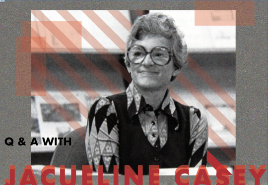
This is my first attempt at a cover page. I think there is a lot more work that needs to be done, but I like the direction it is taking.
1 note
·
View note
Text
Project 3 update
After the feedback session I tried to work with my most resent sketch to create my layout. Here was my first attempt:

In no way do I like this design or do I think it is working. I was going to give up and delete it but I had Andy’s voice in my head telling me to stick with it and not to delete it.
I tried to looK at it objectively to work out at least 3 things that weren’t working:

I set myself a task to fix those 3 things. Then I came up with this:

I am much, much happier with this design. I think I could tweak it a bit more but overall, the biggest thing I need to do is the cover page and the bibliography. Progress that I am finally happy with!
0 notes
Text
week 12 tutorial
In this tutorial we did the much dreaded peer review.
I was quite embarrassed by how little I had to show and was feeling really embarrassed but it was good to see that others had gone the same thing as me, started something and hated it so started again.
I was also reassured by Andy who told me to next time not to delete any of my failures as they are valuable lessons for next time I attempt the technique. If I delete my failures then I am highly likely to redo the same mistakes again, not learning or gaining any skills. This is definitely something I need to work on.
As a class we had to leave feedback on at least one person’s work. I got the feedback that the texture behind that images was really effective in adding interest. This was something I was unsure about so it was good to be today that it worked within the design.
This is what I got feedback on:

1 note
·
View note
Text
Project 3 progress
After my failed attempt at collage, I lost motivation to do the project and didn’t do any work on it for a couple of weeks but with the peer review coming up I tried to get fired up again.
here is my new sketch for my layout:

To make progress on my actual design I made this collage of Jacqueline Casey’s work for the 2nd page of my document:
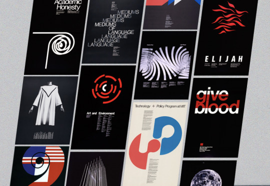
The texture in the background came from one of my scanned images so I guess I did get something out of my first experiment.
0 notes
Text
Week 11 lecture
Today in the lecture the idea of how design will be progressing was explored.
I found the eye writer project really incredible. My Oma has an autoimmune condition that slowly deteriorates her ability to use her hands. This makes me sad as she was a primary teacher so she had perfect, teacher writing and very good drawer. It makes me sad watching her slowly loose the ability to write in our birthday cards, something she loves.
Although this project intend for people with much more serious conditions than her, it makes me really happy to see people helping others who can’t do what they love anymore. It gives me hope that people are using evolving technology to help improve the lives of others and one day that technology may be able to help people like my Oma write in birthday cards.
Something else that really caught my attention was the Metaflop website which allows you to easily make your won typeface.
I decided to try it out for myself and ended up spending way to long on there trying to get my typeface perfect, but to be honest I think I just kept making it worse. This was my final product:

Not the best, but I had a lot of fun making it and I would definitely use the tool again.
Here’s the link to metaflop:
https://www.metaflop.com/metafonts/adjuster
0 notes
Text
project 3
here is my sketch for my layout for project 3. I wanted it to be a long poster with an accordion fold.


I had concerns about how I would communicate this fold to the viewer as it is going to be delivered online. I got feedback from Andy that I was better off making it a long continuous poster rather one with folds, which I agree with
0 notes
Text
Week 11 tutorial
In this tutorial we were lead by Karen instead of Andy.
Karen began the session by expressing an interesting idea: that we should look at practising design like training for a sport, meaning doing a bit everyday in order to improve rather than in sporadic bursts.
As a master procrastinator, I would love to try to try to put this into personal practice. I think it would definitely reduce my stress levels when deadlines come around and I am trying to learn a new skill in 24 hours. I will try to give it a go.
We also discussed the lack of knowledge and recognition of female designers.
If you google ‘graphic designers’ of the first 10, only 2 are women.

https://www.google.com/search?q=graphic+deisgners&rlz=1C5CHFA_enAU781AU781&oq=graphic+deisgners&aqs=chrome..69i57j0l7.3035j0j7&sourceid=chrome&ie=UTF-8
0 notes
Text
week 10 lecture
I really liked the week 10 lecture.
I have always loved activist design. I would love to try to make a difference or spread a message with what i create.
As someone who is trying their best to minimise their environmental impact, I found the Greenpeace posters really effective. Sometimes it feels as though politicians are constantly making lots promises of to protect the environment and make real change, but it seems rarely comes into action. I like how the posters directly target those who were in charge which then indirectly makes people think about who they have elected and their motives, rather than urging the public to try harder. It makes the viewer think about how they can get the ‘climate criminals’ out of power rather than trying to rally for them to change the rules.
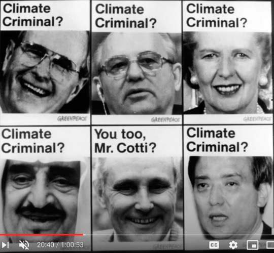
image source: slide from lecture: https://www.youtube.com/watch?v=MDzdExLIm10&feature=youtu.be
The exploration into design activism made me think of a painting I saw that addressed the refugee crisis.

image source: me
This painting is by Maggi Hambling, titled 2016. This painting depicts a sinking boat in the Mediterranean ocean. Habbling wanted to address the on going refugee crisis and draw attention to the sheer amount of people trying to seek refuge dying at sea.
You cannot see it into the photo, but from far away, the paining just looks like a ocean painting, but it is only when you get closer that you can see the boat under water. I think this is to reflect how you only really hear about the refugee crisis when you look into it, it is not covered by mainstream media all that often.
i think this piece is especially relevant in Australia as the way our government has treated refugees has been internally condemned as we have broken international treaties we became parties of. Despite the on going containment of refugees in detention camps with horrific living conditions, it is rarely addressed by our media or government.
I believe that art and design can be used to spread awareness about issues that don’t have a voice. I think they play an important role in creating a conversation about the issues, rather than just spreading facts. However, sometimes it is disheartening when it feels as though nothing is changing :(
0 notes
Text
Week 9 tutorial
At the the start of the class Andy shared some of some collage artists and I particularly liked the work of Christapher Day.
I decided to look into him further.
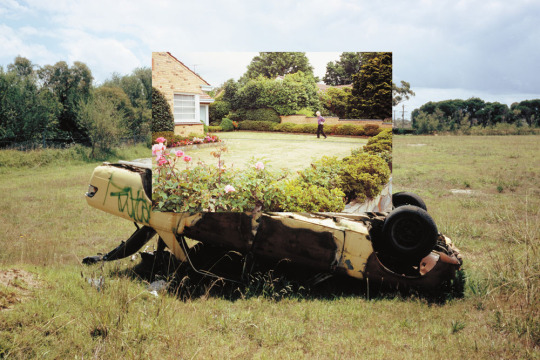
image source: https://www.theblackmail.com.au/issue/2011/02/cut-paste/
I found out that he takes all of his own photos, which I found very impressive. I think these days it is so easy to just repost someone else’s thoughts or use their work in your own so I find it admirable that he took his own photos.
I have always found it confusing where the line is where you can use someone’s work in your design without referencing, because I always feel as though it should always be acknowledged.
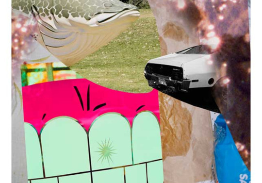
image source: https://www.broadsheet.com.au/melbourne/art-and-design/article/end-christopher-day
I also think it is impressive that he is both a talented photographer and collage artist. Based on the images in his collages, he seems to be able to see very boring situations as an opportunity to create a beautiful collage.

image source: https://www.broadsheet.com.au/melbourne/art-and-design/article/end-christopher-day
I particularly like the one above. The first image is of a women’s butt and legs as she is walking, at a seemingly predatory angle, objectifying and sexualising the women. This contrasted by the wide shot of a man reaching into freezer section at a supermarket. He is in a compromising position, where his bum is sticking out, yet he is being neither objectified or sexualised, despite his position.
I think this is a really unique way of highlighting the fear some women feel of being sexualised on everyday situations such as walking in shorts or bending over.
Where I found my research:
https://www.theblackmail.com.au/issue/2011/02/cut-paste/
0 notes
Text
Week 10 tutorial
during the week 9 tutorial week explored collage.
In groups of 4 we worked to make a ‘happy’ word using photograph collage techniques similar to the ones used by MM Paris. I was in a group with Brooke, Naman and Yanjie.
This is what we created:

Considering the current climate of the world, calm was a very ‘happy’ word to us.
My contribution was the L which admittedly is the weakest letter. It used to be s sprouting seedling but I think I cut too much off it for it to be recognisable.
0 notes
Text
week 8 lecture
in this lecture, Andy and Karen explored the futurist movement. To be honest, I’m not the biggest fan of the super mechanical, geometric graphics. I absolutely loved the dynamic use of type. As I said the other week, I find it fascinating that was made almost 100 years ago can still look as if it was made yesterday.
0 notes
Text
Project 3: set back
I am disappointed with my first try at my layout for project 3.
As planned, I scanned in my ripped up letters and images but when I put into photoshop, I think it was too much of a contrast with her work because the whole design looked off.
Typical me, I deleted the failed experiment out of disappointment before I remembered to take a screen shot. Definitely need to work on my reflex to delete anything that isn’t working how I want it to.
My scanned images:

0 notes
Text
Project 3 research
I started my ‘Ask my anything’ project research and based on Jacqueline Casey’s work, which is very , simple type with one photo or graphic (complete opposite to my work), it could be really cool to contrast her work with a more traditional style zine, lots of ripped edges and texture.
My brother is an avid reader of National Geographic so I stole some of his and ripped out the letters I thought I would need.

Here are all the letters I collected:

In order to create the words I separated the letters into vowels and consonants:

Then, I make the letters into words. I intend to add them to a document on photoshop to create my zine.

I am planning to use the same technique as I used when i made this collage poster for one of the image and identity projects where I took a span of the ripped photos individually, then collaged them on photoshop.

0 notes
Text
week 8 tutorial
today in our tutorial we discussed the meaning of dystopia vs utopia.
This lead to Andy question whether as designers, are we creating utopia through design? Which I found an interesting take on design because before choosing to do a design degree, my main concern was that it was selfish career, simply adding to the world of ‘stuff’. I concluded that design is able to make a difference, if you choose as a designer to create work that brings voice to topics that aren’t discussed.
In the context of our everyday life I can definitely see how someone could think that design in creating utopia. Even just looking at the way design is commonly used to sell something, through packaging or ads, telling the buyer that their life will improve when they spend their money.
Coca Cola has been doing this for decades, using a very fat Santa during the Great Depression to entice people to spend what little money they have on coco cola. Similarly, during the 2nd World War, they showed men in their uniform, pausing for a coke, pulling on the heart strings of those back in the US, missing their loved ones who were at war.
This strategic use of people’s emotions makes effective advertising, making the company money from creating a false sense that buying the product will create a positive emotional reaction.
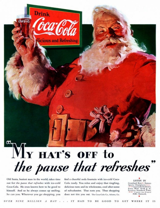
image source: https://www.bigcommerce.com/blog/how-coca-cola-used-santa/
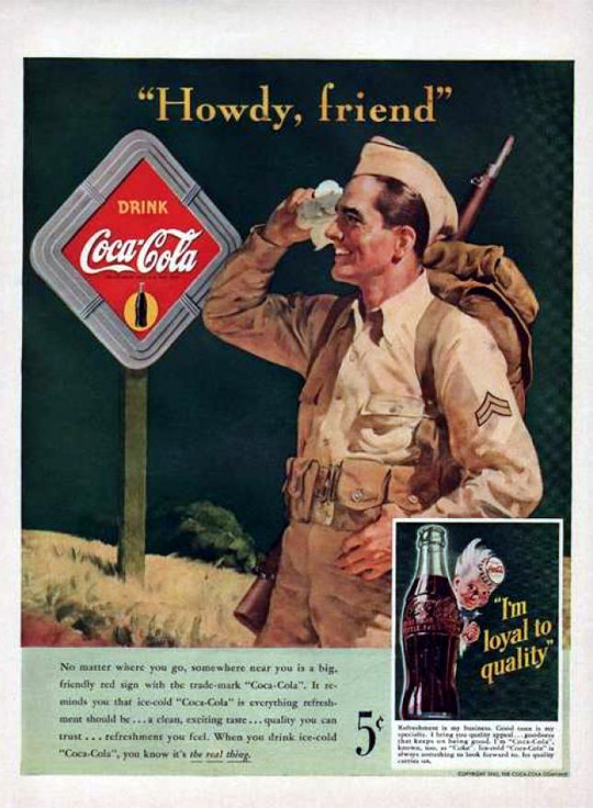
image source: https://imgur.com/t/coke/syX9yVr

image source: https://www.wordstream.com/blog/ws/2019/08/13/persuasive-ads
However, through packaging and ads, design can also be used to warn or prompt action from the audience. Cigarette ads started as promising popularity and even health.

image source: https://www.history.com/news/cigarette-ads-doctors-smoking-endorsement
But now, the only smoking ads shown depict the gruesome consequences of cigarettes.

image source: https://www.medpagetoday.com/primarycare/smoking/31672
Overall, I think that there is no answer to this question considering the meaning of the word ‘design’ is so broad and covers so may different forms. I think that the purpose of design is what you make of it and the goals you have as a designer.
0 notes
Text
week 7 lecture
In this lecture we explored the Bauhaus movement. I couldn't believe how, as Andy and Karen pointed out, most of the designs could still pass as contemporary designs and could have easily been designed any time during the 21st century. i think it is definitely a dream for anyone that their work is still not only relevant but still influential decades later.
an example i was reminded of was a work i saw in the Tate Modern called Projected Quasi Images by Dóra Maurer, a Hungarian artist. i think the geometric shapes and vibrant colours are reminiscent of the Bauhaus movement, despite it being created on 1988.

image source: me

image source: https://www.theguardian.com/artanddesign/2019/aug/11/dora-maurer-review-tate-modern
I loved how the designers used very simple and geometric shapes but then coloured them in beautiful bright and contrasting colours. It made me realise that although most of the designs from the Bauhaus movement could fit in with contemporary design, it was so much more colourful than what you see in mainstream design.
0 notes