
RMIT COMMUNICATION DESIGN STUDIES - online reflective journal
Don't wanna be here? Send us removal request.
Statistics
We looked inside some of the posts by shanaliw and here's what we found interesting.
Average Info
Notes Per Post
803
Likes Per Post
480
Reblog Per Post
319
Reply Per Post
3
Time Between Posts
2 days
Number of Posts By Type
Text
13
Photo
4
Last Seen Tumblr Blogs


Fun Fact
Premium Tumblr themes are available from anywhere between $9 to $49.
Text
bye👋🏽
I can’t believe all 12 weeks are already over ! Looking back at all the work we’ve done throughout these past few months is crazy but is definitely work that I have learnt heaps from and for that I’m proud of what I’ve produced. Having these weekly tumblr reflections has allowed me to constantly recognise and appreciate the content, work and progress I have made along the way which I’m so grateful for.
Our first assignment was really interesting and with my question especially it helped me realize, appreciate and reflect on how design is valuable. Through being challenged on using found objects to create the question, it put perspective on the worth of design. I used items such as pearl necklaces, credit cards and gold chains and realized that design is all around us. I realized that design is everywhere, and that it helps us learn and live our life in so many ways - that it's just as valuable as these items and if not, more. This experience if anything has made me respect and honor my love and current skills within design.
The second assignment where I did an imaginary interview with Gaudi was really interesting as it put me in his world in terms of his thoughts, ideas, process, inspiration, experiences, purpose and attitude. Knowing all the answers to these has almost given me this power to know what it takes to become a success designer, or in his case an architect that's as big as he was. In addition, being asked to get creative with my zine and to tell my answers through my visuals really helped me expand my skills in Illustrator, Photoshop and Indesign. I had so many visions that I wanted to create and my urge to try and make it come to life resulted in me figuring out how to use different tools to do those certain things.
Overall this course so far has definitely strengthened my views, skills, knowledge and connection to design. Thank you to Bailey, Andy and Karen for providing all the detailed lectures and fun activities in class. Being encouraged to make the collages or go outside to take some pictures was really enjoyable and was a nice way to gain that hands on experience I missed before isolation.

source
4 notes
·
View notes
Text
#blacklivesmatter
I just wanted to take the time out to address a major issue going on in the world right now about justice. Seeing the way Black people are treated and have been treated for ages terrifies me. I am hurt for all of those who have experienced racism whether big or small, it shouldn’t be accepted. I have grown up knowing that humans are all equal and deserve the same rights so seeing how unfairly black people are treated with such cruelty not only astounds me but confuses me.
I have had a lot of artworks pop up on my feed about the #blacklivesmatter movement and George Floyd and I really wanted to share some other works I came across. While the protests are going on, mainly in America, I believe it’s such a powerful way to speak up and fight for our rights however being a design student I also see equal power in what design can do for more justice and equality in the world.
Across this course so far, I have developed a stronger connection and love for what design and art can do, specifically with how it can make you feel great emotions. I believe if we can all share all these posts and more, the world and society can slowly become more positive and a greater place to live in among each other. That we can share our emotions and experiences visually through design as a way to communicate and have more understanding for one another.


2 notes
·
View notes
Photo
WEEK 12
This technique is really interesting and never actually realized that you can learn a lot from doing this. For me I just went straight to InDesign to create my zine and focused purely on the visual designs however what Chelsey has does is sort of like seeing what’s behind the scenes. Reading through her reflection was really interesting but mainly beneficial to her and hope for it to benefit me too. I’d love to also try this activity just for myself and own understanding of layouts, spreads, pages, composition and printing when it comes to things such as magazines, zines, books, comics etc.
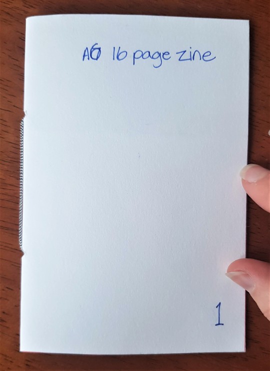

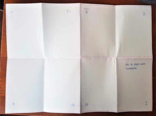
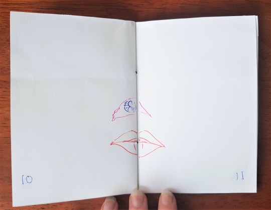

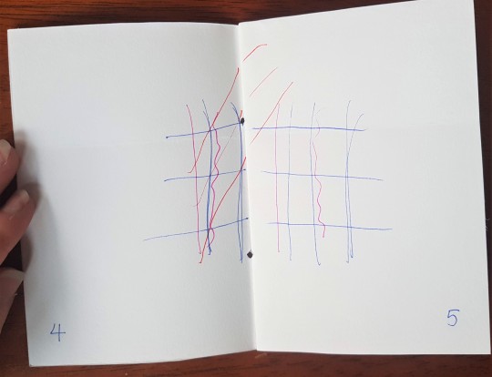
Week 10 \ Class Activity \ Zine Templates
Top Left: Trimmed A6 16 page zine Top Right: A6 16 page zine template
Middle: A6 16 page zine template: open
Bottom Left: Drawing on double pages: after trim Bottom Middle: Drawing on double pages template: unfolded Bottom Right: Drawing on double pages: after trim
Class today was about getting used to folding and using templates when considering making zines or books. Karen walked us through numbering the pages, had us draw pictures in the enclosed pages to see what would happen and then trim the borders to mimic what would happen to our pages when printed. This process helped me to understand how I would go about making a zine and the key parts of the process for example: ensuring the content will fit within the border once the paper is trimmed, even avoiding complications when placing images on double page spreads when they aren’t a centerfold.
It was great to actually make something as it’s been a while sitting in front of the computer screen. I’m just regretful that we haven’t been able to actually print them ourselves. To be honest, I think it’s making this process a bit difficult for me. I love learning new things and being tech savvy and creating sleek things on the computer, but I’m a maker at heart and I’m really suffering from missing out on that environment. Nonetheless, I am grateful for everything we’re learning and the continued encouragement and positivity from our teachers.
I can’t wait for this hands on process to come in handy in the future where as I believe this process will be very helpful for me.
4 notes
·
View notes
Text
WEEK 12
(COMMUNICATION DESIGN STUDIES RELATED):
To finish off our last class we did an activity which I feel was a great exercise to show us all mainly the importance of composition and hierarchy. We were put to the test in 3 ways. We were given sample text and images and had to rearrange and alter it to:
1. Emphasise Image (scale, colour, inset, placement, crop)
2. Emphasise Text (pull quotes, bolding, italicizing, underlining, size changes, rhythmic layout)
3. Distortion (Transform, cutting, collaging, rearranging)
ORIGINAL:

Here were my results:
Emphasise Image:

Emphasise Text:

Distortion:

Overall I found today’s class really fun, helpful and constructive. Reflecting now has made me realize that I learnt a lot from today's session even if it wasn’t intended in one way. Being tested to alter the image and text all within 5 minutes each was in a way quite challenging as we had to think very quickly on the spot however I did try out different tools and techniques I’ve never used before. Hopefully after more experimentation I can be more familiar with all the tools to then use them to my advantage some day with my designs. I loved being able to see the other works people did (both the activity and their WIP for the ‘ask me anything assignment’). Seeing everyones work showed me how versatile design is, that design gives us the opportunity to think creatively and differently from one another however that’s what makes design such an amazing aspect - everyone’s designs were so out there (in a good way of course) but it also challenged and inspired me to get more creative with my own designs.
As we got individual feedback for our assignment, I was able to fix something in my zine which was really bothering me.

A lot of the words were getting cut off and Bailey was able to show me a tracking setting in Indesign which I found really useful. I have now gone through all my pages and used this technique to reduce the amount of divided words - my answers are now a lot more easier to read with a better flow all throughout :)
4 notes
·
View notes
Text
WEEK 12
(COMMUNICATION DESIGN STUDIES RELATED):
Work in Progress (WIP) - Antoni Gaudi Zine
Looking through all my pages I realized that 3 out of 5 of my questions had a simple layout of text with images and it honestly bothered me quite a bit, I wanted to do more but didn’t know how. At first I looked at ideas on Pinterest for inspiration until I realized that simply reading over what I have written for my answers is inspiration in itself. Through doing this I found that it helped bring out more ideas of what I could include. The more I read my answer, the more I realized that my images don’t say enough and don’t exactly replicate what’s written.
I have really enjoyed doing collages in this class and thought to use this as a new way to incorporate more of Gaudi in terms of visuals for one of my questions.
Here was the initial layout I did:

Knowing the kind of imaginative person Gaudi is, I knew that I could experiment more and take this page further. I figured that if I changed this page up a bit that 3 out of the 5 questions would have an more interesting design and the other 2 pages with a more simple layout could balance it all out well.
The key ideas mentioned in my answer for this question was about:
Sagrada Familia
Roman Catholic Church and faith
Art nouveau
Catalonia / Barcelona
Symbolism of God
Imagination
Inspiration from Nature
So with these points in mind, I decided to create a collage that aims to encapsulate as many of these as possible so that the imagery could complement the text well.
After many stage this is what I came up with:

Improvements I made:
- I changed the font of the ALL the questions - as much as I really liked how different the previous font was however after a lot of thought I decided to change it to a more simple style. I got feedback from some family members and the main point I got back was that they couldn’t read the previous font which I agreed to myself. I think legibility is very important, especially considering this is an interview, the questions need to be read easily.
- I matched this tan coloured background with one of the first design layouts in my zine so that the zine overall would flow more and not seem as if that first pages aesthetic is almost singled out - this vintage style/vibe I felt was important to include but also contrast with the colourful pages as I feel Gaudi has 2 sides - this playful, colourful, imaginative side + a more vintage, art nouveau, grand side to him and his architecture
- I added the collage with images to represent the all key points (mentioned above) I found within the text to complete it all together more effectively
- I added some more details to the frames among the text paragraphs such as the art nouveau themed corners
- I changed the images under the text answers - I felt the previous images were to similar to one another and didn’t exactly reflect what the answers were saying. Whereas these new images I feel say more about what's said about Gaudi and show a greater range of perspectives/views on the structure.
- Text of answers go downwards for a more easier read and more organised look - also goes with the idea of how other magazines are layed out
0 notes
Text
WEEK 12
(COMMUNICATION DESIGN STUDIES RELATED):
Work in Progress (WIP) - Antoni Gaudi Zine
One of my questions relate to how Gaudi’s work is unique and different and for that, I wanted to visually answer that through his ‘Park Guell’ design. This park includes a multi coloured lizard mosaic which can be found at the main entrance. I found the vibrant colours and intricate tile work very eye catching and one of a kind - thinking what other park do you know that has mosaics? let alone a giant 3D mosaic of a lizard.

source
Therefore, I knew I wanted to incorporate something similar in honor of him. I initially thought having it sprawled across the page would be very eye catching and interesting, similarly to how it looks in real life. So here are my first few designs:


In terms of the colours for the lizard, I didn’t want to completely replicate the lizard from Gaudi’s one for different reasons. Bailey mentioned to not completely mimic the aesthetic or style and to put your own twist on it so I changed it up however it still shares the similar eye catching quality and feel. Another point is, that colour is a very important aspect to Antoni and can be seen across all his works. Although it was the Casa Batllo that also inspired my colour choice. The Casa Batllo I’d have to say is one of my personal favourites as the variety of colours makes me feel this certain way. As corny as it may sound, I find this design so magical and dreamlike, when I look at it I feel as if I’m in some sort of fairytale. Therefore I have aimed to combine his other unique works such as the Casa Batllo within his Park Guell design through the lizard as a visual way of answering the question.

source

source
The background is a photo of one of the walkways within the Park Guell - I did this in hope to give all the information and lizard more context. However in doing this, the text got lost among the background so I then played around with white and black tints and making the text colour contrast. Overall I was happy with the layout until I did some more reflecting as I felt something was off about it. Thinking from a general perspective, I realized that if I was to read all the information, that I’d like to see more images of Gaudi’s work or some sort of other visual aid to support and complement what is written. So I looked into further refinement ideas to address this, here is what I came up with:

After this, I still wasn’t completely satisfied, I felt the pictures were a good addition however in another way it also looked as if it was almost just squashed in at the last second and that it didn’t really flow or connect in with the rest of the design layout.
I went away for a bit, days later I decided to take another approach towards this idea and design, as what I had currently just wasn’t working for me, something was missing. I knew I wanted to keep the lizard design in terms of the visuals and I knew I wanted to find a way of using the lizard among pictures of some of Gaudi’s other work.
New idea/concept: I thought to place the lizard on a log outline and to then have his tail wrap around as a way to divide all the pictures within the log.
Here is how I went about creating this idea:


As you can see I went through a lot of random steps and techniques to try and make it all work😅. But here is the final outcome for this question:

During this whole process I was able to learn a lot and gain more experience with adobe which I’m very grateful for. This whole experience of making my zine had me going from photoshop to illustrator to indesign one after the other as they all help with a variety of things. I was able to learn more on how to arrange text such as making it diagonal like what’s shown above - this can come in use any time for any design brief or creative task.
8 notes
·
View notes
Text
WEEK 12
(COMMUNICATION DESIGN STUDIES RELATED):
Work in Progress (WIP) - Antoni Gaudi Zine
The first aspect I started off with was the front cover, this way I felt I could ease into his aesthetic and what he is all about for a more effective approach.
Here was my very first design of the cover:


I had put so much effort into changing the colour of each individual piece in the mosaic for the title that I almost refused to the idea of changing or improving the cover design. The mosaic font for his name was very important for me to include as Gaudi works with mosaics A LOT in his work. However the overall composition just wasn’t working, I found having his face in colours with the coloured title was very unbalanced especially with the black and white landscape at the bottom. So I decided to play around with other options I could come up with.


I played around with a whole bunch of things. I experimented with different fonts, layouts, sizes/scale, borders, filters, placements, backgrounds and even added more information as I felt it was looking quite empty and to simple - so at one point I added his year of birth and a caption saying ‘enter my world...’. I discussed all this in class last week and majority were saying they preferred the more vintage ones on the right - which I 100% agreed with.


I then picked two of my favourite and further refined them. I find these designs a lot more pleasing and complete. I made the letters wonky for “Gaudi” as he is very unique and different with his designs - none of his works include perfectly straight lined structures or elements so this playful arrangement of the text aims to reflect this quality of his.
“There are no straight lines or sharp corners in nature. Therefore, buildings must have no straight lines or sharp corners.” - Antoni Gaudi
I tried out both dark and lighter moods and I was leaning more towards the ones with a dark tint to it - I feel it was an interesting way to give my overall zine more mystery and allowed his face to stand out as he is the focal point of my zine. In addition, I changed the caption from ‘enter my world...’ to “enter my world of architecture...”. I found this tweak gave that extra bit of content that I felt it was lacking. I looked at the design from an general perspective and realized that the cover didn’t give a clear sign as to what he was or did - the only thing was his interior design which is blended within his face (not as obvious). Keeping the caption still simple with the 3 dots (...) allows readers to be intrigued and wanting to read further on to the next pages which is also why I placed it on the very right side where the page turns.
The background is of Barcelona, his home which is very important to him and his work which why I felt it was crucial to include in the cover page.

2 notes
·
View notes
Photo
WEEK 11
It amazes me to see how much detail and thought Antoni Gaudi puts into his architecture. I can’t think of one thing or part within his designs that he doesn’t put imagination to - whether it’d be the windows or gates or even the ceiling, it is all unique and has a creative look to it. His architecture is one of a kind and that’s why I admire him so much. He inspires me to be unique and think outside of the box, to not follow the norms and to experiment when it comes to my designs and materials.
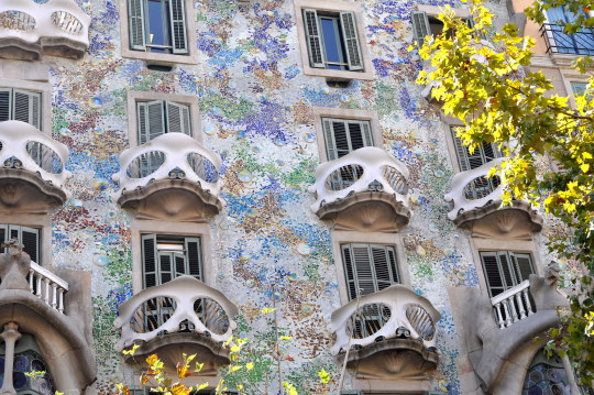
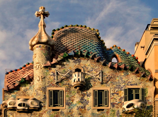
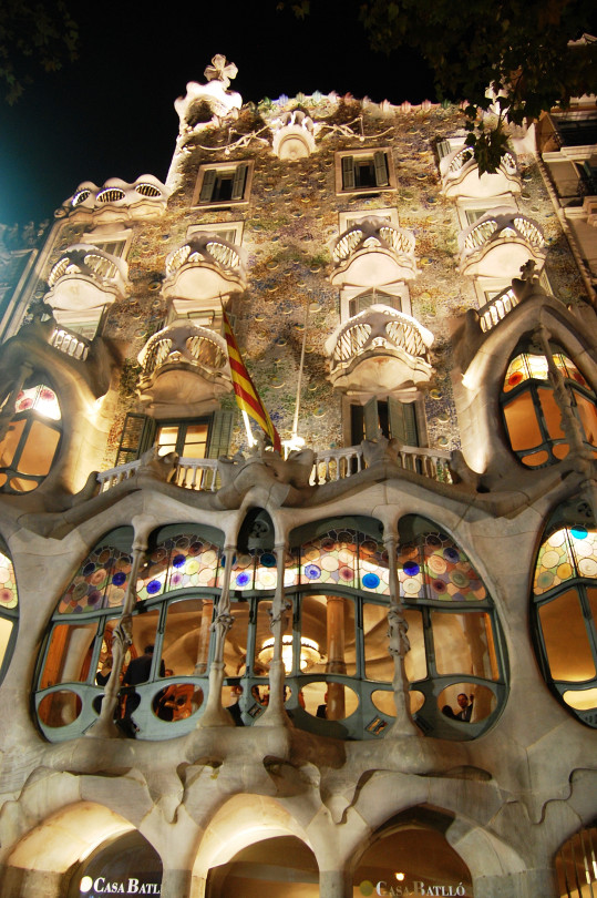
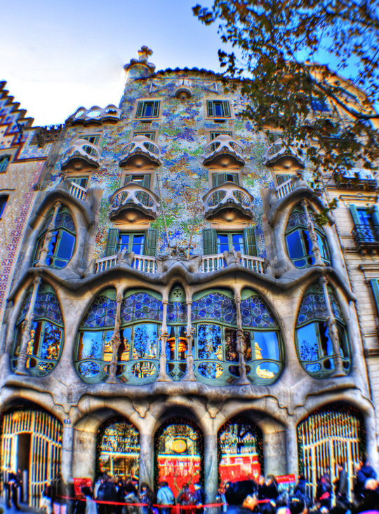
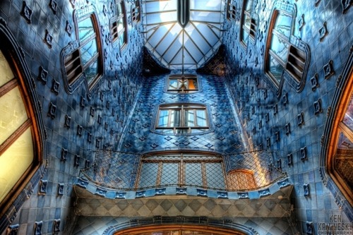


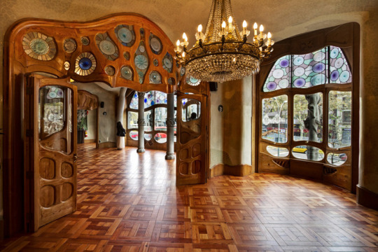

Casa Batlló by Antoni Gaudí
183 notes
·
View notes
Photo
WEEK 11
These dresses I absolutely adore and just found out that this collection is inspired by Gaudi’s architecture (my topic for the ask me anything interview). Elie Saab pays homage to Antoni Gaudi’s designs by replicating a similar style and aesthetic. When I look at this collection I can start to see similar colours, textures and patterns throughout the dresses and his buildings, especially his mosaic work. These all further inspires me to create new patterns that are inspired by Gaudi’s style within my zine.
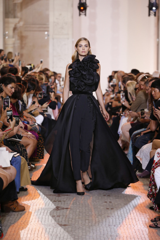
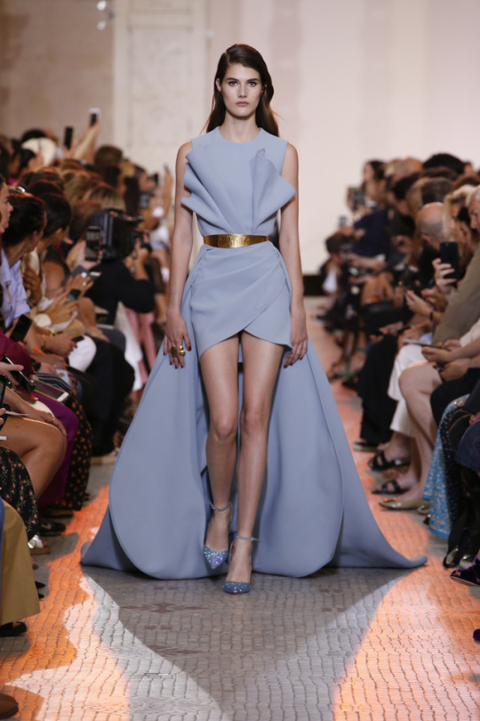
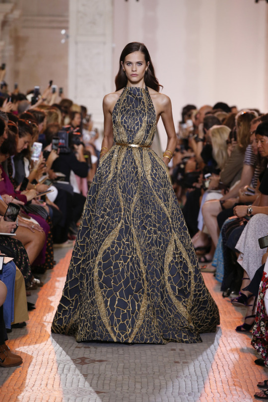
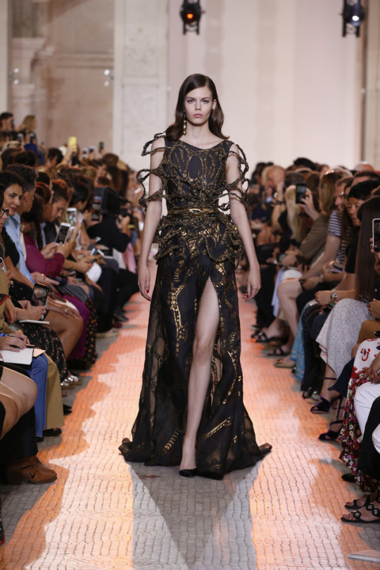
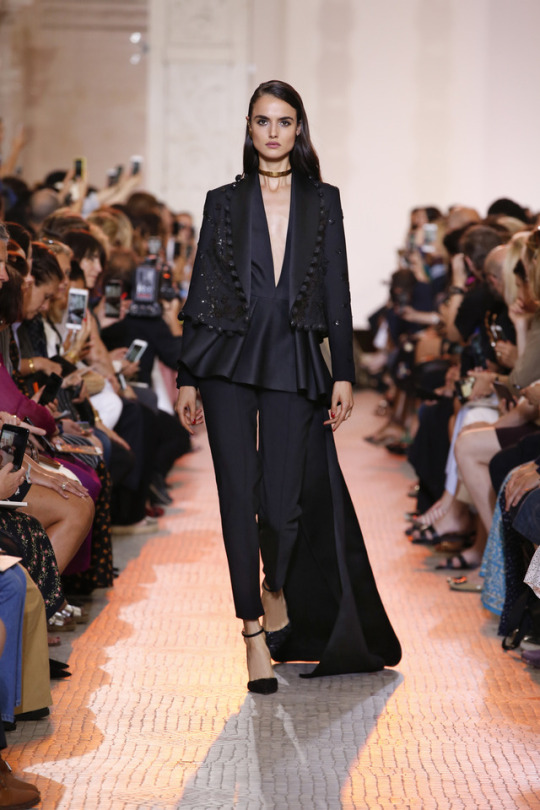

ELIE SAAB Haute Couture Autumn Winter 2018-19 Collection #OfFormsAndLight
540 notes
·
View notes
Text
WEEK 11
At first I was kind of confused on Lily’s topic when she had said she was doing Tupperware - all I really thought about was the lunchboxes I see in kmart and coles these days however, she has opened up this whole new world to me that I never knew about. I love seeing all this inspiration, I feel like it all has this really nice homely and retro vibe to it. But seeing all this inspiration of other ideas has made me notice how well Lily has matched and replicated this vibe and style in her own way with her WIP designs. Seeing all the poster designs at the top as well can really help anyone doing a zine as well, like me :) I feel these posters have a really effective layout and hierarchy - e.g the lady pointing her fingers to the title to gain more focus on the main message in red. This has given me more ideas on how to use different fonts and sizes and how to place that well with your images to create a well thought out design. Love your work Lily!
ask me anything
some inspiration for my zine - I have always been surrounded by these ads at home and have such an appreciation for their design (especially the car ones), so I hope to be incorporating this aesthetic into my Tupperware interview for ask me anything!

source

source

source

source

source my fridge!
2 notes
·
View notes
Text
WEEK 11
(COLOUR & INFORMATION DESIGN RELATED):
Today in colour class we got introduced to the GIFs part we have to make for our current assignment. Not sure if I’ve done this right but here is what I put together. I really enjoyed creating this, its my first time making a GIF. I found it was a different but creative way of bringing your design to life. This task has definitely made me keen on making more which may come handy with other future assignments within my design course :)


3 notes
·
View notes
Text
WEEK 11
(COMMUNICATION DESIGN STUDIES RELATED):
I really liked the idea mentioned in the lecture about emerging technology with the Eyewriter so I research more into it. I came across this video which discusses the same ideas on the Eyewriter but I just wanted to share a comment Tony (graffiti artist who is paralysed) had said as he was able to draw for the first time in 7 years.

I just found this really inspiring and made me really happy :)
source: https://www.youtube.com/watch?v=q7fidQ1UVYI
youtube
0 notes
Text
WEEK 11
(COMMUNICATION DESIGN STUDIES LECTURE):
Favourite lecture points
There were two parts in this lecture that I liked:
Andy and Karen's creation of the ‘Live Draw’ - To be able to see one of their creations was really interesting, I was so amazed. To create a system device that is able to redraw what someone else is drawing is one thing but for it to follow your every movement (where the drawer is almost a choreographer) in terms of where your hand moves and the time you take to draw it took it even further. This idea is the start of something great and can help society in different ways

The EyeWriter - The creation of emerging technologies such as the EyeWriter is changing people's lives for the better and giving so many people different opportunities. Being able to see Tony in that video, no ability to move any part of his body and can’t talk however with an active mind both saddened me and relieved me as this idea has helped give him a purpose within these tough times he's facing. It allows graffiti writers and artists with paralysis to draw only using their eyes.

Appreciation on life
Andy and Karen’s week 11 lecture discussed and answered "What's next for design?". Being able to see different examples of how communication design has emerged over time through emerging technologies has honestly made me appreciate everything around me more. Seeing the emerging technologies amazed me but to be able to grow up in a time where we have things like laptops, IPhones and 3D printing is a fortunate thing to have in itself. I look back on the start of the lectures series when we looked at clay tablets, and to think that those people had to come up with symbols to tell an entire story, situation or question to me is beyond crazy - if I was born within that time period I know for a fact I would struggle - I applaud those who only used clay, rocks or sand to communicate because I’m able to see how I can simply turn on my phone wherever I am and text my friends who are on the other side of the planet within seconds.
0 notes
Text
WEEK 10
(COMMUNICATION DESIGN STUDIES):

Brainstorm for “Ask Me Anything” assignment
Here were my initial questions for the interview however after the past two classes with Bailey I’ve been working on making my questions more specific. I’ve been able to gain really constructive feedback on how to improve my questions throughout class - she showed us many examples of how we should know some background knowledge first to then construct the questions + what we should try avoid with our questions. For example:
“When were you born?“
VS
“What was it like growing up in Germany after WWII“
----------
Thoughts for my zine: Bailey mentioned how we should avoid mimicking the designers work and style throughout the zine, so after I write out all my answers to my refined questions I plan to put a modern style within my zine somehow. I want to play on the idea of Gaudi’s dreamlike and fun style while combing that with a clean look to it to change it up a bit and make it my own. Gaudi’s designs are also very intricate and full on so I want to avoid making the layout to busy and cluttered so that viewers are still able to flow through the zine without feeling to overwhelmed.
0 notes
Text
WEEK 10
(COMMUNICATION DESIGN STUDIES LECTURE):
In this week's lecture it discussed why we design. Andy and Karen showed multiple examples of historical designs that have the purpose of creating social change. It was interesting to see the different ways people use design to speak out on several controversial issues. The two main points that I found interesting were about The Guerrilla Girls and Benetton.
The Guerrilla Girls - These women have a very interesting way and technique to address the biases against women and those of color within the art world. Their protest posters are very unique and bold - these effective posters hold great strength within the graphic design elements with the combination of humour, facts and catchy slogans, hence creating a strong impression around the world on many ideas including sexism, racism, diversity, equality, representation and acceptance.

Benetton - Benetton’s work striked me the most. Benetton has created many controversial works although it is the way he advertises his clothes that I love the most. I admire the intentions behind his work and ideas a lot. This group has the aim of establishing an increase in respect and maturity with this new campaign called “United colours of Benetton - Clothes for Humans”. I just love how this advertising campaign is like no other - it shows and celebrates diversity with real moments, real emotions and real people. It is so far from fashion stereotypes many of us may see nowadays but that to me is the beauty of it. The people Benetton chose to put in their advertising showcase that everyone is unique but also that their clothes can fit a range of shapes and sizes of different races and cultures. The brand works around the quote of:
“We make clothes for humans that come in different colours. And different shapes. Humans that hold different beliefs. Humans that live lives in different places. All humans. ”
https://www.marketingweek.com/benetton-hunts-for-respect-and-desirability-with-new-marketing-strategy/

http://apollo13westend.com/flat-50-off-on-united-colors-of-benetton-apparels-at-myntra/

https://www.prnewswire.com/news-releases/united-colors-of-benetton-is-back-300941789.html
youtube
This all just goes to show that design can be very powerful and influential if you present and advertise it in the best light possible. Addressing issues that mean a lot to you or ideas that are controversial can be powerful in itself - striking a debate within the public, with the hope of it eliminating issues within the world. If the design has strong meanings and aims behind it, and you reflect those values through different colours, shapes, fonts for example then it can go really far and reach out to lots of people.
0 notes
Text
WEEK 10
I love Erin’s approach to Friday's activity with the collages. The style, aesthetic and technique she incorporated I found was so unique and I’ve never seen a collage done like this before. The torn and rough effect within the design I feel gave it a new edge and dimension to it - makes it more interesting and fascinating to look at. Having the idea to create an ocean and sunset by using various tones of up blue and pink I found was a cool way to recreate an image and make it your own with photographs/drawings/icons/illustrations that appeal to you.
Week 9 Communication design
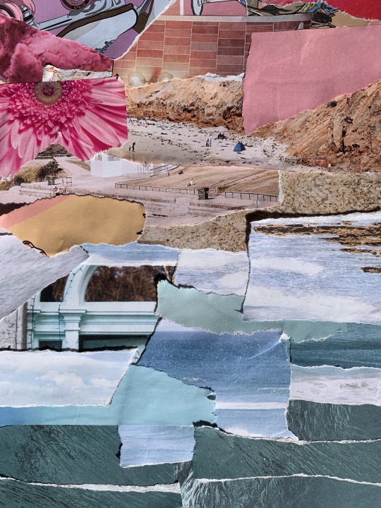
This week in class we were introduced to the world of collage, which we have been recently looking at in our lectures. in class we were given the opportunity to attempt and create our own, so we were asked to bring magazines to our class call and just create any sort of collage. This for me was the best class because we were able to be hands on and be creative which has been a struggle since being in isolation the last couple of weeks. My approach to this task was to try create the ocean and sunset by using various ripped up blue and pink tones and make a smooth transition between the two colours and attempt at landscape collage. At the end of the class we were able to see what everybody else had created and it was interesting to see other classmates interpretations of the task. The best part about collage is that you can incorporate any type of aesthetic whether that be dark and grungy or soft and pastel, but still maintain that idea of creating an image by distorting another image which is why i really admire the uniqueness behind collage.
4 notes
·
View notes
Photo
WEEK 10
more zine inspiration❣️
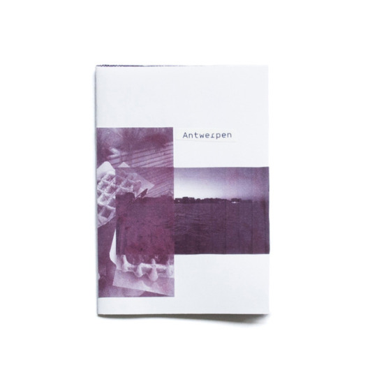
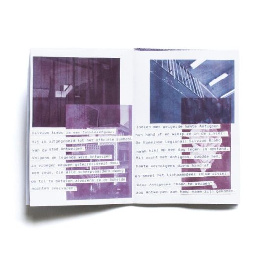
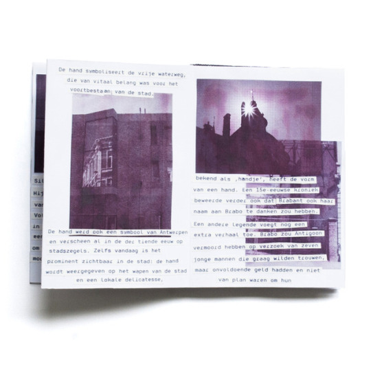
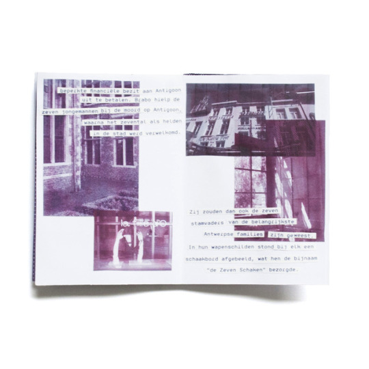
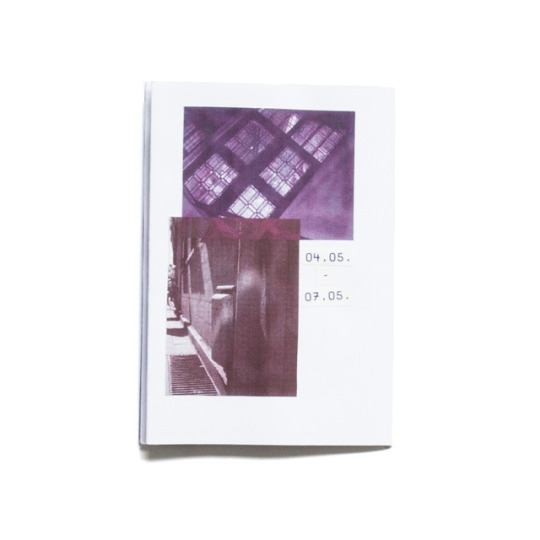
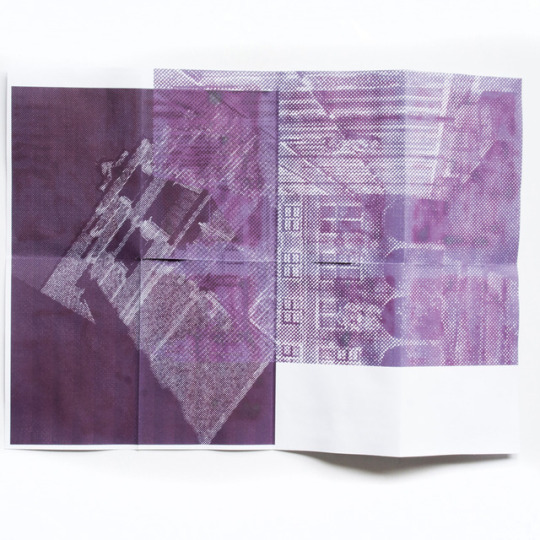
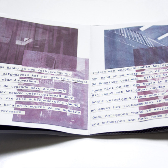
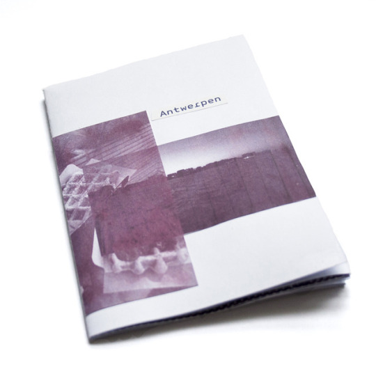
A small zine processing our course trip to Antwerp. All in purple it comes along and tells the story on how Antwerp got its name – of cause in dutch.
Ein kleines Zine, das unsere Kursfahrt nach Antwerpen aufarbeitet. Ganz in lila kommt es daher und erzählt dabei die Geschichte wie Antwerpen zu seinem Namen kam – natürlich auf niederländisch.
zine by @nica_ha_
47 notes
·
View notes