
Don't wanna be here? Send us removal request.
Statistics
We looked inside some of the posts by shareyourdatawithme and here's what we found interesting.
Average Info
Notes Per Post
0
Likes Per Post
0
Reblog Per Post
0
Reply Per Post
0
Time Between Posts
10 days
Number of Posts By Type
Text
16
Photo
1
Last Seen Tumblr Blogs


Fun Fact
28.6 is the average number of monthly visits per US mobile user.
Text
Capstone Project - Week1
My project title is “The association between life expectancy and various development indicators from the World Bank dataset.”
The purpose of this study is to identify specific development indicators that could predict higher life expectancy values and which indicators strongly effect higher life expectancy. Some of these development indicators include sanitation levels, clean water source availability, and adjusted net income to name a few. There are logical benefits to study these correlations to help benefit developing countries identify those areas which they need to focus on to increase life expectancy of their people.
0 notes
Text
Machine Learning - Week 4
This is the fourth and final week of the Machine Learning course, and in this week’s assignment we are tasked with conducting a k-means cluster analysis. The analysis was conducted to identify underlying subgroups of adolescents based on their similarity of responses on 7 variables. The variables represent characteristics that could have an impact on school achievement measured as GPA. Clustering variables included if marijuana was ever used, alcohol problems, gender, depression, self-esteem, if they have ever been expelled, and if they have ever used cocaine. All clustering variables were standardized to have a mean of 0 and a standard deviation of 1.
Data was randomly split into a training set that included 70% of the observations (N=3,202) and a test set that included 30% of the observations (N=1,373). A series of k-means cluster analyses were conducted on the training data specifying k=1-9 clusters, using Euclidean distance. The variance in the clustering variables that was accounted for by the clusters (r-square) was plotted for each of the nine cluster solutions in an elbow curve to provide guidance for choosing the number of clusters to interpret. The figure below is of the elbow curve.
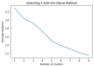
The elbow curve was inconclusive, suggesting that the 2, 3 and 5-cluster solutions might be interpreted. The rest of the analysis was conducted with an interpretation of the 3-cluster solution.
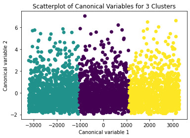
A scatterplot of the first two canonical variables by cluster (Figure below) indicated that the observations in all the clusters had no overlap.
The means on the clustering variables showed that, compared to the other clusters, adolescents in cluster 1 had moderate levels on the clustering variables. They had a relatively low likelihood of using alcohol or marijuana, but moderate levels of depression and self-esteem. With the exception of having a high likelihood of having used alcohol or marijuana, cluster 2 had higher levels on the clustering variables compared to cluster 1.
In order to externally validate the clusters, an Analysis of Variance (ANOVA) was conducting to test for significant differences between the clusters on grade point average (GPA). A tukey test was used for post hoc comparisons between the clusters. Results indicated significant differences between the clusters on GPA (F=113.7, p=1.98e-48 – very small).
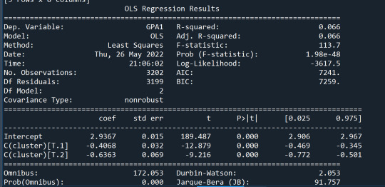
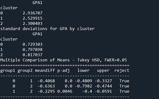
The tukey post hoc comparisons showed significant differences between clusters on GPA. Cluster 3 had the lowest GPA at 2.3 followed by cluster 2 at 2.5. The results of the tukey test indicated that all of the clusters were not significantly different from one another.
from pandas import Series, DataFrame
import pandas as pd
import numpy as np
import matplotlib.pylab as plt
from sklearn.model_selection import train_test_split
from sklearn import preprocessing
from sklearn.cluster import KMeans
import os
"""
Data Management
"""
os.chdir("C:\TREES")
data = pd.read_csv("tree_addhealth.csv")
#upper-case all DataFrame column names
data.columns = map(str.upper, data.columns)
# Data Management
data_clean = data.dropna()
# subset clustering variables
cluster=data_clean[['BIO_SEX','MAREVER1','ALCPROBS1','COCEVER1',
'DEP1','ESTEEM1','EXPEL1']]
cluster.describe()
# standardize clustering variables to have mean=0 and sd=1
clustervar=cluster.copy()
clustervar['BIO_SEX']=preprocessing.scale(clustervar['BIO_SEX'].astype('float64'))
clustervar['ALCPROBS1']=preprocessing.scale(clustervar['ALCPROBS1'].astype('float64'))
clustervar['MAREVER1']=preprocessing.scale(clustervar['MAREVER1'].astype('float64'))
clustervar['DEP1']=preprocessing.scale(clustervar['DEP1'].astype('float64'))
clustervar['ESTEEM1']=preprocessing.scale(clustervar['ESTEEM1'].astype('float64'))
clustervar['EXPEL1']=preprocessing.scale(clustervar['EXPEL1'].astype('float64'))
clustervar['COCEVER1']=preprocessing.scale(clustervar['COCEVER1'].astype('float64'))
# split data into train and test sets
clus_train, clus_test = train_test_split(clustervar, test_size=.3, random_state=123)
# k-means cluster analysis for 1-9 clusters
from scipy.spatial.distance import cdist
clusters=range(1,10)
meandist=[]
for k in clusters:
model=KMeans(n_clusters=k)
model.fit(clus_train)
clusassign=model.predict(clus_train)
meandist.append(sum(np.min(cdist(clus_train, model.cluster_centers_, 'euclidean'), axis=1))
/ clus_train.shape[0])
"""
Plot average distance from observations from the cluster centroid
to use the Elbow Method to identify number of clusters to choose
"""
plt.plot(clusters, meandist)
plt.xlabel('Number of clusters')
plt.ylabel('Average distance')
plt.title('Selecting k with the Elbow Method')
# Interpret 3 cluster solution
model3=KMeans(n_clusters=3)
model3.fit(clus_train)
clusassign=model3.predict(clus_train)
# plot clusters
from sklearn.decomposition import PCA
pca_2 = PCA(2)
plot_columns = pca_2.fit_transform(clus_train)
plt.scatter(x=plot_columns[:,0], y=plot_columns[:,1], c=model3.labels_,)
plt.xlabel('Canonical variable 1')
plt.ylabel('Canonical variable 2')
plt.title('Scatterplot of Canonical Variables for 3 Clusters')
plt.show()
"""
BEGIN multiple steps to merge cluster assignment with clustering variables to examine
cluster variable means by cluster
"""
# create a unique identifier variable from the index for the
# cluster training data to merge with the cluster assignment variable
clus_train.reset_index(level=0, inplace=True)
# create a list that has the new index variable
cluslist=list(clus_train['index'])
# create a list of cluster assignments
labels=list(model3.labels_)
# combine index variable list with cluster assignment list into a dictionary
newlist=dict(zip(cluslist, labels))
newlist
# convert newlist dictionary to a dataframe
newclus=DataFrame.from_dict(newlist, orient='index')
newclus
# rename the cluster assignment column
newclus.columns = ['cluster']
# now do the same for the cluster assignment variable
# create a unique identifier variable from the index for the
# cluster assignment dataframe
# to merge with cluster training data
newclus.reset_index(level=0, inplace=True)
# merge the cluster assignment dataframe with the cluster training variable dataframe
# by the index variable
merged_train=pd.merge(clus_train, newclus, on='index')
merged_train.head(n=100)
# cluster frequencies
merged_train.cluster.value_counts()
"""
END multiple steps to merge cluster assignment with clustering variables to examine
cluster variable means by cluster
"""
# FINALLY calculate clustering variable means by cluster
clustergrp = merged_train.groupby('cluster').mean()
print ("Clustering variable means by cluster")
print(clustergrp)
# validate clusters in training data by examining cluster differences in GPA using ANOVA
# first have to merge GPA with clustering variables and cluster assignment data
gpa_data=data_clean['GPA1']
# split GPA data into train and test sets
gpa_train, gpa_test = train_test_split(gpa_data, test_size=.3, random_state=123)
gpa_train1=pd.DataFrame(gpa_train)
gpa_train1.reset_index(level=0, inplace=True)
merged_train_all=pd.merge(gpa_train1, merged_train, on='index')
sub1 = merged_train_all[['GPA1', 'cluster']].dropna()
import statsmodels.formula.api as smf
import statsmodels.stats.multicomp as multi
gpamod = smf.ols(formula='GPA1 ~ C(cluster)', data=sub1).fit()
print (gpamod.summary())
print ('means for GPA by cluster')
m1= sub1.groupby('cluster').mean()
print (m1)
print ('standard deviations for GPA by cluster')
m2= sub1.groupby('cluster').std()
print (m2)
mc1 = multi.MultiComparison(sub1['GPA1'], sub1['cluster'])
res1 = mc1.tukeyhsd()
print(res1.summary())
0 notes
Text
Machine Learning - Week 3
This is the third week of the Machine Learning course, and in this week’s assignment we are tasked with conducting a lasso regression analysis to identify a subset of variables from a pool of data. I selected 8 categorical and quantitative predictor variables that best predicted a quantitative response variable measuring school connectedness in adolescents.
I used the trees data as my dataset which was mainly categorical data and some quantitative data points.
The following variables were included as predictors in our lasso regression model: gender, alcohol problems, marijuana use, cocaine use, grade point average, a scale for depression, a scale for self-esteem, and whether being expelled from school. All predictor variables were standardized to have a mean of zero and a standard deviation of one.
The total data set of 4,575 data points was randomly split into a training set that included 70% of the observations (N=3,202) and a test set that included 30% of the observations (N=1,373). The least angle regression algorithm with k=10 fold cross validation was used to estimate the lasso regression model in the training set, and the model was validated using the test set. The change in the cross validation average (mean) squared error at each step was used to identify the best subset of predictor variables. See figure below for the change in the validation mean at each step.

During the estimation process, self-esteem and depression were most strongly associated with school connectedness, followed GPA. Depression was negatively associated with school connectedness and GPA was positively associated with school connectedness. The model output is below.

#from pandas import Series, DataFrame import pandas as pd import numpy as np import os import matplotlib.pylab as plt from sklearn.model_selection import train_test_split from sklearn.linear_model import LassoLarsCV
os.chdir("C:\TREES")
#Load the dataset data = pd.read_csv("tree_addhealth.csv")
#upper-case all DataFrame column names data.columns = map(str.upper, data.columns)
# Data Management data_clean = data.dropna() recode1 = {1:1, 2:0} data_clean['MALE']= data_clean['BIO_SEX'].map(recode1)
#select predictor variables and target variable as separate data sets predvar= data_clean[['MALE','ALCPROBS1','MAREVER1','COCEVER1','DEP1', 'ESTEEM1','GPA1','EXPEL1']]
target = data_clean.SCHCONN1
# standardize predictors to have mean=0 and sd=1 predictors=predvar.copy() from sklearn import preprocessing predictors['MALE']=preprocessing.scale(predictors['MALE'].astype('float64')) # predictors['HISPANIC']=preprocessing.scale(predictors['HISPANIC'].astype('float64')) # predictors['WHITE']=preprocessing.scale(predictors['WHITE'].astype('float64')) # predictors['NAMERICAN']=preprocessing.scale(predictors['NAMERICAN'].astype('float64')) # predictors['ASIAN']=preprocessing.scale(predictors['ASIAN'].astype('float64')) # predictors['AGE']=preprocessing.scale(predictors['AGE'].astype('float64')) # predictors['ALCEVR1']=preprocessing.scale(predictors['ALCEVR1'].astype('float64')) predictors['ALCPROBS1']=preprocessing.scale(predictors['ALCPROBS1'].astype('float64')) predictors['MAREVER1']=preprocessing.scale(predictors['MAREVER1'].astype('float64')) predictors['COCEVER1']=preprocessing.scale(predictors['COCEVER1'].astype('float64')) # predictors['INHEVER1']=preprocessing.scale(predictors['INHEVER1'].astype('float64')) # predictors['CIGAVAIL']=preprocessing.scale(predictors['CIGAVAIL'].astype('float64')) predictors['DEP1']=preprocessing.scale(predictors['DEP1'].astype('float64')) predictors['ESTEEM1']=preprocessing.scale(predictors['ESTEEM1'].astype('float64')) # predictors['VIOL1']=preprocessing.scale(predictors['VIOL1'].astype('float64')) # predictors['PASSIST']=preprocessing.scale(predictors['PASSIST'].astype('float64')) # predictors['DEVIANT1']=preprocessing.scale(predictors['DEVIANT1'].astype('float64')) predictors['GPA1']=preprocessing.scale(predictors['GPA1'].astype('float64')) predictors['EXPEL1']=preprocessing.scale(predictors['EXPEL1'].astype('float64')) # predictors['FAMCONCT']=preprocessing.scale(predictors['FAMCONCT'].astype('float64')) # predictors['PARACTV']=preprocessing.scale(predictors['PARACTV'].astype('float64')) # predictors['PARPRES']=preprocessing.scale(predictors['PARPRES'].astype('float64'))
# split data into train and test sets pred_train, pred_test, tar_train, tar_test = train_test_split(predictors, target, test_size=.3, random_state=123)
# specify the lasso regression model model=LassoLarsCV(cv=10, precompute=False).fit(pred_train,tar_train)
# print variable names and regression coefficients dict(zip(predictors.columns, model.coef_))
# plot coefficient progression m_log_alphas = -np.log10(model.alphas_) ax = plt.gca() plt.plot(m_log_alphas, model.coef_path_.T) plt.axvline(-np.log10(model.alpha_), linestyle='--', color='k', label='alpha CV') plt.ylabel('Regression Coefficients') plt.xlabel('-log(alpha)') plt.title('Regression Coefficients Progression for Lasso Paths')
# plot mean square error for each fold m_log_alphascv = -np.log10(model.cv_alphas_) plt.figure() plt.plot(m_log_alphascv, model.mse_path_, ':') plt.plot(m_log_alphascv, model.mse_path_.mean(axis=-1), 'k', label='Average across the folds', linewidth=2) plt.axvline(-np.log10(model.alpha_), linestyle='--', color='k', label='alpha CV') plt.legend() plt.xlabel('-log(alpha)') plt.ylabel('Mean squared error') plt.title('Mean squared error on each fold')
# MSE from training and test data from sklearn.metrics import mean_squared_error train_error = mean_squared_error(tar_train, model.predict(pred_train)) test_error = mean_squared_error(tar_test, model.predict(pred_test)) print ('training data MSE') print(train_error) print ('test data MSE') print(test_error)
# R-square from training and test data rsquared_train=model.score(pred_train,tar_train) rsquared_test=model.score(pred_test,tar_test) print ('training data R-square') print(rsquared_train) print ('test data R-square') print(rsquared_test)
0 notes
Text
Machine Learning - Week 2
This is the second week of the Machine Learning course, and in this week’s assignment we are tasked with performing a random forest analysis to evaluate the importance of a series of explanatory variables in predicting a binary, and categorical response variable. I used the trees data as my dataset instead which was mainly categorical data and some quantitative data points.
The following explanatory variables were included as possible contributors to a classification tree model evaluating regular smoking as my response variable: gender, age, alcohol problems, marijuana use, cocaine use, grade point average, and whether being expelled from school.
The explanatory variable with the highest relative importance score was age, grade point average, and marijuana use, in that order. The output with importance scores is pasted below for reference.
The accuracy of the random forest was just over 81% after 16 iterations with a total of 25 iterations run. After just 1 iteration it was almost 80% which suggests that a single iteration of a decision tree would have been enough and 25 was too much for the extra one percent.


from pandas import Series, DataFrame import pandas as pd import numpy as np import os import matplotlib.pylab as plt from sklearn.model_selection import train_test_split from sklearn.tree import DecisionTreeClassifier from sklearn.metrics import classification_report import sklearn.metrics # Feature Importance from sklearn import datasets from sklearn.ensemble import ExtraTreesClassifier
os.chdir("C:\TREES")
#Load the dataset
AH_data = pd.read_csv("tree_addhealth.csv") data_clean = AH_data.dropna()
data_clean.dtypes data_clean.describe()
#Split into training and testing sets
predictors = data_clean[['BIO_SEX','age','ALCPROBS1','marever1','cocever1','GPA1','EXPEL1']]
targets = data_clean.TREG1
pred_train, pred_test, tar_train, tar_test = train_test_split(predictors, targets, test_size=.4)
pred_train.shape pred_test.shape tar_train.shape tar_test.shape
#Build model on training data from sklearn.ensemble import RandomForestClassifier
classifier=RandomForestClassifier(n_estimators=25) classifier=classifier.fit(pred_train,tar_train)
predictions=classifier.predict(pred_test)
sklearn.metrics.confusion_matrix(tar_test,predictions) sklearn.metrics.accuracy_score(tar_test, predictions)
# fit an Extra Trees model to the data model = ExtraTreesClassifier() model.fit(pred_train,tar_train) # display the relative importance of each attribute print(model.feature_importances_)
""" Running a different number of trees to see the effect of that on the accuracy of the prediction """
trees=range(25) accuracy=np.zeros(25)
for idx in range(len(trees)): classifier=RandomForestClassifier(n_estimators=idx + 1) classifier=classifier.fit(pred_train,tar_train) predictions=classifier.predict(pred_test) accuracy[idx]=sklearn.metrics.accuracy_score(tar_test, predictions)
plt.cla() plt.plot(trees, accuracy)
0 notes
Text
Machine Learning - Week 1
This is the first week of the Machine Learning course, and in this week’s assignment we are tasked with performing a decision tree analysis to test nonlinear relationships between explanatory and response variables. I used the provided trees data as my dataset instead which was mainly categorical data, except for age.
The following explanatory variables were included as possible contributors to a classification tree model evaluating regular smoking as my response variable: gender, age, alcohol problems, marijuana use, cocaine use, grade point average, and whether being expelled from school.

Marijuana use was the first variable to separate into two subgroups, if the value is no marijuana use, then the observations move to the left of the split. This was 2,063 of the 2,745 samples. The next split is on whether or not there are any alcohol problems. Of the 2,063, 1,852 did not have alcohol problems, of the 1,852, 110 were smokers, and 1,752 were not regular smokers.
The highest group of smokers came from instances were people smoked marijuana and did not use cocaine. The total model classified 83.4% of the sample correctly. Code used is pasted below for reference.

from pandas import Series, DataFrame import pandas as pd import numpy as np import os import matplotlib.pylab as plt from sklearn.model_selection import train_test_split from sklearn.tree import DecisionTreeClassifier from sklearn.metrics import classification_report import sklearn.metrics
os.chdir("C:\TREES")
""" Data Engineering and Analysis """ #Load the dataset
AH_data = pd.read_csv("tree_addhealth.csv")
data_clean = AH_data.dropna()
data_clean.dtypes data_clean.describe()
""" Modeling and Prediction """ #Split into training and testing sets
predictors = data_clean[['BIO_SEX','age','ALCPROBS1','marever1','cocever1','GPA1','EXPEL1']]
targets = data_clean.TREG1
pred_train, pred_test, tar_train, tar_test = train_test_split(predictors, targets, test_size=.4)
pred_train.shape pred_test.shape tar_train.shape tar_test.shape
#Build model on training data classifier=DecisionTreeClassifier(max_leaf_nodes=5) classifier=classifier.fit(pred_train,tar_train)
predictions=classifier.predict(pred_test)
sklearn.metrics.confusion_matrix(tar_test,predictions) sklearn.metrics.accuracy_score(tar_test, predictions)
#Displaying the decision tree from sklearn import tree #from StringIO import StringIO from io import StringIO #from StringIO import StringIO from IPython.display import Image out = StringIO() tree.export_graphviz(classifier, out_file=out) import pydotplus graph=pydotplus.graph_from_dot_data(out.getvalue()) Image(graph.create_png()) with open('decisiontree.png','wb') as f: f.write(graph.create_png())
0 notes
Text
Logistic Regression
This week we were tasked with conducting a logarithmic regression analysis on our data. I’ve chosen to determine if there is a relationship between life expectancy, income per person, and internet use rate.
If you are using the gapminder data, which is quantitative data, for the logarithmic regression analysis the data needs to be placed into 2 categories in a binary (0 or 1) format. I did place the 3 data sets into 2 categories each summarized at the following:
1. Life expectancy – less than 70 years old = 0 and greater than 70 years old = 1
2. Income per person – less than $2,000 = 0 and greater than $2,000 = 1
3. Internet use rate – less than 35% = 0 and greater than 35% = 1
First, I ran my log regression analysis looking at the relationship between life expectancy and income per person. The P-value is low at less than 0.0001, which means that there is a strong statistical association between life expectancy and income per person, we can reject the null hypothesis. Using the parameter estimates we could come up with the linear equation for our model lifeexpect=-1.24+3.41*income. The odds ratio is calculated at 30.19. Our confidence interval calculation indicates that those whose income is greater than $2,000 per year are between 12.93 and 70.51 times more likely to live longer than 70 years old.

Figure 1: Output from 1st Log Regression
Next, I’m checking for confounding with the addition of internet use. Adding internet use didn’t change the statistical association between life expectancy and income per person. Both explanatory variables of income per person and internet use were found to be statistically associated with our life expectancy result variable due to their P values being very low at 0.000. The odds ratio indicates that income over $2k leads to 10 times more likely to live past 70 years old. The odds ratio for internet use indicates that in countries using the internet at 35% leads to an increased life expectancy of 17 times more likely to live past 70 years old.
The confidence intervals do overlap we cannot say that income or internet use is more strongly associated with life expectancy. Based on the confidence intervals those who make more than $2k are between 4.1 and 27.4 times more likely to live longer than 70 years old. Lastly those countries whose internet use is greater than 35% are between 4.7 and 65 times more likely to live longer than 70 years old.

Figure 2: Output from 2nd Log Regression
Python Code:
import pandas as pd
import numpy as np
import seaborn as sea
import matplotlib.pyplot as plt
import statsmodels.formula.api as smf
import statsmodels.api as sm
import scipy.stats
import statsmodels.stats.multicomp as multi
# bug fix for display formats to avoid run time errors
pd.set_option('display.float_format', lambda x:'%.2f'%x)
data = pd.read_csv('gapminder_data.csv', low_memory=False)
#convert to numeric
data['incomeperperson'] = pd.to_numeric(data['incomeperperson'],errors='coerce')
data['urbanrate'] = pd.to_numeric(data['urbanrate'],errors='coerce')
data['internetuserate'] = pd.to_numeric(data['internetuserate'],errors='coerce')
data['lifeexpectancy'] = pd.to_numeric(data['lifeexpectancy'],errors='coerce')
# deletion of missing values
sub1 = data[['incomeperperson', 'urbanrate', 'internetuserate','lifeexpectancy']].dropna()
#bin data
#life expect, less than 70 = 0, greater than 70 = 1
def lifeexpect (row):
if row['lifeexpectancy']>=70 :
return 1
elif row['lifeexpectancy']<70:
return 0
sub1['lifeexpect']=sub1.apply (lambda row: lifeexpect (row), axis=1)
print (pd.crosstab(sub1['lifeexpectancy'],sub1['lifeexpect']))
def income (row):
if row['incomeperperson']>=2000:
return 1
elif row['incomeperperson']<2000:
return 0
sub1['income']=sub1.apply (lambda row: income (row), axis=1)
print (pd.crosstab(sub1['incomeperperson'],sub1['income']))
def internet (row):
if row['internetuserate']>=35:
return 1
elif row['internetuserate']<35:
return 0
sub1['internet']=sub1.apply (lambda row: internet (row), axis=1)
print (pd.crosstab(sub1['internetuserate'],sub1['internet']))
#log regression life expectancny with income
lreg1 = smf.logit(formula = 'lifeexpect ~ income', data = sub1).fit()
print (lreg1.summary())
# odds ratios
print ("Odds Ratios")
print (np.exp(lreg1.params))
# odd ratios with 95% confidence intervals
params = lreg1.params
conf = lreg1.conf_int()
conf['OR'] = params
conf.columns = ['Lower CI', 'Upper CI', 'OR']
print (np.exp(conf))
#log regression life expectancny with income and internet
lreg1 = smf.logit(formula = 'lifeexpect ~ income + internet', data = sub1).fit()
print (lreg1.summary())
# odds ratios
print ("Odds Ratios")
print (np.exp(lreg1.params))
# odd ratios with 95% confidence intervals
params = lreg1.params
conf = lreg1.conf_int()
conf['OR'] = params
conf.columns = ['Lower CI', 'Upper CI', 'OR']
print (np.exp(conf))
0 notes
Text
Multiple Regression
This week we were tasked with conducting a polynomial or multiple regression analysis on our data. I’ve chosen to determine if there is a relationship between life expectancy, income per person, and internet use rate.
Last week I determined that there was an association between life expectancy and income per person as there was a low P value at 1.07x10⁻¹⁸ and high F statistic at 98.65. Now I’m checking to see if internet use rate is a potential confounder to the previously calculated relationship. Also ran a calculation to see if income per person has a polynomial relationship with the response variable of life expectancy.
After I ran my regression analysis, I found that the P value was low for internet use rate at almost zero, and the parameter estimate is positive at 7.21. That means that there is a positive relationship between income per person and life expectancy. Our confidence interval ranges from 0.17 and 0.29 meaning that we are 95% certain that internet use rate effects life expectancy when the country’s population uses the internet between 17% and 30% of the time. There is a correlation between life expectancy, income, and internet use is a confounder.
The q-q plot show that the residuals follow a straight line and are generally normally distributed. The scatter plots identify a more polynomial relationship between the explanatory and response variable. The polynomial relationship does seem to be in the negative direction, as in the end points of curve point down in a convex type of curve. Most of the residuals fall between two standard deviations from the mean. There are some residuals that fall outside of the two standard deviations, but the majority (95%) fall within two standard deviations. Looking at the leverage plot at point 130 we have an observation that has high leverage and high influence. All other points fall within range of 2 sigma’s. All plots and python outputs are below.

a) q-q plot

b) standardized residuals for all observations

Most of the residuals fall between two standard deviations from the mean. There are some residuals that fall outside of the two standard deviations, but the majority (95%) fall within two standard deviations.
c) leverage plot – at point 130 we have an observation that has high leverage and high influence. All other points fall within range of 2 sigmas.


import pandas as pd
import numpy as np
import seaborn as sea
import matplotlib.pyplot as plt
import statsmodels.formula.api as smf
import statsmodels.api as sm
import scipy.stats
import statsmodels.stats.multicomp as multi
# bug fix for display formats to avoid run time errors
pd.set_option('display.float_format', lambda x:'%.2f'%x)
data = pd.read_csv('gapminder_data.csv', low_memory=False)
data['incomeperperson'] = pd.to_numeric(data['incomeperperson'],errors='coerce')
data['urbanrate'] = pd.to_numeric(data['urbanrate'],errors='coerce')
data['internetuserate'] = pd.to_numeric(data['internetuserate'],errors='coerce')
data['lifeexpectancy'] = pd.to_numeric(data['lifeexpectancy'],errors='coerce')
data['lifeexpectancy']=data['lifeexpectancy'].replace(' ', np.nan)
# deletion of missing values
sub1 = data[['incomeperperson', 'urbanrate', 'internetuserate','lifeexpectancy']].dropna()
#data_clean=data.dropna()
# print (scipy.stats.pearsonr(data_clean['urbanrate'], data_clean['incomeperperson']))
# def lifegroup (row):
# if row['lifeexpectancy'] <= 55:
# return 1
# elif row['lifeexpectancy'] <= 75 :
# return 2
# elif row['lifeexpectancy'] > 75:
# return 3
# data_clean['lifegroup'] = data_clean.apply (lambda row: lifegroup (row),axis=1)
# chk1 = data_clean['lifegroup'].value_counts(sort=False, dropna=False)
# print(chk1)
# sub1=data_clean[(data_clean['lifegroup']== 1)]
# sub2=data_clean[(data_clean['lifegroup']== 2)]
# sub3=data_clean[(data_clean['lifegroup']== 3)]
# print ('association between urbanrate and incomeperperson for life expectancy under 55 years old')
# print (scipy.stats.pearsonr(sub1['urbanrate'], sub1['incomeperperson']))
# print (' ')
# print ('association between urbanrate and incomeperperson for life expectancy between 55-75')
# print (scipy.stats.pearsonr(sub2['urbanrate'], sub2['incomeperperson']))
# print (' ')
# print ('association between urbanrate and incomeperperson for life expectancy greater than 75')
# print (scipy.stats.pearsonr(sub3['urbanrate'], sub3['incomeperperson']))
# #%%
# scat1 = sea.regplot(x="urbanrate", y="incomeperperson", data=sub1)
# plt.xlabel('Urban Rate')
# plt.ylabel('Income per person')
# plt.title('Scatterplot for the Association Between Urban Rate and Income per person for LE under 55 years')
# print (scat1)
# #%%
# scat2 = sea.regplot(x="urbanrate", y="incomeperperson", data=sub2)
# plt.xlabel('Urban Rate')
# plt.ylabel('Income per person')
# plt.title('Scatterplot for the Association Between Urban Rate and Income per person for LE between 55-75 years')
# print (scat2)
# #%%
# scat3 = sea.regplot(x="urbanrate", y="incomeperperson", data=sub3)
# plt.xlabel('Urban Rate')
# plt.ylabel('Income per person')
# plt.title('Scatterplot for the Association Between Urban Rate and Income per person for LE greater than 75 years')
# print (scat3)
scat1 = sea.regplot(x="incomeperperson", y="lifeexpectancy", scatter=True, data=data)
plt.xlabel('Income Per Person')
plt.ylabel('Life Expectancy')
plt.title ('Scatterplot for the Association Between Income Per Person and Life Expectancy')
print(scat1)
# 2 scatterplots together to get fit lines
scat1 = sea.regplot(x="incomeperperson", y="lifeexpectancy", scatter=True, order=2, data=sub1)
plt.xlabel('Income Per Person')
plt.ylabel('Life Expectancy')
#centering
sub1['incomeperperson_c'] = (sub1['incomeperperson'] - sub1['incomeperperson'].mean())
sub1['urbanrate_c'] = (sub1['urbanrate'] - sub1['urbanrate'].mean())
sub1['internetuserate_c'] = (sub1['internetuserate'] - sub1['internetuserate'].mean())
print (sub1['incomeperperson_c'].mean())
sub1[["urbanrate_c", "incomeperperson_c", "internetuserate_c"]].describe()
print ("OLS regression model for the association between urban rate and internet use rate")
reg1 = smf.ols('lifeexpectancy ~ incomeperperson', data=data).fit()
print (reg1.summary())
reg2 = smf.ols('lifeexpectancy ~ incomeperperson_c + I(incomeperperson_c**2)', data=sub1).fit()
print (reg2.summary())
# adding internet use rate
reg3 = smf.ols('lifeexpectancy ~ incomeperperson_c + I(incomeperperson_c**2) + internetuserate_c',
data=sub1).fit()
print (reg3.summary())
#Q-Q plot for normality
fig1=sm.qqplot(reg3.resid, line='r')
# simple plot of residuals
stdres=pd.DataFrame(reg3.resid_pearson)
plt.plot(stdres, 'o', ls='None')
l = plt.axhline(y=0, color='r')
plt.ylabel('Standardized Residual')
plt.xlabel('Observation Number')
# additional regression diagnostic plots
fig2 = plt.figure()
fig2 = sm.graphics.plot_regress_exog(reg3,"internetuserate_c", fig=fig2)
# leverage plot
fig3=sm.graphics.influence_plot(reg3, size=8)
print(fig3)
0 notes
Text
Linear Regression
For this assignment we were tasked with conducting a basic linear regression analysis. With this analysis I’m trying to determine if there is an association between life expectancy and income per person. My explanatory variable is income per person and my response variable is life expectancy.
The F statistic generated is 98.65 and the P value is very small at 1.07x10⁻¹⁸, which means we can reject the null hypothesis and conclude that income per person is associated with life expectancy.
The coefficient generated from the regression analysis was 0.0006 and the intercept is 65.6. The resulting equation is Life Expectancy = 65.6 + 0.0006*Income per person.


import pandas as pd
import numpy as np
import seaborn as sea
import matplotlib.pyplot as plt
import statsmodels.formula.api as smf
import scipy.stats
import statsmodels.stats.multicomp as multi
# bug fix for display formats to avoid run time errors
pd.set_option('display.float_format', lambda x:'%.2f'%x)
data = pd.read_csv('gapminder_data.csv', low_memory=False)
data['incomeperperson'] = pd.to_numeric(data['incomeperperson'],errors='coerce')
data['urbanrate'] = pd.to_numeric(data['urbanrate'],errors='coerce')
data['internetuserate'] = pd.to_numeric(data['internetuserate'],errors='coerce')
data['lifeexpectancy'] = pd.to_numeric(data['lifeexpectancy'],errors='coerce')
data['lifeexpectancy']=data['lifeexpectancy'].replace(' ', np.nan)
data_clean=data.dropna()
scat1 = sea.regplot(x="incomeperperson", y="lifeexpectancy", scatter=True, data=data)
plt.xlabel('Income Per Person')
plt.ylabel('Life Expectancy')
plt.title ('Scatterplot for the Association Between Income Per Person and Life Expectancy')
print(scat1)
print ("OLS regression model for the association between urban rate and internet use rate")
reg1 = smf.ols('lifeexpectancy ~ incomeperperson', data=data).fit()
print (reg1.summary())
0 notes
Text
Regression - Writing about your data
Sample
I’m using the Gapminder data set. It is observational data collected from the world bank, world health organization, institute of health metrics and evaluation and includes data from 213 countries (n=213). For my specific calculations I’m calculating correlations between income per person, life expectancy, and urbanization rate. The study population for the data is the entire country where the data is provided. The income per person is listed as gross domestic product per capita and is reflected as a dollar value. The data was from 2010, and the source is the World Bank work development indicators. Life expectancy is calculated from 2011 data and it is life expectancy at birth and projects out how long a child would live if born at that time if the current conditions stay the same. Data comes from the human mortality database, world population prospects, and human lifetable database. Urbanization rate is calculated as the population of people living in urban areas and is reflected as a percentage. The data originates from the world bank.
Procedure
Data was collected from 213 countries from various sources for this data set. This includes the world bank, institute of health metrics and evaluation, and the world health organization. The data in this data set is all observational.
Measures
I have conducted various statistical analyses to determine if there is a correlation between income per person and life expectancy but have yet to determine if there is a confounding variable that plays into determining this correlation. My explanatory variable in my analysis has been income per person ( income is in dollars n=176 and mean=$7,327) and urbanization (urb rate is a percentage n=203 and mean=56.7%). My response variable has been life expectancy (le is expressed in years n=176 and mean =69.6). For both explanatory variables I managed the data by removing zero values and making sure the inputs were numeric. I also did the same data cleanup for the response variable.
0 notes
Text
Testing a moderator
For this assignment we were tasked with testing a potential moderator within the context of one of the three tests we were taught in this course – ANOVA/Chi-Square/Correlation Coefficient. I chose to test moderation in the context of correlation.
I wanted to see if there was an association between urbanization rate and income per person when we introduce a moderator of life expectancy.
I split life expectancy into 3 groups, less than 55, between 55 and 75 and greater than 75 years old.
For the association between urbanrate and incomeperperson with life expectancy under 55 years old, the r- value is 0.40 but the p value was higher than 0.05 at 0.06, which means that there is no statistical significance.
For the association between urbanrate and incomeperperson with life expectancy between 55-75, the r-value is 0.46 and the p value was low at 2.44e-06, which means there is a statistical significance between this group.
For the association between urbanrate and incomeperperson with life expectancy greater than 75, the r-value is 0.55 and the p value is low at, 1.03e-05, which means there is a statistical significance between this group
When looking at the 3 scatter plots it allows us to make the same conclusions about the data in that the first plot of the life expectancy less than 55 has a flat slope and no statistical significance. The next two plots show that the life expectancy between 55-75 and 75+ have a positive slope and are statistically significant.


(0.6042447052775239, 1.6976670872273156e-18)
2 95
3 56
1 21
Name: lifegroup, dtype: int64
association between urbanrate and incomeperperson for life expectancy under 55 years old
(0.4049761097781387, 0.068587244951041)
association between urbanrate and incomeperperson for life expectancy between 55-75
(0.4619828736256386, 2.4448492437487537e-06)
association between urbanrate and incomeperperson for life expectancy greater than 75
(0.55191929724066, 1.0368353382455249e-05)
import pandas as pd
import numpy as np
import seaborn as sea
import matplotlib.pyplot as plt
import statsmodels.formula.api as smf
import scipy.stats
import statsmodels.stats.multicomp as multi
data = pd.read_csv('gapminder_data.csv', low_memory=False)
data['incomeperperson'] = pd.to_numeric(data['incomeperperson'],errors='coerce')
data['urbanrate'] = pd.to_numeric(data['urbanrate'],errors='coerce')
data['internetuserate'] = pd.to_numeric(data['internetuserate'],errors='coerce')
data['lifeexpectancy'] = pd.to_numeric(data['lifeexpectancy'],errors='coerce')
data['lifeexpectancy']=data['lifeexpectancy'].replace(' ', np.nan)
data_clean=data.dropna()
print (scipy.stats.pearsonr(data_clean['urbanrate'], data_clean['incomeperperson']))
def lifegroup (row):
if row['lifeexpectancy'] <= 55:
return 1
elif row['lifeexpectancy'] <= 75 :
return 2
elif row['lifeexpectancy'] > 75:
return 3
data_clean['lifegroup'] = data_clean.apply (lambda row: lifegroup (row),axis=1)
chk1 = data_clean['lifegroup'].value_counts(sort=False, dropna=False)
print(chk1)
sub1=data_clean[(data_clean['lifegroup']== 1)]
sub2=data_clean[(data_clean['lifegroup']== 2)]
sub3=data_clean[(data_clean['lifegroup']== 3)]
print ('association between urbanrate and incomeperperson for life expectancy under 55 years old')
print (scipy.stats.pearsonr(sub1['urbanrate'], sub1['incomeperperson']))
print (' ')
print ('association between urbanrate and incomeperperson for life expectancy between 55-75')
print (scipy.stats.pearsonr(sub2['urbanrate'], sub2['incomeperperson']))
print (' ')
print ('association between urbanrate and incomeperperson for life expectancy greater than 75')
print (scipy.stats.pearsonr(sub3['urbanrate'], sub3['incomeperperson']))
#%%
scat1 = sea.regplot(x="urbanrate", y="incomeperperson", data=sub1)
plt.xlabel('Urban Rate')
plt.ylabel('Income per person')
plt.title('Scatterplot for the Association Between Urban Rate and Income per person for LE under 55 years')
print (scat1)
#%%
scat2 = sea.regplot(x="urbanrate", y="incomeperperson", data=sub2)
plt.xlabel('Urban Rate')
plt.ylabel('Income per person')
plt.title('Scatterplot for the Association Between Urban Rate and Income per person for LE between 55-75 years')
print (scat2)
#%%
scat3 = sea.regplot(x="urbanrate", y="incomeperperson", data=sub3)
plt.xlabel('Urban Rate')
plt.ylabel('Income per person')
plt.title('Scatterplot for the Association Between Urban Rate and Income per person for LE greater than 75 years')
print (scat3)
0 notes
Text
Calculating a Correlation Coefficient
For this assignment we were tasked with generating a correlation coefficient for our data. I’m interested to see if there is an association between urbanization rate and life expectancy, as well as income per person and life expectancy. All three data sets are quantitative, and I used Python to conduct my analysis. The output for each scenario is below:
· Urbanization rate and life expectancy – r (Correlation coefficient) = 0.61 and P value = 2.29*10^-19. Since the r value is close to 1 and the p value is small, this tells us that the relationship is statistically significant between urbanization rate and life expectancy.
· Income per person and life expectancy – r (Correlation coefficient) = 0.59 and P value = 1.78*10^-18. Since the r value is close to 1 and the p value is small, this tells us that the relationship between the income per person and life expectancy is statistically significant.


The association between income per person and life expectancy is positive based upon the positive correlation coefficient and the positive slope of our scatter plot. Similar conclusions can be determined from urbanization rate and life expectancy where the correlation coefficient is positive and so is the slope of the scatter plot.
association between urbanrate and life expectancy
(0.6120313791005862, 2.291809393636488e-19)
association between incomeperperson and life expectancy
(0.5997620823601155, 1.783683203051423e-18)
scat1=sea.regplot(x='incomeperperson', y='lifeexpectancy',data=data)
plt.xlabel('Income Per Person')
plt.ylabel('Life Expectancy')
plt.title('Scatterplot to see the association between Income per person and life expectancy')
scat1=sea.regplot(x='urbanrate', y='lifeexpectancy',data=data)
plt.xlabel('Urban Rate')
plt.ylabel('Life Expectancy')
plt.title('Scatterplot to see the association between urbanization rate and life expectancy')
data_clean=data.dropna()
print ('association between urbanrate and life expectancy')
print (scipy.stats.pearsonr(data_clean['urbanrate'], data_clean['lifeexpectancy']))
print ('association between incomeperperson and life expectancy')
print (scipy.stats.pearsonr(data_clean['incomeperperson'], data_clean['lifeexpectancy']))
0 notes
Text
Data Analysis Tools - Lesson 2 Chi-square
For this assignment we were tasked with running a Chi-square test in Python. I’m interested to see if there is an association between urbanization rate and income per person, or in other words if there is an increase in urbanization, you should receive higher compensation. For the Chi-square test we need to use categorical data for our variables. Since the gapminder data is all quantitative data, I needed to categorize the data into groups so that we can run the Chi-square test. The groups and categories I used are below.
· For the urban rate I grouped it into 3 categories, high, middle and low. High was given a factor of 3 which was greater than 75% urban, middle was given a factor of 2 which was in the range of 30-75% urban and low was given a factor of 1 which was less than 30% urban.
· For income per person I created 3 categories. 1 was less than $5k per person, 2 was 5-50k per person and finally 3 was $50k and higher.
As we can see from our Chi-square test, our Chi-square value is 66.28880760795947 and our P value is 1.3768538897996877e-13, which means that there is a relationship between the two variables of income per person and urbanization rate.
urbangroup 1 2 3
incomegroup
1.0 32 78 5
2.0 2 33 36
3.0 1 0 3
urbangroup 1 2 3
incomegroup
1.0 0.914286 0.702703 0.113636
2.0 0.057143 0.297297 0.818182
3.0 0.028571 0.000000 0.068182
chi-square value, p value, expected counts
(66.28880760795947, 1.3768538897996877e-13, 4, array([[21.18421053, 67.18421053, 26.63157895],
[13.07894737, 41.47894737, 16.44210526],
[ 0.73684211, 2.33684211, 0.92631579]]))
import pandas as pd
import numpy as np
import seaborn as sea
import matplotlib.pyplot as plt
import statsmodels.formula.api as smf
import statsmodels.stats.multicomp as multi
import scipy.stats
#import data
data = pd.read_csv('gapminder_data.csv',low_memory=(False))
#setting variables to numeric
data['incomeperperson'] = pd.to_numeric(data['incomeperperson'],errors='coerce')
data['urbanrate'] = pd.to_numeric(data['urbanrate'],errors='coerce')
#new urbanrate variable, categories 1-3 and applying the categories to the data
def urbangroup (row):
if row['urbanrate'] < 30 :
return 1
if row['urbanrate'] >= 30 and row['urbanrate'] <=75:
return 2
if row['urbanrate'] > 75:
return 3
data['urbangroup'] = data.apply (lambda row: urbangroup (row),axis=1)
#new incomerate variable, categories 1-3
def incomegroup (row):
if row['incomeperperson'] < 5000 :
return 1
if row['incomeperperson'] >= 5000 and row['incomeperperson'] <=50000:
return 2
if row['incomeperperson'] > 50000:
return 3
data['incomegroup'] = data.apply (lambda row: incomegroup (row),axis=1)
sub1=data[['incomegroup','urbangroup']]
# ols function to calculate the F-statistic and associated p value
# model1 = smf.ols(formula='incomeperperson ~ C(urbangroup)', data=sub1)
# results1 = model1.fit()
# print (results1.summary())
sub2 = sub1[['incomegroup', 'urbangroup']].dropna()
# print ('means for incomeperperson by urban')
# m1= sub2.groupby('urbangroup').mean()
# print (m1)
# print ('standard deviation for income by urban group')
# s1=sub2.groupby('urbangroup').std()
# print (s1)
# mc1 = multi.MultiComparison(sub2['incomeperperson'], sub2['urbangroup'])
# res1 = mc1.tukeyhsd()
# print(res1.summary())
# contingency table of observed counts
ct1=pd.crosstab(sub2['incomegroup'], sub2['urbangroup'])
print (ct1)
# column percentages
colsum=ct1.sum(axis=0)
colpct=ct1/colsum
print(colpct)
# chi-square
print ('chi-square value, p value, expected counts')
cs1= scipy.stats.chi2_contingency(ct1)
print (cs1)
# graph percent with nicotine dependence within each smoking frequency group
sea.catplot(x="incomegroup", y="urbangroup", data=sub2, kind="bar", ci=None)
plt.xlabel('incomegroup')
plt.ylabel('urbangroup')
0 notes
Text
Data Analysis Tools - Lesson 1 ANOVA - Take 2
For this assignment we were to focus on running an Analysis of Variance or ANOVA in python. I chose to analyze if there was a statistical relationship between urbanization rate (mean = 56.77, s.d. +/- 23.84) and income per person (mean = 8,740.97, s.d. +/- 14,262) from the gapminder dataset. This is a test to see if the more urban your area is, does that result in a higher salary. The null hypothesis (Ho) in this case is that there is no difference in the mean of income per person across the urbanization rate (categorical variable), while the alternative (Ha) is that there is a difference. Because urbanization rate is quantitative variable, I needed to make the values categorical and this is covered in the python script below. I did this by creating 3 groups out of the urban data and numbering those groups from 1 through 3.
I used the OLS function to calculate the F-statistic and associated p value between the two datasets.
The output result, as pasted below shows the calculated F statistic value of 37.28 and a p value of 2.36x10⁻¹⁴. With such a small Since our p value is lower than 0.05 means that we reject the null hypothesis and we accept the alternate hypothesis that there is a difference in means between the 3 groups of urban data vs income per person. So there is no statistical relationship between urbanization rate and income per person.
Next, I conducted a post hoc test to compare to determine if there are any type one errors in our ANOVA. I did this by conducting the Tukey HSD test with the script covered below. The output from the Tukey HSD is pasted below. The multiple comparisons below indicate that we can reject the null hypothesis in 2 of the 3 combinations below. Only the first combinations of urban group 1 and 2 vs the income per person can we say that there is a relationship between those two groups and our income per person indicator.
OLS Regression Results
==============================================================================
Dep. Variable: incomeperperson R-squared: 0.285
Model: OLS Adj. R-squared: 0.277
Method: Least Squares F-statistic: 37.28
Date: Wed, 12 Jan 2022 Prob (F-statistic): 2.36e-14
Time: 10:04:15 Log-Likelihood: -2054.6
No. Observations: 190 AIC: 4115.
Df Residuals: 187 BIC: 4125.
Df Model: 2
Covariance Type: nonrobust
======================================================================================
coef std err t P>|t| [0.025 0.975]
--------------------------------------------------------------------------------------
Intercept 3445.4223 2049.335 1.681 0.094 -597.364 7488.208
C(urbangroup)[T.2] 1496.0110 2350.325 0.637 0.525 -3140.547 6132.569
C(urbangroup)[T.3] 1.909e+04 2745.997 6.953 0.000 1.37e+04 2.45e+04
==============================================================================
Omnibus: 181.250 Durbin-Watson: 1.961
Prob(Omnibus): 0.000 Jarque-Bera (JB): 3658.302
Skew: 3.634 Prob(JB): 0.00
Kurtosis: 23.231 Cond. No. 5.16
Multiple Comparison of Means - Tukey HSD, FWER=0.05
============================================================
group1 group2 meandiff p-adj lower upper reject
------------------------------------------------------------
1 2 1496.011 0.7804 -4057.0802 7049.1022 False
1 3 19093.0933 0.001 12605.1496 25581.037 True
2 3 17597.0823 0.001 12494.0078 22700.1568 True
import pandas as pd
import numpy as np
import seaborn as sea
import matplotlib.pyplot as plt
import statsmodels.formula.api as smf
import statsmodels.stats.multicomp as multi
#import data
data = pd.read_csv('gapminder_data.csv',low_memory=(False))
#setting variables to numeric
data['incomeperperson'] = pd.to_numeric(data['incomeperperson'],errors='coerce')
data['urbanrate'] = pd.to_numeric(data['urbanrate'],errors='coerce')
#new urbanrate variable, categories 1-3 and applying the categories to the data
def urbangroup (row):
if row['urbanrate'] < 30 :
return 1
if row['urbanrate'] >= 30 and row['urbanrate'] <=75:
return 2
if row['urbanrate'] > 75:
return 3
data['urbangroup'] = data.apply (lambda row: urbangroup (row),axis=1)
sub1=data[['incomeperperson','urbangroup']]
# ols function to calculate the F-statistic and associated p value
model1 = smf.ols(formula='incomeperperson ~ C(urbangroup)', data=sub1)
results1 = model1.fit()
print (results1.summary())
sub2 = sub1[['incomeperperson', 'urbangroup']].dropna()
print ('means for incomeperperson by urban')
m1= sub2.groupby('urbangroup').mean()
print (m1)
print ('standard deviation for income by urban group')
s1=sub2.groupby('urbangroup').std()
print (s1)
mc1 = multi.MultiComparison(sub2['incomeperperson'], sub2['urbangroup'])
res1 = mc1.tukeyhsd()
print(res1.summary())
0 notes
Text
Data Analysis Tools - Lesson 1 ANOVA
For this assignment we were tasked with running an Analysis of Variance or ANOVA in python. I chose to analyze if there was a statistical relationship between urbanization rate (mean = 56.77, s.d. +/- 23.84) and income per person (mean = 8740.97, s.d. +/- 14262) from the gapminder dataset. The null hypothesis (Ho) in this case is that there is no difference in the mean of income per person across the urbanization rate (categorical variable), while the alternative (Ha) is that there is a difference. Because urbanization rate is quantitative, I needed to make the values categorical. I did this by creating 3 groups out of the urban data and numbering those groups from 1 through 3. This is covered in my python script below.
I used the OLS function to calculate the F-statistic and p value.
The output result, as pasted below shows a F statistic value of 37.28 and a p value of 0.094. Since our p value is higher than 0.05. Which means that we reject the null hypothesis and accept the alternative that there is a difference between the means of urbanization and income per person.
OLS Regression Results
==============================================================================
Dep. Variable: incomeperperson R-squared: 0.285
Model: OLS Adj. R-squared: 0.277
Method: Least Squares F-statistic: 37.28
Date: Wed, 12 Jan 2022 Prob (F-statistic): 2.36e-14
Time: 10:04:15 Log-Likelihood: -2054.6
No. Observations: 190 AIC: 4115.
Df Residuals: 187 BIC: 4125.
Df Model: 2
Covariance Type: nonrobust
======================================================================================
coef std err t P>|t| [0.025 0.975]
--------------------------------------------------------------------------------------
Intercept 3445.4223 2049.335 1.681 0.094 -597.364 7488.208
C(urbangroup)[T.2] 1496.0110 2350.325 0.637 0.525 -3140.547 6132.569
C(urbangroup)[T.3] 1.909e+04 2745.997 6.953 0.000 1.37e+04 2.45e+04
==============================================================================
Omnibus: 181.250 Durbin-Watson: 1.961
Prob(Omnibus): 0.000 Jarque-Bera (JB): 3658.302
Skew: 3.634 Prob(JB): 0.00
Kurtosis: 23.231 Cond. No. 5.16
import pandas as pd
import numpy as np
import seaborn as sea
import matplotlib.pyplot as plt
import statsmodels.formula.api as smf
import statsmodels.stats.multicomp as multi
#import data
data = pd.read_csv('gapminder_data.csv',low_memory=(False))
#setting variables to numeric
data['incomeperperson'] = pd.to_numeric(data['incomeperperson'],errors='coerce')
data['urbanrate'] = pd.to_numeric(data['urbanrate'],errors='coerce')
#new urbanrate variable, categories 1-3 and applying the categories to the data
def urbangroup (row):
if row['urbanrate'] < 30 :
return 1
if row['urbanrate'] >= 30 and row['urbanrate'] <=75:
return 2
if row['urbanrate'] > 75:
return 3
data['urbangroup'] = data.apply (lambda row: urbangroup (row),axis=1)
sub1=data[['incomeperperson','urbangroup']]
# ols function to calculate the F-statistic and associated p value
model1 = smf.ols(formula='incomeperperson ~ C(urbangroup)', data=sub1)
results1 = model1.fit()
print (results1.summary())
0 notes
Photo


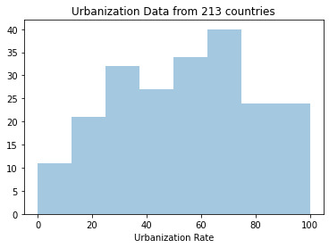
For this assignment we were tasked with creating graphs of our variables, and then examining their center and spread. Once the data was graphed and the charts were analyzed, we were to create a graph showing the association between two of our variables. This is done by selecting an explanatory and response variable from the variables we selected. The variables I focused on analyzing from the gapminder dataset were; the income per person, urban rate, and life expectancy.
Step 1 – creating graphs for each variable
Using python’s seaborn function, I created the following three graphs:
Life Expectancy Frequency:
This graph is skewed to the left with the highest frequency in the 75 year old range.
Urbanization Rate Frequency:
This graph has the highest peak at about the 70% range and it seems to be skewed to the left. Because the urban data is almost evenly distributed and grouped tightly between countries this graph seems to be unimodal.
Income Per Person Frequency:
This graph is skewed to the right and identifies the fact that the majority of the populations around the world make less than $20k per person.
Step 2: Create a scatter plot to show the association between 2 variables. In this case I’m looking at income per person and life expectancy.
The graph shows that there is a relationship between income per person and life expectancy with the trend line sloping in the positive direction. The graph shows that countries with the lowest income per person had the lowest life expectancy. Also on the other end of the plot you can see that there is a group of countries where the income is high and so is the life expectancy.
import pandas as pd
import numpy as np
import seaborn as sea
import matplotlib.pyplot as plt
data = pd.read_csv('gapminder_data.csv',low_memory=(False))
print(len(data)) #number of obervations (rows)
print(len(data.columns)) #number of variables (columns)
#Set PANDAS to show all columns in DataFrame
pd.set_option('display.max_columns', None)
#Set PANDAS to show all rows in DataFrame
pd.set_option('display.max_rows', None)
data = data.replace(r'^\s*$', np.NaN, regex=True)
#checking the format of the variables
#data['co2emissions'].dtype
pd.set_option('display.float_format', lambda x:'%f'%x)
#setting variables to numeric
data['incomeperperson'] = pd.to_numeric(data['incomeperperson'],errors='coerce')
data['urbanrate'] = pd.to_numeric(data['urbanrate'],errors='coerce')
data['lifeexpectancy'] = pd.to_numeric(data['lifeexpectancy'],errors='coerce')
data['co2emissions'] = pd.to_numeric(data['co2emissions'], errors='coerce')
#Count of data elements
print("count of life expectancy")
c1=data['lifeexpectancy'].value_counts(sort=False)
print(c1)
print("count of urbanrate")
c2=data['urbanrate'].value_counts(sort=False)
print(c2)
print("count of income per person")
c3=data['incomeperperson'].value_counts(sort=False)
print(c3)
print('Count of urbanrate - no N/A')
p1 = data['urbanrate'].value_counts(sort=True, dropna=True)
print(p1)
print('Frequency of urbanrate')
pz = data['urbanrate'].value_counts(sort=True, normalize=True)
print(pz)
#frequency using groupby
ct1= data.groupby('urbanrate').size()
print(ct1)
pt1=data.groupby('urbanrate').size()*100/len(data)
print(pt1)
# value counts on a numerical column and placing them into bins
c4=data['urbanrate'].value_counts(bins=4)
print(c4)
c5=data['incomeperperson'].value_counts(bins=4)
print(c5)
c6=data['lifeexpectancy'].value_counts(bins=4)
print(c6)
#subset variables into a new data frame called sub1
sub1=data[['urbanrate','incomeperperson','lifeexpectancy']]
a=sub1.head(n=15)
print(a)
#new urbanrate variable, categories 1-3
def urbangroup (row):
if row['urbanrate'] < 30 :
return 1
if row['urbanrate'] >= 30 and row['urbanrate'] <=75:
return 2
if row['urbanrate'] > 75:
return 3
sub1['urbangroup'] = data.apply (lambda row: urbangroup (row),axis=1)
print('urban frequency')
print('1 is less than 30%, 2 is between 30 and 75% and 3 is greater than 75%')
# urc = sub1['urbanrate'].value_counts(sort=False)
urc=sub1.groupby('urbangroup').size()
print(urc)
print('urban percentage in each category')
# purb = sub1['urbanrate'].value_counts(sort=False, normalize=True)
purb=sub1.groupby('urbangroup').size() * 100 / len(sub1)
print(purb)
#new life expectancy variable, categories 1-4
def lifeexpect (row):
if row['lifeexpectancy'] < 55 :
return 1
if row['lifeexpectancy'] >= 55 and row['lifeexpectancy'] <=65:
return 2
if row['lifeexpectancy'] >= 65 and row['lifeexpectancy'] <=75:
return 3
if row ['lifeexpectancy'] > 75:
return 4
sub1['lifeexpect'] = data.apply (lambda row: lifeexpect (row),axis=1)
print('Life expectancy')
print('1 is less than 55 years old, 2 is 55-65 years old, 3 is 65-75yo and 4 is greater than 75yo')
lrc=sub1.groupby('lifeexpect').size()
print(lrc)
print('life expectancy percentage in each category')
plrc=sub1.groupby('lifeexpect').size() * 100 / len(sub1)
print(plrc)
#new incomerate variable, categories 1-3
def incomegroup (row):
if row['incomeperperson'] < 5000 :
return 1
if row['incomeperperson'] >= 5000 and row['incomeperperson'] <=50000:
return 2
if row['incomeperperson'] > 50000:
return 3
sub1['incomegroup'] = data.apply (lambda row: incomegroup (row),axis=1)
print('income per person frequency')
print('1 is less than 5k, 2 is between 5 and 50k and 3 is greater than 50k')
irc=sub1.groupby('incomegroup').size()
print(irc)
print('income percentage in each category')
pirc=sub1.groupby('incomegroup').size() * 100 / len(sub1)
print(pirc)
# #historgram for income group
# sea.distplot(sub1['incomegroup'].dropna(), kde=False)
# plt.xlabel('Income group')
# plt.title('Income group by category 1-3')
sea.distplot(data['incomeperperson'].dropna(), kde=False)
plt.xlabel('Income per person')
plt.title('Income per person data from 191 countries')
sea.distplot(data['lifeexpectancy'].dropna(), kde=False)
plt.xlabel('Life Expectancy')
plt.title('Life Expectancy data from 191 countries')
sea.distplot(data['urbanrate'].dropna(), kde=False)
plt.xlabel('Urbanization Rate')
plt.title('Urbanization Data from 213 countries')
#standard deviation and other statistical calculations
print('describe income group')
desc1 = data['incomeperperson'].describe()
print(desc1)
print ('std')
std1 = data['urbanrate'].std()
print (std1)
scat1=sea.regplot(x='incomeperperson', y='lifeexpectancy',data=data)
plt.xlabel('Income Per Person')
plt.ylabel('Life Expectancy')
plt.title('Scatterplot to see the association between Income per person and life expectancy')
0 notes
Text
Week 4 Assignment
For this assignment we were tasked with creating graphs of our variables, and then examining their center and spread. Once the data was graphed and the charts were analyzed, we were to create a graph showing the association between two of our variables. This is done by selecting an explanatory and response variable from the variables we selected. The variables I focused on analyzing from the gapminder dataset were; the income per person, urban rate, and life expectancy.
Step 1 – creating graphs for each variable
Using python’s seaborn function, I created the following three graphs:
Life Expectancy Frequency:
This graph is skewed to the left with the highest frequency in the 75 year old range.
Urbanization Rate Frequency:
This graph has the highest peak at about the 70% range and it seems to be skewed to the left. Because the urban data is almost evenly distributed and grouped tightly between countries this graph seems to be unimodal.
Income Per Person Frequency:
This graph is skewed to the right and identifies the fact that the majority of the populations around the world make less than $20k per person.
Step 2: Create a scatter plot to show the association between 2 variables. In this case I’m looking at income per person and life expectancy.
The graph shows that there is a relationship between income per person and life expectancy with the trend line sloping in the positive direction. The graph shows that countries with the lowest income per person had the lowest life expectancy. Also on the other end of the plot you can see that there is a group of countries where the income is high and so is the life expectancy.
import pandas as pd
import numpy as np
import seaborn as sea
import matplotlib.pyplot as plt
data = pd.read_csv('gapminder_data.csv',low_memory=(False))
print(len(data)) #number of obervations (rows)
print(len(data.columns)) #number of variables (columns)
#Set PANDAS to show all columns in DataFrame
pd.set_option('display.max_columns', None)
#Set PANDAS to show all rows in DataFrame
pd.set_option('display.max_rows', None)
data = data.replace(r'^\s*$', np.NaN, regex=True)
#checking the format of the variables
#data['co2emissions'].dtype
pd.set_option('display.float_format', lambda x:'%f'%x)
#setting variables to numeric
data['incomeperperson'] = pd.to_numeric(data['incomeperperson'],errors='coerce')
data['urbanrate'] = pd.to_numeric(data['urbanrate'],errors='coerce')
data['lifeexpectancy'] = pd.to_numeric(data['lifeexpectancy'],errors='coerce')
data['co2emissions'] = pd.to_numeric(data['co2emissions'], errors='coerce')
#Count of data elements
print("count of life expectancy")
c1=data['lifeexpectancy'].value_counts(sort=False)
print(c1)
print("count of urbanrate")
c2=data['urbanrate'].value_counts(sort=False)
print(c2)
print("count of income per person")
c3=data['incomeperperson'].value_counts(sort=False)
print(c3)
print('Count of urbanrate - no N/A')
p1 = data['urbanrate'].value_counts(sort=True, dropna=True)
print(p1)
print('Frequency of urbanrate')
pz = data['urbanrate'].value_counts(sort=True, normalize=True)
print(pz)
#frequency using groupby
ct1= data.groupby('urbanrate').size()
print(ct1)
pt1=data.groupby('urbanrate').size()*100/len(data)
print(pt1)
# value counts on a numerical column and placing them into bins
c4=data['urbanrate'].value_counts(bins=4)
print(c4)
c5=data['incomeperperson'].value_counts(bins=4)
print(c5)
c6=data['lifeexpectancy'].value_counts(bins=4)
print(c6)
#subset variables into a new data frame called sub1
sub1=data[['urbanrate','incomeperperson','lifeexpectancy']]
a=sub1.head(n=15)
print(a)
#new urbanrate variable, categories 1-3
def urbangroup (row):
if row['urbanrate'] < 30 :
return 1
if row['urbanrate'] >= 30 and row['urbanrate'] <=75:
return 2
if row['urbanrate'] > 75:
return 3
sub1['urbangroup'] = data.apply (lambda row: urbangroup (row),axis=1)
print('urban frequency')
print('1 is less than 30%, 2 is between 30 and 75% and 3 is greater than 75%')
# urc = sub1['urbanrate'].value_counts(sort=False)
urc=sub1.groupby('urbangroup').size()
print(urc)
print('urban percentage in each category')
# purb = sub1['urbanrate'].value_counts(sort=False, normalize=True)
purb=sub1.groupby('urbangroup').size() * 100 / len(sub1)
print(purb)
#new life expectancy variable, categories 1-4
def lifeexpect (row):
if row['lifeexpectancy'] < 55 :
return 1
if row['lifeexpectancy'] >= 55 and row['lifeexpectancy'] <=65:
return 2
if row['lifeexpectancy'] >= 65 and row['lifeexpectancy'] <=75:
return 3
if row ['lifeexpectancy'] > 75:
return 4
sub1['lifeexpect'] = data.apply (lambda row: lifeexpect (row),axis=1)
print('Life expectancy')
print('1 is less than 55 years old, 2 is 55-65 years old, 3 is 65-75yo and 4 is greater than 75yo')
lrc=sub1.groupby('lifeexpect').size()
print(lrc)
print('life expectancy percentage in each category')
plrc=sub1.groupby('lifeexpect').size() * 100 / len(sub1)
print(plrc)
#new incomerate variable, categories 1-3
def incomegroup (row):
if row['incomeperperson'] < 5000 :
return 1
if row['incomeperperson'] >= 5000 and row['incomeperperson'] <=50000:
return 2
if row['incomeperperson'] > 50000:
return 3
sub1['incomegroup'] = data.apply (lambda row: incomegroup (row),axis=1)
print('income per person frequency')
print('1 is less than 5k, 2 is between 5 and 50k and 3 is greater than 50k')
irc=sub1.groupby('incomegroup').size()
print(irc)
print('income percentage in each category')
pirc=sub1.groupby('incomegroup').size() * 100 / len(sub1)
print(pirc)
# #historgram for income group
# sea.distplot(sub1['incomegroup'].dropna(), kde=False)
# plt.xlabel('Income group')
# plt.title('Income group by category 1-3')
sea.distplot(data['incomeperperson'].dropna(), kde=False)
plt.xlabel('Income per person')
plt.title('Income per person data from 191 countries')
sea.distplot(data['lifeexpectancy'].dropna(), kde=False)
plt.xlabel('Life Expectancy')
plt.title('Life Expectancy data from 191 countries')
sea.distplot(data['urbanrate'].dropna(), kde=False)
plt.xlabel('Urbanization Rate')
plt.title('Urbanization Data from 213 countries')
#standard deviation and other statistical calculations
print('describe income group')
desc1 = data['incomeperperson'].describe()
print(desc1)
print ('std')
std1 = data['urbanrate'].std()
print (std1)
scat1=sea.regplot(x='incomeperperson', y='lifeexpectancy',data=data)
plt.xlabel('Income Per Person')
plt.ylabel('Life Expectancy')
plt.title('Scatterplot to see the association between Income per person and life expectancy')
0 notes
Text
Week 3 assignment
For this assignment we were tasked with making data management decisions so that we can better clean, group, and understand our data. The variables I focused on analyzing from the gapminder dataset were; the income per person, urban rate, and life expectancy. Here are the steps I took for each variable:
· For the urban rate I grouped it into 3 categories, high, middle and low. High was given a factor of 3 which was greater than 75% urban, middle was given a factor of 2 which was in the range of 30-75% urban and low was given a factor of 1 which was less than 30% urban.
· For life expectancy I also categorized each age range but grouped them into 4 categories of 1 being less than 55 years old, 2 being between 55-65 years old, 3 being between 65-75 years old and 4 being 75 years old and greater.
· For income per person I created 3 categories. 1 was less than $5k per person, 2 was 5-50k per person and finally 3 was $50k and higher.
The result was the following:
· For urban rate the highest category was 2 at 56% meaning that the majority of the countries in the dataset are between 30%-75% urbanized.
· For the life expectancy the highest category was 3 at 35%. Meaning that 35% of the countries have a life expectancy of 65-75 years old.
· For the income per person the highest category was 1 at 53% meaning that over half of the countries make less than $5k per person.
Frequency tables:
1 is less than 30%, 2 is between 30 and 75% and 3 is greater than 75%
urbangroup
1 45
2 120
3 48
dtype: int64
urban percentage in each category
urbangroup
1 21.126761
2 56.338028
3 22.535211
dtype: float64
Life expectancy
1 is less than 55 years old, 2 is 55-65 years old, 3 is 65-75yo and 4 is greater than 75yo
lifeexpect
1.000000 24
2.000000 26
3.000000 76
4.000000 65
dtype: int64
life expectancy percentage in each category
lifeexpect
1.000000 11.267606
2.000000 12.206573
3.000000 35.680751
4.000000 30.516432
dtype: float64
income per person frequency
1 is less than 5k, 2 is between 5 and 50k and 3 is greater than 50k
incomegroup
1.000000 115
2.000000 71
3.000000 4
dtype: int64
income percentage in each category
incomegroup
1.000000 53.990610
2.000000 33.333333
3.000000 1.877934
dtype: float64
CODE:
import pandas as pd
import numpy as np
import matplotlib.pyplot as plt
data = pd.read_csv('gapminder_data.csv',low_memory=(False))
print(len(data)) #number of obervations (rows)
print(len(data.columns)) #number of variables (columns)
#checking the format of the variables
#data['co2emissions'].dtype
pd.set_option('display.float_format', lambda x:'%f'%x)
#setting variables to numeric
data['incomeperperson'] = pd.to_numeric(data['incomeperperson'],errors='coerce')
data['urbanrate'] = pd.to_numeric(data['urbanrate'],errors='coerce')
data['lifeexpectancy'] = pd.to_numeric(data['lifeexpectancy'], errors='coerce')
#Count of data elements
print("count of life expectancy")
c1=data['lifeexpectancy'].value_counts(sort=False)
print(c1)
print("count of urbanrate")
c2=data['urbanrate'].value_counts(sort=False)
print(c2)
print("count of income per person")
c3=data['incomeperperson'].value_counts(sort=False)
print(c3)
print('Count of urbanrate - no N/A')
p1 = data['urbanrate'].value_counts(sort=True, dropna=True)
print(p1)
print('Frequency of urbanrate')
pz = data['urbanrate'].value_counts(sort=True, normalize=True)
print(pz)
#frequency using groupby
ct1= data.groupby('urbanrate').size()
print(ct1)
pt1=data.groupby('urbanrate').size()*100/len(data)
print(pt1)
# value counts on a numerical column and placing them into bins
c4=data['urbanrate'].value_counts(bins=4)
print(c4)
c5=data['incomeperperson'].value_counts(bins=4)
print(c5)
c6=data['lifeexpectancy'].value_counts(bins=4)
print(c6)
#subset variables into a new data frame called sub1
sub1=data[['urbanrate','incomeperperson','lifeexpectancy']]
a=sub1.head(n=15)
print(a)
#new urbanrate variable, categories 1-3
def urbangroup (row):
if row['urbanrate'] < 30 :
return 1
if row['urbanrate'] >= 30 and row['urbanrate'] <=75:
return 2
if row['urbanrate'] > 75:
return 3
sub1['urbangroup'] = data.apply (lambda row: urbangroup (row),axis=1)
print('urban frequency')
print('1 is less than 30%, 2 is between 30 and 75% and 3 is greater than 75%')
# urc = sub1['urbanrate'].value_counts(sort=False)
urc=sub1.groupby('urbangroup').size()
print(urc)
print('urban percentage in each category')
# purb = sub1['urbanrate'].value_counts(sort=False, normalize=True)
purb=sub1.groupby('urbangroup').size() * 100 / len(sub1)
print(purb)
#new life expectancy variable, categories 1-4
def lifeexpect (row):
if row['lifeexpectancy'] < 55 :
return 1
if row['lifeexpectancy'] >= 55 and row['lifeexpectancy'] <=65:
return 2
if row['lifeexpectancy'] >= 65 and row['lifeexpectancy'] <=75:
return 3
if row ['lifeexpectancy'] > 75:
return 4
sub1['lifeexpect'] = data.apply (lambda row: lifeexpect (row),axis=1)
print('Life expectancy')
print('1 is less than 55 years old, 2 is 55-65 years old, 3 is 65-75yo and 4 is greater than 75yo')
lrc=sub1.groupby('lifeexpect').size()
print(lrc)
print('life expectancy percentage in each category')
plrc=sub1.groupby('lifeexpect').size() * 100 / len(sub1)
print(plrc)
#new incomerate variable, categories 1-3
def incomegroup (row):
if row['incomeperperson'] < 5000 :
return 1
if row['incomeperperson'] >= 5000 and row['incomeperperson'] <=50000:
return 2
if row['incomeperperson'] > 50000:
return 3
sub1['incomegroup'] = data.apply (lambda row: incomegroup (row),axis=1)
print('income per person frequency')
print('1 is less than 5k, 2 is between 5 and 50k and 3 is greater than 50k')
irc=sub1.groupby('incomegroup').size()
print(irc)
print('income percentage in each category')
pirc=sub1.groupby('incomegroup').size() * 100 / len(sub1)
print(pirc)
0 notes