Don't wanna be here? Send us removal request.
Statistics
We looked inside some of the posts by shell48 and here's what we found interesting.
Average Info
Notes Per Post
0
Likes Per Post
0
Reblog Per Post
0
Reply Per Post
0
Time Between Posts
8 days
Number of Posts By Type
Text
13
Last Seen Tumblr Blogs


Fun Fact
Tumblr Inc. is funded by 13 investors.
Text
Week 15 – Final Thoughts
I think there a few things that will change in the future of design. One thing I think will happen will be a comeback of decorative elements in the design. Especially in clothing and home decor. Recently there has been an increase in prints and more personal decorative items. This is similar to the decoration in old churches. I think we have strayed away from the idea of international style as styles have become more specialized/personal rather than uniform. Furthermore, while the DIY movement has been around quite a bit I think it still will increase in the future. With more access to online tutorials and ways to purchase specified material, more home projects, decor, clothing, etc. will be done by the homeowner themselves. This is similar to the arts and crafts movement that valued handmade items over factory-made. Lastly, I think a major change in design has been the accessibility in the public making their own designs. Now, anyone can take a professional photo with their phone, create professional websites, and create professional logos all without any commissions. I think this can go one of two ways. It can either increase the understanding of design as more people have experience creating visual layouts/editing photos or it could lower the bar for personal designs since they are more accessible. This is similar to the industrial revolution where the need for craftmanship diminished. Also, some disciplines/projects I think could be affected by this are fashion, home decor, web design, and media. Overall, I think the future of design will include more interest in personalized styles which will increase the public's understanding of design but could lower the bar due to its accessibility.
0 notes
Text
Week 14 – Your choice
I would like to rant about the versatility of design as it is used in product design, architecture, typography, UI/UX, and so on. However, the public has such a limited understanding of what art is, much less how it plays a role in design. The design of cell phones can be just as important as the design of things like a toaster. People don't stop to think why all TVs are black, why all toasters make 2 slices, why cellphones are rectangles, why ads are so flashy, and so on. Furthermore, people often don't think about their use of fonts in words documents, and signs. I hope that someday the average person will understand not to use comic sans on a gravestone or to think about why they may like a product just because it looks flashy. I also hope that the average person will understand design well enough to create homemade logos or flyers for a bake sale, presentations, home decoration etc, with a basic knowledge of how design works and how it affects us.
0 notes
Text
Week 13 – New Media
The "digital aesthetic" refers to artwork made to reflect digital media that also can be made through digital software. It was coined in the 1980s but became increasingly relevant in the 1990s.
A few examples of print media that reflect this is the artwork made for Wired Magazine. Johan WVipper and john Plunkett both make double page spreads. Their artwork has bright imagery that can really only be made with digital software and reflect on the changing world as digital technologies began to change the world.
Another example of artwork that can only be made through digital software was "Pixel Art" first explored by the Ebony studio. Based on raster images and old bit-map Arti games it was artwork made specifically to look like and look best on screens. The textbook uses an example of a work they did for Honda. This work had a whimsical feel in an isometric view with small silly details. The users could pick up and move the cars in the image.
Later, digital aesthetics would also refer to corporate web pages with the rise of Web 1.0. They were made primarily for function and to hold the visitor's attention and guide them to the checkout. Websites for Amozon and FedEx had a simple color screen with columns of text and simple images. The early website was made primarily using the companies already made print logos and branding.
When Web 2.0 came about, Adobe flash allowed digital aesthetics to diverge further from print media. It transferred large image files as raster imagers rather than pixels allowing more webpage and computers to load images and graphics. Comcast.com was a website that allowed visitors to interact with animated puppets and record unique audio. Similarly, F.R.U.I.T. was a website that educated people on the production of produce. It was an interactive map that had pop-up text and images informing the visitor of the farming practices in that location. This kind of media would also be used for soft-marketing, such as fun interactive websites for the movie Snakes on a Plane and animated shorts like "The Story of the Blue Guru".
Eventually, 3D graphics would part of the digital aesthetic. A classic example of this is newsroom and sports opening such as the ones made by MarkBohman and Troika Desing Group. This also would develop the animated film opening. Animated title sequences such as the one made for the James Bond movie From Rusia with Love had already existed but would soon be replaced with computer-animated graphics such as the title scheme for Spider-Man made by Kyle Cooper. Today, motion graphics have become so advanced that they can be a film in their own right. Such as the moving images in the music video for Kanye West's album Power created by Marco Brambilla.
0 notes
Text
Week 12 – New Media
Web 1.0 was created to spread information between colleges would soon be used by the general public. It allowed a different form of combination as advertising used to be once sided now it was 2 ways. Now, customers could find the company online without having to contact the companies themselves.
Web 2.0 provides the average public with social media and direct communication to a brand. It also allowed for things to be provided online that consumers liked.
The introduction of Abobe Flash and allowed for computer graphics, animations, videos, audio, etc. to be possible with a plug-in. Furthermore, this could be used for things like F.R.U.I.T brought about new social networks for social change through a fun interactive website. Eventually, Flash would be replaced by HTML and Javascript.
Web 2.0 would also have its own user-generated content on social media websites such as Youtube and Newsround. Videos, animations, memes, and podcasts could be shared throughout an early internet culture. This also allowed some people to get their 15 minutes of fame as well as become internet famous.
Later, mobile phones and tablets as well as cellular internet moved attention away from desktops and tv. Now, most things are made for mobile tablets as well as desktops. The QR code would also allow people to interact with programs found in the real world. In the future interactive media may even be things like VR technologies.
0 notes
Text
Week 11 – Graphic Design
In this week's reading, it references what is called a Citizen Designer. This is a concept that stems from the struggle of designers that want to create work, but often only find themselves working for large corporations. The idea of a Citizen Designer is to combat this, to focus on designs that do not directly align with the ideas of consumerism, capitalism and climate change. This can be as simple as Bruce Mau creating a brochure that would not be thrown away but could also be hung up as a poster. It can also go as far as him creating massive art insulation about discussing the relationship of design to capitalism. It is relevant because designers often feel forced to work for large cooperation's that contribute to global warming, consumerism, and mass marketing. However, Citizen Designers prove that designers can work to improve theses issue aswell with their designs.
0 notes
Text
Week 9 – Industrial Design
Brooks Stevens believed that doing business was one of the most important parts of industrial design. Thus, he wanted to stay in Milwaukee because he could be right next to the manufacturers that would hire him. This is why he turned down moving to New York. He could work with companies that manufactured in the city. Stevens could also work for clients in the midwest like Illinois and Minnesota.
0 notes
Text
Week 8 – Industrial Design

Most pizzas come with small plastic "tables". This solves the problem of preventing the cardboard boxes from squishing the pizza.
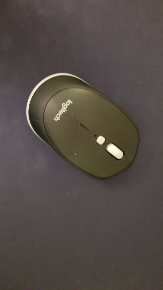
Similar, modern mouses come with bluetooth, right and left click buttons and extra buttons to make the mouse more usable. It also matches the sleek black design of most modern technologies. It matches the corporate style of the car manufactures.

Recently, I've noticed that the key to a car has a physical key inside of it. This solves a problem and also fits with the idea of practicality and sleekness. It has both function and modern style.
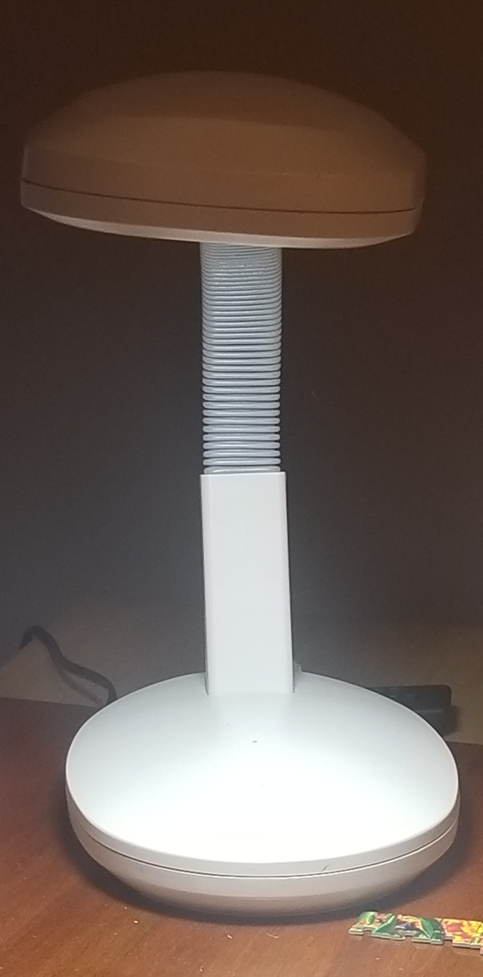
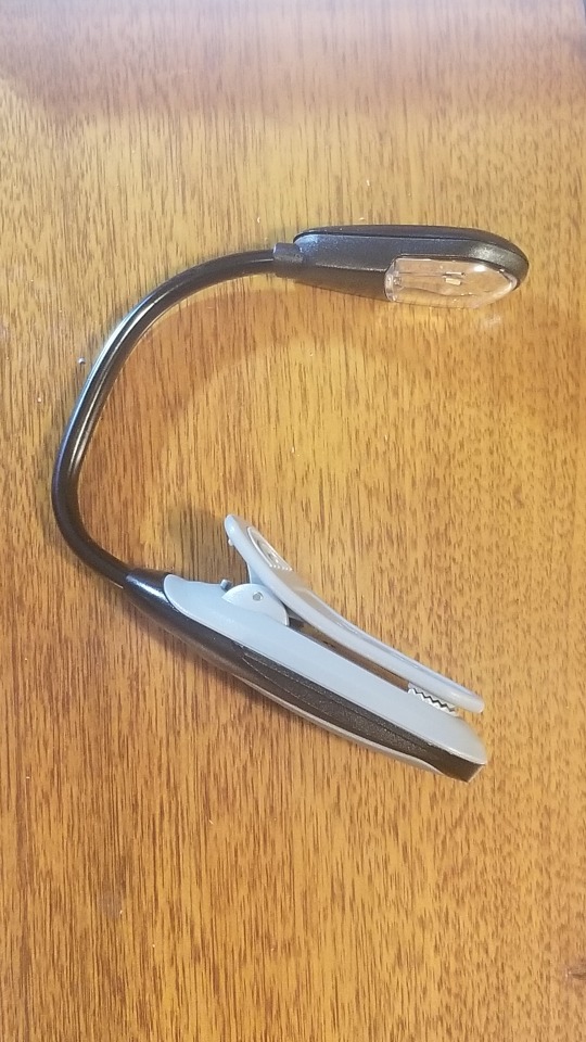
This lamp uses a universal design being accessible with touch only. It also has an adjustable handle. Also, this book lamp serves a practical purpose. It uses new LEDs and plastic parts.
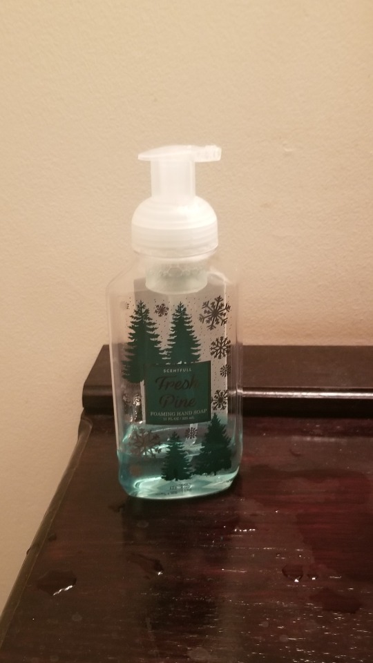
This kind of soap bottle can be easily made and then thrown away. It can be thrown away before the bottle itself has broken. This is an example of planned obsolescence.
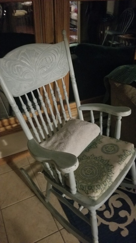
This chair has beautifully carved elements. It has recently been painted. It would have been considered part of post-modernism as it has elements of function but also decorative design. The carving most likely is a call back to art nouveau due to its curves and natural elements.
0 notes
Text
Week 7 – Architecture
Universal design is the idea that design should be useable by all without great adaptions or complications.
One key element is tolerance for error. This means that the design minimizes hazards and the adverse consequences of accidental or unintended actions. One example of this is the new micro USB ports that are oval-shaped instead of trapezoidal to allow them to be inserted in either direction. Another example is swinging doors that open or close no matter how you push them.
Another key principle of the universal design principle is perceptible information. This means that communicate information effectively to the user regardless of their sensory ability. One example of this raises bumps on sidewalks to indicate a crosswalk. This is tactile for those with visual impairments to be able to find it. Similarly, close captions are for those who have hearing impairments to allow them to understand what is happening in videos. Another tactile example is the raised bumps on the "f" and "j" keys on a keyboard. To allow most visually impaired to easily line up their fingers to type.
0 notes
Text
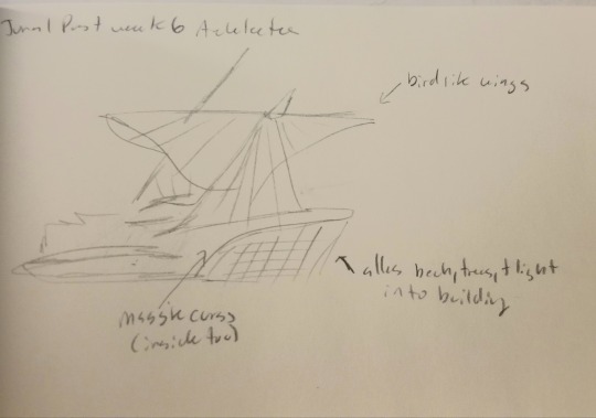
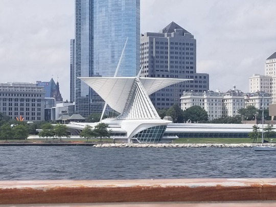
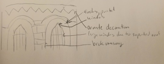
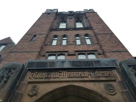
Week 6 – Architecture
Please post observations, photographs and sketches of architectural elements around Milwaukee.
I'm stuck at home this semester so I'm going to do this post with old photos!
The portion of the art museum created by Frank Lloyd right is a famous building in Milwaukee and a great example of the the Art Nouveau style. It uses a massive curves and nature inspired elements in its bird-like wings. It also has elements of fantasy.
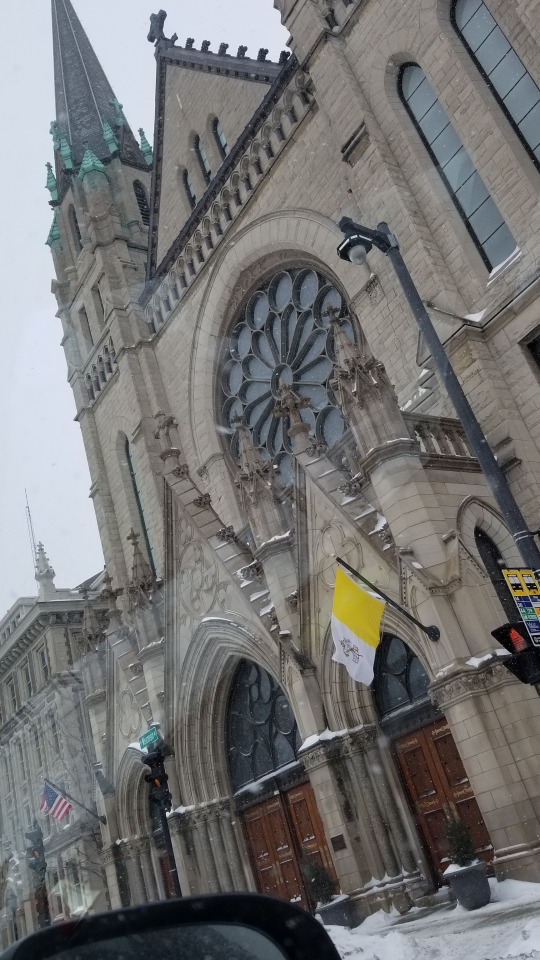
This library I remember from when I lived on campus, it has such a distinct façade. I know that this building most likly a Neo Gothic design. It makes use of pointed arches, free standing brick, stone arches, and large glass windows.
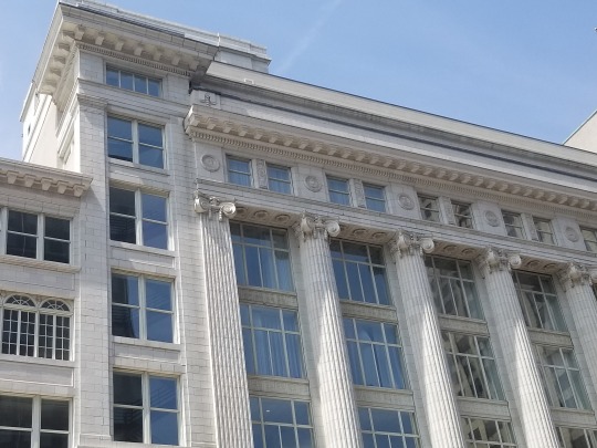
This bank is most likely inspired by Neo Classicism. It uses elements of Ancient Rome in its design, especially it its decorative pillars. It was most likely built as a state building in the early United States. It makes use of tall columns that go to the top of the building. The arches in this building would be inspired by Ionic columns with the bow or scroll like detail on the capitals.
0 notes
Text
Week 4 – Found Object
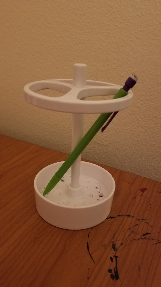
The object I am going to describe today is a toothbrush holder from a large store that I have laying around my house. It is about 6 inches tall and has a 4-inch diameter. It is a hard white shiny plastic. It has a shallow cup at the button with divots to hold the tip of long objects, a disc with 3 large holes at the top for the tip of long objects to rest on, with a stem in the middle to support the top. It is primarily made to hold toothbrushes, but as you can see in the photo I also use it to hold pencils or paintbrushes. I have found that it is not the best thing to use with long paintbrushes or short pencils as both either fall out the middle or slip through the top. Compared to other similar designs like a simple pencil holder or cup this is very different. For one, this container is completely open on all sides. This is probably to allow for air to circulate so that toothbrushes don’t remain wet. I also think this is made for toothbrushes because it can comfortably hold around 3 to 6 objects based on the holes at the top without it becoming too cumbersome to use and to keep the tips from touching each other. This is not great for a package of pencils or a collection of paintbrushes but great for a family’s worth of toothbrushes. This container is also made specifically for toothbrushes, as anything that is a different length than a toothbrush falls out or slips through. In the picture, this pencil is too short and could not be comfortably taken in and out. This would be solved with a shallower pencil holder, but a shallower container would not be good for a top-heavy toothbrush that needs a taller container. Lastly, this container matches perfectly with the aesthetics of most bathrooms today. It is clear, minimalist, and white to match clean tile and shiny floors. A pencil holder would be better with a more colorful or decorative aesthetic to match a busy desk. Overall, this product is perfectly made to hold a handful of top-heavy toothbrushes without the tops of the toothbrush colliding. In comparison, using it as a pencil holder does not work very well. While this object is similar to a pencil holder it differs enough were it becomes impractical to use regularly as such.
0 notes
Text
Week 3 – History of Design
There are plenty of examples of design around the area where I live. Driving to the city shows examples of design that show a resemblance to the Victorian design. This building has a quite a bit of ornamentation that shows that it is most likely inspired by old gothic churches. The decoration would have been to impresses higher powers and serve little practical purpose.
The mass-marketing habits of today are similar to that of the posters littering hoardings in neighborhoods were the local government would collect money from each add. This can be seen today as crowded adds cover websites and online articles
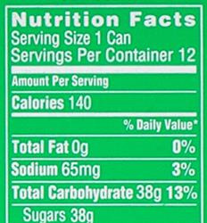
This Spirit can shows some elements of advertisements that came about in the Industry Revolution. Here are some notes I took on the branding.
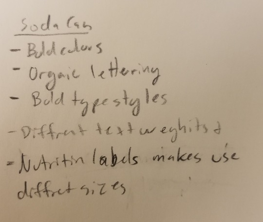
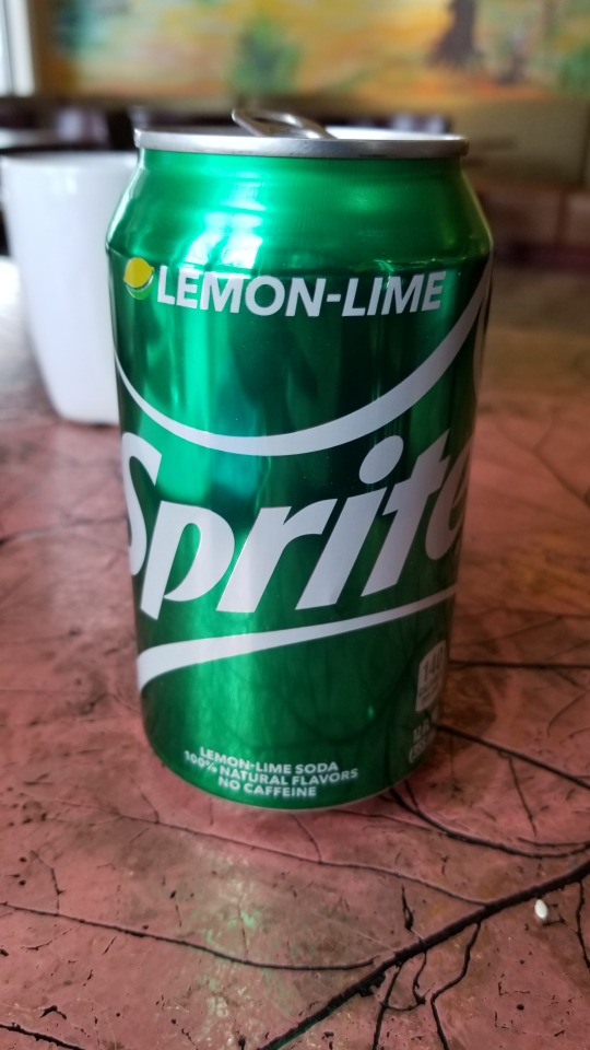
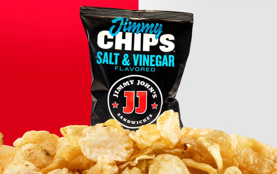
While looking at the can I noticed the nutrition label. Much like advertisements form 19th century, nutrition labels use varying typography with a variety of type face sizes and weights to make it easier to read. The type face is also sans-sherif which makes it stands out.
I also noticed that they had change the logos for Jimmy Johns chips recently. The new logo uses a bold sans-sherif typeface for “chips” making it easy to read what is in the bag. The package also has the the light blue that is in a handwriting like typeface “Jimmy” which make the packaging feel hand made and authentic much like the values from the Arts and Crafts movement.
The influence of Japanese prints in posters from the 19th century reminded me of the design of cartoon characters. They are solid bold shapes with realistic outlines. These kinds of prints were made to be easy to duplicate due to their simple shape much like how cartoon characters designed today to be functional replicated and configured.
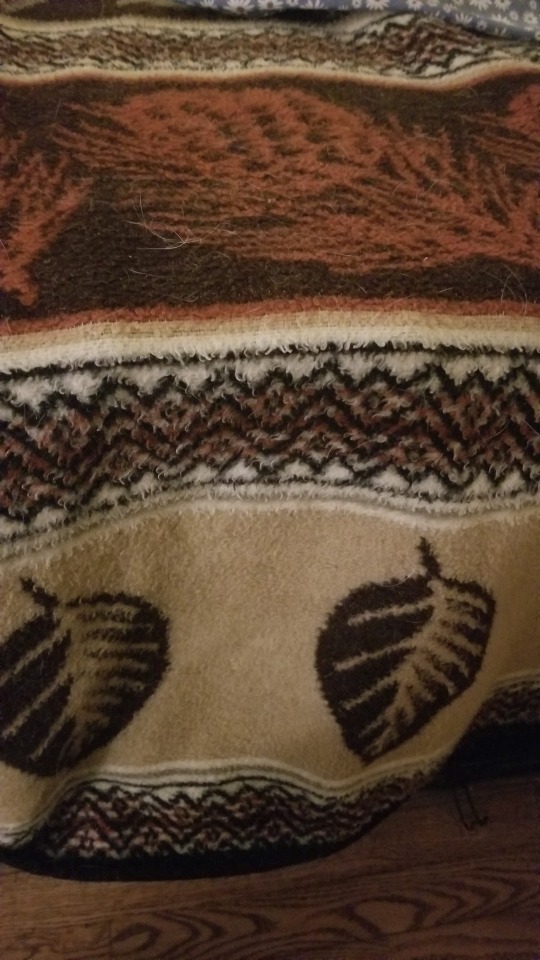
As printing became more available new design theories came about. A revived idea was to decorate functional architecture and items was by creating geometric patterns to complement them. Here is a blanket that uses this idea.
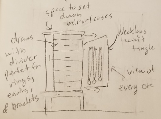
This jewelry cabinet is incredible practical with its side draws allowing necklaces to be hung up. It is also hand painted even if the decoration is a bit garish. This cabinet is a good representation of both function and beauty when it comes to design.
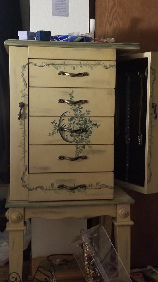
The design of this jewelry cabinet above allows for necklaces to be displayed and hung up avoiding tangled chains and allowing you to view every one. The other draws have dividers for rings, earnings, and bracelets. The jewelry box also has space on-top to put any jewelry cases or a mirror.
0 notes
Text
Week 2 – Design Thinking
After reading “Design Thinking” by Tim brown I was aware of a new definition of deign. I used to think of design as inventing a product, but my perspective has changed. I would now define deign as a process of creating that involved multiple perspectives, collaboration, and technologies as well as an aspect of artistic flare. Design not only involves creating a good product, but one that consumer are asking for, a product that uses technology in new ways, is aesthetically pleasing, etc. In the article, Brown mentions that it isn’t always the first product that sells, but the best designed one. He mentions how the iPod wasn’t the first MP3 player on the market, but it was the best marketed, being essentially the “coolest” one. Nowadays the same idea can be said for products I use such as which phone cover I will buy or which curtains I purchase as I tend to reach for the one I find most compelling not just useful. Another thing form the article that made me rethink my idea of design was the mention of the India’s Aravind Eye Care System. They were able to reduce the cost of, and increase the access to eye-ware and eye care. It shows that not only is design important for making a profit, but also can be used in other areas, such as solving social issues.
0 notes
Text
Week 1 – About me
Hey everyone. I am interested in design because I think it is fascinating how art can be functional and influence people. In high school I worked on branding for our schools robotics team making designs for our t-shirts, decals, brochures etc. From this I gain quite a bit of experience making designs and got inspired to continue making designs in my future. I am mainly inspired by movies and shows honestly. Recently I had to purchases a shell for my laptop to protect it from getting scratched. I choose a matte navy blue laptop case. I ended up choosing this product over others because I basically just like the way it looked. It was sleek, dark, and professional to match to match my mood going into college this year.
0 notes