
Don't wanna be here? Send us removal request.
Statistics
We looked inside some of the posts by shirleysartspace-blog and here's what we found interesting.
Average Info
Notes Per Post
30
Likes Per Post
25
Reblog Per Post
4
Reply Per Post
1
Time Between Posts
17 hours
Number of Posts By Type
Text
16
Photo
1
Last Seen Tumblr Blogs


Fun Fact
In 2020, 27% of US Tumblr users had an annual household income of over $100,000.
Text
Final Post o(≧▽≦)o
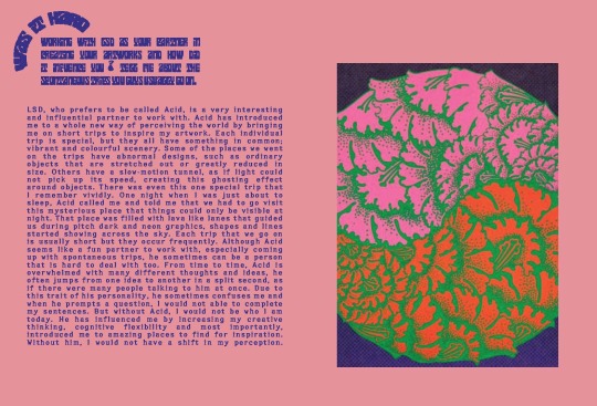
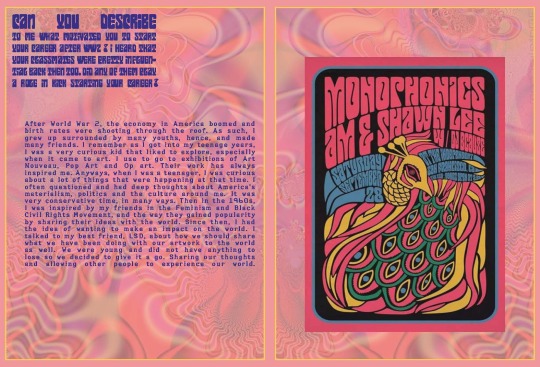
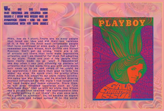
This course has been really fun and interesting! I really enjoyed doing the assignments and activities provided in this course as I got to explore and expand my creativity. Especially for the zine design, I really had to use my imagination and think creatively especially when I had to imagine interviewing an art movement but it was such a fun experience. Other than the assignments, the lectures have also allowed me to expand my knowledge about the art and design world not only from an artistic point of view but also from a social and political point of view. Andy and Karen’s lectures have never failed to spike my interest, it was always something fresh and interesting to me. Furthermore, although online classes had started off challenging for me, with the help of my teacher Ben, he has honestly been such a big help with problems I have and responding to my email really quickly. Overall, I am really glad that I had gain so much throughout this course and I can’t wait to continue and explore what we designers can achieve through communication design.
Ben, Andy, Karen and Bailey, Thank you so much!
4 notes
·
View notes


Text
Layout Experimentation

I experimented by playing with fonts by changing the way I placed it and the opacity of images for my background. For the first layout, I tried changing the way I placed my questions to make it more interesting.
1 note
·
View note
Text
Week 12 Lecture
In week 12′s lecture, Andy had gone through a summary of all the lectures we have had before and what we have learned through out this course. Karen and Andy also added a bonus topic and talked about decolonising design, understanding design and how it can be changed or challenged. I really like what Andy said how design should be celebrated not based on genders but for the work itself. Other than that, they also gave us a list of designers and artist that we can study on our own. During this coming winter break, I would study more about these designers and help me advance and grow as a emerging designer.
0 notes


Photo
I really like the design of this zine! It has a minimalistic and playful style with many leading lines. As the texts are not positioned in a typical way, the composition is interesting and it certainly catches my attention while reading it.


Zine Wrap-up
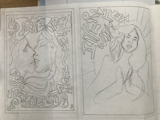
I thought that I pretty much finish my zine and it’s good to go as it is due in 2 days from now! However, the more I look at it the more wrong it gets. I forgot to mention in my last zine wip post, Bailey ask me to be aware of the page layout between the two pages as the final zine is going to be two pages facing another (it’s like when you’re reading a book you look at the layout on both of the pages). So I’ve been playing around with that since last week. I went into my last drop-in class today with Bailey to get my final feedback on my zine. And there are a few minor things that I need to change before I submit it.
Firstly, I tried to match Question 3 and Question 4 in a red background, but it just seems a bit too overwhelmed and a bit too much. [refer to the first image above] Bailey and I had a discussion about these two pages and we both agree that the red background works really well in Question 4 with it’s balance of the white rectangular graphics. However, it doesn’t work as well in Question 3. We talked about different options that I could do but sometimes if a layout doesn’t seem right or seem to work as you wish, then maybe I should just start a new page and explore a totally new layout option. Play around with it, explore different options and if I still can’t find a layout that suit this page, then I could always come back to this and make minor changes, such as size of the number, colour and lines if I need to.
Secondly, last week I added a new page to my zine cause I thought that Question 5 seems a little crammed with having the questions and answers on the same page. But when I move the number and the interview question to the seperate page, it seems like the second page is not balanced and too heavy at the bottom with all that text. [refer to the second image above] Bailey and I both really like the new page that I added, so i decided to just leave it as a blank page after Question 5 and see it as a page break before my image references.
It’s week 13 and the assignment is due in 2 days. All the feedback I received are all minor changes so I’m not too stress about the due date. But I do have to come up with a new layout option for Question 3.
20 notes
·
View notes
Text
In today's class, Ben gave us a photoshop activity to explore and discover skills by asking us to change the composition of the provided photoshop file that was given by him. He gave us 3 tasks:
1. Picture dominant
2. Word dominant
3. Free


0 notes
Text

A better representation of my last post.
1 note
·
View note
Text
Zine Layout Inspiration
Saw this on Instagram and I really like the layout where the zine can become a poster. Might give this a try.

0 notes


Text
Initial Ideas
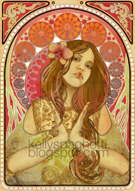
As many of Psychedelic art takes figures directly from Art Nouveau posters, I decided to include an art nouveau poster and give it a twist by adding Psychedelic art’s characteristics.

0 notes
Text
Zine Design Ideas
Sketches that I had drawn for zine cover ideas
0 notes
Text
What is Next for Design?
Here are a few things that I found interesting in week 11′s lecture and did extra research on it.
1. Eyewriter

The initial idea came about because a graffiti artist was paralysed but his mind was still awake. A team of artists and engineers wanted to help the artist to gain back the ability to create his artworks. Hence, a low-cost eye-tracking system was designed to track the artist’s eye movement.
“Art is a tool of empowerment and social change, and I consider myself blessed to be able to create and use my work to promote health reform, bring awareness about ALS and help others.”~ Tempt One
2. Public Face

The public face, designed by artist Julius von Bismarck, experimental designer Benjamin Maus and filmmaker Richard Wilhelmer. The team developed a software that scans the expression of human facial expressions in nearby companies. The majority of the specific expression will determine the expression of the face. The public face is a public art installation located on top of the silo of Malzfabrik building. The face is made up of neon tubes, which makes it visible from far away.
3. This Person Does Not Exist

Every single photo generated by this website is created using a special kind of artificial intelligence algorithm called generative adversarial networks (GANs). Whenever the page is refreshed, a totally fake but realistic picture of a person appears. When an error happens, the face generate by the website can be weird.
0 notes
Text
Week 11′s Lecture
This week’s lecture is so far my favourite lecture. This week’s lecture is about “what’s next for design?” Andy talked about the hybrid state of combining technology with art and the idea that human and machines can be combined by communication design. I find that people that have been revolving around this idea has came up with amazing ideas that can be used as a tool to help someone ( Eyewriter ) and a tool to combine ideas from many people, which we can make more friends around the world.
The combination of art and technology is definitely an eye opener to me, especially when it comes to visualising data through art. Combining coding, algorithms and art is like a balanced between human and technology; keeping our identity but making the best out of the tools we have around us. The future of design cannot be precisely determined but we can guess what is on next.
0 notes
Text
Teenage Stepdad

In week 10��s class, Ben was walking us through artworks and designs that are related to Conceptualism. The teenage stepdad poster really caught my attention as it distributes subversive ideas and humour.
0 notes
Text
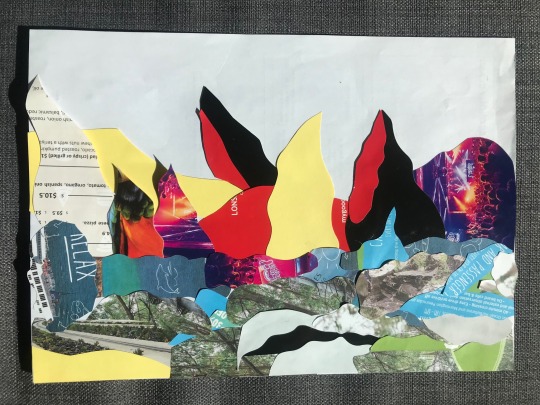
Made this senery collage out of leaflets and magazines. I was trying to make mountains but I think it kind of failed.
1 note
·
View note