
siliconwebx
Silicon WebX
encryption with 5˥ɩ¡(0˄ w̶eﺒ . Focus on Tech. Art. Logo. Design. UIX. WebSite. ✉ [email protected]
1951 posts
Don't wanna be here? Send us removal request.
Last Seen Blogs

good-job-baby-girl
Unbetitelt

lesbian-in-wonderland
❤️Everlasting Love, I Am Yours❤️

tiggerwabbet
Untitled


bamfelf
fuzzy & blue
Text
Silicon WebX present eVisiting Card
1 note
·
View note
Text
Animating Number Counters
Number animation, as in, imagine a number changing from 1 to 2, then 2 to 3, then 3 to 4, etc. over a specified time. Like a counter, except controlled by the same kind of animation that we use for other design animation on the web. This could be useful when designing something like a dashboard, to bring a little pizazz to the numbers. Amazingly, this can now be done in CSS without much trickery. You can jump right to the new solution if you like, but first let’s look at how we used to do it.

One fairly logical way to do number animation is by changing the number in JavaScript. We could do a rather simple setInterval, but here’s a fancier answer with a function that accepts a start, end, and duration, so you can treat it more like an animation:
CodePen Embed Fallback
Keeping it to CSS, we could use CSS counters to animate a number by adjusting the count at different keyframes:
CodePen Embed Fallback
Another way would be to line up all the numbers in a row and animate the position of them only showing one at a time:
CodePen Embed Fallback
Some of the repetitive code in these examples could use a preprocessor like Pug for HTML or SCSS for CSS that offer loops to make them perhaps easier to manage, but use vanilla on purpose so you can see the fundamental ideas.
The New School CSS Solution
With recent support for CSS.registerProperty and @property, we can animate CSS variables. The trick is to declare the CSS custom property as an integer; that way it can be interpolated (like within a transition) just like any other integer.
@property --num { syntax: '<integer>'; initial-value: 0; inherits: false; } div { transition: --num 1s; counter-reset: num var(--num); } div:hover { --num: 10000; } div::after { content: counter(num); }
Important Note: At the time of this writing, this @property syntax is only supported in Chrome ( and other Chromium core browsers like Edge and Opera), so this isn’t cross-browser friendly. If you’re building something Chrome-only (e.g. an Electron app) it’s useful right away, if not, wait. The demos from above are more widely supported.
The CSS content property can be used to display the number, but we still need to use counter to convert the number to a string because content can only output <string> values.
CodePen Embed Fallback
See how we can ease the animations just like any other animation? Super cool!
Typed CSS variables can also be used in @keyframes:
CodePen Embed Fallback
One downside? Counters only support integers. That means decimals and fractions are out of the question. We’d have to display the integer part and fractional part separately somehow.
Can we animate decimals?
It’s possible to convert a decimal (e.g. --number) to an integer. Here’s how it works:
Register an <integer> CSS variable ( e.g. --integer ), with the initial-value specified
Then use calc() to round the value: --integer: calc(var(--number))
In this case, --number will be rounded to the nearest integer and store the result into --integer.
@property --integer { syntax: "<integer>"; initial-value: 0; inherits: false; } --number: 1234.5678; --integer: calc(var(--number)); /* 1235 */
Sometimes we just need the integer part. There is a tricky way to do it: --integer: max(var(--number) - 0.5, 0). This works for positive numbers. calc() isn’t even required this way.
/* @property --integer */ --number: 1234.5678; --integer: max(var(--number) - 0.5, 0); /* 1234 */
We can extract the fractional part in a similar way, then convert it into string with counter (but remember that content values must be strings). To display concatenated strings, use following syntax:
content: "string1" var(--string2) counter(--integer) ...
Here’s a full example that animates percentages with decimals:
CodePen Embed Fallback
Other tips
Because we’re using CSS counters, the format of those counters can be in other formats besides numbers. Here’s an example of animating the letters “CSS” to “YES”!
CodePen Embed Fallback
Oh and here’s another tip: we can debug the values grabbing the computed value of the custom property with JavaScript:
getComputedStyle(element).getPropertyValue('--variable')
That’s it! It’s amazing what CSS can do these days.
The post Animating Number Counters appeared first on CSS-Tricks.
You can support CSS-Tricks by being an MVP Supporter.
😉SiliconWebX | 🌐CSS-Tricks
0 notes
Text
9 Best WordPress GDPR Plugins to Improve Compliance
Are you looking for a GDPR plugin to make sure your WordPress site is in compliance with regional laws?
All websites worldwide that collect data related to people in the European Union need to be GDPR compliant. There are several WordPress plugins that can help you with that.
In this article, we will share the best GDPR plugins for WordPress that you can use to make your website GDPR compliant.
What is GDPR and Why Does It Matter?
GDPR stands for General Data Protection Regulation. It is a European Union (EU) law that gives individuals in the EU specific rights over accessing and controlling their data on the internet.
GDPR applies to all organizations across the world that collect or process data relating to individuals in the EU. For instance, if you live in the United States and run a business website or online store with customers in Europe, then you need to comply with GDPR.
Due to the dynamic nature of websites, no single plugin can offer 100% GDPR compliance. However many of the popular plugins have added GDPR friendly options to ensure that your website abides by the law.
Disclaimer: we’re not legal experts, but we have written the ultimate WordPress GDPR guide that you can refer to for more details. When in doubt, always consult an internet law attorney.
With that said, here are the best WordPress plugins that have GDPR compliance options.
1. MonsterInsights – GDPR Friendly Google Analytics
MonsterInsights is the best Google Analytics plugin for WordPress. It lets you easily add Google Analytics tracking code to your site, and displays powerful reports within your WordPress admin.
With MonsterInsights, it’s easy to anonymize or even disable personal data tracking. GDPR requires you to get explicit consent before you collect or process personal identifying information from EU residents, such as IP addresses.
To automatically anonymize data, simply use the MonsterInsights EU Compliance addon.
What if you want to track personalized data using Google Analytics? Then you simply need to get consent from your users. This can also be easily done with MonsterInsights.
The MonsterInsights EU Compliance add-on integrates seamlessly with the Cookie Notice plugin. That plugin is included below at #3 on our list. This means MonsterInsights will not load the analytics script until the user gives their explicit consent.
Plus, MonsterInsights is compatible with Google Analytics’ built-in cookie opt-out system as well, and it works seamlessly with Google Analytics’ Chrome browser opt-out extension.
Pricing: MonsterInsights costs from $99.50/year. This includes the EU Compliance addon.
2. WPForms – GDPR Friendly Contact Forms
WPForms is the best contact form plugin for WordPress with built-in GDPR compliance.
You can use WPForms to create all sorts of forms, including contact forms, registration forms, order forms, booking forms, surveys, and more.
To make your forms compliant, simply go to plugin’s settings page and check the box next to GDPR enhancements option. Once you’ve done this, WPForms will not collect IP addresses on any of your forms.
You can also enable extra GDPR options. These include disabling user tracking cookies and disabling storing details of the user’s browser and operating system.
Another option with WPForms is to turn on GDPR protection for individual forms instead of for all your forms. To do this, you just need to check a box in the setting for each form.
WPForms also lets you add a special ‘GDPR Agreement’ checkbox field to your forms. You can add this to your form just like any other field.
Pricing: WPForms costs from $39.50/year. There’s also a free version of WPForms that’s also GDPR compliant.
3. Cookie Notice for GDPR & CCPA
Cookie Notice for GDPR & CCPA is a free WordPress cookie notification popup plugin that lets users give or refuse consent for you to use cookies. It helps you comply with GDPR and also with CCPA (the California Consumer Privacy Act).
You can customize the cookie notice for your users and include links to your privacy policy or legal pages. It’s very quick and easy to get Cookie Notice up and running on your site.
The plugin is SEO friendly and it’s compatible with WPML if you have a multilingual website. It also integrates seamlessly with MonsterInsights and holds on to Google Analytics code until a user gives consent.
Pricing: Cookie Notice is completely free. There’s no premium version.
4. OptinMonster – GDPR Friendly Popups and Lead Gen Forms
OptinMonster is a lead generation tool and one of the best popup creators for WordPress. It lets you create a wide range of email newsletter signup forms and optins that you can display in different ways on your site.
With OptinMonster, you can ensure that your email signup forms are GDPR compliant. It’s easy to add a privacy policy field with a customizable checkbox. Users can then only submit the form once they’ve checked the box.
If your organization is audited for GDPR compliance, OptinMonster also has a GDPR Audit Concierge team that can help you out. Plus, their friendly customer service team is always happy to answer questions about GDPR.
Even better, OptinMonster lets you target visitors based on their location. That way, you can make sure you’re showing GDPR-compliant optins to customers in EU countries.
Pricing: OptinMonster costs from $9/month (billed annually). For geolocation targeting, you need the Growth plan, which costs from $49/month.
5. GDPR Cookie Consent (CCPA Ready)
GDPR Cookie Consent covers CCPA as well as GDPR. It lets you create an alert bar on your site with Accept and Reject options so the user can decide whether to accept or reject cookies.
With this plugin, it’s straightforward to customize the cookie notice with your choice of colors, fonts, styles, positioning, and more. You can choose to put the cookie notice bar at the top or the bottom of your website.
Note that you need to list the specific cookies that the plugin restricts. The plugin can’t automatically block all cookies, or it could break your website.
Pricing: The basic version of GDPR Cookie Consent is free. You can upgrade to the premium version from $49/year.
6. Complianz
Complianz lets you easily create cookie notices for different regions (EU, UK, US, or Canada). You can use it to create a GDPR ‘cookie wall’ as well as other types of banner.
With Complianz, there’s the built-in option to scan your site for cookies. This lets you automatically add cookie descriptions to your site.
Complianz has a simple, user-friendly setup process. It takes you step by step through getting the plugin up and running on your site.
The premium version lets you view statistics, use A/B testing to improve your cookie accept ratio, generate legally approved documents, and more. It’s also compatible with WordPress multisite networks.
Pricing: Complianz premium starts from $55/year. There is also a limited free version.
7. WP GDPR Compliance
WP GDPR Compliance lets you automatically add a GDPR checkbox to certain areas of your site. This includes WordPress comments and registration, and also WooCommerce pages.
WP GDPR Compliance also makes it easy for users to request to see their data that’s stored in your database.
It providers a special Data Request page that lets users have temporary access to their information. They can also request that you delete their information, if they want to.
Pricing: WP GDPR Compliance is free. The developers welcome donations.
8. GDPR Cookie Compliance (Moove)
GDPR Cookie Compliance from Moove is a plugin that lets users enable or disable cookies on your site.
The cookie consent notice is fully customizable and editable so you can use your own text, logo, colors, and fonts.
The premium version include a ‘cookie wall’ that prevents users from seeing your site until they accept or reject cookies. You can also target users based on their location, and see stats about how many users accepted your cookies.
You need to add the scripts that use cookies into the plugin’s settings. Otherwise, it can’t block them.
Pricing: The basic version of GDPR Cookie Compliance is free. The premium version offers more features and costs from £49 (GBP).
9. EU Cookie Law for GDPR/CCPA
EU Cookie Law for GDPR/CCPA lets you easily create a simple customizable banner for your website with your cookie policy. Users can then click to accept the cookies or click a link to see your privacy policy.
You can use shortcodes to prevent sections of code or even text from displaying if cookies aren’t accepted.
This plugin uses responsive design, so should look good on all mobile devices. It’s also fully compatible with WPML for multilingual websites.
EU Cookie Law for GDPR/CCPA is designed to be a lightweight plugin that will not affect your WordPress site’s speed and performance.
Pricing: EU Cookie Law for GDPR/CCPA is a free, open source plugin.
Which GDPR Plugin Should You Use?
The plugins you need for GDPR depends entirely on your needs.
If you’re not sure which to pick, here are the absolute must-have plugins:
Use MonsterInsights to easily add and control your Google Analytics tracking. It’s the best Google Analytics tool for WordPress, and it makes it very straightforward for you to comply with GDPR when it comes to analytics data.
Use WPForms to create GDPR compliant contact forms, registration forms, booking forms, and more. Adding GDPR compliance to your forms is as simple as checking a box.
Use Cookie Notice for GDPR & CCPA to display a cookie notification on your site. It integrates with MonsterInsights and it has lots of different options to customize how cookie consent works on your site.
We hope this article helped you learn about the best GDPR plugins for WordPress. You may also want to see our article on the best plugins for business websites, and our comparison of the best business phone services.
If you liked this article, then please subscribe to our YouTube Channel for WordPress video tutorials. You can also find us on Twitter and Facebook.
The post 9 Best WordPress GDPR Plugins to Improve Compliance appeared first on WPBeginner.
😉SiliconWebX | 🌐WPBeginner
0 notes
Text
Balancing on a pivot with Flexbox
Let me show you a way I recently discovered to center a bunch of elements around what I call the pivot. I promise you that funky HTML is out of the question and you won’t need to know any bleeding-edge CSS to get the job done.
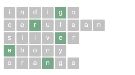
I’m big on word games, so I recently re-imagined the main menu of my website as a nod to crossword puzzles, with my name as the vertical word, and the main sections of my website across the horizontals.
Here’s how the design looks with the names of some colors instead:
And here’s a sample of the HTML that drives this puzzle:
<div class="puzzle"> <div class="word"> <span class="letter">i</span> <span class="letter">n</span> <span class="letter">d</span> <span class="letter">i</span> <span class="letter pivot">g</span> <span class="letter">o</span> </div> <!-- MORE WORDS --> </div>
In this example, the letter g is the pivot. See how it’s not at the halfway mark? That’s the beauty of this challenge.
We could apply an offset to each word using hard-coded CSS or inline custom properties and walk away. It certainly gets an award for being the most obvious way to solve the problem, but there’s a downside — in addition to the .pivot class, we’d have to specify an offset for every word. The voice in my head tells me that’s adding unnecessary redundancy, is less flexible, and requires extra baggage we don’t need every time we add or change a word.
Let’s take a step back instead and see how the puzzle looks without any balancing:
Imagine for a moment that we use display: none to hide all of the letters before the pivot; now all we can see are the pivots and everything after them:
With no further changes, our pivots would already be aligned. But we’ve lost the start of our words, and when we reintroduce the hidden parts, each word gets pushed out to the right and everything is out of whack again.
If we were to hide the trailing letters instead, we’d still be left with misaligned pivots:
All of this back-and-forth seems a bit pointless, but it reveals a symmetry to my problem. If we were to use a right-to-left (RTL) reading scheme, we’d have the opposite problem — we’d be able to solve the right side but the left would be all wrong.
Wouldn’t it be great if there was a way to have both sides line up at the same time?
As a matter of fact, there is.
Given we already have half a solution, let’s borrow a concept from algorithmics called divide and conquer. The general idea is that we can break a problem down into parts, and that by finding a solution for the parts, we’ll find a solution for the whole.
In that case, let’s break our problem down into the positioning of two parts. First is the “head” or everything before the pivot.
Next is the “tail” which is the pivot plus everything after it.
The flex display type will help us here; if you’re not familiar with it, flex is a framework for positioning elements in one-dimension. The trick here is to take advantage of the left and right ends of our container to enforce alignment. To make it work, we’ll swap the head and tail parts by using a smaller order property value on the tail than the head. The order property is used by flex to determine the sequence of elements in a flexible layout. Smaller numbers are placed earlier in the flow.
To distinguish the head and tail elements without any extra HTML, we can apply styles to the head part to all of the letters, after which we’ll make use of the cascading nature of CSS to override the pivot and everything after it using the subsequent-sibling selector .pivot ~ .letter.
Here’s how things look now:
Okay, so now the head is sitting flush up against the end of the tail. Hang on, don’t go kicking up a stink about it! We can fix this by applying margin: auto to the right of the last element in the tail. That just so happens to also be the last letter in the word which is not sitting somewhere in the middle. The addition of an auto margin serves to push the head away from the tail and all the way over to the right-hand side of our container.
Now we have something that looks like this:
The only thing left is stitch our pieces back together in the right order. This is easy enough to do if we apply position: relative to all of our letters and then chuck a left: 50% on the tail and a right: 50% on our head items.
Here’s a generalized version of the code we just used. As you can see, it’s just 15 lines of simple CSS:
.container { display: flex; } .item:last-child { margin-right: auto; } .item { order: 2; position: relative; right: 50%; } .pivot, .pivot ~ .item { order: 1; left: 50%; }
It’s also feasible to use this approach for vertical layouts by setting the flex-direction to a column value. It should also be said that the same can be achieved by sticking the head and tail elements in their own wrappers — but that would require more markup and verbose CSS while being a lot less flexible. What if, for example, our back-end is already generating an unwrapped list of elements with dynamically generated classes?
Quite serendipitously, this solution also plays well with screen readers. Although we’re ordering the two sections backwards, we’re then shifting them back into place via relative positioning, so the final ordering of elements matches our markup, albeit nicely centered.
Screen readers preserve the element ordering as per the original markup.
Here’s the final example on CodePen:
CodePen Embed Fallback
Conclusion
Developers are better at balancing than acrobats. Don’t believe me? Think about it: many of the common challenges we face require finding a sweet spot between competing requirements ranging from performance and readability, to style and function, and even scalability and simplicity. A balancing act, no doubt.
But the point at which we find balance isn’t always midway between one thing and another. Balance is often found at some inexplicable point in between; or, as we’ve just seen, around an arbitrary HTML element.
So there you have it! Go and tell your friends that you’re the greatest acrobat around.

The post Balancing on a pivot with Flexbox appeared first on CSS-Tricks.
You can support CSS-Tricks by being an MVP Supporter.
😉SiliconWebX | 🌐CSS-Tricks
0 notes
Text
How to Get SMS Text Messages From Your WordPress Forms
Do you want to get SMS text message when a user submits a WordPress form on your website?
Receiving text messages on your phone makes it easy to stay on top of new form submissions, leads, product orders, registrations, and more.
In this article, we’ll show you how to easily get SMS text messages from your WordPress forms.
Why Get SMS Text Messages From Your WordPress Forms?
Getting SMS text messages from your WordPress forms lets you receive instant alerts on your phone. This can be very useful for small business websites with smaller teams.
For instance, if you run a restaurant website, then may get want to get an instant alert for food order form on your website.
Similarly, if you have an appointments or bookings form on your website, then an instant text message can notify you of a new booking.
Note: This tutorial is about receiving text message alerts yourself or for your team. If you want to send text messages to your readers and customers, then check out our guide on how to send SMS messages to your WordPress users.
For this tutorial, we will use WPForms which is the best WordPress form builder plugin on the market. We’ll use Twilio which is a leading text messaging service to send SMS texts.
Since our goal is to always show no-code solutions for beginners, we will be using Zapier to act as a bridge between the two apps.
This will let you setup everything without having any coding knowledge.
Ready? Let’s get started.
Setting Up Your WordPress Form Using WPForms
First, you need to install and activate the WPForms plugin. For more details, see our step by step guide on how to install a WordPress plugin.
While WPForms has a free version, you’ll need at least their PRO plan to access the Zapier addon which we need for this tutorial.
Upon activation, you need to enter your WPForms license key. You will find this under your account area on the WPForms website.
Simply go to the WPForms » Settings » General page in your WordPress admin to add your license key:
Next, it’s time to create your first form.
Simply go to WPForms » Add New page to launch the WPForms’ form builder. You need to give your form a name and choose a template:
Go ahead and use the drag and drop editor to modify your form however you want. Don’t forget to click the Save button after making changes.
Once you’re happy with your form, it’s time to add it to your site. You can edit an existing post or page or add a new one.
We’re going to add a new page by going to Pages » Add New in the WordPress admin.
If you’re using the WordPress block editor, then click the add new block (+) button and then insert the WPForms block to the content area.
Once you’ve added the WPForms block, you need to choose the form you created earlier from a dropdown list.
You can now save your post or page and preview your form.
You need to submit a test entry in order to set up Zapier. Here’s our test entry in our custom form:
Need more help creating your form or adding it to your site? Follow our step by step instructions on how to create a contact form in WordPress for more details.
Preparing to Connect WPForms and Zapier
We are going to use Zapier to connect WPForms and Twilio. To do this, you need to install and activate the WPForms Zapier addon.
Simply go to the WPForms » Addons page. From here you need to search for the Zapier addon and then click the ‘Install Addon’ button.
The Zapier addon will be installed and activated for you.
Now, you need to visit the WPForms » Settings » Integrations page. Just click on the Zapier logo and you will then see your Zapier API key.
You will need the API key in a later step to connect Zapier to your WPForms. Go ahead and copy it somewhere safe, or just leave the tab open.
Preparing to Connect Twilio and Zapier
We’re going to use the Twilio service to send an SMS message. It is the leading SMS service, and they offer a limited free account that you can use.
First, you need to visit the Twilio website and click the Sign Up button at the top to create your account.
Once you’ve set up an account, you need to choose a phone number. This is the number that will be sending you texts.
You will also see your Twilio Account SID and Auth Token. You will need these when you set up Zapier. You could copy them to a safe place, or leave your tab open.
Creating a Zap to Send an SMS When Your Form is Submitted
To use Zapier, you need to sign in on the Zapier website. If you don’t have an account, simply create a free one.
Next, click the ‘Make a Zap’ button in your Zapier dashboard:
Note: Zapier uses the word ‘Zap’ for a process with a trigger and an action. Our trigger will be someone submitting the form. Our action will be to send an SMS message.
Go ahead and give your Zap a name at the top of the screen. Then, you need to set up the trigger.
First, you need to type ‘WPForms’ into the search bar. The WPForms icon should come up. Simply click on it.
Zapier will automatically fill in ‘New Form Entry’ for the trigger event. You just need to click the ‘Continue’ button here:
Now, Zapier will prompt you to sign into WPForms. Go ahead and click the ‘Sign into WPForms’ button:
You should then see a popup window. Here, you need to enter the API key that you found earlier. You also need to add the URL (domain name) of your website.
After you’ve done that, just click on the ‘Yes, Continue’ button to move on.
Now, you need to select your form from a dropdown list.
Next, Zapier will prompt you to test your trigger. This will use the test data that you submitted through your form. Go ahead and click the ‘Test trigger’ button:
You will then see your test data:
Just click the Continue button to move on. Zapier will now take you to the action part of your Zap.
Here, you need to type in Twilio. Then, go ahead and click the Twilio icon:
You now need to choose the action event. Simply click on the ‘Send SMS’ option here:
Next, Zapier will prompt you to sign into your Twilio account. You need to enter the Account SID and Auth Token that you found earlier.
You now need to customize your SMS message.
Just click on the From Number dropdown and you should see the free phone number from your Twilio account. Simply select this.
For the To Number, type in your own phone number.
For the message, you can type in any text you like. You can also select from your WPForms input fields.
With our message, we’re including the name, email address, and request from the form:
You can also choose to send the message as a large message. This is useful if you want to include lots of detail in the SMS. However, it will use up your Twilio free credit faster.
When you’re ready to move on, just click the Continue button.
Zapier will now show you the data that will be sent through your Zap. Just click the Test & Continue button to send the test:
You should see a message saying that the SMS was successfully sent:
We also recommend checking your phone to make sure you received the SMS:
Hopefully, the SMS message reached you successfully. Just click the ‘Turn On Zap’ button and your Zap will be switched on.
Now, you will get a text each time someone completes your WordPress form.
We hope this article helped you learn how to get SMS text messages from your WordPress forms. You may also want to see our comparison of the best business phone services, and our guide on how to create a free business email address.
If you liked this article, then please subscribe to our YouTube Channel for WordPress video tutorials. You can also find us on Twitter and Facebook.
The post How to Get SMS Text Messages From Your WordPress Forms appeared first on WPBeginner.
😉SiliconWebX | 🌐WPBeginner
0 notes
Text
The Widening Responsibility for Front-End Developers
This is an extended version of my essay “When front-end means full-stack” which was published in the wonderful Increment magazine put out by Stripe. It’s also something of an evolution of a couple other of my essays, “The Great Divide” and “Ooops, I guess we’re full-stack developers now.”
The moment I fell in love with front-end development was when I discovered the style.css file in WordPress themes. That’s where all the magic was (is!) to me. I could (can!) change a handful of lines in there and totally change the look and feel of a website. It’s an incredible game to play.
Back when I was cowboy-coding over FTP. Although I definitely wasn’t using CSS grid!
By fiddling with HTML and CSS, I can change the way you feel about a bit of writing. I can make you feel more comfortable about buying tickets to an event. I can increase the chances you share something with your friends.
That was well before anybody paid me money to be a front-end developer, but even then I felt the intoxicating mix of stimuli that the job offers. Front-end development is this expressive art form, but often constrained by things like the need to directly communicate messaging and accomplish business goals.
Front-end development is at the intersection of art and logic. A cross of business and expression. Both left and right brain. A cocktail of design and nerdery.
I love it.

Looking back at the courses I chose from middle school through college, I bounced back and forth between computer-focused classes and art-focused classes, so I suppose it’s no surprise I found a way to do both as a career.
The term “Front-End Developer” is fairly well-defined and understood. For one, it’s a job title. I’ll bet some of you literally have business cards that say it on there, or some variation like: “Front-End Designer,” “UX Developer,” or “UI Engineer.” The debate around what those mean isn’t particularly interesting to me. I find that the roles are so varied from job-to-job and company-to-company that job titles will never be enough to describe things. Getting this job is more about demonstrating you know what you’re doing more than anything else¹.
Chris Coyier
Front-End Developer
The title variations are just nuance. The bigger picture is that as long as the job is building websites, front-enders are focused on the browser. Quite literally:
front-end = browsers
back-end = servers
Even as the job has changed over the decades, that distinction still largely holds.
As “browser people,” there are certain truths that come along for the ride. One is that there is a whole landscape of different browsers and, despite the best efforts of standards bodies, they still behave somewhat differently. Just today, as I write, I dealt with a bug where a date string I had from an API was in a format such that Firefox threw an error when I tried to use the .toISOString() JavaScript API on it, but was fine in Chrome. That’s just life as a front-end developer. That’s the job.
Even across that landscape of browsers, just on desktop computers, there is variance in how users use that browser. How big do they have the window open? Do they have dark mode activated on their operating system? How’s the color gamut on that monitor? What is the pixel density? How’s the bandwidth situation? Do they use a keyboard and mouse? One or the other? Neither? All those same questions apply to mobile devices too, where there is an equally if not more complicated browser landscape. And just wait until you take a hard look at HTML emails.
That’s a lot of unknowns, and the answers to developing for that unknown landscape is firmly in the hands of front-end developers.

Into the unknoooooowwwn. – Elsa
The most important aspect of the job? The people that use these browsers. That’s why we’re building things at all. These are the people I’m trying to impress with my mad CSS skills. These are the people I’m trying to get to buy my widget. Who all my business charts hinge upon. Who’s reaction can sway my emotions like yarn in the breeze. These users, who we put on a pedestal for good reason, have a much wider landscape than the browsers do. They speak different languages. They want different things. They are trying to solve different problems. They have different physical abilities. They have different levels of urgency. Again, helping them is firmly in the hands of front-end developers. There is very little in between the characters we type into our text editors and the users for whom we wish to serve.
Being a front-end developer puts us on the front lines between the thing we’re building and the people we’re building it for, and that’s a place some of us really enjoy being.
That’s some weighty stuff, isn’t it? I haven’t even mentioned React yet.
The “we care about the users” thing might feel a little precious. I’d think in a high functioning company, everyone would care about the users, from the CEO on down. It’s different, though. When we code a <button>, we’re quite literally putting a button into a browser window that users directly interact with. When we adjust a color, we’re adjusting exactly what our sighted users see when they see our work.

That’s not far off from a ceramic artist pulling a handle out of clay for a coffee cup. It’s applying craftsmanship to a digital experience. While a back-end developer might care deeply about the users of a site, they are, as Monica Dinculescu once told me in a conversation about this, “outsourcing that responsibility.”
We established that front-end developers are browser people. The job is making things work well in browsers. So we need to understand the languages browsers speak, namely: HTML, CSS, and JavaScript². And that’s not just me being some old school fundamentalist; it’s through a few decades of everyday front-end development work that knowing those base languages is vital to us doing a good job. Even when we don’t work directly with them (HTML might come from a template in another language, CSS might be produced from a preprocessor, JavaScript might be mostly written in the parlance of a framework), what goes the browser is ultimately HTML, CSS, and JavaScript, so that’s where debugging largely takes place and the ability of the browser is put to work.
CSS will always be my favorite and HTML feels like it needs the most love — but JavaScript is the one we really need to examine The last decade has seen JavaScript blossom from a language used for a handful of interactive effects to the predominant language used across the entire stack of web design and development. It’s possible to work on websites and writing nothing but JavaScript. A real sea change.
JavaScript is all-powerful in the browser. In a sense, it supersedes HTML and CSS, as there is nothing either of those languages can do that JavaScript cannot. HTML is parsed by the browser and turned into the DOM, which JavaScript can also entirely create and manipulate. CSS has its own model, the CSSOM, that applies styles to elements in the DOM, which JavaScript can also create and manipulate.
This isn’t quite fair though. HTML is the very first file that browsers parse before they do the rest of the work needed to build the site. That firstness is unique to HTML and a vital part of making websites fast.
In fact, if the HTML was the only file to come across the network, that should be enough to deliver the basic information and functionality of a site.
That philosophy is called Progressive Enhancement. I’m a fan, myself, but I don’t always adhere to it perfectly. For example, a <form> can be entirely functional in HTML, when it’s action attribute points to a URL where the form can be processed. Progressive Enhancement would have us build it that way. Then, when JavaScript executes, it takes over the submission and has the form submit via Ajax instead, which might be a nicer experience as the page won’t have to refresh. I like that. Taken further, any <button> outside a form is entirely useless without JavaScript, so in the spirit of Progressive Enhancement, I should wait until JavaScript executes to even put that button on the page at all (or at least reveal it). That’s the kind of thing where even those of us with the best intentions might not always toe the line perfectly. Just put the button in, Sam. Nobody is gonna die.
JavaScript’s all-powerfulness makes it an appealing target for those of us doing work on the web — particularly as JavaScript as a language has evolved to become even more powerful and ergonomic, and the frameworks that are built in JavaScript become even more-so. Back in 2015, it was already so clear that JavaScript was experiencing incredible growth in usage, Matt Mullenweg, the founding developer of WordPress, gave the developer world homework: “Learn JavaScript Deeply”³. He couldn’t have been more right. Half a decade later, JavaScript has done a good job of taking over front-end development. Particularly if you look at front-end development jobs.
While the web almanac might show us that only 5% of the top-zillion sites use React compared to 85% including jQuery, those numbers are nearly flipped when looking around at front-end development job requirements.
I’m sure there are fancy economic reasons for all that, but jobs are as important and personal as it gets for people, so it very much matters.
So we’re browser people in a sea of JavaScript building things for people. If we take a look at the job at a practical day-to-day tasks level, it’s a bit like this:
Translate designs into code
Think in terms of responsive design, allowing us to design and build across the landscape of devices
Build systemically. Construct components and patterns, not one-offs.
Apply semantics to content
Consider accessibility
Worry about the performance of the site. Optimize everything. Reduce, reuse, recycle.
Just that first bullet point feels like a college degree to me. Taken together, all of those points certainly do.
This whole list is a bit abstract though, so let’s apply it to something we can look at. What if this website was our current project?

Our brains and fingers go wild!
Let’s build the layout with CSS grid.
What fonts are those? Do we need to load them in their entirety or can we subset them? What happens as they load in? This layout feels like it will really suffer from font-shifting jank.
There are some repeated patterns here. We should probably make a card design pattern. Every website needs a good card pattern.
That’s a gorgeous color scheme. Are the colors mathematically related? Should we make variables to represent them individually or can we just alter a single hue as needed? Are we going to use custom properties in our CSS? Colors are just colors though, we might not need the cascading power of them just for this. Should we just use Sass variables? Are we going to use a CSS preprocessor at all?
The source order is tricky here. We need to order things so that they make sense for a screen reader user. We should have a meeting about what the expected order of content should be, even if we’re visually moving things around a bit with CSS grid.
The photographs here are beautifully shot. But some of them match the background color of the site… can we get away with alpha-transparent PNGs here? Those are always so big. Can any next-gen formats help us? Or should we try to match the background of a JPG with the background of the site seamlessly. Who’s writing the alt text for these?
There are some icons in use here. Inline SVG, right? Certainly SVG of some kind, not icon fonts, right? Should we build a whole icon system? I guess it depends on how we’re gonna be building this thing more broadly. Do we have a build system at all?
What’s the whole front-end plan here? Can I code this thing in vanilla HTML, CSS, and JavaScript? Well, I know I can, but what are the team expectations? Client expectations? Does it need to be a React thing because it’s part of some ecosystem of stuff that is already React? Or Vue or Svelte or whatever? Is there a CMS involved?
I’m glad the designer thought of not just the “desktop” and “mobile” sizes but also tackled an in-between size. Those are always awkward. There is no interactivity information here though. What should we do when that search field is focused? What gets revealed when that hamburger is tapped? Are we doing page-level transitions here?
I could go on and on. That’s how front-end developers think, at least in my experience and in talking with my peers.
A lot of those things have been our jobs forever though. We’ve been asking and answering these questions on every website we’ve built for as long as we’ve been doing it. There are different challenges on each site, which is great and keeps this job fun, but there is a lot of repetition too.
Allow me to get around to the title of this article.
While we’ve been doing a lot of this stuff for ages, there is a whole pile of new stuff we’re starting to be expected to do, particularly if we’re talking about building the site with a modern JavaScript framework. All the modern frameworks, as much as they like to disagree about things, agree about one big thing: everything is a component. You nest and piece together components as needed. Even native JavaScript moves toward its own model of Web Components.

I like it, this idea of components. It allows you and your team to build the abstractions that make the most sense to you and what you are building.
Your Card component does all the stuff your card needs to do. Your Form component does forms how your website needs to do forms. But it’s a new concept to old developers like me. Components in JavaScript have taken hold in a way that components on the server-side never did. I’ve worked on many a WordPress website where the best I did was break templates into somewhat arbitrary include() statements. I’ve worked on Ruby on Rails sites with partials that take a handful of local variables. Those are useful for building re-usable parts, but they are a far cry from the robust component models that JavaScript frameworks offer us today.
All this custom component creation makes me a site-level architect in a way that I didn’t use to be. Here’s an example. Of course I have a Button component. Of course I have an Icon component. I’ll use them in my Card component. My Card component lives in a Grid component that lays them out and paginates them. The whole page is actually built from components. The Header component has a SearchBar component and a UserMenu component. The Sidebar component has a Navigation component and an Ad component. The whole page is just a special combination of components, which is probably based on the URL, assuming I’m all-in on building our front-end with JavaScript. So now I’m dealing with URLs myself, and I’m essentially the architect of the entire site. [Sweats profusely]
Like I told ya, a whole pile of new responsibility.
Components that are in charge of displaying content are almost certainly not hard-coded with data in them. They are built to be templates. They are built to accept data and construct themselves based on that data. In the olden days, when we were doing this kind of templating, the data has probably already arrived on the page we’re working on. In a JavaScript-powered app, it’s more likely that that data is fetched by JavaScript. Perhaps I’ll fetch it when the component renders. In a stack I’m working with right now, the front end is in React, the API is in GraphQL and we use Apollo Client to work with data. We use a special “hook” in the React components to run the queries to fetch the data we need, and another special hook when we need to change that data. Guess who does that work? Is it some other kind of developer that specializes in this data layer work? No, it’s become the domain of the front-end developer.
Speaking of data, there is all this other data that a website often has to deal with that doesn’t come from a database or API. It’s data that is really only relevant to the website at this moment in time.
Which tab is active right now?
Is this modal dialog open or closed?
Which bar of this accordion is expanded?
Is this message bar in an error state or warning state?
How many pages are you paginated in?
How far is the user scrolled down the page?
Front-end developers have been dealing with that kind of state for a long time, but it’s exactly this kind of state that has gotten us into trouble before. A modal dialog can be open with a simple modifier class like <div class="modal is-open"> and toggling that class is easy enough with .classList.toggle(".is-open"); But that’s a purely visual treatment. How does anything else on the page know if that modal is open or not? Does it ask the DOM? In a lot of jQuery-style apps of yore, yes, it would. In a sense, the DOM became the “source of truth” for our websites. There were all sorts of problems that stemmed from this architecture, ranging from a simple naming change destroying functionality in weirdly insidious ways, to hard-to-reason-about application logic making bug fixing a difficult proposition.
Front-end developers collectively thought: what if we dealt with state in a more considered way? State management, as a concept, became a thing. JavaScript frameworks themselves built the concept right in, and third-party libraries have paved and continue to pave the way. This is another example of expanding responsibility. Who architects state management? Who enforces it and implements it? It’s not some other role, it’s front-end developers.
There is expanding responsibility in the checklist of things to do, but there is also work to be done in piecing it all together. How much of this state can be handled at the individual component level and how much needs to be higher level? How much of this data can be gotten at the individual component level and how much should be percolated from above? Design itself comes into play. How much of the styling of this component should be scoped to itself, and how much should come from more global styles?
It’s no wonder that design systems have taken off in recent years. We’re building components anyway, so thinking of them systemically is a natural fit.
Let’s look at our design again:
A bunch of new thoughts can begin!
Assuming we’re using a JavaScript framework, which one? Why?
Can we statically render this site, even if we’re building with a JavaScript framework? Or server-side render it?
Where are those recipes coming from? Can we get a GraphQL API going so we can ask for whatever we need, whenever we need it?
Maybe we should pick a CMS that has an API that will facilitate the kind of front-end building we want to do. Perhaps a headless CMS?
What are we doing for routing? Is the framework we chose opinionated or unopinionated about stuff like this?
What are the components we need? A Card, Icon, SearchForm, SiteMenu, Img… can we scaffold these out? Should we start with some kind of design framework on top of the base framework?
What’s the client state we might need? Current search term, current tab, hamburger open or not, at least.
Is there a login system for this site or not? Are logged in users shown anything different?
Is there are third-party componentry we can leverage here?
Maybe we can find one of those fancy image components that does blur-up loading and lazy loading and all that.
Those are all things that are in the domain of front-end developers these days, on top of everything that we already need to do. Executing the design, semantics, accessibility, performance… that’s all still there. You still need to be proficient in HTML, CSS, JavaScript, and how the browser works. Being a front-end developer requires a haystack of skills that grows and grows. It’s the natural outcome of the web getting bigger. More people use the web and internet access grows. The economy around the web grows. The capability of browsers grows. The expectations of what is possible on the web grows. There isn’t a lot shrinking going on around here.
We’ve already reached the point where most front-end developers don’t know the whole haystack of responsibilities. There are lots of developers still doing well for themselves being rather design-focused and excelling at creative and well-implemented HTML and CSS, even as job posts looking for that dwindle.
There are systems-focused developers and even entire agencies that specialize in helping other companies build and implement design systems. There are data-focused developers that feel most at home making the data flow throughout a website and getting hot and heavy with business logic. While all of those people might have “front-end developer” on their business card, their responsibilities and even expectations of their work might be quite different. It’s all good, we’ll find ways to talk about all this in time.
In fact, how we talk about building websites has changed a lot in the last decade. Some of my early introduction to web development was through WordPress. WordPress needs a web server to run, is written in PHP, and stores it’s data in a MySQL database. As much as WordPress has evolved, all that is still exactly the same. We talk about that “stack” with an acronym: LAMP, or Linux, Apache, MySQL and PHP. Note that literally everything in the entire stack consists of back-end technologies. As a front-end developer, nothing about LAMP is relevant to me.
But other stacks have come along since then. A popular stack was MEAN (Mongo, Express, Angular and Node). Notice how we’re starting to inch our way toward more front-end technologies? Angular is a JavaScript framework, so as this stack gained popularity, so too did talking about the front-end as an important part of the stack. Node and Express are both JavaScript as well, albeit the server-side variant.
The existence of Node is a huge part of this story. Node isn’t JavaScript-like, it’s quite literally JavaScript. It makes a front-end developer already skilled in JavaScript able to do server-side work without too much of a stretch.
“Serverless” is a much more modern tech buzzword, and what it’s largely talking about is running small bits of code on cloud servers. Most often, those small bits of code are in Node, and written by JavaScript developers. These days, a JavaScript-focused front-end developer might be writing their own serverless functions and essentially being their own back-end developer. They’ll think of themselves as full-stack developers, and they’ll be right.
Shawn Wang coined a term for a new stack this year: STAR or Design System, TypeScript, Apollo, and React. This is incredible to me, not just because I kind of like that stack, but because it’s a way of talking about the stack powering a website that is entirely front-end technologies. Quite a shift.
I apologize if I’ve made you feel a little anxious reading this. If you feel like you’re behind in understanding all this stuff, you aren’t alone.
In fact, I don’t think I’ve talked to a single developer who told me they felt entirely comfortable with the entire world of building websites. Everybody has weak spots or entire areas where they just don’t know the first dang thing. You not only can specialize, but specializing is a pretty good idea, and I think you will end up specializing to some degree whether you plan to or not. If you have the good fortune to plan, pick things that you like. You’ll do just fine.
The only constant in life is change.
– Heraclitus – Motivational Poster – Chris Coyier
¹ I’m a white dude, so that helps a bunch, too. ↩️
² Browsers speak a bunch more languages. HTTP, SVG, PNG… The more you know the more you can put to work! ↩️
³ It’s an interesting bit of irony that WordPress websites generally aren’t built with client-side JavaScript components. ↩️
The post The Widening Responsibility for Front-End Developers appeared first on CSS-Tricks.
You can support CSS-Tricks by being an MVP Supporter.
😉SiliconWebX | 🌐CSS-Tricks
0 notes
Text
How to Move a Live WordPress Site to Local Server
Do you want to move a live WordPress website to a local server on your computer?
Installing WordPress on your computer (local server) allows you to easily learn WordPress and test things. When you move a live WordPress site to a local server, it enables you to experiment with the same data as your live site.
In this article, we’ll show you how to easily move a live WordPress site to a local server without breaking anything.
Why and Who Would Want to Move a live WordPress Site to Local Server?
If you have been running WordPress website for sometime, you may want to try out new themes or a plugin. However, doing this on a live website may result in poor user experience for your users.
To avoid this, many users create a copy of their WordPress website on a local server to test new themes, plugins, or do development testing.
This allows you to set up your theme with all your content and test all the features without worrying about breaking your site. Many users copy their site to a local server to practice their WordPress and coding skills with actual site data.
Even though you can do all the testing with dummy content in WordPress, real site data gives you a better visual representation of how these changes will appear on your live site.
Preparing to Move a Local Site to Local Server
First, you need to make sure that you always back up your WordPress website. There are several great WordPress backup plugins that you can use.
Secondly, you need to install a local server environment on your computer. You can use WAMP for Windows, and MAMP for Mac. Once you have set up the environment, you need to create a new database using phpMyAdmin.
Simply visit the following URL in your browser to launch phpMyAdmin.
http://localhost/phpmyadmin/
http://localhost:8080/phpmyadmin/
From here you need to click on ‘Databases’ tab and create a new database. You’ll need this database to later to unpack your live site data.
You are now ready to move your live WordPress site to local server.
Method 1. Moving Live WordPress Site to Local Server using Plugin
This method is easier and recommended for all users.
First thing you need to do is install and activate the Duplicator plugin. For more details, see our step by step guide on how to install a WordPress plugin.
Duplicator allows you to easily create a duplicate package of your entire website. It can be used to move your WordPress site to a new location, and can also be used as a backup plugin.
Upon activation, the plugin adds a new “Duplicator” menu item in your WordPress admin sidebar. Clicking on it will take you to the packages screen of the plugin.
To create a new package, you need to click on the create new package button. Duplicator will start the package wizard, and you need to click on the Next button to continue.
The plugin will then san your website and run some background checks. It will then show you a summary of those checks. If everything looks good, then click on the ‘Build’ button to continue.
Duplicator will now create your website package.
Once finished, you’ll see an archive zip file that contains all your website data, and an installer file. You need to download both files to your computer.
You are now ready to unpack and install these files on your local server.
First, you need to create a new folder in your local server’s root folder. This is the folder where your local server stores all websites.
For instance, if you are using MAMP, then it will be /Applications/MAMP/htdocs/ folder. Alternatively if you are using WAMP, then it would be C:\wamp\www\ folder.
Inside this folder, you can make new folders for each new website that you want to import or create on your local server.
After that, you need to open the folder you created for your local website and then copy and paste both the archive zip file and the installer script you downloaded earlier.
To run the installation, you need to open the installer.php script in your web browser.
For example if you pasted both files in /mylocalsite/ folder, then you will access them in your browser by visiting http://localhost/mylocalsite/installer.php.
You will now see the Duplicator installation script like this:
Click on the Next button to continue.
Duplicator will now unpack the archive zip file and will ask you to enter your local site’s database information. This is the database you created earlier.
The server name is almost always localhost and username is root. In most cases, your local server installation does not have a password set for root, so you can leave that blank.
At the bottom of the page, you’ll see a ‘Test Database’ button that you can use to make sure your database information is correct.
If everything looks good, then click on the ‘Next’ button to continue.
Duplicator will now import your WordPress database. After that, it will ask you to double-check the new website information that it has automatically detected.
Click on the Next button to continue.
Duplicator will now finish the setup and will show you a button to log into your local site. You’ll use the same WordPress user name and password that you use on your live site.
That’s all, you have successfully moved your live site to local server.
Method 2. Manually Move a Live WordPress Site to Local Server
In case the plugin does not work for you, then you can always manually move your live site to a local server. The first thing you would need is to back up your website manually from your WordPress hosting account.
Step 1. Export your live site’s WordPress database
To export your live site’s WordPress database, you need to log into your cPanel dashboard and click on phpMyAdmin.
Note: We’re showing screenshots from Bluehost dashboard.
Inside phpMyAdmin, you need to select the database you want to export and then click on the export tab on the top.
phpMyAdmin will now ask you to choose either quick or custom export method. We recommend using custom method and choosing zip as the compression method.
Sometimes WordPress plugins can create their own tables inside your WordPress database. If you are not using that plugin anymore, then the custom method allows you to exclude those tables.
Leave rest of the options as they are and click on the Go button to download your database backup in zip format.
PhpMyAdmin will now download your database file. For more details, see our tutorial on how to backup your WordPress database manually.
Step 2. Download all your WordPress files
The next step is to download your WordPress files. To do that you need to connect to your WordPress site using an FTP client.
Once connected, select all your WordPress files and download them to your computer.
Step 3. Import your WordPress files and database to local server
After downloading your WordPress files, you need to create a folder on your local server where you want to import the local site.
If you are using WAMP then you would want to create a folder inside C:\wamp\www\ folder for your local site. MAMP users would need to create a folder in /Applications/MAMP/htdocs/ folder.
After that, simply copy and paste your WordPress files in the new folder.
Next, you need to import your WordPress database. Simply open the phpMyAdmin on your local server by visiting the following URL:
http://localhost/phpmyadmin/
Since you have already created the database earlier, you now need to select it and then click on the Import tab at the top.
Click on the ‘Choose File’ button to select and upload the database export file you downloaded in the first step. After that, click on the ‘Go’ button at the bottom of the page.
PhpMyAdmin will now unzip and import your WordPress database.
Now that your database is all set up, you need to update the URLs inside your WordPress database referencing to your live site.
You can do this by running an SQL query in phpMyAdmin. Make sure you have selected your local site’s database and then click on SQL.
In phpMyAdmin’s SQL screen copy and paste this code, make sure that you replace example.com with your live site’s URL and http://localhost/mylocalsite with the local server URL of your site.
UPDATE wp_options SET option_value = replace(option_value, 'https://www.example.com', 'http://localhost/mylocalsite') WHERE option_name = 'home' OR option_name = 'siteurl'; UPDATE wp_posts SET post_content = replace(post_content, 'https://www.example.com', 'http://localhost/mylocalsite'); UPDATE wp_postmeta SET meta_value = replace(meta_value,'https://www.example.com','hhttp://localhost/mylocalsite');
This query will replace refences to your live site’s URL from database and replace it with the localhost URL.
Step 4. Update wp-config.php file
The final step is to update your local site’s wp-config.php file. This file contains WordPress settings including how to connect to your WordPress database.
Simply go to the folder where you installed WordPress on your local server and then open wp-config.php file in a text editor like Notepad.
Replace the database name with the one you created in phpMyAdmin on your localhost.
After that, replace the database username with your local MySQL username, usually it is root. If you have set a password for the MySQL user root on your localhost, then enter that password. Otherwise, leave it empty and save your changes.
/** The name of the database for WordPress */ define('DB_NAME', 'database_name_here'); /** MySQL database username */ define('DB_USER', 'username_here'); /** MySQL database password */ define('DB_PASSWORD', 'password_here');
You can now visit your local site in a browser window by entering the URL like this:
http://localhost/mylocalsite/
Replace ‘mylocalsite’ with the name of the folder where you copied your WordPress files.
That’s all, your live WordPress site is now copied to your local server.
We hope this article helped you learn how to easily move a live WordPress site to local server. You may also want to see our guide on how to easily make a staging site for WordPress for testing, or how to move a WordPress site from local server to live site.
If you liked this article, then please subscribe to our YouTube Channel for WordPress video tutorials. You can also find us on Twitter and Facebook.
The post How to Move a Live WordPress Site to Local Server appeared first on WPBeginner.
😉SiliconWebX | 🌐WPBeginner
0 notes
Text
Looking at AWS Amplify
AWS Amplify is a collection of tools from AWS to help you build applications.
Allow me to set the stage here to try to make that as clear as I know how. I have a friend (true story) who wants to build an app centered around physical training. His wife is a physical trainer, and they think perhaps there is some money to be made. It’s not entirely specced out, but perhaps the app sells access to personalized training programs, offers customized diets, exercise videos, and does the scheduling for one-on-one consultations. Sounds smart to me! Assuming they prove out the idea to some degree, it’s time to put their development skills to work and get to building.
A lot of the needs of an app like this map directly and easily to Amplify. A developer starting to plan might think like this:
We need to host this somewhere… Amplify has Static Web Hosting. And it’s fully featured with the fancy DX we’re starting to except these days: I connect a Git repo, and it will not only do deployment to CDN-backed global static hosting based on commits, but it will run my CI/CD (e.g. run tests) and give me URLs for previewing feature branches. You do all this with the AWS Amplify Console.
We need to do user authentication... The whole point here is that users can log in to get access to their stuff. Amplify helps with this (it’s Amazon Cognito built-in), which allows for typical sign-up/sign-in/forgot-password stuff, but also all the social login stuff you would expect. This is an example of what Amplify does: it helps abstract and build out underlying cloud services with minimal code.
We need data storage… Ideally, it’s managed with GraphQL because my modern front-end really benefits from that (perhaps it’s a React app). Amplify has that. It’s AWS AppSync built-in, which means you can use any type of data store, but get amazing features on top, like the GraphQL endpoints, realtime data syncing, and offline support.
That’s just the basics. All of that is extremely well-covered.
How do we set all this stuff up? This is one of the best parts: there is a CLI to help do everything. For example, about that data storage stuff, how do we get going with that? Once the CLI is installed and we’ve run amplify init in the project, we do amplify add api and we’ll be walked through it.
Now for this physical training app, we’ll need some static file storage as well. Maybe all the users have custom avatars, and the videos themselves need protected hosting. Well, we’re in AWS land here, so S3 buckets are a perfect fit. How? amplify add storage and we’ll be walked through it and of course, there are docs.
Impressive, really. We can build almost this entire thing with Amplify.
The one time we might have to reach out to another service is to handle payments. Stripe is usually the first choice of developers because of their great DX and robust APIs. They are built exactly for apps like this. We’d do our communicating with Stripe APIs over serverless functions. And guess what? We’re in AWS land here, so we have access to Lambdas, the best serverless function provider there is. The trick is that we can have our GraphQL setup, via AppSync, call a Lambda which can communicate with any outside API. Fortunately, there is a detailed walkthrough here from Ramon Postulart.
The guide to add Payments to your React Native App with Stripe, Expo and AWS Amplify by @ramonpostulart https://t.co/CvKl72kzw4 pic.twitter.com/T1MxsK51WC
— AWS Amplify (@AWSAmplify) May 22, 2020
And here’s another approach from Beez Fedia.
So here’s what I think is important to know:
Amplify is a helper. AWS offers tons of cloud services. Amplify helps you tie them together and get started using the important ones that you need.
The static hosting is the foundation for a web project. This is a Jamstack approach. But even that isn’t required, you can, for example, build an iOS app with the tools.
AWS is the biggest cloud provider in the world and powers many of the world’s biggest websites. You can build a personal project here and typically do it under the free tier, but you’ll never need to worry about scaling. You’re at the right place for scaling.
There is a lot to explore. If you wake up one day and want to add push notifications or explore something like machine learning, that stuff is there too.
If you’ve read this far, I think this quick high-level video will land better:
youtube
Other Resources
The main resource page
Nadar Dabit writes a ton about Amplify:
Egghead: Building AWS AppSync APIs using the AWS Amplify CLI
Here on CSS-Tricks: Getting into GraphQL with AWS AppSync
AWS Startups Blog: Building your App from Idea to MVP
DEV: Full Stack Serverless – Building a Real-time Chat App with GraphQL, CDK, AppSync, and React
Shawn Wang:
Dave and I chatted with him recently on ShopTalk
First Look at AWS Amplify Flutter (Developer Preview)
Typesafe, Fullstack React & GraphQL with AWS Amplify
The post Looking at AWS Amplify appeared first on CSS-Tricks.
You can support CSS-Tricks by being an MVP Supporter.
😉SiliconWebX | 🌐CSS-Tricks
0 notes
Text
Using JavaScript to Adjust Saturation and Brightness of RGB Colors
Lately I’ve been taking a look into designing with color (or “colour” as we spell it where I’m from in New Zealand). Looking at Adam Wathan and Steve Schroger’s advice on the subject, we find that we’re going to need more than just five nice looking hex codes from a color palette generator when building an application. We’re going to need a lot of grays and a few primary colors. From these primary colors we’ll want a variety of levels of brightness and saturation.
I’ve mainly been using hex codes or RGB colors when developing applications and I’ve found I get slowed down by trying to work out different levels of lightness and saturation from a single hue. So, to save you from getting RSI by carefully moving the color picker in VS Code, or continually opening hexcolortool, let’s look at some code to help you manipulate those colors.
HSL values
An effective way to write web colors is to use HSL values, especially if you plan to alter the colors manually. HSL stands for hue, saturation, lightness. Using HSL, you can declare your hue as a number from 0 to 360. Then you can note down a percentage for saturation and lightness respectively. For instance:
div { background-color: hsl(155, 30%, 80%); }
This will give you a light, muted, mint green color. What if we needed to throw some dark text over this div? We could use a color close to black, but consistent with the background. For example, we can grab the same HSL values and pull the lightness down to 5%:
div { background-color: hsl(155, 30%, 80%); color: hsl(155, 30%, 5%); }
Nice. Now we have text that is very close to black, but looks a bit more natural, and is tied to its background. But what if this wasn’t a paragraph of text, but a call-to-action button instead? We can draw some more attention by ramping up the saturation and lowering the lightness a little on the background:
.call-to-action { background-color: hsl(155, 80%, 60%); color: hsl(155, 30%, 5%); }
Or, what if there was some text that wasn’t as important? We could turn back up the brightness on the text, and lower the saturation. This takes away some of the contrast and allows this less important text to fade into the background a bit more. That said, we need to be careful to keep a high enough contrast for accessibility and readability, so let’s lighten the background again:
div { background-color: hsl(155, 30%, 80%); color: hsl(155, 30%, 5%); } .lessimportant { color: hsl(155, 15%, 40%); }
CodePen Embed Fallback
HSL values are supported in all major browsers and they are a superior way of defining colors compared to RGB. This is because they allow you to be more declarative with the hue, saturation and lightness of a color.
But, what if you’ve already committed to using RGB values? Or you get an email from your boss asking “is this going to work on IE 8?”
Libraries
There are a lot of great color libraries out there that are able to convert HSL values back into hex codes or RGB colors. Most of them also have a variety of manipulation functions to help build a color scheme.
Here is a list of some libraries I know:
If converting between formats is a problem, try colvertize by Philipp Mildenberger. It’s a lightweight library providing a lot of conversion methods and a few manipulation methods.
Then we have color, maintained by Josh Junon. This allows you to declare, process and extract colors using a fluent interface. It provides a variety of conversions and manipulation methods.
Another one is TinyColor by Brian Grinstead over at Mozilla, which can handle a whole lot of input types as well as utility functions. It also provides a few functions to help generate color schemes.
Also here is a great CSS-Tricks article on converting color formats.
Colour Grid Tool
Another option is you can try out a color tool I built called Colour Grid. To quote Refactoring UI, “As tempting as it is, you can’t rely purely on math to craft the perfect color palette.”
Naturally, after reading this, I built a React app to mathematically craft a color palette. Okay, it won’t solve all your problems, but it might start you off with some options. The app will create 100 different levels of saturation and lightness based the hue you select. You can either click a grid item to copy the hex code, or copy a color as a CSS custom property from a text area at the end. This could be something to try if you need a quick way to get variations from one or two hues.
Here are some techniques I learned for processing RGB colors as well for if you are using RGB colors and need a way to transform them.
How to find the lightness of an RGB color
Disclaimer: This technique does not account for the intrinsic value of a hue. The intrinsic value of a hue is its inherent brightness before you’ve started adding any black or white. It’s illustrated by the fact pure yellow looks a lot brighter to us than a pure purple.
This technique produces the level of lightness based on a programmatic measure of how much white or black is mixed in. The perceived brightness is affected by more than this measure so remember to also use your eyes to judge the level of light you need.
The level of lightness of an RGB color can be worked out by finding the average of the highest and lowest of the RGB values, then dividing this by 255 (the middle color does not affect the lightness).
This will give you a decimal between zero and one representing the lightness. Here is a JavaScript function for this:
function getLightnessOfRGB(rgbString) { // First convert to an array of integers by removing the whitespace, taking the 3rd char to the 2nd last then splitting by ',' const rgbIntArray = (rgbString.replace(/ /g, '').slice(4, -1).split(',').map(e => parseInt(e)));
// Get the highest and lowest out of red green and blue const highest = Math.max(...rgbIntArray); const lowest = Math.min(...rgbIntArray);
// Return the average divided by 255 return (highest + lowest) / 2 / 255; }
Here’s a CodePen using this function:
CodePen Embed Fallback
How to saturate an RGB color without changing lightness or hue
What can we do with our newfound ability to find the lightness of an RGB? It can help us saturate an RGB color without changing the lightness.
Saturating an RGB comes with a few problems, though:
There is no information in the RGB format of a gray color to tell us what the saturated version will look like because gray doesn’t have a hue. So if we’re going to write a function to saturate a color, we need to deal with this case.
We can’t actually get to a pure hue unless the color is 50% lightness — anything else will be diluted by either black or white. So we have a choice of whether to keep the same lightness as we saturate the color, or move the color towards 50% lightness to get the most vibrant version. For this example, we’ll keep the same level of lightness.
Let’s start start with the color rgb(205, 228, 219) — a light, muted cyan. To saturate a color we need to increase the difference between the lowest and highest RGB value. This will move it toward a pure hue.
If we want to keep the lightness the same, we’re going to need to increase the highest value and decrease the lowest value by an equal amount. But because the RGB values need to be clamped between 0 and 255, our saturation options will be limited when the color is lighter or darker. This means there is a range of saturation we have available for any given lightness.
Let’s grab the saturation range available for our color. We can work it out by finding the lowest of these two:
The difference between the RGB values of a gray with the same lightness as our color, and 255
The difference between the RGB values of a gray with the same lightness as our color, and 0 (which is just the gray value itself)
To get a fully gray version of a color, we can grab the end result of the getLightnessOfRGB function from the previous section and multiply it by 255. Then use this number for all three of our RGB values to get a gray that’s the same lightness as our original color.
Let’s do this now:
// Using the previous "getLightnessOfRGB" function const grayVal = getLightnessOfRGB('rgb(205, 228, 219)')*255; // 217 // So a gray version of our color would look like rgb(217,217,217); // Now let's get the saturation range available: const saturationRange = Math.round(Math.min(255-grayVal,grayVal)); // 38
Let’s say we want to saturate the color by 50%. To do this want to increase the highest RGB value and decrease the lowest by 50% of the saturation range. However, this may put us over 255 or under zero, so we need to clamp the change by the minimum of these two values:
The difference between the highest RGB value and 255
The difference between the lowest RGB value and 0 (which is the value itself)
// Get the maximum change by getting the minimum out of: // (255 - the highest value) OR (the lowest value) const maxChange = Math.min(255-228, 205); // 27
// Now we will be changing our values by the lowest out of: // (the saturation range * the increase fraction) OR (the maximum change) const changeAmount = Math.min(saturationRange/0.5, maxChange) // 19
This means we need to add 19 to the highest RGB value (green) and subtract 19 from the lowest RGB value:
const redResult = 205 - 19; // 186 const greenResult= 228 + 19; // 247
What about the third value?
This is where things get a bit more complicated. The middle value’s distance from gray can be worked with the ratio between it and the distance from gray of either of the other two values.
As we move the highest and lowest values further away from gray, the middle value increases/decreases in proportion with them.
Now let’s get the difference between the highest value and full gray. Then the difference between the middle value and the full gray. Then we’ll get the ratio between these. I’m going to also remove the rounding from working out the gray value to make this more exact:
const grayVal = getLightnessOfRGB('rgb(205, 228, 219)')*255; const highDiff = grayVal - 228; // -11 subtracting green - the highest value const midDiff = grayVal - 219; // -2 subtracting blue - the middle value const middleValueRatio = midDiff / highDiff; // 0.21739130434782608
Then what we need to do is get the difference between our new RGB green value (after we added 19 to it) and the gray value, then multiply this by our ratio. We add this back on to the gray value and that’s our answer for our newly saturated blue:
// 247 is the green value after we applied the saturation transformation const newBlue = Math.round(grayVal+(247-grayVal)*middleValueRatio); // 223
So after we’ve applied our transformations, we we get an RGB color of rgb(186, 247, 223 — a more vibrant version of the color we started with. But its kept its lightness and hue.
Here are a couple of JavaScript functions that work together to saturate a color by 10%. The second function here returns an array of objects representing the RGB values in order of size. This second function is used in all of the rest of the functions in this article.
If you give it a gray, it will just return the same color:
function saturateByTenth(rgb) { const rgbIntArray = (rgb.replace(/ /g, '').slice(4, -1).split(',').map(e => parseInt(e))); const grayVal = getLightnessOfRGB(rgb)*255; const [lowest,middle,highest] = getLowestMiddleHighest(rgbIntArray);
if(lowest.val===highest.val){return rgb;} const saturationRange = Math.round(Math.min(255-grayVal,grayVal)); const maxChange = Math.min((255-highest.val),lowest.val); const changeAmount = Math.min(saturationRange/10, maxChange); const middleValueRatio =(grayVal-middle.val)/(grayVal-highest.val); const returnArray=[]; returnArray[highest.index]= Math.round(highest.val+changeAmount); returnArray[lowest.index]= Math.round(lowest.val-changeAmount); returnArray[middle.index]= Math.round(grayVal+(returnArray[highest.index]-grayVal)*middleValueRatio); return (`rgb(${[returnArray].join()})`); }
function getLowestMiddleHighest(rgbIntArray) { let highest = {val:-1,index:-1}; let lowest = {val:Infinity,index:-1};
rgbIntArray.map((val,index)=>{ if(val>highest.val){ highest = {val:val,index:index}; } if(val<lowest.val){ lowest = {val:val,index:index}; } });
if(lowest.index===highest.index){ lowest.index=highest.index+1; } let middle = {index: (3 - highest.index - lowest.index)}; middle.val = rgbIntArray[middle.index]; return [lowest,middle,highest]; }
How to desaturate an RGB Color
If we completely desaturate a color, we’ll end up with a shade of gray. RGB grays will always have three equal RGB values, so we could just use the grayVal from the previous function to make a gray color with the same lightness as any given color.
What if we don’t want to go straight to gray, and only want to slightly desaturate a color? We can do this by reversing the previous example.
Let’s look at another example. If we start with rgb(173, 31, 104), we have a saturated rouge. Let’s grab the decimal measure of lightness and multiply it by 255 to get the gray version:
const grayVal = Math.round(getLightnessOfRGB('rgb(173, 31, 104)') * 255); // 102
This means that if we fully desaturate this color to gray we’re going to end up with rgb(102, 102, 102). Let’s desaturate it by 30%.
First, we need to find the saturation range of the color again:
const saturationRange = Math.round(Math.min(255-grayVal,grayVal)); // 102
To desaturate our color by 30%, we want to move the highest and lowest color by 30% of this range toward full gray. But we also need to clamp the change amount by the distance between either of these colors (the distance will be the same for the highest and lowest), and full gray.
// Get the maximum change by getting the difference between the lowest (green) and the gray value const maxChange = grayVal-31; // 71 // Now grab the value that represents 30% of our saturation range const changeAmount = Math.min(saturationRange * 0.3, maxChange) // 30.59999
And add this change amount to the lowest RGB value and subtract it from the highest value:
const newGreen =Math.Round(31+changeAmount); // 62 const newRed =Math.Round(173-changeAmount); // 142
Then use the same ratio technique as the last function to find the value for the third color:
const highDiff = grayVal - 173; // -71 subtracting red - the highest value const midDiff = grayVal - 104; // -2 subtracting blue - the middle value const middleValueRatio = midDiff / highDiff; // 0.02816901408 const newBlue = Math.Round(grayVal+(142.4-grayVal)*middleValueRatio); // 103
So that means the RGB representation of our rouge desaturated by 30% would be rgb(142, 62, 103). The hue and the lightness are exactly the same, but it’s a bit less vibrant.
Here’s a JavaScript function that will desaturate a color by 10%. It’s basically a reverse of the previous function.
function desaturateByTenth(rgb) { const rgbIntArray = (rgb.replace(/ /g, '').slice(4, -1).split(',').map(e => parseInt(e))); //grab the values in order of magnitude //this uses the getLowestMiddleHighest function from the saturate section const [lowest,middle,highest] = getLowestMiddleHighest(rgbIntArray); const grayVal = getLightnessOfRGB(rgb) * 255;
if(lowest.val===highest.val){return rgb;} const saturationRange = Math.round(Math.min(255-grayVal,grayVal)); const maxChange = grayVal-lowest.val; const changeAmount = Math.min(saturationRange/10, maxChange); const middleValueRatio =(grayVal-middle.val)/(grayVal-highest.val); const returnArray=[]; returnArray[highest.index]= Math.round(highest.val-changeAmount); returnArray[lowest.index]= Math.round(lowest.val+changeAmount); returnArray[middle.index]= Math.round(grayVal+(returnArray[highest.index]-grayVal)*middleValueRatio); return (`rgb(${[returnArray].join()})`); }
Here’s a CodePen to experiment with the effect of these saturation functions:
CodePen Embed Fallback
How to lighten an RGB color keeping the hue the same
To lighten an RGB value and keep the hue the same, we need to increase each RGB value by the same proportion of difference between the value and 255. Let’s say we have this color: rgb(0, 153, 255). That’s a fully saturated blue/cyan. Let’s look at the difference between each RGB value and 255:
Red is zero, so the difference is 255.
Green is 153, so the difference is 102.
Blue is 255, so the difference is zero.
Now when we lighten the color, we need to increase each RGB value by the same fraction of our differences. One thing to note is that we are essentially mixing white into our color. This means that the color will slowly lose its saturation as it lightens.
Let’s increase the lightness on this color by a tenth. We’ll start with out lowest RGB value, red. We add on a tenth of 255 to this value. We also need to use Math.min to make sure that the value doesn’t increase over 255:
const red = 0; const newRed = Math.round( red + Math.min( 255-red, 25.5 )); // 26
Now the other two RGB values need to increase by the same fraction of distance to 255.
To work this out, we get the difference between the lowest RGB value (before we increased it) and 255. Red was zero so our difference is 255. Then we get the amount the lowest RGB value increased in our transformation. Red increased from zero to 26, so our increase is 26.
Dividing the increase by the difference between the original color and 255 gives us a fraction we can use to work out the other values.
const redDiff = 255 - red; // 255 const redIncrease = newRed - red; // 26 const increaseFraction = redIncrease / redDiff; // 0.10196
Now we multiply the difference between the other RGB values and 255 by this fraction. This gives us the amount we need to add to each value.
const newGreen = Math.round(153 + (255 - 153) * increaseFraction); // 163 const newBlue = Math.round(255 + (255 - 255) * increaseFraction); // 255
This means the color we end up with is rgb(26, 163, 255). That’s still the same hue, but a touch lighter.
Here’s a function that does this:
function lightenByTenth(rgb) { const rgbIntArray = rgb.replace(/ /g, '').slice(4, -1).split(',').map(e => parseInt(e)); // Grab the values in order of magnitude // This uses the getLowestMiddleHighest function from the saturate section const [lowest,middle,highest]=getLowestMiddleHighest(rgbIntArray); if(lowest.val===255){ return rgb; } const returnArray = []; // First work out increase on lower value returnArray[lowest.index]= Math.round(lowest.val+(Math.min(255-lowest.val,25.5))); // Then apply to the middle and higher values const increaseFraction = (returnArray[lowest.index]-lowest.val)/ (255-lowest.val); returnArray[middle.index]= middle.val +(255-middle.val)*increaseFraction ; returnArray[highest.index]= highest.val +(255-highest.val)*increaseFraction ; // Convert the array back into an rgb string return (`rgb(${returnArray.join()})`); }
How to darken an RGB color keeping the hue the same
Darkening an RGB color is pretty similar. Instead of adding to the values to get 255, we’re subtracting from the values to get toward zero.
Also we start our transformation by reducing the highest value and getting the fraction of this decrease. We use this fraction to reduce the other two values by their distance to zero. This is a reversal of what we did lightening a color.
Darkening a color will also cause it to slowly lose its level of saturation.
function darkenByTenth(rgb) { // Our rgb to int array function again const rgbIntArray = rgb.replace(/ /g, '').slice(4, -1).split(',').map(e => parseInt(e)); //grab the values in order of magnitude //this uses the function from the saturate function const [lowest,middle,highest]=getLowestMiddleHighest(rgbIntArray); if(highest.val===0){ return rgb; } const returnArray = []; returnArray[highest.index] = highest.val-(Math.min(highest.val,25.5)); const decreaseFraction =(highest.val-returnArray[highest.index])/ (highest.val); returnArray[middle.index]= middle.val -middle.val*decreaseFraction; returnArray[lowest.index]= lowest.val -lowest.val*decreaseFraction; // Convert the array back into an rgb string return (`rgb(${returnArray.join()}) `); }
Here’s a CodePen to experiment with the effect of the lightness functions:
CodePen Embed Fallback
If you ever do need to work with RGB colors, these functions will help you get you started. You can also give the HSL format a try, as well as the color libraries to extend browser support, and the Colour Grid tool for conversions.
The post Using JavaScript to Adjust Saturation and Brightness of RGB Colors appeared first on CSS-Tricks.
You can support CSS-Tricks by being an MVP Supporter.
😉SiliconWebX | 🌐CSS-Tricks
0 notes
Text
How to Find Out Who is Hosting a Certain Website (2 Ways)
Have you ever wanted to know which web hosting service any website is using?
Recently, a user asked us how to find who is hosting their website. It is a common question asked by beginners who hired someone to set up their website initially.
You might also want to find out who is hosting your competitor’s website. In this article, we’re going to show you how to find out who is hosting a certain website (using two methods).
Why Find Out Who is Hosting a Website?
All websites on the internet need web hosting. This is where all the files for a website are stored.
Website hosting is different than a domain name. A domain name is the address of a website, e.g. wpbeginner.com.
Finding out who is hosting a website is not that difficult because this information is publicly available.
There are several scenarios when you may need to find out the website hosting service behind a website.
A WordPress developer built a website for you. They forgot to tell you who the web host is, or you lost the details.
You set up your WordPress website a long time ago. You can’t remember who is hosting it.
You’ve seen a website that is fast and performs well. You want to know who the host is so you can use their services too.
Another website is stealing your content, and you want to send a DMCA takedown notice to their host.
There are multiple ways to find out who is hosting a website. We’ll show you the two easiest ways to quickly find out which hosting company is used by a website.
Method 1. Use the WPBeginner Theme Detector Tool
Our WordPress Theme Detector tool is a great way to detect what WordPress theme a site is using. It also tells you who is hosting a website.
To use it, simply go to the WordPress Theme Detector Tool page and type in the URL (domain name) of the site:
Click on the ‘Analyze Website’ button to continue.
In just a couple of seconds, you will see details about the website. This includes the name of the hosting provider:
Here are some names you may see coming up:
Unified Layer: EIG (Endurance International Group) hosts these sites. EIG is the company behind Bluehost and HostGator. They also own several other smaller web hosting brands.
New Dream Network, LLC: DreamHost
Media Temple: Media Temple is a web hosting company owned by GoDaddy
In some cases, the theme detector may not be able to tell you the host. For instance, when a website is using a CDN service or a website firewall.
These services route all website traffic through their own servers which means all hosting detector tools will show them as the hosting provider.
One popular CDN service is Cloudflare. They offer a free CDN service which is used by many websites.
You may also see Sucuri, which is a website security and firewall service with their own CDN servers.
For instance, If you look up wpbeginner.com using the theme detector tool, then it will show Sucuri as the hosting provider.
We do use Sucuri for our firewall, but WPBeginner is hosted by SiteGround.
If the theme detector isn’t giving you a clear answer, then the second method in this guide can help. It will show you how to dig deeper to find the real hosting company behind a website.
Method #2: Using WHOIS Tools to Find Who is Hosting a Website
Another way to find out a website’s host is to look at their WHOIS information. WHOIS is like a public directory. It lets you look up ‘who is’ responsible for a website.
What is Whois Information?
Most domain names on the internet are managed by a global organization called ICANN. They keep a public directory of all website data which also includes information about where a website may be hosted.
This is publicly available information, and there are many tools you can use to lookup whois information on any website on the internet.
First, you need to go to WHOis.net. Then, simply type in the URL of the website to look it up. You will see a list of information, starting with the domain name:
You just need to look for a ‘Name Server’ entry. This lets you know who is hosting the site:
In this case, the host is Dreamhost. To find out what web host the nameserver relates to, simply search for the nameserver on Google.
Again, you may not always be able to find out the host information. The nameservers may be set for a CDN instead, such as Cloudflare.
Other Ways to Find a Website’s Host
These methods are a little more time-consuming. However, they are worth trying if you are unable to find the host using the above quick methods.
For your own website, you could check your billing records. You have likely been billed for the hosting.
You could also contact whoever set up your website. If you aren’t able to contact them, then check through any information they have sent you in the past.
Finding out who hosts someone else’s website can be harder.
First, you could search the website for information about the web host. This might be on the About page or in the footer. For instance, the WPBeginner footer shows that our site is hosted by SiteGround:
If you still can’t find any information, then you could contact the website owner or editor.
You will normally find a contact form on most websites that you can use to reach out. Explain that you like their website and that you wondered who is hosting it.
We hope this article helped you learn how to find out who is hosting a certain website. If you need help finding a great hosting service, then check out our guide on how to choose the best WordPress hosting service, and our comparison of the best WooCommerce hosting companies.
If you liked this article, then please subscribe to our YouTube Channel for WordPress video tutorials. You can also find us on Twitter and Facebook.
The post How to Find Out Who is Hosting a Certain Website (2 Ways) appeared first on WPBeginner.
😉SiliconWebX | 🌐WPBeginner
0 notes
Text
On the Web Share API
I think the Web Share API is very cool (here’s our coverage). In a nutshell, it taps into the native sharing features on whatever platform you’re on, if that platform supports it.
I like this:
Web Share API activated on iOS
A heck of a lot more than these things:
This is just an image, don’t try to click them. You clicked them didn’t you?
Why?
The Web Share API is just a couple of lines of code. Easy! No images, no weighty JavaScript or iframes, no chance of going out of date (cough, Google+).
The UI that users see is customized to their platform and perhaps even customized by them to have the things they want in it.
Good job, web standards.
But it’s not supported everywhere. For example, I’m writing this blog post in Chrome, and it doesn’t work in desktop Chrome. But it does work in desktop Safari!
So if I’m going to use it, I’d rather test for support before plunking the button on a page. It’s very easy:
if (navigator.share) { }
Here’s an example where I plop a <button> onto an article, should that API be supported:
CodePen Embed Fallback
That JavaScript does a little fancy dancing to grab the title and first paragraph of the post to use in the API. I like how Jeremy Keith does it at the page level:
if (navigator.share) { navigator.share( { title: document.querySelector('title').textContent, text: document.querySelector('meta[name="description"]').getAttribute('content'), url: document.querySelector('link[rel="canonical"]').getAttribute('href') } ); }
You could just pass in strings to those values too. This is just showing off how you might do things dynamically that work on any page.
Jeremy has also been on a kick advocating for a JavaScript-optional version of the Web Share API, which he thinks could work like this:
<button type="share">
And then, for specifying title and text:
<button type="share" value="title,text">
That feels a little funky to me, with the comma. What if the title has a comma in it? And what about specifying the URL? Could we split them all up into attributes? I think I know what Jeremy would say: this is a simple declarative version. If you’d like to change the default behavior, that’s what JavaScript is for.
But also, should it be there at all if the browser doesn’t support it? Well sure, if you polyfill it:
CodePen Embed Fallback
This polyfill turns the button into a mailto: experience if not supported. That’s pretty clever. I think if I was production-bound, I’d probably only slip the button in when the feature is truly supported.
The post On the Web Share API appeared first on CSS-Tricks.
You can support CSS-Tricks by being an MVP Supporter.
😉SiliconWebX | 🌐CSS-Tricks
0 notes
Text
Styling Complex Labels
Danielle Romo covers the HTML pattern you need when you have a wordy <label> with fancy styling for an <input type="radio">.
The trick? The ol’ <span class="hidden-visually"> that contains the label that you want to be read, and a <span aria-hidden="true"> with the visual-only content.
CodePen Embed Fallback
I think it’s interesting how often people are landing on this pattern. Have you seen Ethan’s The World-Wide Work? The drop-cap pattern he talks about here lands on essentially the same pattern.
<span aria-hidden="true"> Markup for the visual experience only, where you can (somewhat safely) use markup that would be crap for screen readers. </span> <span class="visually-hidden"> Markup for the read experience only, that you keep very clean on purpose. </span>
That class is like this.
Direct Link to Article — Permalink
The post Styling Complex Labels appeared first on CSS-Tricks.
You can support CSS-Tricks by being an MVP Supporter.
😉SiliconWebX | 🌐CSS-Tricks
0 notes
Text
How to Make an Unobtrusive Scroll-to-Top Button
A button to return to the top of the page allows the user to quickly return to the top of the page without making too much effort. This can be very useful when the page has a lot of content or which happens, for example, on one page websites, when infinite scrolling is used, or on mobile devices where different screen sizes can cause the content to scroll extend.
Those buttons usually float in the bottom corner of sites and then take you back to the top of the page when clicked. They are pretty easy to create with JavaScript. But visually, we are looking for it to be non-obtrusive while still being a large enough target to tap or click. Let’s look at a few ways we can do this, starting simple, then improving things as we go.
Option 1: Keep it simple
First, we select the button in JavaScript.
var scrollToTopBtn = document.getElementById("scrollToTopBtn")
Now document.documentElement returns the root element of the document. We need it to get the offset values. So, next let’s save it in a variable called rootElement — that way it’s easier to call in the code.
var rootElement = document.documentElement
We’ll add a click event listener to the button:
function scrollToTop { // scroll to top logic } scrollToTopBtn.addEventListener("click", scrollToTop)
Then, inside the scrollToTop function, we will make it scroll to the top of the screen with the scrollTo method.
function scrollToTop() { // Scroll to top logic rootElement.scrollTo({ top: 0, behavior: "smooth" }) }
We can style the button up a bit as well:
#scrollToTopBtn { background-color: black; border: none; border-radius: 50%; color: white; cursor: pointer; font-size: 16px; line-height: 48px; width: 48px; }
Now we’re able to drop the button somewhere down the page, say, the footer:
<footer> <!-- Scroll to top button --> <button id="scrollToTopBtn">☝️</button> </footer>
And we get this:
CodePen Embed Fallback
Option 2: Detecting the scroll position
We can detect scrolling with a scroll event listener.
function handleScroll() { // Do something on scroll } document.addEventListener("scroll", handleScroll)
The handleScroll function will be called every time the user scrolls. Now we need the total number of pixels we can scroll.
scrollHeight gives the height of an element, including the part not visible due to overflow.
clientHeight gives the inner height of an element in pixels, which is the height of the visible part.
If we subtract scrollHeight by clientHeight, we get the total amount of pixels that we can scroll:
var scrollTotal = rootElement.scrollHeight - rootElement.clientHeight
Now we have a variable called scrollTotal that represents the maximum number of pixels that can be scrolled vertically. By dividing the amount scrolled by the total amount of pixels we can scroll, we get a ratio between 0 and 1. Playing with this ratio, we can easily toggle the button on and off.
For example, we will add a condition that shows the scroll-to-top button when the user has scrolled 80%, (or a ratio of 0.80) down the total height of the page. 80% is an arbitrary number. Basically, the closer we get to 1, the more the user has to scroll before seeing the button.
Here’s the JavaScript:
var rootElement = document.documentElement
function handleScroll() { // Do something on scroll var scrollTotal = rootElement.scrollHeight - rootElement.clientHeight if ((rootElement.scrollTop / scrollTotal ) > 0.80 ) { // Show button scrollToTopBtn.classList.add("showBtn") } else { // Hide button scrollToTopBtn.classList.remove("showBtn") } }
document.addEventListener("scroll", handleScroll)
We’re going to want some CSS to position the button correctly when it comes into view:
.scrollToTopBtn { /* same general styles as before */ /* place it at the bottom-right corner */ position: fixed; bottom: 30px; right: 30px;
/* keep it at the top of everything else */ z-index: 100;
/* hide with opacity */ opacity: 0;
/* also add a translate effect */ transform: translateY(100px);
/* and a transition */ transition: all .5s ease }
.showBtn { opacity: 1; transform: translateY(0) }
With that, the button appears when the user gets 80% down the page and then hides when it’s higher than that.
CodePen Embed Fallback
This seems like a grand option, and setting an event listener to do this is pretty easy. But the performance overhead can be costly since we’re always checking the current scroll position.
There’s another option that takes care of this…
Option 3: Intersection Observer
The Intersection Observer API is an excellent solution to the above problem. It’s a fairly recent browser API that lets developers hand most of these tasks off to the browser, in a way that is more optimized. Travis Almand wrote up a thorough explanation of how it works. Here’s how MDN defines it:
The Intersection Observer API provides a way to asynchronously observe changes for the intersection of a target element with an ancestor element or with a top-level document’s viewport.
Pretty neat! That means the button can be our target element:
// We select the element we want to target var target = document.querySelector("footer");
We then write a callback function that does something when our element becomes “intersects” with the viewport — which is a fancy way of saying when it comes into view.
And once the footer enters or leaves the viewport, all we really want to do is add or remove a class. The callback receives an array of entries as a parameter.
function callback(entries, observer) { // The callback will return an array of entries, even if you are only observing a single item entries.forEach(entry => { if (entry.isIntersecting) { // Show button scrollToTopBtn.classList.add('showBtn') } else { // Hide button scrollToTopBtn.classList.remove('showBtn') } }); }
We need to create a new IntersectionObserver instance and pass it the callback function we just wrote.
let observer = new IntersectionObserver(callback);
Finally, we tell the observer to start watching (err, observing) the target element that was selected above for when it intersects with the viewport:
observer.observe(target);
CodePen Embed Fallback
And what about smooth scrolling?
Of course it’s possible! In fact, Chris showed us how it can be done with CSS back in 2019:
<html id="top"> <body> <!-- the entire document --> <a href="#top">Jump to top of page</a> </body> </html>
html { scroll-behavior: smooth; }
There’s a little more nuance to there, like accessibility enhancements that Chris also covers in the post. The point is that CSS is gaining new powers that can accomplish things that we used to use JavaScript for.
There you have it! We started with a pretty simple idea. We enhanced it by displaying and hiding the button based on the user’s scroll position. Then we improved the performance by implementing the Intersection Observer API instead of watching the current scroll position. And, finally, we saw how CSS can be used for smooth scrolling. All together, we get a scroll-to-top button that is easy to see and use, while not blocking other elements on the page.
The post How to Make an Unobtrusive Scroll-to-Top Button appeared first on CSS-Tricks.
You can support CSS-Tricks by being an MVP Supporter.
😉SiliconWebX | 🌐CSS-Tricks
0 notes
Text
How to Create a Sticky Floating Navigation Menu in WordPress
Recently, one of our users asked us how to create a sticky navigation menu for their site?
Sticky navigation menus stay on the screen as users scroll down the page. This makes the top menu always visible, which is good for user experience because it contains links to the most important sections of your website.
In this article, we’ll show you how to easily create a sticky floating navigation menu in WordPress.
What is a Sticky Floating Navigation Menu?
A sticky or floating navigation menu is one that ‘sticks’ to the top of the screen as a user scrolls down. This makes your menu visible to users at all times.
Here’s a sticky menu in action. We’re going to show you how to create a menu exactly like this for your own site:
Why and when sticky menus can be useful?
Usually, the top navigation menu contains links to the most important sections of a website. A floating menu makes those links always visible, which saves users from scrolling back to the top. It is also proven to increase conversions.
If you run an online store, then your top navigation menu likely include links to the cart, product categories, and product search. Making this menu sticky, can help you reduce cart abandonment and increase sales.
Some of the best WordPress themes have built-in support for a sticky navigation menu. Simply see your theme settings under Themes » Customize to enable this feature.
If your theme does not have this option, then keep reading, and we’ll show you how to easily create a sticky floating navigation menu in any WordPress theme or WooCommerce store.
Method 1: Add Your Sticky Floating Navigation Menu Using a Plugin
This is the easiest method. We recommend it for all WordPress users, particularly for beginners.
If you haven’t set up your navigation menu yet, go ahead and do that using our instructions on how to add a navigation menu in WordPress.
After that, you need to install and activate the Sticky Menu (or Anything!) on Scroll plugin. For more details, see our step by step guide on how to install a WordPress plugin.
Upon activation, you need to visit the Settings » Sticky Menu (or Anything!) page to configure the plugin settings.
First you need to enter the CSS ID of the navigation menu that you want to make sticky.
You will need to use your browser’s inspect tool to find the CSS ID used by your navigation menu.
Simply visit your website and take your mouse to the navigation menu. After that, you need to right-click and select Inspect from your browser’s menu.
This will split your browser screen, and you will be able to see the source code for your navigation menu.
You need to find a line of code that relates to your navigation, or your site header. It will look something like this:
<nav id="site-navigation" class="main-navigation" role="navigation">
If you’re struggling to find it, bring your mouse cursor over the different lines of code in the Inspect pane. The navigation menu will be fully highlighted when you have the right line of code:
In this case, our navigation menu’s CSS ID is site-navigation.
All you need to do is enter your menu’s CSS ID in the plugin settings with a hash at the start. In this case, that’s #site-navigation.
Don’t forget to click the ‘Save Changes’ button at the bottom of the page.
Now, go ahead and check out your sticky menu live on your WordPress website. It should stay on the page as you scroll down, like this:
The next option on the plugin’s settings page is to define the space between the top of your screen and the sticky navigation menu. You only need to use this setting if your menu is overlapping an element that you do not want to be hidden. If not, then ignore this setting.
We recommend leaving the box checked next to the option: ‘Check for Admin Bar’. This allows the plugin to add some space for the WordPress admin bar, which is only visible to logged-in users.
Here, you can see that the admin bar on our test site is correctly displaying above the sticky menu:
The next option allows you unstick the navigation menu if a user is visiting your website using a smaller screen such as a mobile device:
You can test how your site looks on mobile devices or tablets. If you don’t like how it looks, simply add 780px for this option.
Don’t forget to click on the Save Changes button after making any changes to your options.
Method 2: Manually Add a Sticky Floating Navigation Menu
This method requires you to add custom CSS code to your theme. We don’t recommend it for beginners.
We also recommend that you take a look at our guide on how to easily add custom CSS to your WordPress site before you begin.
First, you need to visit Appearance » Customize to launch the WordPress theme customizer.
Next, click on ‘Additional CSS’ in the left pane and then add this CSS code.
#site-navigation { background:#00000; height:60px; z-index:170; margin:0 auto; border-bottom:1px solid #dadada; width:100%; position:fixed; top:0; left:0; right:0; text-align: center; }
Note: This will produce a navigation menu with a black background. If you want a different color, change the number next to background. For example, using background: #ffffff will give you a white menu background.
Just replace #site-navigation with the CSS ID of your navigation menu then click on the Publish button at the top of the screen.
Go ahead and visit your website to see your sticky floating navigation menu in action:
What if your navigation menu normally appears below the site header instead of above it? If so, this CSS code could overlap the site title and header or appear too close to it before the user scrolls:
This can be easily adjusted by adding a margin to your header area using some additional CSS code:
.site-branding { margin-top:60px !important; }
Replace site-branding with the CSS class of your header area. Now, the sticky navigation menu will no longer overlap your header before the user scrolls down:
We hope this article helped you add a sticky floating navigation menu to your WordPress site. You may also want to see our guide on how to create a custom WordPress theme without writing any code, and our comparison of the best WordPress page builder plugins.
If you liked this article, then please subscribe to our YouTube Channel for WordPress video tutorials. You can also find us on Twitter and Facebook.
The post How to Create a Sticky Floating Navigation Menu in WordPress appeared first on WPBeginner.
😉SiliconWebX | 🌐WPBeginner
0 notes
Video
youtube
Everest Corporation Website Review 2020
silicon webx, web design, website design, website builder, website builder, web developer, web designer, webdesign, ecommerce website, web design company, website creator, website designer, responsive web design, web development, best website design, web page design, build a website, design website, web design courses, how to design a website, web design inspiration, website layout, web application development, graphic design
0 notes
Text
Elegant Themes Black Friday Win A Free Mac Pro - Divi Theme

We Are Giving Away A Mac Pro Worth Over $6,000!
The Divi Black Friday sale is going to be amazing, but we still have a few weeks to wait before the big day, so we thought: why not do something fun in the meantime? We decided to do a giveaway, but we wanted this giveaway to be bigger and better than ever before. We have given away iPads, Macbooks and even iMac Pros, so how do we top that? Well we decided to give away a free and fully loaded Mac Pro. I’m talking about the new generation of Mac Pros that will be available soon, and you could be one of its first owners. Entering to win is free using the form below. The more raffle tickets you submit, the better your chance of winning!.
Click here to register
0 notes
Text
WordPress for iOS 12.6.1 Revamps Stats, Acknowledges Third-Party Libraries
WordPress for iOS 12.6.1 is now available in the iTunes App Store. The User Interface as well as the backend that powers stats has been revamped and more closely resembles what you see on the Jetpack Stats module. There are now date selectors and individual stats contain more detail.

Revamped Stats in the WordPress for iOS App
More often than not over the years, when I’ve tried to view stats, they don’t load. In 12.6.1, the stats are cached making them not only quicker to load, but they’re available to view offline as well.
This version also improves the block editor by fixing an issue where the setting to open links in new tabs was always set to off. Also, when users attempt to put invalid content into blocks, there’s a more descriptive error message.
Those who share photos into WordPress from other apps can now share an unlimited number of photos and if an image fails to upload, the error message will contain more detailed information.
The WordPress for iOS app uses libraries from third-party’s. To see who these parties are, the team has added an acknowledgments section in the app. You can view this page by browsing to Me > App Settings > About WordPress for iOS > Acknowledgements. Fair warning, this page is quite lengthy. There’s also a variety of bug fixes in this version as well.
WordPress for iOS Third-party Library Acknowledgements
One change that I noticed that doesn’t make sense and that I’ve been unable to find an explanation for is the labeling change. The app is now labeled on the app store as WordPress #1 Website Builder.
I don’t view the app as a website builder, it’s more of a website manager. I’ve asked in the WordPress Mobile Slack channel why this change was made but as of publishing, have not received a response.
WordPress for iOS is free and available on iTunes. There’s also a mobile app for Android devices and a desktop application that be found on the WordPress Mobile Apps site.
😉SiliconWebX | 🌐WPTavern
1 note
·
View note