
Don't wanna be here? Send us removal request.
Statistics
We looked inside some of the posts by simeongordonmc and here's what we found interesting.
Average Info
Notes Per Post
0
Likes Per Post
0
Reblog Per Post
0
Reply Per Post
0
Time Between Posts
1 day
Number of Posts By Type
Photo
5
Text
12
Last Seen Tumblr Blogs


Fun Fact
In 2020, Tumblr had 29.4 million users in the US.
Photo


These are two of the same photograph that I have edited but I’m not too sure which way round I prefer it as the top one looks nice but you cant read the writing unless you are looking from upside down. The second image it is showing the image with the text faced the right way round, however it looks like it is going to fall off the image.
Overall, I am going to choose the top image even though the writing is the wrong way round. The way that the paint tube is faced on it is much better as it doesn’t looks like it is going to fall out of the image. It also adds an reality to the shadow and the reflection that i have created.
0 notes
Photo

Final Edit with the Reflection from the paper:
For this very final image I have put an reflection on the paint tube so it looks more realistic.
Process:
To create this I selected the ‘Brush Tool’ and changed the colour to pure white #ffffff. Then as it was too bright I used the ‘Eraser Tool’ a with a opacity of 20% to slowly take away the whiteness so it leaves a fade layer of white behind so it looks like a small slight reflection.
0 notes
Text
editing final image (lightroom step)

In this screenshot I have put my final images onto ‘Adobe Lightroom’ by selecting the folder there in on File > Import. Then I placed them all into the ‘Capture Folder’ by selecting all of my images with ‘Ctrl+A’. Then I select the ones that I want to edit and rated the ones that I like out of 5 stars then dragged and dropped them into the ‘Select Folder’.

Then I chose the photograph called ‘minimalism_013’ to edit in Photoshop which I have already shown the process for further down.
Once I had finished the editing I had to save it into the ‘Master Folder’ by going to File > Save As > Workflow > Lightroom > New > 2017> 2017-11-23 FINAL SHOOT > Master Folder

0 notes
Photo

Evaluation:
The new techniques that I learnt from doing this assignment are they I used how to use ‘Capture 1’ to the basic level while having the camera tethered which is another thing that I have learnt this this assignment as I have only ever shot ‘tethered’ once before. I found these two techniques easy to use and it helps me get a more precise final image as when you shoot the photographs they go straight onto the computer/laptop so you don’t need to mess around with the camera as you can also change the settings on ‘Capture 1’ as well. These techniques allow me to move my photography up to the next level in the studio and to a professional standard they will be expecting you to know at a studio job.
Over all for both of my shoots I needed all of these materials:
· Coloured Card – This is for using as the background as I needed different colours.
· Baby Shoes – This was for my first photo shoot that I did but didn’t like the images that I got from it so I decided to do my second idea instead.
· Paint Tubes – These were for my second idea where I placed the tube of paint on top of the coloured paper.
· See Through Thread – I used this for my first photoshoot where I wanted the shoes to hang down without being able to see what was holding it up.
· Safety Pins – I used this in my first photoshoot where I wanted to hold my shoes up with the see through thread to hold up the baby shoes so I used the safety pins to tie the threat to.
I am inspired by minimalism as I love the style that they shoot their photographs in, I also enjoy shooting in the studio with products and lining them all up properly so they are in straight lines and tidied up. It also gives you a lot of space to move within the minimalism and product due you can pretty much do anything you want as long as it has straight lines and is effective as I found out in my first shoot as it didn’t work correctly.
I was mostly inspired by the minimalist product photography from an artist called ‘Bobby Doherty’ for a company called ‘Rodin Olio Lusso’. This photograph inspires me because it is so sharp and clean to the point that it does almost look unnatural and all of the image has been cleaned up in Photoshop so there aren’t any marks of dust within the image. This reaches out to me as I love using Photoshop to edit my images and to clean them up.
I feel like my final piece isn’t really trying to say anything as it is only a product shot which would be used on a website or in a magazine so it is showing the product off as an advertisement. I feel like this is important as this shot would be the one that they place onto their website to actually sell the item of product with.
I really like my final piece as it is a strong minimalist photograph with strong lines and bright colours that make you look at the image. I found the editing process easy to do for this image as I only had to remove the reflection and marks on the paper and on the item which I used the ‘Spot Healing’ and ‘Clone Stamp Tool’ for as I only had to select the colour next to the fault and then go over it. The other thing I did to this image were that I used the ‘Pen Tool’ to straighten up the white line and to make the shadow darker which were also easy to do.
Next time I would prefer to practice on ‘Capture 1’ and ‘Lightroom’ more so I am able to correctly use both the programs properly to a high level. Next time I would also think of more ideas to do before I go and shoot because I feel like I rushed into it a bit so the images I got from my first shoot came out really bad and I didn’t like a single one of them to turn into a minimalist photograph as the baby shoes were to round and didn’t have any straight edges on them which is what minimalism is about.
I have already done the editing process that I wrote up and screenshotted for this process further down.
0 notes
Text
Final Adobe Photoshop Process
The image below is the photograph that I am choosing as my final piece from my second shoot:
I feel this is my strongest shot from the studio shoot and I am happy with the crispness of detail within the image, the boldness of contrast and has stayed true to the shot that I was aiming at.
I feel this photo is worth working on in Adobe Photoshop by getting it to where I want it to be and happy with.

Editing:

The image above is showing my final image that I have chosen, I have Cropped it down by using the ‘Crop Tool’ and I also rotated the image by Image > Image Rotation > 90degrees Clockwise.

In the image above, I am showing the process after I have taken out the “Wilko” logo as I didn’t think it looked very professional and looked cluttered and too busy for minimalism. I used the ‘Lasso Tool’ to draw around it and then I right clicked onto the selection and went to ‘Fill’ and then changed ‘Contents’ to ‘Content Aware’ so it takes the area from around the selection and replaces it with that.
On this screenshot I have also made the white line as straight as I could by using the ‘Pen Tool’ to select alone the straight line of the shadow onto the red card and I then made it into a ‘Selection’ by right clicking inside the ‘Pen Tool’ selection and going to ‘Make Selection’ which brings up the magic ants. From this point I used the ‘Clone Stamp Tool’ to select the white from next to the selection and filled in the area selected to make a harsh line.

In the image above it is showing the screenshot after I have taken the white reflection out from the top left and bottom left corners. To do this I used the same process as before which was that I made a ‘Selection’ by right clicking inside the ‘Pen Tool’ selection and going to ‘Make Selection’ which brings up the magic ants. From this point I used the ‘Clone Stamp Tool’ to select the white from next to the selection and filled in the area selected with the area surrounding it so it blends in without any imperfections.

In the image above it is showing my final image, but first I had to make the shadow much darker and stronger so I did this by making an selection using the ‘Pen Tool’ around the shadow area and then made an ‘Adjustment Layer’ by going down to the bottom right corner onto the fourth tab and added a ‘Colour Fill’. Then I made it into a ‘Clipping Mask’ by right clicking on the ‘Colour Fill’ Layer and going to ‘Create Clipping Mask’ which adds it to the layer under it which was my shadow layer, this only added it to that layer and then I made it black but I felt it was too dark so I lightened it up a bit so it is #282828.

0 notes
Photo


Shoot 2:
I am much happier with how this photoshoot went and how my final images came out. I have explored a different coloured of tubes and backgrounds that compliment or match each other. For this shoot I have used a different studio with over head bars so I can get right over head to maximise the shadows giving the strong lines and angles needed for minimalist style. I have chosen to use the photo called ‘Minimalism_013′ to develop further as I feel it is a strong and clear image which represents my goal of minimalism and product the closest.
0 notes
Photo


Shoot 1:
These are my contact sheets from the first shoot, I was happy with the preparation and set up of the studio and the number of photographs that I shot. But I didn’t really feel like they met the criteria of minimalism and I’m not sure whether it was the softness of the shoes or need for stronger lighting. But the shadows and angles I was aiming at didn’t come through, so i am choosing not to develop any of these further and spending my time on photoshoot number 2.
0 notes
Text
Set Preparation and Set Design
SHOOT 1
SET PREPARATION
1. Why did you select the materials / models / objects / clothes or costumes / food for your shoot?
· Baby Shoes – to use as the props for my image as they are simple to get and also bland new, as he is yet to be born
· Plain Black and White Card – To change the background colour as there was only a White backdrop in the studio.
· See through thread – I used this to hang the shoes up with so you won’t be able to see it when you shoot the image
· Safety Pins – These are to attach the thread to so I can hold it in place easily.
2. Where did you get them?
· I have managed to source the Baby Shoes from a girl in my course who is pregnant called Jordan who lent me three pairs of shoes.
· I have gone out and bought some Black and White Card.
· My mum managed to find me some see through thread from within her sewing things.
· My mum also managed to find some small safety pins that I can use inside the shoes to hold the thread in place.
3. How have you prepared them? If you have done anything specific justify your reasons why…
· I have prepared the shoes by cleaning them of any dust or marks from them and I also made sure that I have taken the labels off them.
· For the card I have prepared that by giving it a wipe down with a dry cloth to get any small fibres and dirt off.
· To prepare the thread I cut it to the lengths that I needed and attached it to the safety pins by tying them on with a knot.
SET DESIGN
1. Why have you set up your composition this way? Be specific when discussing the model / product / food placement and arrangement.
· I have used thread to hold the Baby Shoes up as they are light enough for it to hold their weight and also so I can have them hanging down at different heights to get different compositions.
· I am setting them at different heights and angles so I can obey they rules of minimalism.
2. Does your composition / set up reference any specific painting?
· I have tried to do the same set up as they would have done for this image:

I also used my own imagination on how to set this shot up without having all of the proper equipment that I needed.
3. Is your original set up the same as your final one?
· No, I have used the same set up each time for my images but for the first shoot I used a chair to hang the shoes up on, but for the final shoot I used a camera tripod that faces downwards with a massive pole on it so I didn’t get any shadows from the legs onto the backdrop.
4. Did you encounter any issues when setting up? If so – how did you overcome them?
· The only real issue that I had was that I found the space to be too small for what I was wanting to do and there wasn’t anything high enough enough for me to hang the shoes onto. I tried to overcome this by using a camera tripod to hang them off but I don’t feel like it has been successful.

This is an example of the whole set up I used

This is the other Canon EF 24-105mm F/4L IS USM Lens

This is how I suspended the shoes but with see through thread

This is how I attached the shoes from inside but with see through thread
SHOOT 2
SET PREPARATION
1. Why did you select the materials / models / objects / clothes or costumes / food for your shoot?
· Paint Tubes – to use as the props as I liked the shape of the tube and graphics of the design printed on them.
· Coloured Cards – To place under the prop and use in multiples to create the lines and colours of the background to compliment the product.
2. Where did you get them?
· I got the paint tubes from Wilko.
· I got the coloured card from Hobby Craft which came in a multi-coloured pack.

3. How have you prepared them? If you have done anything specific justify your reasons why…
· I prepared the paint tubes by cleaning them with a wet cloth and then dried them with a towel to make sure there weren’t any finger prints or marks on them.
· I prepared the coloured card my whipping it down with a dry cloth to get rid of any dust or marks.
SET DESIGN
1. Why have you set up your composition this way? Be specific when discussing the model / product / food placement and arrangement.
· I have placed my items in several different ways to try and get the best composition on the final photo complimenting both the original idea and minimalism, also giving me multiple ideas for my final choice.
2. Does your composition / set up reference any specific painting?
· Below is the image that I have chosen to recreate and to make my own version of. It is by Bobby Doherty which I found during research.
3. Is your original set up the same as your final one?
This set up is much different to all of the other photoshoots I have ever done myself, as I didn’t use any of the college studios because I went down the road to a business called DeFacto and I was able to use their professional studio for a couple of hours. I also used their equipment for example:
Camera: 2x Canon 5DS
Lens: Canon EF 24-105mm F/4L IS USM
Canon EF 100mm Macro F/2.8L IS USM
Lights: Bowens Gemini 500PRO head 120cm recessed octagon softbox

This is the whole studio set up that I used

This is the Canon 5DS with the Macro Lens on for using hand held

This is the other Canon EF 24-105mm F/4L IS USM Lens

This is the IMac with Capture 1 on it

This is one of the Canon 5DS camera with the 24-105mm lens on the overhead bar

This is the Canon EF 24-105mm F/4L IS USM Lens
4. Did you encounter any issues when setting up? If so – how did you overcome them?
The only real issue I found was that I could not correctly use Capture 1 as I haven’t really used it much within college, but the studio at De Facto is already set up to only use it. I managed to over come this by asking the photographer how to use it properly and he quickly showed me how to use the main parts.
0 notes
Text
Research
Renaissance - Renaissance art is the painting, sculpture and decorative arts of that period of European history known as the Renaissance, emerging as a distinct style in Italy in about 1400, in parallel with developments which occurred in philosophy, literature, music, and science. Two of the original artists are called Piero Della Francesca and Sandro Botticelli.
https://en.wikipedia.org/wiki/Renaissance_art


Cubism - Cubism is an early-20th-century art movement which brought European painting and sculpture historically forward toward 20th century Modern art. Cubism in its various forms inspired related movements in literature and architecture. Cubism has been among the most influential art movements of the 20th century. The main artist from the movement is called Pablo Picasso.
https://en.wikipedia.org/wiki/Cubism


Surrealism - Surrealism is a cultural movement that began in the early 1920s, and is best known for its visual artworks and writings. Artists painted unnerving, illogical scenes with photographic precision, created strange creatures from everyday objects, and developed painting techniques that allowed the unconscious to express itself.[1] Its aim was to "resolve the previously contradictory conditions of dream and reality into an absolute reality, a super-reality".
https://en.wikipedia.org/wiki/Surrealism


Abstract – Abstract art uses a visual language of shape, form, colour and line to create a composition which may exist with a degree of independence from visual references in the world. Western art had been, from the Renaissance up to the middle of the 19th century, underpinned by the logic of perspective and an attempt to reproduce an illusion of visible reality.
https://en.wikipedia.org/wiki/Abstract_art


Chosen Style:
Minimalism - This movement started in the late 1950’s. It is an extreme form of abstract art developed in the USA and typified by artworks composed of simple geometric shapes based on the square and rectangle. Also components such as colour, line and texture. The subject has to be the strongest element of the photograph even though it isn’t always the biggest thing there or take up the majority of the frame. I have learnt from my research that the rule to minimalist photography has to keep it simple but doesn’t mean boring or uninteresting. The movement was created when artists such as Frank Stella began to turn away from the general art of the previous generation. Another one of the main minimalist artist is called Dan Flavin who is famous for creating sculptural objects and illustrations from commercially available fluorescent light fixtures.

Sol LeWitt – (Two Open Modular Cubes/Half-Off, 1972)
I have chosen this image due to the simplicity of the art work as you can see it and see through it. This image is showing a sculpture within a studio or gallery space. For this image it looks like he has shot with a fast shutter speed which allows him to capture it in focus or he used a slow shutter speed to capture the light but would have had to use a tripod to keep it steady. I really like the way it is lit as it is placing two spot lights onto the sculpture making it create its own shadows.

Frank Stella – (Hyena Stamp, 1962)
I have chosen this image as the colours really capture my eye and pulls you into the middle due to the simple pattern going in a spiral and the limited use of colours and shapes makes it easy to look at. This is a painting that was painted onto a canvas.

Dan Flavin – (Untitled, 1972-1973)
I have chosen this image as the colour is bright and luminous and the simple use of one colour using its many tones. This would have been made by shining a back light behind some blinds which is hung along a corridor and used the reflection of the floor adding more depth to the photo. I really like this photograph as that as soon as you look at it you get interested and question what it is.

Dan Flavin – (Monument’ for V. Tatlin’, 1966-1969)
I have chosen this image as the colours from the lights really stand out from the black background which captures the attention of the viewer. This photograph would have been taken in a studio with a black backdrop or wall with the camera on a tripod to get the best shot of it central. I really like this photograph because as soon as I saw it I was drawn into it by the lights standing out so much and I love how it contrasts with the backdrop.

Fiore Rosso – (Stefan Giers, date is unknown)
I have chosen this image as all of the stairs and lines look really pleasing to the eye with them all going in different directions and with the people standing there shows how large the sculpture is. The photographer would have taken this using his camera standing in front of the sculpture. I like this image as it captures my attention with the straight lines.
Minimalism within product design:
I am aiming at product design as it is really simple and works well for this genre as it is full of straight lines and concentrates on the subject being sold. I don’t feel like portrait and food photography complement this genre of photography as portrait is too personal and food is too cluttered and doesn’t follow the rules of the movement easily.

Bobby Doherty, (Rodin Olio Lusso Hand & Body Cream)
I have chosen this image as it stands out because of the strong colours that are within it and how strong the shadow is. They have shot this photograph in a professional studio with expensive equipment. It would have also been touched up in Adobe Photoshop. This photograph really stands out to me as the strong lines are distinct and how simple the tube looks with the straight sharp shadow.

Timothy Musho, (Spring Line Up)
I have chosen this image as the strong lines really make this photograph stand out and the line also matches the colours of all of the objects within this image which are pleasing to the eye. They have shot this photograph in a professional studio with expensive equipment. It would have also been touched up in Adobe Photoshop. This photograph appeals to me as I really like the style and setting of the objects against the background which help them really stand out.

Ian Lanterman, (Native Shoes)
I have chosen this image as it is showing levitation within the image which would have been captured either in different photographs or they would have held the shoes up with invisible string like fishing wire. They have shot this photograph in a professional studio with expensive equipment. It would have also been touched up in Adobe Photoshop. I personally like this photograph as it is very clean and is very creative but also takes a lot of practice to get an image this professional which is also inspiring to get my photography to this level and my Photoshop skills to the best that I can.

Outmane Amahou
I really like this image as it isn’t a photograph but actually a graphic design, they would have created this on Adobe Illustrator. This image catches my attention as the simplicity of it is really nice and stands out to me straight away.

Unknown photographer but for a brand called Odyssey Leather
I have chosen this image as it is a really good example of minimalism with all of the strong straight lines and how the colours all blend together and work well with each other. They have shot this photograph in a professional studio with expensive equipment. It would have also been touched up in Adobe Photoshop. I really like this photograph as the background really helps the shoes stand out and adds a bit of colour to the image which makes you look straight at it instead of a black or white background which will blend in.
MY IDEAS:
My First Idea:
For my main idea I am going to try and create a Minimalist Product shot for example I am going to try and recreate this photograph by Ian Lanterman and put my own twist on it.

I feel like it would be a challenge to try and recreate as I have to get all of the shadows correct and get the shoes in the right places to make it look realistic.
For my idea I am going to borrow some baby shoes from a girl in my course (Jordan) and then I will take them into the studio with some see through string/wire so you’re not able to see it and have them hanging up in front of the white backdrop. I am going to make it minimalist by adding an object with sharp but straight corners, diagonals and lines. I will not allow myself other props to stay within the definitions of the movement
Equipment:
Camera: Canon 1D MK iii
Lens: Canon 100mm Macro F/2.8L IS USM lens
Lights: Bowens Flash
Black Reflector
Baby Shoes
Black & White Card
My Second Idea:
For my second idea I am going to try and create a simple but strong image that I came up with and have already researched one like it.

I am going to add my own style to the image as well, so the colours will be different and so will the props.
For my idea I am going to go into the studio and using some plain white card and some coloured card so I can get the different backgrounds and I am going to get a new tube of paint or some skin care things depending on what I can find that I feel will complement the colours and style of minimalism.
Equipment:
Camera: Canon 1D MK iii
Lens: Canon 100mm Macro F/2.8L IS USM lens
Lights: Bowens Flash
Black Reflector
Black & White and Coloured Card
0 notes
Text
Food Photography

The image above is showing the final food photography layout that I have chosen for this shoot. Using licorice allsorts in a 3x3 pattern all spaced out equally and set onto the side of the image to use Rule Of Thirds. I shot this on a camera stand that faces the camera straight down. This is shown below:


The image above is showing the shot once I had duplicated the layer by ‘Ctrl+J’ and I have also used the ‘Clone Stamp’ and ‘Spot Healing tools’ to cover up the small pieces of dirt or discolouration on the sweets.

For the image above I have added some margins so I am able to line up all of the sweets correctly by going to View > New Guide Layout > 6 Columns and 7 Rows.

Then I realised that the sweets didn’t quite line up as shows in the image above with the guides so I used the ‘Rectangular Marquee Tool’ around all of the sweets including their shadows as I want them to line up perfectly.

The image above and below are showing me moving individual sweets that still are not in line so I selected the ‘Rectangular Marquee Tool’ again to straighten them out and to make them be inline with the others.


In the image above it is showing my finished photograph still with the margin guides, and below is without guides.

0 notes
Text
Unit 5 Contextual Studies
Part One: War Photography
The first record of war photography that I have managed to source was the aftermath of the 1847 Mexican – American War by an unknown photographer.
In the Crimean War in 1853 one of the first War Photographers was called Roger Fenton. He could not capture images of moving subjects at that time as the technology didn’t exist to capture motion without motion blur. They had no choice but to make the subjects stand still for a long time so could only catch the aftermath of the war or staged shots. Another pioneer of photography is a man called Thomas C. Roche who shot the aftermath of the 1861-1865 American Civil war.
The aims of War photography is to show the world what war is really like and the aftermath that it leaves. This is to help people understand what effect war has on the world and the personnel involved. Originally the shots were propaganda, either staged battle aftermaths or portraits of brave soldiers. They were instructed not to show suffering or death within the image. In modern times with much improved technology and techniques war photography tries to capture the reality of the moment and the true horrors involved.
I learnt from researching Roger Fenton that he changed the genre of war photography by returning to the scene of the war a year later and setting up staged shots that have now become iconic.
Due to the basic technology the subjects had to sit steady for long periods of time as the cameras could not capture movement without blur. The aims of staged scenes were to recreate real life war scenarios of the aftermath and the solders within the armies. I learnt this from: https://sluggerotoole.com/2010/11/07/roger-fenton-the-first-war-photographer-2/
Since the inception of war photography there have been many improvements to equipment, technology and techniques. In the 1850’s they had only one type of camera which was very expensive and much heavier than anything that exists nowadays. We have multiple types of cameras, lenses and accessories which produce a variety of images and styles.
Although many images are still commissioned for political reasons by sides involved in conflicts there are many photojournalists who document the reality and not for the glorification of war. They highlight the fact that it’s not only soldiers but also civilians who pay a heavy price. Images can be published online and be accessible anywhere in the world within minutes unlike the past where images may have been weeks or years old before there were published by the press.
Image 1:
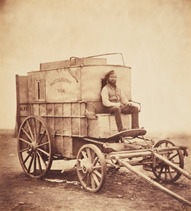
Roger Fenton, 1855 - The Crimea War
The portable darkroom with his assistant modelling.
This photograph was taken by setting up the cart with the portable darkroom within it with his assistant sat as still as he can for a period of time. I don’t think that he used the horse in this image as it would have been constantly moving causing motion blur.
This image is communicating how hard it was to be a photographer as all of the equipment was so heavy and of a large size so they used a cart to transport it all.
This image has an impact on me because it is showing how hard it was to be a photographer in 1850’s as you had to get the shot perfect each time because you only had a limited amount of shots you can use. I really like this photograph as it is showing where photography actually came from and where it war photography began.
Image 2:
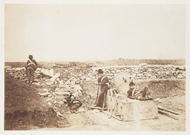
Roger Fenton, 1855 – The Crimea War
A British mortar battery during the siege of Sebastapol
The image its self looks very scratched and grainy which gives it the effect that is has been bombed and warn.
This image would have been taken over a period of 20 seconds, so the soldiers would have had to stay perfectly still so there wasn’t any motion blur.
Through this photograph it is showing “A Quiet Day in the Mortar Battery” as the photograph has been named. This communicates that they have busy days and some where they do nothing so they just relax all day but would always be ready for anything.
This photograph has impact on me as you can see a mortar blast from were an enemy mortar landed right next to the soldiers nearly hitting them. Just seeing them as relaxed is brave as they could be attached at any time.
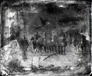
Image 3:
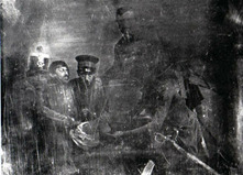
Unknown photographer, 1847 – Mexican American War
This image is really old image so it’s grainy and scratched with most of it undistinguishable on the right side due to the early date of the photograph which leaves a ghostly feeling within it.
This photograph looks like it was taken inside a building due to the ghosting of the object on the right side of the image which looks like a wooden post. This would have been a staged image as they are all looking towards the camera.
This photograph commutates the feeling that the soldiers are staring right at you through the image which intimidating you straight through the camera which makes you feel completely separate from them.
The impact of this image on the view is an honestly of the hardness of war and the human factor through it.
I really like this photograph for the fact of them starting right at you through the camera and how much it intimidates you.
Image 4:
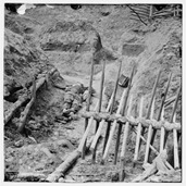
Thomas C.Roche, 1882 – Late War in Petersburg
“Dead Confederate Soldier, In trench beyond a section of chevaux-de-frise (Horse Barricades)”
This photograph is a very emotional due to the death of the two soldiers that are shown within the image with one shown in the main path and one of them are half buried with footprints on top of him.
This photograph would have been created after the war had moved on from that point and the aftermath had been left.
This photograph was one of the first shown images in a gallery of actual death within the photograph, so it would have been very emotional and shocking to see. This image also had a lot of impact on people because they actually got to see the proper aftermath of the war so they all realised what it was like to be there.
I really like this photograph as it is very sad and emotional to look at. However, the warness through the image from the dead bodies to the ground as there isn’t any grass within it and how all of the soil is crumbling.
Image 5:
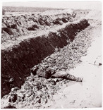
Thomas C.Roche, 1864 – American Civil War
“Dead Confederates, Fort Mahone”
This photograph is very grainy and looks a small bit over exposed so it is very bright and has less detail within the image. It is also quite emotional because of the body that is shown in the centre of the photograph.
This photograph would have been created when the war had finished and moved to a different place after one side had concord that part of the war field. Then the photographer would have gone in and shot images of the aftermath and death.
This photograph communicated and impacted the true honest brutality of war from the dead body shown and the desecration of the ground from everyone’s foot prints and bullets scattered everywhere.
To me this photograph is very inspiring as it is showing the truth behind war and not what people thought it was like. It shows the reality of the conditions and what the soldiers had to deal with and live in, but also shows how they aren’t very respectful with how they treat the body’s of fallen soldiers.
Part Two: The Bang Bang Club
The Bang Bang club was made up of four conflict photographers in towns of South Africa between 1990 and 1994. The name “The Bang Bang Club” was born out of an article that was published in South African magazine called “Living”. The people involved with this organisation were:
Kevin Carter
Greg Marinovich
Ken Oosterbroek
João Silva
They were trying to show the conflict and fighting between the ANC and IFP supporters, they were all trying to document the under reported conflict.
The Bang Bang Club existed in South Africa between 1990 and 1994 during the transition from the apartheid system to democracy. And through this small time period there was a lot of black on black factional violence particularly between ANC and IFP. The conflict occurred when the political motivations and beliefs of the two parties differed after they lifted the bans of both political parties. They were previously banned by the white controlling powers.
I know from my own knowledge that the black people of South Africa didn’t respect the white population due to how they were previously treated. This caused major tensions within the country as the black population tried to claim back what was rightfully theirs.
Equipment they used:
Nikon Nikkormat SLR, Nikon F2, Nikon FM2, Nikon F4, Leica M3, and a large format camera, Nikon F2, Nikon FM2, Nikon F4, Leica M3, and a large format camera
Image 1:
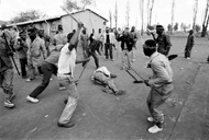
Greg Marinovich, 1990-1994
This photograph is very sad to look at as there is one person in the middle of everyone being beaten and sliced by knifes and machetes. It is a very hard photograph to look at as it isn’t something that should happen and never does normally happen.
This photograph was taken by the photographer from The Bang Bang Club called Greg Marinovich on the streets. He would have taken this with a 35mm film camera.
This image communicates the scale of how bad the fighting and the “almost war” reached. This photograph is showing what the locals would do to people who did not agree with their political views.
This will have impact on everyone who looks at this as they would want to try and help but would be scared to intervene.
I feel like this photograph is because they are targeting people who are defenceless and are without weapons. I am sad when I see this because it is showing a defenceless man getting attacked by a gang of people in the middle of the street.
Image 2:
Kevin Carter, 1990-1994
This photograph is very very emotional and sad to look at as it is a man being burnt alive by having a tyre put around them full of petrol which slowly burns them alive (necklacing) and left out in the street for everyone to see.
This photograph was created with a 35mm film camera and the photographer got up close to the person sadly dead on the floor and everyone else in the background just standing there watching.
This communicates that no one has any power to stop what was happening. It is also representing that everyone is scared to do anything as they would have the same done to themselves .
This has a lot of impact on myself as it is showing torture of this man and how slow and painful his death would have been. Everyone should be sad and shocked to see this.
Image 3:
João Silva, 1990-1994
This photograph is showing four men carrying the dead body of a fallen man who would have either been shot or stabbed my someone. There is also a blood trail falling from the body onto the floor as they are carrying him.
This would have been shot on a 35mm Film Camera and the photographer would have been following the people around to get close to them. The photographer would of had to earn the trust of the people to be allowed to get this close.
This image is communicating that even though people are dying that everyone is still trying to clean up the streets of the bodies and take them home to their families. This also has a lot of impact on people because it is showing the true aspect of what is happening.
I feel like this image is very emotional to look at because it shows that there are good people out there trying to help in their own communities and country.
Image 4:
João Silva, 1994
This photograph is very powerful because it is showing the eastern suburbs of Johannesburg and is showing an injured young man being held up my other men with guns helping him get away.
This photograph was taken while they were scrambling for cover, the photographer would have been following a couple of men fighting for what they believe in. It would have been taken with a 35mm Film Camera.
The message of this photograph is to show how young everyone is that are fighting to get their way in the village that they live in. But also, to show the effect that it has on the people and their injuries. The impact of this could have been that people can see how much badly injured they can get but also how young the fighters are.
I feel strongly about this photograph as it is showing the reality of the situation. That people are always there to help each other on their own side.
Image 5:
Greg Marinovich, 1990 and he won Pulitzer Prize in 1991 for Spot News Photography.
This image is showing a man who supports Zulu Inkatha being a burnt alive and clubbed to death by an African National Congress supporter. The child in the bottom right looks like he is trying to run away from that area as he doesn’t want to die and that he’s trying to get out of there with his life.
This would have been created by using a 35mm Film Camera and the photographer Greg Marinovich would have probably been walking along the streets to find this shot or in a car driving down each street looking for something that is happening.
This photograph is communicating the aggression they all have to each other and that they would do anything to kill the people who support the opposing political party. They would also try to do it in the most painful way that they could. What makes the impact of the image so great is that you could never imagine this happening in normal life.
I really like this photograph because it inspires me to do something to stop all of this and try and have peace in different countries in the world.
https://www.npr.org/2011/04/21/135513724/two-war-photographers-on-their-injuries-ethics
http://www.thebangbangclub.com/ken-oosterbroek.html
https://bakwamagazine.com/2015/06/16/the-bang-bang-club/
https://www.google.co.uk/search?q=The+bang+bang+club+photography&rlz=1C1AVNE_enGB671GB671&source=lnms&tbm=isch&sa=X&ved=0ahUKEwjFjIa5nbnXAhXEuBoKHbDmC8IQ_AUICigB&biw=958&bih=954#imgrc=LCQKJYLDNlyTnM:
https://en.wikipedia.org/wiki/History_of_South_Africa_(1994%E2%80%93present)
https://en.wikipedia.org/wiki/Bang-Bang_Club
https://en.wikipedia.org/wiki/War_photography
https://en.wikipedia.org/wiki/Roger_Fenton
http://time.com/3881577/crimea-where-war-photography-was-born/
0 notes
Text
Downloading a preset
Lightroom:
Presets:
What is a preset?
A preset is a downloadable filter that can be applied in the lightroom program. It is very similar as using a pre-saved action in Adobe Photoshop.
How to download presets
Go to VSCO.com.
Or presetlove.com
Press download > make sure you save them in the right place, as follows:
Lightroom > make folder called presets > all presets go into here > import from lightroom
Why use Presets?
The advantages of using a preset is that you can always download and use the latest style or look. The speed that you can download them and put them onto your images is quicker than just editing and adjusting the settings from scratch. You can also use them repeatedly on as many projects as you like.
0 notes
Text
Questions:
How do you create your own presets in Lightoom?
- Edit image > Press (+) on presets and untick exposure and white balance
What is resolution? Why is it important? Which contains more pixels, A 12”x8” image at 72 DPI, or A 6”x4” Image at 300 DPI? What is web resolution? What is print resolution? If you scan an image at 1200 DPI, how much bigger than the original can it be printed?
- Resolution is how many pixels are contained within a one inch square of an image. The higher the resolution, the larger the size you can print. It is important because it changes how big you can print the final images off and the picture quality.
- The 6”x4” image contains more pixels because it has 2,160,000 pixels in it and the 12”x8” image has only 497,664 pixels within it. How I calculated this figure: 6x4=24 300x300=90000 90000x24=2,160,000
- 72DPI is the resolution of web images and 300DPI is the resolution of print resolutions.
- You can print it 40x bigger at 1200 DPI but it will can take a few hours.
What are snapshots and why are they useful? What are virtual copies and why are they useful? Why stack?
- Snapshots are when you make a couple of edits and want to keep them all so you go to the snapshots so you press the (+) on the tab and press “Create” once you have done an edit. Then you can also go back to them and put it onto any picture.
- Virtual copies are when you make copies of one image so you can see different edits of each copy of the same image.
- Stacking helps with your final images as you can stack the copies and original image together so you can have the edit that you preferred at the top so when you Export the images it will only export the top image.
0 notes
Text
Work Flow
Workflow = getting to A to B as smoothly and efficient as possible
workflow:
- Planning & Time Management
- Being organised
- MUST have a system: Systematic Cataloging
- Batch Processing
- Achieve the shit you are aiming for
. Minimise stress and maximise enjoyment
. Time is money
Batch Processing in Adobe Photoshop:
Open an image in Photoshop.
- Window > Actions

- Press the second to last icon to create new Action and call it ‘B&W High Contrast’
- Create new ‘Adjustment Layer’ of ‘Black and White’ and ‘Levels’
- With Levels move the bars to Shadows to 35-40 and Highlights to about 230

Open a new image on Adobe Photoshop.

- once it is open you need to click onto your new Actions and Play it to apply the settings.


File > Scripts > Image Processor

- In the Image Processor select your folder to get the images out and another where to place them. Also you need to select the action that you just created called ‘B&W High Contrast’

Creating a batch Process in Lightroom:

- Open up Adobe Lightroom and create a new ‘Catalogue’
- Select all of the images that you want to import
- Select ‘Copy as DNG’ images and press ‘Import’


- Go to the ‘Folders’ Tab then right click onto the 2017 folder and press on ‘Show in Explorer’ and it shows the folder that they are in.

- Next you can actually add to the date by right clicking on the date and press rename to put the shoot down that it was from.

- Create 4 Sub folders within the main folder
Capture - Raw files from shoot
select - PSD files for photoshop editing
Master - TIFF files ready to print
Output -
- next move all of the images into the capture folder.

- Then press ‘D’ to go onto ‘Develop’

- To edit all of them you will want to click on the image you have edited and then select all of the images after it and then press the ‘Synk’ button in the bottom right.
- Next go choose which images you like and use as final images.
- Go back to your library after you select the images that you like and then press ‘File’ > ‘Export’ into the selects folder.
- Change the File Settings to a ‘PSD’ file for Adobe Photoshop.
Next open Photoshop and Open the images for things you can’t do in Lightroom.
Then finally you need to save them into the ‘Master’ File saved as a ‘Tiff’
0 notes
Text
Scanning Negatives
Epson Scanner - Epson Perfection 2480
http://www.techradar.com/reviews/pc-mac/peripherals/printers-and-scanners/scanners/epson-perfection-2480-photo-59155/review
Epson scan is the program to use the scanner.

You need to make sure that you hold the negatives by the side and place them onto a piece of white plain paper and use a micro fibre cloth to clean the shinny side.
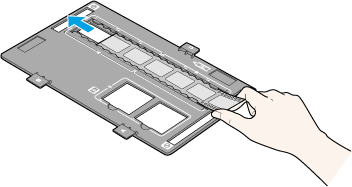
Transfer the negatives into the negative holder as shown above.
You can only scan 3 film negatives in a line of 6 at a time.
Make sure that you clean the glass bed of the scanner fully so has no marks.
You need to line up the negative holder with the mark on the scanner.
Program:
Select the professional section mode to get the best quality.
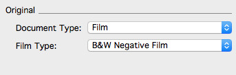
Original:
- Film
- B&W negative film
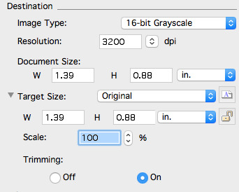
Destination:
- 8 or 16 bit Grayscale
- Resolution : 3200
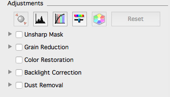
Adjustments : don’t use any
After you scan the negatives in the scanner and see what the prints are going to look like you can then edit them to make them brighter or darker.
Then you need to preview your negatives so you use the ‘Preview’ button to scan them.
You need to make a selection of the correct negative size by drawing a box the right size around them.
After scanning the preview in adjustments go to:
Histogram:
- Bring the true ends to the true ends.
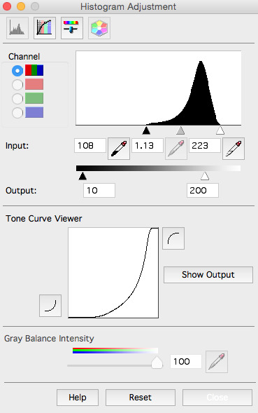
Resolution:
- 2400 or 3200
Scale:
- 121
= 35.32 MB
Aim for 35 MBs in 35mm film
Save the scans as ‘Tiff’ as they don’t lose any of the image quality.
Next open it up in Adobe Photoshop
- You will need to rotate the image by Image > Image Rotation.
- Duplicate layer (Ctrl+J)
- Press (Ctrl+L) to open up Levels Tool
- You need to reline the true ends together at the start of the incline
- Next you can experiment with the Exposure and Contrast and Curves to make it look exactly how you want.
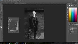
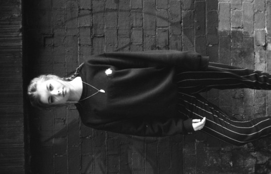
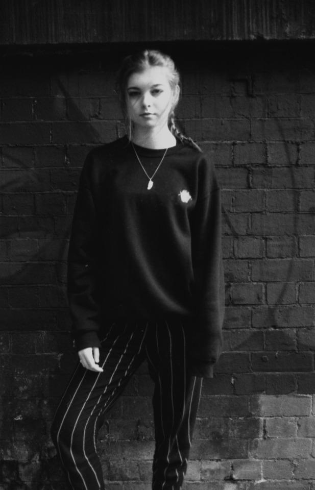
Below is the final image that I have created
Why do photographers scan their Film?
Photographers scan their negatives as they can crop the image much easier and also get much more detail in the image than from the developing process in the darkroom.
Why did you deselect any adjustments presets automatically selected?
I deselected any adjustment presets when I scanned my negatives because you loose control of editing the image. Also the contrast and saturation increases and the dust is removed from it.
Why did you adjust the histogram levels?
I adjusted the histogram levels because it helps to balance out the tones and to make the colours correct.
Why did you choose the specific DPI/Scale?
For my scans I chose to use 121 as it made my image go to 35mb as you need to aim for 35mb when you scan a 35mm film so you can get the mode detail from within it.
What is the difference between Tiff and JPEG?
A Tiff stands for (Tagged Image File Format) and a JPEG stand for (Joint Photographic Experts Group). These two are the main formats for images.
Tiff: allows you to have the option to save the image compressed or not. It also allows you to open your image and save it over and over without loosing any resolution.
JPEG: this is a format that compresses files but after opening it multiple times, it starts to loose resolution within it.
0 notes
Text
Final editing

The image above is my final image from the photoshoot that i have chosen to edit.

Above is showing the image once i have loaded it onto Camera Raw. The next step is to flip the image so it is as shown in the image below.

In Camera Raw i edited it to the settings of:
- Exposure: -0.15
- Contrast: -17
- Highlights: 0
- Shadows: +100
- Whites: 0 -
- Blacks: -10
- Saturation: -10

Next I opened it up in Adobe Photoshop as there were lots of marks and paint faults on the image so in the image. Below is the image after i have used the Spot Healing and Clone Stamp Tool to Edit them out.


Next I went onto Interact to get the Logo of the business that we have been set the task to do. Once we loaded it onto Photoshop I then used the Quick Selection Tool to get rid of the white background of it.

In this screenshot above it is showing where I have placed the logo into the position that I feel is the strongest. I have also changed the colour of it by holding down Ctrl and clicked onto the layer window of the logo, then I selected the right colour of the pink.

Finally I Added the Slogan by making three different texts with ‘Paint’ ‘&’ ‘Create’ in them and selected the right size and the colour by doing the same step as above.

Questions:
Do your images successfully reflect in style or the images in the original brief?
I think that my images will successfully reflect back to the client brief as they asked for images to promote their new spray paint and it is showing both of the new colours, and has also shown it in different positions which helps people to see what it would look like in the lighter and in darker areas.
What are the similarities?
The similarity between my image and the ones that were given to us on the brief are that they both have household objects in them, also i didn’t use any other colours than what they asked us to.
What are the differences?
The only differences that are on my image and not the brief is that i have used two colours in the image instead of one, also that i used technology instead of children's sports toys.
Does the logo and slogan sit well in the image?
I feel like the logo and slogan both fitted really well onto my final image that i chose as they follow the colour scheme and they stand out well due to their positioning.
Why did you select the specific typeface?
The typeface that chose to create the slogan was Haettenschweiler as it stands out due to it is big and bold but also looks simple. I decided to choose this type face over anything else that was more fancy because i wish to keep it as simple and clean as the image it was being placed up on. I chose the colours so they match the ones of the new spray paint to follow through with the clean and simple idea.
Why did you manipulate the text the way you did? (Size, Style, Layer Mask ect)
The size of font that i chose to use for the slogan was 120pt as i needed to fill in some negative space that i didn’t think worked for this piece and the large font size helped to decrease the void. I have also faded away two edges of the ‘Paint’ and ‘Create’ to add more of effect on the font to give it some depth and interest. Also for the slogan I chose to use was the same blue colour of the Montana new spray paint shade used within the image so it goes really well with the final peice.
Are you happy with the results of the logo / slogan?
Overall, I am very happy with the final position I have placed my slogan and logo as the finished piece looks really professional and they both stand out.
Could you improve them?
I think that next time I should make the logo larger in scale in the bottom right corner so it stands out more.
Did you crop your image?
I didn’t crop my image as I got it right in camera, as all of the positioning of the objects were how we wanted as a group and the balance was correct.
Annotations of Final Image:
What went well?
The things I felt went well, were how easy it was to set up the studio as we went in for 15 minuted before we had our final shoot to set up multiple different prop sets, so once it came to shooting the images we knew how we wanted them. Also I really like the way that the image has been positioned and taken from the angle I used as I haven't had to do any cropping to it. The photoshop process for this image was quite simple as you only had to use the Spot Healing and Clone Stamp Tool to edit out all of the marks on the sensor and the small imperfections on the props. Also the positioning of the slogan and logo as they look professional and stand out due to the colours that I have chosen to create them.
What didn’t go so well?
The things that didn’t go so well were that we should have taken more shots so we had more to choose from as a group. Also the shadows were way too dark so I could have lightened them up in the camera or by moving the lighting around a bit or by turning them up.
What would you do differently next time?
If i was to re-shoot these images next time i would slightly change the lighting setup to allow the shadows to be less sharp and more faded away. I also would shoot more photographs to allow more of a varied choice.
0 notes
Text
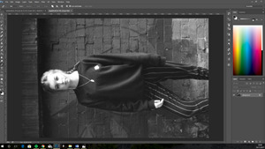
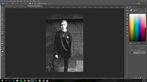
Example editing final image that we learnt in lesson
Open image on camera raw:
Change the orientation
Use the straighten tool and draw a straight line where you want it to be then press enter to accept
Experiment with the basic settings.
- Exposure
- Contrast
- Highlights
- Shadows
- Whites
- Blacks
- Clarity
- Saturation. Do it from -100 and then go upwards so it doesn’t look unreal.
Next go to detail settings:
- Sharpening:
- Amount set to 45
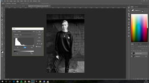
Next in Photoshop you need to:
- Duplicate layer (Crtl+J)
- Then you can use Clone Stamp or Spot Healing Brush Tools.
- To use these you need to zoom into 50-100%
- You also use the clone stamp tool to get rid of any imperfections.
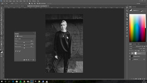
Download capture image from interact
File > place embedded > image into photoshop
Right click on layer and go to ‘rasterize layer’.
Use magic wand tool to select all of the white areas
Press and hold Ctrl and click inside layer window to select the writing and logo
Add an adjustment layer > solid colour
0 notes