sjnm3217
Major Spacer Rabbit
Writing for NM3217
11 posts
Don't wanna be here? Send us removal request.
Last Seen Blogs
sylphy
✨🔶
primeofprimes115
The Writer of Primes

fatherkreiner
@vassyflorence

6vviw-g7vlb
Dieta chetogenica alimentare
amalia-red-22
♡Red♡
Text
⊹╰(⌣ʟ⌣)╯⊹ Reflections: Final Project
It is said that the author of this post has achieved Nirvana after working on the final project. It is currently 3.30am in the morning, after wrapping up perhaps the final group call of this project. Kind of happy, but also kind of sad that it’s all over.
First of all, I would like to say that I am immensely proud of my group and of the final work. Perhaps one of my most efficient and hard working project groups this semester!! Out of the 4 of us, we delegated the workload according to our strengths and preferences - Stacey, Zhuo Ting and I was in charge of conceptualising the magazine and doing the layouts, while we put our strongest artist Sharmaine solely in charge of illustrations. For the final lap, Stacey and Zhuo Ting continued to work on refining the layouts while I did the design document together with Sharmaine. Thus I’m afraid that some of the reflections I wrote in the group document echoes mine, but here they are anyways.
Lets dive deeper into the reflections:
Being more conscious and critical about design elements
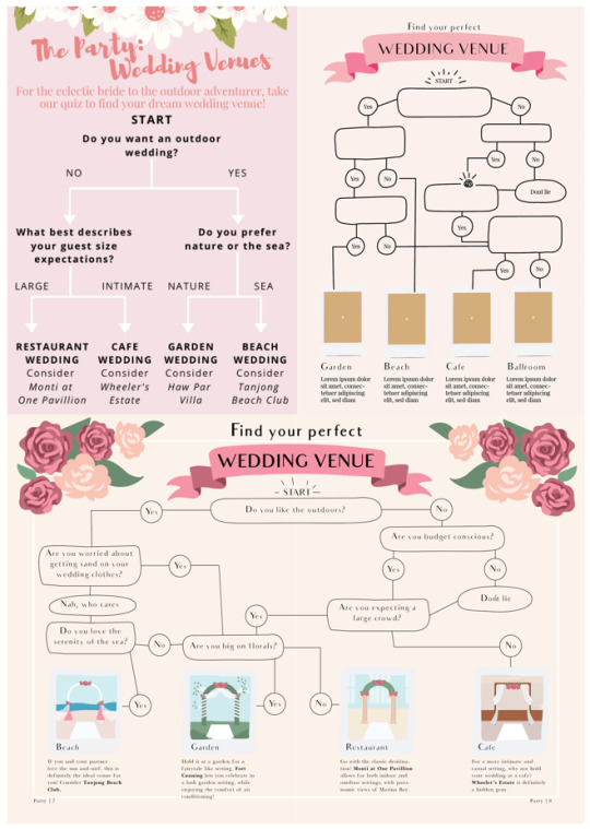

The 4 iterations of the Venue spread that I was in charge of. Tumblr, stop resizing my images omg...
The flowchart was first conceptualised on an A4 page, with no lines or shapes enclosing the words. This however made the information look messy, with constraints on how close we can place elements together whilst maintaining breathing space and enough space to tell the separate elements apart. The second iteration was done with lines enclosing the various options, which made the overall flowchart look much neater. It draws upon the Gestalt concept of similarity - closed lines for questions, and open lines for decisions and to guide direction.
After the first consultation, and through internal deliberation, I changed the A4 layout to a spread to allow for more liberal arrangement of content. Again, bearing in mind the hierarchy of information, I used height as the main signifier to distinguish the hierarchy of steps the reader should take. I made several mishaps at first unknowingly, such as this:

The reader was probably like, oh so which way should I go
Putting the “Don’t Lie” on the same level as the “Are you expecting a large crowd” shows that it can be a possible option, when “Don’t Lie” was actually a consequence of the previous budget conscious question.
I had to take extra care to rearrange the elements bearing in mind the mental frame and approach the reader would take.
Even then, due to the greater negative space around the options that I had, since I wasn’t using an A4 portrait layout now, the flowchart looked bland and flat against a larger spread. I had to think about how best to make the flowchart “pop” - perhaps lines wasn’t the most effective? I listed my options and decided to try shapes or solid colours out instead. Which leads to this design
It was just a minor change, but I thought switching around the colours for the “Yes” and “No” icons were better, as I usually associate warmer colours with more positive feelings and vice versa.
Sometimes, you really have to hunker down and think if the element or principle used is the best one available to present the information. Shapes? Lines? Or shapes with lines? Which leads me to my second learning points...
How to best present and communicate a huge amount of information
I remember that when we first started out, we struggled to deal with the huge amount of information we had with the planning page. We had many different ideas like representing total costs as a pie chart (of a ring) but we scrapped that because the page might look too cluttered.
For the tips page, we eventually narrowed the information down to 3 key tips. Although receipts and invoices were the final choice, we also went bounced many different ideas around, for instance using

Sugar Hearts and wedding invitations (what we presented for the first critique).
But beyond being aesthetically pleasing, its important to ask ourselves if the medium really fit the message. As we were talking about financial tips, it would make more intuitive sense to use receipts, cheques, and invoices, borrowing existing semiotics shared between us and the reader to convey information more directly.
Pushing beyond design rules (and comfort zones)
At first, I stuck to a very safe rendition of the contents page.
But safe is boring - it didn’t even covey the dynamism and unfettered nature of the topic. Besides, there’s literally no hierarchy in contents page at all, just pure listing.
From a reflective process of design, I slowly got feedback from tutors and peers and made edits to the contents page as I went along. It made me think more about anchoring, hierarchy matters and colour combinations. Here are some of the other iterations - I was trying to play around with pushing design rules here, hence the “popping” out of numbers from the usual grids and margins.

And the final contents page!!
For me, I’ve also never used inDesign before this class, so it was really - I’m running out of vocabulary at 3am - an eye-opening experience.
Learning to let go.
And most importantly, sometimes you really need to just take a leap of faith. And tell yourself that it’s good enough, and time to set the work free ⊹╰(⌣ʟ⌣)╯⊹ We spent the night before submission poring through the magazine spread over and over again, to adjust the most minute of phrases and alignments. At the end we decided that it was enough, and ok, we really need to learn how to just let go. Because sometimes, when it comes to the real world - besides churning out a piece of quality work, it’s also about learning how to do things fast.
P.S. I can’t imagine the work and consideration that would go into doing a design meant for print, with all the different paper types and print types and print checks one has to go through. Man...
0 notes
Text
Reflections: Assignment 3
*Caveat: I’m submitting two versions for this assignment as the PDF directly exported from the ai file looks weird (colour-wise) on my computer screen, even though I’ve opted for no compression or conversion. It looks fine on PDF on the school computer though, but I’ve uploaded 2 versions JUST IN CASE!!!
Update: The final PDF has missing elements for the draft artboard, so please refer to either this post or the PNG file for the draft artboard.
2019 really is the year of binge watching, isn’t it? From the breakthrough new series Umbrella Academy at the beginning of the year, to the return of perennial favourites Orange is the New Black and Stranger Things this summer, I felt Netflix really did spoil us silly :-P I thought having a infographic centred on Netflix might be a really fun project to undertake, hence the topic for assignment 3! On hindsight, tapping onto a brand with a pre-existing brand palette would also make the selection of colours for the infographic much easier for me. I didn’t notice that till someone pointed it out during the critique session!
Before starting the infographic design proper, I first looked up examples of infographics online. I really liked how some of them made full use of the context and theme of their infographic, and created such an immersive experience with their creative ways of presenting otherwise drab data. I’ve included a few of my favourites below:
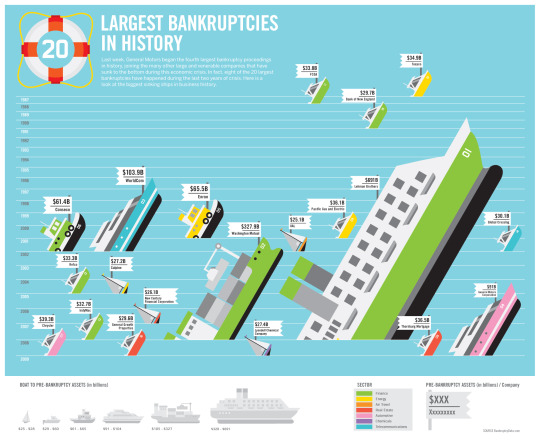
Infographic from the Good Magazine, which commissioned infographic specialists from Always With Honour. Retrieved from: https://www.autoblog.com/2009/06/12/putting-it-in-perspective-largest-bankruptcies-in-u-s-history/
Instead of using bar graphs, the designers chose to represent bankruptcies as shipwrecks. Using the “sinking ship” metaphor, the designers managed to graphically show bankruptcies in perspective by varying size and repetition to create a unique yet aesthetically pleasing and understandable graph. How cool is that.

Behance. (2019). 1910 Making Kimbap [Image]. Retrieved from: https://www.behance.net/gallery/87461175/1910-Making-Gimbap?tracking_source=search%7Cinfographic
I really liked this one too because instead of listing the steps platonically, the designer chose to represent the steps through a cross section of the Kimbap, or rice roll. The body copy was also grouped for easy reading through firstly chunking the information, and secondly categorising them by similarity in typefaces
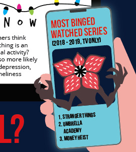
This was something I sought to emulate in my assignment. As my topic was centred on the habit of TV-watching, I thought – hey, why not frame my data from the perspective of a person watching Netflix on TV? This could definitely anchor my infographic within the theme and make for a more intriguing POV. Thus I came up with the initial artboard for the infographic:
The main body of information would be framed within the TV screen. To overcome space constraints with the restrictive TV screen, I thought of having a Fun Facts section in the handphone screen that the user is holding. In a way, it automatically chunks the information up for easier reading and draws attention to the Fun Facts section.
First Critique
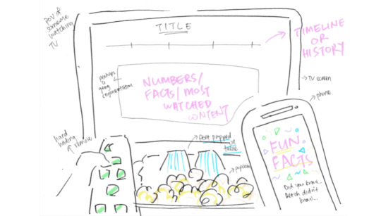
During the first critique session, the feedback garnered was generally positive, with some scepticism about the space constraints posed by the TV screen. On reflection, it was probably better to have mapped out the main dataset on the artboard more clearly, as it posed problems later on. This really showed the importance of sketching!
Second Critique
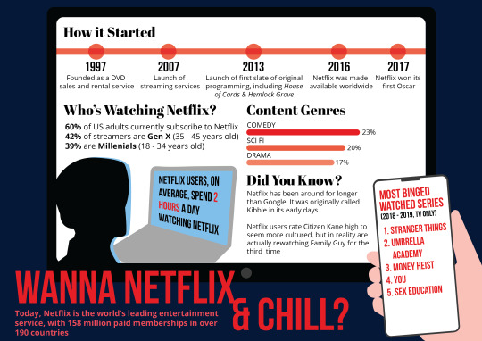
Eventually, this was the artwork I submitted for the second critique session. In terms of the type of infographic, it would be a mixed infographic, as it contains both elements of an informational and timeline infographic. As I have lots to write for this assignment, I’m going to chunk the writing in subsections, so forgive me please if this writeup looks choppy!
Direction
As the human eye typically reads information from up to down, left to write, I thought it’ll be good to tap on this shared understanding to categorise my information. Starting with the timeline, it’ll move down to the demographics section, then content by genres, fun facts, and finally most popular titles.
Due to space constraints, I scraped the idea of a remote control/human feet/popcorn by the side of the TV frame, and replaced it the title of the infographic. Even though it might create a “gap” in the reading of the information, I thought having the title at the bottom would be even better, as it created better balance with the handphone screen element on the right. The asymmetrical balance engendered by placing the title on the bottom left corner evokes a sense of modernity and movement, and is in fact better than placing the title on the centre top. I also thought it would be quite apt to tap on the slang/euphemism “Netflix and Chill”, hence the title.
Colour
For colour choice and theory, my colour palette was pretty much determined from the beginning due to Netflix’s existing corporate colours of black and red. However, I feel that through the utilisation of limited colours, I still managed to learn quite a bit from the application of colour theory. For instance, when we learnt in class that red is commonly used in entertainment, it didn’t dawn on me till I started doing up the infographic for Netflix. Haha!
Red is a colour used to simulate, create urgency, draw attention. It is good in all 3 aspects of visibility, attention, and recognition. Thus I made use of it to draw attention to title headers, and areas that I wanted to emphasise.
We also learnt that warm colours advance while cool colours recede. Even though white (of the TV and phone screen) is a neutral colour, against a cool, dark blue background it stands out, thus creating an effect of foreground and background without any warm colours. Cool colours give an impression of calm, and creates a soothing impression, and relaxing mood. It gives the impression of the person watching Netflix on TV at night, while mindlessly or aimlessly scrolling through his/her phone.
For my first draft, I also tried to keep to a limited number of hues - white, black, red, blue, beige - and varied only the values and chroma (e.g. for the bar graph in the content genre section). The main variation of colours – white, red, and black – were also at opposing values, which made the contrast even greater. I noticed that this is a tactic used by many designers, such as the designs for Sin City:
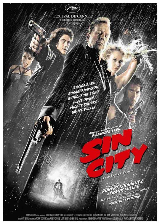
Original Film Art. (2005). Sin City Poster [Image] Retrieved from: https://www.originalfilmart.com/products/sin-city-2005
I really liked the concept for Sin City, it made extremely deft use of shadows to mimic a chiaroscuro style. It really exemplified how to come up with an interesting illustration/infographic with a limited colour palette, but I wasn’t deft enough with the manipulation of shadows and illustration yet. Thus, my infographic came across as too wordy and unsophisticated in the second draft.
Font
Even though design principles stipulate serif font types for titles and sans serif for body copies to ensure better readability, I thought it’ll be more appropriate to use sans serif for the title. This is because Netflix’s corporate font, Bebas Neue (which is sans serif) would ensure better recognisability of the Netflix brand and its identity. To create a form of repetition and dynanism in terms of the typefaces, I used a serif font type - Abril Fatface - as the subheader font, and contrasted it by using another sans serif font - Open Sans - as the body copy. Personally I liked the Abril Fatface as it resembled the typeface used in magazines like the Economist, whilst retaining a modern look, but we’ll talk more about that later :-)
Having standardised font for different sections also ensured better hierarchy within the infographic, helping to segregate the data dump for better readability.
Form
In terms of form, I created the form of a human head using 2 different colours to show light and depth. By showing the light reflecting from the computer screen, a form of a 3D human head came into view, despite using 2 organic shapes with flat colours. It was also my attempt of trying to play with positive and negative to give rise to a more multidimensional form, even though the human head was clearly lacking in any features aside from the exterior shape.
Comments
After the second critique session, I realised my infographic was waaaay too wordy, and lacking in visuals. Elements (such as the timeline) were also not arranged well, giving off an overall haphazard feel. I made sure to improve on these for the second draft. I was also forced to reflect on my font choice - is it the best typeface to use for a contemporary topic?
Final Infographic
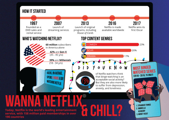
I made quite a lot of changes in terms of the final artwork, and I’ll run through the improvements I made here. This is especially so in terms of representing numbers through visuals, instead of relying on just words. I also became more adventurous in terms of experimenting with elements like light and texture, which I felt worked really well for the final submission.
Visuals
Previously, I used words to represent the demographic breakdown of Netflix in America. This time, I decided to use a pie chart, drawing on the concept of closure (reification). By using lines and stars to create the graph in the image of the flag of America, the viewer automatically perceives the shape of a pie chart, even though there isn’t a closed shape in terms of the overall graph.
For the section on content genres, I considered using repetition of different icons, e.g. laughing face, spaceships, drama mask, and placing them close together to form a bar graph, instead of using an actual bar. However, I found such a layout too cluttered due to the limited space for the section, and opted instead to stick to the bar graph, but use an icon at the end of each bar to better illustrate the genre.
I also replaced the words for the most binged watched titles with an illustration of a Demogorgon instead, and reduced the number of titles from 5 to 3 to accommodate the Demogorgon. It was also a nice touch to have the Demogorgon “pop out” from the screen, without letting the artwork be constrained by the phone or TV wireframe. Same for the teardrops dripping out of the eyes!
Colour
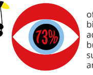
With the use of more colours in the final artwork, I had to think more critically about using colours in context. At first, for the eye icon, I used red for the background which drew too much attention away from the number, which was key in the icon. This brought into mind the concept of the colour quadrant, in terms of shouting, speaking and whispering colours. Thus, I replaced the background eventually with gray, even though it wasn’t exactly a variation on the colour wheel, it’s still a reminder of how varying colours in context can better emphasise certain elements.
Font
This time, I removed Abril Fatface as a font, and stuck to using just sans serif fonts for a more modern look. However, for the Fun Facts/Did You Know section, I tapped onto the iconic fairy lights scene in stranger things to spell out the words Did You Know. (For those who didn’t watch Season 1 of Stranger Things, Joyce Byers hung up fairy lights in her living room with the alphabet under each fairy light to create a makeshift Ouija Board).
Light
I found my original infographic kind of flat and lacking in dimension. Thus to better emphasise the effect of different depths, I used the light emanating from the phone to give the impression of the phone being in closely proximity/emerging from the screen. I also gave the human face a light reflecting from the computer screen, and overall background a gradient, all to emphasise multidimensionality in the final artwork.
Initially, I used an outer glow for the phone screen, but I felt that it didn’t gel well with the overall aesthetic.
Texture
I also tried experimenting with texure, by making use of the Grain function in Illustrator. I think it mimicked the graininess of TV, and gave a static feeling, like dust floating through the light! It simulates the grainy textures by implication of how areas of the picture were rendered. I applied this effect on the background, and light reflection (computer and phone screen).
My first try with the Grain effect. I tried to use a radial sort of light/blur effect on the phone screen, like the outer glow, but it took really unnatural. I used a slanting reflection for the final submission.
Data Sources
Timeline
https://media.netflix.com/en/about-netflix
Demographics
https://www.theverge.com/2019/7/18/20699037/netflix-earnings-report-q2-streaming-wars-disney-apple-warnermedia-international
https://www.forbes.com/sites/jeffewing/2019/02/12/new-research-highlights-streaming-demographic-trends/
Did You Know
https://mentalfloss.com/article/64325/13-facts-about-netflix-recommended-you
https://www.prnewswire.com/news-releases/netflix-declares-binge-watching-is-the-new-normal-235713431.html
Most Binged Watched
https://www.vanityfair.com/hollywood/2019/10/netflix-viewing-records-umbrella-academy-stranger-things-murder-mystery
0 notes
Text
Reflections: Assignment 2
While reading the assignment brief, I thought long and hard about what I wanted as the centerpiece for my second work. Before I started, I knew that there were several technical challenges I had to address for the assignment:
1. Difficulties with using human subjects: Was I able to find convenient, yet convincing human actors for the story I wish to narrate?
2. Dificulties with using inanimate subjects: Using toys could prove a more convenient alternative to human subjects, as I could circumvent issues like timetabling, and finding willing subjects (since they were inanimate, I could always bend them to my will, hehe). But they certainly don’t provide the depth of expression that human actors possess, unless I were to find some way to manipulate their facial expressions.
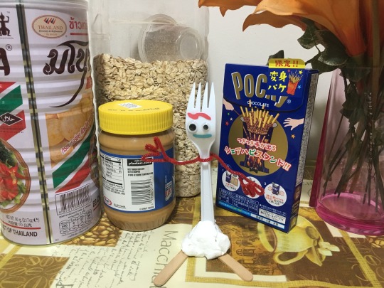
Thus, I decided to make my own characters from scratch, as that would give me greater control over the story and characters I wanted to portray. I eventually drew inspiration from one of my all-time favourite animations, Toy Story.
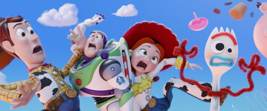
Movie Stills Database. (2019). Toy Story 4 Publicity Still [Image]. Retrieved from: https://www.moviestillsdb.com/movies/toy-story-4-i1979376
The Toy Story franchise has been met with critical acclaim from children and adults alike; it has a slew of funny, likeable, multi-dimensional cast members. Most recently in Toy Story 4, Forky was introduced:

Tumblr. (2019). Forky [Image]. Retrieved from: https://www.tumblr.com/search/toy%20story%204%20forky
Aww. I feel you Forky.
Made from a disposable spork and other dispensable materials, Forky thinks he’s ‘trash’ and not a toy. All he wants is to disappear into the safe oblivion of the trash bin. Unlike the other Toy Story characters, I think Forky is a refreshing change because he doesn’t exactly embrace his gift of life, and constant faces an absurd existential crisis.
Tapping on to a pre-established character like Forky was a great idea as my audience would probably already be familiar with the background story, and I could spend less time establishing the motivations of the character, and more time fleshing out the key components of my story. To put it in terms of Saussure’s ‘Dyadic’ or Two-part Model of Sign, the signifier of a fork with a face immediately brought up in the minds of my audience the shared signified of Forky from Toy Story, and thus Forky’s associated back story and quirky characteristics.
Critique Session
This was the original storyboard that I came up with:

This was based off the conventional plot outline of an exposition → rising action → climax → falling action → denouement.
These are the shots I took and selected for the critique.

1. I knew I wanted a mid shot – cutting off at the waist – as it was traditionally a good shot size to introduce the titular character. I experimented with several compositions, and decided that instead of situating Forky right smack in the centre, he looked better positioned at the third of the shot instead (aka Rule of Thirds). Surprisingly, aside from being aesthetically pleasing, it gave the impression of a camera panning across the household products to focus on Forky, giving the image more movement.
Too zoomed out and centralised at first. Didn’t like this
2. For the second image, I focused on the trashcan on my phone camera, giving the rest of the image a natural blur. The intention of this frame is to introduce the trashcan as the apple of Forky’s eye.
3. For the third image, I tried using an eye-level shot at first to simulate Forky interacting/coming close to the trashcan. However, I found using a neutral angle too bland eventually, and resorted to using a over-the-shoulder shot from the trash can’s perspective. This (1) made the image more dynamic and (2) led more smoothly to the 4th frame, where...
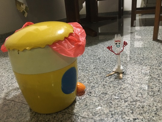
Example of a neutral, slightly Dutch angled shot that I felt didn’t work as well as a POV shot
4. … An unknown human tries to grab a hold of Forky. The high angle shots employed in frames 3 and 4 also further characterised Forky as small, weak and vulnerable.
5. A neutral shot was employed to show Forky’s distress as the focal point of the image.
6. Forky is left alone in the disposable serving bowl
However, while shooting, I felt that the ending didn’t resonate well with me. It seemed like the story stopped at falling action, without a proper ending or denouement. Or perhaps I just didn’t like the idea of leaving Forky with a bad ending :-( I thought he deserved better.
Since I had 3 frames remaining, I decided to utilize them to provide a better closure to the story. A twist (e.g. unexpected victory or bittersweet return) would also make the narration more compelling, and add tension to the storyline.
7. Thus, frame 7 shows the human user throwing the disposable serving bowl into the trashcan. Again, the image is taken from a top-down angle to show the POV from the human user. It maintains continuity, whilst emphasizing the human user’s position as someone powerful, respected, and threatening. *I realized later a continuity issue with this shot – Forky’s not in the serving bowl…
8. Frame 8 is a reaction shot of Forky in the trashbin. It seizes the moment and puts Forky’s emotion on the mantlepiece. Forky is saddened, because he doesn’t yet realise that he’s…
9. … Actually already in the trash! He’s reunited with his favourite place in the world! Congratulations Forky.

Tumblr. (2019). Forky [Image]. Retrieved from: https://www.tumblr.com/search/toy%20story%204%20forky
I was quite heartened that most people seemed to enjoy the story, although the critique session revealed certain continuity issues. Some of the audience members found it quite jarring that between images 2 and 3, Forky managed to unexplainedly make his way down to ground level. For the last image, it could also be made clearer that Forky has made his way into the trash bin.
In addition, I found certain aspects of the shoot unsatisfying for me. Due to the cluttered environment, I think it drew attention away from the main characters in the narration. I also felt Forky’s expressions could be better varied, since I had the deployment of coloured paper and googly eyes on my hands.
Final Submission
Thus I decided to reshoot the project, utilizing the more or less the same angles/shots as my first try, but incorporating the feedback given by the class, as well as certain improvements I personally felt could be made. Still the same plot and number of frames though.
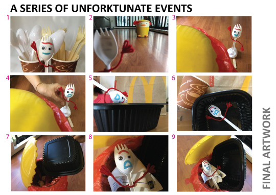
1. Reduced clutter in the environment and used only disposables in the background to make Forky stand out. Instead of using the Rule of Thirds in this iteration, I found Forky better in the centre, giving the impression of a hard cut at the beginning of the film reel.
2. Forky is now revealed to be on the same level as the trash can, removing sources of continuity issues found in the previous iteration. I also made us of a long shot this time, to bring into clarity the mise en scene/setting of the story.
3. No change in composition. But Forky’s mouth has been changed to a heart shape to symbolize his fervent admiration and weird attachment to the trash can. Lol! I also experimented with other angles, but found the original composition the best at conveying the character dynamics of the story.
4. Not much of a change.
5. Not much of a change.
6. This time, a Dutch angle is used to show the disarray of Forky’s surroundings (quote Big Bang Theory, “a swirling vortex of entropy” – not quite but we are getting there) and the conflicted emotions he is feeling.
7. A tear was added for dramatic effect. *sad saxophone playing in background*
8. A wider shot was used to show Forky in the bin. I think there’s added comical relief once we pan out and see Forky grinning foolishly in the bin.
Overall, I wanted this story to tell a greater moral - that even though sometimes things don’t go our way, despite the many setbacks we face in life, things do work out, eventually.
A behind the scenes was included for all canned shots. And in the spirit of Toy Story, I thought having a bloopers reel would also be quite interesting.
I had lots of fun with this project overall! As it is now Week 9 of school, let me end off with a very appropriate meme I found from Tumblr:

0 notes
Text
(╯°□°)╯︵ ┻━┻ Week 8: In-Lecture Exercise G
Here’s the in-lecture exercise for the week!!

I wanted to do a pattern made up of tree branches. At first, the sparse branches look solitary against the white background, like when you look up at the sky on a wintery, cold morning. It’s lonely, but I think it gives off a calming mood at the same time.
Thereafter, I progressively added more branches, and also thickened existing branches. The branches begin at the sides of the photo, but branch in into the centre of the image. The direction of the lines point toward the middle, and hence guides the readers eye to the centre of the pattern.
I used scraggly lines on purpose to reflect the rough texture of the branches. As the picture gets progressively crowded, and perhaps due to the use of only black tones in the image, the pattern begins to look increasingly ominous. After a while, it starts to look like the branches are obscuring your view on purpose, and you are seemingly trapped in a dark forest looking up for escape.
0 notes
Text
Reflections: Assignment 1

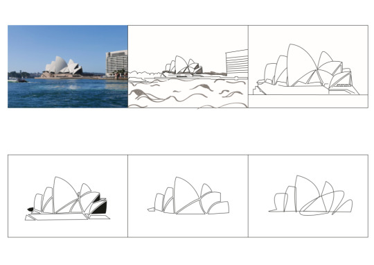
This is an image of the Sydney Opera House that I took on my trip to Australia. Even though I’m no architect myself, I really like the look and feel of buildings, particularly those with interesting shapes and details. It was also a trip with many fond memories, hence the choice of this photograph.
I struggled to simplify the picture initially, as I chose an image that lacked prominent details as compared to some of my peers. However, as the image I chose was such of such an iconic architectural structure, I took some liberties with how far I could possibly simplify it.
This was the initial abstraction I did:
Some of the feedback I gathered was:
1. To be consistent – My stream of thought was haphazard at times. Why were the concave interiors shaded for the later image but not the earlier ones?
2. To be strategic – I should critically scrutinize how I could add more details to the first abstraction (2nd image) so that subsequent images may follow an obvious, stepwise logical progression
3. To not oversimplify – Perhaps stopping at the 4th image might be good. The 6th image and final abstraction, whilst pleasing, might not be as suitable for this assignment. It oversimplifies and represents a different style, instead of encapsulating the original image.
I really appreciated the kind feedback the class gave to me, which gave me the confidence I needed to continue with improving my initial abstraction. I thought I had misinterpreted the assignment guidelines, as I used the example of Picasso’s Cow from the lectures as a guide instead. Unfortunately, I am not Picasso!! )-:
Consolidating the feedback given, I came up with the revised abstraction:

Such was my thought process:
Image 1: Initial, unrendered unfiltered image of the Sydney Opera House in all its glory
Image 2: I traced the outline of the Opera House and its surrounding scenery. This time round, I made use of shading and gradients to bring out the curvatures of the Opera House. As the Opera House’s uniqueness lies in its modern expressionist design, and not the attention to details – in fact it is almost devoid of windows from a distance – I decided that using shades to show its depth and dimension was the best choice and improvement I can make from the previous iteration.
Image 3: As the focal point of the image was the Opera House, I removed unnecessary details from its surroundings.
Image 4: Moving on, I removed the gradient from the exterior of the Opera House, and further reduced details. Originally, the shadows gave an impression of certain portions of the exterior receding from the viewer, giving rise to the famous shell-like roof structure. I noticed that removing the gradient did not detract from the sigmantics and syntax of the Opera House, as it still retained its iconic, organic shape.
Image 5: The next step involved further combining shapes whilst retaining the recognizable façade of the Opera House. I also reduced the colour values (from initial black and varied shades of gray) to just black only. I thought the restriction of colour values would make me more conscientious in terms of how I choose to represent the form of the Opera House.
Image 6: As the final step, I combined and reduced existing curves to enclosed shapes only, to push the abstraction further while retaining its initial meaning. All line thickness were also made uniform. As I had the privilege of using an international icon that was almost instantly recognizable to everyone – even though the signifier consisted of what seemed like a haphazard arrangement of shapes, how the shapes came and gelled together was still able to produce the signified of the Sydney Opera House in the minds of viewers. As a tiny experiment, I did a vox pop among 2 friends and found that they were able to recognize the unmistakable structure of the Opera House, even without the initial image as a prompter.
So… success!!

This assignment made me consider more critically the lengths we could go to distill meaning. In communication, the mental model of the signified is so ingrained in our heads - we could just simplify the signifier and communicate with much greater ease due to the common, established basis of understanding that we already possess.
0 notes
Text
ლ(ಥ Д ಥ )ლ Week 7: In-Lecture Exercise D

Why, recess week is over... my precious... ლ(ಥ Д ಥ )ლ
This is a photo I took at a cafe while working on one of my school projects! Talk about convenient. These are some of the hues I picked up from the image:

From L-R: Yellow, Brown (or perhaps Beige/Orangey-Yellow), Orange, Green, and Blue
These are predominantly warm hues. I almost made the mistake of identifying white and gray as hues, until I realised they are variations in values instead. I think the warm colours complement each other well - they are pretty close to each other on the colour wheel, and mesh well together to give off the warm, cosy vibe of the cafe.
If we talk about individual colours, brown is a colour that represents stability and comfort. It reflects the natural setting of the cafe well, without being boring due to the accents of yellow and orange. Orange, on the other hand, is a colour associated with adventure, creativity, and fun, which I think is what a cafe should be a hub for. The colours seen is this photo is partly thanks to the warm lighting used in the cafe, which highlights the importance of using lighting to establish a cosy, comfortable ambience in cafes. Because seriously, who wants to chill in a cafe with harsh white lighting anytime... ¯\_(ツ)
0 notes
Text
೭੧(❛▿❛✿)੭೨ Week 6: In-Lecture Exercise E
It’s recess week!!
Last week in class, we looked at the principles of typography and what makes good typography. We were given an example of type gone wrong for the in-class exercise, and were to identify areas of improvement.
These were the glaring issues that I found:
1. Hierarchy Matters
A different font should have been used for the body text, to better contrast the design. Besides capturing the attention of the reader instantly, it gives the text better structure, and guides the reader into reading things from top to bottom, left to right, and in a clockwise direction.
2. Complementary Typefaces
To continue from hierarchy, a complementary typeface should have been used to better distinguish between body and headers. This font looks like a mix between a slab serif and a decorative font - so I would suggest that a sans serif be used for the body copy instead, for better contrast. Even though the font used in this example isn’t particularly my favourite - it might suit the content more, so to each its own I guess :P
3. Readability
Alignment is definitely a huge issue here too. Having a center aligned body makes the text hard to read, even though some of us instinctively center align it, thinking that it looks better - which is completely understandable. However, in this case there is no consistent starting point, which makes it hard to read.
Now that we have looked at a really terrible example of typography, lets look at some good examples to cleanse our eyes.


Source: https://www.behance.net/gallery/71237365/Broadway-Youth-Center
I personally really liked the design and font used for the Broadway Youth Center. There’s great hierarchy, especially when we look at the namecard designs - the important information, which is the name, is bolded, capitalised and right at the top.
The logo design as well is also a great example of wordplay and typography as artwork. The abstracted letters of B,Y, and C are entwined in the logo (also cool to see how the artist used grids so meticulously to guide her design here). It’s also partly inspired by African prints.

The logomark is simple, clean and bold!
0 notes
Text
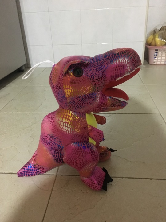
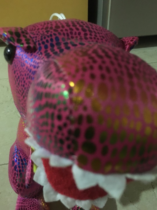
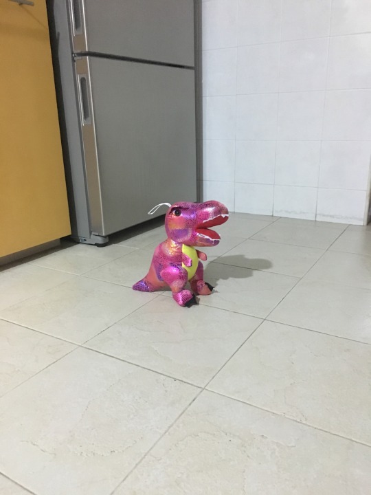
⋆ටᆼට⋆ Week 5: In-Lecture Exercise D
There’s no lecture in school this week, but we have an e-lecture instead! School’s getting busier ⋆ටᆼට⋆ , I’m starting to get swamped.
1. This is mid level shot of the dino, used to establish the character. I think there’s a sense of mystery as well, because we can’t quite figure out the exact setting of the narration yet.
2. We move to a close up shot, or a reaction shot. I find this angle much more interesting and effective at establishing both the character and its expressions.
3. A wide angle shot here. Now we know the setting - the kitchen. But it also gives the dino a feeling of “wth am I doing here?” Perhaps it’s up for a late night snack? Let’s find out!
4. I like this angle! The high angle gives a birds eye view of the character, and makes it look tiny, smol and cute :3 Like “I’m hungry, feed me pls”

5. A high angle shot. This makes the dino appear much larger and menacing that it actually is. “FEED ME IM A HANGRY DINO WITH TINY HANDS!!”

0 notes
Text
【・ヘ・?】 Week 4: In-Lecture Exercise C
I found this week’s lecture the most challenging thus far, hence the confuzzled face. I’m not sure if my analysis is right but here’s my attempt at analysing this advertisement in terms of semiotics!

Signifier: The signifier represents what we can actually observe in terms of the naked eye. In this case, the red background catches my immediately, as well as the distinctive Heinz Ketchup Bottle, which is sliced like a tomato. Underneath the bottle is the tagline “No one grows Ketchup like Heinz”. A strategic keyword, maybe? Because Heinz manufactures ketchup, but does not grow them. We’ll keep this thought it mind for later.
Signified: Underlying it all is the implied motivation, or message that Heinz/ the advertisers are trying to convey - the veritable freshness of Heinz’s Ketchup
Sign: Taking the signifier and signified together, the advertising is a sign to consumers that Heinz’s Ketchup are a cut above the rest due to its freshness, due to how its Ketchup is harvested and grown (compared to competitors). This is achieved by representing the Heinz bottle as an actual tomato (wholesome product, 100% pure tomato puree).
I personally feel that there is yet another layer of semiotics at work here. The signs, signifier and the signified are able to work because there is an implicit assumption of shared understanding between the communicator and the recipient. It is context dependent - I am able to grasp the message communicated more easily because of my prior knowledge that consumers are concerned about the preservatives in food, and this serves as a basis for advertisers to leverage/advertise on.
This was an interesting exercise to make me think more critically about the meanings we share between communicators and recipients, and how to best convey ideas across with graphics. I think it’s a good warmup for the abstraction exercise, heh!
0 notes
Text
╰(*´︶`*)╯ Week 2: In-Lecture Exercise B
I found this extra reading: https://diversifiedarts.wordpress.com/2011/03/01/artistic-criticism-how-to-critique-art/ particularly useful for helping me delineate the subtle differences between the different steps. I was initially struggling to start!
Description
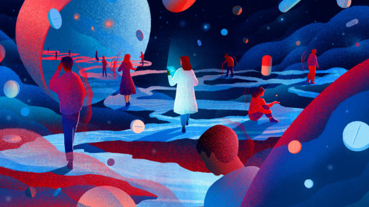
This image shows an illustration done by Tracy J Lee in response to the National Public Radio’s article, “How to Teach Future Doctors About Pain In The Midst of The Opoid Crisis”. In the illustration, a person with a white lab coat, presumably a doctor, is standing amidst solitary individuals and a sea of pills.
Analysis
Immediately, our attention is drawn into the doctor figure due to (1) Her placement and (2) Lee’s deft play with colours. She uses light to accentuate the doctor, while keeping the rest of the palette consistent with use of minimal lighting and colours. White is also a colour associated with peace, hope, and perhaps the salvation the patients around her hope to achieve from their suffering.
The image is made grainy to good effect, to show us the pain the and perspective of a suffering patient. Or maybe the painter was trying to depict the otherworldly aesthetic of outerspace, and playing with textures was a good way of bringing about that.
Interpretation
By alienating the doctor from the patients around her, the creator brings into question the level of understanding and familiarity doctors and other professionals have of the patients around them. In this “Opoid Crisis” as we speak of, physicians are feeling pressure to limit prescriptions for opioid painkillers. Yet, they are facing on a daily basis patients afflicted with disease, injuries, and the after-effects of surgical procedures. This brings into question whether doctors truly know what patients are going through from a 3rd person POV, and whether they are getting desensitised by the suffering they see so frequently.
Judgment
Overall, it is an imaginative take on the very real subject of pain, by making use of fictional elements and settings to maximum impact. Like how debris are stranded in space, doctors and patients stand as unanchored bodies, mirroring the alientation and solitude inherent in space exploration. Even without the article and title as the context, I believe a 3rd party observer could come to the same intended interpretation that the creator has, due to the non-ambiguous elements that Lee employs.
0 notes
Text
٩(◕‿◕)۶ Week 1: In-Lecture Exercise A
For Week 1′s In-Lecture Exercise, we were tasked to come up with a machine/device that will enhance our creativity. This is my creation, the Invincible Vacuum Pack! I came up with a really rough sketch during class and went home to further refine it.
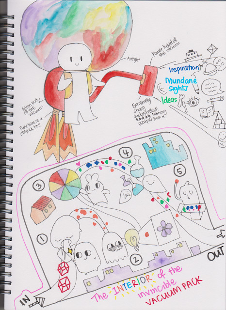
Because visual communication and design are everywhere, I envisioned my device to come from the most mundane of household products - a vacuum cleaner. It is able to suck in inspiration, ideas, sights and sounds from its environment, before undergoing further processing in the interior of the vacuum pack. The processed ideas then diffuses into the head of the user, much like the helmet of an astronaut suit.
The interior of the vacuum pack operates as such: 1. Breaking up the ideas 2. Illuminating the ideas (sort of like a Eureka! moment) 3. Adding colour to the thought process 4. Testing the feasibility of the ideas and 5. Packing them up for easier diffusion into the user’s brain!
It comes equipped with a jet pack too, so that the user can fly across greater distances to broaden her/his horizons. As Buzz Lightyear famously said, 🚀 To infinity and beyond 🚀
On a separate note, inspired by the use of emojis during class, I have decided to label my post titles with my mood of the week. I think it’ll be interesting to convey information through a mood meter sort of thing. Expect to see it descend into craziness and frustration as the semester progresses, I guess!
1 note
·
View note