
Statistics
We looked inside some of the posts by slacson-space and here's what we found interesting.
Average Info
Notes Per Post
0
Likes Per Post
0
Reblog Per Post
0
Reply Per Post
0
Time Between Posts
9 hours
Number of Posts By Type
Video
2
Photo
10
Text
5
Last Seen Tumblr Blogs


Fun Fact
Total funding amounts to $125.3M.
Video
tumblr
MIHIMIHI #3 - MASSKARA FESTIVAL
Sound audio of what kind of music might be in the background of the site.
0 notes
Photo


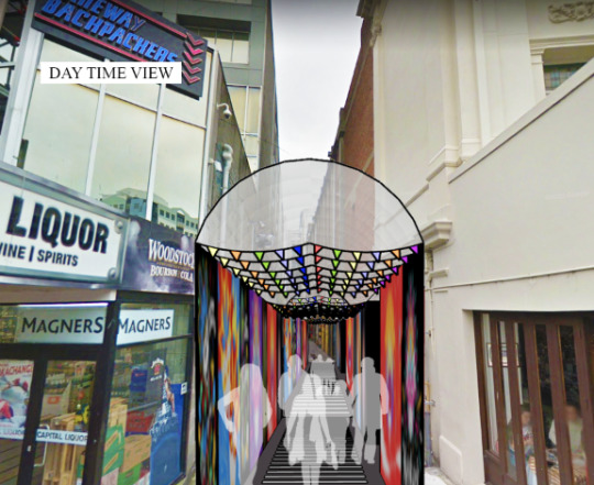
MIHIMIHI #3 - Masskara Festival
My third Mihimihi is inspired by the Masskara festival which happens in my hometown in the Philippines. The festival happens once a year on the third week of October and its purpose is “to throw away any sadness and grief” that happened in the city in the early 80′s. Mass = crowd and cara in Spanish means mask or many faces, hence the name Masskara. The festival happens on the main road and performers are dressed in colorful outfits with many different textures, eg. sequences, feathers, beads, etc. They also wear smiling masks which range in sizes, and are also decorated in many different textures and colors. Music plays during the festival while the performers dance
In my site I wanted to make it feel like the people walking through were at the festival. I decided on a curved glass roof so people can be sheltered from the weather but can still see the sky. I have incorporated the bright and colorful atmosphere onto the walls and buntings hanging below the roof. I would like to get filipinos artist such as KooKoo Ramos, Gerilya and Tripp63 who are know for grafiti/street art to decorate the walls. The ground of the site will also imitate a pedestrian crossing to mirror the festival happening on a street. There will also be music playing in the background just enough for people to hear when walking but not to loud. Random people can also play their own music and there is a stage and seats for people to watch or just hangout.
0 notes
Photo


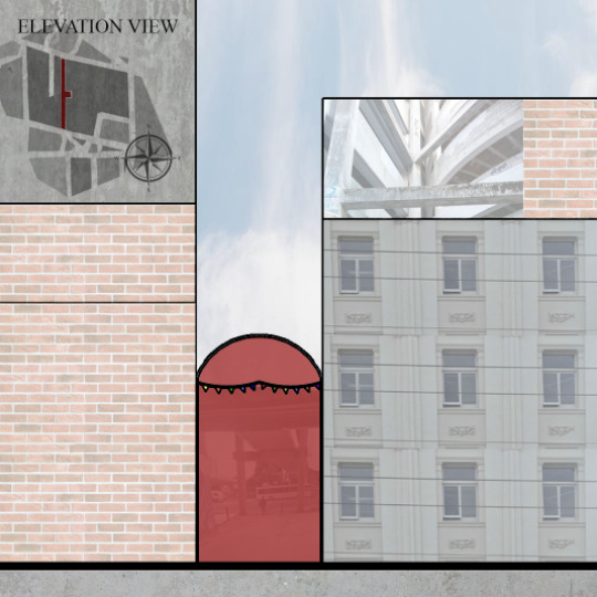
WEEK 5
Plan, Elevation, Section, Perspective view of Mihimihi #3 - Masskara
Used a mixture of white and black silhouettes because some couldn’t be seen because of the backgrounnd.
0 notes
Video
tumblr
Video which Briar, Chelsea and myself took and edited during classtime.
0 notes

Photo


WEEK 4
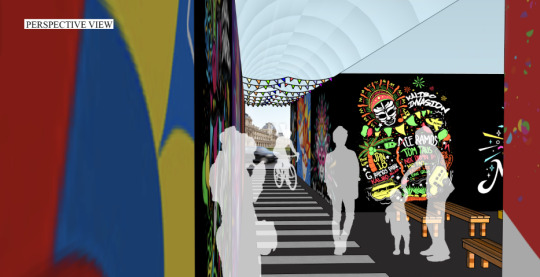
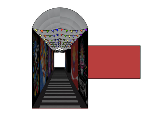
Mihimihi #3 - Masskara
Plan view, Perspective view, Elevation view, Section view
0 notes
Text
WEEK 4
Video Drawings
Outside environment time-lapse of the sun going down. Getting darker.
0 notes
Text
WEEK 4
Video Drawings
Video of the light changing in my room.
0 notes
Text
WEEK 4
Video Drawings
Time-lapse video of someone walking past. Only one person walked past because of lockdown.
0 notes
Text
WEEK 4
Video Drawing
Another video of the outside environment at home, because of lockdown. I like the different textures in the video and the colors at the start and it both suits my mihimihi #3 which is Masskara Festival.
0 notes
Text
WEEK 4
Video Drawings
Video of the outside environment and the sunlight hitting the camera.
0 notes
Photo


WEEK 4
5/5 Precedents: Ateliers Jean Nouvel - Louvre Abu Dhabi
The Louvre Abu Dhabi is designed by the Architect Ateliers Jean Nouvel and was completed in 2017. It is located in Abu Dhabi, United Arab Emirates and is 97,000 m2 and the dome is 180m in diameter. The meaning of Louvre is “a set of angled slats fixed or hung at regular intervals in a door, shutter, or screen to allow air or light to pass through.” This does just that with the dome. “It wishes to create a welcoming world serenely combining light and shadow, reflection and calm.” I think the white buildings underneath is a perfect pair to match the steel dome ceiling. To me it reminds me of clock work or the inner workings of machine which gives it a complex look contrasted with the simple white. The light shadows also give off a water/glass like reflection which further supports the calm and serene feeling the dome wants create.
“Jean Nouvel sought inspiration for the concept of Louvre Abu Dhabi in traditional Arabic architectural culture. Taking a contextual approach to the site, Nouvel designed Louvre Abu Dhabi as a ‘museum city’ in the sea. Its contrasting series of white buildings take inspiration from the medina and low-lying Arab settlements. In total, 55 individual buildings, including 23 galleries, make up this museum city. The façades of the buildings are made up of 3,900 panels of ultra-high performance fibre concrete (UHPC).”
“The dome consists of eight different layers: four outer layers clad in stainless steel and four inner layers clad in aluminium separated by a steel frame five metres high. The frame is made of 10,000 structural components pre-assembled into 85 super-sized elements, each weighing up to 50 tonnes.” [1]
[1] https://www.archdaily.com/883157/louvre-abu-dhabi-atelier-jean-nouvel
0 notes
Photo


WEEK 4
4/5 Precedents: Jeanne Gang - the Ford Calumet Environmental Center
This architectural space “Ford Calumet Environmental Center” was designed by Jeanne Gang in 2008. It is located in Chicago, Illinois and is 28,000 square feet. This space conceives a new way to build which uses local, abundant materials and scrap only to demonstrate “the importance and coexistence of industry and ecology in Chicago’s Calumet region.” The model uses nest-making process and “the design for the Center is composed of materials collected from things abundant, nearby, and discarded: salvaged steel from the Calumet industrial region and other remnant, recyclable materials such as slag, glass bottles, bar stock, and rebar. In highlighting these materials and using them in new ways, the building demonstrates the sustainable principle of re-use.” This building “is an important resting stop for migratory birds” so it was important for the design to take into account the protections of birds “who cannot see transparent materials like glass and are often hurt or killed following interactions with non-bird-safe architecture.” The salvaged steel rebar on the south porch of the building resembles a nest like design which also protects the birds from striking to the transparent facade. This building also has many other environmental systems which helps it function whilst using minimal energy. It has solar panels, earth tubes to regulate air distribution, geothermal boreholes, and many more eco friendly aspects. It is nice to see designs which do not harm our environment (as much) and use sustainable ways to operate.
“On the north elevation, the building insulates against winter cold by employing solid walls with intermittent windows. Clad with reclaimed barrel wood, the walls have a linear texture that transitions to slats in front of windows to prevent bird strikes.” [1]
[1] https://studiogang.com/project/ford-calumet-environmental-center
0 notes
Photo
WEEK 4
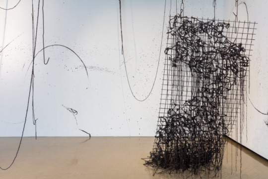
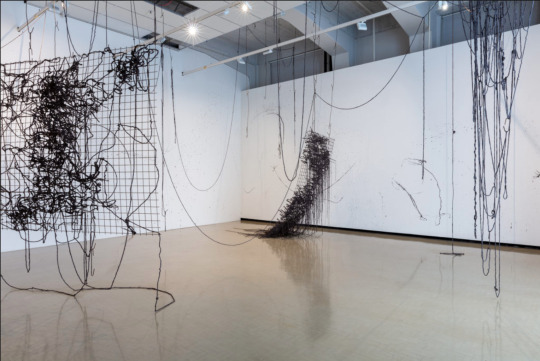
3/5 Precedents: Isabella Loudon - Platforms
This sculpture/installation called “Platforms” was displayed in the Wellington City Gallery. It is made by a fellow Wellingtonian and past student of Massey University, Isabella Loudoun. She graduated with a Fine Arts degree in 2016 and on her last year she found that she was very interested in concrete. I actually saw an ad about this on Instagram which intrigued me and I decided to go and see it in January this year. What drew me to it online was that it looks very simple and empty yet busy and complex. I thought that it was made of string or yarn of some sort but then in person it looked like metal and I wondered how she got it to bend like that. Turns out it was none of the above and it is actually made by twine soaked in concrete. The worker at the gallery when I went mention that she only had a week to complete all of this and it was made in that space in the gallery.
“Loudon says she was thinking of the extraterrestrial symbiotic that fuses with Peter Parker in Spider-Man 3 (2007). I was reminded more of the sci-fi special-effects sequence at the end of Lucy (2014), when Scarlett Johansson evolves into a similar morass of sticky black tentacles.
Loudon erratically wove her twine-concrete into three horizontally suspended metal-mesh grids. After it cured, the two largest grids were released from some of their hooks and gently lowered to the vertical. One met the floor and slouched, the other swung free. They suggested demented tapestries, scribble on graph paper, bad-hair days.
Loudon left up the hooks as clues to the process and added some finishing touches. Inspired by the suspended extension cords in her studio, she added lengthy drapes of twine-concrete to visually tie everything together. The walls were already splattered with concrete, but she added some big arcs by flicking lengths of wet twine-concrete onto them.” [1]
“Platforms is bold and aggressive, but also brittle, fragile, ready to crumble.” - Robert Leonard, Chief Curator at City Gallery Wellington.
[1] https://citygallery.org.nz/blog/isabella-loudon-concrete-mixer/
0 notes
Photo


WEEK 4
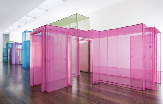
2/5 Precedents: Do Ho Suh - The Passage
This architectural installation created by Do Ho Suh was displayed Victoria Miro gallery in north London until March 2017. I found out about this through one of the exercises in class where we got into groups and had to research and compare two different sites. I really like the look of this installation as well as the meaning behind it. Dezeen says this installation “explores ideas about identity and migration.” The installation seems to be lifesized/to scale and each room represents a space the artist Do Ho Suh has lived in in throughout his life. I like how you are able to walk through and experience it from the inside and the use of the different, but vibrant colors. Do Ho Suh said "I see life as a passageway, with no fixed beginning or destination, ...We tend to focus on the destination all the time and forget about the in-between spaces." There are nine sections and the use of the color helps us see that clearer. I’m not sure why he picked these colors but they may have a symbolic meaning, like it might represent his emotional state at different stages of his life. The gallery said "To move through these delicately precise, weightless impressions is to experience a distinct emotional register, a sense of being in flux, crossing boundaries and moving between psychological states." For the artist, walking through this may trigger some memories of feelings he linked to the spaces and for anyone else walking through they might remember spaces they have lived in before and remember ‘inbetween’ spaces they may have forgotten about. I feel like it may almost feel like a time machine walking through it or one of those scenes in movies when they have a memory and walk around but in their current state. I can’t imagine how long this would have taken to make and the patience and precision that was needed. The installation is made out of translucent stitched panels of polyester which gives it a see through and a lite, delicate and airy feel. When I look at it in the photos I can’t help but think it looks like a cartoon or a water color sketch which has come to life. I feel that this installation is reall effective in a sense where it would make you feel like your are somewhere else mentally, which I feel like is what he partly was trying to achieve.
Pictures from Dezeen website: https://www.dezeen.com/2017/02/10/do-ho-suh-explores-identity-migration-colourful-connected-structures-installations-design-victoria-miro-gallery/
0 notes
Photo


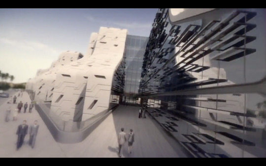


WEEK 4
1/5 Precedents: Zara Hadid Architects - Stone Towers https://youtu.be/Fo5tT2Rq-Y8
Overall I liked the video. The music was fast paced and upbeat and I feel like it fits the vibe of the site really well and matches the speed the shots were taken and cut. They used a little bit of descriptions during the video but i think it was purposeful to selling their design. They used it to explain what we could find in this site such as, shops and offices and their carpark, but also what inspired the design.
0 notes
Photo


WEEK 4
1/5 Precedents: Zara Hadid Architects - Stone Towers https://youtu.be/Fo5tT2Rq-Y8
This video was for the scheme called the Stone Towers for the Stone Park district of Cairo, Egypt which Zaha Hadid Architects unveiled. It starts off with an upbeat sound and continues throughout the whole video. We see in the beginning that it shows us the location of where this would be made through words and pictures. In this video I really liked how they showed us what it was inspired by. Since this scheme is in Eygpt the structure and the exterior of the building was in spired by nature and heritage. They showed this to us by comparing a tree trunk with the base of the building and was further enhanced in the video by putting an effect which swapped between the two making the comparison clearer. They also did that with the face/neck of the sphinx as well as hieroglyphics and how that inspired the shape/structure of the building annd the exterior designs. I also like how the had an angled top view of the whole scheme during the day at the start of the video and a night view at the end. What I didnt like too much was the weird angles the video was shot in. I would have wanted more shots at eye level as if we were walking through the site but instead it felt like we were on a magic carpet and flying through the different gaps and levels of the site. Maybe it was done like that to show the complexity of the design or focusing on the exterior of the building.
(more in the next post since i can only post 10 pictures at once)
0 notes