
Don't wanna be here? Send us removal request.
Statistics
We looked inside some of the posts by smitmb1 and here's what we found interesting.
Average Info
Notes Per Post
1
Likes Per Post
1
Reblog Per Post
0
Reply Per Post
0
Time Between Posts
5 days
Number of Posts By Type
Text
17
Last Seen Tumblr Blogs


Fun Fact
In 2020, 44% of users from Denmark used Tumblr daily.
Text
Reflection of Fundamentals
• What did you know about this process before you started?
before i started taking this course i only had a slight idea of how to use illustrator and InDesign. but i had a lot of knowledge in photoshop before. i didn't know the purpose of every software and the reason we use what one. so it was super helpful to now understand what we use what software for.
• What problems did you encounter?
throughout the course of taking this class, many challenges arised. mostly in class when i'm still working on the last step, while the next step is taught and then i get far behind. throughout the class i also had troubles when i made the smallest mistake on my computer then the next steps would not work.
• How did you solve these problems?
i would usually ask the person beside me in class or call on Alexia to help get me back on track. this was super helpful and explained really clearly.
• What did you learn during the process?
i have learnt so many skills to take away from this class. from basic vector lines (that i can now finally do much easily than before). then also with editing photos using the curves tool ( a tool i had seen lots before but never understood how to work it). then also into InDesign, as a place to put all the skills we learn and t create text and layout to export easily in the form we want.
• Who/what influenced your process and how?
my work was clearly influenced by my lecturer Toby, it helped as he demonstrated each and every task and repeated the steps til everyone had understood it easily. but i also enjoyed many of the lessons, gaining so many skills. therefore, i was motivated to learn more and practice what i had learnt.
• One thing I would like to improve on ...
layers, mask and selecting. we did this in week 5. this was one lesson i struggled to keep up on. i had used the masking tool before, but when we started to change the colour of the oranges in the fruit bowl, i got stuck behind and couldn't quite understand the whole concept in my mind. this wouldn't be a tool i would use often with what i'm passionate about in design. but i think it wold be handy to know because it is used quite often in photoshop.
• What did you enjoy most about this project/process and why?
my favourite part of our course was learning the InDesign content. one thing i always wanted to learn was the indesign software but it was too difficult on my own. so having the help was so helpful and motivating! i really enjoyed learning about wrapping the text around images, and about exporting it into mockups. these two things were questions i had for awhile and couldn't wait to learn.
• What resources did you use to investigate/complete this project?
for our final project of the children book, it was really helpful looking back through my own tumblr blog to remember basic shortcuts or steps to do things. when i forget, it is handy to have this blog to look back n and gain more understanding and be refreshed of my knowledge. it was as helpful having the lecturers nearby to ask questions when needed, so we could gain full understanding on our tasks.
overall, we used the three adobes softwares of Illustrator, Photoshop and InDesign to complete this course. i found it helpful paying for the adobe subscription so i have it on my laptop. therefore i can do it at home too. this was a perfect resource for me to do more work from home and keep gaining knowledge and understanding.
• What are the project / exercise’s strengths and weaknesses?
the strengths for me in this course was probably my efficiency in gaining understanding. i found that. was always finished earlier while steps were still being repeated (not with all though) but this meant i had more time to put more in my tumblr blog so i have more information to look back on. i could work on both my tumblr and the project at the same time throughout all classes.
weaknesses would defiantly be my skills in masks, in photoshop as i mentioned before. t was a bit struggle and took a very long time to fully understand as there was many steps to keep going back to.
• How would you use this process again?
i believe i would use many f the skills i've learnt in the rest of my study and hopefully my career afterward. i have already seen many of these skills and tools come in handy in my DT1 and DT2 classes and i am sure they will for the next semester too. the skills are all relevant.
• What were your goals for this project/exercise? Did they change?
my biggest goals were literally just to learn something new. i found that every lesson i learnt multiple new things, so this was defiantly achieved. the thing i looked most forward to was using InDeign, so it was defiantly a goal for me to just learn the basics of that software.
• What is the most important thing I learnt, personally?
At first i did not see why i would need shortcuts because it was just more to remember. but i know understand that after working away your fingers get sore and it is much easier when you don't need as much movement to each tool in the tool bar. this was a very important thing to learn because it has already made things so much easier. it also means i wont be searching under headings to find the tool i need if i know the shortcut.
• What most got in the way of my process?
motivation. although i loved this course, sometimes when other work piled up in other classes i had less motivation to do the work.
• How did I help others during this process? How did others help me? What was useful?
throughout the process of this class, the person next to me often needed help catching up o steps, so i would step in and give her a hand. this also helped me, because teaching someone else gets the understanding more in my mind by saying it aloud. so that was helpful for both me and the person next to me. this was super useful to remember more knowledge.
overall, this class was a super good foundation to design. i learnt plenty skills to take out into the wider area of design and careers too hopefully. the lecturers did n amazing job and really came alongside us to teach us well.
0 notes
Text
week 12
this was our final week of fundies, learning the software. today we did a bit on exporting in InDesign. we looked a little bit into RGB and CMYK. what these stand for and what we use what for. i had learnt a bit about this in DT1 and DT2 so i already had an idea of the use and what the colours combined in each one create.
today we exported our book as a PDF.
3mm bleed is always a good idea, because it means we aren't loosing any of the image but still getting the full size. we don't want a white edge going down the side of the page.
we also use crop marks to know where to cut the page, with the bleed on.


in the compression tab we can adjust how big the file is. we can also make it a high quality print which is what we want.

then we opened it with adobe acrobat.
we downloaded mockups for our book in photoshop and were able to add covers. it was all under smart objects so it created another file that when we save it, it will update the other tab of the mockup... see below.


i started off having a transparent background so i went back into indesign ad editted the actual cover. little did i know there was a shortcut for this that would save me so much time...

then we made spreads, it was the same idea and system to it...


from there we can add any background we want to.
learning this was super handy and helpful. i know know how to create mockups! throughout school in design, i always made it manually and edited the individual images.
shift + option + command + s (save as web) this means it can easily be uploaded. it saves as a gif.

here are the mockups of my whole book. (below) (because the mockup file was very small the quality is not very good)


0 notes
Text
childrens book


above are the pages of my book. for all my pages i used photoshop stylising to create the oil paint look on every image.
my vector drawings are shown in the little teapot page with the tea bag and the teapot. i also created a whole book cover with vector lines but it didn't end up matching my book so i got rid of it. this is the cover (below). it had the oil paint filter addd on top too.

in all my pages i used paragraph styles and character styles to keep my text the same throughout the whole book. this was super helpful and made it so much easier to create the body text and headings quickly.
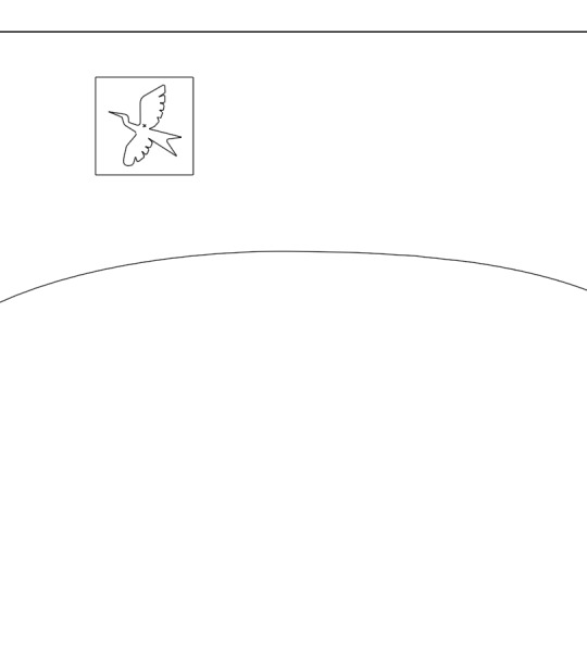
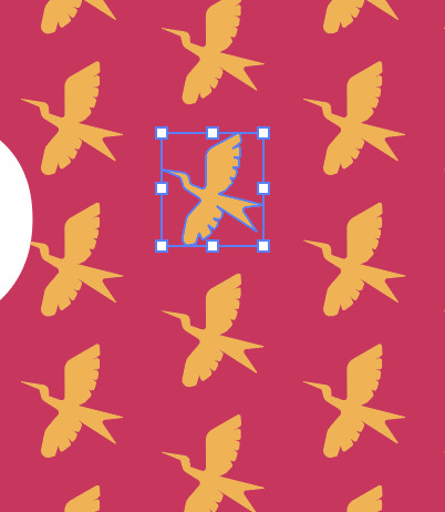
my end pages were done in illustrator to create a pattern, what we had learnt in class (week 11) mine is super simple but I'm happy with how it turned out.
0 notes
Text
week 11
end papers.
we started off in illustrator and set up an a4 document.
patterns: repeating behaviour, a collection of repeating things.
have everything on ayers so its easier to move things separately. sometimes when we select something it selects the wrong thing.
command + 2 (lock selection) option + command + 2 (unlock selection).
above shortcuts mean you don't need to have seperate layers and can work on items without moving the wrong things.
this shortcut took me awhile to wrap my head around, it didn't seem to do what i wanted. at this stage i don't see why that shortcut would be important since i find it difficult to use but i'm sure i will get used to it.
command = v (paste) shift + command + v (paste in place)
shift + x (swap fill and stroke)
we made a pattern using the pen tool, then we dragged it into the swatches palette and it created a swatch of the drawing.

in the above image you can see the swatch selected and how we used it in the shape we made.
when we go into outline mode (command + y) we can see that our original image shows the vector lines but our shape doesn't. this is because it was interested just as a graphic.

by double clicking on the swatch we can easily adjust the placement and the entire swatch.
hold option and a move to make a copy of something.
WHEN SCALING shift: constrain. option: to/from centre
Tools i found very helpful and will be useful is copying an image in place (command + c, Shift + command + v). i also found adjust the shape centured super helpful. (shift + option then scale).


we did the same thing with our new swatch, but because it was hexagons there was Diamond shapes in between and it didn't sit well. we then changed this by double clicking the swatch and change the type to hex by row. this made it stack (above).
object - expand (convert pattern to editable objects) now you can adjust every single part of the pattern (below)


type - create outlines. this allows us to edit the text as if it were a shape or vector line.
0 notes
Text
week 10
putting it all together in In Design. learning parent pages and column grids.
(shortcut) w = toggles preview.
if facing ages is checked it will make the pages like a book. with the box unchecked it will be singular pages on their own.
open pages window to add more pages to document.
when changing text size hold down shift to make the size jump up in 10s. click off text box and onto selection tool. then hold shift and command to scale.
remember: SHIFT + COMMAND for scaling.
shift + option + drag item (this will make another copy of your item and you just drag it to where you want it).
point of parent page make it easier to change things, if you want to change a header at the top of the book on every page, you can simply do it in the parent page instead of doing it all manually page by page.

drag the none to all the pages you don't want the A parent page to apply to. it will get rid of any of the placed items on the page.
pressing command + A on a text will select all.
to create page numbers, add text to the parent page then go into type, markers and insert current page number while the text is selected.

have two sets of parent pages for numbers if you have some pages with photos where you cant see the page number. ten you can have one with white numbers and one with black.
you can adjust two groups of text at a time while selecting them both on V then going into T and adjusting the size in the top bar.

to change margins, make sure both parent pages are selected. then under layout, margins and columns we can change it. if the link has a cross through it, to change the different sides individually. without the cross through all side change together.

you can also change the guides for columns under that same setting too.

when this red cross comes up in text box, it means that there is text that doesn't fit in the box. you can click on the red cross and drag out a text box of the size you want so there is no text not seen.
that was all we learnt in class today, I now have a whole book to make.
overall today was pretty simple, i already knew a few things fromDT1 graphic design but it was a good refresher.
0 notes
Text
week 9
today we started in InDesign. this adobe app is where we bring everything together from illustrator, photoshop or word. it is where we join all our work to produce a magazine, book, poster etc.
same shortcuts for zoom (command Z) for move (command space) and for direct selection and selection tool (A or V).
to exit text editing mode into selection tool, click outside of text box then command v.
universal select tool in ext box command A. or hold down shift while you click in places. it will add to the selection with each click.
click W to show preview mode. no lines.

learning paragraph styles... this means that we can easily select the style of text we want to use for our roject. it can mamke it much quicker to create the same body text, subheadings and titles.

we also adjusted the space before and space after to make the body text headings apart of their paragraph.
this was a simple but super helpful tool to learn. will make future projects so much easier!
with the paragraph styles you cant just change a word alone. that is why we also learnt character styles. this means we can change one singular word or one typeface even.

we can also adjust the specifc style of font under basic character formats when we make a new character style.
we can turn off hyphenations under paragraph style for body text by double clicking on it. this will make a more right rag but less with no hyphenations.
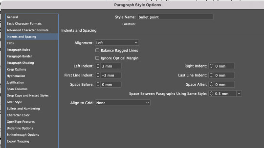
then we added bullet points. we had to change a few settings for this. we created a new paragraph style from the body text. we changed the left indents to make the writing not so far away from the bullet point. we also changed the space between the rows of bullet points so show that they were separated instead of one paragraph.


adding images to document. to put an image in indesign we need to not drag the image otherwise it wont save the image in it. it will be embedded. instead we should place the image. under file-place.
we can draw on the image in photoshop or make any adjustments then it will come up with an orange triangle which means the image needs updating.
moving an image. don't just use the corners to move in. it will crop the image. hold shift and command to scale an image to the size you want.
to wrap text around te image there is a bar up the the top (screen grabs below)

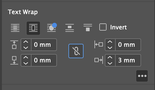
adjust the text wrap to make it fit seamlessly around the image. above. to get those options you need to be under windows-properties and then click the three dots under text wrap.
changing the shape of frame. get elipse tool and make circle around frog in this case. then once its centred click command X. then a circle outline will appear. from there click on the circle then right click then select 'paste into'. it should make the frog appear in the circle.
from there we can wrap text around object shape and move to where we want it upping the mm distance if needed.


that was everything we learnt today. it was super helpful and i learnt heaps of things i had questions about before so that was good. it will help heaps with my graphic design book project too.
i didn't struggle to keep up today in class which was nice but some things like the command x and deleting other frames took a little bit to wrap my head around.
overall stoked with what i learnt from todays lesson. heaps of useful tools!
0 notes
Text
week 8 part two
this was the second image i created. i started off in procreate drawing the outlines and adding handles where i thought i would need them.


i chose this image as it was more of a step up from the last image. not as many repetitive things involved. using different shapes too.
from there i went in illustrator and created the image. it was alot easier than i thought as im getting used tot he tools and creating anchors and handles more better.
this was the final image on the left, and the original i used for inspiration that i copied on the right.

now looking at these images side by side, i could have added in another handle in the hair at the back of the head to create more of a wave like the original. other than that i am really happy with how the image turned out. below are my handles shown.

i worked in a way that i could just create boxes on layers more under to make the process easier and more efficient.
my handles do not line up completely with what i envisioned but i think i am still learning what the handles will look like and i need more practice on learning handles and anchors.
0 notes
Text
week 8 part 1
today was just a day to spend more time on our own and creating two images on illustrator. we were instructed to document the process of every step.
we learnt a quicker way to take screenshots. (select, object, direct selection). also to get rid of points when points won't join together. (select, object, stray points).
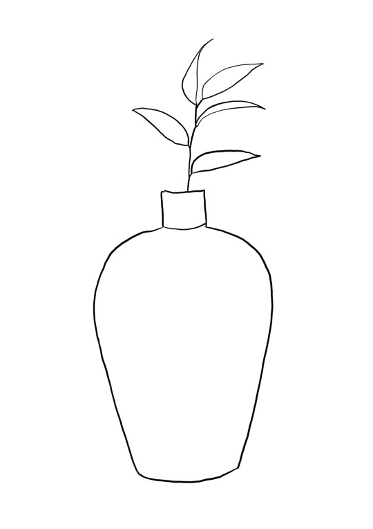
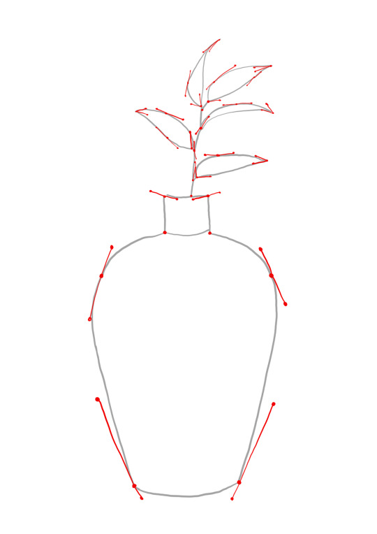
I started off with this drawing of a plant in a pot. I got an image of Pinterest and used a portion of the image. once I had the drawing on procreate I drew up where I would need to put all the handles. this was all an estimate and I was not 100% sure so I will see how it goes in illustrator.

this was my first attempt. as you can see it is not at all like t˙e handles I drew. I think I will try this again but only draw half of the pot and then use the reflect tool to make both sides symmetrical.

this was my second attempt. although it does not line up as well I like this shape and will continue with the drawing. it worked so much better using the reflect tool because I was able to make both sides exactly the same.


to make the leaves and the stem I ended up using a new tool. I used the width tool on a stroke to make the one appear thicker in certain points. then once I made a shape like a stem I make the stroke into the outline path with the tool under the heading object. from there I used the clipping mask wth the leaf and the stem then with the direct selection tool on I was able to make the stem flow into the leaf by creating more rounded corners.
when I looked at the hands and anchor points it began to look a bit hectic. this was because of the tool I used. but if those points were al there it would look more similar to my original sketch. you can see what I mean below...

overall I am happy with my first drawing but I think I can definitely choose something more challenging for myself. I learnt new skills today more specific to what I was drawing to make things easier.
these are the tools I used...
reflect tool (for the pot to make both sides even)
width tool (to make the thickness and range of thickness in the stem)
object outline tool (to turn the stroke into a shape)
colour dropper tool (for making all leaves and stems the same colour.
clipping mask (to join a stem to a leaf to the go ahead and make them seamlessly fit together)
along with these tools I also used the basic pen too to create all my shapes in this image.
0 notes
Text
week 6 catch up
I was absent week 6 due to sickness so week 7 is all about catching up. this lesson i played around with skills i had learnt since there was no lesson recording and i have no guidance. so this is what I did and achieved.

this is the image we are working on today. we are using both illustrator and photoshop brought together. practicing the masking and selection tools.

i started by using the pen tool to create the shape of the man. then i turned it into a selection. so now it is seperate from the background.

i played around with putting the man on different backgrounds. to put into practice those skills i learnt in week 5 for photoshop.

i then removed the man from the background and spot healed places to make it look more natural.

with the old man gone in the image i added a new person and used the magic eraser tool to get rid of the background he had (trying out new tools). i then changed the opacity and the colour balance so it blended with the image more.
from there i was unsure what to do next without any guidance. i needed to use illustrator in my work somehow too, not just photoshop.

I then used vector lines on illustrator to make shapes and more graffiti on the wall behind the man. but i changed the opacity to make the image more blended and not as harsh.
0 notes
Text
week 5 homework
my homework this week was to create an image out of two images... a background and a subject. i did this using the tools i learnt in the last lesson. having learnt how to do it in the bird photo from Friday, i was able to do this easily. i just looked back at my notes for reminders.
the photo of the person was originally not very sharp so the end result is not as good as it could have been.


0 notes
Text
week 5
this week we were looking at photoshop again. we started with some basic shortcuts. we played around with layers, brushes, erasers and opacity to create artworks. this was just to get our head around the basic tools and shortcuts regarding these tools.
these images below show the use of these tools. the first image is just using one layer but experimenting with the brushes and erasers with different opacities. the second image shows multiple layers while using the same tools.
And the third image shows the use of the marquee selection tool. we created selections and then click (v) to move the selection over the page, which was a new tool i did not know! from there we could also use the transform tool (command T) to scale, position and rotate the selection we had made. i already had previous experience with the transform tool so i knew how to use it. (i always make the mistake on adobe illustration by clicking command T to transform something when it is not needed) kind of frustrating how there is a difference between adobe apps with the tools, it can be quite confusing!


from there we got into masking real images. we started off with the steam boat (first image) and added another boat to the back and used the swapping background eraser tool (x) to get the mask as close to the boat as we could to bled in with the background better.

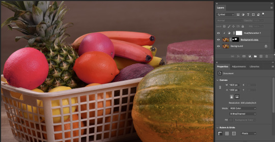
after this we did a fruit bowl image. we used the ellipitical marquee tool and also learnt how to add to selections and reduce selections. this was pretty simple to get my head around. but then when we started using the keys (option + delete) i got a bit behind and made simple mistakes but i got there in the end. that was a bit more to wrap my head around! (shown in second and third image) the last image also shows the mask layers.


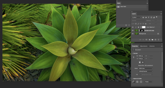
then we used the pen tool to make a selection around leaves in a plant. this involved using the skills we learnt in adobe illustrator about vector lines and with handles and anchors. (first image shows the pen tool outlining the leaves. i maybe could have gotten away with less anchor points but im still getting the hang of it. we also had to use the option key alot to create the pointy shapes but for me its getting easier to do, unlike a few weeks ago when i was struggling with that. then we used the colour balance tool and changed the colour by taking the same steps. (we did click on the hamburger icon on the paths palette then clicked make selection before we started to change the colour balance).

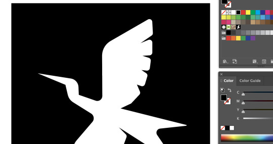
the last thing we did was put a bird on a different background. we started by using the object selection tool ad got the outline of the bird then we went back in with the pen tool to get a finer outline of the bird and its wings. then we used the blur tool to make it look like there was movement in the birds wings. we also added a darker background colour to the bird image in a new layer so the bird blends in. then we edited around wit the brush tool and then moved onto the new background!


that was the end of the lesson... above are my notes from class today.
1 note
·
View note
Text
homework week 4
image one (black and white) this image was way too dark so I just wanted to lighten it up. I just used the curve palette for this one. and made the image have more contrast and be darker.


this next image had the same problem so I did the exact same steps to make it show the blacks in the image


this coloured image was too dark, but there was a pretty sunset in the background and I still wanted that to be seen, so I lightened the image up taking away the black in the curves palette. then I used the saturation to add more colour to the image.


this last. image was overexposed but also was very blue. I wanted to be able to see the persons face more but also not let her face go blue swell. so I used the colour balance tool as well as the others to add more red tones to the skin instead of more cyan.


0 notes
Text
Week 4
Today we started on the photoshop software. I had previously had some knowledge in this app as I used it all through college. But today was all new stuff to me.
We started with curves and learnt about adjusting images to lower the contrast or heighten the contrast… depending on the image. I liked this skill, I had always seen it when I am editing photos I have taken, or when my dad (photographer) edits his photographs. So it is good to actually understand how it works and not just how it looks.
we started with this image below. it was underexposed and needed some darker shades in it.


thus image below was too dark and needed the lighter tones added in... so we did the opposite thing.


we did the same thing with an image of a cat. this image was in colour but it still had the same concept. the image was too dark overall so we brought out the white tints in the image with the curves tool.


Next up we looked at Hue/ Saturation. With the three concepts: Hue, Saturation and brightness. With what we were doing today with the image below we really only needed to adjust the saturation and not add tints to the overall image. We just wanted to bring out more of the original colours.


We also looked at colour balance and being out colours that are missing in an image. This is a good skill to use as when an image is too warm and orange or too blue and cold we can adjust it to make it more neat trail or towards the colours we want. On the colour balance palette, it shows three sliders with the colours in contrast to each other (opposite on the colour wheel).
this image below we just played around and made it look how we wanted with the new skill we learnt. i added some green tones to look more retro.


this image below was far too green. by using the colour balance tool we were able to bring more magenta into the image which is the contrast of green.


the image below was too orange. i used the colour balance tool to bring out the blue and green tones, i look more yellow away from the image.


below is my notes I took from the class:


0 notes
Text
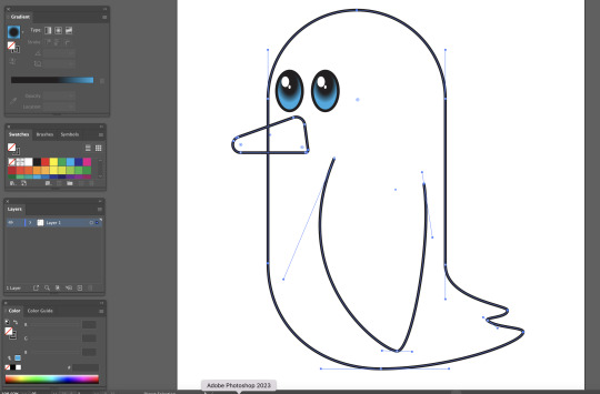
week 3
In today lesson, we created our first image using all the tools we had learnt plus plenty more. I recorded a bunch of notes I have left below.
I found this lesson extremely helpful as we were taught everything step by step and were able to go back steps till we were all there.
there was a heap of shortcuts we have learnt over the past few weeks and it can be difficult to remember them all, but today I managed to keep up with the shortcuts better than before... starting to get the hang of it!
here are my notes from this morning I wrote down:


here are my penguin images and a few steps...


0 notes
Text
week 2 homework
I got given an image to make on illustrator by a partner in class. we did this to put into practice the curve pen tool we had learnt.
I didn't receive an image from my partner for awhile so I started to do my own (scenic image below). I then got sent one to make (butterfly)
shown below are my drawings, and then my creations on illustrator.


I found this exercise good to practice and remind myself of the tools and shortcuts I had learnt.
0 notes
Text
week 2
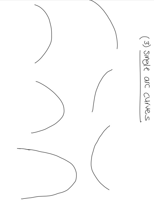
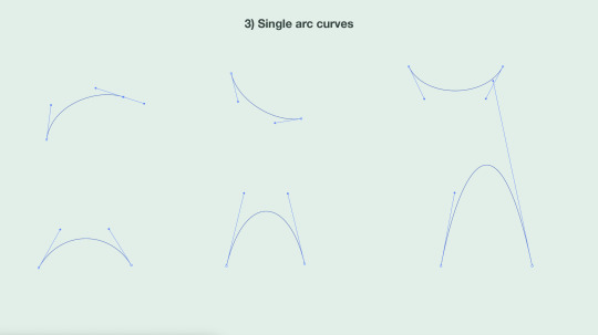
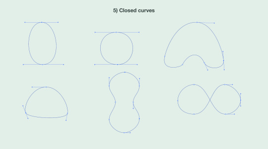
This week we began to look at curved lines on Adobe Illustrator. We learnt about handles and anchors. Handles control the curve and anchors are the two points which make a line.
It was super difficult at first to try, but towards the end of the lesson I had gotten the hang of it. At first I was using the wrong tool (the curvature tool instead of the pen tool) I was wondering why it was so simple. Once I got the right tool I struggled at first to understand how to use it. With direction, i got the general idea and then was on a roll!
towards the end of the lesson we learnt four different types of points.
corner point
curve point
hybrid point
broken point
This was a lot of information to take in. I wrote a bunch of notes on how to make these points in steps which helped me understand it better. When i make these points i have to really concentrate before I click anything or make a point or handle, but with practice I will get better.


0 notes
Text
Week 1 (part two)
Link below are my drawings by hand from the straight line exercise. I found this difficult as I am not the best drawer, that is why I really appreciated illustrator and how simple it made it for me.


0 notes