
Don't wanna be here? Send us removal request.
Statistics
We looked inside some of the posts by smm-utd-blog and here's what we found interesting.
Average Info
Notes Per Post
1
Likes Per Post
1
Reblog Per Post
0
Reply Per Post
0
Time Between Posts
7 days
Number of Posts By Type
Photo
11
Text
2
Last Seen Tumblr Blogs


Fun Fact
In Q3 of 2020, 31% of US users access the Tumblr app daily.
Text
Blog Post 3: Jenny Holzer
I enjoyed reading this article about the artist Jenny Holzer because it was interesting to look at the evolution of her art, and understand her background, schooling, and cultural environment. I admired her decisions to keep transferring to different art programs until she found one that she was satisfied with.
I thought that her Dia exhibit “Laments”, which expanded on her earlier work, must have been an amazing experience, and her way of instantly changing the tone and emotions throughout her exhibit creates a disorients the audience and forces them to contemplate our history on earth and what we have made of it.
0 notes
Photo
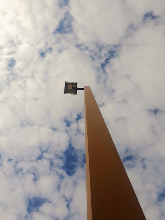
(Photo 10) The last photo in this assignment, this photo plays with perspective in that the photo guide the eye through different depths until it reaches the top of the lamp. By starting the photo frame at the base of the lamp, and having the top of it centered, this photo makes the lamp stretch and seem longer than it actually is. Placed against a cloud filled sky, the lamp breaks a soothing pattern of white and blue and brings focus to an otherwise repetitive environment. #1301frame
0 notes
Photo

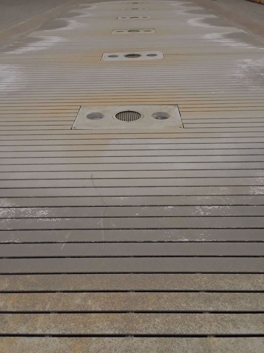
(Photo 9) This photo employs a tightly focused perspective to find symmetry balance. The proportions in this photo are very close to equal with the jet of water in the center and with no side having greater importance than the other. #1301frame
0 notes
Photo
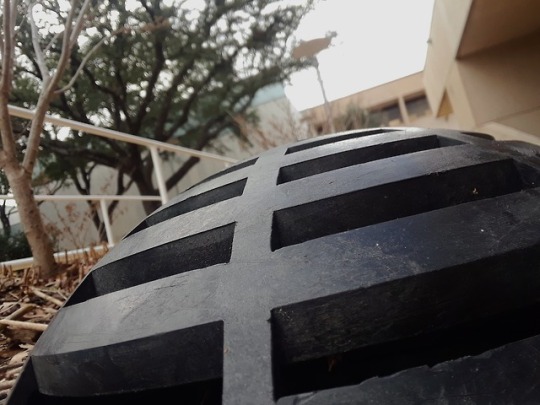
(Photo 8) Yet another photo with a pattern as its main focus, the slanted viewpoint of this frame prevents the photo from becoming yet another study in symmetry and geometric patterns. Instead, this close-up of the object at a slant makes the object itself seem more dynamic and interesting that a straight shot photo would. The focus is tightly kept on the object of interest, and this is accomplished by blurring out the background so that the viewer focuses on what is right in front of them. #1301frame
0 notes
Photo
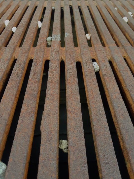
(Photo 7) In a similar vein to photo 5, this photo also uses the geometric symmetry present in a grate to give the view a sense that the pattern continues far beyond the photo. However, unlike photo 5, this photo’s symmetry is broken by the rocks lodged in the grate. This serves to break up what would otherwise be a uniform and monotonous photo and give it a more interesting texture.
0 notes
Photo
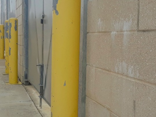
(Photo 6) This photo also plays with perspective in that the yellow bars are positioned so that they look as though they keep continuing outside of the camera frame. The first bar stretches across the frame to draw the viewer’s eye directly to it. They may not know exactly what it is until they look to the left and understand that this is one of many bars in a pattern.
0 notes
Photo
(Photo 5) The next idea that I wanted to explore in this assignment was that of symmetry and of depth perception. The framing of this photo cuts off the natural sides of the fountain making it seem as though it is stretching out far beyond what the camera captured. The geometric symmetry of this photo was also interesting to me because almost everything in this photo-- the horizontal stripes, the fountain lights, and the water patterns on the side-- are symmetrical and help the photo look uniform. #1301frame
0 notes
Photo

(Photo 4) The last photo in this collection to use a flipped perspective, this photo also experiments with asymmetry and depth perspective. The photo was flipped so that until the viewer sees the railing in the lower half of the photo, it would be easy to assume that they were looking at the ceiling of a building. The board sticking out of the right side of the frame abruptly cuts off what would otherwise be a symmetrical photo which I thought an interesting imperfection. The narrowness of this photo was created by using the walls on either side of the ledge as a natural frame, drawing the eyes down towards the lower center. The contrasting pattern of the brick wall with the concrete also helps to guide the viewer down the center of the photo and bring them to the realization of exactly what they are looking at. #1301frame
0 notes
Photo
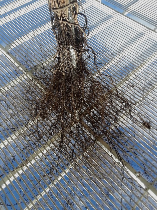
(Photo 3) This photo is interesting in the way its subject is presented. The framing makes it clear that this is a photo pointing towards the sky, but the subject itself, the collection of vines, mimics the roots of a tree stretching out into the sky. The dual perspectives in this photo come together to offer competing views of what a viewer might first see. The framing intentionally cuts off the rest of the environment to prevent the viewer from easily understanding what they are looking at. #1301frame
0 notes
Photo
(Photo 2) Continuing with the the theme of flipped perspective, this photo was included because of the way it seems normal at first glance. However, upon closer inspection of the background, it becomes evident that there is something off about the photo that the viewer must then decipher. #1301frame
0 notes
Photo
(Photo 1) One of the first photos I took for this project, I included this in my final post because of the way the frame’s perspective is flipped. What’s real and what’s a reflection is somewhat difficult to determine at first glance and sets up one of my themes for this project that is revisited in later photos. #1301frame
0 notes
Text
Art for the Sake of Art
I thought that it was very interesting in the way that Modernism emerged. Prior to reading this critique, I had thought that Modernism emerged in the early 1900s. However, learning that Modernism began in Europe during the Enlightenment (1687 to 1789) was a shock. However, as Barnett explained the evolution of modernism, it became clear that “Art for the sake of Art” could not have happened before the Enlightenment, and did begin during it. Prior to the late 1600s, patronage to wealthy individuals, the constraints of the church and other religious organizations would have prevented the freedom of expression that is the hallmark of Modernism. I also think it interesting that upon becoming freed from these restrictions, artists lashed out and rebelled in their work against what had previously been the status quo. I also had not heard of formalism before reading this article, and was surprised at how an art theory could reject the artist’s original intention in a work of art. By only viewing the piece at face value wouldn’t the message that the artist wanted to communicate be lost? However, the reasoning behind Formalism, is very interesting and I do think that in divorcing “significant form” from “social or ideological function” does make for a completely different viewing of a piece of work.
1 note
·
View note