
Statistics
We looked inside some of the posts by snailss-u1 and here's what we found interesting.
Average Info
Notes Per Post
5
Likes Per Post
5
Reblog Per Post
0
Reply Per Post
0
Time Between Posts
4 minutes
Number of Posts By Type
Text
17
Last Seen Tumblr Blogs


Fun Fact
Tumblr’s reach among the 26-to-35-year-olds in the US is 11%.
Text


Gifs finished! I wanted to mix renaissance and Medieval due to the mixed inspirations. These took far longer than I expected, and there's definitely room for improvement but for 2nd try I feel it went quite well. If it wasn't for time constraints, I think there are changes I would of attempted, but it felt like I hit a roadblock in terms of ways to improve it.
5 notes
·
View notes
Text


Final design boards complete and glued down! I alternated with card between red/blue/green to match with the design themes, and utilised print outs of Renaissance paintings to fill in the back. I was tempted to add a pen drawn tree and flora to the white spaces, but I was encouraged to allow the empty space stay. I’m not usually a minimalistic person, so it was quite difficult having so much open space unused- but I’m really happy with the results.
0 notes
Text


Some design board attempts! Got my tutor to check them through, and she’s ultimately happy with how it’s going so she’s left me to decide. I don’t want these too cluttered so I’m going to try aim for a more scattered minimalist style so it doesn’t take away from the designs too much and gives some more variety. The Sheffield portfolio workshop helped with some great examples and has definitely inspired me in ways that I could change things up.
0 notes
Text
Final paint for my final designs! Not my proudest, I should of gone with a darker red and perhaps avoided blonde. Feels too 80s, and not as regal as my initial hopes.
0 notes
Text
This is where things get more difficult- I wish I went with red instead of blue, the blue was suppose to be more of a highlight as it would be white but I wanted to follow the 3 main colour theme. The hair was a mistake, I should of gone with another dark brown but I wanted some more change through hair colours- just didn’t quite work as well for this.
0 notes
Text
4th of paints! It feels like this one lacks a lot of colour, but it’s my fault for removing the underskirt which held the most colour in the initial designs. I changed this one to green, which I’m really happy with.
0 notes
Text
3rd of my paints! Not much to say that isn’t along the lines of the others. Results are good enough for me, and I’m happy with how they’re coming out.
0 notes
Text
2nd of my paints! The hardest part has been skin tones and hair colours so far, but I’m happy with how these have been coming out. Aside from size, I’m wanting a good diversity range in skin with my designs.
0 notes
Text
Started the painting process on my final designs!! I wanted to go with the colour theme of red > blue > green, and I’m ultimately really happy with how this one came out- perhaps I should of gone darker with the red, but otherwise it’s definitely my favourite out of the results.
0 notes
Text

Press release done and dusted! Under the crop are two alternate layouts, there wasn't too much to say about the process or writing, it went pretty quickly and I'm developing good bluffing skills for explaining and presenting things. I wanted to get across how my designs are, as well as selling the civic- though it feels pretty much like a fancier duplicate of my customer profile.


0 notes
Text
More lining! I started taking far more videos as my gifs are coming up, and I need as much media to work with as i can to make the job 10x easier.
0 notes
Text
Lining my designs so I have a copy without any sketchy-ness in the background, basically just so I can prep them for photocopying ready for media experimentation. My lightboard's started having issues, but luckily it survived the full process. :,)
0 notes
Text

Design 1 was a full-length dress using the window design for a bodice design- I wanted to give it flares from the start if i had to modernise it, and my tutor encouraged the possibility to show some hip with it with maybe low-rise jeans- an attempt but wasn't personally a fan. Another student helped me delve into the possibility of style lines up the front following down into splits in the flares, which ended up being the final product- I'm really grateful for their input, it's helped massively with sensualising my designs.

Design 2 was a favourite of mine, giving a thick winter theme, though to show more skin it would have been best to remove the sleeves too for a more airy, summery look to mix well with the skirt change. I turned it into a side slit with a lace up and shield for decor above. I also lowered the neckline to show more skin, which removed a bit of empty space and filed up the garment more.

Design 3 was a fun one, but there's still aspects I'll definitely miss from the original design. The window didn't work at all and adding a more plunging neckline and more lines definitely fixed it, and I added splits up both sides to show a lot of bare thighs to try keep the long regal skirt yet sensualise it in an uncommon way. I wasn't too happy with the face and hair given, but overall, still appreciate the outcome and developement.

Design 4 is my child, my love, it was a mashup of design 2 and held heavy inspiration to a game I have started playing recently. I wanted to keep as much as I could, so I settled for a plunging neckline to show cleavage and the same splits for thighs as the prior design. I contemplated removing the grate behind, but it would remove the whole point of it. Very happy with the results, from original to finalised.

Design 5 wasn't planned to be finalised, i removed the underskirt entirely and changed the side layer into the skirt itself and used design 2's skirt as inspiration for the lace. It holds the draped shoulders and corset, though I removed the turtleneck and netting just as it held no real importance. Simple, but an improvement. Not sure how I feel overall, not a bad design but nothing unique in my opinion.

Design 6 was another not originally planned to be finalised, there wasn't many changes i could imagine making outside of shortening it to mid-thigh and lowering the neckline to show more skin. I wasn't sure between red and black or white and black, but overall, it feels like a solid design. Not entirely sure for execution should it be made, though likely lots of wiring and interfacing- same as design 4. Tudor houses are great, would die to live in one 10/10.
0 notes
Text


Finalising designs! It was a fight, I was stubborn to the idea of changing my designs too much due to preferring modesty and the medieval look, but that isn't the goal for this unit therefore it had to be done. I will post next all pages and changes in more detail, but overall, the differences have been to sexualise and sensualise my designs far more. Thighs, Cleavage, and an odd pair of flares so far. I manged to work in a face that I preferred that follows the theme far more and upsized my designs ready for paint. I'm actually really happy with how most of these came out, but once again I will go into further detail for each individual design/change in the next post.

0 notes
Text
0 notes
Text
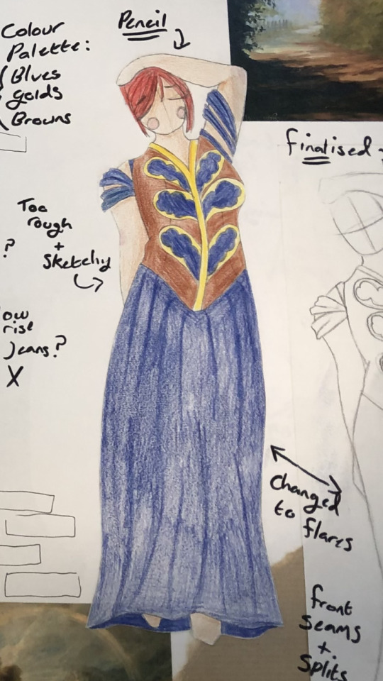
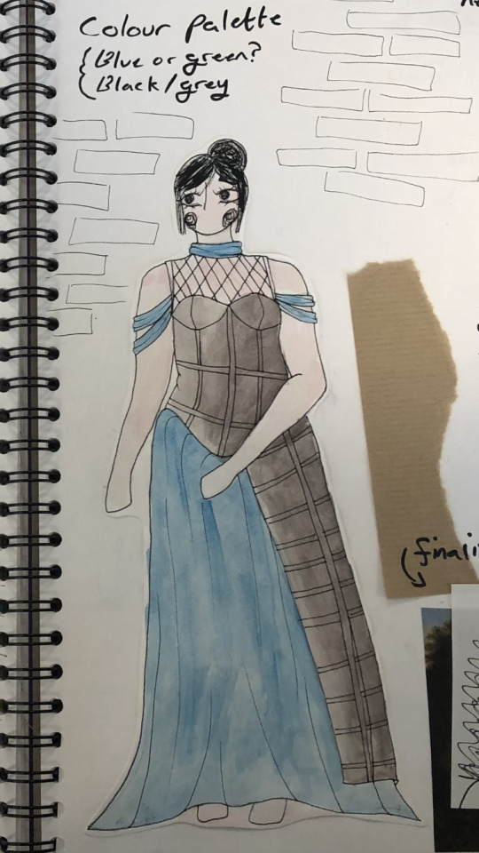
Pencil and watercolour! Pencil can have such a pretty outcome, but on A3 sized things it can be incredibly time consuming to get rid of all white spots and smooth it out- I also tend to get wrist pains from using pencil too much for block colouring which just doesn’t help. If it wasn’t for these, I’d definitely pick pencil as one of my chosen media for final designs but ultimately went for comfort. Watercolour was another quick one to mess with colours and concepts, I’m not sure about sticking with blue but ultimately it gets the point across and o have ideas on where to further try alter it as I think I’ll use this as one of my final designs. Not sure yet :,)
0 notes

