
sneezysketches
Diesneezy
Robyn, 21, HND Printmaking
33 posts
Don't wanna be here? Send us removal request.
Last Seen Blogs

bmhbengkulu
Lembaga Amil Zakat Nasional Perwakilan Bengkulu

jrmonde-blog
Untitled

go50shadesofdaz-blog
Untitled
askthewanderingpirate
Miu The Wandering Pirate

lostgifs
lost gifs
Text


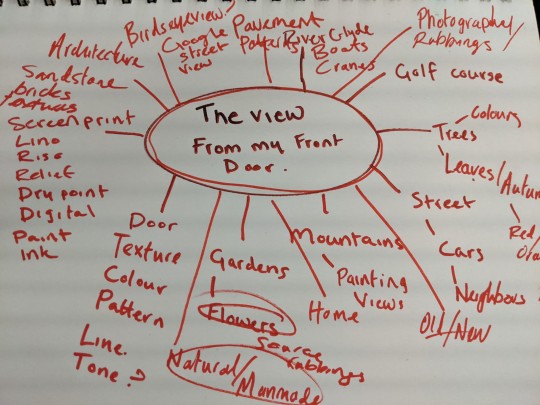
I created many different edits while completing this assignment. I done this because it was an easy way to come up with compositions at home which was accessible to me. I used Canva and ProCreate. Doing this helped me come up with the most effective way to layer and combine elements into an idea for my final print. Although I liked these edits with the circular shape to add a pop of colour, I preferred the more organic lines and leaf silhouettes I chose to use. I felt they added to the idea of my project stemming from man made vs. natural inspirations.
3 notes
·
View notes
Text
Statement of Intent
The brief given to me was that I must explore my ‘Beauty in the Mundane’. I interpreted this to mean finding objects/subject matters that I normally overlook in my everyday life. Current global circumstances dictate that most people are spending a lot of time at home - myself included. I intend to centre my project around the idea of the view from my front door because it is something that is safe and accessible for me to collect source material from. I will focus on collecting source materials such as texture rubbings and photographs, focusing on man-made and natural surroundings. The brief includes that I must develop a concept that I will then submit as 2 identical multi-layered prints that contain a minimum of 2 colours. I must also submit a finished Zine that showcases developmental processes. I feel my only major limitation in completing this project will be a lack of access to studio space, this means I will have to adapt to working on a smaller scale than I am used to. I don’t, however, feel this is a huge setback and I am looking forward to producing experimental work.
0 notes
Text
The View From My Front Door - Evaluation
For this project I was given the brief of ‘Beauty in the mundane’ however, I chose to narrow this down and instead work from the title ‘The view from my front door” as I felt this would be a fun challenge and force me to appreciate an area I had previously given no thought to.
I began by investigating the different tones, patterns and textures of different materials. I wanted to focus on man made aspects verses natural forms, such as the coarse brickwork surrounding the entrance, softer reliefs from leafs and foliage and various patterns from the pavement. All of these elements were used at different stages throughout my body of work.
I used the relief prints as background for mono printing, this was partially successful as I feel that mono prints are too unreliable and would not allow me the desired effect or the consistency I wanted. They tend to come out too messy to create identical prints which is what the unit required. I do feel that this pushed me to try other techniques, mainely digital as I had more control over the final outcomes.
While using Canva and Procreate I solidified my choice in colour scheme being black, white and red. These colours are reminiscent of the autumnal colour scheme which was present at the beginning of the project as well as tying in to the surroundings I was focusing on, e.g. red front door,black pavement ect. I also think these colours are bold and they accentuate the linear aspects of my pieces.
For the shape aspect of these pieces I have incorporated red geometric patterns inspired by the path at my front door. They are located in the top right hand corner of some of my pieces, I also added an element of perspective inspired by cubist works by artists such as Pablo Picasso and Georges Braque. The geometric pattern was created digitally however the circular shapes directly opposite them were taken from an exercise I did at the start of the project drawing and painting around found objects which related to my theme. These particular shapes were created by tracing the outline of rocks found in my front garden with a paintbrush and Quink. An aspect of this work i am really pleased with is the three lines coming across the piece, they represent the yellow parking lines on my street however i have angled them to tie in to the direction of sun light. This tied in with the natural vs man mad theme i was going for and nicely balanced the piece.
Towards the end of the project I experimented briefly with a process called Risography. I had never used this technique before and although I enjoyed learning about the process I didn’t feel the resulting prints flowed with the rest of the body of work because the inks that were available to me did not accurately represent my colour pallet.
I am very pleased with the resulting final prints from this project. I screen printed both layers and finished by mounting them on red card for impact. I really enjoy the geometric linear part of the first layer juxtaposed with the botanical shapes in the lower half of the piece, I think this gives the print a nice variety of textures and pull the viewers eye across the page. For the second layer I digitally manipulated a one line drawing, I made opposite halves of each drawing negative because I think the heavy black areas balance out the print nicely. The only thing I am not completely satisfied with is the opacity of the black ink, in my digital explorations I had made the black transparent so that the botanicals underneath weren’t hidden. Overall I enjoy my final prints and if I were to have more time I would make sure I perfect the transparency of the ink.
1 note
·
View note
Text
Final Prints

I am very pleased with the resulting final prints from this project. I screen printed both layers and finished by mounting them on red card for impact. I really enjoy the geometric linear part of the first layer juxtaposed with the botanical shapes in the lower half of the piece, I think this gives the print a nice variety of textures and pull the viewers eye across the page. For the second layer I digitally manipulated a one line drawing, I made opposite halves of each drawing negative because I think the heavy black areas balance out the print nicely. The only thing I am not completely satisfied with is the opacity of the black ink, in my digital explorations I had made the black transparent so that the botanicals underneath weren't hidden. Overall I enjoy my final prints and if I were to have more time I would make sure I perfect the transparency of the ink.
2 notes
·
View notes
Text

Final print concept layers created in ProCreate
after having some success screen printing some of my developmental pieces I have decided that I will screen print both layers of my final print and then mount them on some wine-red card to match the base layer. I have chosen screen print because it is the method that I am most confident with and I feel that it will be a relatively quick process, this means I can print lots of extras to make sure at the end I choose the most identical prints.
2 notes
·
View notes
Text


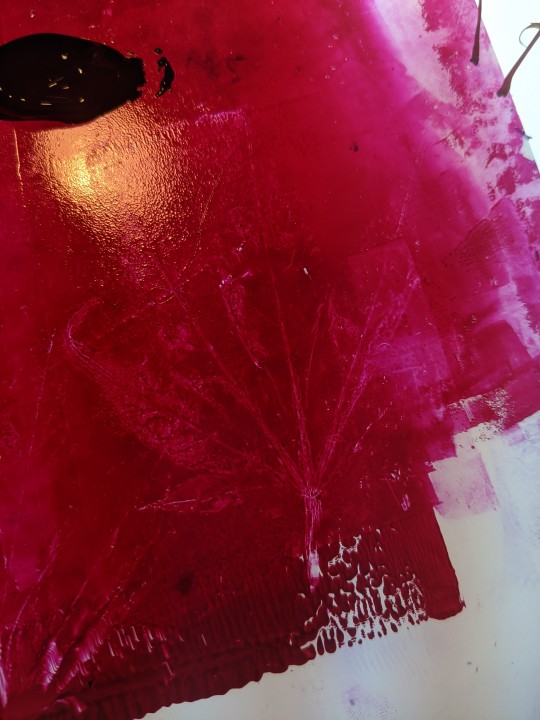
2 layered Risograph prints, I enjoy the colours that I used for these prints, I think the bright pink and yellow and pink breaks up the colour scheme of my body of work. I think this makes these prints eye-catching and sets them apart from the screen prints that I created using the same composition.
The prints on black paper are printed with the same ink as the ones on the white paper, I didn't expect the colours to change so dramatically but I am eager to explore Risograph more and test how the inks layer on different coloured paper.
3 notes
·
View notes
Text
The View From My Front Door
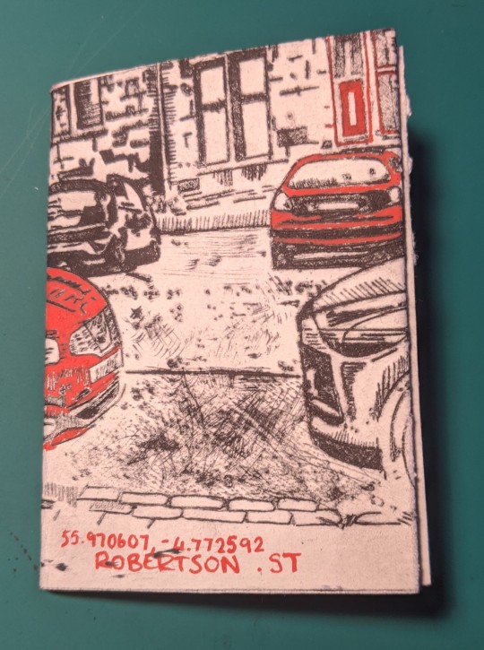


I made a small 8 fold Zine out of a dry point print. I used my print of my direct view, folding it gives the viewer time to appreciate the different textures and patterns included in every area of the print. I used a red posca pen to 'repair' weaker areas of the print and paired that with small red text at the bottom of the pages. I would like to make more experimental zines and perhaps try to create a digital zine
4 notes
·
View notes
Text

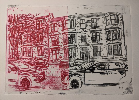
I printed my dry point in red and then cut it in half and pasted it on top of a black version of the same print, the black print I used was one I was going to discard because the left side of the print was considerably weaker than the right. I think using the red print to create a full imagine with a colour split is visually interesting and meant my prints which didn't turn out how I had imagined were still interesting to include in my development. I feel a piece like this would have benefited from being mounted on some coloured paper to make one side more of a focal point.
3 notes
·
View notes
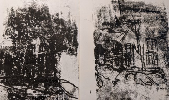
Text
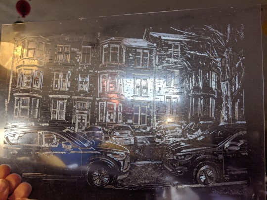

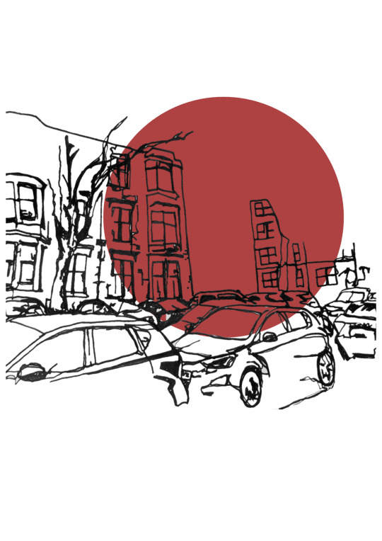
This dry point is very literally of "The View From My Front Door". I wanted to use dry point for this print because of the linear, graphic qualities of the architecture and the cars parked on the street.
I used a combination of 1.5mm, 2mm and 3mm etching needles, along with sandpaper to achieve variety in line weight, pattern and texture.
This was one of my first attempts at using this medium and I’m very proud of how it turned out, I think I will use a copy of this print to create my zine as I would like to focus the viewers attention to parts of the print I think are most visually interesting.
3 notes
·
View notes
Text


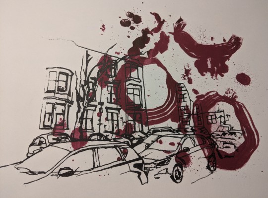
2 layered Screen Prints. I started with my red background layer, the design of which I took from a sample I created while drawing around found objects (in this case rocks) with ink. I chose this background because I like the organic quality of the brush strokes, unfortunately I thinned down the ink too much and it caused the ink to bleed. I did get a few prints that I am happy with but I think I will repeat this process before deciding whether or not to include Screen printing in my final prints.
1 note
·
View note
Text


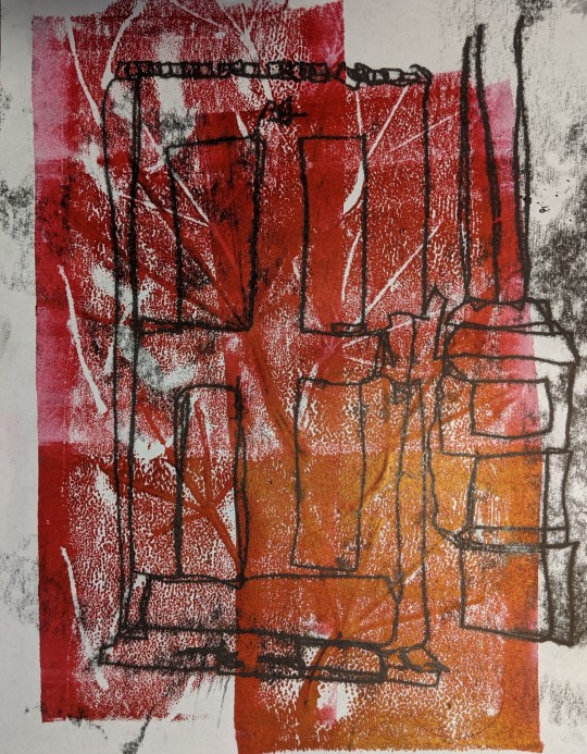
One line mono print inspired by some of the digital manipulations I have been including in my blog. I printed on top of a relief print of some leaves I collected from my front garden. I started by using tracing paper to plan my layers before completing the print.
1 note
·
View note
Text
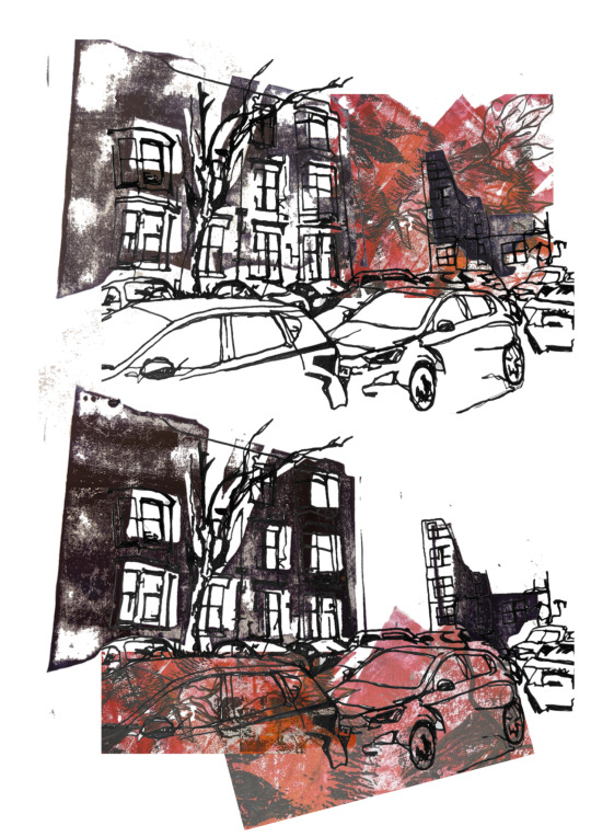
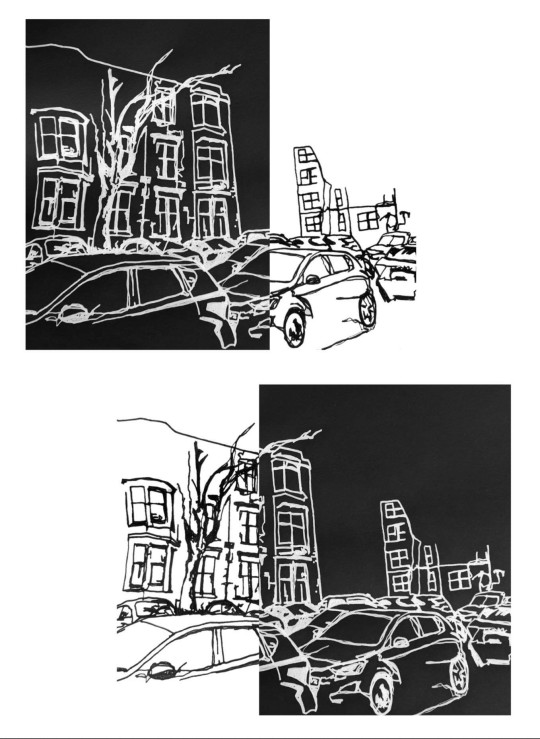
Experimenting with ways I could layer my prints, I think for the most part I will be using screen printing and lino printing for my final prints. Out of the two different layering options I prefer the bottom one, I feel having the cars in colour opens up the background and makes nice use of negative space. It is also an effective way to distinguish the foreground from the background
4 notes
·
View notes
Text
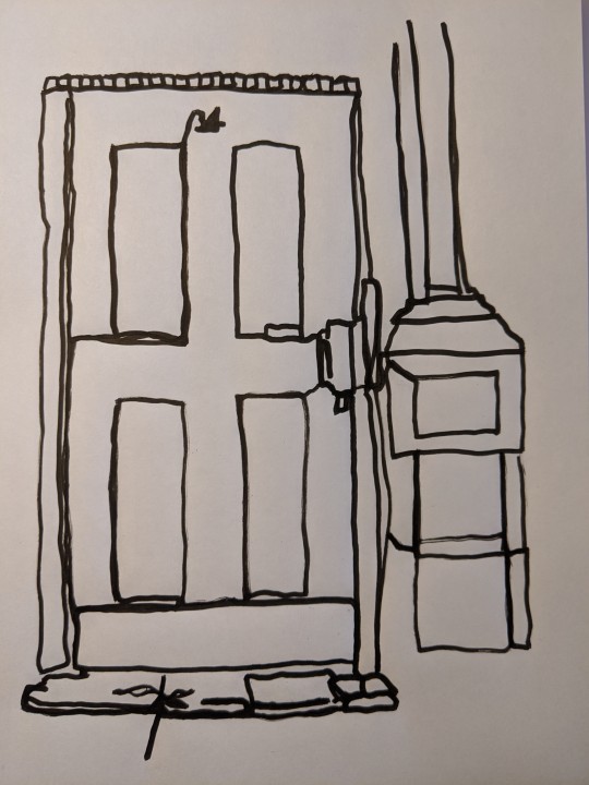

I done a one line drawing of my front door with my non dominant (left) hand. I enjoy the organic quality of this drawings so I thought of indicating the colour of the door using one of my Natural Form prints. I have included an edited version of this concept which I like and may attempt some prints to use to develop my final prints.
3 notes
·
View notes
Text
The View From My Front Door
I tried some monoprinting, overall this was a really effective way to capture some texture that I might take forward but I feel the technique itself isn't precise enough so will not use it in my final prints as I have to produce at least 2 identical prints
1 note
·
View note
Text


Trial edits for some multilayer screen prints I am planning to do later this week. Done using Canva and Snapseed, I think this is a really quick and effective way to plan my prints out and experiment with layering styles and opacities
I like the geometrical shapes that I have layered, these were inspired by a trash polka style of tattooing. I think the bold directional lines draw the viewers eye across the piece and make it visually interesting.
8 notes
·
View notes
Text

Updated concept board for the Natural Form portion of my project, I was asked to include more examples of drawing and print processes. I also updated my colour pallet which I enjoy much more now
4 notes
·
View notes
Text


I took some leaves from my front garden to print with, I like the resulting prints but the marks left on my rolling mat were just as interesting in my opinion, I like the idea of doing negatives inspired by this
2 notes
·
View notes