
Statistics
We looked inside some of the posts by soofz and here's what we found interesting.
Average Info
Notes Per Post
15
Likes Per Post
15
Reblog Per Post
0
Reply Per Post
0
Time Between Posts
4 days
Number of Posts By Type
Text
17
Last Seen Tumblr Blogs


Fun Fact
Mobile Tumblr US users spend an average of 4.04 minutes per session on the app.
Text
Links used for youtube tutorials
youtube
youtube
youtube
youtube
These are the youtube tutorials that helped me get a finish product of making my transitions + animations in my kinetic type video edit.
1 note
·
View note
Text
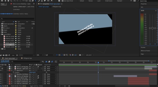
Week 12 - Final kinetic type project + Handed in
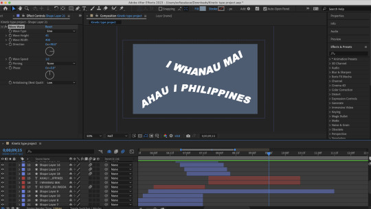
Introduction: 'My pepeha' as my whole kinetic type video is about my pepeha. I didn't really focus in one main subject and decided to just add most of my pepeha in. "I whanau mai ahau I Philippines" - 'I was born in the Philippines".
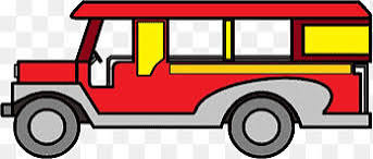
I decided to add one of the most recognizable + most common vehicle found in the Philippines, the Jeepney. I traced this picture I found off google with a white line to fit with my text.
I also added a traffic background noise from Manila as the environment there is always crowded and busy and lots of honking from cars and jeepneys.
Philippine map - I did a pop up animation of the Philippines map to show a visual evident to back up my pepeha phrase. - To show my home country.
"Ko Taal te roto" - 'My lake is Taal'.
Lake taal is a popular tourist spot in the Philippines. It is also a common place my family and I goes to, I wanted to mention this important place to me as it has been our go to spot in every family occasion.
I also added a wavy border in different shades of blue to embody a body of water + splash of water sound effect from the ocean to emphasize this.
"Ko Mount Pinatubo" - 'My mountain is Mount Pinatubo'.
I did a dramatic opening for this, as I wanted the text to smoothly flow with the Mountain silhouette goes up. + I added a rumbling of stones to emphasize the sound of the mountain.
During this part the music background stops just briefly when the text popped up and gradually comes back in when the mountain slid up. This creates a tension for the next sequence of my video (the end credits).
1 note
·
View note
Text
Week 12 - Finishing up work
Type specimen book;
I have made some final changes on my book as I noticed there were some pages that didn't seem too fitted to my theme as I initially thought it would. I redid these pages as it seemed a bit too crowded and the text are overlapping one another. I needed to give more spaces in between these pictures + text.


I also redid the paragraph structure to make it look more neat and tidy.

Kinetic type; - I didn't really add major changes since my last edit but after looking back on my type specimen book, I noticed I didn't add the same pepeha information from my type specimen to my kinetic type. - I decided to change the line "Ko Philippine Sea te moana" to "Ko Taal te roto" which is my lake. - This is the same line I used from my type. The reason why I had a different line at first was because I was looking back at my A3 pepeha poster we did and used one of the stuff written there that related to water.

After finishing up my work I have successfully filed all my work for type specimen book into a pdf, ind, idml + document fonts + pictures used and compressed into a zip file.
I have rendered my kinetic type video + saved my aep.
I have submitted all these into the canvas :)

1 note
·
View note
Text
Hand in: Rationale
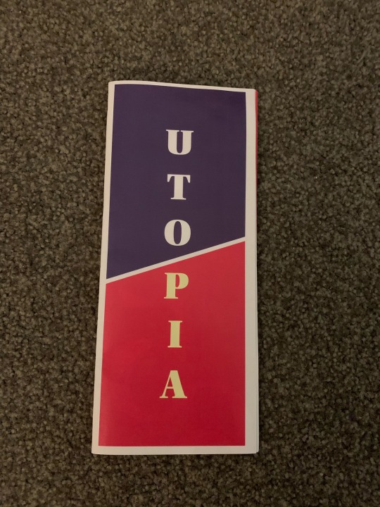
As I searched for a typeface, I wanted an old-fashioned/historical look as I talk a bit about my background past in the Philippines. A font that would fit for the traditional look as I showcase the places in the Philippines which takes me back to when I was still a kid. The Philippines is where I grew up and acknowledging the fact that I’ve known these specific places for my whole life almost seems like an ancient past to me as I look back at my old home. These places are shown in pictures throughout the book in different compositions, shapes and filters as I match it with the color scheme of the pages. The Utopia font just embodied the style I am looking for, with its clean lines and proportions as well as its classical yet modern appearance makes it look timeless and bold. It was an excellent choice for conveying information about my country as well as discussing my pepeha. Utopia is a serif typeface that is designed by Robert Slimbach and was released during late 1980s (1989) through the adobe system. Utopia is widely used world-wide and is popular in the print world due to its range of different optical sizes. There are four options which are normal, caption, subhead and display, because of these it makes it suitable for a wide range of typographic usage and challenges.
I was able to use the Utopia’s benefits, values and functionality in different ways as I explored the sizing and how I can lay them across my pages in unique perspectives. Since I was relatively new to the world of typography, I learned a lot about the principles of designing a text in creative forms and what makes a ‘good design’ based on the simplicity and the effective use of communicating a message with it. I struggled a lot making my book at first since I wasn’t able to balance my positive + negative spaces thoroughly.
But after finishing the project and seeing the final outcome, I finally understood how I can maintain a good balance with my spaces and let the pages ‘breathe’. The paragraph structure was also something I had to maintain also. Keeping relevant informative phrases and limiting how much I can add into a page is very crucial to making the pages look clean yet communicated well to an audience.
1 note
·
View note
Text
Week 12 - Final editing


For my end credits I decided to add transitions as each frame shows. The first frame: "Making and Media" - This changes from two different inverted colours as it rotates from the clip before. "Animated by Cristina Sofia Salazar" - I added a pop up circle transition to this clip. "Sound effects used" - I added a sliding layer from left to right (with gradient colours) and I applied the same layer for the next clip except it slides from bottom to top for the text "Music by". I have successfully added a background music and sound effects
1 note
·
View note
Text
Week 11 - Thursday
Today in class, we discuss about how to render our video in after effects through Adobe Media Encoder. After the class discussion. I worked on my Kinetic type and I added another clip for my mountain with the phrase "Ko Mount Pinatubo".

I did a text animation, with each text moving one by one
"Ko" sliding upwards then slides to the left, "Mount" slides out from left to right, "Pinatubo" 3D rotates -95 degrees while all the text slowly slides up making space for the mountain silhouettes shows up.
The mountain slides up slowly a second after.
1 note
·
View note
Text
Week 10 - Wednesday/Thursday

For my self-brainstorming I did a draft plan of different sceneries I would like to add into my kinetic type. I explored and sketched out different kinds of transitions and text animations I found off youtube tutorials, video edits from a range of medias/platforms such as advertisements for brands. In my own time, I experimented with the transitions from my ideas and edited them in after effects as I incorporate it to the draft edit I initially have.

I did a pop of multiple circles as it transitions to a phrase.

Moving borders as it slides from top/bottom vice verse from the two rectangles (for the background)
A circle pop up animation as the Philippine map shows (this is to present my home country)
"Text along path animation"
The texts moves in a swirly/curvy structured path as I use the pen tool for this to work.

Wavy border
This effect is to emphasize "Philippine Sea" with the water/flowy effect border
1 note
·
View note
Text
Week 9 - Thursday, May 7 (Progress)
(In class activity) - David introduced us the basic fundamentals of using premiere pro and how to use premiere pro & after effects together. - I just downloaded both premiere and after effects today so I am testing out transitions and starting to make a draft edit on the first few seconds of my video.

During the last hour, I tested out motion blur, text transitions (sliding from left and right, rotations, scalings - big to small) At the moment I am planning out how the introduction of my video would be and I am thinking of adding pop ups to the text as well as sliding borders along with it? (draft idea) And I also thought of adding a black and white flash? (alternating colours between the text and background)
2 notes
·
View notes
Text

Week 8 - Wednesday, May 3
Storyboard planning hw
- I just refined my scrambled ideas for the kinetic typography.
After looking at lots of inspiration, I have thought of ideas to connect to each other and what transitions/effects I can add.
Row 1 - INTRODUCTION to my typeface as I show the font up-close and also animating the serif of “a” to show that detail.
Row 2 - I start to experiment more with the effects such as a pop up effects when the full text of “Utopia” gets shown. Then the next clip shows an alternative filter as the font and background changes to a different colour and is more zoomed in. After this clip, another second of the text zoomed out in an alternate colour again (flash effect back and forth). I zoom the text out and rotate to do a transition for next clip.
Row 3 - “Ko” zooms out with a pop up effect with lines this time. The word “mount” shows from behind as it pops up when the “Ko” rotates. The screen zooms our showing a mountain (edited) and another mountain that will be blurred out in the background. The word “Pinatubo” will show in the foreground as it presents my mountain.
1 note
·
View note
Text

Week 7 - First week back from mid sem break
(In class activity) We did plannings / storyboard of our typeface video
1 note
·
View note
Text


Final attempt of printing (success!)
- My final attempt I was able to print the pages much better, with a help from a teacher and my friend.
- I printed the odd pages first and then printed the even pages after. It was a weird process and time consuming but it was more aligned than my other attempts.
1 note
·
View note
Text

Second attempt of printing
- I went to uni again the next day after I unsuccessfully printed my first booklet.
- I tried printing the pages in an A4 size (in black and white as a test-run) I figured if this would solve the problem of alignment issues. Unfortunately it was still not aligned and the pictures I added in the booklet was not showing up for some reason.
- I printed each page individually (not double sided) I was thinking if I aligned them manually and glue these pages to each other it would work. Turns out I wasted a few cents and my time cutting out these pages. 😅
1 note
·
View note
Text


First attempt of printing
- My trimming were not even as I when I tried trimming the edges that showed white lines.
- I figured the alignment of the pages were not centered nor even, hence why I wasn’t able to properly cut it in an even and straighter line.

- When I stapled the fold at the middle from the front page, it did not align to the pages inside the booklet. I had to take out the staple multiple times and staple to make it in the middle even though the middle fold was not aligned to the other pages.

- The final outcome showed all the pages were not centered, giving random pages peeking out of the booklet. It was not aligned at all.
1 note
·
View note
Text


First attempt of printing
- My trimming were not even as I when I tried trimming the edges that showed white lines.
- I figured the alignment of the pages were not centered nor even, hence why I wasn’t able to properly cut it in an even and straighter line.
- When I stapled the fold at the middle from the front page, it did not align to the pages inside the booklet. I had to take out the staple multiple times and staple to make it in the middle even though the middle fold was not aligned to the other pages.

- The final outcome showed all the pages were not centered, giving random pages peeking out of the booklet. It was not aligned at all.
1 note
·
View note
Text


Week 4 - A3 typographic poster, working on texts with grids/margins
0 notes
Text

Adobe photoshop - Duotone practice I added red/pink colouring to it which gave a more mysterious/gloomy effect.
The original picture was blue/orange
0 notes
Text
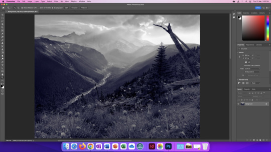
Adobe photoshop practice - Duotone option and added blue coloring to it as well as adjusting the contrast between blue and black. The original color of the image was yellow and green with pops of red.
0 notes