
Statistics
We looked inside some of the posts by sophierattueba1b and here's what we found interesting.
Average Info
Notes Per Post
8
Likes Per Post
8
Reblog Per Post
0
Reply Per Post
0
Time Between Posts
57 minutes
Number of Posts By Type
Text
1
Photo
6
Video
10
Last Seen Tumblr Blogs


Fun Fact
China blocked Tumblr because of pornography and censorship problems in 2013.
Text
Backup PDF links for reflective journals and Media Roles
https://drive.google.com/open?id=1db3osax13TV4UVMFMuPzwnRnNW7WJw-U
6 notes
·
View notes
Photo


In this session we drew series of poses on top of each other to get a sense of how a movement progresses. I’m really pleased with most of these, especially the top right as I managed to keep the drawings cleaner and in proportion to one another- you can also get a good sense of the arc of movement. However it was quite challenging as the more you poses drew, the less you could make out where your lines are supposed to be placed.
These actually remind me a lot of ‘onion skinning’ in 2D animation programs, where you can see each frame presented on top of each other in the same image. I use this tool a lot for sketching in-betweens but occasionally find it difficult as my drawing gets lost among the other frames and I can’t entirely tell how it looks. I think by practising this exercise I can improve in my ability to use onion skin, as well as develop my ability to draw the key frames of an action.
1 note
·
View note
Photo

I’m extremely pleased with this portrait I painted in session today. I think it’s a good likeness and I was able to include a lot of tone and detail. The biggest strengths, in my opinion, are the eyes, nose and chin area as they give the face a strong structure and they look in proportion with each other (except possibly, the mouth which may be a little too small). I was also pleased with how I managed to paint the hair & beard, by using an almost-dry brush and stippling on tones of grey and very light brown, then a little white to depict the light hitting some individual hairs.
My biggest critique would be that the shading around the ear and below the eye is very dark- I wanted to create a lot of contrast but i don’t think there are enough other dark areas of the face to warrant a section of tone that looks so harsh- it also doesn’t match the tone of the ear, which should also be in shade.
0 notes
Photo


For the first half of the session we focused on silhouettes & the readability of poses. I really dislike all of the silhouettes I painted- whilst I managed to depict some whole figures none of the proportions on any of these look accurate. I think this was because of multiple reasons. Firstly, I've become accustomed to using charcoal which can be erased and drawn over, but with ink there’s no real allowance for mistakes so whenever I made an error I had to either leave it or change the entire painting to look more cohesive with it. Also, as we were using pure black, I couldn’t reference different body parts to measure proportions like I usually do, as they’re all obscured.
However I am definitely pleased with my second, 40 minute painting- I began with light tones then gradually built over them with darker ones to map out the planes of the body and I think this worked really well. I especially like the forced highlights on the arm, stomach and leg. If i had to improve it I’d say the legs maybe look a little too thin around the ankle and the feet could have more detail, but overall I think this is one of my best pieces yet.
I think partly why my second piece ended up so much better is because I had more space to work in, so I could make some mistakes and fix them without worrying about going over into other paintings. So the next time I try drawing silhouettes I should take care to space out the figures and give myself room to work.
0 notes
Photo

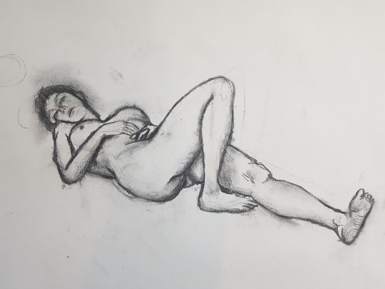
06/01/20 Life Drawing- perspective
Drawing from what we learnt last session about points of perspective and how objects diminish as they move closer to it, I tried sketching this model with those in mind, attempting to draw the areas of her body furthest away from me at a smaller size. Overall I’m really pleased with most of these, not only was I able to draw whole figures (as I often have trouble including the whole body- see previous perspective drawings) But I think i was able to utilise perspective quite well. However I need to practise drawing legs & feet more often as they’re the part of the body I seem to struggle most with, the bottom left drawing looks especially crooked- almost like her leg is bent backward.
I’m also really pleased with my longer 40 minute drawing, I think her proportions look correct and I was able to make her head- the thing furthest away from me- seem smaller. I also think I utilised some minimal shading really well to create the texture of skin. However, like my other sketches the feet look underdeveloped and a little too small, and they undermine the rest of the drawing.
1 note
·
View note
Photo
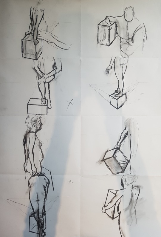
November 2019 Life Drawing- Perspective
I found this session a little more challenging than usual as I often struggle with perspective. I used a lot of my time in trying to draw the boxes correctly so all of the figures are unfinished and many have odd proportions like thin arms. I think my most successful drawing in this is the top right, as while the figure is unfinished you can easily read the pose and the box looks 3 dimensional. Overall I think not practising over Christmas break definitely hindered my ability, so I will try to do some more sketching in my free time before next session.
0 notes
Video
youtube
(right click video & set to loop) For my fourth and final attempt, I think I achieved a good balance of squash & stretch that adds dynamic movement to the ball without looking overly- exaggerated. It also has a good sense of speed- travelling faster as it moves towards & away from the table, then slowing as it reaches the top. If i were to improve this, maybe I would have sped up the entire sequence a little to give the ball more weight, but overall I’m really pleased.
To finish, I took the frames into Photoshop and used the healing brush as a quick way of erasing the rig from the shot (as well as the rig’s shadow). I also added some sound effects, recorded from me tapping a table with a piece of blu tack. After doing so, I think this really enhanced the animation and made it much more believable.
youtube
0 notes
Video
tumblr
I think my third attempt is a vast improvement. This time, as the ball is falling I used a very small amount of stretch so as not to distort the shape of the ball too much, this time remembering to pull the material upwards to create a sense of drag. I also slowed down the speed at which the ball rises to its peak and I think this helped the action look more natural.
Still, to improve I think I could have exaggerated the squash as it hits the surface a little further and made the whole sequence a tiny bit slower.
0 notes
Video
tumblr
In my second attempt, I made the same mistake of stretching the Plasticine downwards as it falls but I think the speed at which it bounces feels better
0 notes
Video
youtube
Using this ball as reference, you can see that as it falls the bottom of the ball doesn’t stretch towards the ground, and only really stretches when it is bouncing back upwards
0 notes
Video
tumblr
In my first attempt, I think the timing of the bounce works well and you can see the use of squash & stretch, however there are multiple issues with this. The first is that I've tried to add stretch as the ball is falling to exaggerate it’s speed, however what I didn’t realise was that I was stretching the Plasticine downward. So, instead of the ball looking like its distorting due to velocity, it looks like its actually reaching towards the ground then being dragged back upwards.
Additionally, I think I exaggerated the stretch of the ball too much, as for most of the animation it doesn’t even hold the shape of a ball & looks more like a cylinder.
Finally, I think I could add a few more frames as the ball reaches its peak to create a smoother ease-in and ease-out.
0 notes
Video
youtube
In this, the animator uses exaggerated frames to show the ball squashing as it hits the surface and stretching as it moves back upwards, so I’m going to try and include this in my own tests.
0 notes
Video
tumblr
In this test I animated the puppet on the right as it stood up and when it pats the other puppets shoulder.
Using myself as reference, I noticed that to stand up from a sitting position I usually place one leg backward to stabilise myself then lean forward to get up, twisting towards the back leg to support myself. I tried to replicate this here and I think I managed to capture the same motion quite well. However it is very fast so you don’t get a real sense of weight from the puppet. I’ve made the same mistake as in my ‘heavy object lift’ animation, so obviously this is something I need to improve. Also, I accidentally left a thimble in the shot so I need to be more aware of this in future tests. Nevertheless I think the movement itself looks smooth but on my next test I’m going to spend more time really studying the movement and animating with weight in mind.
0 notes
Video
tumblr
(My puppet is on the left)
In this test I just wanted to try playing around with the puppet and see what extreme poses and movements I could come up with. As weird and exaggerated as it is I think this test looks ok. There’s no jumping around and I think the timing of the movements work well- with long anticipation leading into large actions. However I could have included more slow-in slow-out on the arms as they seem to stop mid-action. Also there is a slight pause on the second step where the leg moves forward but the rest of the body remains still. Nevertheless I think I’m improving in my ability to animate in stop motion and developing my technique in adjusting the puppets so that they move in a sequence without ‘jumping’.
0 notes
Video
tumblr
I’m really pleased with the final result of this test and the amount of details I was able to include. Firstly, I think I timed the lead up to the reaction really well, the puppet seems as though it’s nonchalantly looking around and the slight swinging of the arms adds another layer of boredom. The quick, surprised reaction also works quite well but I think I should have left the hands on the puppets face for a few frames longer to emphasise it’s shock, before moving into the next action.
Having the puppet wiggle its fingers in anticipation also highlights it’s eagerness to lift up the object and gives reason for when it tries to do so multiple times. Then the puppet leans back in anticipation, however, I feel this would have worked better if I had just move the arms backward and kept the head focused on the object- moving the whole upper body as one unit doesn’t look very natural.
Then as I outlined in my storyboards, the puppet curves its spine towards the object as it leans down, then away as it tries to lift. To add an extra detail, I also made it’s head shake to indicate how tense it is and followed this up by re-curving the spine as the puppet loses tension & pants in exhaustion. This is my favourite part of the animation as I think this small detail adds so much humanity and a sense of relatability to the viewer.
Finally, as the puppet lifts again the object is really quickly pulled from the ground and the momentum of this carries the puppet backwards, followed by its foot. By doing this, I think I changed what the object itself is meant to be- I had intended to depict it as extremely heavy but by having it pulled from the ground so quickly it gives the impression that it was just stuck. Whilst I’m really pleased with how this film looks I think the next time I try to animate a heavy object it needs to move much more slowly- dragging down the carrier with it.
0 notes
Photo


Before animating I tried sketching some quick storyboards to see what kind of poses I should be trying to recreate with the puppet. I really like the position in the top right panel of my first storyboard- with the chest puffed out and arms pulled backward in anticipation. I think I’m going to try and do something similar with the puppet. Additionally, I think the curvature of the spine will be important in communicating the weight of the object- at the beginning of the action it should be curved around the object, then as the puppet starts to lift it should curve away.
0 notes