
Don't wanna be here? Send us removal request.
Statistics
We looked inside some of the posts by sosworkbook and here's what we found interesting.
Average Info
Notes Per Post
0
Likes Per Post
0
Reblog Per Post
0
Reply Per Post
0
Time Between Posts
5 minutes
Number of Posts By Type
Text
17
Last Seen Tumblr Blogs


Fun Fact
Mobile US users spent an average of 115.8 minutes on Tumblr app monthly.
Text
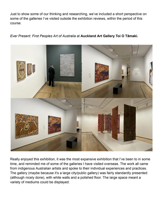
exhibition reviews (all)
Karl Maughn, Sprung at PAGE 21 September - 14 October
https://www.pagegalleries.co.nz/exhibitions/172-karl-maughan-sprung/works/ PAGE gallery on Victoria street
The work was all presented in the space to show it in the most sellable format, a beautiful clean space with white walls and presentable sitter. The work was at a standard eye level, all evenly distributed through the space.
Work was placed around the space in symmetrical series and individuals. repeated forms and colours as the exhibit seemed to be a study on one particular garden. As his work all is colourful representations of gardens this exhibit was clearly a show for sales and distribution. Which was successful, as every work on the website but one from this exhibition has been sold. As that was the intention I see the hang and presentation only as a way to present a product rather than a way to bask in one's creation, immerse your senses or enjoy a space
This was not the intention of our exhibition. Going into the exhibition paper our group had the intention of breaking away from a white cubesque space, creating a space not for sales and perfect presentation of work and one for obstructed view, crammed corners and tripping hazards. Not ideal for selling work, as Maughn does - at the price and scale. So the space was well lit, clear and calm. To showcase the work that he makes. With neutral white walls and gray floors.
In picking a space we wanted something that wasn’t going to be absurdly far from that space at
PAGE gallery, I appreciated the medium level hang and the symmetry of the show but intentions for exhibiting work were clear and definitely clashed. Though selling work for a Karl Maughn price tag would be excellent.
image from PAGE gallery website. taken by

Sione Tuívailala Monū the way we were at Robert heald, 24 august - 16 September
A different dissemination of similar artwork by the same artist (Sione Tuívailala Monū) as another survey done by Cailin.
This exhibition was at Robert Heald, a dealer gallery at the top of left bank. One that usually presents paintings/ wall work. This work that was shown on the 24th was a video work and used the usually very cold space in a way that changed it. Not drastically but slightly. An iPhone format video work projected onto the main wall of the gallery. A white wall. The gallery usually has big wide-open windows and an archway that leads you into another room. Today it had curtains to block light and close the space off so the viewer can engage with just the projected video work and not be distracted by the surroundings - surroundings that usually wouldn’t distract from the presented art work but as this was video work the curtains were a necessary touch.
The way we intended to use the space we acquired for our own exhibition was to transform it - to not distract from the work but embellish it and also create an artificial, slightly experimental and definitely exciting atmosphere. Cailin had projected video work so covering up external light, similar to the use of curtains in this show, was crucial to make sure the work was visible and honored. As for the rest of the works we exhibited - mostly paintings and some photographs, the natural and external light being taken away was very important to make sure the works would be presented and read in an experimental way rather than just being placed in a space designed for artwork to go into.
(Isla)
Photo from Robert Heald gallery website

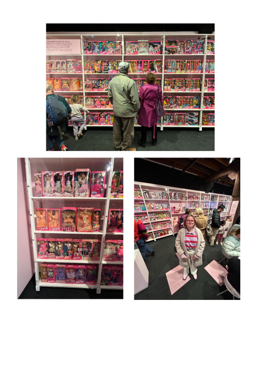
The Barbie Collector Exhibition at Wellington Museum
As a somewhat alternate exhibition space, I visited The Barbie Collector Exhibition at the Wellington Museum. While not a typical gallery space (the white cube) with a display of (fine) art, the exhibition did present an array of “artworks”, Barbies of varying makes and models strewn across the room. This collection is privately owned by the Barbie aficionado Patsy Carlyle. The exhibition was intended to be both a space to witness the Barbie mayhem while also getting to know Pasty and a collector and as her own person. I recognise this exhibition serves a different purpose/intention as a informative, museum backed exhibition, over our intended art focus.
The room had a wide entrance but was not overly big. The room felt smaller still with the wall to wall case of 500 Barbie figures and the room full of visitors. The atmosphere was therefore busy but not chaotic, the brightly coloured displays kept up an optimistic atmosphere. The scale of the main shelves was quite impressive, almost overwhelming. The stacking and positioning of the Barbies (all still within their boxes) meant each Barbie could be seen. The bright overhead lighting lit up the shelves as well as the room (as opposed to a dim space with specifically placed spotlighting). The lights directed towards the shelving looked to be angled in a way as to avoid a direct glare coming off the glass case and obscuring the memorabilia. There were other facts to the space, including interactive features like a childrens colouring table. There was also informative wall/plinth texts speaking to the historical relevance of some of the Barbies on display. A video was also displayed on the opposing wall, being an interview of Patsy Carlyle on her extensive Barbie collection. I did not notice a specific publication on the works although there were purchasable museum mementos (postcards, bookmarks etc).
While the technical display of the work does not align with the direction our exhibition group is heading (an alternative space, low lighting, spotlighting etc), the visual craziness does align with some of my own aesthetic favourings within my work (loud, colourful, vintage). I liked the brightness of it, and the evident consideration for the Barbies being the full focus.
(Felix)
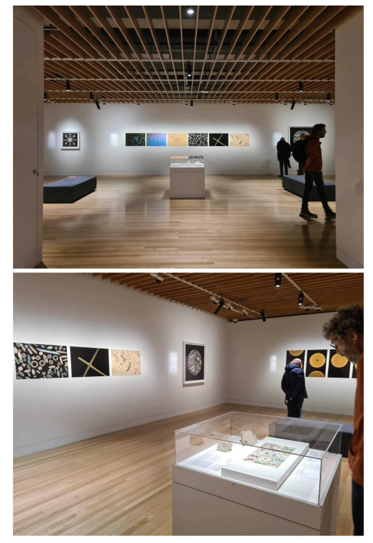
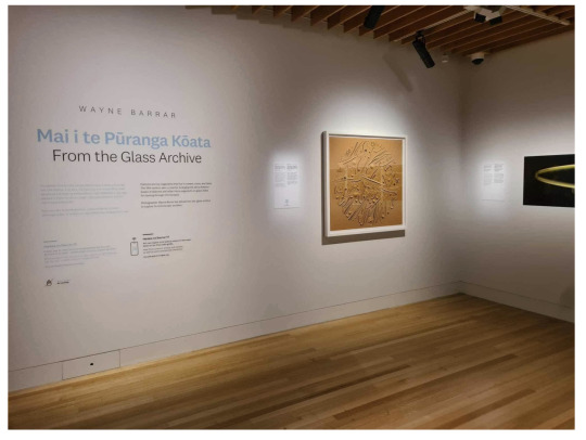
Mai i te Pūranga Kōata | From the Glass Archive Exhibition at Wellington Museum
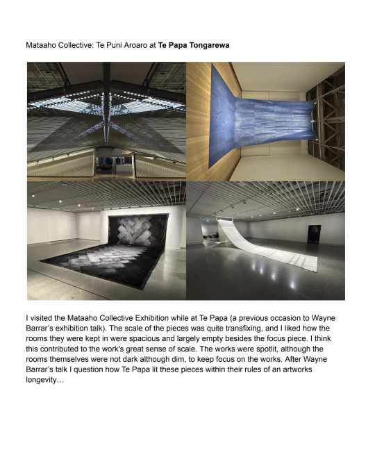
I recently visited Wayne Barrar’s From the Glass Archive Exhibition, currently on display at Te Papa Tongarewa. The work explores diatoms, silica skeleton fossils, arranged into microscopic mosaic formations, as a past fad of the 19th century.
The gallery was a white walled, wooden floored space, a side room to the larger Toi Art component of the museum. Some works were framed while others were pinned prints. From my understanding, this framing vs pinned prints was partially dependent on what was owned by Te Papa and what was owned by Wayne (I went during his talk in the space). This also affected the lighting. The space was spotlit, and the level of brightness varied slightly, due to how long the work was meant to be on display. The length of time affected the max level of brightness Te Papa was willing to light things under for the sake of the artwork's longevity. Some of Wayne’s (owned) pieces were therefore brighter, as he was less concerned with the ageing of the work and more concerned with how dimly lit the pieces were. The atmosphere within the space was calm and cool, being a temperature controlled space. The works varied in scale, with some larger prints (framed) being quite captivating, although not overly large (approx 1m tall and wide by eye). There was also a central island with a glass top, displaying the diatom arrangements in real size (microscopic) as a recognisable sense of scale between the real thing and the microscopic photography around the room.
I didn’t see a publication specific to the exhibition, but they did have a Te Papa owned copy of Wayne’s previous publication for the displayed work. Being in the space, you could argue there’s potential overlap in wanting to create a dim, spotlit space, albeit to different extremities (we intend for ours to be more dramatic and not a white cube). I did like the work in itself, (although very different to my own) but found the necessary dimness of the images frustrating as a viewer (although its purpose was respectable). I also liked the clean white frame and matte board choices, leaving the image to take full focus.
(Felix)
Nova Paul
Ngā Pūrākau Nō Ngā Rākau
City Gallery, 1 July - 8 October 2023
During my visit to the City gallery, I viewed Nova Paul’s large scale four channel video work. The works' video, sound and its dramatic installation created an ‘other-worldly’ feel to the otherwise white wall gallery space I am used to in that room of the City Gallery.
I spent an extended amount of time with this work. The four projections that extend around the whole room, with slow paced narratives, allows for an extended moment of quiet and ‘awe’ with the work. The long benches in the middle of the huge space made me feel like I was sitting alone with the work even when others were in the room too, which added to the intimacy of the content of the work. The long thin benches also allowed you to turn around and view the different channels as a 360 when they were displaying different visual content. The video works had a neutral simplicity to them, a peering into different lives and location sites, not trying to convince you of anything but more of a presentation of appreciation. This resonated with me and the way I want our exhibition to feel, a look into our lives, experiences and senses of self without trying to convince the viewer of anything but just an honouring of experiences.
The scale and sounds of the work, particularly during the shots of nature made you feel like you were really there amongst a field with children playing or sitting staring up at a big landscape or looking out at a running river. The floor was varnished and shiny which allowed for the projections to reflect on the floor, allowing the work to take up the space further. This reflective quality was something I wanted to bring into my own video work to add depth, light quality and immersion.
This work spoke to me because, as a video artist, I am always looking for ways to unconventionally display video work in ways that takes it out of conventional screen and into an atmospheric experience for the viewer, which is exactly what this work did for me. I'm interested in the ways installation elements can both inform and change the way a video is received. It showed the utilisation of install methods to align the content of the work with how you want your audience to feel when they are viewing it. This show felt beneficial to the curation of our show as it presented ways in which you can change the energy of a space with use of scale, sound, light and movement. Although it was changing a white cube gallery space into an atmospheric space I feel we are doing something similar with transforming our underground space.
(Cailin)

Sione Tuívailala Monū
Stories
City Gallery, 6 May - 3 September 2023
Sione Tuívailala Monū’s mixed media video installation at the City Gallery was a youthful and playful show, with colourful hanging sculpture and video work in the format of raw iphone footage and snapchat videos. The video works were shown on a mixture of projection, monitors and mounted iphones. I felt a sense of connection and inspiration to the content and installation of this work and our ‘Still or Sparkling’ exhibition due to the themes of youth and of nuances of gender and identity in the contemporary world. On the City Gallery website they describe that “ Their films and floating ‘Ao Kakala embody the vibrancy and contradictions inherent to diasporic life.” The playful and relatable format of iphone and snapchat videos made the work personal and intimate, a factor that is prevalent in all our individual practices and the coming together of us as a group as we explore ideas of self and identity.
I enjoyed the bright plastic flowers used for the hanging sculpture, they replicated tropical flowers that don't typically grow in Aotearoa so were sourced from dollar stores. The synthetic and ‘kitschy’ yet beautiful plastic flowers were aesthetically appealing to me, much like the dollar store fake candles I’m using in my work. I like that they suggest something real being represented but not present, the fabricated nature of them speak to the themes of the work, much like the elements of constructed reality within my work and what they can communicate.
Colour was a large aesthetic factor of the show, Monū didn't shy away from utilising a rainbow of colours in their work. The embracement of so much colour brought a sense of fun to the work, while still a presence of careful consideration felt apparent within the use of all these colours. Bright and various colours are shown throughout each of our members' works, which actually brought them together rather than clashing. With the use of lighting and placement we were able to make connections between our works through shades of pinks, oranges and blues. Use of colour within our lighting in order to connect our works in the show was important to us, Isla and Elenas works both feature pinks and oranges and drew to my video work and candles. Felix’s prints were lit with a cool toned spot light which related to Isla’s glowing blue forms in her outer paintings. (Cailin)

Brent Harris, Transfiguration at Robert Heald - 21.9.23 — 14.10.23
Robert Heald is a commercial gallery in Wellington. To me, the gallery often feels cold and sterile due to its white walls, concrete floors and fluorescent lights. Because of this very simple gallery setting, Brent Harris’s paintings have a lot of room to breathe and hold themselves in a way that speaks to the viewer, with no distractions around them.
It may be the sterile room or Brent Harris’s paintings, but the exhibition feels a little sombre. Brent Harris is a very successful contemporary New Zealand born artist who has spent most of his career in Australia and recently moved back to his motherland. The imagery in his paintings, the colours and the title of the exhibition Transfiguration, makes me believe that the room is meant to feel nostalgic and contemplative.
Overall, this exhibition is very simple and doesn’t push many curatorial boundaries, but it is an effective way of showcasing the beauty of these paintings without any distractions.
(Elena)
Ayesha Green: Folk Nationalism
1 July–15 October 2023 at Wellington City Gallery
This show includes a range of work in different mediums all done by the same artist Ayesha Green, presented in some very interesting ways that push white cube boundaries. Which makes sense since this exhibition “interrogates the ways that power is upheld by images” and “examines histories of Māori and Pākehā representation, often questioning the particular ‘truths’ or myths they perpetuate”.
Because Ayesha Green works across sculpture, drawing, and painting, the show feels full of life and you can feel her artistic expression coming through each work. I have found in the past that many people sense that rooms feel empty when there is just work on the walls, and to “fix” this, the most common solution is to put sculptures in the middle. I personally think this can be a hit or a miss. It’s true, sometimes rooms feel empty when there is only work on the walls, but I think that if that is the case, it is because the work on the walls don’t captivate the viewer as they should, rather than the room being “empty”. Sometimes having sculptures in the middle can distract the viewer from fully taking in the work that’s on the walls. I found that Ayesha Green’s sculpture in the middle worked really well in the context of the exhibition and I found it very intriguing and an extension of the other work, rather than a distraction from it.
Overall, this exhibition made me think a lot about how different mediums can work together harmoniously in the same exhibition as long as they each hold themselves up in their own way.
(Elena)

0 notes
Text
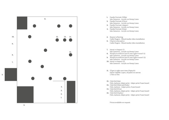
works list
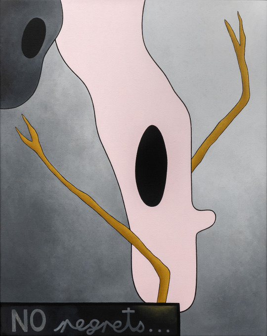
Family Portrait (Willa), Isla Cameron - Acrylic on Hemp Linen
Family Portrait (Cleve), Isla Cameron - Acrylic on Hemp Linen
Family Portrait (Jasper), Isla Cameron - Acrylic on Hemp Linen
Family Portrait (Huia), Isla Cameron - Acrylic on Hemp Linen
Beauty is fleeting Cailin Rogers - Mixed media video installation
Charm is deceptive Cailin Rogers - Mixed media video installation
Would you still love me if I was a glow worm? (1) Isla Cameron - Acrylic on Hemp Linen
Intent vs Impact (1) Isla Cameron - Acrylic on Hemp Linen
Intent vs Impact (2) Isla Cameron - Acrylic on Hemp Linen
Would you still love me if I was a glow worm? (2) Isla Cameron - Acrylic on Hemp Linen
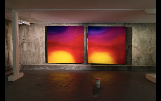
I’ll get it right next time (Diptych), Elena Vidiella-Lopez, oil paint on canvas, 1.75m x1.75m
Club Kid (Isla), Felix Jackson, Inkjet print - Inkjet print Foam board
Club Kid (Sibel and Ruby), Felix Jackson - Inkjet print, Foam board
Club Kid (Elvis), Felix Jackson, Inkjet print - Inkjet print Foam board
Club Kid (Hayley), Felix Jackson, Inkjet print - Inkjet print Foam board
Not pictured on map,
If I had a car, I'd be on my phone less (1&2) Isla Cameron - Acrylic on Hemp Linen (left center pillars)
0 notes
Text
final photos and files of work installed
Cailin Rogers ‘Charm is deceptive’ and ‘Beauty is fleeting’ video links https://youtu.be/u5TwfKr9kus https://youtu.be/QZo-dfHuCtw


0 notes
Text
causal bib + context
Taylor Swift
https://open.spotify.com/track/3sqrvkNC6IPTIXvvbx9Arw?si=bb123d3021024374
https://open.spotify.com/track/3CeCwYWvdfXbZLXFhBrbnf?si=039243d287fa493d
Lana Del Ray
https://open.spotify.com/track/1NZs6n6hl8UuMaX0UC0YTz?si=18d2aefcadd24ed6
https://open.spotify.com/track/2nMeu6UenVvwUktBCpLMK9?si=db1631b36a984f5d
Hill, Sarah Hill. Young Women, Girls and Postfeminism in Contemporary British Film. Bloomsbury Publishing Plc, 2020.
Kearney, Mary Celeste. ‘Sparkle: Luminosity and Post-Girl Power Media’. Continuum, vol. 29, no. 2, Mar. 2015, pp. 263–73. DOI.org (Crossref), https://doi.org/10.1080/10304312.2015.1022945.
0 notes
Text
publication words
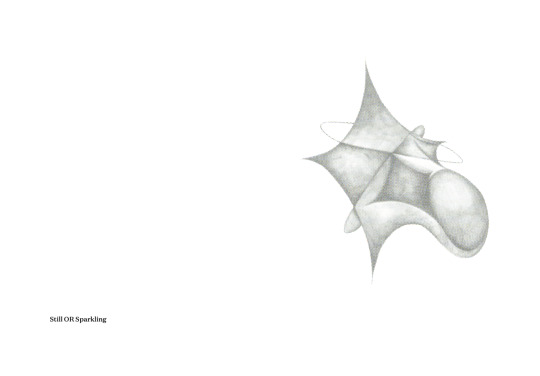
‘Still or sparkling?’ A self reflective question asked in moments of self indulgence, spaces of enjoyment and a question of personal preference. Would you like still or sparkling? Do you choose to be still or choose to sparkle? ‘Still or Sparkling?’ speaks to an outwardness, to be in the company of others, to have an opinion, to exist in an imperfect world. To express and explore, towing the line between sincerity and irony in the projection of self. As young people in the digital age we are faced with an overload of information and an abundance of choice every day. This question ‘Still or sparkling?’ channels this sense of autonomy to have a choice in preference and self perception in this contemporary world.
Within this question we ask what it means and what it looks like to ‘play’ as young adults in modern Aotearoa. To dance, to dress, to create, to love; these are the feelings and experiences we hope to capture in the space we have created within the walls of our exhibition.
Conceptually demonstrated in intersections of girlhood and queerdom, our exhibition explores early adulthood and how creative cultures influence our experiences, identities and sense of fun. We believe our immediate surroundings, digital spaces, and communities of belonging within the 21st century hold something valuable and worthwhile to be honoured in this space.
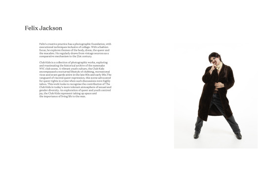
Felix’s creative practice has a photographic foundation, with executional techniques inclusive of collage. With a fashion focus, he explores themes of the body, dress, the queer and the macabre. He regularly draws from vintage sources as a comparative mechanism to the 21st century.
Club Kids is a collection of photographic works, exploring and reanimating the historical archive of the namesake NYC club scene. A vibrant youth culture, the Club Kids encompassed a nocturnal lifestyle of clubbing, recreational vices and avant garde attire in the late 80s and early 90s.The vanguard of visceral queer expression, this scene advocated for queer rights in a time when such discussions were highly taboo. This work looks to recognise the contribution of The Club Kids in today's more tolerant atmosphere of sexual and gender diversity. An exploration of queer and youth centred joy, the Club Kids represent taking up space and the importance of living life to the max.
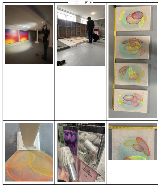
Isla’s painting practice aims to honour and navigate the experience of 21st century girlhood through a process that explores aspects of self and interpersonal relationships. She paints with bright, abstract forms encapsulated with the importance of love, light and colour.
Synesthesia, the phenomenon that happens when one's brain links sensory information through other unrelated senses, creating simultaneous connections between multiple senses. Isla utilises the experience of synesthesia giving her work a special sensitivity to energy, experience and senses. She experiences the use of colour intensely in a way that can overlap and connect the external physical with internal feelings, such as, the experiences of a relationship can be linked to taste, texture, colour and smell. This exploration of senses and experience is manifested throughout her work.
The glowing forms within Isla’s paintings are taken and abstracted from the natural and digital world. Physical objects and beings as well as experiences and feelings inform the shapes and colour seen. Light, flowers, animals, loved ones, a house, a home, sharing meals, cups of tea, and the twinkles of the sun, moon and stars are some of the inspirations pulled behind these abstract shapes.
An interest in the binaries and intersections between ‘sincerity vs irony’, ‘friendship vs romance’, ‘nature vs nurture’ is explored in Islas practice and can be seen visually represented through the overlapping forms she paints. The use of form and colour blending and merging, making new shapes, new ideas, new moments represents the very experience of what it means to Isla to be a girl in the 21st century, everchanging and exciting.
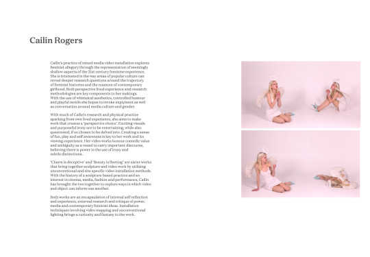
Cailin’s practice of mixed media video installation explores feminist allegory through the representation of seemingly shallow aspects of the 21st century feminine experience. She is interested in the way areas of popular culture can reveal deeper research questions around the trajectory of feminist histories and the nuances of contemporary girlhood. Both perspective lived experience and research methodologies are key components to her makings. With the use of whimsical aesthetics, controlled humour and playful motifs she hopes to invoke enjoyment as well as conversation around media culture and gender.
With much of Cailin’s research and physical practice sparking from own lived experience, she aims to make work that creates a ‘perspective choice’. Exciting visuals and purposeful irony are to be entertaining, while also questioned, if so chosen to be delved into. Creating a sense of fun, play and self awareness is key to her work and its viewing experience. Her video works honour comedic value and ambiguity as a vessel to carry important discourse, believing there is power in the use of irony and subtle distinctions.
‘Charm is deceptive’ and ‘Beauty is fleeting’ are sister works that bring together sculpture and video work by utilising unconventional and site specific video installation methods. With the history of a sculpture based practice and an interest in cinema, media, fashion and performance, Cailin has brought the two together to explore ways in which video and object can inform one another.
Both works are an encapsulation of internal self reflection and experience, external research and critique of power, media and contemporary feminist ideas. Installation techniques involving video mapping and unconventional lighting brings a curiosity and fantasy to the work.
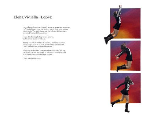
Elena
I am walking alone to my friend’s house on an autumn evening. I left my jacket at home and my feet hurt a little from my new kitten heels. The air is fresh, and the colours of the sky are perfect. It’s beautiful to be alive.
I want this fleeting feeling to last forever, and I want to share it with you.
As I try to hold on to these moments, I realise that when something is pure at its core, it can never last the same. Like a faraway land that once was mine.
Every day is different. Every brushstroke holds a feeling. Each layer carries the weight of them all. Fleeting feelings in changing colours. Painting is simple.
I’ll get it right next time
0 notes
Text
publication information
riso graph layers for outside of publication


preprinted publication..

0 notes
Text
testing to see how the publication could be printed on risograph


0 notes


Text
costs x budget
Total spent: $890.56
With our total estimated budget being $1500.00 we went under by $609.44 which is pretty impressive.


0 notes


Text
Week 11
Gallery Sitting and deinstalling: Sunday
Cleaning up after opening - Isla
Sitting from 11-1 Elena
Sitting from 1-3 Cailin
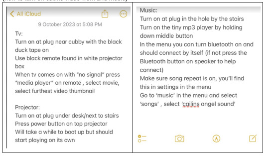
(how to turn on cailins video work and music)
Monday
Elena 11-1
Isla 1-3
Tuesday
Felix 10-1
Elena 1-3
Cailin 3-5
Isla 5-7:30
Thursday
Felix and elena deinstall photos, paintings and remaining lights, bringing lights back to uni.
Friday
Saturday
Deinstall was much easier than install. The vinyl was a great call because it came off in one piece. It was definitely expensive but worthwhile. Especially with the black paint over the top.
Wednesday
Isla and Cailin deinstall video work, vinyl and paintings. Repair holes and remove work from space - with Elena’s car.
Exhibition overview/ walk through
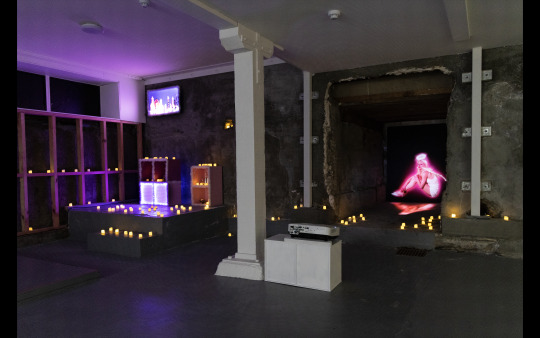
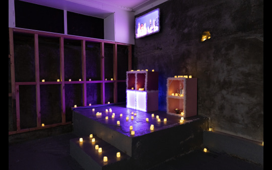
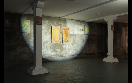
The space Is on Holland street. Down the stairs and in a dark cave like pillar filled space.
You walk along Holland Street and come to the corner where a sign and a couple posters (designed by Carly Wattam) lead you down the stairs into the main space. Along the stairs is 4 works by Isla, paired with each other to lead one in, to be seen from the street so the viewer knows where they are going and that they are in the right place,
Work stickered by Islas dad on the night of opening to “market” more sales (though work was not yet sold just claimed for Christmas presents) this has been successful as several works did get sold in the duration of the exhibition.
As you walk down the white stairs a beam with pink tape is placed on the first hazard to make one aware of the danger of a head being bonked.
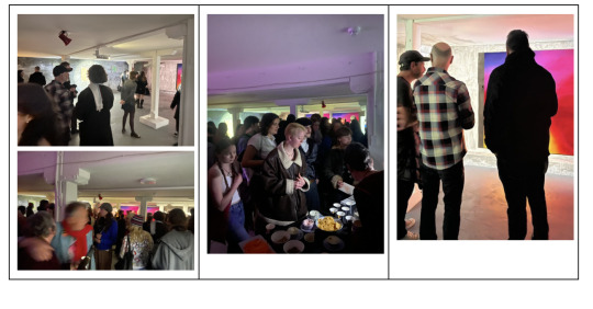
After avoiding the head hitting you make it to the end of the stairs. Where a sound piece made by Lian Hontalba for Cailin’s video work set the mood for the rest of the space. A magical twinkling sparkly piece that made the cool and dark room seem brighter and more calm and safe. Rather the dungeon it could also be seen as.
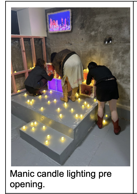
When you turn left you see Cailins dual installation pieces, dotted with LED candles and sculpture x video install work in bright light pinks filling the stage area and in the cave. The work was made to fit into the requirements of the space. To emphasise the cool architecture and lead your eyes up and into the corners of the room.
The windows leading the wall to caillins work have been blocked out with vinyl and painted with matte black paint to make sure no light from the street penetrates the space and disturbs the intended atmosphere.
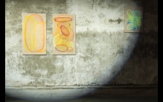
Along from caillins work is Islas paintings installed symmetrically on the concrete wall and corresponding pillars, as her paintings play with symmetry and light the install intended to emphasise the light and dark forms in her work and move them into the space around. The orange paintings sit in the middle surrounded by a circle of cool light then green ones hidden by pillars but lit with small torches to illuminate small spots of glitter that resemble glow worms. Mini works placed on pillars remained unlit by direct light but lightly touched by surrounding glows. As they were the same width as the pillars they slightly blended in. To be seen as a surprise to viewers in the intense space.
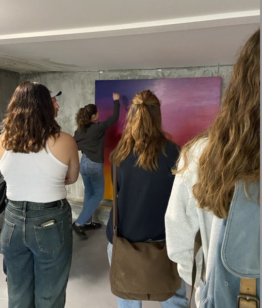
Around the room to the left again is Elena's large dual paintings, depicting the sunset gradient of the instagram logo. Her work was lit with two lights from a low angle in reference to sunset and to Cast a shadow on the viewer - placing them into the image as a play on perception and self.
To the left again is the series of four works by Felix, thematically connected to the club kids' moment the work stands on the pillars, attaching itself to the space which is informal and experimental as the movement was in the 80s. His work is lit by the cooler spotlight in the space as it was most compatible with the white boards the photographs were printed onto.
We balanced the cool light and the warm light evenly in the space. Having warm spotlights on Elenas paintings and warm protection and candles on cailins and then cool light on Felix and Isles which were opposite each other in the room to create some balance in the dark space. This was something we hadn’t intentionally planned for but as each of the lights we were loaded
There were huge flaws in the space including plumbing issues and ugly walls - along with many tripping hazards. For the actual health and safety we decided to address the issues with pink fluro tape to make sure visitors in the space are aware of the potential dangers.
The vinyl arriving late was a huge drawback. Having to troubleshoot different potential ways of installing it while it hadn’t yet arrived, also hanging work up before the space was fully darkened.
0 notes
Text
Week 10 week of exhibition! (Recap)
Monday
Trying to figure out how the publication should be structured. How well the images would print onto the paper we got. (we ended up using a different type of paper.)
buying cups for opening as well..
Boring calm before the storm day. Admin and preparation.
Bought vinyl expecting it to come by the next day.
printing tests

Tuesday
a day of nothing and planning mostly. making sure we were rested and all was in order for Wednesday- vinyl didn't arrive
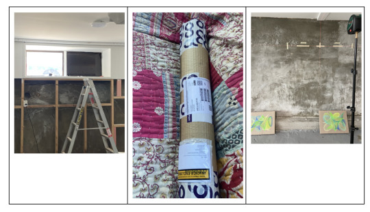
Wednesday 4th Move in day.
Elena had to get 2 different trailers to move her work as the paintings were too big to put in the first ones and it was a very windy day
Elenas paintings did not fit through the stairway so they had to be taken apart and put together again in the space. Thankfully her parents were around to help with that.
Felix’s work was printing Wednesday, so it didn't make it into space till the day after.
Islas' work all got into the space in one load. And arranged in different ways according to the other works in the space.
Cailin moved all work into space, built a screen for projection, and tested out all possible positions for the projector. Original plan for mounting projector to pillar was unsuccessful due to angles for getting both projection quads (wall and floor) without interruption of peoples head walking in front. Ended up with making a white box for projector to sit on to create a presence for it to avoid foot traffic/H&S hazard. Successfully installed screen for projector, began playing with composition for sculpture/tv/candles.
Thursday
Vinyl issues. Our vinyl finally arrived, however it was more transparent than expected, with light still coming through and bubbles showing. We solved this by painting over the vinyl with matte black paint, which blocked out light and hid bubbles
Simon and Will's level 200 figurative painting class came into see our install process at 1:30 on thursday. We were in chaos mode when we saw them. Elenas work was the only thing that was up. Cailins was all turned off and she was trying to drill holes into the concrete, Isla's work was marked and Felix had nothing up yet. We shared the ideas behind the exhibition with the class.
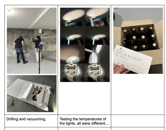
Drilling holes. The holes were a struggle to get drilled, the walls being concrete was the biggest problem. Only because we had no experience in drilling into concrete. We had the drill from mike and the drill form Elena's dad which were very different and both a little complicated to use.
Friday
Lights
Morning putting lights up. After turning all the lights we had been given by Mike on we found that they were all different. Each having different brightnesses, warmths and hues.
To figure out where we would place the lights, each of us held the lights and aimed to see what looked best for each person's work.
Cailins work was naturally glowing as it was made from light projections and LED lights. It had a warmer and pinky hue, and orange glow from dotted candles.
Elena wanted warm lights that had a sunsetty glow so her works needed warmth in the cooler space. As
Felix's work was on sterile white foam boards; it was better suited to a cooler light so they didn't look yellow and stale.
Islas work suited either or but to create a balance in and flow within the room we decided she would be better off having a cooler tones light
Isla and Felix got one light and Elena got two.
We painted the windows that already had vinyl on black to make them blackout.
Wine sponsor arrived
Publication printing
- As things do not go to plan. Thank god we were working with Carly, Islas flatmate, who did all the layout and design for the publication. We managed to print 60 of those. Ran out of paper and then by the end of the day was so exhausted and hungry.
Saturday (opening night)
8am was so much rain that 5 buckets of water had to be emptied in half an hour,
Thankfully the rain subsided.
Elena went to uni to finish publications while Isla worked on getting her lighting right. As she just had the one light and that meant all other work was left in the dark. Torches were needed and
Cailin
Sunday
Cleanup from the opening.
Sitting the space
0 notes
Text
Week 9
Organisation, preparation and resolving a lot of the publication before a shitstorm of week 10.
Week 9 was focused on going to others exhibitions as well. Making sure


lists and job delegation
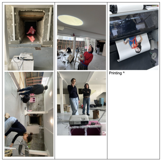
27th Sept, went into space to briefly test work on site for the first time:
(Cailin) tested projection work and discovered the back of the ‘hole’ was too textured and ate up detail/warped projection (pictured to right). Solved this issue by building a screen.
(Felix) brought in mock up sheets similar sized to photo prints to trial sizing on pillars
(Elena) tried to bring my paintings into the space to see if they would fit but they didn’t fit in the van that was hired.
(Isla) had to work


0 notes
Text
poster

made on Risograph as a collaboration with Carly Wattam,
0 notes