
A visual-driven blog made by a university student, Nabilah Munazah (19B8050)
Don't wanna be here? Send us removal request.
Statistics
We looked inside some of the posts by soultoshine and here's what we found interesting.
Average Info
Notes Per Post
2
Likes Per Post
2
Reblog Per Post
0
Reply Per Post
0
Time Between Posts
6 days
Number of Posts By Type
Text
12
Last Seen Tumblr Blogs


Fun Fact
Hackers stole 65M passwords from Tumblr in 2013.
Text
In Pursuit of a Future
youtube
I watched this video when it released a couple of years back. It starts of about how Bradley Friesen talking about how he took his future into his own hands when he was rejected from being a helicopter pilot for being so young. But despite that, he passion to be one overcome all the barriers as Bradley signs a lease for a helicopter, and the rest is history.
I was kind of the opposite of that attitude for awhile. For the most part of my teenage years, I’ve always just followed what was slated for me by my parents or by the expectations of my teachers and friends. And honestly, I felt terrible for not really liking the career path many expected me to go to. I was scared to say anything about it, not in fear I’ll get scolded, but in fear that what I wanted to do, wouldn’t actually give me a comfortable life later on. Because, sure I liked to paint, or make some graphics, but I just did it for fun, I had no real skill- or so I thought.
One of the biggest take away from the video was there’s no such thing as you’re too young or too old to do something new, or something you’re passionate about. You have to fight for your future to make it the best possible future.
And so, I did.
After 6 years of being in the science stream, expected to go to the medical field or at least computer science and constantly in the bubble of being around high achieving students, when I applied for university, it was the first time I set my foot down and said, yeah, I’m going to go get a Degree in Design and Creative Industry. Nobody is going to change my mind about it, so here I am.
It was a bit shocking for me at first, because I finally am opened up to many other students that had amazing skills and created beautiful designs and many, a strong portfolio, I was just starting out. I had a little bit of catching up to do, but nonetheless, I always try my very best at doing my work, even if it’s a tad bit late.
0 notes
Text
Creating Presence
In comparison to other creative careers in Brunei, it is pretty clear that we do have an abundance of good photographers. However, if you want to give yourself a job as a photographer, you have to stand out more. In recent years, photography as an art form and prospective career has evolved by leaps and bounds. Besides, the development is forcing photographers to put more effort and develop new content in able to thrive, which benefits not only them but the entire industry as well.
Photography has never been more prevalent than it is now, from the rise of small business wanting their advertisements to be better, to content creator or influencers having their photos taken to post on the internet. Even with technological advances, availability to high quality equipment as well as a limitless number of social platforms to display our work, it won’t guarantee your presence to the audience you want to have.
You do have to question yourself, what are you doing this for? Is it worth the effort to try and get a following for your work? I find that your motive or the intention you have will make a difference in some ways. Being a photographer is exciting, it’s ever changing and challenging. There's also a lot of demand for creative material, and there are a lot of options and entrance points for photographers who know how to first build a niche and then stand out.
Firstly, in order for you to create a job for yourself or even get hired, you have to make yourself available to the world. If you don't make yourself known, no one will come to you. So it is important for you to have the online presence. It might be difficult to have a break through in the current market, but if there is a will, there is a way! Let’s expand on that a bit more.
1. Putting effort into your work
While Instagram lends itself to a snap-and-post approach to photography, this isn't how great photos are made. Great photos aren't just shot; they're made. This entails shooting in RAW and then editing the images in your preferred application. Take the editing process seriously, learn how to work with light, shadow, and clarity until you have a finished piece you can be proud of. Because the Instagram app isn't designed for this level of intricacy, forgo the tacky filters and effects and work on a computer instead.
Create a separate Instagram page for your business that will represent and promote your brand. Choose a name for your account that is easily remembered and instantly recognizable. If at all possible, utilize the same name across all of your social media platforms. Choose a profile shot of yourself or your main subject matter that best represents your photography style.
In your bio, include your area of expertise as well as your location. Make it easy for others to find and contact you outside of Instagram by including your contact information and a link to your website.
2. Finding your niche
Concentrate on one scope of expertise; this is critical for creating your identity as a photographer and growing. It's all about figuring out what makes you stand out from the crowd and then using that difference to create something unique and intriguing.
Consider Instagram to be an online platform for improving and enhancing your brand's appearance. On your feed, highlight photos from your work that center around a specific theme. This might be a specific subject or photographic style.
Your followers will expect you to maintain a consistent style or theme in your feed, which will keep them returning for more. In most cases, Instagram users will come on your profile and determine whether or not to follow you based on your last nine photos. As a consequence, make sure the top of your feed always shows who you are as a photographer in order to attract and increase your audience.
3. Create supporting stories and Captions
Great photography leaves a lasting impression. Similarly, well-written stories do. Moreover, by combining powerful picture with bold words, you may provoke an emotional response from your audience and help them connect with your work.
People are more likely to spend more time on an image when there is a fascinating caption to read. As a result, create a story, educate people about the image, and explain what it means to you. To elicit actual participation, give them something to ponder about.
Captions allow you to connect with your audience on a more personal level and provoke an emotional response. If your caption is interesting, people are more inclined to read it or click the "more" button, resulting in more time spent on your post.
5. Sharing your work
Share only your best work. Make your Instagram account appear like a highlight reel of your portfolio by posting just your finest photos.
Prioritize quality above quantity, and post photographs on a regular basis, but not too frequently. Relevant, high-quality material is more likely to elicit a positive response, which can help your posts rise in the feeds of your followers.
If you have a lot of photos from a single session and can't pick which one to publish, choose the multiple picture option. This way, only one image displays in your feed, but your followers may see more. Alternatively, develop a posting pattern or habit, meaning that you post one picture from the shoot on different days, spreading out your content over more days.
6. Practicing your people skills
Actively seek out and form relationships with photographers you admire to form a community. It might take awhile, but constantly communicating with them will be necessary to grow besides being beneficial.
Spend some time responding to people who have left remarks. Respond to their comments, answer their questions, thank them for leaving a comment, and appreciate them for giving their time. It's both appropriate etiquette and an opportunity for critique. Return the courtesy by complementing and respectfully commenting on their posts.
0 notes
Text
The Fate of a Challenger
As mentioned in my previous post, I challenged myself all semester to create a few artworks themed around quests from the game ‘Genshin Impact’. I have made 6 artworks in the last 4 months, I will be talking about them in more details below! The artwork are namely:
A Storm, A Spire and A Sanctum
Of the Land Amidst Monoliths
The Winding Homeward Way
For a Tomorrow Without Tears
Sacred Sakura Roots
Ceremonial Site, Tsurumi Island.
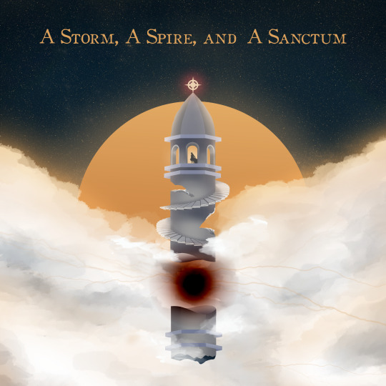
‘A Storm, A Spire and A Sanctum’ is an original soundtrack from Hoyo-MIX for the game. This soundtrack has a special place in my heart where it was played in the beginning quest (or called the prologue chapter) that introduced the first region, Mondstadt, the city of freedom and wind, and the lore of the game to us, the Traveler. For this artwork, I tried to visualize the what each word meant. Firstly, I recognize that it there should be attributes of a storm, which are thick clouds that are grey and murky. Then a spire, a tapering structure on top of a building. Lastly, a sanctum, where it is a private place where most people are excluded. In the same order, I can interpret the title as a building with a spire, located where it is hard to get to and is shrouded with clouds from a storm.
My first order of starting the artwork was creating the building itself. In the game, there is an area called ‘Stormterror’s Lair’ it is an area where ancient ruins lies, namely ‘Decarabians Tower’. It is also where the OST plays in the background while we are in the area. While I did not want to use the design of the ruins itself, I, however, did use the idea of a lone tower with a spire design. At this point one of the three main idea has been ticked off. Next, to give the idea of the tower being a private place, I decided it would be best to lift the whole tower off the grounds where normal people who live on land, will not know how to get there in the first place and promptly added a single figure that can indicate that she is alone. Lastly, I built the background where the bottom half is thick clouds with grey areas to allude to a storm and the ‘moon’ behind everything. From this angle, the tower is above the stormy clouds. I then wanted to add the element of ‘energy’ that is mysterious and presumably is keeping the tower afloat. Again, to add the element of storm, I added lightnings coming out of the black matter. Other than that, the next few things that were added on were minor details.
What do I love about this? I love that for the most part, the artwork is balanced in the middle of the artwork. The colours that I have used gave it the mysterious and dark yet glowing and lonely persona I wanted.
What can I improve? I personally think I can work on the overall design of the tower more. There should be more details, and structures instead of it being a straight and blocky looking tower. I could have also added small details of rocks floating about the tower from the cracked parts as well.

‘Of the Land Amidst Monoliths’ is the first act of the first chapter for the next region, Liyue, that we go to Genshin Impact. As the title reads, It talks about the land of geo (or earth), that are surrounded by monoliths. In the history of the region, there is a legend where the god of Liyue, defeated a sea monster and imbedded it on the sea floor with stone lances that later became ‘Guyun Stone Forest’, an area that is made of a group of small stone islands. These stone lances, along with more stone pillars found all around the region gave the chapter its name. With this in mind, I started this area from the basis, the land. I wanted to create the dynamic of a mountain with a leading and zig zagged road up towards the top. So I sketched that out, and then creating a monolith design and placing them where I wanted it to be. Other than that, I added another feature found in the game and found only at Liyue currently, which are amber rocks. They are bright orange and glowing, made as such to attract and capture intruders that come close it, which I then placed at the top of the mountain.
What do I love about this? I love the way the land itself looks, I feel that it looks natural especially after I had painted it and added the small details to the grass and the rocky cliffs. I also love that the designs on the monolith are clearly still glowing despite the brightness of the amber rocks.
What can I improve? Right of the bat, the colour scheme. At the time when I made this, I wanted it to use analogous colours. However, while it doesn’t look too bad, I feel that it didn't create the dynamic that I had envisioned, where I wanted the mountain and the monoliths to look like a beautiful but can evoke curiosity.

‘The Winding Homeward Way’ is part of a limited event quest where the Traveler goes to an archipelago far from the main land of regions where the main quest line are based on. The title simply talks about finding your way back home, which I find easy to do. However, I did not want it to be too simple, so I had the idea to create a beautiful flower and nature covered valley that lead to the way home. Since my previous two artworks had been very dark and mysterious looking, I wanted to do the opposite for this project. I used a bright colour palette and built the layers of nature on the walls of the valley at the same time, to my mistake. I then use bright green and yellow highlights on the grass floor creating a zig zag pattern than lead to a hill further past the valley. On the hill, I made a simple and small home. I purposely also made the sky for this artwork very blue and bright.
What do I love about this? After putting them all together, I felt that the artwork does tell the story or the scene of how your journey coming home would be like. Surrounded by breathtaking nature that we see less of day by day. I was also scared that this piece would be too overwhelming, but in the end, it worked out quite well.
What can I improve? As I’ve mentioned, I have made a mistake building the layers of the walls on both sides together, as it created a problem when I was doing the final render. I had forgotten to take note of where the light source is at, resulting in having the same brightness in both sides of the valley. This poses an issue as the right side should have been shaded more and less vibrant as the light source was meant to be in the upper right hand corner. Due to that fact, I has make changes with the brightness, contrast and saturation of the right side. Another similar mistake that I made was the shadings of the clouds as well where the shadings should have been heavier on the left side instead.

'For a Tomorrow Without Tears’ is the second act of the prologue chapter. In the game, this is the quest where we try to save a dragon who has shed tears from pain of corruption. It quickly popped into my mind to make a small figure holding a weapon, ready to fight for their future. But before I can start on the figure, I had to think about the surrounding area first. At the time of creating this, I was watching an old Barbie movie ‘Pegasus’ as they enter the Forbidden Forest. Lightbulb moment! What if the figure had been on a journey going through a dark and magical looking forest? I quickly started to sketch some trees and try to lay out the scene. Reading back title, I wanted to create an Easter egg in the shape of a teardrop. I found that the best way to do that was to intersect two trees together. I deliberately chose to have the foreground darker as to indicate that the angle of this artwork is from inside the dark forest, where we can still see the strange continuing branches that covers it, and fireflies that glow bright even in the brightest of days. I finally then placed the figure facing away towards the bright ‘outside’ holding up a sword. I added sparkles around the figure as to signify that they are excited for what’s to come.
What do I love about this? I honestly love the enthusiasm that is radiating from that small figure. It doesn’t even have a face to look at! I also did this project when I was feeling quite burnt out, but I wanted to express that even if I feel small currently, there is still a big fighting power in me!
What can I improve? The leaves for the trees at the upper corners. What have I done?! I took the chance to look back at the time lapse I did while trying to create this, and about 60% of it was me drawing then erasing it over and over again. Clear indication I should practice drawing/painting trees!
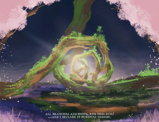
This artwork is my own recreation of a scene (and currently an area) of the last part of the Sacred Sakura Cleansing Ritual. This scene was a very sad yet beautiful scene that happened in the third region that we arrive to in the world. For this artwork, it was less about creating a story but rather I focused more on how I wanted to portray the scene from the way the art style itself looks. I focused on it being sort of messy and rough, chaotic but also serene. In other words, instead of going in to do small details and making each piece of leaf or grass well defined, I opted to make sure that it was fine as long as it has the overall shape and shading, which is why the artwork feels a bit more rough, and the green growth on the trees look more like scribbles instead of proper leaves.
What do I love about this? I love how rough and ready it looks. This was my first time creating an artwork and fighting the urge to go back and define more and more. It also brings about a quote said in the quest: "Do not be blinded. Do not waver. Keep walking the path that you believe in.” to which I find to be a beautiful quote.
What can I improve? While I did want it to look rough and ready, I think I can learn to use more colours instead to ‘define’ more details in it. It can create more value within the drawing itself as well.

Last but not least is yet another scene from the latest available area in the region, Inazuma. I particular chose this scene as it does play a big part in the island’s lore. Here, again, I focused more towards creating a softer art style while still not needing to properly going in making more defined details. I focused more on the rock formation and the rock platform, while playing around with highlighting the areas the candles light up. I also added purple fireflies that lead towards the ceremonial site, this and the light fog that surrounds it, may indicate that the site might still be buried in the sea of fog, as in the game initially.
What do I love about this? I love that the effect of the lighting really attracts your attention. It then might bring up the question, what is it? why does it look like that? I certainly still do not know the answer as to why the design is as such.
What can I improve? Personally, I think I can frame or compose this artwork better, it is a bit off centre and the surrounding area seem too lackluster and are not balanced as well. I have yet to receive more feedback about this too.
So, what have I learned?
Firstly, I can actually art! wow! On a more serious note, I certainly can develop my art skills better if I continue creating more artworks like these. There have been ups and downs while making each one of these, but the end result and the lessons I’ve learned make me feel that I have progressed, and can progress even further.
And you too, reader, challenge yourself to do something out of what you usually do. The mistakes and the successes you make will make it worth it in the end!
2 notes
·
View notes
Text
Process Is Everything
Many believe that drawing is a talent, as which means that you are born it with. While it does sound fantastic and exclusive, that’s not particularly true. Personally, drawing is more of a skill you develop over time with practice, regardless of your background. The only difference from somebody that can draw and somebody that do not, is the passion to spend the time to learn how to draw, again as I’ve said before, you might not like the quality of work when you start of, but you’ll get to a point where you’ll love your artworks eventually. So,
Where do you start?
In the beginning, a pencil and a sketchbook is the perfect place to start. The goal when you start off is to become familiar with your own creative expression, so whatever that you draw, it may be loose but simplistic, it might be good for you to embrace that art style.
When you draw, don’t think too hard about what is it you are going to create. Draw what ever it is that is on the top of your head. It could be a tree, and apple, the bottle sitting in front of you, then create a narrative for it. It could be the tree where a ghost lady sits on dead at night- how would that look? an apple half bitten, by a maiden who then got poisoned, you could draw a chunk of the apple gone. Even if you’re thinking of creating a fight scene, but you end up drawing two stick men with swords, that’s okay because visual communication may take various forms, there's no shame in using simple stick figures, circles, smudges, or lines to tell your tale.
Other than that, plagiarize- wait, don’t. Never do that. What I mean is that try to copy the way people do their work, especially those whose art style you like. And when I say that, I mean for educational purposes, you’d want to copy their skills. If the artist has a tutorial video on how they do their art, for example, how they draw their initial sketch, what material they use and so on, you maybe want to learn from that. Your final artwork might not look as amazing as their final result, but you’re a step closer to it. When you copy how they do their work, you indirectly are using the process itself as a way to find your own art style and also find the techniques that work for you better. A word of caution though, do not pass other people’s work as your own.
When you get comfortable with drawing, you can then learn more by going to masterclasses or trying out new mediums of art. The process of discovering your own style will be difficult and will take a long time, some even took years to find their best art style and creative process, and for that long you might even struggle staying motivated. But you as a budding illustrator, you can always find more opportunities to such as creating a new social media account for your art and interacting with people who appreciate it, furthermore, you can even participate in challenges made by other groups of artists within the platform. In my case, I decided to give myself a challenge all semester long to take on illustrating a few titles.
Why did I take on this challenge?
1. To try be more creative with my artworks For quite awhile, I stuck mostly towards creating art from vector shapes or using the pen tool to create a ‘scene’ or a landscape. This limit the kind of artwork I can do as I felt that there was little to no element of it being ‘natural’, as in it didn’t feel organic and loose, in a sense. So for this part, I challenged myself to create the scene by hand without the help of straightening tools, pen tool or the like.
2. To develop and explore my art style I wanted to try different ways of starting my art process, there where some that I started of with a sketch and define all the smaller ridges, there were some where I painted directly to the canvas and created shapes before slowly defining them. So I tried my best to try out different brushes, different shadings, different way of painting on the colours as well.
3. To get feedback from people When I do work I’ve never tried before, and it’s far more complicated than any works I have done before, and most important of all- I am proud of what I have created, It’s easy to get blindsided by it. Meaning that, for me I might not see the mistakes I’ve made, while other people do. So I like to ask for constructive feedback so I can learn from my mistakes or develop certain areas that I had not worked too well with.
With this, I will be sharing the artworks that I have done over the course of the challenge in the next post! I will talk more about my creative process, what I love about the illustration, and what I can improve next time I visit the same title, or try to redo a past artwork. See you then!
sneak peak!

0 notes
Text
It’s okay if you suck.
youtube
One thing that all creatives, even the most successful ones, have in common is that we all have doubts. Especially when you’re a beginner, you start doing creative work because you’re interested in it. But despite all your efforts in creating your works, it’s really not that good. Then you doubt your abilities in being able to do what you’re passionate about, and sooner or later you sort of manifest the doubts into an inner monologue along the lines of “You suck. Give up and get a real job.” You think that there are people who are good at certain things and are known for being exceptional at certain things, and then there are you– and everyone else who is average.
But the truth is, for your first few thousands of picture could or would be your worst. Personally, looking back at the pictures I took when I first started photography, there are only a handful of them that I’m really proud of. Although, it might still be bad for some, but these pictures gave me the will to learn more and improve besides genuinely learning something that came from the failures. That’s okay though, because it’s only the beginning.
When you start something, you’ll struggle for quite some time and that’s also normal. No one really expects you to do amazing and accomplish works the level of a professional from the get go. It’s probably cliché to say that in order to master anything, you just have to do it, and learning how to do it requires you to be terrible at it for awhile. Allow yourself to suck; else, you'll never improve.
You may have heard of Ira Glass’ advice for beginners:
“Nobody tells this to people who are beginners, I wish someone told me. All of us who do creative work, we get into it because we have good taste. But there is this gap. For the first couple years you make stuff, it’s just not that good. It’s trying to be good, it has potential, but it’s not. But your taste, the thing that got you into the game, is still killer. And your taste is why your work disappoints you. A lot of people never get past this phase, they quit. Most people I know who do interesting, creative work went through years of this. We know our work doesn’t have this special thing that we want it to have. We all go through this. And if you are just starting out or you are still in this phase, you gotta know its normal and the most important thing you can do is do a lot of work. Put yourself on a deadline so that every week you will finish one story. It is only by going through a volume of work that you will close that gap, and your work will be as good as your ambitions. And I took longer to figure out how to do this than anyone I’ve ever met. It’s gonna take awhile. It’s normal to take awhile. You’ve just gotta fight your way through.”
It’s very tempting to stop doing your creative work when you find that the quality of your work doesn’t compare to your visions or your liking, but you simply need to keep practicing, learning and adapting. It does help towards bringing you beyond the barrier of having your work suck. Even if you’re excellent, you’ll almost certainly fail at some point.
Nowadays, it’s hard not to compare yourself to other people who create the same content like you do. These people are everywhere on the internet, it’s on TikTok, Instagram, Twitter and many other platforms. There will be times where you find out more about these creatives and find out the quality of their work far surpasses yours despite being in the field for a shorter amount of time. But that isn’t what it’s about.
I have been doing photography for 5 years now, I have seen great improvements from when I started. I certainly don’t just point and shoot anymore, I frame my models properly, use the right camera settings, the list could go on. I genuinely did not know that I even had to time when I should be doing photoshoots because I didn’t know how far the sun’s position could affect the lighting of our models. Trust me, I’ve done a photoshoot for a client and it ended up with them having panda eyes because I did the shoot outside in the middle of the day. That’s of course not to say that other people might do the same mistake, but it just goes to show that you have to start somewhere. Even if we’re more seasoned, we do still make mistakes, or the work that we do ends up sucking. It happens to everyone, not just creatives.
In Peter McKinnon’s video, Stefan highlights that you have to give room for you to suck. Not that you have to suck. But allowing yourself to make errors and focusing less on the end product but rather how you go about creating it, can help you develop your work more. Done is better than perfect. Those bad works that you’ve created will count for something eventually, it will manifest into something better, maybe not for your next project, it could be your 4th or 20th project. In time, you’ll notice, you have done your work better than you’ve ever expected in the beginning.
Peter McKinnon's Creative Process
This is awesome
This is tricky
This is shit
I am shit
This might be ok
This is awesome
It might drain you of all your energy, excitement, and active inventiveness. It can make you feel like everyone else is tearing ahead of you if you don’t push yourself to do better, faster. We believe we suck because when we push ourselves and try something new, we goof up and make mistakes. But you know what? That’s okay. Give yourself room to suck, you’ll survive the failures.
0 notes
Text
A Work In Progress


These photos came from a photoshoot I’ve done as part of an activity for the Executive of Media and Public Relation (EMPRO). Me and everyone else from the same team came in not really having any or much experience with photography and modelling. We started off with some basic photography skills such as trying out different aperture and shutter speed.
It was a very fun experience as everyone had the chance to take photos and be taken photos of. Not only that, I found that the photos that came out were particularly to my liking as I have the tendency to have warm or pink tones to my photos. Learning photography from each other’s experiences and seeing how different people use different materials that were in the area to create interesting shadows or effects was also very interesting to see.
0 notes
Text
Visual Liking
When it comes to design, there’s a clear divide to my design liking; clean, elegant and classy looking or modern abstract pattern and textured. Let’s take a look at some classical designs I had taken interest of:

Disney's Beauty and the Beast - Social Campaign by Fabian De Lange
This design took my attention the moment I saw it floating about on Pinterest. I loved the (mostly) symmetrical design of the poster itself. The first thing that caught my eye is the use of the gold colour in both the font and the chandelier. It surprised me how well it looked without blending together too much. I also love the Serif typeface they used as it conveys the formality, and sophistication of the design. The contrast between the background and the foreground also makes the chandelier pop more as well as create emphasis on it. The same reason applies for the hand mirror below.

After looking at them, and analyzing what I loved about it, I decided to create visuals with the same idea, using analogous colours for the main text and image, and a darker background as to let the foreground look more like it’s shining. This project was done during the semester break this September!

0 notes
Text
A Shutter Away From The Next Best Creation (2/2)
In 2016, I began working on a passion project. It was after completing a photoshoot for a theater group that I discovered my passion for photography.
Many of my photographs are portraits with an editorial style backdrop and editing. I mostly utilize natural light and the surrounding area to construct my photographs because I believe that nature is sufficient to produce engaging art.
Many of my pieces also use my particular motif, 'pink dreams.' Pink is associated with feminine characteristics such as compassion, harmony, and charm. As a result, 'Pink Dreams' is all about my treasured goals, which I have translated into visuals.
The main idea for the photoshoot I will be featuring was to showcase the power in femininity. I wanted to use pink as a basis but make sure my models show emotions and sentiments, because I feel that is what feminine power is centred on.


0 notes
Text
A Shutter Away From The Next Best Creation (1/2)
‘A shutter away from the next best creation’ is something I say a lot when it comes to my motivation to create something. The ‘click’ sound of a camera shutter represents the part of me that absolutely loves photography. While I started my photography journey with a Nokia E65, I now hold dearly a Canon DSLR. So why not share some of my favourite photoshoots? I plan to share two of my favourite photoshoots so here's to part 1!


These photos were from a shoot with two creatives for their feature in @JustBruneians a creative a day event during the creative economy week. It was nerve wrecking when I got contacted to do this photoshoot as I had doubted my abilities at that time. But the photos came out good and I am glad to have taken the opportunity!
0 notes
Text
Letting the wind lead
I’ve been told I have a weird way to get inspiration for design or art projects. Why is that? Well, usually people find inspiration from what they see, feel, or maybe find a theme to do. While that does work for me from time to time, I personally start most of my projects with a title.
Sometimes when I’m playing games and a quest pops up, or when I’m reading a book and going to a new chapter, they usually have a title for the quest or the chapter. If I happen to like the title, I would write it down in a book so I can keep the title in view especially when I want to start on something new. This also means that a lot of the time, my art stems from what my title is, rather than giving a title to my art.
Now, how would that work? I’ll use one of my latest art projects as an example. The title I used was ‘The winding homeward way’. From the title, I breakdown the keywords: “winding way” and “homeward”. And by using these two keywords, I interpret it in a way where there is a long and twisting path leading to a house. Then, I’d sketch out the basis of the route and the house before going along to make the route interesting. This is what the finalized digital art project looked like!

0 notes
Text
Travail Tales
Growing up, I was obsessed with drawing, painting and crafts— all because I regularly watched shows like Art Attack, Backyard science, and Blues Clues. Every week I’d do a project I’d seen on the shows and get scolded for making a huge mess. Nonetheless, it was a great way to keep me busy and practice my art skills.
Then secondary school rolled around, and I had no time to do any of that labour intensive work (i.e. cleaning the mess I’ve made). I switched over to writing instead where I wrote a few chapters of a story per week and changed the story every week. And yes, I never ended up finishing any of them. Right around that time as well, I got a laptop to use for school, and from there on, I got introduced to digital art. It was fascinating, as I found out some of my friends have done digital artworks as well. Though I didn’t know how to download any of the apps or was even open to the world of YouTube tutorials back then, I started graphic designing on PowerPoint. I found a good background, then added some gradient shapes, and wrote a quote on top of it and that was IMPRESSIVE. Not only that, I often did book covers for the writings I posted on Wattpad too.
Trust me, they were bad. Look at what I mean:

(A book cover I made in 2013)

(A poster I made for a play)
A few years came along, and 15 year old me had started to watch more tutorials on graphic designing— Learning how to layout things, aligning texts and images, and all that jazz on PowerPoint. It wasn’t until I was involved in being the media person for a stage play that I realized I should probably start being a bit more professional and start learning better programs. But alas, did I start to learn using apps like photoshop right then and there? Nope, not yet at least.
Now you see, for the longest time, within my batch mates, I was proactive in learning design so when it came to editing, I was kind of sought after. (By the way, art as in drawing people or landscapes were a whole different matter). So when I was talking to one of my teachers, and she told me this girl from a different class did some shirt designs on photoshop, and apparently did pretty well, I felt offended. Why? Because the girl wasn’t interested in design or arts whatsoever, she was a true science student who happened to learn an industry standard design application. To spite back, I came home that day and immediately went to get Photoshop and learn it right then and there. It took me a good week to learn all of the basics and the main side panel function of photoshop. And I was happy about it.
Despite learning out of spite (because I wanted the upper hand in designing), It pretty much helped me get to where I am. It’s a whole skill set I am proud to have learned as a teen.
(Also, the girl didn’t actually learn photoshop to make the shirts, the store did it for her)
Do find me on my Instagram, for digital designs at @munsgrafiks and photography at @iambasedinbrunei. Or if you want to know more about my life, @asoultoshine!
0 notes
Text
Getting Underway

Hello! I’m Munaz - a twenty-one year old university student, based in Brunei. Dreaming of being a successful figure in the creative industry. I’ve engaged in multiple kinds of areas within the industry; design, crafts, video and photography and performing arts, however it’s still undecided which do I see myself pursuing. But all the while I’m still discovering what career exactly I want to be in - I’ll document my journey towards said vision.
This blog functions as some sort of a journal. You can find previous works, discussions on some visuals and designs I find interesting, and so much more! I’ll also be sharing the things I’ve learned while starting out in Brunei’s creative industry, experiences and things that pique my interest.
Geared up, and eager to grow and pave a path for myself, I’m ready for my soul to shine!
See you in the next post!
0 notes